As the curtain comes down on 2025, the time for holiday films and Oscar hopefuls has arrived. A quick glance at the schedule, however, shows plenty of the latter and none of the former. I guess the remake of Silent Night, Deadly Night (December 12) counts, but it’s hardly the family-friendly fare or Christmas rom-com you’d expect.
Everyone has their go-to classics at home, anyway, so take this opportunity to check something out you might not otherwise have thought to see. Find a poster that looks fun or different and discover whether the product it advertises proves the same.
And you still have The Spongebob Movie: Search for Squarepants (December 25) if you need to send the kids away.
Distorted faces


I have absolutely zero clue what’s happening in the poster for Timestamp (limited, December 19), but it is too mesmerizing to look away. The film is about schooling in Ukraine amidst the constant threat of ongoing Russian invasion, so one can assume the image is potentially a self-portrait of a student’s psychological turmoil as they reconcile learning and growing while confronting their mortality.
What it looks like sans context, however, is a face covered by a maze of Where’s Waldo’s scarf if he played the Fourth Doctor instead of Tom Baker. I wonder if it is supposed to spell something or represent something that only one who is in the chaos of that situation could know. Either way, you feel the tumult. You understand the jumbled sense of self as hope becomes a luxury many cannot afford. It’s unlike any other poster you’ll see at the multiplex this month.
Rather than covered, the face in Man Finds Tape (limited, December 5) is being pulled into some sort of spatial anomaly. Thus the question is whether the visual issue is a real-life phenomenon we are witnessing or a manifestation of one due to something being wrong with our own perception. Add the word “tape” to the mix and you cannot help but conjure images of VHS tracking as it warps your screen until you turn the knob just right to fix the issue.
The whole takes on that dual meaning—its horror conceit can either be monstrous in nature (those onscreen) or paranoia-induced (how they’re being perceived). Is it adjacent to Invasion of the Body Snatchers or They Live? And the tagline does nothing to narrow the odds; sight is the key to both scenarios. You truly must watch the film to find out.
Peaches Goes Bananas (limited, December 3) uses a more literal approach to its facial distortion by drawing on top of the portrait of its subject. This is a representation of who Peaches (Merrill Nisker) is as an artist by both letting her personality shine in the pose and illustrating that same identity above it to ensure we know what we’re in for. The devil-horn bananas doubling as phallic objects to be licked (at left) and chomped (at right). The ornate eyeball scratched into the frosty glass-like wall between her and us. The graffiti yellow title with a ghost-like character that itself becomes a peeled banana in its human-wearing-sheet construction. Get ready for a wild ride.
Conflict


While I can’t say anything about the quality of the film itself—its delicate subject matter is in the hands of the often-indelicate Angel Studios—I do like the poster LA put together for I Was a Stranger (limited, December 31). Set in the aftermath of an event in Aleppo that ultimately concerns five families on four continents, the artwork seeks to represent this sprawling scope by focusing on four characters in what appear to be vastly different locales.
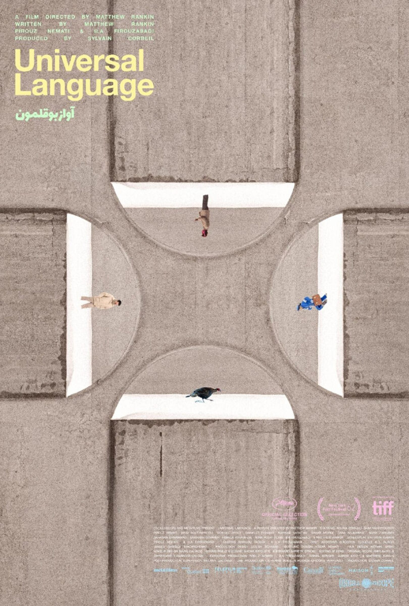
More than just separate the actors, however, the layout utilizes its entire frame to position one upon each edge. It’s reminiscent of Derek Gabryszak and Hannah Christ’s one-sheet for Universal Language, albeit much more literal. Our eyes want to travel in a circle from one to the next, taking us around the different landscapes and occupations (doctor, soldier, captain, smuggler). Thus we try guessing how they connect with the boat of refugees surely playing a part in an inevitably tragic collision.
From real warzones to fake ones, Akiko Stehrenberger’s latest illustration for Atropia (limited, December 12) takes us to the insanely real training ground for Middle Eastern operations that’s populated by actors to simulate civilians and insurgents. With storylines spanning romance, comedy, and sushi delivery, you can imagine the sort of hard-shell / soft-underbelly commentary at play. What better way to depict it than a turtle whose shell is a military helmet?
Beyond the image comes some stellar typography, too. The sans serif font is quirky in its top-heavy construction with the kerning feeling even wonkier as the text shrinks in size. And I love the way Stehrenberger recreates its look with a painted title. She could have just typed it like the tagline below, but the hand-drawn aesthetic proves a perfect touch that ties everything together with the turtle. That which looks real isn’t quite right upon further examination.
Next, we move from wars between countries to wars between men with Steady’s posters for No Other Choice (limited, December 25; expanding in January). Yeon Yeoin’s teaser illustration is a beast of foreshadowing with characters, events, and crimes hidden on branches and behind leaves as Lee Byung-hun stands front and center in his rubber smock and potholder mitten.
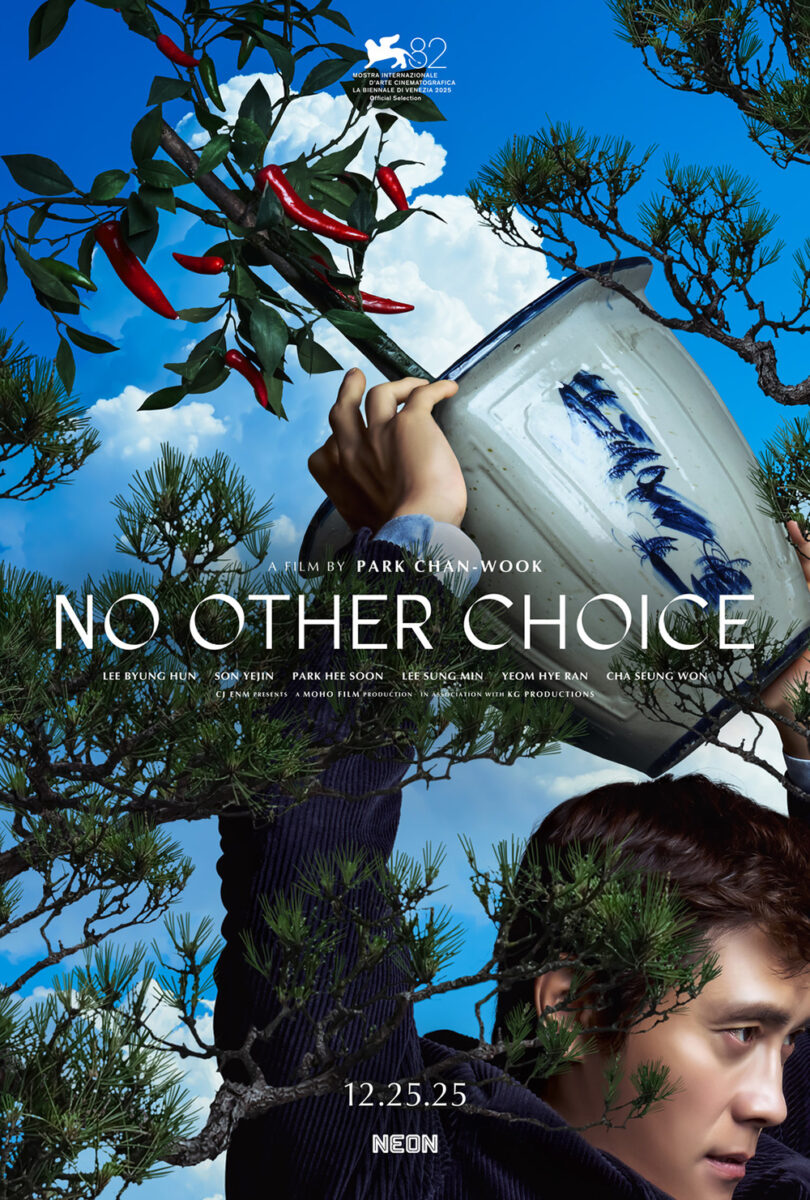
We see joy, struggle, dogs, a violinist. There are family members, victims, and innocent bystanders all about to become embroiled in the protagonist’s ill-conceived plan to weed out his competition for a coveted job opening. All that’s missing is a giant drum of paper to be tapped by the stick hanging out from the top left of the tree.
This motif continues in the firm’s photographic sheet, Lee holding a heavy potted plant above his head. The foliage still seeks to hide him so that his target doesn’t catch his approach and his face is determined to hit the mark. If you don’t know the film is a comedy, you might believe this is a cold-blooded murderer wreaking havoc with malice in his heart; watching this scene in context to understand just how hapless he proves instead is to laugh even louder than you might without having seen this first.
Hidden faces


Call it the Let the Right One In phenomenon, but Mark McGillivray’s poster for The Plague (limited, December 24; wide, January 2) has me bracing for impact. Are those boys’ heads already decapitated above the water line? Is the predator coming from below? The angle and foreboding atmosphere make this swimming pool look like the Marianas Trench holding all sorts of unknown creatures in its darkness.
McGillivray reverses our expectation of white space by giving it life beneath the people rather than above. We want to float up top with them, but those dark vertical lines and the diagonal light beams sink us like an anchor to settle on the title instead. And you must love its typography with a closely kerned, all-caps sans serif—both the way each letter tucks into the next and the decision to turn “The” into an outline to better allow “Plague” to scream its warning.
I can’t read what I assume is the artist credit on the side of the one-sheet for Franz (limited, December 12), but kudos to them for a gorgeously playful, text-centered composition that turns the title into its star. Because it’s not just four letters in the corners; it’s five with the “A” built from a triangular window in which we see the “Eye of Providence” of its namesake. The heavy, dark letters are bespoke, the texture of the page comes through the printing process, and the credits almost become an afterthought, as if it was supposed to be a tease before getting that block of text added later.
Thankfully, the eye is staring off to the left; I might have been worried about waking up as a cockroach tomorrow if it were looking directly at me.
That brings us to the embarrassment of riches that is the Resurrection (limited, December 12) campaign. I honestly could have highlighted any of these four in the top spot, but I cannot stop thinking about inbetween’s Taiwanese version.
What an image. The arms of a man struggle to pull the arm of a clock downwards—not to change the hour, but to change the year. There are music notes opposite his chest and a creepy eyeball gazing upon us from the pendulum below. And, as the agency explains, there’s also the meticulous choice to render each Chinese character of the title’s translation with the English letter “I” used above. Check it out for yourself. Every line is a repetition of the “I” in Resurrection.


Jump Cut Creative’s latest US sheet is equally captivating with its giant silhouette in black-on-red smoke opening into a stairwell populated by a nightmarish figure, hunched and awaiting our arrival. The title treatment maintains the marble surface wielded in the earlier festival sheet of a sharp-clawed figure rising through a crack in the stone and, in fact, is the same font and texture used in its red counterpart with its melted candle human bust.
I’ll admit I’m not very familiar with Bi Gan and have only seen Kaili Blues, but reading Resurrection‘s synopsis piqued my interest. However, after seeing the vibes of these posters and the disparate ways each embody the film, I’m truly sold on needing to watch it as soon as possible. I’m ready to enter Bi’s dreams.