Despite there being a bunch of sequels (Nobody 2, The Bad Guys 2, Ne Zha 2, and Freakier Friday) and remakes or reboots (The Naked Gun, The Toxic Avenger, and Highest 2 Lowest) hitting theaters, I can’t say this month is hinging on any of their successes. Not like a Disney / Marvel month would. Heck, the two most-talked-about on that list are the two that will surely make the least amount of money (Toxie almost never earned a release and Spike’s Kurosawa reimagining hits Apple TV+ three weeks later).
Maybe the bookers are leaning into festival season by scheduling some alums to finally make their bows in America? Maybe it’s a sign of the industry’s creative soundness? Unfortunately, it’s probably just a product of July’s myriad blockbusters refusing to relinquish their screens.
Whatever the reason, the below posters are primed to turn heads and coax viewers away from all that bombast. Catch some eyes and, in a perfect world, the work’s half done.
Hiding faces


It starts with the gorgeously illustrated sheet for Stranger Eyes (limited, August 29). What should be a straightforward depiction of a man and a tower of surveillance cameras takes on a surrealist slant by layering both in such a way that the lenses become stand-ins for the former’s eyes. One becomes a telescope at his sightline while the others become cyborg-like extensions, as though his head remains on a constant swivel to even see what’s happening behind him.
The drawing style lends a comic-book quality to the scene, and a sinister aspect emerges from the wall of windows in the background––each a potential victim of those cameras’ intrusion upon their privacy. And then you read the synopsis to discover the duality of the image: the film’s lead is both searching and being watched. The tool that could bring him back his daughter is also the weapon used to terrorize him.
A Spartan Dream (limited, August 15) harkens back in time with its retro design. Its giant central image is stacked above a row of cast portraits which, in turn, is stacked above a fun title treatment with everything placed atop a textured buff base, complete with visible paper fibers adding a grainy, tactile texture. It’s no surprise the film is set in the ’80s (that cursive headphone jack says it all) or that its romantic adventure uses magical realism to give that hefty spartan helmet some stakes.
I love the screenprint quality of the sunset and the helmet’s monotone silhouette against it, but also the juxtaposition of the more photoreal headphones covering its metallic ears. Not only are we going back in time to its setting––it is going further back with its iconography. A dream of the past to better understand the present.
Whatever the achievements of those two high-concept pieces, sometimes you just need a photo and text to evoke a film’s ethos. That’s the case with Andrew Bannister’s great sheet for It’s Never Over, Jeff Buckley (limited, August 8).
The image selection being one where Buckley is leaning away from the microphone, hand on head to lend an emotional weight beyond the music itself, is perfect both for the feeling and composition. It allows for an off-center, dramatic crop that remains balanced, the mic being just far enough from his face to keep us grounded from falling off the page with him. And while the text above finds just enough room to stay centered without touching his hair, the title is boldly stamped above the whole without a second thought of overlap––handwritten, personal.
There are no drop shadows sullying the superimposition with visual tricks. No artificiality ruining this moment of vulnerability. It takes confidence to risk losing some legibility for the effect to land (regardless of the hues not being fully conducive to the attempt) but also intelligence to know that a few spots in the title block and outlet names (which are way too tiny anyway) can be sacrificed for overall success.
Lines


For a film about an outsider infiltrating the inner circle of a soon-to-be celebrity, you must appreciate the claustrophobic nature of MUBI’s Lurker (limited, August 22) poster. It’s not only the vertically stacked letters of the title serving as small windows through that solid field of red either. It’s the crop of the two men seen––one in extreme close-up to catch an eyeball and smile while the other is pushed slightly out-of-frame to give a sense of him being a voyeur.
The sheet is also a great display of typographic composition, each bit of information chunked together like rungs on a ladder leading us lower. The director’s name rests just under the “U.” The Sundance laurels one letter down. Lead actors are next. And the tagline takes us to the other side to create balance.
Rather than simply careening down the center line without absorbing anything, our journey becomes mired by starts and stops as we bounce lower like the coin in a Plinko board. For once, the decision to position the letters this way (instead of rotating the entire word 90° together) works because we’re actually meant to consume each one separately.
The lines on the Polish illustration for the Quay Brothers’ Sanatorium Under the Sign of the Hourglass (limited, August 29) are less about engagement and more about aesthetic. Yes, we still use them to trickle down the frame from title to image, but there’s also a utility (to mimic a woodcut print) and purpose (the strings of a harp being played).
Thus you get caught up in the craft as well as the scene––the medium sends us into the past just as the wardrobe does. The man’s body and disembodied eyeball’s frame are given shape by breaking those lines rather than covering them. It’s a wonderful use of negative space as positive form.


It might not prove as uniquely evocative as Franciszek Starowieyski’s classic Polish school image for a previous cinematic adaptation of Bruno Schulz’ novel (few are), but you cannot deny its mystery and charm. The puppetry itself should provide more than enough material for a memorable poster, but the only ones I found leave a lot to be desired with its rudimentary text-on-image format. Yes, it reveals the craft, but that faux woodcut sells the intrigue necessary to make that craft meaningful.
Then you have Brian Hung providing the best of both worlds via By the Stream (limited, August 8). It’s like he taped 31 white crayons to a ruler and raked his way down the blue to create the stream––as a slide for our downward vision, and a wall to serve as a platform for the character, title, director.
That vertical ribbon optical illusion is great for playing with our perspective (overhead or three-quarters or both), but it’s the swapping of colors that really disorients––our assumption is for the “water” to be blue. Thus it lends an impressionistic veneer to the whole, like we’re actually catching the reflection of moonlight off the current from that tiny crescent in the top right.
And what a choice to put the credit block in a slightly darker blue. Just enough for it to be legible against the background, but not enough for our eyes to be distracted from our main path.
Bodies v. Nature


Midnight Marauder goes lo-fi, high-contrast with To Kill a Wolf (limited, August 1) and really sets the mood on this reimagining of Little Red Riding Hood. The forest becomes the wolf––teeth bared––consuming our protagonist, her face sinking into the ground as the pointed pines rise. You feel a sense of danger. The presumed futility. Nature’s power.
With no laurels or top billing or taglines to worry about, that image is allowed the full breadth of the page to transform its locale into the landscape of a soul. The title’s bold font with sharp, predatory corners cuts through the dark with its brightness. And that one branch just above the “To” breaks the vertical pattern to tilt 45 degrees, as though a snout pointing to the sky to howl.
The Sparrow in the Chimney (limited, August 1) goes the color route––albeit a muted palette that, coupled with the pristine crispness of foreground and background, all but erases any natural depth of field for a flat, painterly aesthetic. It fits the style of director Ramon Zürcher perfectly: his tales of human relationships often dip their toes in fantasy through a realism lens.
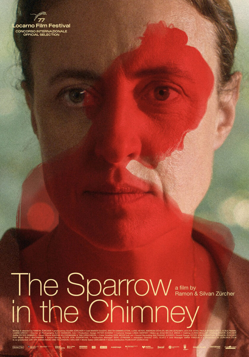
The poster gives anti-Disney princess vibes. Yes, the animals all seem keen to help as they surround this woman, but her frown and blood-covered cheek and neck show they are doing a poor job. Not that she’s doing any better, considering the fate many of those critters suffer during the film. It’s not a coincidence that the title mirrors the phrase “canary in a coal mine.”
It’s an intriguing choice to use Britta Hammelstein, who isn’t the lead. (That would be Maren Eggert, who graces with equally stunning festival sheet with a red Luise Heyer superimposed above.) I think it speaks to the fact that her character is like those animals: a visitor witnessing the turmoil within her sister’s home.
My favorite artwork of the month, however, is the sprawling campaign for Harvest (limited, August 1; MUBI, August 8) by designer Korina Gallika and artist Renee Zhan. It’s tough to choose a favorite, but I must go with the gorgeous, haunting x-ray of a horse galloping across the frame.
Not only is it a beautiful piece straight down to the tidy block of text at bottom and eccentrically curved font choice for the title––it provides a mystery that demands buying a ticket to solve. Because I have no clue what that red shape is at the horse’s head. If this is an x-ray, we can assume it’s inside the animal and not a superimposition. It looks almost like a cartoon face screaming into its ear.


If there’s credence to that thought––the next sheet depicts a person wearing a horse mask––was that a metaphorical riff on this literal image? Either way, this iteration is the most straightforward with its large title at top, photo in the middle two-thirds, and credit block at the bottom. Still intriguing, though. Still unsettling.
Number three is the most hopeful in the sense that its bright watercolors deliver a daytime sky of clouds. Yes, they’re getting a bit dark and could be signifying turbulence on the horizon, but at least there’s a chance at something good. The others are already, conversely, set post-shoe-drop and thus past the point of no return.
The same goes for poster four. It shows how effective an expression is at portraying emotion––this could easily be someone pleasantly ruffling a girl’s hair––yet the angle of her head and discomfort on her face lend a more sinister air to the whole. Rather than a moment of support, it starts to suggest a threat.