Videogame IP, a remake, and a children’s film: August’s blockbuster titles don’t really need marketing help. So, Borderlands (August 9), The Crow (August 23), and Harold and the Purple Crayon (August 2) go heavy on the Photoshop to slap something on the wall and rake in the cash. If Bill Skarsgård didn’t look so much like Jared Leto’s Joker, I’d probably be more interested in his film’s goth artistry. Alas.
That leaves the little guys. And not just the indies either—although they take up most of the space below. Because despite one title’s own IP legacy and another’s director’s pedigree, those two Hollywood productions aren’t necessarily slam dunks. Every bit of intrigue therefore helps. Tease the horror and suspense to come.
Drips


First up is B O N D’s Strange Darling (limited, August 23) and its slow melt of candle wax. Not quite as extensive as the watercolor nature of the drips from Brandon Schaefer’s Minor Premise, but you still get that sense of blurred identity—like the person we’re looking at is either not who she seems or no longer able to see herself.
It’s both nightmarish in its literal implication and intriguing in its figurative psychological potential. Unless it’s simply supposed to be blood expressing impending violence. The tag does say “Love Hurts” after all. And the title treatment shows the silhouette of a woman running from a man with a rifle. Maybe the red hair is liquifying as a means of becoming a prophecy for death.

Either way, its artwork is lightyears ahead of the alternative. Not to say the illustration work isn’t good—it’s merely much less captivating. Her head and his aim of the gun … we don’t receive anything from this main image that we don’t already get from those title silhouettes. It’s victim and perpetrator. It’s all surface level while the version above begs us to look deeper.
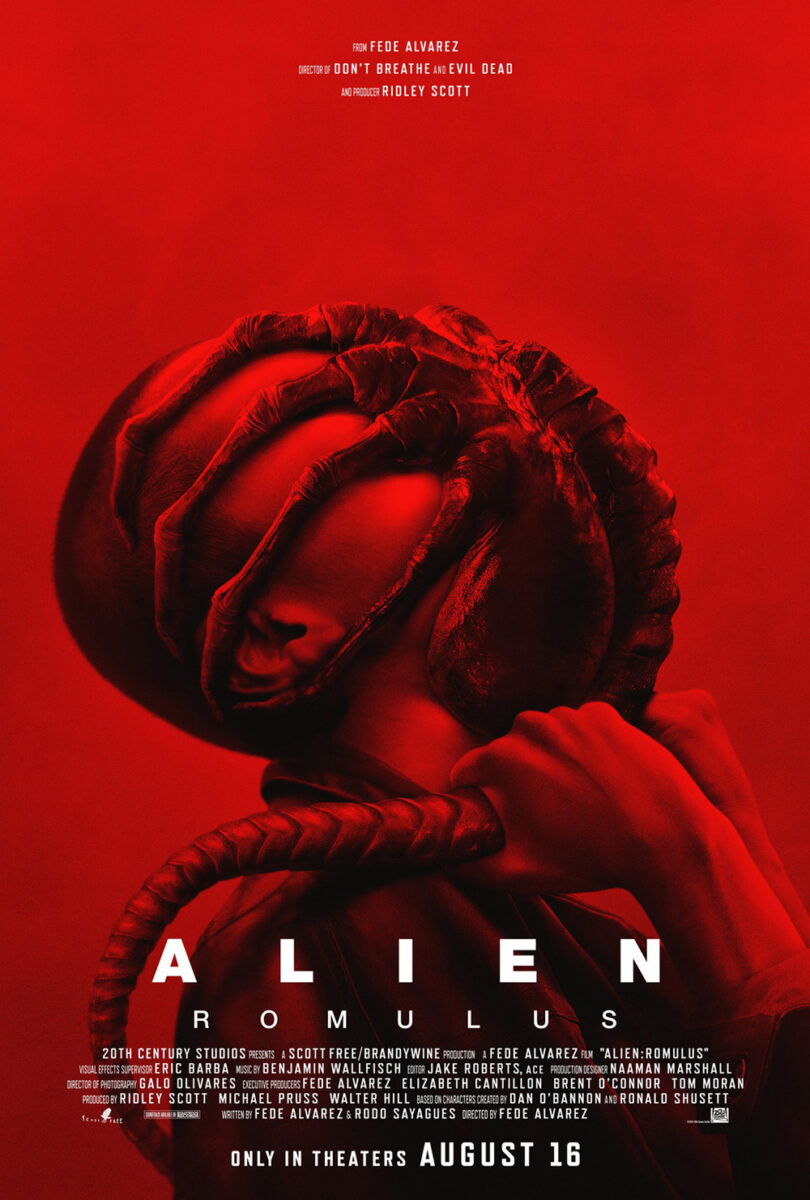
Concept Arts’ Alien: Romulus (August 16) is somewhat superficial too considering it says nothing about what we can expect beyond the horror inherent to xenomorphs. The difference is that this franchise lives through that superficial aesthetic. H.R. Giger’s work and all that mucus is part of the appeal. Yes, it’s just the tease of a monster readying for the kill, but that’s exactly what we came to see.
The same goes for the firm’s other poster. Whereas that Strange Darling‘s predator and prey dynamic remains static by not even placing the characters in the same scene, Romulus ensures we know what happens when they come together. Sure, it’s hardly original since facehuggers have always been a staple of the franchise (and it looks heavily Photoshopped rather than grabbed from a polished bit of special effects), but it’s all about whetting our appetite. It’s about telling us that the promise of the series is being met.
It’s that promise that Mister.S must create themselves when it comes to Doctor Jekyll (limited, August 2). Not because we don’t know the source material (Robert Louis Stevenson’s novella was published in 1886 with countless adaptations), but because we aren’t certain what this version might bring.
Is this tease of Eddie Izzard’s face sloughing off as paint on canvas going to adorn most theaters? No. It’s probably more for the internet than the multiplexes considering the title and date are too small read so it can maintain the illusion of being a framed painting. I wish it were, though, since work like this is exactly what turns heads. The moment you can force your audience to question whether what they’re seeing is a poster, you’ve hooked them into at least finding out. Give me a good trompe-l’œil any day.
That the designers then expand on that idea for their “real” poster is a brilliant bit of evolutionary marketing. Those who’ve seen the painting will be able to connect it to the now framed mirror showing the fracture of Izzard’s Jekyll and Hyde. Now the title is huge, the critics’ quotes added, and the duality a bit more overt. The high concept guerilla tease and polished mainstream display are in direct conversation.
Eyes


Between the title and the tagline, I will assume that most mock-ups for The Wasp (limited, August 30) included an image of the insect. It’s the easy path. The one an executive would probably gravitate towards first. And it’s the sort of concept that you must put on paper for no other reason than to get it out of your system en route to finding something better.
What Kustom Creative created is better. A lot better. You still get the “sting” aspect via the triangle window opened on Naomie Harris that pierces through the image of Natalie Dormer (complete with drop of blood), but it’s so much more captivating than a literal representation shoehorning in a visual metaphor that’s already glaringly obvious from the text.
I love the contrast of the red against the black and white. The decision to keep the text beholden to the diagonal of the triangle even though it makes it move right to left rather than left to right because that fight against the grain ensures we pay closer attention. And, of course, the huge amount of white space that lets Harris and Dormer command our attention above everything else. It’s an impressive composition.
I wouldn’t say the same for BULLDOG’s Trap (August 2), but it remains effective anyway. The layout itself is all over the place with Josh Hartnett’s name and the credit block centered while everything else isn’t. It can’t be considering the angle of the actor’s face and the need to fill in the gaps, but it’s still distracting.
Why it works is the title. In a case of a part being more than the whole, the choice to drop the opacity and let Hartnett’s eye come through the “A” is genius. Not because it’s scary or because it helps put a bow on the design. No, because it’s so funny. This is supposed to be a menacing face—and it probably is without the title getting in the way. By highlighting that eye, though, the tone shifts dramatically because we’re no longer seeing the full context. It’s like Kyle MacLachlan on Modern Family. Cover half his face and everything changes.
The result is very disquieting. Because anyone who has seen the trailer knows who this character is. So, is that wide eye presenting malice? Is it fear? To me, it comes off as unbridled excitement. He can’t wait to see what happens and neither can we.
That brings us to GrandSon’s Skincare (August 16). It’s the perfect amalgamation of the previous two one-sheets with its use of white space and a window as well as it highlighting an expressive eye. Whereas Trap was subtractive by addition (a second layer singling the eye out above the rest), this one is additive by subtraction (removing a layer to expose a hidden eye beneath). This isn’t someone exiting the shadows. It’s someone being forced out.
We’re therefore also unsure what to make of the image. Is she victim or perpetrator? Is she forcing herself or is this against her will? Maybe she’s a monster being unleashed. Maybe this is an awakening.
Either way, the poster itself is formally stunning beyond its context. The slash of bright skin. The lipstick script. The cool, modern logotype of Elizabeth Banks’ name with letters tucked into spaces and pulled through others. It has the feel of a teaser with all the information of a final (save the date) if one is willing to get out the magnifying glass. It’s the best of both worlds.
Central Focus


The Japanese poster for Tokyo Cowboy (limited, August 30) is a lot of fun. Here’s the titular Japanese businessman, who’s taken it upon himself to travel to Montana after telling his bosses he can turn a failing cattle ranch around, sitting on an office couch of what looks to be a tourism center welcoming him to “Big Sky Country.” More than the juxtaposition, though, is the expression on Arata Iura’s face—one of wide-eyed uncertainty about whatever is happening off-screen and, perhaps, the entire situation he has unwittingly thrust himself into.
It’s a case of an image that’s simply too good not to use. So, the skill aspect comes in finding a way to not ruin it with contractually obligated text. Push the credit block to the bottom and shrink it down. Use the margins for vertical type. And keep the title big, bold, and orange at the top. Design around the frame so as not to distract from that gorgeous old school aesthetic. Let the inherent drama of the moment speak for itself.
The same goes with War Game (limited, August 2). Its imagery may not be a film still, but its content provides us all the context we need to understand what is happening in the room without seeing it for ourselves. Because this movie is about US officials simulating a coup attempt after an insurrection on the Capitol. So, even if you’re freeze-framing a random person screaming from their conference room chair, the ability to show tension and stakes from actual footage is difficult.
What better solution than to wield a tool of which we’re all familiar? Little green army men. Are they the good guys or the bad guys? Why not both? If we’re talking about a coup, the perpetrators could be anyone. They could already be inside the building. So, those fortifying the President’s seal are just as likely to be the ones surrounding it. By using these nondescript toys, one layer of skin around that seal simultaneously supplies both.
And the poster itself is attractive in its symmetrical layout with everything radiating out from the center. The only piece not locked onto the y-axis therefore becomes our entry point: a hand placing the last piece onto the board to start the doomsday clock. Midnight has arrived.
Red Island (limited, August 16) also pushes out from the center thanks to an opening through beach palm trees onto a blue sky housing the object of everyone’s attention.
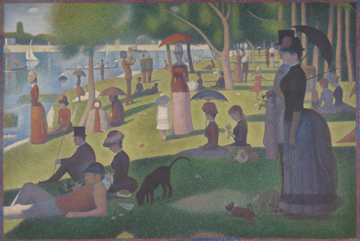
I’m so happy the studio decided to stick with the original image they released a year-and-a-half ago because it’s magnificent. I still remember when it came out. The first thing I thought was Georges Pierre Seurat’s Sunday Afternoon on the Island of La Grande Jatte. I felt like Cameron from Ferris Bueller’s Day Off, staring at that canvas as the camera moved closer and closer to capture each stipple.
The heavy saturation really helps the image pop in that painterly way. It feels like a moment frozen in time—one that is meant to portray a Rubicon of sorts with no turning back. You can sense that what these people are looking at is a major shift that will forever change their lives on this island. And we’re one of them, slowly standing up in the sand behind the others, raising our hands to our eyes to squint and understand what’s to come.