“Don’t Judge a Book by Its Cover” is a proverb whose simple existence proves the fact impressionable souls will do so without fail. This monthly column focuses on the film industry’s willingness to capitalize on this truth, releasing one-sheets to serve as not representations of what audiences are to expect, but as propaganda to fill seats. Oftentimes they fail miserably.
Spring is bringing some TIFF 2015 holdovers and a couple Hollywood hopefuls to take down the juggernaut that is Batman v Superman despite its bad reviews (I proudly hold firm on thinking it fun). Disney may have a hit on their hands with one of their old properties turned new (the one that isn’t pretending it isn’t connected to the film it’s a prequel of), but the success of the rest is up in the air.
Except for Barbershop: The Next Cut (April 15) and the aforementioned Disney rehash, marketing may prove a huge component towards box office returns this month as a result. These films are small and possibly not in the public consciousness. A good poster will go a long way towards turning heads so their titles work themselves into a comfy spot between our ears. April delivers a few that just might get the job done.
Character distraction
These four aren’t necessarily the ones “getting the job done” as much as helping keep the design firms afloat with copious amounts of posters that all pretty much do the same thing as the next. Two are established properties showing how cast and spectacle truly is all that’s left to provide while the other two are unknowns wherein cast is crucial to getting butts in the seats.
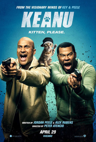
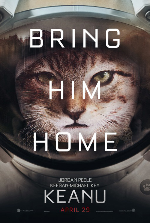
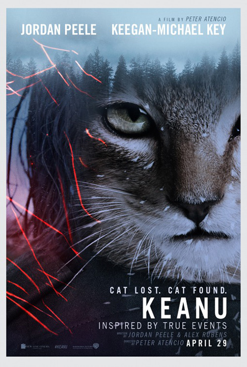
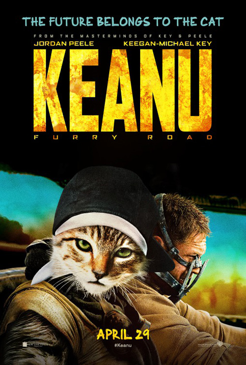
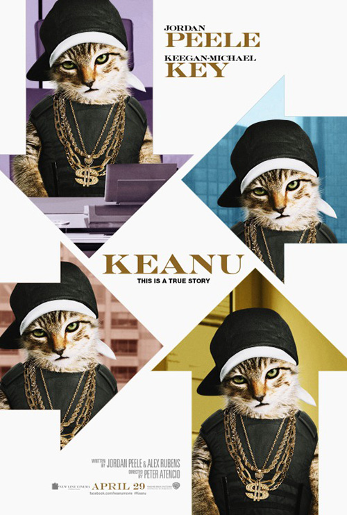
Keanu (April 29) is the latter because saying Key & Peele might not be as ubiquitous as fans of the duo believe. That’s not to say the general public won’t have light bulbs going off saying “It’s those guys who do the weird football player names!” They just need visual cues for the level of recognition they actually deserve.
Well, besides the full sheet showing both screaming with guns in hand, Jordan Peele and Keegan-Michael Key along with Warner Bros. have decided the joke is more important. So they put the titular cat front and center in the style of four of 2015’s award season contenders for the rest. Rather than re-stage these posters like Tyler Perry is wont to do, however, Gravillis Inc. goes lo-fi by just Photoshopping little Keanu on the existing work. I wonder if they have to pay Tom Hardy extra for the effect.
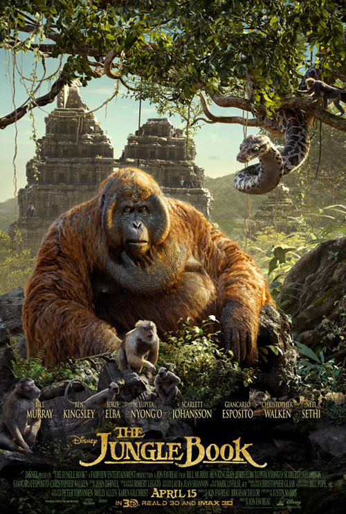
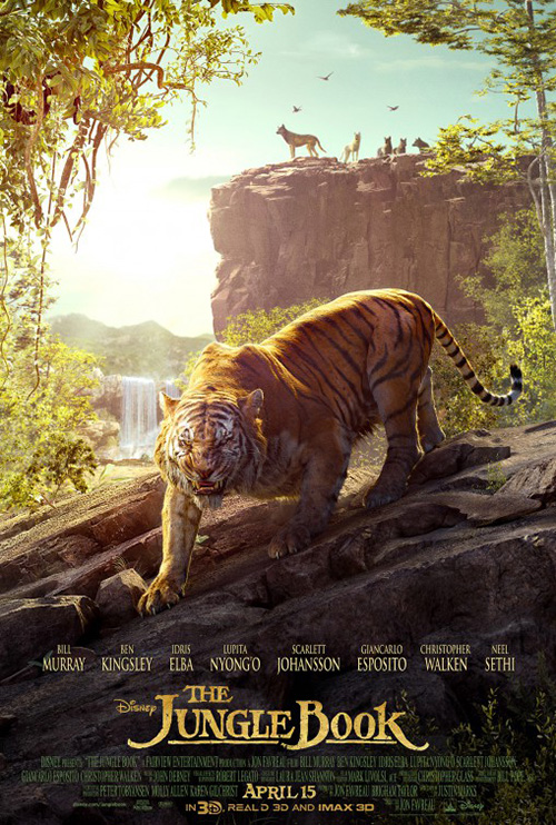
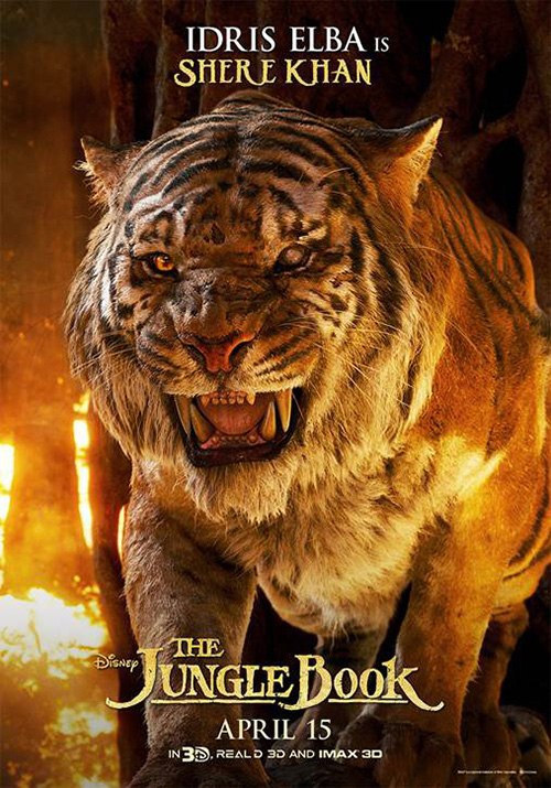
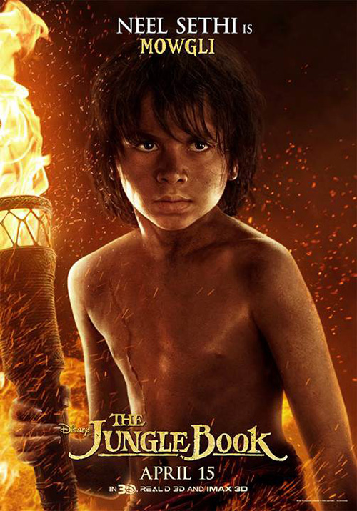
Disney’s The Jungle Book (April 15) is one of the aforementioned “established” properties wherein we know what’s coming (even if I want to believe it will adhere to the 1994 live-action version instead of the original animated one from 1967). This means it’s BLT Communications, LLC’s job to sell us on the computer graphics. We’re to stare slack-jawed at King Louie, Shere Khan, and the rest because the sense of realism they deliver is crucial to whether or not we believe in the film.
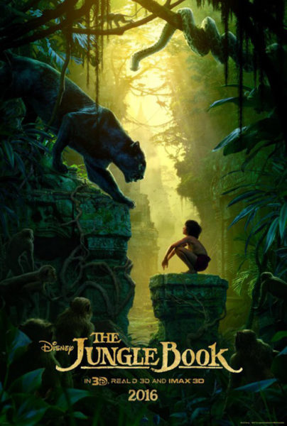
The firm at least looks to add some intrigue with one round of posters by putting their jungle creatures on majestic backgrounds holding unique details to seek out. These are much better than the in-close, fiery portraits of their second series. Thankfully they didn’t make posters out of those glamour shots with actor and character together — well I haven’t seen them yet since they’re probably out there.
In the end none can match the imaginative power of the teaser and its painterly atmosphere. Why can’t children’s movie be sold on mystery as opposed to graphic engine power anymore? Leave something off-screen so we can bask in their introductions on the big screen with awe.
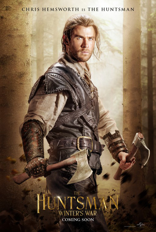
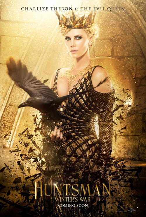
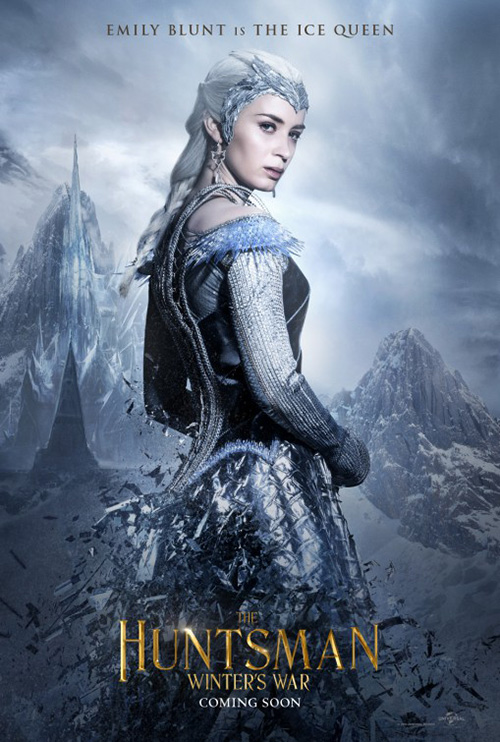
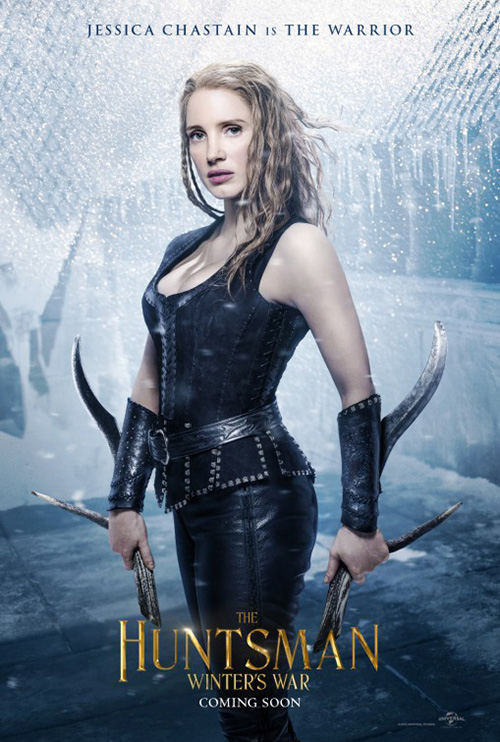
The Huntsman: Winter’s War (April 22) is the movie I meant when talking about how far it’s distancing itself from the film it directly connects with: Snow White and the Huntsman. If the original property was so forgettable that you’d rather say “From the producer of Maleficent” instead of “The story before the not-so blockbuster hit,” why even make it? And if you still feel compelled, why hinge excitement on a competing studio when you’ve already made a film with the same characters? That doesn’t even seem sound in a business sense.


Show White is gone but the Evil Queen, magic mirror, and titular hero remain. Kudos to LA for not just using the same background on each character sheet, but they stir no emotion in me regardless. Not that Creative Partnership’s full sheet with all four collaged together in a totem does. No, the only image that has me curious is the one with Emily Blunt and Charlize Theron as reflections of each other. I care more about their relationship and fight than any of the “huntsmen.” But I honestly don’t care at all.
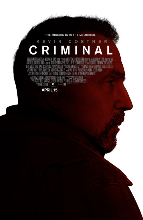
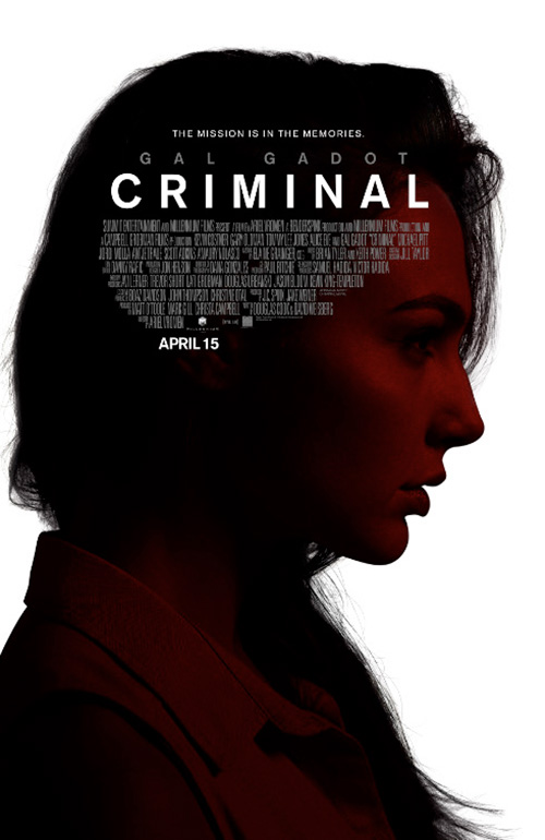
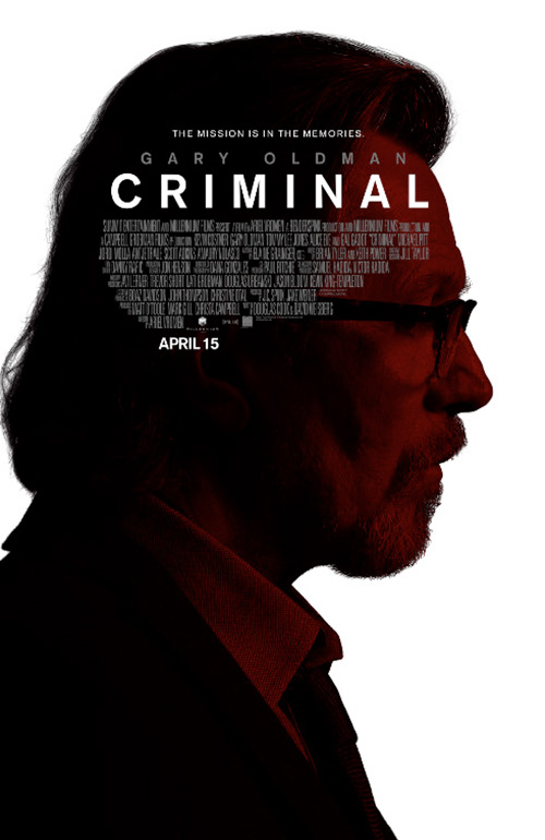
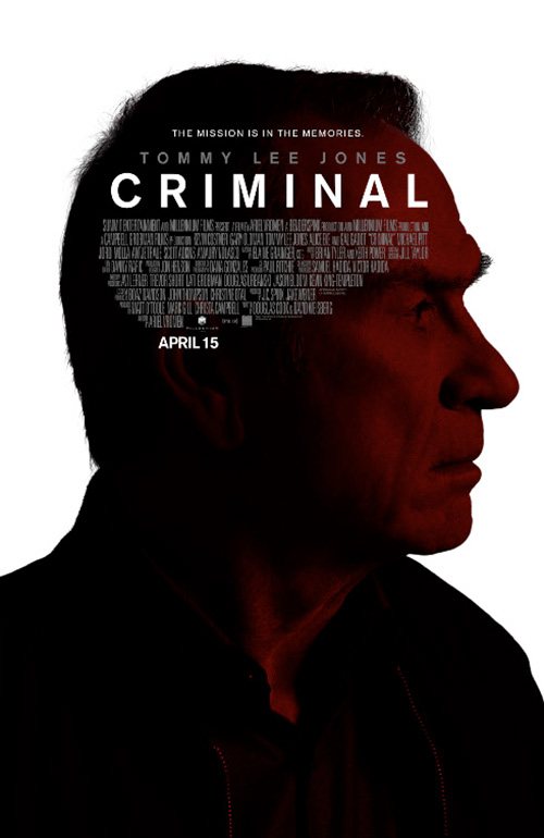
And that leaves Criminal (April 15), a film I know literally nothing about and am not sure I should. It’s Ariel Vroman’s follow-up to the okay The Iceman starring a bunch of recognizable faces. LA’s campaign goes for mystery by shrouding each face in red-hued shadows. But while the design choice is intriguing in its relief silhouettes, the credits box on the actors’ heads instead of in the bottom’s dead space proves odd and distracting.


Sorry, I’m not buying a ticket after looking at these. I might for the firm’s blue-hued translucent collage, however, but only because it looks as though Kevin Costner has a mohawk on first glance. Otherwise it too seems like it should work in a redundant, been there done that way, but doesn’t. Then there’s the Mondo-lite sheet that looks exactly like that sounds: inferior.
Close but no cigar


There are many things you could do to promote Men & Chicken (limited April 22), but the design teams abroad and stateside have all decided to put all their eggs in a hair-lipped Mads Mikkelsen basket. You can’t blame them since his is the recognizable face within its ensemble, but there’s a lot more going for it when it comes to weird. Placing an eggshell on the body of who we assume to be David Dencik isn’t quite surreal enough.


Again, though, it’s a foreign film from a niche distributor with alienating subject matter, so going full-on celebrity is smart if safe. But as the Danish poster shows, you can give Mads the spotlight while also spending some time with his co-stars. I’m not saying this original sheet is better than its American counterpart, just that showing real people is stranger and more fascinating in this instance than not.
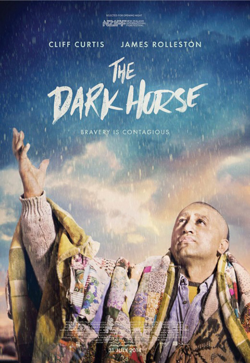
I’ll admit to knowing absolutely nothing about The Dark Horse (limited April 1) so my gauge of interest hinges on the artwork alone. What InSync + BemisBalkind have done is pretty good in its architecture, but there’s too much happening. I love the graphic chess piece and the colorful title to match Cliff Curtis’ wardrobe, but they literally take up every last square inch of the frame opposite quotes and credits. There’s no room to breathe, no white space to rest our eyes. Subtly drawn or not, it’s still a visual assault.
Carnival Studio’s original is better as far as easing us into the imagery, but it’s not as captivatingly unique. It’s just one more use of the God-like motif as this “shaman” calls to the sky with rain pouring down upon him. I do like the title font, though. It’s like something you’d use on a horror advert, but it works.
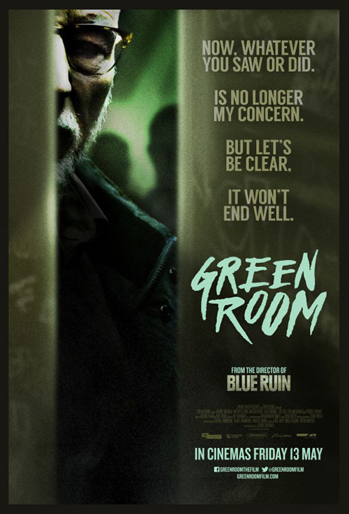
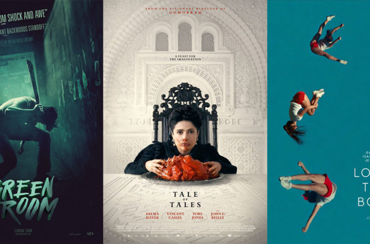
BOND’s Green Room (limited April 15; wide April 29) is so close to being great. The off-kilter angle is unsettling and gives movement to the scene as the figure at center pulls his machete down. The atmosphere is darkly menacing, the color scheme oppressive in its poisonous haze. I even like the font despite its three-dimensionality lending a more playful vibe than I think the designer wants.
The title block also provides a video game feel when put together with the whole, though. It’s like the words want to pop out and shake a la the opening titles in Scott Pilgrim. I can hear the heavy metal scream—something that actually does go with the subject matter of a band locked in their venue’s green room—and I’m lost me a bit. Those fading quotes at top don’t help being that they’re insanely distracting. Remove them and I can probably forgive the rest.
Regardless, this one has a heck of a lot more intrigue than Yolk Creative London’s version. Creepy Patrick Stewart is a nice touch, but there’s just too much text at right overpowering any tension he can provide.
As for Demolition (limited April 8), the idea of Jake Gyllenhaal plastered to walls and cracking seems effective but really is too on-the-nose. Maybe if they turned his face into the wall similar to Lena Headey’s becoming glass in ARSONAL’s The Broken, the idea would work better. As is, though, the French poster image itself seems an afterthought to the concept. The paint chips are authentically rendered but Gyllenhaal is blurry, uninteresting, and flat. Zoom out and show why he’s on that wall and I’ll appreciate it more.


The Dutch entry looks to remove verisimilitude completely by rendering the whole a cartoon. I do like that the title shatters with Jake this time, but the rest is bright and tacky. And the American version is the worst of all. I hate saying things like this, but it really does look like a five-year old put it together with scissors. The font is bland, the giant square gash too precise. It feels like a thumbnail someone was supposed to expand upon but forgot.
Shrouded in mystery


Leroy and Rose’s Sing Street (limited April 15) isn’t as much mystery as it is tactile aesthetic. It tells us that the film is about music and a band or concert, but doesn’t give details besides what those universal motifs portray—simple black Xerox on crumpled paper. This is a great piece of counter-programming to Hollywood’s glossy sheen and a sure-fire way to excite a certain demographic that may or may not attend the movies as regularly as live shows.


Everything is meticulously exacting from the text being scratched and textured to the photo being high contrast and distorted. I wouldn’t be surprised to learn that the firm printed the poster out, weathered it with use, and then scanned it back in for what we see now. It’s very much alive with an electricity of feeling—more than their other poster despite it possessing a wonderful sense of do-it-yourself effort too. While that one looks more like The Punk Singer authentic sheet on the surface, the first one mimics its aura.
Where the mystery enters this section is with Ignition’s stunning work on Colonia (limited & VOD April 15). I didn’t love the film when I saw it at TIFF, but this poster has me wanting to watch it again. It doesn’t rely solely on Emma Watson because it knows it can’t. By focusing on the true-life setting instead—Colonia Dignidad’s secretive and abusive colony—we wonder about what may be behind that giant gate.


It’s a perfect composition with the giant trees enveloping us in darkness while the undisturbed ground presumes very few people ever come to visit. The fence itself looks almost inviting as though it was once a brightly colored, Disney World-esque barrier to fun that has been aged by oppression. This entry is shudder-inducing while the others just numb our brains while screaming, “Emma Watson is here! Why do you need more?”
The original sheet for The Invitation (limited & VOD April 8) takes this dark foreboding to eleven with its dusky light source floating in a vacuum above a circle of people blurred as though shimmering opposite their sole motionless friend. I cannot stop staring into the lantern’s fuzzy glow, the ghostlike quality making my mind interpret it as gradually extinguishing and igniting in creepy succession.


It’s simultaneously different and identical to The Boland Design Company’s design of a broken wine glass surrounding Logan Marshall-Green. That soft focus is still present with hazy lights in the distance, but the juxtaposition of glass, actor, and skyline is too false to truly invest. The other has a sense of place within its shadows while this is obviously manufactured. There’s always more fear in a seamless glimpse at terror rather than one manipulated to be such. Even the character sheets (recalling that second Green Room poster from earlier) possess more suspense via their blind fear.
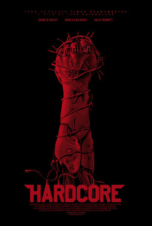
For Concept Arts’ Hardcore Henry (April 8), you could say all mystery is excised even though we’re left scratching our heads. This is the film: a first-person action flick wherein we become Henry running amok. The guns and feet are positioned as our own and as soon as our brains adjust we discover we’re upside-down flying through the air. We don’t know what awaits or why we’re in this position, but the adrenaline rush has already begun to stop us from caring. Let’s do this.
It’s perfectly measured to stick our arms out and take those guns. It excites with its missile launching helicopters and bustling city. The only thing missing is the sound of air whipping through our cloths as we approach impact. So while I enjoy the blood red festival poster and its man meets metal display, it doesn’t get my heart pounding quite like the other. Concept Arts’ literally distilled the entire film into a single frame.
Abstract intrigue


You don’t get much more representatively iconic than those shades for Elvis Presley, but I’m not quite as sure about an American flag for Richard Nixon. At least Empire Design uses a tiny metal pin as opposed to its real deal fabric counterpart. That decision kind of fits with the former President’s not quite up-and-up practices. Sure he stood for America, but ultimately we discovered it was the America he could fit on his lapel. This is Elvis & Nixon (limited April 22).


Who needs faces? After all, would you put Elvis and Tricky Dick up there or Michael Shannon and Kevin Spacey pretending? Sticking with graphic stand-ins is a calculated choice because you don’t want to alienate potential audience members by showing them an impersonation they can’t get behind. Knowing Shannon will be donning the King’s look is one thing. Seeing him do it and thinking it fails is another. Leave some things until after the ticket is bought.
As for the poster, it’s simple, clean, and worthy of a gander. Yes it’s pretty much what Gravillis Inc. did on Killing Them Softly—not to mention similar objects on white iterations from The Bling Ring, Kingsman, and Dope—but it works. P+A’s alternate does too in a flashier way. They again keep Shannon and Spacey in the shadows and let the names speak for themselves. It may be too Jersey Boys for my liking and the ampersand squishing the “V” is awkward, but whatever. It does its job.
I’ve put Akiko Stehrenberger’s sheet for One More Time (limited April 8) because her work should be highlighted as the uniquely inventive change-of-pace it is. Her hand-made approach with physical medium rather than digital pixels is refreshing and always lends the work a layer beyond industry homogeneity. She creates art for art.


Completed when the film was still called When I Live My Life Over Again, the sheet is captivating in its abstract negative space. These aren’t two-dimensional figures atop a pitch-black background; it’s a pitch-black background allowing two figures to be seen. It’s even more intriguing in its use of color not only to spotlight the hair of her female subject, but also the name of Amber Heard—the second-billed actor. She suddenly becomes the focus, the “I” in the original title.
The other two designs—the record by The Dream Factory and The Posterhouse alongside the portrait by P+A—pale in comparison. They aren’t as challenging or transparent. Instead they almost seem to be hiding something. The first doesn’t look anything close to resembling a real record and the second looks Photoshopped despite being a rather straightforward set-up. They’re too cute for their own good. They’re trying to be something they aren’t while Akiko’s is exactly what it wants to be.
Shortlisted for best posters of the year is HANDVERK’s Louder Than Bombs (limited April 8). Does this image of three cheerleaders in mid-air have anything to do with the film? I don’t know. But it’s impossible not to wonder, right? It’s like this small bit of Americana freeze-framed out of context to depict a film by a Danish filmmaker (it marks his English-language debut). I need to know what it all means.


InSync + BemisBalkind’s sheet lacks this creativity and individuality. It throws actors at us in shards of mirror. One spans two pieces and is given two eyes while the others are relegated to one and one. Why? Unlike the cheerleaders, I don’t care about the answer. The same goes with Coffee & Cigarettes’ quad sheet. I’m not certain what it happening with its boxed shutter filter, but it distracts from the faces that themselves are distracting by being placed without rhyme or reason. Add the cheerleaders slapped on top and all intrigue is gone.
And if you think HANDVERK’s work is stunning, get a load of this Italian sheet for The Tale of Tales (limited April 22) above. What a gorgeous feat from the computer generated maze cube that looks as though we can touch it to the tiny figure of Salma Hayek wandering its grooves to the distressed and hand-scribed fonts below. It’s stark white and yet full of depth—the red doubling as accent and complement.


The American poster at right is similar in its extreme detail and jarring color. Regardless of the grotesque image of Hayek feeding on raw meat, the saturation of her dinner is so potent that she pops forward and the wall back. It’s like we can walk right into the frame to run our hands along the ornate carvings gracing her throne. And her gaze directly into our eyes proves one of surprise and recognition. She sees us as easily as we see her.
Now compare these two to their photo-heavy counterparts. They can barely be thought of in the same sentence. The Vincent Cassel orgy has something to it with its barely shallow depth of field, but the font is straight out of a King Arthur videogame. And the collage version is blah with Hayek’s red muted by the other figures surrounding her despite a fog attempting to mute them more.
What is your favorite April release poster? What could have used a rework?