“Don’t Judge a Book by Its Cover” is a proverb whose simple existence proves the fact impressionable souls will do so without fail. This monthly column focuses on the film industry’s willingness to capitalize on this truth, releasing one-sheets to serve as not representations of what audiences are to expect, but as propaganda to fill seats. Oftentimes they fail miserably.
A five Friday month means a lot of films will be hitting multiplexes and the fact it’s June means even more. Despite this, however, it’s still insane to see that there are five sequels (six if you consider June 16th’s All Eyez on Me as a continuation of Straight Outta Compton like the trades wanted us to believe when it was green-lit). That’s one a week to ensure talk of creative bankruptcy in Hollywood never evaporates. Then again, it doesn’t deserve to in a world where Michael Bay has been able to direct five Transformers films alone (The Last Knight bows on June 21st).
It’s the age of franchise bankability—so much so that studios have taken to blaming Rotten Tomatoes for poor box office performance rather than the quality of their too-quick churning. Maybe they’ll understand the concept of supply and demand soon enough to adjust their strategies. Just don’t forget that it’s up to you to buy tickets for the good stuff so they may begin to understand what’s truly viable.
Princess Diana of Themyscira


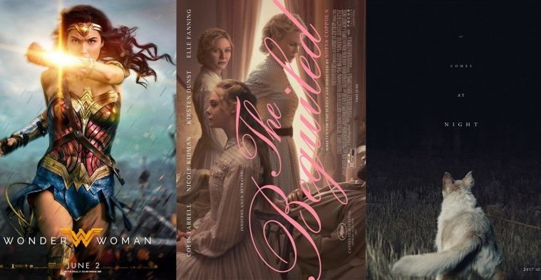
Look no further than DC’s Wonder Woman (June 2) as an example of what to spend your money on. Yes it’s a franchise player (sequel to Batman v Superman and Suicide Squad no matter how tangentially) and yes it is a remake (Lynda Carter donned the bracelets in the 1970s), but it’s also a big deal due to its behind the scenes barrier breaking. You can surely read about its budget as it pertains to a woman director (Patty Jenkins) and non-Caucasian female star (Israeli Gal Gadot) elsewhere.
I’ll focus on what this film means for its audience: namely young girls and women who have yet to see their gender lead the way as a superhero on the big screen. B O N D and Warner Bros. realize what this means and both ensured their marketing push mirrored it by putting their iconic character at the forefront.


It honestly doesn’t matter how you have Gadot pose (bracer deflection, tank lift, or lasso). You simply have to make certain she’s the only person on the poster. Throw words like “Power,” “Courage,” or “Wonder” if you’d like, but DO NOT take for granted what this property means for an audience that has for too long been ignored. This is DC’s badass moment to do what Disney/Marvel didn’t have the guts to do (the lack of Black Widow and Rey action figures upon release of their vehicles proves it). If you don’t clutter Man of Steel posters with Lois, you better not slap Steve Trevor next to Diana either.
And when you do (poor Little Giant Studios), the internet will mock you with derision. Granted, the firm didn’t do itself any favors by Photoshopping Chris Pine in the background as though he’s a Jedi ghost watching over our heroine. This poster is easy to laugh at and we all did. But at least they didn’t go the romantic route to try and “appeal to girls” because they still think females don’t like action.
For my money, though, it doesn’t get better than Concept Arts’ tease. This thing is gorgeous with its smoky haze of colored atmosphere; its shadowy drama to match that of the DCEU yet retain the bright gold, blue, and red; and its pose of regality, hair flowing and strength ready to uncoil. I don’t like the bold “Ws” since the tag is literally over the logo to make it unnecessary—and why isn’t the one in “Power” bold too—but the imagery is too good to be ruined by it.
Kids vs Adults


June has a good mix when it comes to blockbusters hitting every age group. While Wonder Woman is in that sweet spot of targeting everyone (depending on parents of course), there are a few others for those seeking a bit more or less.
We’ll start with the less: animation. There’s a new property out (June 2nd’s Captain Underpants: The First Epic Movie), but most little ones will probably be wanting Mom and Dad to take them to two tried and true franchise continuations in Blue Sky’s Despicable Me 3 (June 30) and Pixar’s Cars 3 (June 16). It’s actually funny how these two parallel each other in number of sequels and the ability to spawn offshoots with Minions and Planes respectively.


The thing about being the third entry in a series is that you don’t need much for brand recognition. Just look at LA’s tease for Gru and company. You probably could have just left the whole thing white with the “2017” in that font and color and we’d know what it was. The banana-loving Minions are just an added bonus to turn kids’ heads.
The second brings more into play with a larger Gru, a full title stack, and a glimpse at plot with the reformed villain’s … brother? The trailer I saw mentioned nothing of this development so it’s either an intriguing direction to go with the poster or evidence that what I saw was deflection. Whichever is correct, the sheet is less than exciting.
No, the adverts with the Minions getting ink are much funnier—even if the act itself probably has nothing to do with the film. Gru is contemplating going back to crime, though, so maybe these yellow guys get arrested along the way and decide to immortalize their love of fruit in prison? Who knows? The idea of a banana teardrop tat simply made me chuckle, so I applaud them.
What Ten30 Studios does on Cars 3 is different. They still go minimalistic as far as not needing the title, etc., but the mood is the total opposite. Whereas Despicable Me 3 banked on light frivolity, Lightning McQueen and company have embraced drama—perhaps too much.


When you couple the tag “From this moment everything will change” with an image of its star crashing, the result is frightening. Did they just kill off Lightning? Is this a horror film? This vein of marketing went on for weeks if I remember correctly to create an interesting type of buzz that may have risked keeping kids away.
Thankfully the firm shifted focus to the cars driving down the speedway or through water for a more adventurous lilt devoid of the macabre. All three of these first teases are pretty with their splashes and sparks, diagonal layouts creating motion, and sharp colors. They introduce a new car in #20 too before finally allowing a fourth sheet to tell us he is the antagonist. We have a “VS” poster setting up the central race as well as competing aesthetics between glossy warms and matte cools. Welcome to the carbon age … whatever that means.
Now onto the adults for lackluster convention—there’s no sleek angles, compositional artistry or white space utilization here.
Photoshop reigns supreme with Concept Arts’ Rough Night (June 16), its collage so manufactured that it looks like Kate McKinnon and Ilana Glazer are playing children half the other actors’ size. “Terrible choices” indeed.


At least the character sheets have some spunk even if they’re generic. I prefer the close-up series best as it highlights the words on each sash so we can picture the actress through that description. You lose this imaginative interest once you move out to add their faces. Suddenly it’s a portrait rather than a gag, a glamour shot rather than an attempt to spark something in us. Not that either is going to cajole those uninterested in this gender-reversal Very Bad Things to buy a ticket anyway. The cast is king and the campaign exploits that truth so as not to waste time complicating matters.
LA tries to add some vision to their The Mummy (June 9) variations, but it’s tough to accomplish when you’re saddled with an unwieldy faux metallic title font that wouldn’t feel real if it was made of metal and glued on top.


They do choose intriguing images though whether a symmetrical view of the coffin or the mummy’s facial brands/tattoos (although I find the split eye thing to be laughably over-the-top). These are both effective teases to introduce atmosphere and mood without Tom Cruise plastered atop it to distract our attention.
You obviously have to add him in eventually, though—even if only for the IMAX sheets. What’s sad is that placing these two entries next to each other shows that the studio feels Sofia Boutella is as important as a stone tomb when compared with their box office juggernaut. It’s a shame because she’s honestly the only reason I’m interesting in going to the theater for this one.
Bright colors


I probably could have called this section “hipster chic” since it is just as apt despite being more esoterically subjective. What better way is there to describe folk bands, retro illustrative technique, and kitschy quirk?
A work like InSync Plus’ Band Aid (limited June 9) is actually something I would generally find myself hating and yet it works really well. Its play on vintage vinyl covers uses the look and feel of that design style without copying it in homage. Think of this as an evolution of the aesthetic, one where the motifs are singled out and repurposed for today’s audience in ways that recall the past while also signifying the present.
I like the off-kilter tilt of names at top to counter the straight title, its own slight dip between words mimicking the diagonal. I like that the color boxes contain the photograph while also interacting with it, the blue field being visibly over the actors a brilliant technique to force my eyes to their faces for recognition. And having “Aid” be the color of the background only adds another layer for it to become cutout rather than add-on. There’s a lot happening in what otherwise appears to be a simple poster.
The opposite is true with Lost in Paris (limited June 16). Here is what looks to be a complicated poster that’s in fact rather simple. All those little figures are one person. The blue of “Paris” complements the yellow of the sheet, the former aligning with the tiny Emmanuelle Rivas (the “lost” woman) and the latter with the gentleman’s shirt in the foreground. The red should pop and yet its hue matches the rest to feel as though an equal. If anything, it’s the green of the woman on the Eiffel Tower that pops.
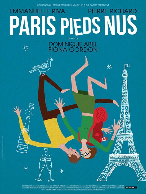
The geometry is deceiving too because the typography appears to be wild and crazy with letters going in every direction. But this is a lie once you look closer to see that each one is straight on the poster’s y-axis. It’s the vertical shifts, additional lines and circles, and translucent overlaps that trick our mind into thinking we’re seeing more chaos than actually exists.
But what truly stands out from this and the original French poster is the Jacques Tati tone. Todd McCarthy’s quote is therefore a perfect fit to the design style. Search the Criterion Collection’s catalog for Tati’s films and bask in the gorgeous illustrative past of comedy.
There’s been resurgence for the portraiture collages of old (you know, the 80s and 90s) and many have proven serviceable if uninteresting the past couple years. Brandon Schaefer looks to change that with his The Little Hours (limited June 30) by actually crafting something out of his portraits. He takes the subject matter of Catholicism and builds his own Eucharist. Look at this sheet and see the Communion wafer floating above the hands of the priest and the chalice of supporting characters. The symmetry and poses lend an air of dignity to match the ornate aesthetic and therefore augment the hilarity in the cast’s juxtaposition within.
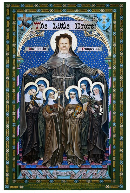
It’s a similar usurpation of style as the previous stained glass iteration. This one is good in concept but lacking in execution. The title font doesn’t quite fit comfortably (Why wouldn’t you use the church font of “Obedientia” and “Paupertas”?) and the faces (save John C. Reilly) are creepily out-of-place. The cohesion of Schaefer’s Biblical totem is absent.
That cohesion is present in Canyon Design Group’s The Bad Batch (limited June 23). It may just be a cropped image from the film above a blank field housing title and credits, but it feels grander. The humor of the winking face on the yellow shorts helps. The perfect compositional placement of the gun walling off the text in a similar slant helps—its weight felt. And despite being awkward in reading like “the bad BATCH,” the full justification title pops as the sole use of that stylish font towering over the smaller sans serif.


The character sheets utilize an identical design sense, but they don’t work quite as well. The overlap of gun, knife, and microphone beyond the separating line between photography and text feels fake here—an afterthought. With the camera pulled out, these objects barely register. What’s great, though, is the firm not pulling far enough out to show faces. There’s a wonderful sense of style in these midriffs. There’s an attitude in body language that facial expressions would only ruin.
Using the whole page


I talked about GNAH Studios’ poster for Amityville: The Awakening (June 30) a couple months ago when Table 19 also did a social media gimmick, but it’s time to focus solely on it today. Why? Because it’s pretty great.
The reason is that it’s authentic. In today’s world someone would post a photo of their new home with moving truck in the driveway to tell friends and family about taking the plunge. Some would comment with jokes. Others would desperately try getting ahold of you to share information you may not know. This is what Amityville for millennials looks like.


But it’s also great because it embraces the vehicle’s look. There’s the white space to the right of the comments that never gets used. There’s the profile photo up top and the time period designation of it being posted one week ago. (Does the film span said week maybe?) Sure the photography looks faked, but don’t most Instagram filters do that to your photos too?
Just compare this bit of ingenuity with the rest and it looks even better. I hated when Macbeth did the weird isolated bust on white and I hate it here too. It’s as bland as the third entry with scratchy textured ghoul in the corner. Whether it’s a pretty blonde or creepy demon, nothing compares to the iconic upstate New York house itself. Even if you don’t know the “legend,” those lit window eyes are horror enough.
Since some may scratch their head at me saying a poster with white space “uses the whole page”—even if that white space has contextual purpose like a social media screen—I’ll give them one with every inch covered in color. Just because P+A’s The Book of Henry (limited June 16) doesn’t have “white space,” however, doesn’t mean it is devoid of “negative space.” No, this sheet has that in spades.
It’s a rather captivating scene with giant chalkboard full of indecipherable writing and sweater-wearing children with toilet plunger. There’s no way you can guess what the film is about from this and yet that fact only makes you want to try. We ask ourselves what the most important piece is. We wonder about the scribbling and whether we can look closer and read them. These kids are planning something and it seems as crazy as it does cutely endearing with a side of mischievous severity.


There’s nice coloring as the orange-ish text separates itself from the darker background but doesn’t blind us. The positioning of credit info at top above the chalkboard lets it dissolve away into becoming part of the handwritten formulas. And the positioning of actors so backs are shown lets our minds race so our own expressions are placed upon them rather than whatever the director wanted.
P+A’s red book is a bit on the nose by comparison, although no less effective in orchestration. The texture is tactile, the addition of a taped photo makes us wonder if the girl is an addition or subtraction to the family, and the drawing is allowed to be taken at face value rather than as a piece of an elaborate whole. Couple it with James Goodridge’s illustration (it and Rory Kurtz’s artwork for June 28th’s Baby Driver are examples of the phenomenon discussed above with The Little Hours) and you have too nice counterparts that just don’t hold the same “wow” factor of the chalkboard’s scale. Goodridge’s does play up the “family-friendly” Amblin-esque look, though—something that could help sell tickets all by itself.
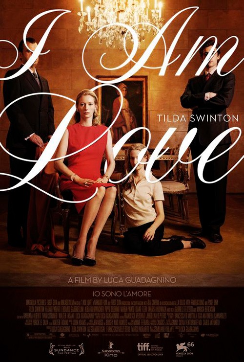
Better yet, however, is what P+A did for The Beguiled (limited June 23). Yes it’s very similar to The Refinery’s I Am Love with the script font interacting with image, but it is its own beast too in how that’s accomplished. We aren’t talking depth as much as composition this time. The text doesn’t weave in and out of the women depicted; it exists above them both as a complement to their positioning and a caption for their identity.
The image itself is wonderful with everyone blocked and cropped with meticulous care. We get a sense of Elle Fanning’s curiosity and duplicity. There’s Nicole Kidman’s angry disappointment and Kirsten Dunst’s willful interaction with us their audience. And they all loom above their prey, his face cropped off the edge to ensure he’s included as object rather than character.
The women’s faces are positioned so our eyes can bounce up from one to the other, Kidman outlined by the curtain and also the large title spanning top to bottom. Not one piece is out of place. I could do with less text and a smaller credit box, but none of that truly distracts from the central content’s success.
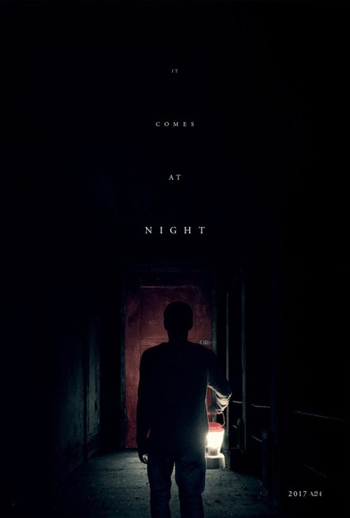
If we’re talking best use of the frame, however, I have to give it to InSync Plus and their It Comes at Night (June 9). Leave it to A24 to let mystery be everything. These are official sheets and yet we receive no cast list, no director, nothing. Title, year, and the production company are it—the latter becoming almost as revered as a director’s name would on his/her own. Because they have become an umbrella brand, the marketing people are allowed more leeway on what they can and can’t do.
Both posters are ostensibly black, that void being cut into by their visible imagery highlighted in the foreground by an unknown light. The title scrolls backwards, fading into the darkness. We almost want to read it as Night at Comes It and that’s not necessarily a mistake in spatial terms. The “night” is what we know and the “it” is what we’re unsure about discovering. The former is upon us and the latter still lies hidden in the distance. The title is moving in our direction just as we’re being led forward by it alongside the dog and man. It becomes the spotlight, a triangle of vision falling from a point at the top that dares us to walk outside its false sense of safety.
What is your favorite June release poster? What could have used a rework?