“Don’t Judge a Book by Its Cover” is a proverb whose simple existence proves the fact impressionable souls will do so without fail. This monthly column focuses on the film industry’s willingness to capitalize on this truth, releasing one-sheets to serve as not representations of what audiences are to expect, but as propaganda to fill seats. Oftentimes they fail miserably.
It’s a pretty tame May for blockbusters this year. A lot of that probably stems from studios not wanting to compete with Avengers: Endgame‘s legs following a billion-dollar global opening weekend, but still. A Disney rehash, kaiju battle, and Nintendo critters are pretty much it besides A-list starring comedies and action flicks.
This isn’t a bad thing for posters since it means the little guys can reign supreme. While one side of the theater has six frames dedicated to the 24-hour superhero screening cycle, the other facilitates a war between those left to vie for the rest of our attention. This is counter-programming’s moment to turn some heads.
Altogether now


I really like AllCity’s poster for Extremely Wicked, Shockingly Evil and Vile (Netflix, May 3) because of its 1970s vibe. The title treatment is like that of an old school paperback that appreciates its own cumbersome length. People are going to just call this thing Extremely Wicked for short anyway, so highlight that as the focal point to remember. The rest is still present, but not forced down our throats as though it’s all or nothing.
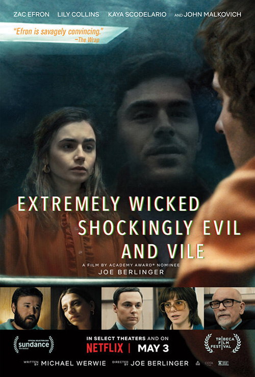
What stands out most, however, is the imagery itself. While it might not be anything too special on its own (besides the subtlety of a scowl in reflection that could very well infer upon his internal rage as compared to any warmth his girlfriend may still believe he possesses by sight), it’s great when compared to its counterpart.
OOG Creative’s American sheet utilizes a similar concept, but reverses what we see. The reflection is now a smile and perhaps a means to provide him humanity when none should exist. It completely changes the mood of the piece—something that isn’t helped by boxes of supporting cast members and a less foreboding air of mystery. The way AllCity’s UK poster uses that wall to push Bundy off the page in order to leave the monster in his stead is infinitely more interesting.
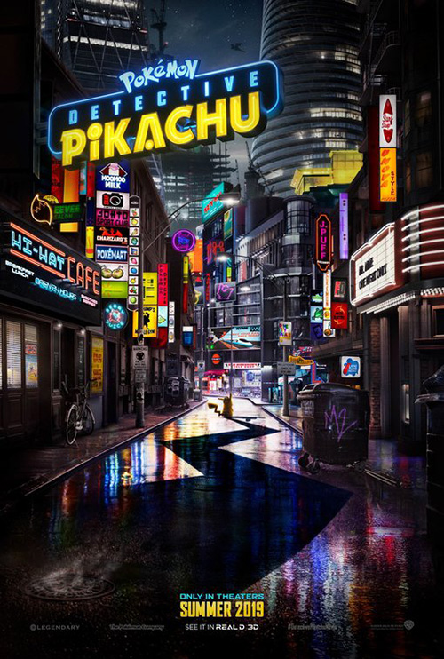
Art Machine looks to capitalize on some drama too with their Pokémon: Detective Pikachu (May 10). What is a colorful game of cute creatures running around and waiting to be caught arrives here with a stormy night’s sky and modern noir neon lighting. It’s a captivating juxtaposition that I personally can’t wait to experience (whether my complete ignorance to the franchise assists this enthusiasm or not). To look at the characters in a barroom setting through the building’s window in the foreground has me thinking it might be what Happytime Murders should have been.
There’s actually a lot to discover within the frame from an Aipom at the top of the scaffolding to the titular hero smiling back at us on his human friend’s shoulder. You can take a journey through the streets to catch more neon in the hustle and bustle below, but to me the sign above is what lingers in my mind. The effort to make it look real with three-dimensionality and actual tubing is appreciated.
Legion Creative Group’s tease isn’t quite up to snuff. Here the title sign is just floating rather than affixed. Things are darker and yet not as mysterious—filtered rather than enhanced. And without the sense of scale from above, the whole proves a lot busier. If you’re not paying close enough attention, you might miss Pikachu standing there at the center.


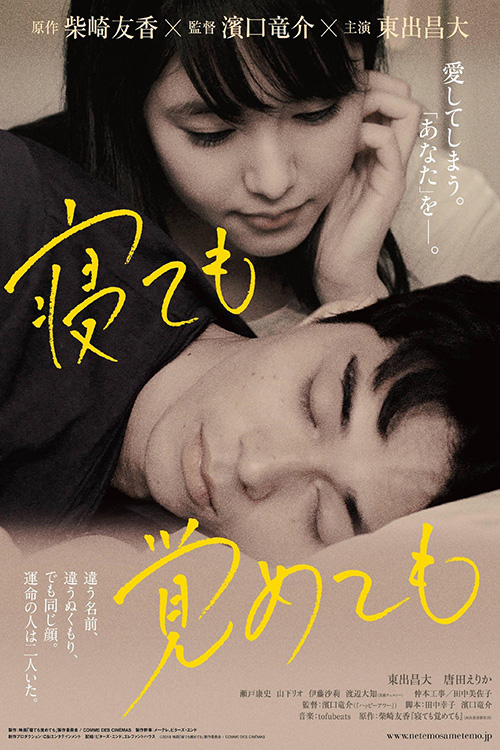
We move from cartoons trying to be real to reality trying to be cartoon via the US-release of Non-Fiction (limited May 3). It’s a fun sheet if somewhat off-putting due to the faces being so much more detailed than the bodies. There’s a weird quality to it that makes you feel as though the heads were pasted on afterwards and, if inclined, could be swapped around. It’s definitely eye-catching, but I wonder if it might have been more effective as photography to alleviate any issues in perspective a la Crew Creative Advertising’s Shortbus.
The French version by comparison is a lot more polished. Not only do the illustrations look cohesive, but the composition of them falling rather than piled atop each other lends a necessary motion and white space reprieve. Having the actors’ names placed right by their doppelgangers is awkward, but not a deal breaker. I’ll take zany and crowded over uncanny discomfort every time.
That’s probably why I like the poster for Diamantino (limited May 24) despite its surrealism risking going overboard. Caution has surely been thrown to the wind as its collage of characters finds random vehicles, odd costumes, and an almost universal sense of shock and uncertainty (minus the shirtless dude lounging on a … soccer ball).
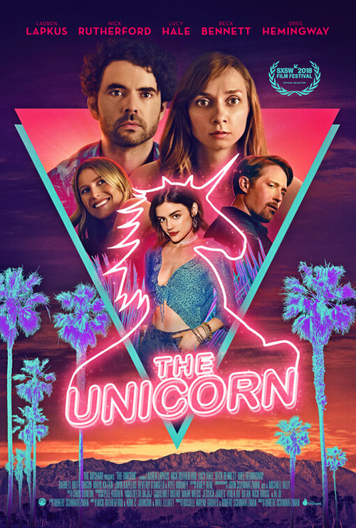
How everything is put together feels very reminiscent to The Refinery’s one-sheet for The Unicorn. Where that one is rigid and flat, this one is soft and inviting with a depth of field that has us thinking we’re floating above those red clouds to join the others in their coffin-like void. Add a bold cursive title that’s practically an unreadable series of humps and you won’t find anything else in the theater lobby that’s wild enough to match it.
Portraiture


I know it seems Rocketman (May 31) is getting flack across the internet due to it coming hot on the heels of the subpar Oscar nominee Bohemian Rhapsody, but I’m really looking forward to it. Knowing that it’s leaning more towards fantasy and embellishment rather than adhering to strict bio-pic standards is a great direction to take for someone as iconic as Elton John. So it makes sense for BLT Communications, LLC and photographer David LaChapelle to create a freeze frame of electric action that delivers more than mere stage presence.


Taron Egerton looks like he’s about to fly away with those feathers forming wings around him. He’s provoking us specifically rather than an unseen audience inside a disembodied scene. Compare it to BLT’s second sheet with him simply singing at the piano devoid of kinetic energy. One is an assault threatening to leave the page while the other remains a pose imprisoned by it. Hopefully Gravillis Inc.’s Bohemian sheet of sunset silhouette that captures a similar moment of arched back performative force is the only part of that film to out-do this one.
It’s been years since its debut, but Pasolini (limited May 10) is finally hitting theaters this month. The smart move that all its posters make is to highlight the star: Willem Dafoe.


Some do it better than the others, however, with BIG JELLYFISH®’s Italian entry proving my favorite. Yes, it’s just a film still flanked by white text on black. And yes the red title weirdly rises above the bottom border for no reason. But look at the treatment of the photo itself. Not only does the moire pattern of the print become a wonderful texture depicting time and aesthetic, the color plates have been taken off balance to lend a queasy blur that mesmerizes as much as it sickens.
The VHS look at right doesn’t compare with its old TV lined halftone pattern replacing print. It’s practically the same and yet not even close to as impactful due to the loss of visual and thematic clarity. And I don’t have much to say about the new American sheet besides to give a yawn.


If you’re trying to make a portrait interesting, you need to do more than just bump up the contrast to the point of unrecognizability. Give it some character like Perfect (limited May 17). This thing is gorgeous with its blues and purples clouding vision as the head at its center distorts beyond the physical towards the psychological. The colors will grab your attention alone, but the way they split this face in half draws you in figure out what’s going on.
I also like the outlined title superimposed above what could be Japanese as easily as some electronic language removed from Earth. It’s the one detail that’s carried over onto the next poster’s darker sight of a body in water. There’s intrigue in the glowing radial pattern around that eye, but not quite as much as the carnival mirror effect above a la Cam. The second intellectualizes its sci-fi underpinnings while the first captures its possibilities through sheer unpredictability.
Godzilla: King of the Monsters (May 31) moves away from people altogether to give us a canvas of mythic proportions. This Comic-Con tease takes identity even further by presenting it in a scene that digs underneath the surface at its subjects’ destructive function. There’s drama, atmosphere, and unbridled rage illuminated solely by a strip of light dividing good from evil. Setting is inconsequential as the fight itself takes our senses over.


If I remember correctly, that artwork was a big hit amongst fans. Don’t be shocked then to discover B O N D took its concept from paint to computer for an international and domestic version with varying success.
I like the Japanese roadshow one because it retains the haze while separating its opponents on either side of a monument meant to supply scale. The US one might be more exciting on paper with its Godzilla caught and soon to be engulfed in flames, but the ethereal mood has been replaced by a harshness of war. It’s a dark backdrop behind humans left on the ground to watch—less drama than chaos, less anticipation than inevitability.
Two’s company


The text over everything maneuver is probably one of the most prevalent and overused techniques in movie posters this century. That truth doesn’t, however, automatically mean every poster utilizing it is bad by default. I look at Too Late to Die Young (limited May 31) and see a winner.
A lot of this has to do with how the maneuver has been augmented. It’s one thing to have a photo with opaque text atop it and another to integrate image and typography together. This design doesn’t work without the decision to lighten the background and see through the title. Add the box to subdue the photo and pop the title (while giving the English translation enough additional contrast to pop even brighter) and you have a well-rounded piece with a lot of information that never loses clarity.
ARSONAL goes the opposite route on Booksmart (May 24) by providing only the information we need. Besides the photography by Mary Ellen Matthews, title, tag, and date, this sheet becomes about the attitude contained within rather than content. Those two women are calling us out with their expressions. We assume they are book smart like the name suggests, but also street tough like the tag alludes.
The font choice is therefore spot-on. It’s both delicately sophisticated with its thin curves and formidably strong with its thick weight. And like it bleeds off the edges, so do the actors. This is about breaking free of the boxes their classmates have placed them in as well as the boxes they entered on their own. The days of staying home to study are over.
Asako I & II (limited May 17) does the opposite as its characters move closer to the center—so much so that they are about to overlap and merge as one. Rather than two women in tandem struggling to escape like in Booksmart, these two are separate versions of the same person seeking to reconcile past with future. They are shadows of each other (as mirrored by the title treatment) that prove identical save one having a cat.
The mystery this creates is potent because we’re unsure if the figures are coming or going. Is it past and future combining into the present or separating as though a door has been closed to keep one from the other? That question piques our interest where the Japanese sheet of normalcy cannot. Which Asako is this one? Without a glimpse at her duality, she’s merely living in the present with no regard to what came before or comes after. She’s just a woman in love.
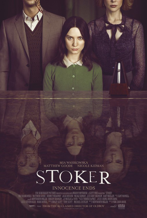
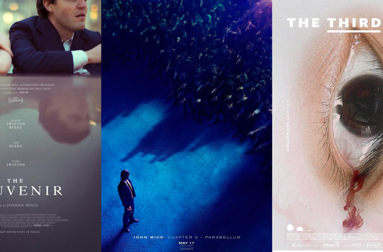
P+A wields duplicity differently as The Souvenir (limited May 17) separates positive from negative through reflection. Unlike Ted Bundy above where we can infer that which we see is contrary to that which we don’t, this poster mimics Empire Design’s Stoker in providing us exactly what is. The thing that captivates isn’t then what’s unseen as much as what’s hidden beneath. It’s about faulty façades and seeing beyond appearances towards substance.
It’s also just a good one-sheet that expertly uses the dulled monochrome of whatever it is the actors are leaning on as a field with which to place text. Hinging along the y-axis for symmetrical purposes allows us to follow the centerline up and see it as more of a dividing point than the raised horizon too. Suddenly a cross forms to keep truth and fiction apart as well as woman and man. They refuse to look at each other, shoulders in defensive postures. What was is no longer what is.
Fresh takes


Derek Gabryszak does a great job dealing with the three-pronged dynamic at the center of The Proposal (limited May 24). It’s a story about an artist’s attempts to peer behind a steel curtain set-up by the owner of the collected works of Mexico’s famed architect Luis Barragán—each aspect present with minimalistic intent. There’s Jill Magid looking through a window at what is forbidden to her, a window with Barragán’s visage and clutched by her opponent as though a compact Phantom Zone just out of reach.
The contrast between black and white of old with color of new is effective and the soft stamp lettering of the title a nice flourish, the whole an abstract representation distilling the film to its bare bones with an artistic flair that should set itself apart from the glossy posters it will surely hang beside.

You could say the same about Gravillis Inc.’s Aniara (limited May 17) and its optical illusion of pulsating lines intent to blur you eyes while daring them to continue looking. The name doubles as that of the rectangular spacecraft cutting through the radial pattern separating it from its Martian destination. Rather than steady the course smoothly, however, something has gone awry to place it off course. It must now push against unseen forces both in space and within the human condition while Mars watches.
The design firm could have depicted this narrative synopsis in multiple ways, but the fact that Magnolia Pictures let them do it with such an abrasively disorienting graphic approach deserves mention and merit. It will disturb viewers and most definitely cause a stir in ways the original festival sheet couldn’t (despite being equal to the task in terms of scale). If only more theaters would risk showing a Swedish sci-fi so more of us could see its poster’s visual trickery in-person.
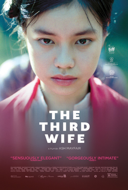
That film and The Third Wife (limited May 15) both screened at last year’s TIFF. Where the former went crazier with its US marketing strategy, however, the latter went tamer. I’m not sure why anyone would choose to forsake this giant eye with bloody tear for a straightforward view of Nguyen Phuong Tra My, but that’s exactly what’s happened.
It’s a shame because that original poster is unforgettable. I guess the way the eye becomes sexualized at this orientation with blood flowing to prove this third wife’s body is ready to work towards birthing an heir might have been too much for theaters to willingly place on their walls. But isn’t that type of controversy good for business? Screw the Bible Belt and give praise for evocative art.
What LA did for John Wick: Chapter 3 – Parabellum (May 17) may not be confused for sexually explicit content (except to thirsty theatergoers), but it is just as bold in believing in its material. This is a big budget Hollywood film with a teaser whose text is all backwards. That’s no small feat on its own and yet this one goes further still by leaving off its title. If that’s not confidence, I don’t know what is.


They’ve pretty much merged the aesthetic of Remember with the typography of their own Nerve while placing authenticity and style above clarity. And every single detail from where the condensation ends to let Keanu Reeves be seen to the gold leaf of The Continental’s logo is meticulous at delivering its message.
Since it’s a huge trilogy capper, the studio has given it room to acquire a sprawling collection of artwork spanning a foreboding action scene of hundreds opposite one, a more generic entry in orange that spotlights the idiocy of its long-winded title, and a series of grungy street art more interested in being different than substantive.
That first one remains on top by being the best of both worlds since it literally places us inside the film while also providing an image unlike anything else on your theater’s walls.
What is your favorite May release poster? What could have used a rework?