“Don’t Judge a Book by Its Cover” is a proverb whose simple existence proves the fact impressionable souls will do so without fail. This monthly column focuses on the film industry’s willingness to capitalize on this truth, releasing one-sheets to serve as not representations of what audiences are to expect, but as propaganda to fill seats. Oftentimes they fail miserably.
If you didn’t believe superhero films were the priority when it comes to Hollywood studio release schedules, May 2016 should finally change your mind. It’s the first real summer month for the blockbuster season and there are at least 30% less films coming out as compared to the April. Why? The answer is Marvel.
Yes, within the twenty-one noteworthy studio/independent releases hitting screens are Disney’s Captain America: Civil War and X-Men: Apocalypse. The former goes wide on the first Friday or the month and the latter on the last. Besides small-scale counter-programming only one film dares compete on either of those days — Alice Through the Looking Glass. No one wants to touch these box office juggernauts and we suffer their greed.
So kudos to those few brave souls willing to attempt cutting into the Big Boys’ financial earnings and screen monopolies. A few are below. Hopefully their posters garner enough attention so audiences don’t forget they exist.
Superhero medley


Speaking of those comic book icons, let’s take a gander at the campaigns that they literally don’t need to approach the billion dollars each they’ll end up earning.
First up is Captain America: Civil War and the rather intriguing if cartoony tease courtesy of Art Machine, A Trailer Park Company. Here we have Steve Rogers and Tony Stark engaged in battle with sparks, dirt, and sweat flying. It’s cool because of the action depicted and frozen kinetic energy we can’t wait to enjoy watching unfurl on the big screen. You look at this and think comic book cover — it gets the fanboys excited.


For those who would rather see something artistically different, take a look at the IMAX sheets. With so many characters — many wonder why this wasn’t Avengers 3 due to the sheer breadth of heroes involved — the design team has decided to do a triptych. I applaud the effort but this is no chaotic visual splendor like with the brilliant sextet painting for Age of Ultron.
They don’t even fit together despite the first two pitting Team Cap against Team Iron Man. The trios in each poster are facing the other but the angled ground on which they stand isn’t. Then you add another sheet with the leftover cast members facing each other within their own poster and the relationship between the three is muddied further. Was Disney just throwing Black Widow a bone by giving her equal poster billing instead of her own movie? Maybe.
The rest are lackluster. The generic IMAX is a weird circular stage collage that’s way too busy and the final theatrical sheets split in half with angry faces. I’m glad they didn’t jam pack one poster with everyone a la Neighbors 2: Sorority Rising (opens May 20), but there isn’t that same sense of scale and impact like the first one above. We know who’s in the movie. We want to see the fight not the stare-down.
BLT Communications, LLC delivers the battle thematically in its teaser for X-Men Apocalypse. The “X” symbol is burning away via a virus of fire permeating the very metal of which it’s built. It’s a captivating visual and serves its purpose without throwing so many characters of its own our way. But of course there are a ton of characters and they all need time in the spotlight.
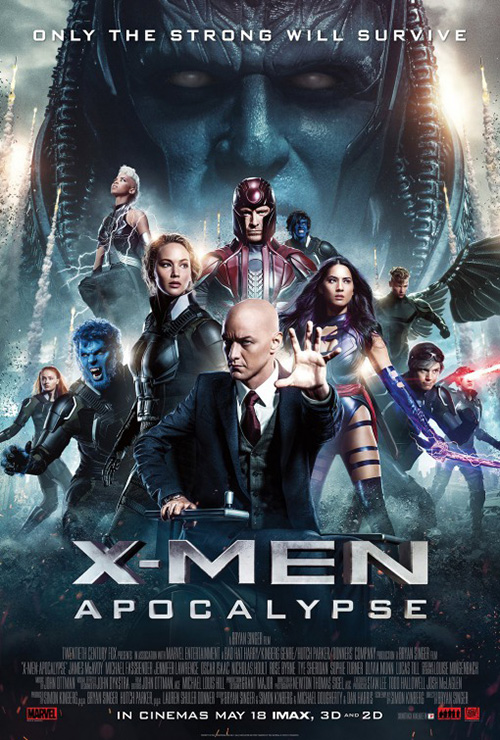
Rather than engage each other, however, BLT puts their diptych of heroes versus villains against the viewer. These posters are pretty much totem collages but they aren’t quite as uninteresting as that description assumes. While the “Defend” one is less intriguing besides forcing us to stare into the eyes of the two telepathic mutants (Professor X and Jean Grey) able to harm us from afar, “Destroy” stirs feelings of intimidation. Apocalypse is gigantic and skewed in a way to make him seem even bigger in comparison to the others and his Four Horseman are each glaring our way from above. They dwarf us and we feel their power.
In the end Gravillis Inc. and illustrator Justin Erickson trump them all (especially the bland collage by Art Machine that only appears interested in giving the actors a consistent hierarchy of paycheck status). Their sheet of hieroglyphics and Xavier’s School destruction has true artistic merit. It’s set-up like there might be a series of these for each mutant, but this is the only one I’ve found. Give Erickson a crack at doing a full poster with everyone amidst detailed environments next time. I’d love to see that.
Please stand by


I’m a big fan of Manheim’s work on Money Monster (opens May 13) because it’s both extremely simple and relevant. When I think broadcast media I automatically go to the color bars and “Please Stand By” screens. Sometimes things happen and producers need to cut away to a generic filler frame so the audiences at home aren’t privy to the chaos, swear words, or whatever else. And if you’ve seen the trailer to Jodie Foster’s latest work in the director’s chair you’ll know that’s exactly what happens.
Extra applause to the firm and Sony for allowing George Clooney’s eyes and nose to be covered too. If we’re honest we can admit we’d know who this was regardless of his name because we know Clooney. Putting the bars there doesn’t distract from him, it puts focus on everything else. That’s a key distinction.


As for the character sheets, the effect of a frame being separated plays into the whole broadcast TV aesthetic more. In the days before digital this could literally happen and if you’re old enough to remember watching film reels in school you’ll recall it always did. Beyond the visual effect, though, is the power it gives the image and the expressions being split. Clooney’s jaw is tense, but his eyes show fear. Julia Roberts is in control as the red light explains whom it is she’s talking to and Jack O’Connell is crazed. I don’t love that his pieces don’t fit together, but I understand the need to show the gun.
At the end of the day they’re all much better than the rest. The alternate bars poster pales due to its use of vertical boxes that don’t match the colors beneath; I hate the one with the red line bisecting a photo for a made-for-TV thriller; and I’m officially over the 45-degree slants.
Mirrored transformation


The first live-action Alice film under Tim Burton’s watch had one thing and one thing only going for it: the visuals. I’m not even a little bit excited for the sequel Alice Through the Looking Glass (opens May 27), but I’ll probably see it anyway just to experience the trippy computer graphics.
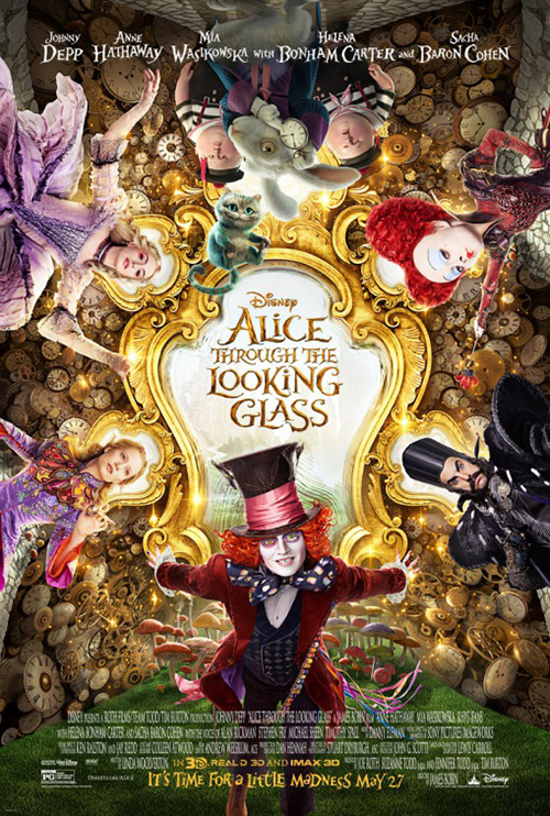
It’s no surprise then that BLT would hinge its marketing campaign on said imagery. I have to say the firm’s pair of teasers with melting clocks impresses. They aren’t afraid of some negative space at the top, escape the need for a massive credits block at the bottom, and have fun playing with the idea of a mirror. Even though everything is identical between them but the actor, it works due to that final point. Alice forward is Mad Hatter backward. Real and fiction brought together by a trail of magic.
The full sheet continues this trend with its revolving spiral of mirrors each housing a different character in similar repose, but it’s so busy that I’m getting sick looking at it. Despite the film embracing its more-is-more creed, less is definitely better on the page.
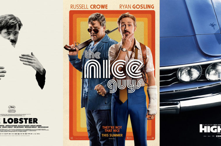
The same can be said about The Lobster (limited May 13). Talk about sparse piquing interest. Both character sheets intentionally deceive us by removing a crucial piece — the recipient of each focal point’s embrace. You only get half the picture unless you’re given both pieces. So even though we know Colin Farrell is hugging Rachel Weisz and vice versa now, we couldn’t guess who had been erased until seeing the reverse. It’s an enchanting pair of images that play with our minds as white space becomes both positive and negative through a trick of design.


The other versions never quite match it’s effect despite providing unique compositions in their own right. Propaganda’s Korean sheet is wonderful in its use of the page — showing the vastness of the world and how small Farrell and Weisz are in comparison. The Italian example intrigues in its desire to give information that’s intentionally vague. Two people peering down at a dead (sleeping?) body outside the surreal sounding “Transformation Room”? Yes, please. Sell me all the tickets right now.
The leftovers


I don’t love Concept Arts’ poster for The Nice Guys (opens May 20), but I do respect its desire to go all-in on the 70s aesthetic. It uses many of the same motifs as Boogie Nights and American Hustle yet aligns them more to its own light-hearted tone. The colors are brighter, the expressions softer, and the feel more game show set dressing than dramatic vacuum of black. Hipster culture will love it and the rest of us will squint our eyes to discern the title from its font.


The character sheets are therefore much cleaner if not as wild sans rainbow burst of rounded corner boxes. They’re still bright thanks to the wardrobe, but the title is easier to decipher being against a solid orange (though the drop shadow causes its own problems). If the studio wanted the imagery to “pop” on the wall, these will do the trick. I just don’t think anyone is going to buy tickets based on the artwork itself.
The Last Days in the Desert (opens May 13) won’t get many blind-buys either, but there’s something to be said for its simplicity. Yes it’s just a film still cropped into a portrait orientation and yes it depicts nothing but its star Ewan McGregor, but don’t tell me you aren’t a little intrigued. I didn’t know he was playing Jesus until reading up on the project, but now that I do it seems so obvious. There’s pain in his eyes and a longing to escape — he’s not looking at us because he’s searching for a way out.
I’m not so sure about the title design with its mish-mash of all-caps changing to small-caps changing to a lower-case “d” though. What’s up with that? It unfortunately looks more like a font defaulted than a conscious stylistic choice; especially since the text gets lost as it is due to size and placement. I guess you can ask the box office attendant for tickets to the new McGregor film if the name doesn’t stick.
In contrast to these two comes High-Rise (limited May 13). I wish someone would have let Michael Eaton and Felicity Hickson (the graphic designers responsible for the extensive period-look inside the film) create some posters, but Empire Design doesn’t do a bad job itself. That tease of tiny Tom Hiddleston exiting his elevator is pure architectural and geometric delight. We literally are entering a new/old/fabricated world.


The series they craft from this triangular motif is successful and allows an artistic flair with its contemporary collage — the plainer one is my favorite although the kaleidoscopic version (a relevant style if you’ve seen the film) works in its busy-ness. My only problem is that my mind went straight to the music video for The White Stripes’ “Seven Nation Army” instead of Ben Wheatley’s visual epic. That’s less a fault of Empire and more a back pat to Alex & Martin for directing such an iconic video.
I know a lot of people absolutely adore the car taillight poster with its falling man in reflection, but I’m not one of them. Cars have no bearing on a film that literally takes place indoors for 95% of its run-time. Is this some sort of play on the Fast & Furious franchise? It just feels false whereas the minimalistic paint-splattered Hiddleston is spot-on. This one puts the insanity on the page and prepares us for the chaos to come.
But the most stunning poster of the month for me is Gravillis Inc.’s Dheepan (limited May 13). I love its crop to barely place the entire family in frame, the darkening of the color to add dramatic contrast between shadow and glare, and the bright text complementing the pigment of its cast’s skin while also bursting off the page. And how great is it that the adults peer steely-eyed and fiercely into the distance but the young child looks at us with warmth and perhaps the faintest smile?


It’s a far cry from the international sheet using the same photo but with a wider window. The coloring ruins the gravitas and it just becomes a copy of What Maisie Knew. This is the difference between a big budget superhero film shooting plastic costumes and then delivering metallic power through post-production effects.
The other entry with its closely-cropped hand in embrace seeks to combine both with yellower browns and tight drama, but even it can’t quite match what Gravillis accomplished. Having such a huge Palme D’or laurel covering the image’s focal point and distracting us from everything but the thickly fonted title doesn’t help.
What is your favorite May release poster? What could have used a rework?