“Don’t Judge a Book by Its Cover” is a proverb whose simple existence proves the fact impressionable souls will do so without fail. This monthly column focuses on the film industry’s willingness to capitalize on this truth, releasing one-sheets to serve as not representations of what audiences are to expect, but as propaganda to fill seats. Oftentimes they fail miserably.
It’s a rough month for posters thanks to an influx of sequels and remakes. I just don’t have it in me to talk about how staid the character sheets are for The Lego Movie 2: The Second Part (February 8), Alita: Battle Angel (February 14), and How to Train Your Dragon: The Hidden World (February 22); how forgettable Miss Bala (February 1) is; or air-brushed and Photoshopped Fighting with My Family (February 14) and What Men Want (February 8) prove. Rounding their titles up here is enough.
Luckily there are a few gems down below to ensure things aren’t at a total loss. Let’s a give a round of applause to the small shingles providing foreign work the type of stunning artistic complements necessary to stand apart from the glossy Hollywood machine.
On the vertical axis


If you’re going to do a vertical axis collage of characters, you could do worse than The Refinery’s The Unicorn (limited February 15). Is it kind of a poor man’s Bad Times at the El Royale aesthetic that loses LA’s atmospheric mood? Sure. But I like the flatness to it with bright colors lending a graphic feel above photo-realism. This isn’t a “real” neon sign nor are the palm trees giving us a sense of place beyond drug-addled trip into psychedelia. Throw a filter on the actors so their portraiture matches the pared down periphery and you have something.


Doing a bit better on this trend is The Man Who Killed Hitler and Then The Bigfoot (limited February 8) with the artist pretty much taking the look of Empire Design’s Inglourious Basterds and giving it a more throwback illustrative sense of flair a la John Alvin and his contemporaries. I could do without the dueling Sam Elliotts, though. If you already have him in the foreground as the de facto leader of this motley crew of character actors, you don’t need a giant smiling face as a backdrop above such a somber environment.
The swastika meets bigfoot print is a nice touch albeit thrown in somewhat awkwardly. I could see it being used as an insignia of sorts either to take center stage on a teaser or interact with the laboriously long title. It’s the latter that I cringe to look at. A quick glance and you assume the articles to be The Hitler and The Bigfoot—killer of both lost in our quest to move on before fully comprehending what it is we saw.
Lords of Chaos (limited February 8) uses its vertical axis for symmetrical purposes rather than a backbone for totem heads and its poster proves a captivating one. The backdrop silhouette of Rory Culkin ruins the uniformity by being in profile, but I guess a little chaos in visual language to go with nightmarish carnage works for the theme.
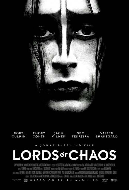
The central image of a burning cathedral is provocative and beautiful in equal measure, the stylized title utilizing its mathematical palindrome to create a visual one. You feel like you can fold the page in half and somehow the knife bladed “L” and “S” will cancel each other out perfectly, the whole a demonic Rorschach test of violence and evil.
The alternate sheet by B O N D just doesn’t live up to this electricity with its subdued typography (I do love the font, though) and black and white Culkin portraiture. It’s a bit boring by comparison and frankly makes me wonder if Rory should have been cast as the new Crow.
For a good example of (mostly) full symmetry, look no further than The Gospel of Eureka (limited February 8). It’s a really simple representation for the culture clash between Evangelical and LGBT communities without any earmarks for the sort of hate and abuse we’d expect from such a pairing. This Jesus has arms wide open with a rainbow of colors providing halos as though forming a tunnel towards His light.
I love the under-saturated trees distilled into a monochrome just barely supplying depth of field above the pitch-black background. Those rainbow arcs are crisp yet thin, emanating out of the statue as radiant positive energy. The stacked title is unwieldy in its attempt to mirror the white/rainbow coupling due to its thick font, but it’s not a deal-breaker. Put them all together and you get a uniquely minimalist work that packs a surprising wealth of context.
The silent void


There is one remake/sequel this month with a pretty decent campaign: Cold Pursuit (February 8). We shouldn’t be surprised since it stars Liam Neeson, comes out in the Jan/Feb winter months, and somehow wields the straight-to-DVD qualities of lower-brow genre fare with enough gravitas to make waves at the box office. So why not give the actor’s choices some extra marketing dollars to tip them over the edge? Why not let someone design something instead of slapping faces onto a sheet of paper with fire effects?
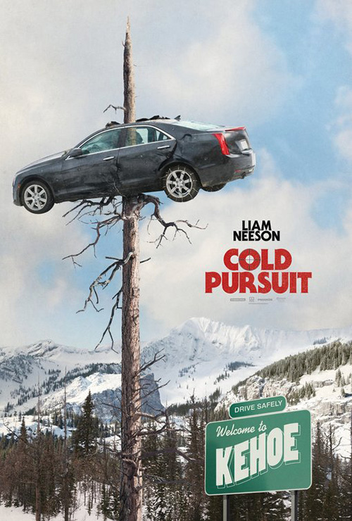
This Americanized version of a popular Norwegian film starring Stellan Skarsgård has a key element to combat the latter trait being that it is set in the snow. No need for fires here when frostbite will suffice. So LA leans into the whiteout nature of a blizzard with the sheet, filling two-thirds of the page with weather effects before showing us Neeson dragging a dead body in front of his snowplow. It’s not the greatest variation on this compositional theme and the imagery looks really fake regardless of production value, but it stands out.
I personally prefer Empire Design’s teaser simply because of its wild subject matter. A car impaled on a tree? How can that not pique your interest? That type of death paired with the pleasantries of a “Welcome to Kehoe” sign projects the kind of tone we should expect and frankly what more do you need?
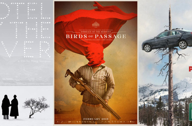
Hotel By the River (limited February 15) conversely does a much better job at the whiteout look by retaining a photo-real quality that the pasted on Neeson couldn’t. This is a scene captured rather than manufactured. The snow is real rather than a layer of translucent white superimposed above another manipulated piece.
The layout is gorgeous with two virtual silhouettes standing in the pure white field of snow, popping out to grab our attention next to a solitary tree. If for some reason you don’t see them first, the centered “V” in “River” above serves as an arrow to direct us down so their gaze can bring us back up to the town in the distance. And what a great imperfectly rendered font of circles as lights, suns, snowballs, or simple glares to both scream its name against the darkened sky and whisper its presence as it floats for a second before shimmering away.
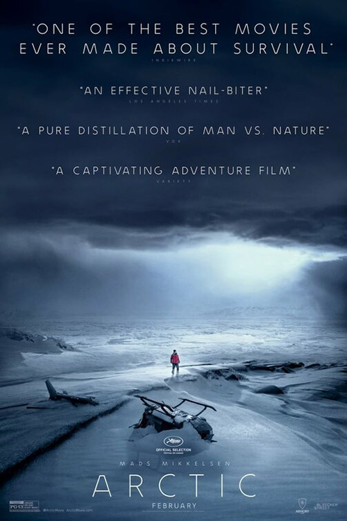
BOND is using snow in a different way with Arctic (limited February 1). Instead of having it be a way to separate us from the scene, they use it to isolate the character at its center. It’s the perfect “survivalist” trend—an expanse of emptiness with nowhere to turn. You simply cannot match this vantage point’s dread with one that’s straight on (see the firm’s second design at right with crashed helicopter and foreboding storm clouds). The latter still gives you a destination and a sense of coming and going. The former being uniform in every direction means there is no beginning or end. You could run in circles and never know.
No matter how effective that poster proves, however, it’s the one for Styx (limited February 27) that will “wow” you. The alternate version at right is more similar in its bird’s eye view of the unknown (see The Shallows and many others before it too), but the one above taps into the psychological consequences of the scenario’s despair.


Rather than just be ocean water, its fractured triangles puzzled together create some wholly new nightmare out of time and space. Are those waves upside down? Are those swaths a rocky pattern to salvation or disjointed possibilities ready to slice you to pieces? Add the red title that isn’t afraid to get lost in the texture of reflections and foam and you will find yourself as disoriented as the character we’re sure to meet lost within. You’re lucky if you don’t get a little seasick after peering into its labyrinth too long.
Strikingly different


The whole title on its side effect doesn’t always work for myriad reasons: the letters/font leave weird negative space, the word(s) is/are too long to take up enough real estate, or the stuff put on or around it detract from the boldness of the maneuver. Donnybrook (limited February 15) doesn’t have these issues. Well, it doesn’t the way this poster’s artist handles it.
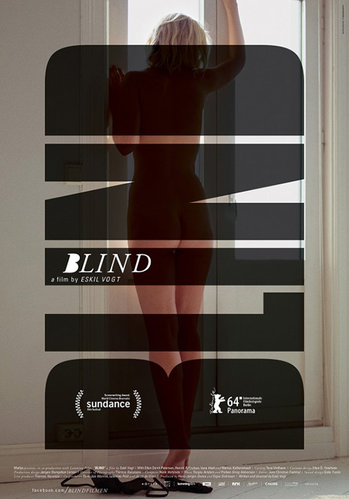
Where the effect works best is with a short word like Blind (added style points from HANDVERK for using it as an obstruction to mirror one definition of the word). Because Donnybrook is ten letters broken in half between syllables, you can stack them together for added surface area. That’s not enough to avoid the wonky angle of a “Y” and “K,” though—especially when both fall on the same end. So you flip the one half. “Donny” is read bottom to top and “Brook” top to bottom. The “Y” and “K” are now positioned kitty-corner instead of side-by-side, and our eyes continue reading the whole as a single unit by snaking around the top.
Honestly, that alone would have made this a good poster. Red text with director name in the triangle of the “K” and cast list (with subtly “top-billed” Frank Grillo raised slightlyabove the title’s horizon) alongside the “Y.” So the decision to put faces in proves another slippery slope to contend with if you’re not careful. Once again, though, the artist is up to the task with monochrome profiles exiting out from the center like the film’s world is literally born from this poster and desperate to escape.
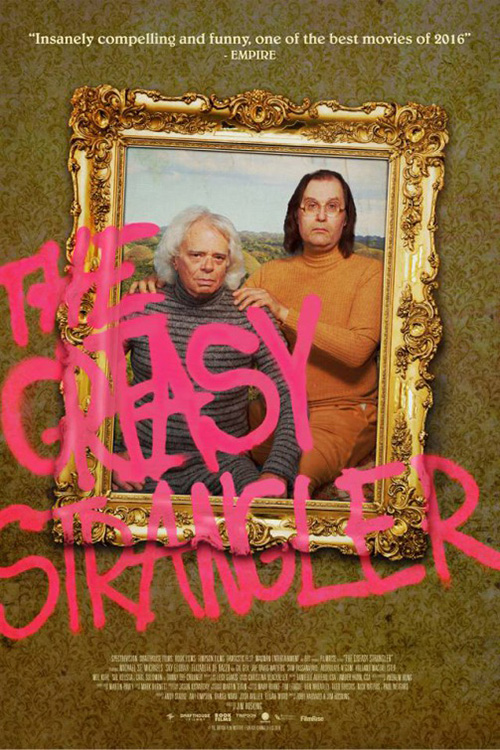
Another design trend you see once in a while (The Greasy Strangler comes to mind) is graffiti. Sometimes it’s just a pre-packaged font superimposed atop the imagery, but other times it’s actually integrated into the scene. P+A’s Velvet Buzzsaw (Netflix February 1) is strangely similar to Greasy in its use of a frame. The reason is different (this one deals with the art gallery world), but the visual possibilities remain.
Netflix posters are tough since so often they arrive as teasers and final key-art in one because the time between announcement of release and release can be truncated. I wonder then what the next step in this campaign might have been. This is a good start, but also a rather sterile one.
Why isn’t the title itself bleeding over the frame like its river of drips? The effect is messy enough to go with it and the “V” and “W” are close enough to flirt with that edge. I’d understand wanting to “frame” the text, but then the drips would be behind said frame. And I know it’s nitpicky, but the names at top are really distracting too. They’ve made the light fixture’s support system go off-center to allow Jake Gyllenhaal’s letter-count and yet the “J” still goes beyond its edge anyway. Just put the names below the light and remove the vertical bars completely. We’ll believe there’s a bar affixing the light to wall that it blocks from view. Voila.
I commend the concept, but mourn the execution.

One of my favorite design tricks movie posters use a lot is the dramatic cropping of faces. The simple ability to draw us into the emotion of the characters rather than leave us watching a scene can have a profound enough impact to burn the title into your brain. ARSONAL’s Everybody Knows (limited February 8) is one such example. We see the desperation on Penélope Cruz’s face and wonder about the hidden Javier Bardem behind her. Is he sad and contemplative? Or manipulative and domineering, blocking her from turning back? Cruz’s eye staring us down makes me think the latter.
As far as the rest of the poster goes, the firm simply lets things lie as they normally would without any threat of distracting us from that powerful gaze. Everything is centered at bottom in the usual hierarchal way, the title gradually blurring left to right the sole flourish of note.
Now compare this to Goodlab’s Italian sheet. Now you have text bold and all over the place in differing transparencies. You have a red filter atop the image in a heavy-handed display of warning. And the camera has pulled out to remove emotion, drama, and intrigue. Cruz is no longer looking at us, but towards the distance. Both their faces are now rendered sad and worried. There’s no mystery, only some ham-fisted tension. The changes are tiny, but the result night and day.
Pushing trends aside, I’m going to finish this column with what should prove one of the year’s best one-sheets simply because it rejects convention to deliver something unlike anything else by its side. Just take a gander at P+A’s Birds of Passage (limited February 13) and absorb its beauty, dread, and fine art sensibilities.


No disrespect to Dan Petris’ work, but P+A takes the delicate composition of his unforgettable photography and cursive type (see right) and repackages it to deliver a slap to our face. Look at he added grunge and texture taking us from crisp photography to aged and saturated painting; the addition of the gun and disturbing skull recesses in the cloth (the moody weight recalling Storm Thorgerson’s cover art for The Mars Volta’s Frances the Mute); and the strong yet ornate serif text blocked to become one with the layout rather than separate above it.
Where Dan showed us a scenario constructed, P+A provides the power of its message. One is a behind the scenes look and the other the final result in all its glory.
What is your favorite February release poster? What could have used a rework?