“Don’t Judge a Book by Its Cover” is a proverb whose simple existence proves the fact impressionable souls will do so without fail. This monthly column focuses on the film industry’s willingness to capitalize on this truth, releasing one-sheets to serve as not representations of what audiences are to expect, but as propaganda to fill seats. Oftentimes they fail miserably.
I often think there are simply too many films being released any given weekend. When the campaign for Avengers: Endgame (April 26) works best on a computer screen where you can line all the character sheets up and discern the aesthetic meaning of its color palette and the one for Shazam! (April 5) is less than inspiring with Zachary Levi acting a fool with props, however, there can’t be too many because there’s more to look forward to than what we’re going to see anyway. These films don’t need inspired artwork because the opening date is literally the only thing that matters.
The same can be said about remakes of Pet Sematary (April 5), Hellboy (April 12)—although the latter said screw it and went crazy nonetheless (see below)—and to a lesser extent Laika’s Missing Link (April 12). That’s why the indie scene with original works is so crucial to the longevity of posters as an art form. It’s the small stuff looking to standout that has the need to risk everything to be seen. Sometimes it works. Sometimes it doesn’t. Either way, there’s a chance you remember.
Peas in a pod


One way to get noticed: sex. So Kustom Creative puts Félix Maritaud front and center in the throes of ecstasy for Sauvage/Wild (limited April 10). Realizing that the words “Graphic” and “Raw” will be read to infer upon what this scene shows outside of its tight crop, they’re allowed to focus more on the face, sweat, and spirit instead. A blurred mustache at top right is all that’s necessary to create a story. The open mouth and closed eyes taking up the left half of the page enough to designate the star’s pleasure. You want to see more? Buy a ticket.
Sex is also what Gravillis Inc. uses to sell the new-adult romance adaptation After (April 12). It’s not surprising since the book series on which it’s based is often compared to Fifty Shades of Grey and apparently deals with the aftermath of losing one’s virginity. Rather than allude to the sexual tension like the marketing for that trilogy, however, this one brings us right into the act.
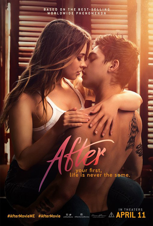
What’s great about this first poster is the way it simultaneously shows the kiss and censors its participants. This plays into the assumed youth of the protagonists—hiding their eyes so as to hide their identities—and provides a welcome dose of negative space to place the title. Either we settle on the name before coming up for air to see the embrace or we start there and slowly make our way down like a camera pan giving its actors some privacy. Both options are effective.
The final sheet loses that dance between viewer and subject. Here everything is out in the open and we’re simply forced to watch. What had mystery now almost seems comical with a tattooed kid feigning “bad boy” cred and its glamour shot lighting making us think someone will yell “Cut!” so we can see the crew just out-of-frame.
Little Woods (limited April 19) changes gears here by utilizing an atmospheric blend of overlays. Its mystery lies in the parallel scenes of fire amongst the trees above and foreboding figure silhouetted in the dark below. Where the two women factor in is anyone’s guess, those two moments frozen in their heads as memories still haunting them despite being (literally and figuratively) behind them.
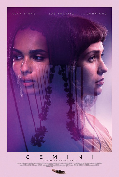
It’s a captivating sheet with a great condensed, boxy sans serif font that appears to be expanding further in front of us. What’s most interesting, though, is how this design might reveal NEON’s hand as far as aesthetic goes since it is so similar in style to AllCity’s Gemini. You can’t blame them as the ethereal quality does stray far from the glossy photo sheen of most movie theater wall art. And you can’t blame the agency for giving them something they know they probably will like.
The couple of the month, however, comes courtesy of The Posterhouse and their one-sheet for J.T. LeRoy (limited April 26). Those who know the story know that the two women on the poster are both the titular author and not. So it’s great to see them dressed similarly (hat and sunglasses) despite very obviously being Kristen Stweart and Laura Dern. And for those who don’t know the story, well everything they need is right there.
First you have the faux book spine to depict the literary craft at its back. Then you have the actors themselves in their matching wardrobe. And last the watercolor blotches that turn the whole into some sort of photographic Rorschach test. What do you see? Two women? One man? A lie? Or the truth hiding in plain sight? It’s too bad that all the text makes it so the central image can’t breathe because it’s a good one without it.
Ominous forces


Ominous forces don’t always have to be devils and demons. Sometimes the limelight of fame and fortune can portend even worse things for a protagonist. I think B O N D does a great job presenting this concept with their poster for Teen Spirit (limited April 12). They could have just slapped a photo of Elle Fanning on a stage to get at the musical nature of the film and yet they decide to bring things close and freeze her at a moment of calm and perhaps fright. She’s not belting lyrics here. She’s either at a quiet moment or staring off into the distance at something or someone she didn’t count on being there.
The purple light and neon title call to mind Nicholas Winding Refn and honestly this could have easily been inspired by his collaboration with Fanning on The Neon Demon. We can tell this character’s journey to live her dream isn’t going to be cheery because of the colors, shadows, and contrast providing drama rather than success. This is more electric dread than poppy excess.
Hail Satan? (limited April 19) kind of does the exact opposite by taking its dark material and making it relatably light. This is Black Phillip as the Statue of Liberty—freedom of religion fought for in a country that more and more pretends to be Catholic rather than the melting pot promised by its Constitution.
So we’re not laughing at the juxtaposition as much as letting it remind us that the Satantic Temple has as many rights as the Catholic Church. It must because there’s no point otherwise? Let this animal become a symbol of hope because that’s exactly what it is. The institution has spoken to a nation of unrest and positioned Satan as a voice of reason. He is now asking for your tired, poor, and huddled masses yearning.


Leave it then to Hellboy (April 12) to reclaim the horror of Hell and place it back to the realm of fantasy—despite also giving it the potential to be savior rather than destroyer. This reboot is the type of property that doesn’t need a huge marketing push beyond recognition and dates, yet LA went all-out in creating a massive campaign with unique aesthetics.
To me the more photo-real teaser is the cream of the crop because it embraces the chiaroscuro of flames in darkness to beautiful effect with a formidable subject and a gorgeous crown. There’s malice here in direct contrast to the hokey comic font of the title—a glimpse at what might be if this hero starts fighting for the wrong side.
Compare it to the full sheet and its mishmash of characters to see just how much better less is than more. The red washes everything out until it becomes a boring tint scale instead of a depiction of characters. I’m not sure you can get anything or worth out of this muddled mess.
So good on them for traveling outside the box with a surreal painting meets cartoon hybrid of demons taking Hellboy apart and the regal profile in blood of a Hellboy in reverie. These both take the character out of the Hollywood machine and allow him to put his emotions, history, and fears on display. This is a story about a devil nurtured to be better than his nature. The artwork should reflect that internal battle.
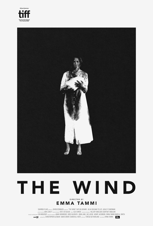
It’s P+A’s The Wind (limited April 5) that I enjoy most in this section, however. This is a thriller with an unseen and unknown entity wreaking havoc on those forced to remain in the desolate plains of unpopulated territories out west. Maybe the title describes the reality of what frightens the woman standing in that doorway or perhaps it’s merely the vehicle on which the more malicious darkness rides to claim its victims. Either way it’s not quite coming for her since it’s already there.
The sheet is a huge evolutionary leap from the original festival piece thanks to the added budget afforded by a distributor. That’s not to say it’s inherently better, though, since this black and white gem does well to express the film’s mood to audiences. It’s more obscure as far as narrative is concerned, but there’s no mistaking the unease you’re about to experience when placing a woman dressed in white and covered in blood at the center of the page.
Bisection


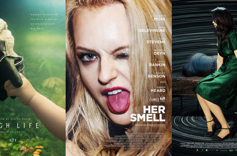
P+A is also the firm of note on A24’s poster for High Life (limited April 5). It’s a fascinating tease with an astronaut glove holding a baby’s hand: two worlds colliding in a union that splits the page to separate title from cast list. Our eyes therefore get drawn directly to the center, the black glove the most saturated part of the whole. From there we go down to the bottom left via the fingertips and eventually up to the top right, pushing out to finally see the scene presented and the oddity of it all. Add the tagline “Oblivion awaits” and you have to wonder if this meeting between time and age occurred too late.
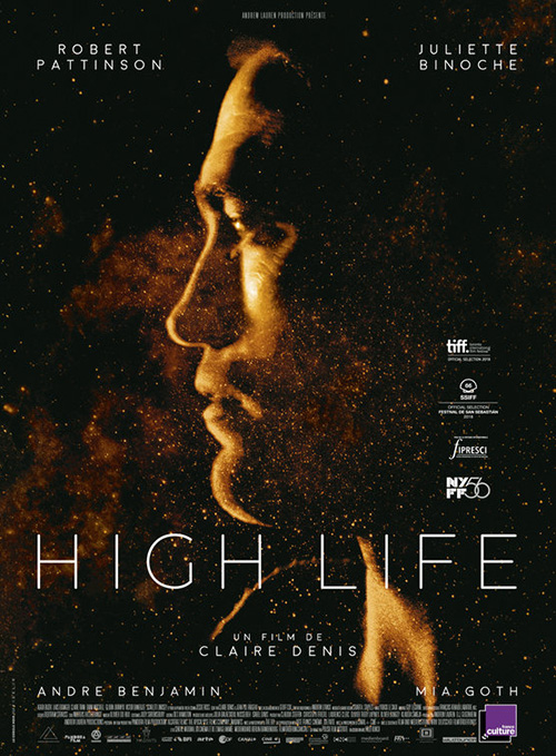
Something about the glossiness of the imagery and the generic, faceless characters leaves things a bit impersonal, though. While Le Cercle Noir’s sheet doesn’t have that issue with Robert Pattinson’s face creating a sort of quarter moon aura against the stars, it also doesn’t possess the same allure. It’s captivating enough, but nowhere near as mysterious. The sheer fact that the American studio went with an expression of kinship instead of portraiture makes you wonder what’s in-store.
There’s a similar disconnect in the opposite direct where Suburban Birds (limited April 5) is concerned. This time it’s the festival sheet that delivers a sense of play and exuberance that cannot be matched in its American counterpart. I love the way the flagpole bisects the frame with a janky curve because it lends itself perfectly to the actors being in motion around it to let their bags fly into the distance. Even the clouds in the sky create a curved trajectory as though we’re spinning around it too, the dizziness of the act bringing a smile to our faces.
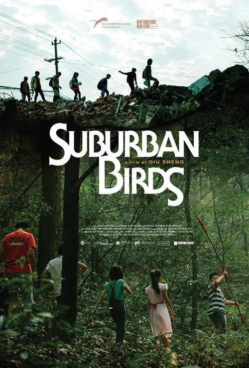
F Ron Miller’s version provides a much different tone with its bold font and darker palette. What was a fleeting glimpse of youth is now steeped in the drama of the unknown as these kids walk away rather than around. There’s almost a horror vibe here, the title’s sharp edges foretelling danger where the thin serif had given hope. Maybe this one gets the film better (I haven’t seen it yet to say), but the other draws us in more.
Empire Design’s The Man Who Killed Don Quixote (limited April 10) is a glorious bit of minimalist advertising. They’ve really given it character beyond the hand-scrawled graphic quality alone, titling things a bit to drive the spear through the dead body’s heart right down the middle of the frame. The white title pops off the page, pushing downwards with its lines all drawn to the figure’s heart. It’s as though the spear was thrown and the white provides the motion with Q and X forming a “v” to guide it towards that mark.

The firm’s final sheet is good too with its Terry Gilliam surrealism and the cutout-animated aesthetic he used back in his Monty Python days. This title is playful in its loops and lines connecting to fill the white space in the middle. The giant hand as stage is also a fantastical element of metaphor if not an example of the set itself. But I miss the spare quality of its predecessor when trying to parse the many faces with incongruous expressions thrown together without purpose.
It’s Empire that’s responsible for The White Crow (limited April 26) too, its line a mirror of the one on the Quixote tease. This one also presents itself less as a division point and more as a focal point to travel through the scene. The arm is a result of the performance and the sightline snapping our gaze up the arch of his body and through the title—which itself provides depth in its gradually decreasing point size and thus brightness. That arm is playing off the otherwise central axis, dancing around its regimented stability to share the tag’s freedom from conformity.

The other poster loses that inherent elegance by overpowering the canvas with a determined face covered in shadows. Where the first created drama, this one forces it down our throats without a shred of subtlety. The dance pose is flooded with light to cancel out the anatomical detail, its position beneath that gigantic floating head almost an expression of having conjured it from thin air like magic. The first let its subject speak through form while the second proves too scared to let its inherent beauty shine.
Human instinct


With a title like Her Smell (limited April 12), Leroy and Rose’s poster seems pretty apt. This is about a punk rocker self-destructing, so there’s no need for a glamour shot when attitude serves a better purpose. Have Elisabeth Moss stick her tongue out at the camera while winking. Let her character’s persona shine through without going full-bore into her descent like the film stills showing tear-streaked mascara. The goal is to be provocative and inviting and this one does both.
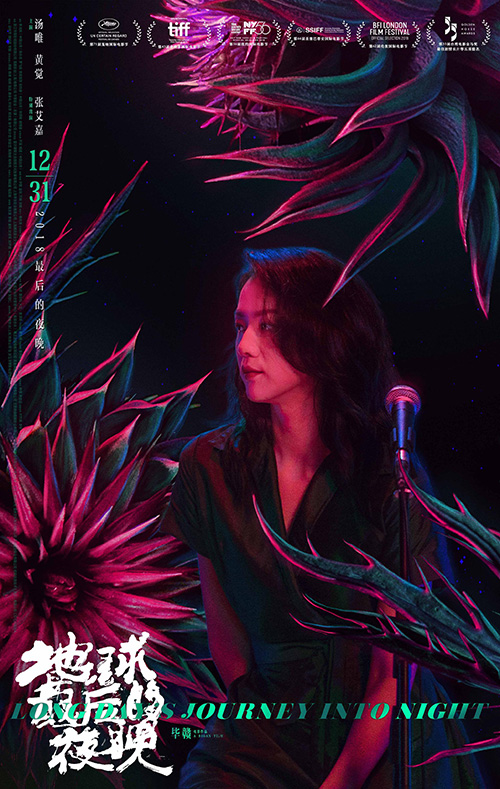
The designers don’t let hair frame the actor’s face for Long Day’s Journey Into Night (limited April 12), though. This one is more about the mystery surrounding the character than the character herself. So the hair becomes a veil masking her identity and revealing nothing more than an open mouth in what could be shock at what has occurred. Maybe she shot the man in the background with the gun by her side or maybe she found them both that way. Regardless, the scene is set.
Where things go even further is with the light blur of motion surrounding them. It’s as though we’re inside her head as it spins with confusion so fast that time becomes irrelevant. The title then seems a metaphor for the darkness of the situation in which she finds herself, the journey through it proving long and perhaps impossibly demanding. Will she fall to the floor dizzy upon standing up? Or will she be able to walk away and do what must be done?
It’s interesting that the original Chinese sheet removes this presumably defining moment to focus on the woman alone. Now we see her face, the look of fear replaced by certainty. Instead of creating a murder scene, this poster presents her as a singer onstage joined by what look like pastel flowers bursting open around her. The whole is still dark, but it’s not nearly as anxiety-inducing. Here we see promise instead of helplessness. Here is the dream instead of the nightmare. I guess tragedy is an easier sell for Americans.


From blacks to blues we move towards Fast Color (limited April 19) and eclipse’s bright yet apprehensive poster. The watercolor paint aesthetic has been used many times in the past (see For Colored Girls and All I See Is You), but usually it’s wielded atop the subject rather than outside. It’s generally about tears or makeup—unavoidable drama ready to be unleashed by the film containing it. This time, however, the color is escaping.
The reason Gugu Mbatha-Raw is still sad stems from the fact that she’s unsure of whether it should be released. We see tears as catharsis while this paint represents power. Maybe it’s a weapon being unleashed or a force field meant to protect. Either way it’s a part of her—she the black and white vessel and it the fantastical abilities her world might not be ready to accept.
And that leads us towards mass humanity courtesy of AllCity’s Peterloo (limited April 5). From provocation to fear of circumstances to fear of oneself, we finally hit the pure chaos or war via an English massacre. The faces are just as prevalent and expressive, but context is taken out of their individual hands and placed into the historical significance of their mutual convergence. It’s a kinetic mess of limbs as bodies fight against each other in the foreground while others speak with purpose above.
And rather than lean into the period aesthetic so prevalently on display via costume, the firm goes for a modern contrast with a sans serif in bright green stamped above the carnage. The director’s name gets a pristine serif above those people still maintaining the calm while all hell breaks loose against the boldly in-your-face title serving as a literal border between peace and battle. The levee is about to bust.
What is your favorite April release poster? What could have used a rework?