“Don’t Judge a Book by Its Cover” is a proverb whose simple existence proves the fact impressionable souls will do so without fail. This monthly column (with a special year-end retrospective today) focuses on the film industry’s willingness to capitalize on this truth, releasing one-sheets to serve as not representations of what audiences are to expect, but as propaganda to fill seats. Oftentimes they fail miserably.
It hasn’t been a great year for domestic movie poster design. Yes there are always a handful to admire each month, but that’s not saying much when you’re comparing them to absolute dreck.
Whereas most years I’m collecting 15-20 images and find myself exasperated trying to cull them down into a Top Ten, 2015 had me struggling to fill the #10 slot. Only maybe three or four were “musts” and the rest ended up waging a war of attrition to mold an order with which I’m happy to share.
There’s something to like in each of the honorable mentions even if they aren’t perfect. The reality is that #25 could easily be #11 had I set them into stone an hour before or after I did. As for the Top Ten: to my mind they’re the ones we should take care to remember.


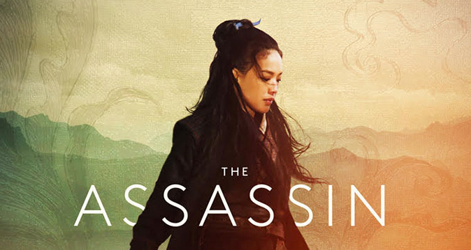
#25 – The Visit (LA); #24 – Freeheld (LA); #23 – The Assassin (Palaceworks); #22 – The Seventh Fire (Midnight Marauder); #21 – The Age of Adaline (Ignition); #20 – Focus (BOND); #19 – Felt (Unknown); #18 – Brooklyn (Ignition); #17 – Horse Money (Simplissimus); #16 – Love (Unknown); #15 – Hyena (InSync Plus); #14 – Far From the Madding Crowd (Mark W. Carroll); #13 – By the Sea (Iconisus L&Y); #12 – The Hateful Eight (BLT Communications, LLC); #11 – Welcome to Me (LPH & Leroy and Rose).
Top Ten:
#10 – Magic Mike XXL (Concept Arts)

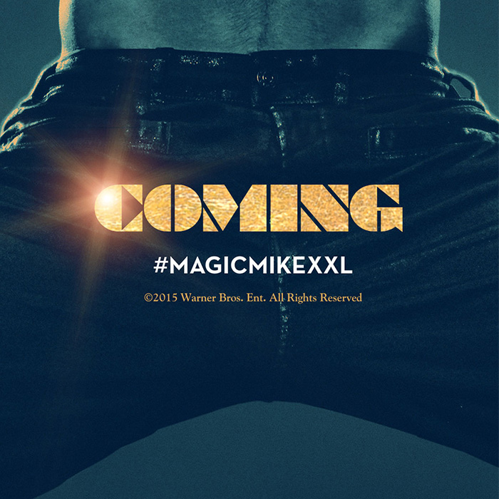

Whatever your feelings about Channing Tatum aggressively pointing at his genitals with the tagline “Coming” plastered to cineplex walls, you cannot deny how perfect the image is at encapsulating the wild ride that is Magic Mike XXL. It’s inspired, relevant, and about as cheesy as the film itself. But beyond the conceptual lies a pretty great design too. From the grainy haze of the image to the color stripped to a duotone that stands apart from its flesh-toned peers to the austere, textured font: it’s eye-catching before sex even crosses your mind.
#09 – The Forbidden Room (Galen Johnson)


Anyone aware of Guy Maddin’s oeuvre we’ll instantly think of his name upon viewing Galen Johnson‘s scratchy, double-exposed faux film strip one-sheet for The Forbidden Room. It’s as though the piece is still soaking in its chemical bath as light pierces from beneath to project the words onto our retinas. The imperfect x-height and leading of each individual letter gives a feel of handmade just as the sprockets conjure an appreciation of film’s tactility despite the digital debate raging on within the industry. There’s unparalleled beauty in its roughly-aged aesthetic—a potentially extinct art form clawing forward to stay alive.
#08 – Tangerine (P+A)


Part of me loves Tangerine‘s poster because P+A didn’t lazily inject a Christmas motif, knowing that would have felt extremely disingenuous. This is the “iPhone” movie: it needs grit and grain alongside its starlets towering above the skyline to offset its carved-in, scripted font. Using the “magic hour” lighting to silhouette both women proves an attractively unique photographic choice for coloring as well as a calculated artistic decision to ensure viewers leave preconceptions at home. This is an hilarious and poignant adventure of two women. Ignorance shouldn’t be allowed to label it something else before it can prove that truth.
#07 – Sicario (LA)


Everyone is talking about the totem collage of characters Sicario‘s final sheet delivers rather than the superior, singular, and mysterious Cannes tease at left. A visual metaphor for the rabbit hole Emily Blunt travels through during the course of the film (and in turn an embodiment of the tagline), the aura of light surrounding her shows that her morality may be our last chance of escape from the dark and dangerous world of the foreground in which we live. The glow illuminates the corrugated metal into an impossible maze our eyes revolve around with only the intense title font breaking the cycle. Welcome to Hell.
#06 – Carol (Empire Design)


It’s one of the best films of the year so it’s only right that it would also have one of the best posters. A quick glance doesn’t necessarily say as much considering it’s merely two film stills atop one another, but unlike the rest of the film’s campaign this juxtaposition means infinitely more than simply showcasing its leads. What we’re seeing is love traveling through the extraneous blur of existence’s superfluity directly into the eyes of another. This is that moment when time stops and who we are is forever changed. This is Carol the advertisement and better than that it’s Carol the movie.
#05 – The Revenant (Kellerhouse, Inc.)


There’s something perfectly eerie about this minimalist poster for The Revenant that its character sheets can’t convey. We don’t need actors scowling to understand the harshness of nature. Nature’s infinite vastness is enough to do that. Here it is: ominous clouds reaching to the stars as the same grey-blue covers the earth’s desolate wasteland that two men on a horse slowly traverse, their destination simply forward. This is the purgatory our main character endures, an existence devoid of hope and joy. All that’s left is loneliness as the crackle of Hell’s fire licks the edge of his view. All that’s left is death.
#04 – Wild Canaries (Corey Holms)


Wild Canaries is pitched as a farcical detective story and that’s exactly what Corey Holms depicts via his playful SXSW advertisement. It’s simple and yet completely out of left field showing two characters spying behind a tree with a surrealist bent. The hands are off-putting and yet key to reading the image as “detecting”; the stark grayscale risks muddily disappearing into the background and yet its crucial for our eyes to skip the actors and instead rest upon two bright yellow birds cozying up to one another above. Add an ornate font as one more disparate element that shouldn’t work in concert and yet I wouldn’t change a thing.
#03 – It Follows (Palaceworks)


It’s all in the lighting—a horror film staple of atmospheric nightfall hiding monsters in the darkness as two lustful teens emit the pheromones inevitably bringing about their gruesome demise. If you’ve seen It Follows you know its terror is more cerebral than merely something that goes bump in the night, but that doesn’t mean such tropes can’t sell it as well as the next. Design-wise I love the symmetry of text and image, the blue on black electricity, the neon glow of razor-thin outlined lettering, and its long-shot vantage placing the actors in the distance. Something is waiting and it’s peering at them the same way we are.
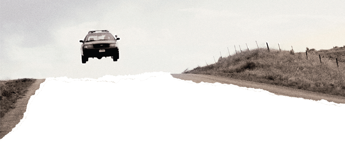
#02 – Cop Car (Akiko Stehrenberger)


I’m not a fan of how big Kevin Bacon’s name is compared to the title or that both are italicized, but neither issue prevents Cop Car‘s sheet from being one of the most striking images all year. The white space is bold, but transforming it into a positive void is more so. The bottom half isn’t just empty white, it’s a surface beneath the torn photo of a car airing it out over a country road missing in action. I can imagine seeing this on a theatre wall, text printed on transparent vellum so the white becomes whatever ratty board or painted wall lies underneath. It’s no longer just a poster; it’s a physical object embracing its own medium.
#01 – Shelter (CHIPS)


Above all others it was Shelter‘s image I couldn’t shake despite arriving over a year ago. The stark red meets black, pulpy serif-filled page, and punched-up contrast stopping just before rendering Jennifer Connelly and Anthony Mackie into silhouette is enthralling. There’s love, pain, romance, and aggression all mixed together in an image that vibrates off the page—I see these two moving closer together in their embrace despite knowing that’s impossible. It’s a trashy novel aesthetic and yet there’s an authenticity piercing through any such notion of convention. I don’t know how anyone can see it and not stare with intense curiosity.
What is your favorite poster of the year?