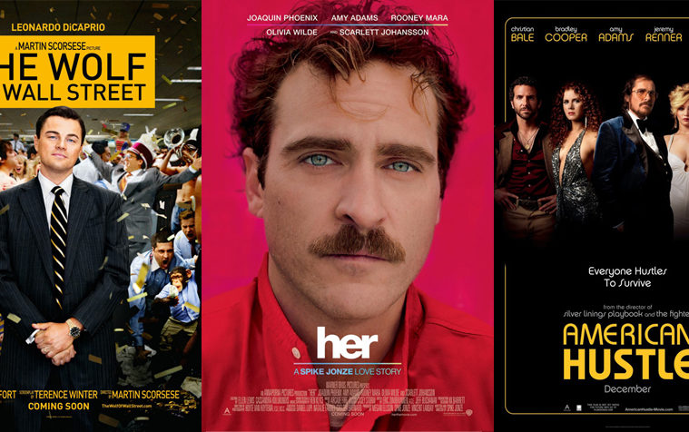

“Don’t Judge a Book by Its Cover” is a proverb whose simple existence proves the fact impressionable souls will do so without fail. This monthly column focuses on the film industry’s willingness to capitalize on this truth, releasing one-sheets to serve as not representations of what audiences are to expect, but as propaganda to fill seats. Oftentimes they fail miserably.
Is the industry overcompensating a bit with almost every film in December having character sheets? And I’m not even talking about Fox’s Walking with Dinosaurs (December 20)—the one that no one is surprised would.
It’s interesting that indie flicks have decided to go this way too; maybe it’s a bit of an Oscar push for the contenders? One can only assume the bigger studio entries are simply trying to saturate the market during a season many filmgoers are catching up on critical darlings — star power truly does sell.
It’s hard in this life for a pimp
 |
 |
 |
 |
 |
 |
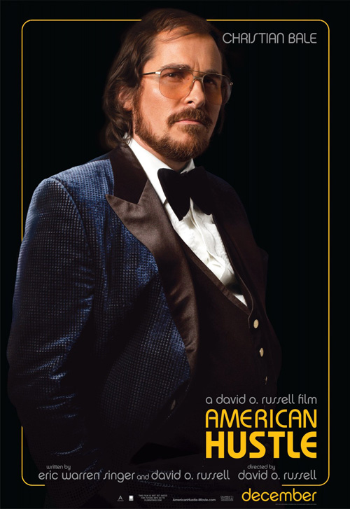
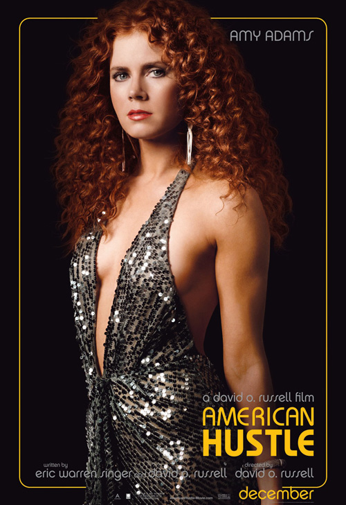
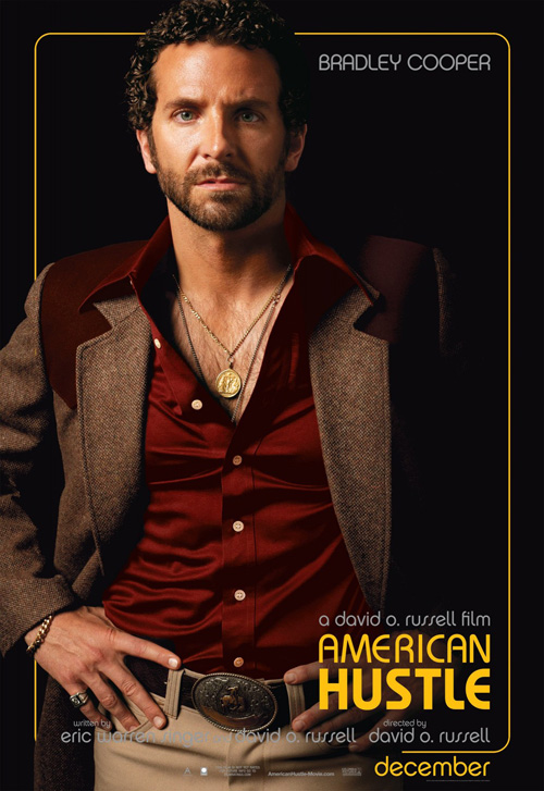
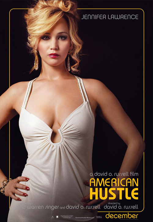
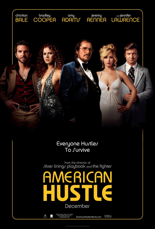
I like what BLT Communications, LLC did with their American Hustle (December 18) sheets even if it’s not necessarily their work that’s on display. These actor shots are all about the make-up artist and costume designer and I’m not even sure the firm would deny this fact. They’ve slapped a Boogie Nights vibe on it, let the fantastic photography shine, and then Photoshopped everything together for a one-sheet that honestly proves pieces can be better than the whole.
The attitude is captivating, the font a nice flavor of 70s fun, and the sexuality palpable with both Amy Adams and Jennifer Lawrence. Just like the trailer turned heads with these retrofitted movie stars in curls, paunchy guts, and receding hairlines, BLT makes sure to whet our appetites with aesthetic so the real meat of the film/plot remains a mystery to discover on opening night.
A love for scotch
 |
 |
 |
 |
 |
 |
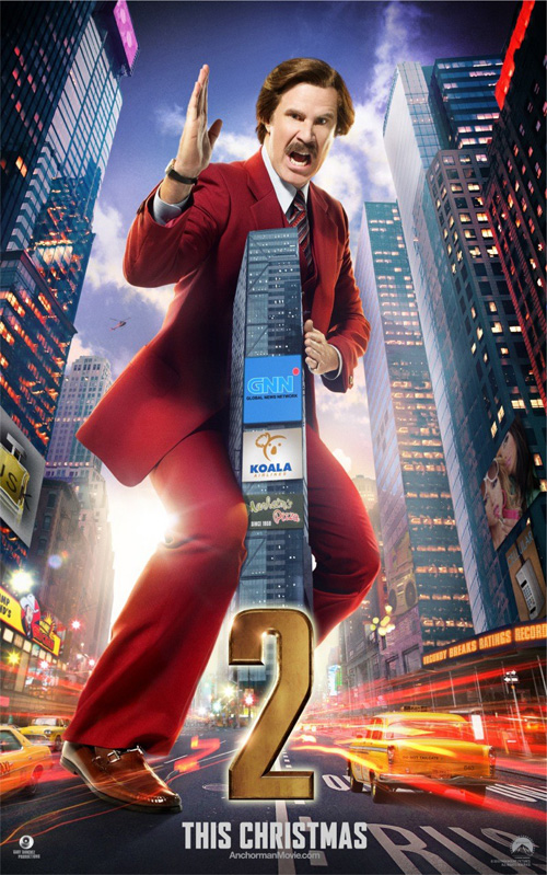
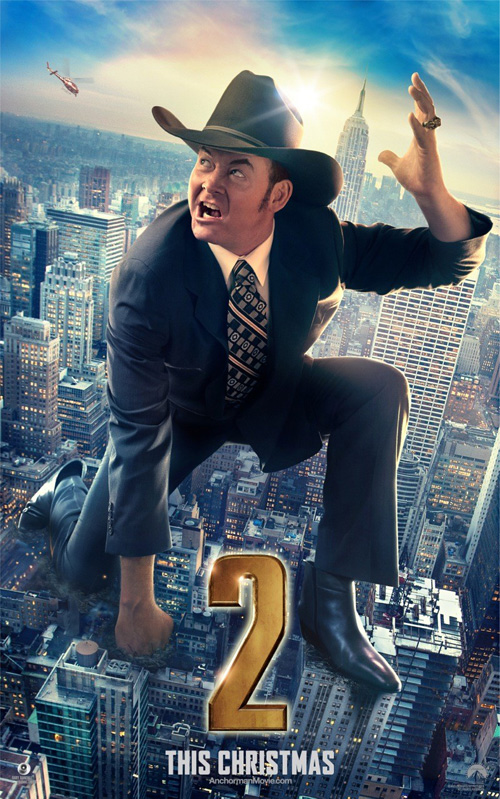
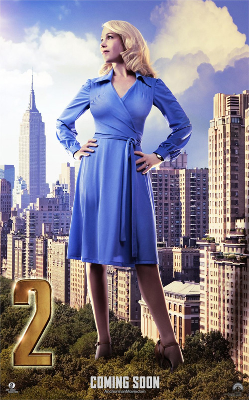
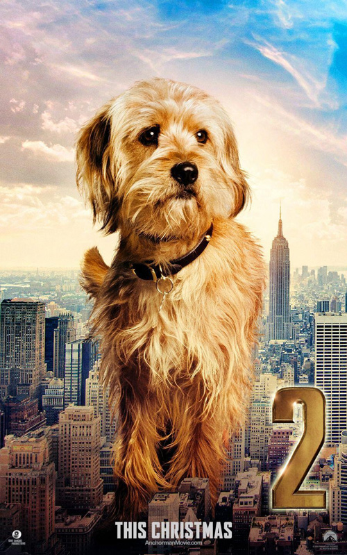
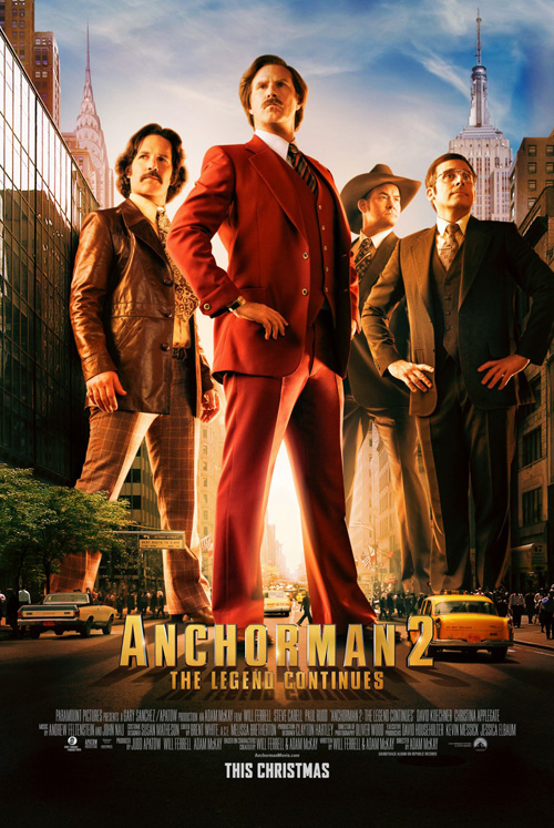
Anyone who knows me knows I have no love for Anchorman besides its back-alley brawl, so my saying I don’t really get the campaign for Anchorman: The Legend Continues (December 18) should come as no surprise. They are giant Godzilla-like creatures taking over New York City? Does this film take place in present-day and they’re like out of the past or something? Riiiight …
It’s a funny juxtaposition—I’ll concede this point. I like Will Ferrell‘s karate chop straddling of a skyscraper and David Koechner‘s crazy face reaching for a helicopter. I even like that the dog gets some play. But none of them match the viral takeover of advertising and media Ferrell and Adam McKay have been rolling out on TV. Putting Ron Burgundy on Sportscenter is inspired.
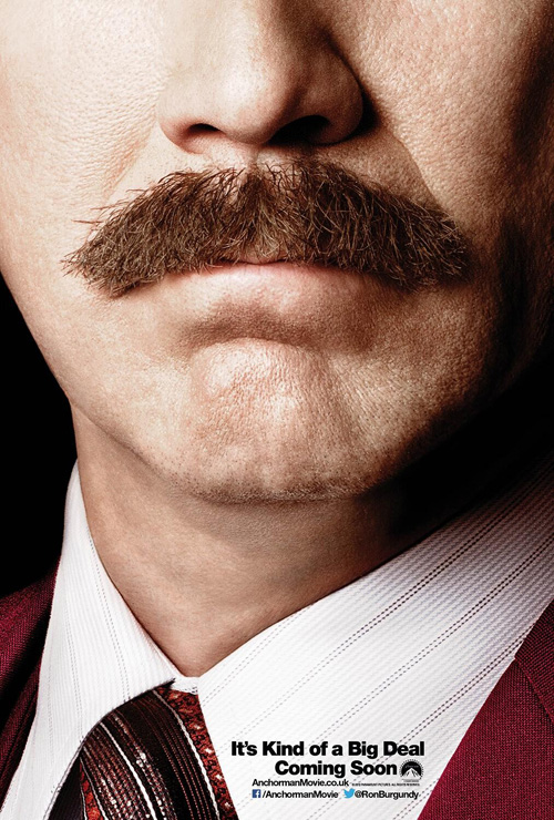
The one poster I do actually like comes from Burgundy’s miraculous moustache. It’s a bigger deal than the man himself and as a tease it works perfectly for fans and detractors alike. The rest of the sheets only appeal to those who already set aside cash a decade ago—those die-hards who prayed this day would come.
Without a master
 |
 |
 |
 |
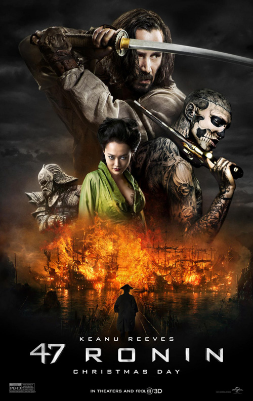 |
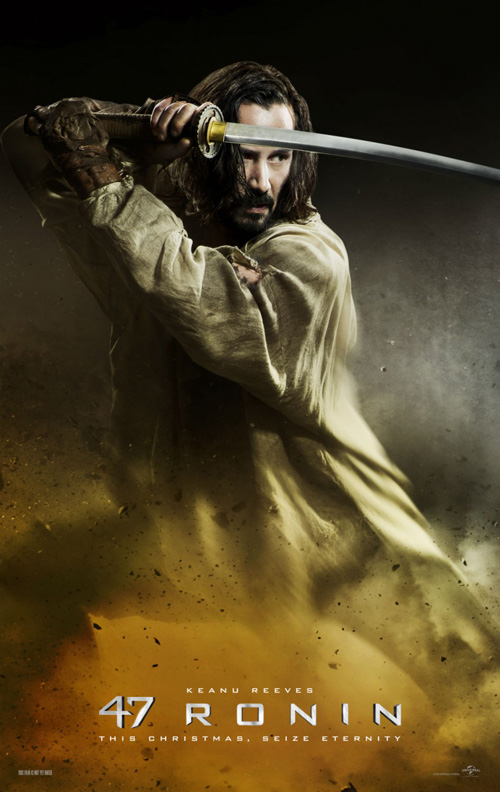
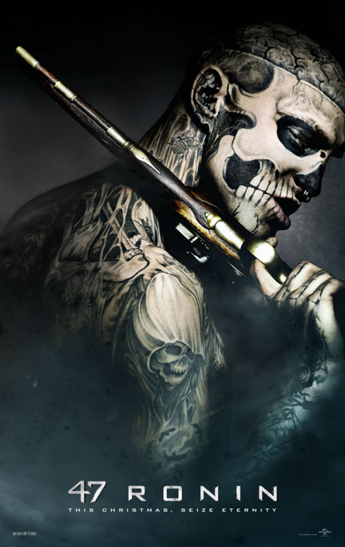
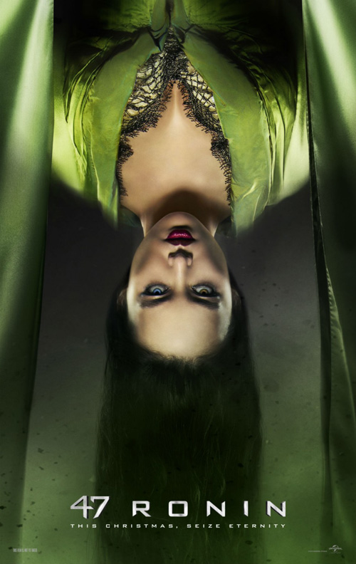
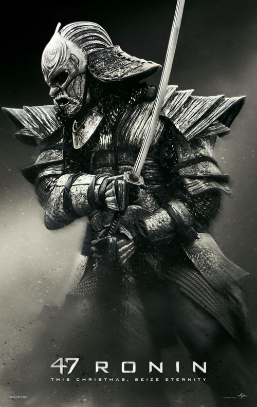
They may not be more than character shots like American Hustle, but BOND found a way to make 47 Ronin (December 25) look really good. Add some colored atmosphere to the bottom, shroud everything in a high contrast chiaroscuro, and let the mystical samurai artistry shine in its pitch-black dread. The main one-sheet may simply take these the rest and mush them together, but I almost don’t mind because the characterizations are that good.
There’s a painterly quality raising the quality level beyond mere photography, truly letting the make-up/costume work be seen as it was intended. I wish BOND would have done something different with the title font since its crazy tight kerning on the numbers beside wide chasms between the letters prove distracting. Thankfully, it’s still rendered small enough so our attention can be drawn in by the image so those scary faces can serve as the only “title” we need to remember.
Ding, ding
 |
 |
 |
 |
 |
 |
 |
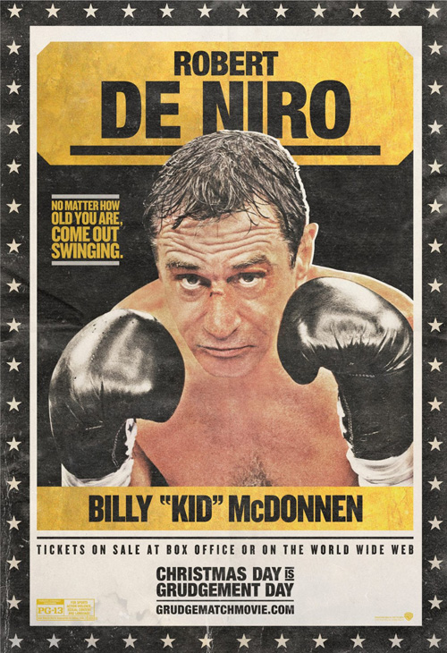
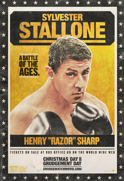
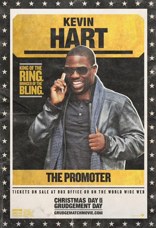
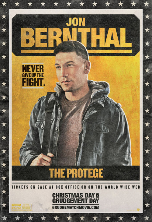
I want to give cold open credit for doing a good job at creating an old school boxing poster feel for their Grudge Match (December 25) campaign, but there’s just something off about them. The desaturation of the photos looks okay on Robert De Niro and Sylvester Stallone, but the addition of clothes on Kevin Hart and Jon Bernthal ruins the authenticity completely. It’s cute, but perhaps too cute—especially having so many different iterations.
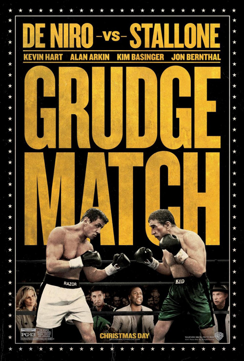
Throw those out, however, and you may enjoy the first of three main sheets with its dirty yellow text taking over three quarters of the space and an engaged bout below. I really like how the sans serif font fills the black gap, love the stars’ brightness when not competing with the washed out playing card photos, and feel the color filter on the sparring partners is a perfect complement to the vintage/marbleized texture of the rest. Only the Photoshopped supporting players behind the ropes ruin it from being flawless.
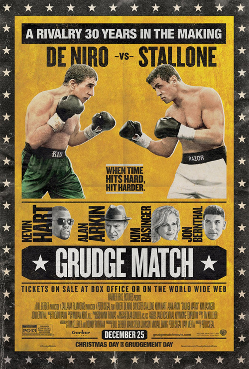
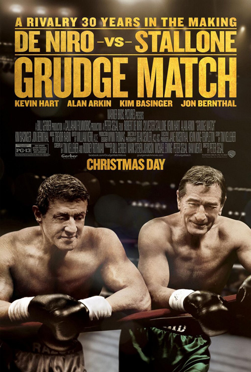
The second try is worse with its attempt to take the character sheets and combine them together, but the third is godawful—and sadly the one I believe is being used in theaters. The want to be photo-real is misguided and the touch-up work on De Niro and Stallone’s necks is horrendously bad. I can’t even bring myself to look at their poor excuse for bodies again, so I’m going to simply stop talking about it.
A world of imagination
 |
 |
 |
 |
 |
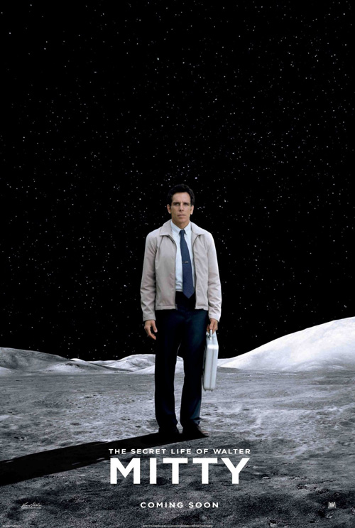 |
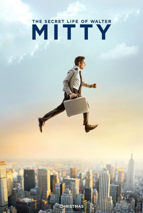
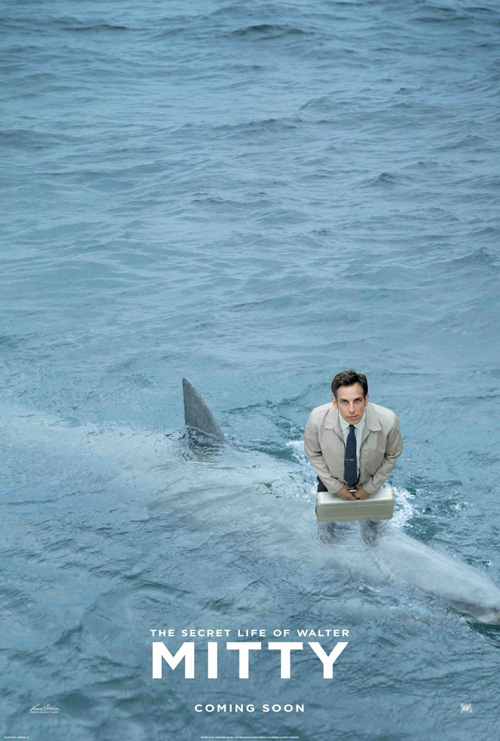
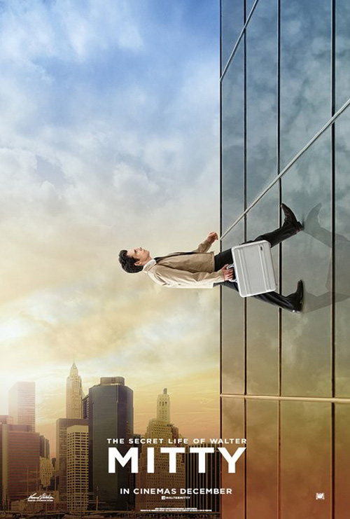
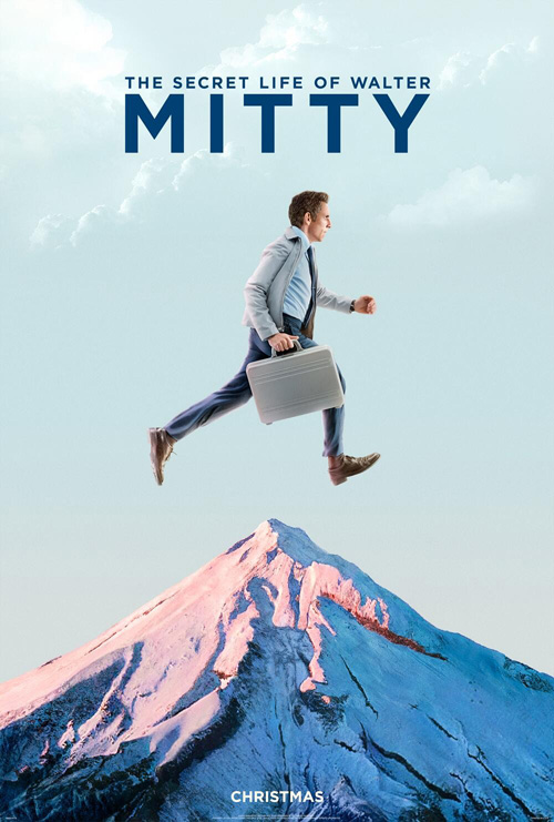
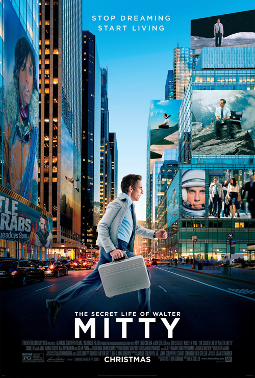
It’s not a far stretch where concept is concerned considering the whole film is about Ben Stiller‘s titular role escaping into fantasy for crazy adventure, but both ARSONAL (the endcaps with title at top) and Midnight Oil Creative (all the rest) have brought The Secret Life of Walter Mitty (December 25) effectively to life. And even though it’s literally just cut and paste, I like it.
Obviously ARSONAL went conservative by pretty much creating identical sheets only a change in background delineating them. I wish they had done more, but perhaps that’s exactly what Fox thought and why they brought another firm in. Midnight Oil Creative knocks it out of the park, though, with multiple vantage points, playing with the horizon line, and putting gravity on the moon. Their main sheet finally loses a step by popping the Stiller cutout ARSONAL used into a cityscape with the other entries serving as billboard imagery, but it’s still not horrible.
As for the logotype: I’m mixed. I like the block formed despite its “Y” not having a vertical edge to contain what’s to its left, but I wonder if “The Secret of Walter” is too much smaller than “Mitty”. Focusing on this to start nitpicking only shows how good the rest of the pages are, though. They’re simple, engage your imagination, and show a sense of formal aesthetic the trailer already surprised us by possessing as well.
Look me in the eye
 |
 |
 |
 |
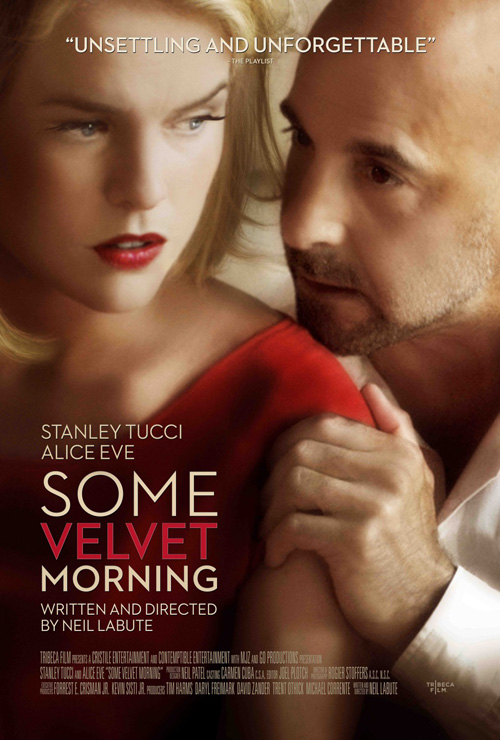 |
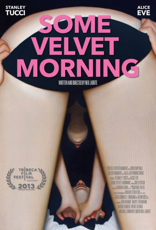
I get why Tribeca Film would choose to switch up their artwork so stars Alice Eve and Stanley Tucci could help sell tickets, but you can’t deny the festival sheet for Some Velvet Morning (limited December 13) is more memorable. I don’t even care if the logistics of the view is improbable or that we’re supposed to believe those depicted are the aforementioned actors—it will turn heads and stick with you after little more than a glance.
The pink text gets lost when not above the black panties, the drop shadow on the Tribeca logo is distracting, and the credits list is somewhat unreadable, but the gradient work between her legs on their faces in the distance is beautifully rendered. The faux fantasy glow and blur on the newer poster simply can’t meet this level of ingenuity. Yes, its crop is well made and yes the stagey emotions are etched with drama, but two mysterious people don’t have the same impact as a couple undressing from below.
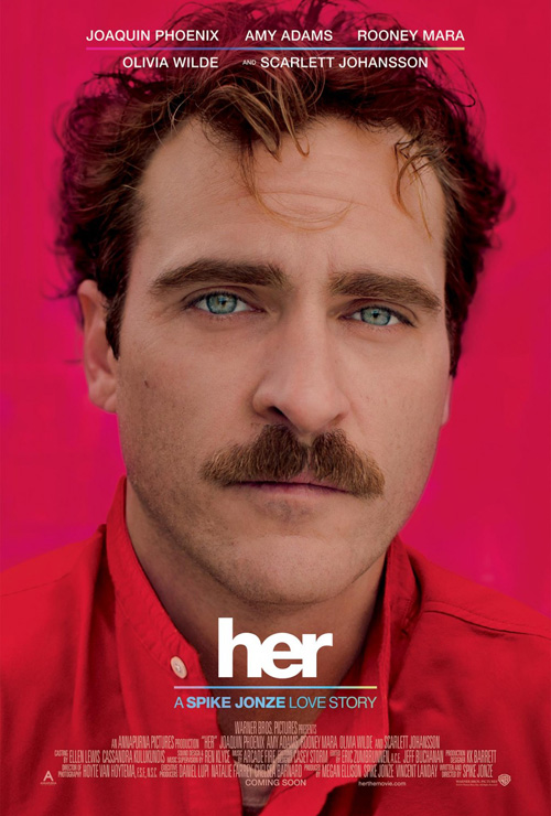
From pink to red: there is something very appealing about aSquared Design Group‘s work on Spike Jonze‘s Her (limited December 18). Red shirt, red background, reddish tint to Joaquin Phoenix‘s face, and a rainbow band of color subtly injected into the top and bottom? Yes, please.
I won’t bore you by putting a bunch of portrait poster similarities up here—you surely have a couple floating in your head while peering at this—but for some reason Her stands out. Is it the wild yet restrained hair? The sadness in Phoenix’s eyes or the quietly pursed demeanor set by his lips underneath that is-it-or-isn’t-it goofy ‘stache? It assaults us with red yet gives us an image of blue. But there is something hopeful behind it too; something that just seems to exist there to feel if not quite put our finger upon it.
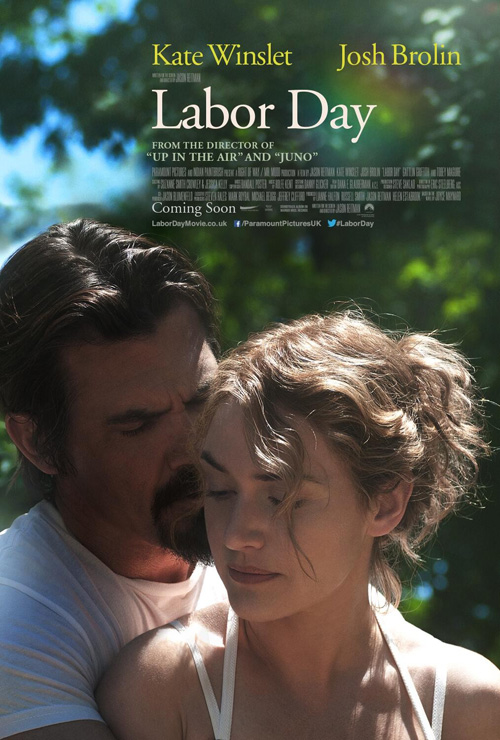 |
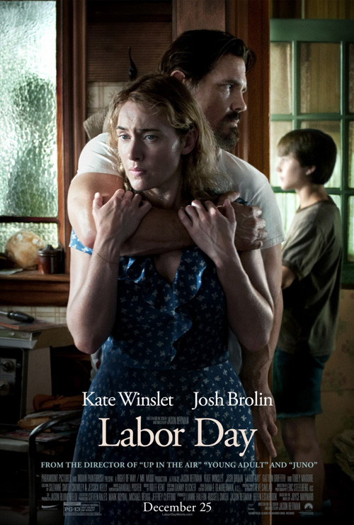
BLT’s work on Labor Day (limited December 25) gives off that same type of quality—more so if you’ve seen the film or have read the book. I love the duality at work behind the first because to someone who didn’t know it kind of looks like an embrace of love between Josh Brolin and Kate Winslet. She doesn’t seem too threatened if still scared; he may be hiding but isn’t necessarily holding her captive from escape.
The second sheet goes further into the love aspect by making it seem like your run-of-the-mill romantic drama and yet there’s still something stronger underneath. It possesses enough to intrigue to not give away what’s happening and still provides more for those like me who know the intricacies of the relationships depicted. They’re also very well composed in their bright white serif titles and carefully justified text blocks—every piece deftly capturing the mood.
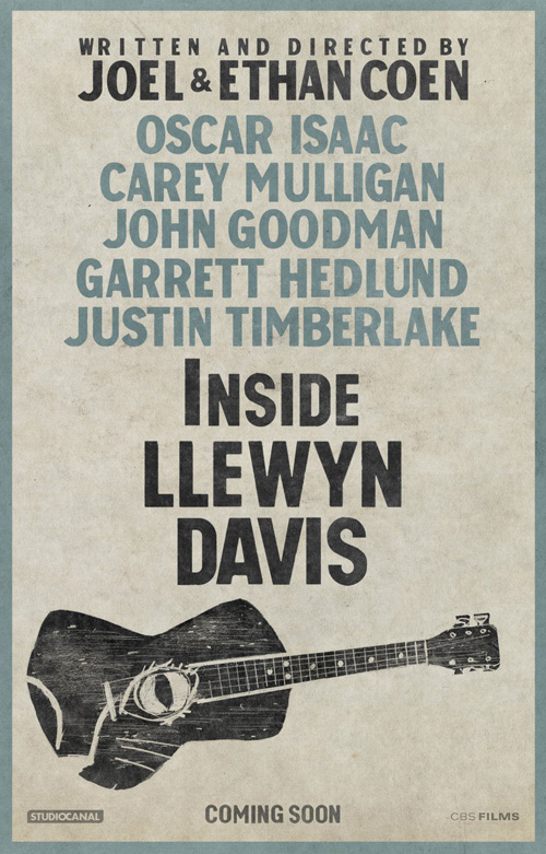 |
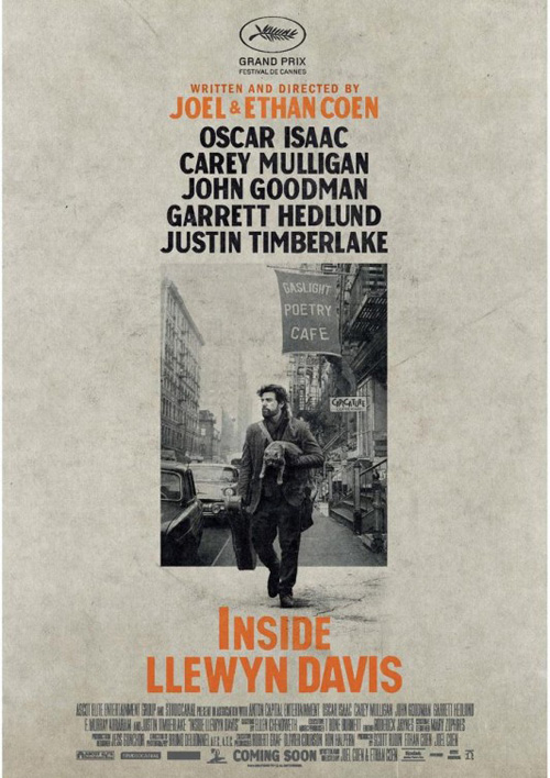
If you want an even better example of projecting the correct mood, however, look at the advert for Inside Llewyn Davis (December 6th). From the scratched parchment texture to the muddy off-white coloring to the high contrast black and white photo of star Oscar Isaac walking out of the page, there is a very distinct folky feel without being as blatantly abstract and handmade as BLT’s teaser containing only names and a guitar.
It’s simple, distinct, and gorgeous to behold with its vertical symmetry going down from top to bottom and thin to wide. The orangish stanzas stick out visually while still retaining an earth tone hue to let them almost get lost into the background at the same time. And the letters themselves also have a rather non-exacting size and shape to fluctuate fluidly from character to character.
We may not know where Mr. Davis is looking off to in the distance so forlornly with his cat, but we are definitely staring right at him. The design hooks us into wondering what stories exist in the guitar case or his bohemian image torn from that nostalgically vintage sidewalk. And that alone is why it is so good.
Letting loose
 |
 |
 |
 |
 |
 |
 |
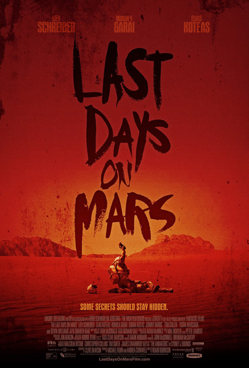
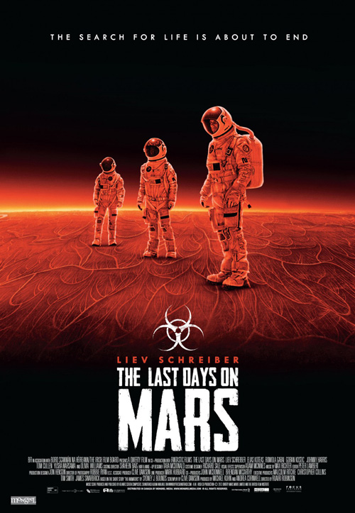
I really like this sheet for Last Days on Mars (limited December 6) by Blood & Chocolate and AV Squad. The blood red coloring alludes to the crimson planet as well as what appears to be a pretty rage-fueled thriller; the title font’s crude brushstrokes could easily point towards letters drawn by a blood-soaked finger; and the image of an astronaut about to bash another’s helmetless head in is riveting despite its small size on the page. There’s a pulpy tone mixed with grindhouse noise and it definitely has my interest piqued.
I cannot, however, say the same for any of the film’s other clichéd design tropes. Whether its Outer Arc’s rudimentary filtered photo with a contemporarily hip logo that looks like 28 Days Later; Blood & Chocolate and AV Squad’s giant head rising above a less interesting image of the head-bashing’s aftermath; or that team’s tired attempt at text over face: nothing screams originality. Whereas that first entry questions your preconceptions of yet another sci-fi horror on Mars, the rest can’t help but conjure images of 2000’s Red Planet or Mission to Mars.
 |
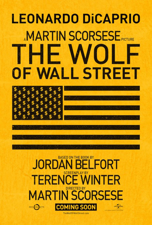 |
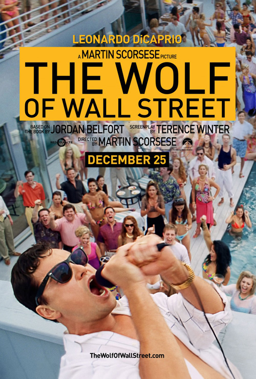
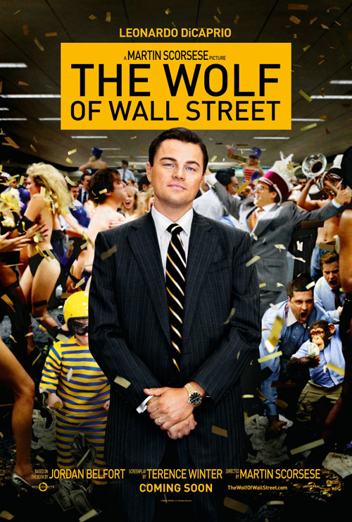
For Martin Scorsese’s epic-length look at excess, BLT decides to use the same imagery that made The Wolf of Wall Street’s (December 25) trailer so memorable—minus Kanye West of course. Their two iterations may not be wholly unique or interesting beyond distilling the film’s tone in actual frames, but they’re both better than the firm’s teaser with extra big text and a too pristine American flag despite its supposed want to be grunge.
The one with Leonardo DiCaprio standing smugly in front of an insane party with monkeys and midgets is marginally exciting yet weirdly sterile. Maybe I would get a better sense of the mood if the background were motion-blurred so the page looked like our star was slowing down time while everyone went crazy around him. In contrast, the one with our Jordan Belfort stand-in screaming into a microphone has the party people grooving and dancing as well as some attractive design qualities.
The yellow box with almost no interior padding is a nice opaque addition on both, but DiCaprio going off page and rocking back is much more engaging then his straight-backed man in a suit. The blur on the hands depicts the fervor and excitement of his singing and you understand the feeling of invincibility and entitlement at play.
 |
 |
 |
 |
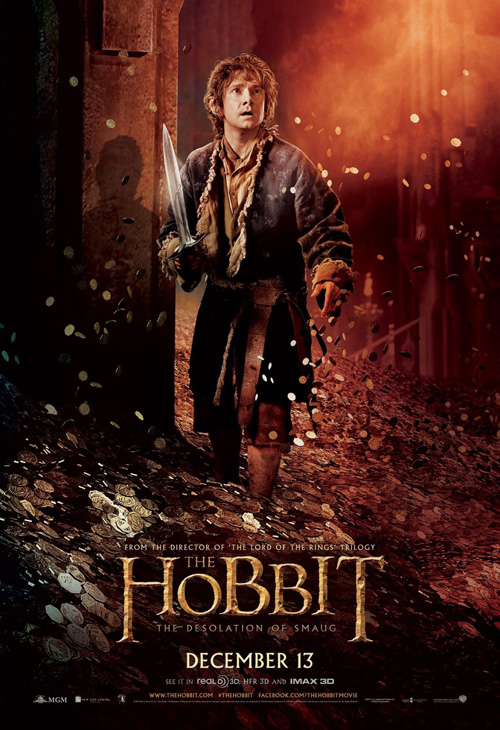
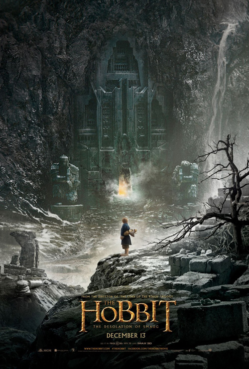
Where The Hobbit: The Desolation of Smaug (December 13) is concerned, the poster by Statement Advertising I have at top is not the best. It just happens to fit this section’s title more than the rest. I do like the smoky Smaug breathing fire into Gandalf’s pipe though—it almost makes you forget the rest is a lame photo collage with images that have nothing to do with each other besides being from the same movie.
At least Statement used un-touched character shots to compose it, though, because their Bilbo Baggins one-sheet does not have Martin Freeman in it. Who is that guy taking Sting out of his belt with smooth, elongated cheeks and dead eyes? At least Art Machine, A Trailer Park Company allowed their character shots to look like the actual actors. And putting them on a background that seems natural if not their exact setting from the movie is a nice touch too.
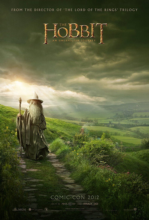
As for the other elements—it’s The Hobbit. You’re either going to go or not. The logotype is identical to the first (and the Lord of the Rings trilogy); Peter Jackson’s name is absent in lieu of an anonymous line explaining the LOTR director returns here; and the release date gets people ready. Nope, my praise goes to Ignition Print for at least giving us a look at the scale and scope of the series. Just like BULLDOG did with Gandalf last year, Bilbo gets to stand against an awe-inspiring world of magic.
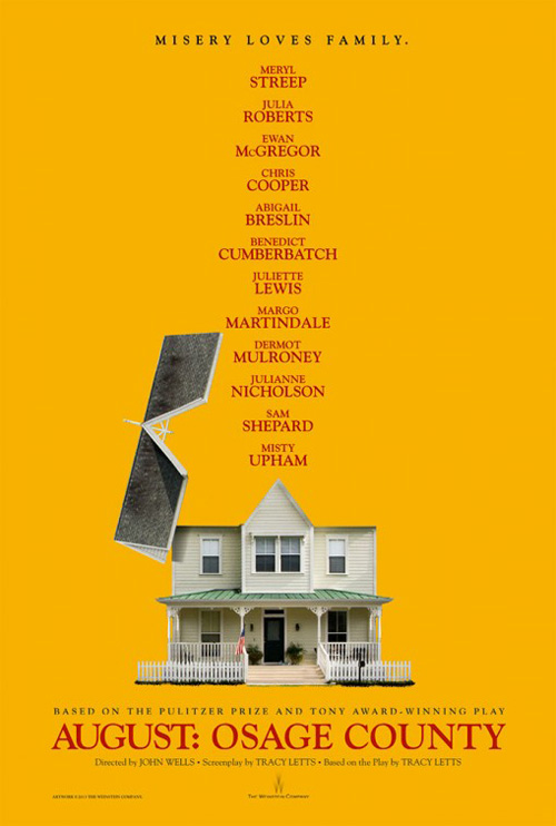 |
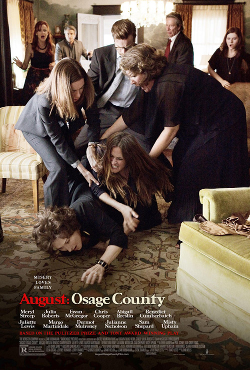
My favorite poster of this section, however, goes to Blood & Chocolate/AV Squad’s August: Osage County (limited December 25). I admittedly did not like their original teaser with its opened roof house that looks like a Terry Gilliam animation. It was too plain, too interested in naming names, and too intent on making playwright Tracy Letts’ name the smallest possible despite being a decently hot commodity after last year’s Killer Joe.
That said—its failure only helps me appreciate their second sheet’s success (even if Letts is all but gone besides the tiny screenwriter credit at the very bottom). It’s just a brilliant shot of family chaos with rage, surprise, shock, and indifference. The fact it so perfectly encapsulates its portrait orientation also makes it better since the frame it comes from must have been widescreen landscape. To know the firms probably had to retool the scene in Photoshop to get everyone in frame realistically only shows that some artists are still talented enough to make “faking it” work.
What is your favorite December release poster? What could have used a rework?