“Don’t Judge a Book by Its Cover” is a proverb whose simple existence proves the fact impressionable souls will do so without fail. This monthly column (with a special year-end retrospective today) focuses on the film industry’s willingness to capitalize on this truth, releasing one-sheets to serve as not representations of what audiences are to expect, but as propaganda to fill seats. Oftentimes they fail miserably.


I usually find myself needing to whittle down a list of around twenty posters to the fifteen showcased below. For 2014, however, my list was at forty-five. Now that’s what I would call a good year. Seeing how many came from the big boys like BLT Communications, LLC (who reigns supreme with three entries) similar to 2013 only makes it sweeter because they’re taking note of the little guys and their more risqué creativity to compete on the aesthetic front regardless of deeper pockets or name recognition providing unfair advantages.

It seems to have also been a year for inventive photo manipulation. Or at least it’s a year where my personal tastes skew towards just such examples. There are a couple illustrative examples—as there should—but designers have really gone above and beyond in their ability to turn film stills and portraiture into something more than glossy magazine covers. A good font, better concept, and a fearless desire to depict tonality above celebrity goes a long way and it appears studios are finally willing to take the risk and choose their marketing materials accordingly.


Honorable Mentions

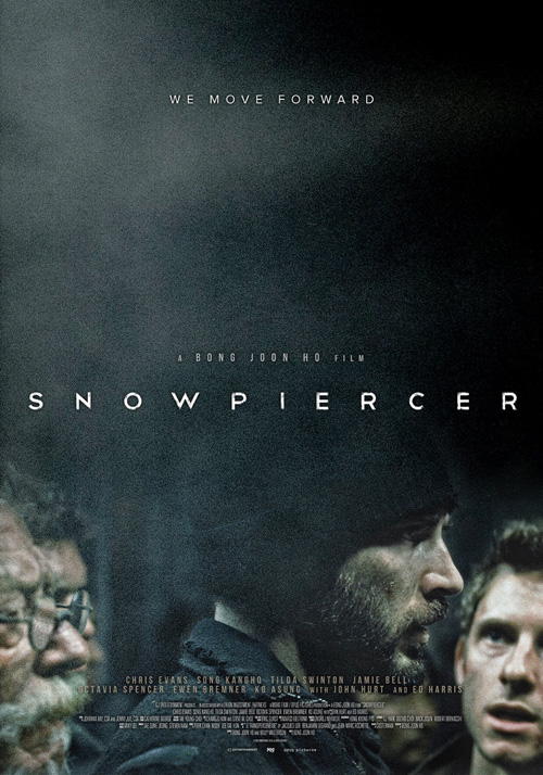
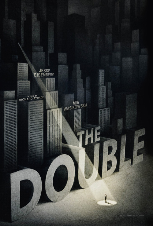
#15: SnowpiercerSnowpiercer #14: The DoubleThe Double
Empire Design
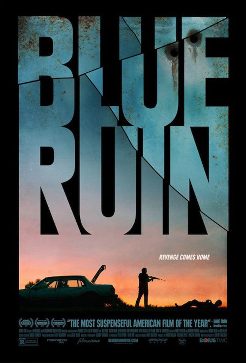
#13: Blue RuinBlue Ruin
Palaceworks
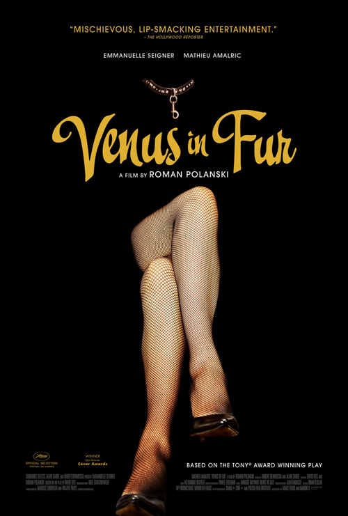
#12: Venus in FurVenus in Fur
Gravillis Inc.
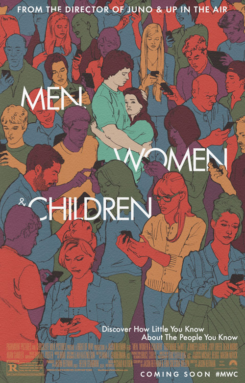
#11: Men, Women & ChildrenMen, Women & Children
BLT Communications, LLC

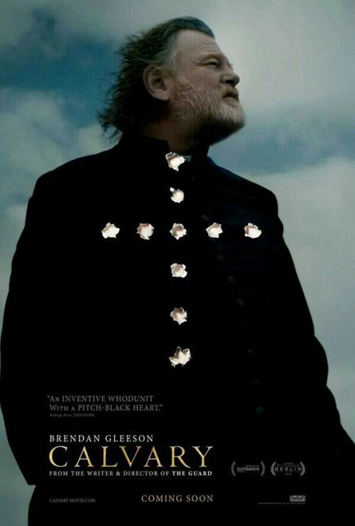
Calvary #10
Calvary

I find something truly captivating about posters mimicking their own medium or at the very least utilizing it as a feature of itself rather than merely the canvas upon which it lies. This dark, brooding one-sheet depicting a contemplative Brendan Gleeson looking off into the distance does exactly that. Little more than a portrait on its surface, the bullet holes ensure we’re aware the image is nothing but a paper representation—a target standing in for the real thing. The orientation of the frayed-edged holes speaks to his spirituality, as the absence of what used to be foreshadows his potential end.

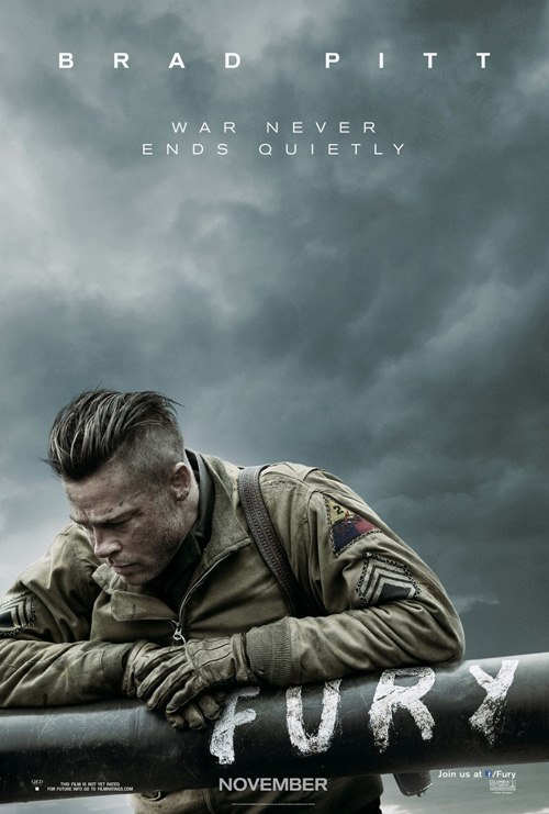
Fury #09
Fury
BLT Communications, LLC

Another tumultuous sky arrives with more melancholy and despair thanks to Brad Pitt‘s solemn stare downwards to hide the pain in his eyes. A brilliant use of empty space, the white text at top is visible for us to read but never-overshadow the mood on display. There’s no need for a title font when you can integrate it directly into the scene and there’s even less necessity for a group of characters when one’s defeated gaze is enough to portray the horrors of war his movie promises to show. The silence is deafening.

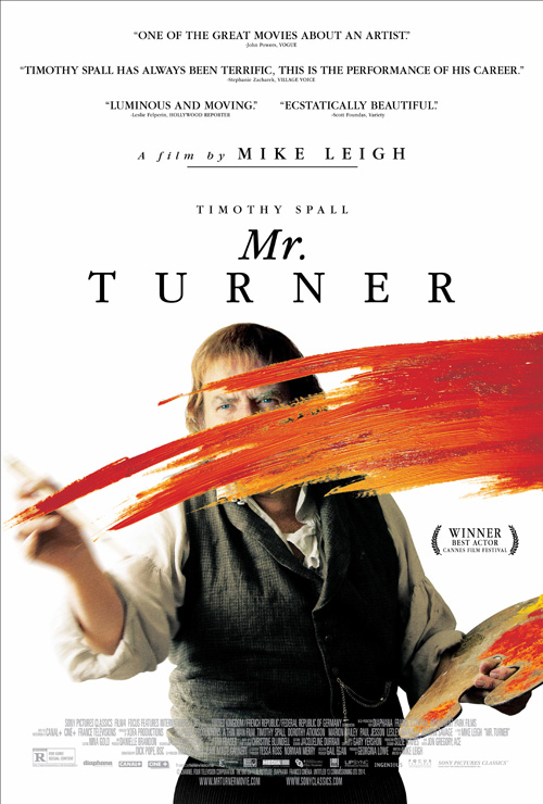
Mr. Turner #08
Mr. Turner
AllCity

Unlike the previous two sets of squinting eyes, Timothy Spall‘s pierce through the page with a ferocity of creation straight past us and into the ether of whatever new image he’s about to paint. The poster might actually be just as effective if we could see his full body poised to lay down that first stroke of pigment, but the swath of color concealing everything but those eyes makes it all the more dramatic. Its sense of space with the viewer puts us in his presence a few steps away and his kinetic act appears coiled to move despite its being frozen in time.

Son of God #07
Son of God
Gravillis Inc.

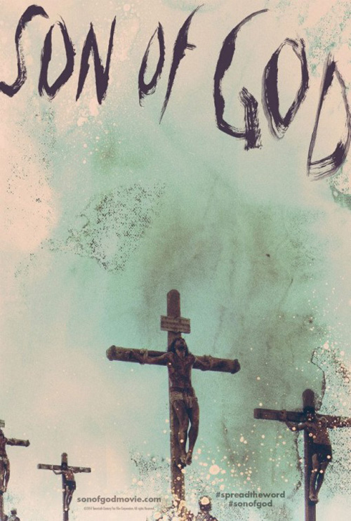
A daring piece I’d be surprised to learn was displayed at any US multiplex, its dirtily scrawled aesthetic is less the draw than its juxtaposition against the content it’s meant to convey. A condensed version of a well-regarded TV-movie, you’d expect the advertising to put “sexy Jesus” front and center with a smile that says, “Follow me to Heaven.” Instead we receive an acid bath nightmare of suffering on the cross, a controversial conversation piece of stunning beauty for a glossy epic pared down to fleece Catholics of ticket revenue despite most having already experienced its unedited tale on cable.

Inherent Vice #06
Inherent Vice
Dustin Stanton

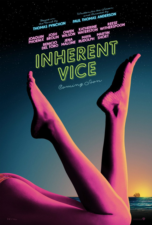
What better way to portray an adaptation of a pulpy, hallucinatory detective romp than the bright neon lights of big city sex appeal? It’s a perfect illustration from the smooth legs bent towards the sky to the florescent glow of the logotype virtually shimmering in its inconsistent current of electricity to illuminate its otherworldly look into the paranoid mind of Doc Sportello. The way the feet frame the text is fantastic, but it’s the color scheme that truly sets this design apart. An aura of sunset ushers in its evening escapades while also marking the transition from drab reality to drug-fueled adventure.

Nightcrawler #05
Nightcrawler
BLT Communications, LLC

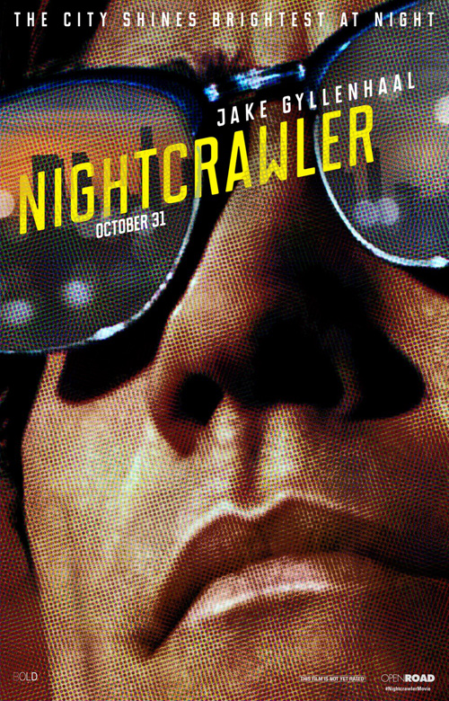
I could have easily replaced this selection with 2014’s other moire-patterned close-up (P+A‘s Bad Words), but I couldn’t shake the high-style contrast and colors of Jake Gyllenhaal‘s face basking in the glow of a seedy cityscape housing the same violence and greed that’s rattling inside his mind. The font is sleek, the limitations of the printing process depicted to an extreme a lo-fi gimmick stripping away celebrity sheen, and the calm severity of Jake’s expression turning any joy from being at the movies into pure anxiety. You feel as though you must wash your eyes the second you’re able to pull them away.

Big Significant Things #04
Big Significant Things
Corey Holms

A film easily lost on the festival circuit, whether it ultimately proves a success or not cannot discount the gorgeous poster created to assist in selling it to distributors and audiences alike. I obviously love negative space and this design has so much you almost have to conversely label it the positive content. The whole is an expanse of sky with text barely large enough to read, beckoning us into its infinite possibilities while the title arrives at bottom as though an afterthought. A creative use of text flawlessly integrating it into the scene, the scaffolding tranforms it into a landmark to remember as we soar by towards the heavens.

Wild #03
Wild

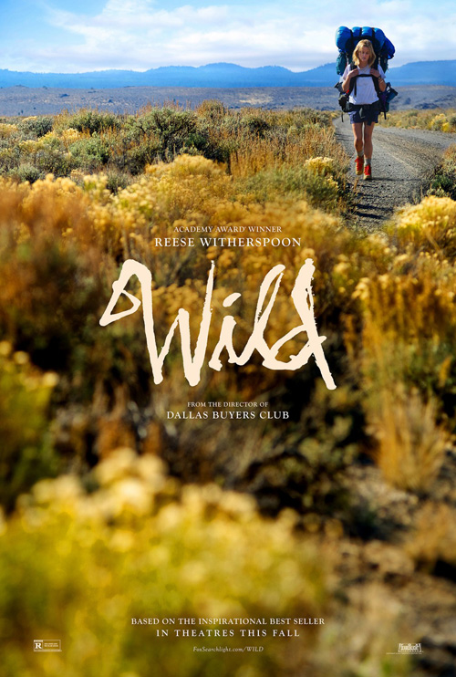
I thought this one’s appeal would lessen as the year progressed, but it has stubbornly remained. A stunning tease putting its rough yet elegant handwritten font front and center, our eyes travel from it’s hard-edges to the open air of wilderness surrounding it before ever setting our sights on Reese Witherspoon slowly ambling to the foreground. The shallow focus pops the title out from blurry foliage as the sharpness beyond provides detail for miles into the distance. We don’t know where this woman has come from our where she’s going; all we know for sure is that the outdoors has consumed her. She’s but a traveler caught within its breadth.

Under the Skin #02
Under the Skin
Kellerhouse, Inc.

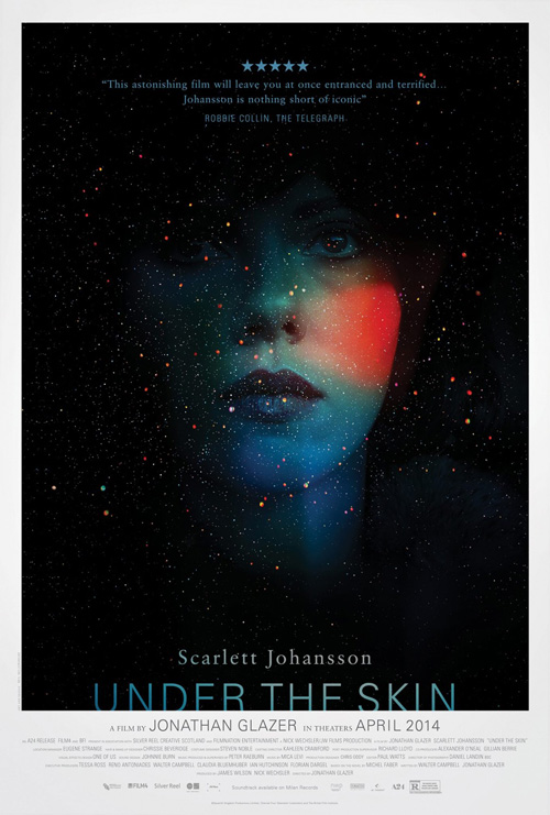
Kellerhouse, Inc. doesn’t do too many campaigns a year and yet 2014 puts them at the top with a pair memorable pieces. The first possesses the capacity to turn heads towards its pitch-blackness and brightly lit daubs of paint shining as beacons in the night. The eerily translucent overlay of Scarlett Johansson‘s monotone face draws you deeper into its abyss until you’re connecting faux constellations and/or attempting to decipher her blank stare. And while it may be subtle, the way in which the title sinks into the thick white border beneath her might be the most succinct visual summary of a film all year.

Gone Girl #01
Gone Girl
Kellerhouse, Inc.

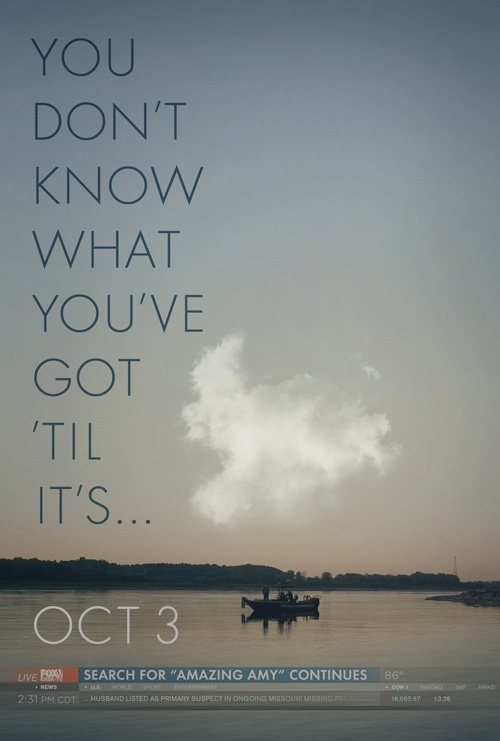
But at the end of the day nothing beats the poster leaving its name silently spoken in your head at the culmination of a catchy song lyric. A bold maneuver, the risk proves a calculated one considering the book on which it’s based was so widely read and the anticipation of its cinematic version so high. The use of a Fox News scroll at bottom gets to the heart of the story’s central conceit while also providing the surefire clue of what property it’s selling through the words “Amazing Amy”. The amount of information conveyed in what’s otherwise a sparse image is astounding and absolutely unparalleled this year.

What is your favorite poster of the year?

See our year-end features and more of the best of 2014.

No more articles