There’s a bit of everything this month, from the new Paul Thomas Anderson to a final final chapter to Downton Abbey to Ed and Lorraine Warren’s last ride. Add a couple debuts straight from this week’s Toronto International Film Festival (as well as last year’s installment) and you’re bound to find something that sounds good.
That doesn’t mean it will be good, but the subject matter and genre selection is too varied to leave anyone’s interests in the cold. One must only glance at the posters to find some personal selling point. Is it Jordan Peele? Check. Is it Stephen King? Check. Heck, even Kanye’s mug will be gracing the walls of your multiplexes so that you don’t blindly choose In Whose Name? on accident.
Sea creatures


I’m a tad worried about the goldfish on GrandSon’s poster for Splitsville (expanding wide, September 5). Not because it’s just floating up there by the title––the angle reveals it’s currently healthy and swimming upwards to find food rather than gasping for air. No, I’m worried because the humans shown below it are in rough shape.
Since it’s just the men who are battered and bruised, I’m worried even more that a cursory Google search reveals it, too, is probably a male. Maybe that’s why it’s high-tailing it out of there while it still can.
Beyond its inclusion, the one-sheet is rather simple. Off-white background. Thick frame matching the title color for stability. Center-justified body copy. What it lacks creatively in its structure, however, it possesses in intrigue, starting with the tagline “An unromantic comedy.”
Suddenly this pair of couples starts looking like a Fleetwood Mac cover, the implication that there are multiple love triangles happening at once. The arm positions. The longing gazes. The blood stains. Give us an ongoing progression of marketing materials and you might find a few dismembered limbs by the end.
Sleep with Your Eyes Open (limited, September 5) is also simple in its piece parts––it’s just a film image superimposed by text––but you must love the composition and motion in its execution.
By cropping the photo here, you not only have the actor’s body supplying a perfect diagonal from top left to bottom right, but also the fish supplying a staircase down to his hand. It’s only natural to exploit that implicit pathway for our eyes by sticking the title alongside it for a staccato hop from one word’s steppingstone to the next.
Yes, it gets cluttered by having the title in three different languages, but I like the shift in how they’re justified. The middle sections are centered amongst themselves while bookends are pushed to their respective edges, as though brackets containing the entirety of these words as one single unit.
MOCEAN’s illustrative design for The Baltimorons (limited, September 5) creates that diagonal by rendering a long dock to nowhere for its characters to walk towards. Are they about to fall in the water? Maybe. But there’s something to them doing it together. That’s the movie’s central message: taking that leap of faith you’ve been too afraid to do yourself. If it doesn’t work out, at least you finally tried.
That their trajectory also leads us to the title is just good design. So, too, is that hanging crab off the edge because it pauses our eyes just long enough for us to not get wet ourselves. We instead jump down to the laurels and carefully descend each line of text until we reach the end.
Is the hyphen superfluous? Sure. Is it a nice touch to highlight the title’s joke? You bet.
Marauding at midnight


It’s always fun when the timing works for an artist to have multiple titles all opening in the same month––then I’m able to devote an entire section to them. That’s the case this September with Midnight Marauder.
First up is the atmospheric Plainclothes (limited, September 19). The textured black lends a grittiness to the whole: the image of Tom Blyth (and presumably Russell Tovey with head turned into shadows) almost feels projected by a cool hued light. They become something like ghosts ethereally floating upon the right half of the page above a gorgeous rainbowed flare of color below.
It’s that positioning that allows the text to shift left as a counterbalance: two separate pieces clicking into place to become one. Add the subtle distortion of a digital artifact to a few letters in the actors’ names and the title, and that idea of ghosts in the machine becomes solidified. The sheet truly becomes a flicker of life rather than a photograph. A memory rather than the here and now.
Next comes Rabbit Trap (limited, September 2). There’s a distortion again, but this time it isn’t a digital manipulation. This is seemingly temporal: the image of Dev Patel repeats atop itself as though a second copy of him is being pulled from the first. It’s a captivating visual made more intriguing by the headphones and plot, about discovering a mystical sound separating the listener from reality––your brain suddenly wants to up the sensory ante, despite our sight’s inability to hear.
Yet you do “hear” something, don’t you? That visual shift, coupled with the springy coil wave rendered as a sort of totemic symbol below, allows us to hallucinate a piercing shriek capable of tearing a rift through space. The placement of the title only amplifies this phenomenon by grabbing our attention with its brightness, ensuring we clock those repeated eyes above it. We become the rabbit caught in the moment’s figurative time trap.
Last, but certainly not least, is Sunfish (& Other Stories on Green Lake) (limited, September 12). What a stunning piece of art wielding its shallow depth of field so we’re guaranteed to go straight for the buoyed platform floating in the water.
The title’s bold white only distracts us for a moment to read it. Our eyes don’t linger because the blurred reds of the flowers surrounding it overpower our attention and let the letters fade into the foliage. We become latched to the circular spiral of leaves instead––its tidal wave swooping in from the right and folding in on itself upon hitting the left-side wall so its end points us towards escape into the sky and its critic quotes.
And while the image might simply be a cropped still from the film, that slanted horizon has me believing this angle was precisely measured to provide the sense that we’re on the water too. We’re bobbing along and sloshing upwards with the branches. We’re losing our equilibrium and becoming desperate for that small, squared oasis just out of reach.
Repetition


While the poster for Twinless (limited, September 5) does make me wonder if the studio shut everything down post-Sundance leak––the photos of Dylan O’Brien and James Sweeney are taken directly from the original film still––GrandSon did a nice job creating something cool from it.
They cut them away from their setting, removed the Sims Halloween costume, and surrounded them by paired silhouettes so they truly become the two “twinless” individuals amongst them. It’s colorful, twee, and conceptually relevant. If the movie didn’t win those two awards, you probably could have removed the laurels altogether and still had us assuming it premiered in Utah.
Adrian Curry’s choice of a film strip for Riefenstahl (limited September 5) is the perfect visual pathway into a documentary about the infamous filmmaker. That the image is Riefenstahl holding her hand before her face to duck a question and / or exposure only makes it more so; it gives life to the philosophical debate between art and artist, this question of whether you can appreciate someone like Leni Riefenstahl’s craft while still vilifying her actions. To merge her visage with the medium of said craft is to blur the line further and ask whether any separation is possible at all.
It’s also just an attractive piece that utilizes its built-in segmentation to lead our eyes down, frame by literal frame. Quote, laurels, title––each frozen image clicking with an imaginary lightbulb flash to simultaneously turn us into the journalist, paparazzi, and angry mob demanding answers.
StudioRan’s Happyend (limited, September 12) wields its repeated rectangular outlines as both an aesthetic motif and representation of school surveillance. Each highlights a different student as they run away, presumably signifying a facial-recognition algorithm trying to determine the identities of these pranksters.
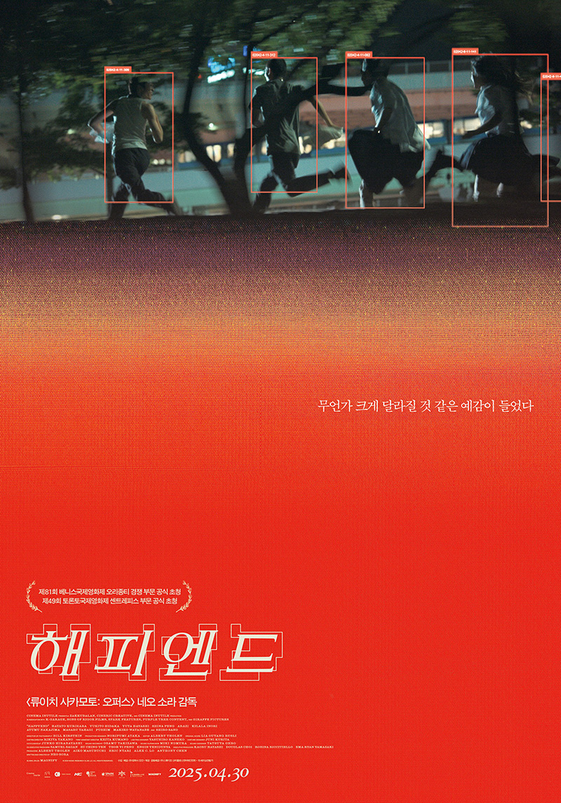
The designer’s choice to mimic that effect on the title lends a thematic connection for our eyes to follow as we wade through the vast expanse of white space between. The whole feels like we’re the computer processing this data––the orange field of color gets distorted by digital noise and halftone lines. The culprits are escaping the camera, but also our gaze.
It’s a testament to the success of the design that PROPAGANDA’s Korean version simply translates everything while maintaining full compositional fidelity. Visual language is quite often universal.