Theaters are starting to actually reopen this month with purpose, but that doesn’t mean they’re going to be populated with the same amount of new, first-run films like they would have pre-COVID. Just count the number of Netflix titles below to see how tiny things have shifted. With the predictions of a rough fall on the pandemic front, venues may be shutting down again very soon. So hedging bets is the way to go.
And it’s not like there aren’t some quality titles to choose from via streamers and VOD. Besides Tenet (September 4) doing its damnedest to retain its tent-pole blockbuster status, the little guy is king of September 2020.
Isolation


To prove as much, here’s a quartet of sheets highlighting a lead or pair of leads hell-bent on showing who’s king of their film.
First up is #Alive (Netflix, September 8) and its fantastic set-up with a zombie apocalypse survivor using nerves of steel and a selfie-stick to capture the best photo he can of the occasion. Hilarious and thrilling all on its own, you might not even see the undead horde below him with arms outstretched. A metaphor for how we’ve all become a bit brainless due to social media? Perhaps.


The alternate Korean sheet is pretty spiffy too with its equally intriguing use of perspective and concrete balconies. I really like that there’s one zombie highlighted on the first and second floor screaming—a man and a woman much like the living duo above them. It’s a cool bit of foreshadowing and/or portending of what will be and/or what could. Eschewing comedy for straight horror makes it a nice companion piece to the above in order to show both sides of its coin too. If only the English-language sheet followed their lead. Its bland film still wants to conjure scares, but it’s too static to actually do the job.
Isadora’s Children (MUBI, September 2) is an interesting bit of spotlighting because it uses its subject as a canvas for another. Agathe Bonitzer is front and center, but she isn’t what we’re meant to see—as evidenced by a crop that removes her face from above the nose. Her pose is more important than her identity; her clothes more crucially a screen than representation of movement through dance.
This is a portrait within a portrait of soft focus pastels and family in an embrace both literally and figuratively thanks to the random covering of the title’s letters adding depth and space between her arms and chest. I don’t love that “ADO” and “DRE” pop out as a result considering they make the whole tougher to read, but it’s a minor distraction. The coloring, font choice, and composition render the piece a stunning work of art regardless.
It’s always nice when Netflix goes outside the box to attempt the same since they more often than not stick to glossy photos. That they got Midnight Marauder to do I’m Thinking of Ending Things (Netflix, September 4) is therefore a coup. They still get that glossy photo, but it comes with a world all its own too.
Because I haven’t seen the film yet, I was going yo say that there was no way the ceiling of this room was that high. That would mean the designer had to stretch things out in a way that stays authentic: i.e. recreating what’s there over and over again with expert precision and seamless stitching. And than I saw an image from the trailer that proved it is in fact that high. Like an Alberto Giacometti sculpture of an elongated man bearing down against the existential dread of its day, this empty space does the same for Jessie Buckley.
The result ends up possessing an uncanny surrealism that vacillates between real and fake. You may find yourself combating a case of vertigo as your eyes travel up that wall only to slide back down as though we’re caught in a Spike Lee double dolly shot.
Obstruction


Since you can also highlight a subject through obstruction, it’s only fitting to show how with another cellphone user via The Social Dilemma (Netflix, September 9). While the technological device is the star here, it’s nothing without its user. So we see that person without actually seeing them. The designer uses them as the pedestal upon which the phone is propped so it may turn its holder into its slave.
The conceit is simple and yet profound in this way—aesthetically captivating in its use of light and contrast while also psychologically relevant in its intellectual scope. We’re watching someone get lost in the glow of his/her screen as though this is a horror film. I guess reality is a bit of a horrific nightmare. Just proves once again that documentary is a medium, not a genre.
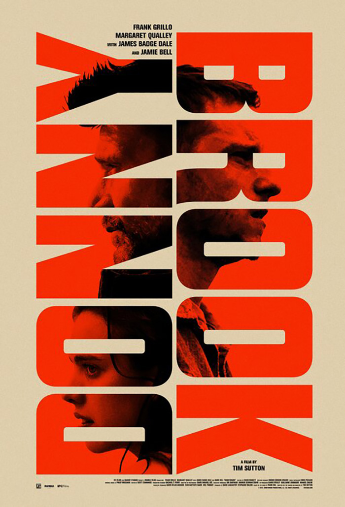
The Devil All the Time (Netflix, September 16) does things a bit differently. It obscures and highlights simultaneously as it transforms its title’s letters into windows. They carve into the frame (a grungy gray with a splash of water in the bottom left corner) in order to let the actors enter our gaze.
I’m a big fan of this type of design trick (most recently achieved by Brandon Schaefer on Donnybrook). Usually those letters open up on a scene, but here we get an actor for each one: nine giant openings and nine top-billed stars. Rather than just plop them in, though, these characters are cropped with meticulous care. Some are vertical. Some are horizontal. Some are looking at us. Some are looking off-screen. There’s a story in each, a tease of what’s to come.
Leroy and Rose’s Antebellum (VOD, September 18) skews more towards the first example of obstruction as Janelle Monáe’s mouth is covered by a stenciled butterfly dripping red. When the poster is viewed as an object, it becomes paint sprayed on graffiti-style. When looked upon as a visualization of the film, it becomes blood, violence, and a representation of the character’s inability to stop it. We cannot hear her scream.
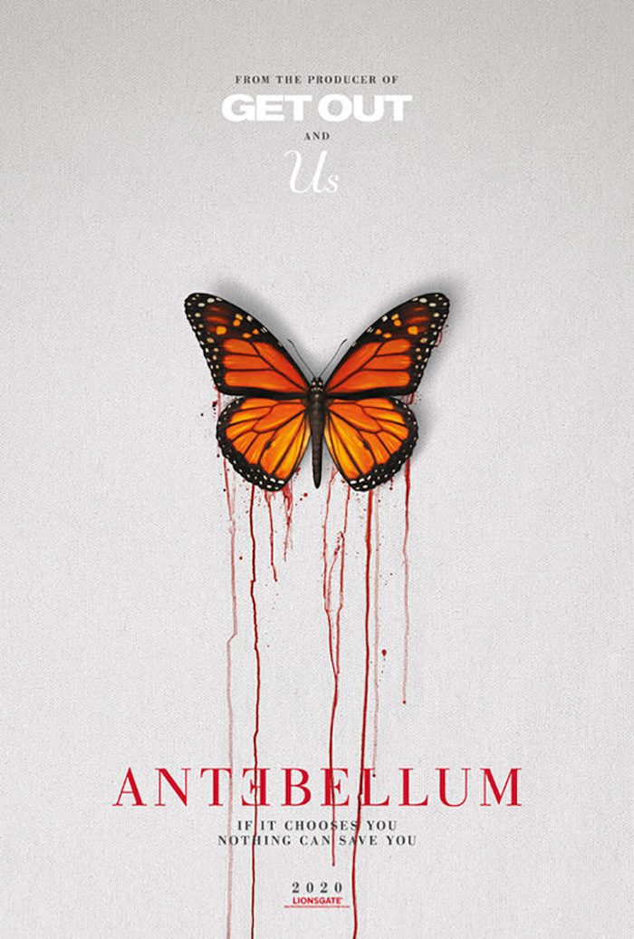
It’s an evocative image that leads into the subject matter while also proving to be a simple yet effective composition marrying photography and graphic elements. There’s a bigger sense of drama than P+A’s tease too with its darker coloring and the presence of an emotional expression courtesy of Monáe’s eyes. That’s not to say the bleeding butterfly isn’t a great image in its own right. It’s simply more clinical and obtuse. I also hate the tagline. The double “You” is clunky and redundant. There are so many better ways to get that message across.
Coarse grain


Netflix shows some more inspiration this month by joining Array to hire Matt Needle on September 16’s release of Residue. Talk about the antithesis of gloss photography. This image is filtered through ample grain, veiled in color, and allowed to express a feeling beyond the person depicted to perfectly epitomize its title. This is a lingering image of what was. A memory. A ghost.
And the photo isn’t at the top. The whole is reminiscent in tactility to gritty 70s posters with images framed above text on white, but that formula is reversed so that the title isn’t crushed beneath the weight. Instead it stands above as a label and sticks out with its bold serif in sentence case contrasting the all-caps sans serif surrounding it. Think of it as a museum piece: photo and card.
P+A seeks a similar effect despite retaining the idea of glossy photography on The Nest (limited, September 18 / VOD, November 17). The grain created by low light lends it a matte finish and extra drama. It ages the whole, placing the proceedings into period piece territory as though it was unearthed from an album collecting dust in the attic.
It’s also a bit of an optical illusion thanks to the scratches and shallow focus. Is it a photograph or a mirror? Is Jude Law present or a fading memory? Is Carrie Coon ready to turn and look at him or has she already turned away? The image is rife with contradictions and possibilities—deafening in its silence with so much that needs to still be said.
And that leaves us with a combination of both courtesy of Small Dog Design’s Entwined (VOD, September 8). It’s an image, a feeling, and a mystery all wrapped in one. It’s both portrait and landscape, intent on having us linger in the foreground while wishing we could enter the background and see who owns the shadows in the distance.
We’re disoriented by the ninety-degree turn and yet grounded by the text ensuring everything is where it’s supposed to be. The red title is muted into a dull shriek as the points and lines of its letters try to escape the confines of their position, their distressed scuffs helping the word feel at home within the forest’s fuzzy naturalism. Suddenly nothing about it is quite what it seems.
What is your favorite September release poster? What could have used a rework?