“Don’t Judge a Book by Its Cover” is a proverb whose simple existence proves the fact impressionable souls will do so without fail. This monthly column focuses on the film industry’s willingness to capitalize on this truth, releasing one-sheets to serve as not representations of what audiences are to expect, but as propaganda to fill seats. Oftentimes they fail miserably.
It feels like the window between Toronto International Film Festival screenings to our local multiplexes has compressed to non-existence. I’m not saying there aren’t a few gems with no intention of being released this side of the New Year (I’m looking at you Free Fire), but there are at least six September releases that will have been shown at TIFF mere weeks or even days beforehand. Either the cinematic quality of blockbusters has gone through the roof or festival programmers have fallen a tad too commercial.
There are more than just these prestige (and wannabe prestige) films wearing their festival backing on their sleeves, though. The return of Bridget Jones (September 16th), JCVD (Kickboxer: Vengeance, limited September 2nd), and Tim Burton (see below) are only but three. You’ll need some name recognition like that too since marketing on the whole is ultimately proving flashy if still a bit bland.
Miscellany


In all honesty, Concept Arts’ poster for When the Bough Breaks (September 9) isn’t that bad. The red on black pops, the melting wax candle drips add intrigue by doubling as potential blood, and there’s great motion from top to bottom. It’s not great, but it does its job effectively while still providing the sex appeal the studio more than likely demanded.


I’m highlighting it this month for a different reason, though. Rather than rip it apart or laud it with praise, I simply want to ask a question. Does Morris Chestnut have a stipulation in his contract that he’ll only do a movie if the poster showcases his co-star as a plunging V-neck of breasts? Between this and The Perfect Guy, blatant objectification has moved to coincidence bordering on obsession. His IMDB page is blank after this one so I guess we’ll just have to wait and see if the pattern continues.
LA’s The 9th Life of Louis Drax (limited September 2nd) follows a more is more logic by giving us all the principle players in quasi collage. I really like the use of negative space as the foreground shifts from Sarah Gadon amongst trees to Aiden Longworth falling into an expanse of white. It’s a cool transition that is sadly overpowered by the translucent men looming large above. I wonder what would have been if they were removed.


It is a more mature advertisement than what BOND did with their cave mouth silhouette, a cartoony effort trying to embrace its inherent darkness much like the film itself. The effort is nice, the execution a bit half-baked. If the imagery is alluding to Drax being in a coma with a storm of nightmares brewing, maybe the person standing there should be someone else? Or perhaps a subtle glimpse of the monster guiding him through this adventure by his side?
As for the Spanish version, we can all agree the shortening of the title to The Mystery of Louis Drax definitely allows for a less clunky block of text. The rest, though, is more subjective. The idea of a woman’s face with a reflection in her sunglasses is hardly new, but the high-contrast/saturation of the coloring lends it a fascinating clarity. It reminds me of a trashy novel cover, one that causes head turns at the very least.


The Disappointments Room (September 9) by Switch has earned my attention despite its issues—namely the plain title that looks like a defaulted font with multiple alignments and inconsistent kerning fading away. I enjoy the scale of the keyhole and the fact that it’s not a clichéd eyeball looking back. The focus is acute, the object a Samara-like contemporary Cousin It to create quiet dread. I think about The Orphanage, a superior sheet with its meticulous coloring, but a similar symmetry of light to dark. And it’s the opposite of Baskin‘s great in-your-face keyhole menace, but effective nonetheless in its own disparate way.
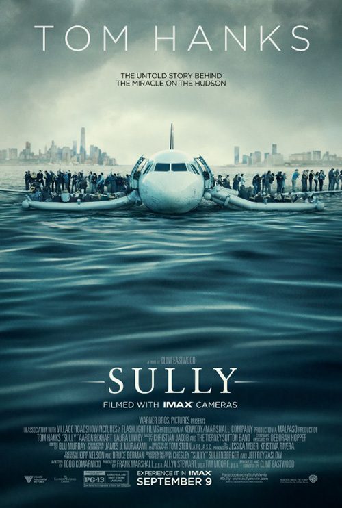
Where The Refinery’s Sully (September 9) is concerned, I’m a fan of the layering. There’s a definite foreground (the plane’s window frame), mid-ground (Tom Hanks), and background (the water and clouds in the distance) with a shallow depth of field making it so the titular pilot is all that’s crisp. His demeanor is had to pinpoint, the darkness of the weather creating a ominous sense of drama. If only Hanks’ name didn’t fill an eighth of the entire page this could be great.
It’s still a lot better than its counterpart with plane and inflatable ramps forming a silly mustached face just like its stars. Hanks’ name is still way too big and the large area of water isn’t doing anything but providing the bottom text a darkened field to be visible on. It isn’t balancing the scales—my focus simply can’t leave that plane. It’s as if it’s egging us on. Stop staring at me!
For the kids


Let’s get the unpleasantness out first: I hate the Frankensteined title font for Miss Peregrine’s Home for Peculiar Children (September 30). I hated it when the trailer released and still hate it now. Surprisingly I actually like the fancy capitals in faux-brushed metal and the flourishes framing the lines, though. What makes me cringe is the scrawl of the final two words. They may look okay on their own, but it’s distractingly out-of-place when juxtaposed with the clean polish of the rest. And I do get that this is the point. These kids are peculiar and don’t fit in. I just have to believe there was a better way to depict this.


I’ve otherwise taken a shine to the visuals LA utilizes and really can’t wait to see a Burton flick that harkens back to his early days of imagination much like his beautiful aberration Big Fish. Eva Green was born to act under his watch—but we can forget Dark Shadows—and the oddities behind her are delightfully strange. Yes it’s just a mishmash of the character posters, but it works.
The second is far superior, though, because it trusts that one example of peculiarity is enough to get the point across. We have the star—Asa Butterfield—and one of the titular children floating in the air like a kite while her shoes remain on the ground. The setting is gorgeous, the distance from sand to sky awe-inspiring, and the tone playful with just a hint of danger in the clouds rolling in.
After all, this thing is going to get creepy. Right? Invisible boys and mask-covered twins are hardly the stuff of blissful dreams, but Samuel L. Jackson’s demonic villain takes the cake. I’m all for a bit of horror in my children fare.
You won’t see any of that in Storks (September 23), however. But then you wouldn’t have expected it. This is a cutesy tale of stylized animation with glassy eyes and smooth gradient skin. BULLDOG embraces this aesthetic and lets the characters speak for themselves with broadly expressive faces and brightly colored hues. Despite this, I am definitely a bit concerned that we see so many teeth in the synchronized flying sheet—those two at the bottom definitely did something they weren’t supposed to do.


Art Machine was responsible for the character sheets, each one showcasing the exaggerated features of the film’s stars against a monochrome background still tinted bright. These are mainly built to introduce names to children walking by at the theater, but that doesn’t mean you can’t also create some depth with the simple inclusion of a white border for the subjects to spill over into three dimensions. It’s an underappreciated detail that catches eyes without them knowing why.
But the one that really works for me is BULLDOG’s Spanish variation. It may resemble The Muppets and The Peanuts Movie before it with a filled-to-the-brim hoard of characters, but this one has purpose beyond getting around the stale collage trope. The majority of figures are babies—on the loose and wreaking havoc. Their freedom gives meaning to those nervous grins (and that one bird’s anger at mid-right) and provides the latitude to have fun with depth. That one baby in the foreground coming to say, “Hello” makes this an interactive success alone.
Not quite forgettable


It’s a film that no one necessarily wanted to be remade (let alone as a remake of a remake), but you cannot say the cast of The Magnificent Seven (September 23) isn’t captivating. So there’s no surprise that BOND would shine the spotlight on them—and absolutely nothing else. The maneuver works because these isolated character portraits aren’t pretending to be standing next to one another. They are staggered along with the giant text as obstacle, stars in front and the rest in back. It still feels old-timey western in its modernity, the font and gold texture helping pop the desaturation of their figures.


Vox and Associates then do everything wrong that BOND avoided. By having the actors face us as though they approach, we suddenly are made to believe they’re in the same scene. But the size and scale makes it appear the two guys in the back are miles away. And what’s with the giant bloody red “7” in the middle? To me this is a blatant rip off of Gravillis Inc.’s Hateful Eight campaign even if it doesn’t really look the same. My brain tells me it is.
Ignition’s play looks as though they saw Vox’s and decided to right the ship. The “7”becomes more than an eyesore by actually augmenting the frame both with a splash of color and as a trail for us to travel from tagline to release date. They crop out the actors’ feet so we aren’t bombarded with seven horribly placed drop shadows and each is pretty much parallel to create a realistic gallery of antiheroes. It’s a solid big budget blockbuster advert that ends up outshining the tease above.
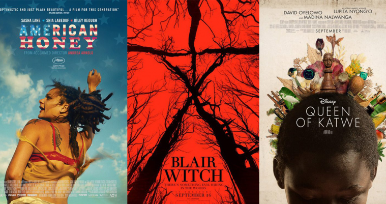
American Honey (limited September 30) succeeds in its simplicity. The image used has its own motion, Sasha Lane seemingly on a bucking bull with arm in the air to keep balance as a rodeo cowboy. She is assumedly the “American Honey” of the title, a living embodiment of today’s youth. Who is she and where is she going? These questions ask us to buy a ticket and find out.
I’m not sure I love the fading stars superimposed above the sky—they seem more overkill than anything else since they don’t match the American flag of the logo. They’re also too crisp and perfect, something no other part of the poster is. Lane is being thrown about by the wind at the very least and the flag motif is watery as though painted and seeped into the paper by contrast. Nothing here necessarily screams at us to take note, but our interest does get piqued anyway.
P+A’s Denial (limited September 30) is deceptively great. There isn’t much happening and it is just the three leads, but it feels natural. We can believe that Timothy Spall and Rachel Weisz are sitting next to each other—she looking at us, he elsewhere—while Tom Wilkinson sits in the distance. The men are easily recognizable but the shallow focus a la Sully above ensures it is Weisz we pay most attention towards. She is the star.
There are issues I have with the text layout, but these are minor squabbles that would be hard to rectify considering the industry. One: the tagline is so long that it weighs down the one-word title despite it being bigger and bolder. I’m not sure dropping it to three lines rather than two would have helped, though.
Two: Spall sadly didn’t get an Oscar nomination for his role in Mr. Turner and therefore doesn’t get the clarifying label like the other two. This inconsistency leaves his name floating and bare. It can’t help but grab my attention as a result despite not needing it.
Three: I get that there’s a hierarchy to name location on posters via contracts and whatnot, but having them perfectly centered over characters yet not above the character displayed beneath them irks me. This one is definitely a personal preference, but maybe blur the men a bit so Weisz still pops despite being in the middle and not first?
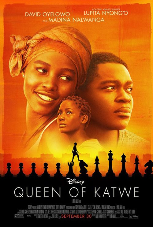
Despite having two highly recognizable stars in David Oyelowo and Lupita Nyong’o, Palaceworks decides not to follow Denial‘s footsteps for Queen of Katwe (September 23). Rather than show its trio like the second sheet in bland totem collage, the firm focuses instead on story motifs like chess, trophies, animals, fruits/vegetables, and more. It provides us its lead (Madina Nalwanga), partial hidden to show those objects as meaningful pieces of her identity. They make her who she is, the wooden carved Queen at the center epitomizing her place in the world.
I like the symmetry and the use of her black hair to fit the title nicely stacked from short to long. I’m not sure why Mira Nair’s name is compressed beyond coherence considering the cast is clearly readable above, but I give the designers credit for moving the credits box to the top. It’s okay to go against tradition if it serves the overall frame and this does just that.
Exceptions to the rule


And now we come to the standouts.
First up is Kicks (limited September 9) from Ignition. I have no clue what’s going on with this film, but it’s impossible not to be intrigued by the imagery. An astronaut tossing a kid a sneaker with the tagline “They Aren’t Just Shoes”? What?
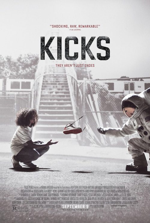
There’s mystery in the darkness—the ground looks like asphalt but who’s to say that’s not a flat portion of moon surface? The black of the background ensures we see the exchange in the fore while also letting the giant title grab us quickly and directly. The grunge texture and not quite pure white keep the letters from appearing tacked on and fake—they are tactile, they belong.
The alternative version with inverted coloring only shows how good the other is. The white now forces them to put in a background, but they cut its opacity because the kid and astronaut are still imperative. Now it’s not a natural scene anymore. They would have been better off leaving it blank. And because the figures are solid in contrast, they compete with the now-black title. The visuals have become muddled and our interest wanes as a result.
Next is LA’s Blair Witch (September 16) campaign. My adoration for this one is less the final product and more the process. This film was originally titled The Woods in order to keep its being a sequel to The Blair Witch Project under wraps until a ComicCon debut. And if you remember the original sheet, this red with black branches in the shape of the original film’s totem is a sequel too. The aesthetic was always in play to make sure that we associated the old poster with new after the reveal. It’s a well-thought out plan with perfect subliminal connective tissue.


The other tease with hands on tree trunks as though they are prison bars exists on its own—effective but without a visual marriage to the others. It shouldn’t be dismissed, however, because of the quotes. Those three critics need to be applauded for keeping the secret despite seeing it extra early. As for the second Blair Witch-approved advert goes? Well, I’m not sure what’s happening here. Is that statuary? Bodies? Bone branches? It’s unsettling for sure, but I prefer its more minimalistic sibling’s mystery.
LA also designed what’s probably my favorite poster of the month in Deepwater Horizon‘s (September 30) teaser. This thing is great—chock full of drama, diagonal motion from cloud plume to burning rig, and no excessive text to distract from the stunning visual itself. The colors are deep, the contrast lending three-dimensionality, and the title as non-flashy as possible while still being extremely visible. You want to know what tragedy occurred in the water and are helpless to assist those trapped in the flames.


Their full sheet with Mark Wahlberg staring downward is good too because it retains the drama of the explosion in a subtle, captivating way. We don’t need this to be “action-packed” like the next variation with its up-close rig and Wahlberg bleeding like he’s ready to fight God with his fists to set things straight. That’s not what this story is about and not what the poster should imbue.
They must embrace the sorrow like the character sheets. How great is it that we see emotion rather than glamour shots. They’re covered in oil and sweat; they’re desperate and hopeless. I want to know how they survive not how they “win”. It’s not about victory like the aforementioned third sheet’s straight-to-DVD, Steven Seagull aesthetic. It’s about digging deep to stay alive against a ticking clock that’s out of their control.
The most inventive poster of the month, however, is the one for Operation Avalanche (limited September 16). This—for lack of a better term considering it’s a thriller—mockumentary deals with a quartet of CIA agents posing as a documentary film crew at NASA in 1967 who uncover truths that have fueled conspiracy theories for decades. And the poster uses that artifice to its advantage.
It’s an astronaut on the moon so we obviously assume the “mystery” is that they discover the landing was a hoax. So why not make the poster a hoax? How great is that hand with tweezers “applying” the Earth in the top right? It only makes us wonder what else is wrong. Is that the shadow of a photographer taking the shot in his helmet? Can we see that they’re on a soundstage? It only takes one obvious bit of fabrication to get your head spinning for more. This thing sold me. I’m ready to watch.
What is your favorite September release poster? What could have used a rework?