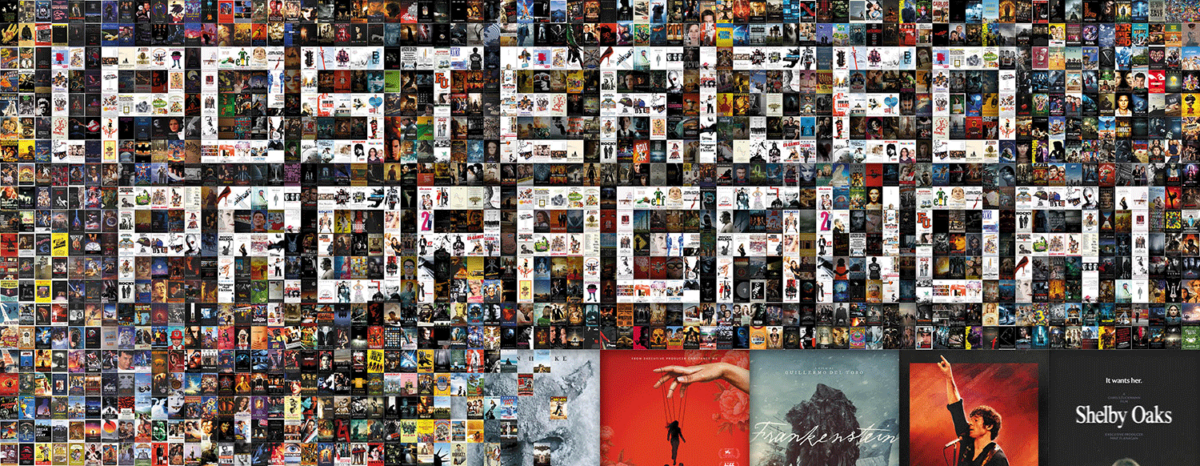
Spooky season arrives with a lot more non-horror titles than horror ones. It shouldn’t be a surprise considering the genre has become a year-long celebration rather than just the routine of good ones opening in October and bad ones in January. I simply can’t get used to studios not wanting to capitalize on Halloween.
Some still slip through, though. Shelby Oaks (October 24) gets a creepy poster campaign. Guillermo del Toro’s Frankenstein (limited, October 17; Netflix, November 7) has a nice diptych. And Ethan Hawke dons an icy mask for Black Phone 2 (October 17).
We’re simply too close to awards season. There’s only so much time to squeeze in all the festival favorites and early recognition means avoiding the risk of being lost amidst the November/December deluge. So keep an eye out for Nouvelle Vague (limited, October 31; Netflix, November 14), Roofman (October 10), and the below as well.
Standing still


Bone Lake (October 3) knows exactly what it is, though, so you can be sure Bleecker Street has it hitting theaters for the holiday. They’re so into the double entendre of the title that they had MOCEAN create a rather risqué teaser to celebrate.
It’s a fun piece depicting skeletons engaged in a sex act––making good on the “bones” of it all. The red tint of the whole supplies an allusion to blood as the bright white of the title pops so our eyes don’t get stuck trying to figure out if what we think is happening is happening.


The firm has multiple concepts with other satirical takes on the subject matter (see “You better have a safe word” and its pierced cherries) as well as S&M and skull motifs. Each entry blurs the line between sex and violence to the point where you can’t tell if the film is leaning into the trope of sex marking victims for death or subverting it by turning sex into the very act of murder. You must pay to find out.
MUBI’s The Mastermind (limited, October 17; MUBI, TBA) is similar in its construction despite being wholly different in tone and execution. It also has a figure standing against a solid-color background, but it is white with red lettering rather than the other way around. As such, we’re drawn to Josh O’Connor’s identity (he is the lead, after all) as opposed to his utility to the scene.
The poster feels like a book cover with its all-caps, sans serif typography enlarging the title and filmmaker text to become the real focal point. The former overlaps O’Connor with the subtlest of opacity shifts while the latter adds a kerning anomaly to better frame him as a piece of a single cohesive unit. The words act as support beams. The “A” and “Film” provide bolsters on either side while the rest of the letters ensure he won’t topple forward out of the page. Simple yet elegant.
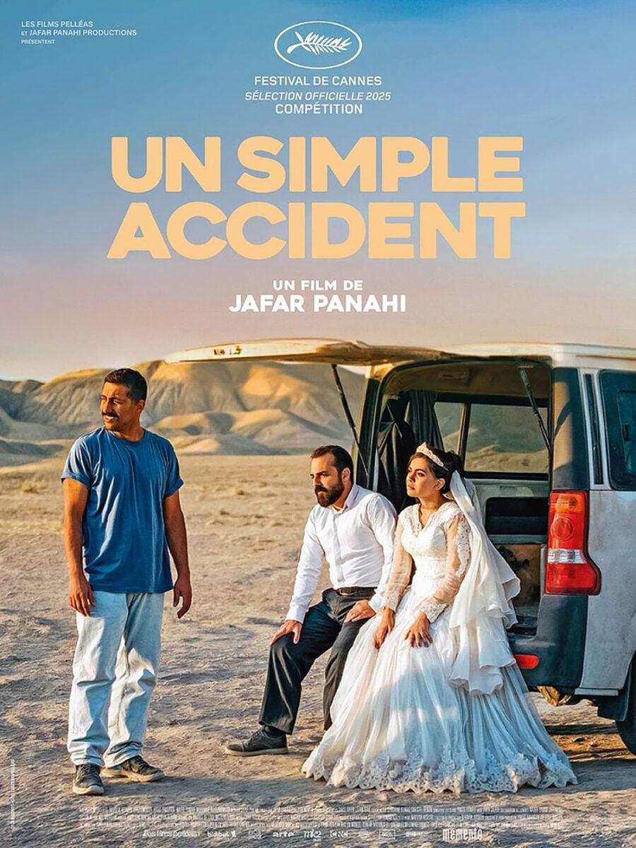
These are words that can also describe Brandon Schaefer’s It Was Just an Accident (limited, October 15)––a wonderfully moody rendition of the original Cannes sheet. The images aren’t identical, but the scene is with bride and groom sitting on the back bumper of a van as others look on in frustration at their horrible luck.
Where they truly diverge is in the crop and coloring. The French sheet takes us in close to capture the three prominent characters in the bright heat of day. Schaefer’s American iteration zooms out to include the entire vehicle and its remaining two passengers beneath a cooler, darker sky that cranks the drama to eleven.
One shows a trio having a bad day. The other reveals a quintet suffering an existential crisis while trapped in a desolate purgatory. The stakes have been raised.
Descending


Netflix rarely delivers a poster with as much personality as Ballad of a Small Player (limited, October 15; Netflix, October 29). That’s not to say there haven’t been good Netflix posters. Just that my head turns every time one drops. Does that mean my enjoyment depends more on the quantity of titles the studio churns out? Perhaps. A gem amidst so many generic film stills does carry extra impact.
The sheet contains a cool image of Colin Farrell falling through water as he seemingly dissolves into an oil spill of monochrome streams, but there’s some effective typography in play too. The balanced spacing of its sections lead our eyes from left to right and up to down in a pleasing way while the text’s interaction with the actor (and his vapor trails) hold everything on the center axis without a need for strict symmetry.
The Chinese characters at left are also expertly positioned to match both the bottom edge of one word and the left edge of another––tucking it in while also providing depth via the choice of coloring them like the shadowy hand nearby. The whole feels like we’re slowly floating down with him, bouncing between each ladder rung to read the title in staccato as we go.
I love the graphical nature of The Ice Tower (limited, October 3) despite it being a photographic composite. The way the icicles layer atop each other to turn the top-left corner into a textured white allows the gorgeous arts and crafts font to remain legible without calling too much attention to itself. The text is colored in a way that mimics the cool hued shadows, maintaining a faux monochrome that perfectly establishes a diagonal mirror onto Marion Cotillard at bottom right.
Her dress is so severely brightened that it ultimately finds itself adopting the same effect as the icicles. The fabric’s ornate embroidery holds a similar textured effect as the ripples in the ice––just enough differentiation to give her form, but not enough to prevent her from turning into a flat field of white. She’s a stalagmite to the ice curtain’s stalactites. Elemental cold falling to meet her rising emotional freeze.
Vasilis Marmatakis also plays with a photographic composite as his Bugonia (limited, October 24; wide, October 31) layers over a picture of Emma Stone with the color and texture of honey and blood. She’s consumed by these fluids. Covered and drowned while gasping for one last breath of oxygen.
Rather than achieve this by snapping a shot while the liquids run down her actual face, however, the filtering effects merging these two-dimensional images lend the finished piece a real-world tactility. These are stains and spills. They feel like something a person in the lobby did instead of character in the film, bringing the viewer into the act of defacement. You want to use your finger to see if anything comes off.
It’s no wonder the title must also receive a typeface so uniquely bold that there’s no risk of being too distracted to read it. The letter blocks prove just as captivating due to them having seemingly been hand cut with a hole saw. Every counter and aperture (even the angled notches in the “N”) has been bored through. Add a circle to the “I” and you can even string them together into a necklace.
Looking beyond


What lurks in the shadows? That’s the question behind the premise of Good Boy (October 3) and MOCEAN’s poster for it. Centered upon Indy (earning his own lead actor credit) as he experiences the strange happenings within a haunted house beside his ill owner, the movie gives shape the phenomenon of dogs suddenly staring or barking at nothing. What if here’s something supernatural that only he can see?
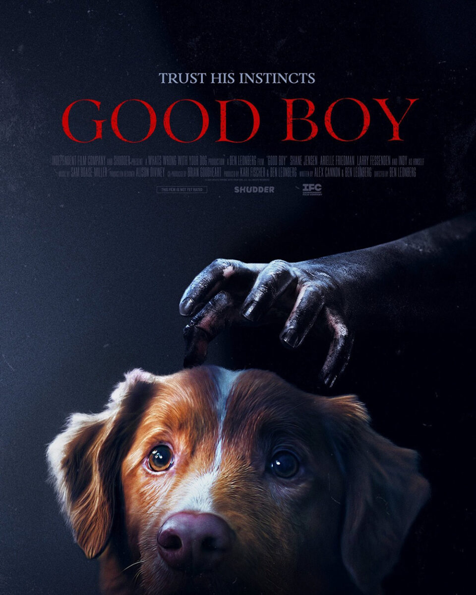
Going the illustrative route is smart because you’re able to enhance that sense of tension and horror by personifying a shadow with outstretched hands as well as construct a lively composition without needing to hope an animal might wield the lighting correctly. This is a movie that took over three years to make considering how problematic a dog’s whims are to acting. There’s no need to mirror that frustration with the advertising.
The multiplication of those hands lends it some great suspense too––regardless of there never being more than one at a time during the actual film. So while the second sheet might provide a better representation of the finished product, it does lose the chilling atmosphere sold by the first. This one is more like a dog falling victim to something bigger than him rather than a dog actively confronting its wrath.
Nikos Pastras takes that otherworldliness to another level with She Loved Blossoms More (VOD/Digital HD, October 3). What’s great about its opened face mimicking a faux Hamsa is that it’s not just an allusion to themes or a surreal depiction of a character’s psychology. No, this is a literal prosthetic creature effect that serves a major plot point to the narrative.
The intrigue it conjures carries a very real payoff that renders its inclusion a no-brainer insofar as distilling the weirdness on display into a single image. Same with the spiritual undertones of its science fiction conceit to reclaim a person from an alternate time/dimension… or the afterlife itself. Is it therefore a God? A harbinger of death? An experiment gone extremely wrong? The questions are infinite and exactly why it’s being used to sell the journey.
I do think the typography could use some shoring up, though. The critic quotes are almost as big as the title while also proving much brighter and more legible to steal its ornate thunder. Add the festival laurels and distributor logo (the latter of which is raised to fit and thus breaks alignment) and the face suddenly becomes too cramped to reach its full potential as a portal sucking us in. That it succeeds anyway is a testament to its power.
And that brings us to the most haunting and beautiful poster of the month: Sam Ashby’s Bogancloch (limited, October 3). Using a high contrast version of a black and white photo taken by director Ben Rivers, the poster transports the viewer to an unknown place that feels quite unlike our own world. Its austerity has me thinking about Hard to Be a God.
Beyond the image itself, however, comes a gorgeous bit of typographical chaos placing each letter of the title around Jake Williams’s prone body sitting in an outdoor bathtub. Rather than hope to know their order, the designer dons a red pen to scrawl a pathway from one to the next. Some are underlined (as is the director’s name at top). Some are enclosed (the “A” in a triangle, the “H” in a square, the “C” in a dashed circle). All are linked by a straight line.
We therefore play a game of hopscotch while also attempting to sound out the name of this Scotland home where the subject calls himself “king.” And since I’ve seen the BBC spell it Bugen Clark, who knows if you’ll get it right? All the more reason to buy a ticket, enter this hermit’s domain, and find out from his own mouth.