“Don’t Judge a Book by Its Cover” is a proverb whose simple existence proves the fact impressionable souls will do so without fail. This monthly column focuses on the film industry’s willingness to capitalize on this truth, releasing one-sheets to serve as not representations of what audiences are to expect, but as propaganda to fill seats. Oftentimes they fail miserably.
It’s kind of insane how the science fiction and fantasy genres have absolutely blown up in the wake of cinema’s comic book onslaught this past decade. Three of this month’s highest profile titles fit the bill and they of course receive the massive marketing budgets the genre provides (in the studio system) to plaster cities in posters. (See Section 1.)
If you want to avoid those long lines, however, November is also overflowing with award-season combatants—many of which are fresh off TIFF, Teluride, and NYFF runs. It’s that time of year where you could feasibly hit the movies at least three times a week and not see a true stinker. Get excited and see them all.
Characters don’t have to be human


Humans are so yesterday when you have animals, wizards, sorcerers, and aliens today. So while we still need humans to play them onscreen and stare back at us on the multiplex wall, make believe goes a long way thanks to menacing glares and special effects.


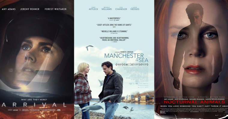
The “animals” in question come courtesy of Tom Ford’s Nocturnal Animals (limited November 18). And if you were unsure that this film was the fashion heavyweight’s work, look no further than every one of B O N D’s character sheets. Nothing irks me more than seeing a name twice let alone right on top of each other. Unless Tom’s cousin Tom wrote it and we’re talking about two Toms, this overkill is beyond annoying.
I understand why you can’t say “Written & Directed” —he didn’t “write” it. He adapted it. So say that. “Adapted & Directed by Tom Ford.” It’s clear, concise, and fits protocol (or at least it should). I loved A Single Man more than some so I’m all about giving Ford credit where credit is due. But this splash of ego is distracting.
As for the posters themselves: they’re not horrible. We’ve seen the trope with WORKS ADV’s BvS already this year to better effect, but the imagery is still striking enough to turn some heads. I think the firm improves the ripped aesthetic at the bottom of their final one-sheet, but sadly the whole of it doesn’t succeed for me. The superimposition of actors is unsettling, but more as a mistake than mood setter. One being portrait and the other full body doesn’t help. Is it a double exposure? If so, perhaps it’ll make more sense after seeing the film.


The wizards are everyone’s (soon-to-be) favorite magic throwers continuing in the tradition of J.K. Rowling’s Harry Potter franchise. Will we like Newt Scamander and his friends in Fantastic Beasts and Where to Find Them (November 18) as much as Dumbledore’s Army? That remains to be seen. WB hopes we will, though, since they’ve already announced multiple sequels despite no true source material to fall back on plot-wise.
If the character sheets tell me anything it’s that we better have our minds ready to sponge up a ton of information because they are jam-packed with it. Besides new roles we’ve yet to meet, there’s also documents, objects, environments, and secrets hiding in the background. I see the Deathly Hallows symbol, a voodoo doll (?), zoo creatures, and a US version of the Wizengamot. Let the adventures begin.
Where those posters fail, however, is in attractiveness. There’s too much going on to divert our attention and overload our comprehension. Concept Arts’ tease fixes this by putting Scamander in an environment with beautiful sunlight and intriguing architecture. This is more mood and aesthetic than an assault of detail. This is world building as an entranceway to prepare for what will unfold. The same goes for WORKS ADV’s foggy street scene. The characters are Photoshopped, but they work realistically in the context of the whole. Welcome to atmosphere, cast list, and mystery.
My favorites come in the form of a mid-point between excess and minimalism, though. The silver mosaic for Comic-Con is prettier in its coloring compared to the overpowering yellow-tint of the gold, but I enjoy the latter’s layout of characters better. I love the angular nature to the geometry and the Art Deco design of both to counter the softer, aged aesthetic of Hogwart’s tapestries. Kudos to the Art Directors—I’m definitely going to enjoy the film on this level of internal artwork if not beyond.


LA’s first round of characters for Doctor Strange (November 4) is almost as busy as Fantastic Beasts. The difference is that the background doesn’t contain anything more than a sense of “cool.” You can block it out of vision and focus on the actor to get a feel for attitude and wardrobe—the designers even made it paler to do so. All those buildings are out-there and off-kilter, but they aren’t pertinent without context. Even so, I do enjoy the starker close-ups on white of LA’s second round. One, they give us a clearer look at details like Mads Mikkelsen’s eye make-up. Two, the distortion waves lend a memorable filter to the bottom half of each that makes it more than JC Penney Studio Portrait.
Like with most, however, the full sheets are still better. Not necessarily the one that’s literally a stripped down version of Benedict Cumberbatch’s character sheet, but the others. I find myself unable to tear my eyes away from the one by BLT Communications, LLC where his fingers are in front of his face but completely see-through. It’s a difficult effect to render on the page, but they succeed beautifully to create levels of depth from background to face to fingers to galaxy swirl of magic.
But the one that’s worthy of wall hanging has to be the wildly painted (almost stained glass-like) IMAX collectible. This is the kind of artwork Tool would have put on an album cover during the early aughts with its trippy, dark motives and almost animated sections devoid of trickery (and more than likely augmented on hallucinogens).


And then we come to Arrival (November 11) to throw a wrench in my thesis and prove humans literally aren’t needed to stare back at us from the wall. When you have something as ominous as a sleek black, halved ellipsis floating in the sky, nothing could be more important. I won’t lie and say the idea of placing them over different terrains doesn’t conjure memories of Independence Day, but the designers do retain a clear sense of mood rather than theatrics. Serenity meets fear.
These are a lot more enticing than Amy Adams and Jeremy Renner in astronaut helmets. Not that these two sheets are bad—there’s some nice effects work and composition to set them apart from The Martian and Approaching the Unknown—they’re just boring by comparison. It’s hard to fathom that a face with emotion is less interesting than a statically non-descript monument, but here we are. Could this be the new monolith?
Callbacks


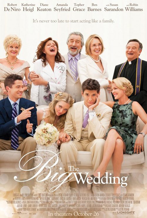
I could have picked a ton of similar posters to LA’s Almost Christmas (November 11), but something about Big Wedding works better than a more aesthetically manipulated piece like Moonrise Kingdom. The idea of characters posing for a “photo” goes back to Robert Altman’s A Wedding and earlier—nuptials as well-worn a reason as holidays. So I guess the comparison is less about what I show and more the tiredness of the theme no matter how effective it is for the subject matter.
What I do like about this one is its almost universal lack of smiles. Danny Glover is happy everyone is under the same roof, but no one else is. Hijinks are obviously going to ensue and family will come together to get under each other’s skin. Is it perfect? No. But it is unassuming with some humor (the scowls), symmetry (centering everything against the fireplace wall), and absurdity (the matching sweaters). You’re either excited to see it or not.
Art Machine’s Miss Sloane (November 25) is less effective on its own terms. The fact that it is breaking down the photo of Jessica Chastain into a stark graphic division of light and dark means it’s trying to hook us beyond the idea of the film itself. There’s no inherent Christmas reunion aspect here—there’s no inherent anything. And when you use the Scarface look you can’t help but make it appear to be an action flick.


But this film is a drama about a power broker. Is she weighing morality? Life and death? Or is the light and dark merely Republicans versus Democrats? In all honesty, I don’t care. My familiarity with Scarface won’t let me stop thinking Chastain is about to wreak fiery vengeance on the Capital. And tilting “Miss” to the side like that so it gets lost in the fray seems like an unconscious way of removing gender. If you want to call to mind Salt, just drop it altogether and call this Sloane.
The tease isn’t much better, but it thankfully isn’t pretending to be something it’s not. The title is bold and legible and the inclusion of the table lets us know the character isn’t going to be mowing people down with automatic weapons. She’s a badass ready to take you down with rhetoric and intimidation. She’s her own weapon.
For Bad Santa 2 (November 23), cold open accurately leans towards raunchiness. It’s an interesting poster with a stark white wall for which Santa and his elf can pop out against, but it’s hardly unique or precise. The graffiti is way too “perfect” (including its drips) and the edges around the characters crisp enough to render it impossible to believe anything we’re seeing is real. The color contrast is truly the only pure success here. And even though Crew Creative Advertising’s Role Models (complete with urination) isn’t much better, it is better.


The final sheet isn’t going to excite anyone but fans of the first who didn’t know a sequel was coming, but it does fix some of its predecessor’s mistakes. Using a close-up of Billy Bob Thornton’s drunkenness is light years better than the blinding white. It allows the artificial font to not seem so out-of-place considering there’s no wall for it to feign verisimilitude. Less is more doesn’t always mean stripped back and stark. Sometimes it deals with the number of moving parts. A photo with text is much less tasking than white space, high contrast, faux realism, and action. And considering how lazy Willie Soke is, this is closer to his spirit too.
November’s most egregious copycat artist, however, is BLT and their sheet for Allied (November 23). It’s attractive in that it has attractive actors readying for a kiss with bright highlights against a pitch-black field, but it’s been done before … by them no less. I really hope Paramount said, “Do what you did for A Most Violent Year, but make it pop with more class and elegance. Give us hard-edged ballroom chic, not softly dressed-down gangster.”


I like that there’s less happening in this one, but I can’t stand the off-center composition. Is it a mistake? Was the poster file cropped wrong? Why else would the gutter on the left side and bottom be half the width of right side and top? It’s horribly distracting and not mimicked to point out a pattern of intent with BLT’s second design—one I actually dislike more. Where did the guns come from? Why are they so plastic? The juxtaposition of wardrobe and chaos is more comical than serious.
Actors reign


I enjoy a well-used film still as poster with expert cropping to find ways to create breathing room for text where some may not have been before. InSync Plus’ Manchester By the Sea (limited November 18) does a great job of this. I simply wish the firm didn’t have to include so much text to almost negate the quality work utilized. Thankfully it is all presented in a rather small font to not overpower us. Sadly the title is too, though, and it gets somewhat lost as a result.
Making the critics quotes the darkest text on the page is another mistake because our eyes get lost in that block. We try to peer lower at the actors talking, but the black keeps us going back up. It’s a shame because this one has the makings of a memorable poster if not for the amount of information packed in. I especially like the foreground seagull blurred enough to ensure Michelle Williams and Casey Affleck prove the only crisp imagery in the shallow focus. But even it gets lost in the whole.

I feel as though I shouldn’t like Creative Partnership’s Lion (limited November 25) due to its overused internet aesthetic of photos separated by borders (generally used to create faux 3D effects), but I do anyway. It works in conjunction with the search bar making the poster into a computer screen of sorts and is clean enough to allow some symmetry both vertically and horizontally. The white is nice too as it never wrestles away interest from the over-exposed photography. And the extreme kerning on the title helps our eyes spread out from the center to see everything surrounding it.
It’s a lot stronger than the tease with nothing but Dev Patel’s mug. The position of the search bar is weird (maybe placing it on his head as though a thought would be better?); the yellow burn of color from glare is unnecessary flourish; and the title no longer has purpose in being stretched so far. Patel fans will enjoy knowing he has a new film coming, but that’s about all this sells.
What will prove memorable this month is Michael Koelsch’s artwork and Fred Davis’ design work on The Love Witch (limited November 11). Similar to the film styling itself on Technicolor pictures of the 1960s, these two artists go back to the days of hand-painted posters to great effect. There’s nothing like the texture of paint to pop next to glossy photography on the wall. Even though the craftsmanship is impeccable, you still know it isn’t a photo and therefore get drawn in to see the detail while spending more time remembering the title.
I love that Davis smartly puts all the text to the bottom so as not to distract from the image itself. The title is compact and noticeable enough in the bottom left with the credits readable against white but small enough to remain as an afterthought to the rest. This is old school artifice at its finest.
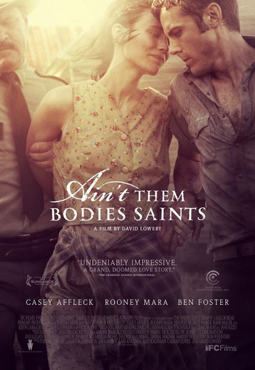
Even so, I find B O N D’s Loving (limited November 4) excels above it in its photo-manipulation. Similar to P+A’s Ain’t Them Bodies Saints, the coloring filter lends a soft, elegiac aesthetic to complement the heavy emotions on display. The title text is slightly porous to feign age and use while the thin border perfectly highlights Joel Edgerton and Ruth Negga in an almost telescopic push in towards the center.
And the typography couldn’t be better with the super small credit block being forgotten (besides Jeff Nichols’ name). We can read the actors names (and who they play) as well as the tagline without forgetting the title is the main take away. The decision to place it on top of the embrace is ingenious too because it ensures the faces remain undisturbed while cementing the love and hope amidst hardship the film will surely deliver.
Atmosphere rules


Hamagami/Carroll, Inc.’s Moana (November 23) tease is all about intrigue by not even bothering to show us the characters’ faces. And why should they? Seeing them means nothing because these are new roles in the Disney universe for which recognition is zero. If you’re going to show anything you put Dwayne Johnson’s name on the top, but they even ignore doing that. All we truly need right now is the tag: “The ocean is calling.” We bask in the scale of the water, the discovery of land, and the cool construction of both Maui’s tattoos/weapon and the raft he sails.


Even better is the firm’s foreign sheet superimposing those tattoos onto the water as a sort of rune pattern to protect them. We’re so far away from the raft now that the scale of this world becomes even larger. Land is less a discovery or destination as it is a distant memory. Who needs it when you have possible adventures in the ocean yet to experience?
You can’t blame Disney for wanting to eventually showcase a bit more detail with Maui and Moana in full regalia (with pig and rooster). Johnson’s name is now included as well as the exposure of myriad deep-sea creatures awaiting they moment in the spotlight. For a film I personally know nothing about, this campaign provides just enough to pique interest.
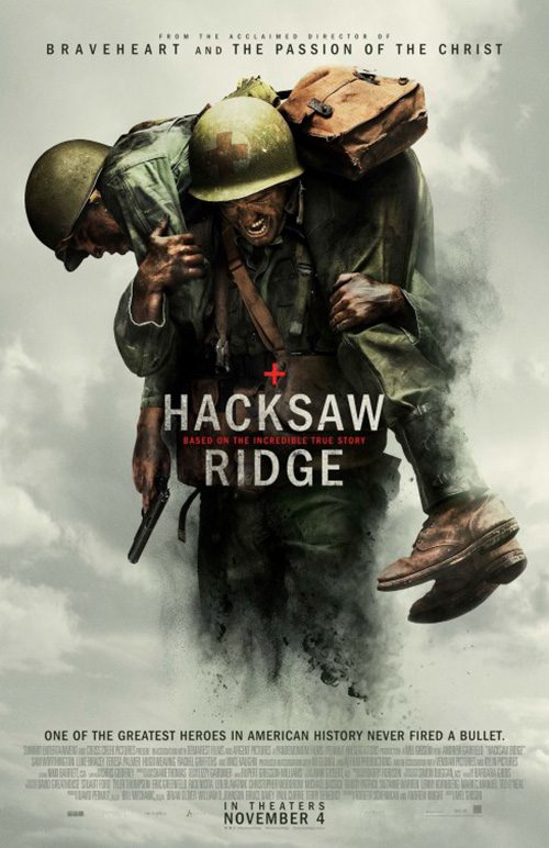
LA has a winner with their tease for Hacksaw Ridge (November 4). This is literally all mood and atmosphere as plumes of smoke, dust, and debris blocks visibility like a wall—yet refuses to stop Pfc. Desmond T. Doss from running directly into it. The lighting is fantastic, the scale overwhelming in a good way, and the title bold without flourish to distract from the soft danger of explosion beneath it. I still, however, find it interesting that director Mel Gibson’s name is only alluded to rather than shown.
The main sheet sees the firm pairing with photographer Cullin Tobin to create another striking image. I find this one’s contrast to be a bit too jarring, though. The dark saturation of the actors against the smoky gray background looks more like they are materializing out of thin air rather than escaping Hell. I do love the improvements on the title, however, with some texture added alongside some red. That plus sign is glowing off the page at what’s almost the exact middle position, forcing us to gaze upon it as the rest comes into focus. There’s some heavy drama here indeed.
There doesn’t seem to be an officially finalized poster for The Monster (limited November 11), but you can’t go wrong with the teaser that’s been going around instead. Without any information besides mentioning director Brian Bertino’s previous film The Strangers and the A24 logo, we’re treated to what looks like a gorgeous pencil and charcoal drawing to get the ball rolling. Is it a mistake to reveal the titular creature before you even sit down? Maybe. But once you see the film you’ll realize the monster has less to do with its intrigue as the relationship between mother and daughter.
The child with teddy bear silhouette is very 80s family film rather than R-rated horror, but that maturation of tone to hit today’s adults’ nostalgia button is in fashion as we’ve seen with Stranger Things. I think I would like to see the trees darker to bleed into the abyss more than compete with the light detail of the monster, but besides that this is a compelling piece of work to catch your eye.
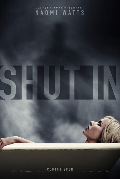
Of all November posters to make a run at Top Ten of the year, however, Switch’s Shut In (November 11) is the one to bet on. This design is by far the most memorable of the month in both drama and beauty. The red title screams at us from the blackness and the monochrome high contrast rest instills a sense of dread you cannot shake. While we’re inside this closet with Naomi Watts, we have more to fear because we can’t see what she can through the blinds.
The distorted perspective adds an unsettling vibe as we teeter trying to orient our vision with the skew and the fear on Watts’ face is enough to make us stop and turn away. This is immensely better than Art Machine’s tease of the actor in a bathtub as a figure manifests in steam behind her. The title as negative space doesn’t quite work without a shower curtain to give it place and the horror feels faked as though the danger will disintegrate when she opens her eyes. In contrast, the other’s nightmare isn’t going anywhere anytime soon.
What is your favorite November release poster? What could have used a rework?