“Don’t Judge a Book by Its Cover” is a proverb whose simple existence proves the fact impressionable souls will do so without fail. This monthly column focuses on the film industry’s willingness to capitalize on this truth, releasing one-sheets to serve as not representations of what audiences are to expect, but as propaganda to fill seats. Oftentimes they fail miserably.
—
Summer is here! Well, at least the summer we hoped to have when the sun was still shining out my window.
Yes, the requisite Oscar bait arrives with a few festival favorites that should make a splash come awards season, but November has a surprising amount of blockbusters staggered throughout as well. At least that means there should be a little something for everyone.
Poster party
 |
 |
 |
 |
 |
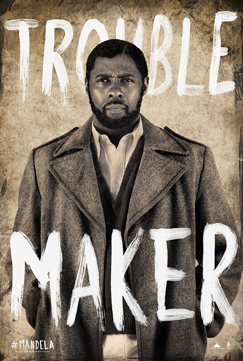 |
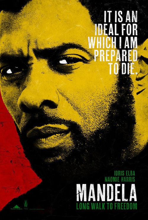
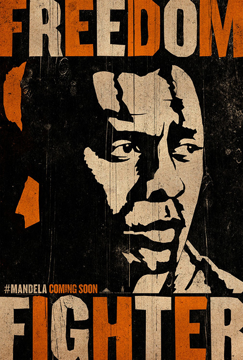
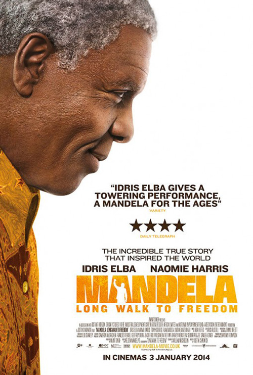
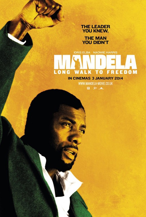
And while we’d generally peg those blockbusters to be the poster hogs with so many variations on the same subject possessing little to no difference amongst them, Mandela: Long Walk to Freedom (limited 11/29) shows how indies like over-saturation too. Whether it’s the rather lackluster buzz out of TIFF or a desire to set it apart from that other Mandela film (Winnie), The Weinsteins are definitely intent on letting the public know Idris Elba is coming.
 |
 |
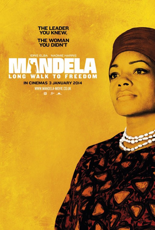 |
Gravillis Inc. went the political route with a high contrast, South African color saturated sheet of its star’s face (and it’s definitely selling Elba over Mandela, no question). It does the job, grabs attention, and sets a tone. Their “Freedom Fighter” iteration is overly busy and confusing to understand; “Troublemaker” looks more like an ad for the actor’s series Luther or maybe a GQ photo shoot more than anything else. I like the intention, but execution lacks a bit of punch.
Old and gray Elba aside, the UK marketing campaign skews closer to the heart of the film with its depiction of the Mandelas as regal leaders readying for a fight. The logotype’s stylized “A” looks a bit too much like Rocky, but I like it. The expanse of white space also proves easier on the eyes than the jam-packed stateside examples.
 |
 |
 |
 |
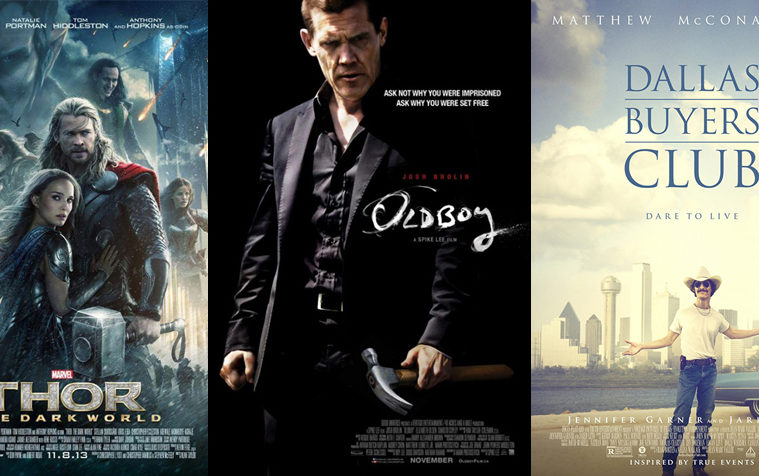
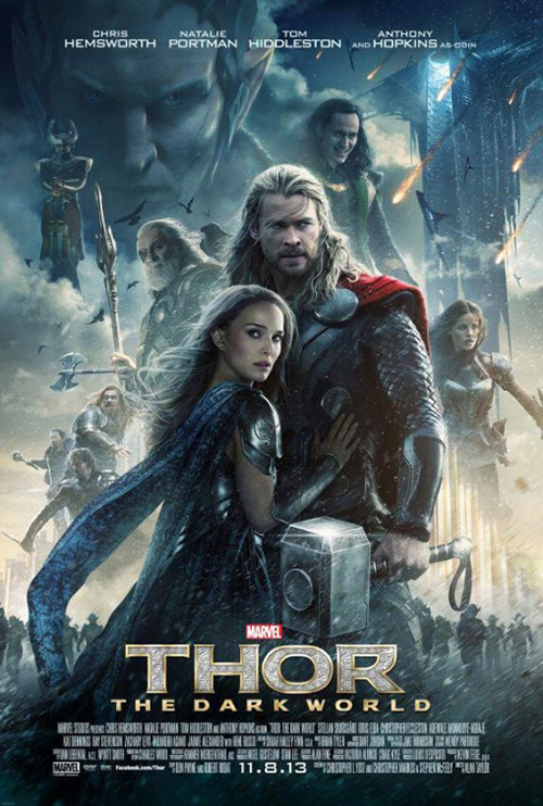
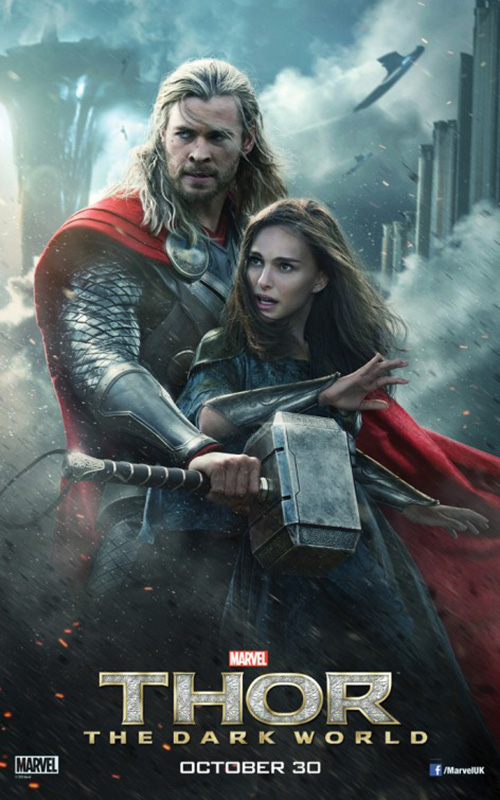
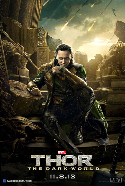
But I do applaud Gravillis’ attempt at doing something different with a sort of guerilla-style assault, because no one would ever think to do that for a film like Thor: The Dark World (open 11/8). No, BLT Communications, LLC toes the usual status quo line for Disney/Marvel with both the titular heroic stance shrouded in lightning debris and the character collage so intent on including everyone that people are floating or disembodied heads Photoshopped into one scene.
What more would you expect, though? Those two are the necessary full sheets that would be much better painted a la Drew Struzan—that’s obviously the look they’re trying to capture. Add in character sheets that succeed or fail on how interesting the actor’s expression is and there’s nothing worth getting properly excited about. The Loki one is fun just because we don’t know what to expect from him and Malekith’s is cool because we get to see a bit of the make-up work.
 |
 |
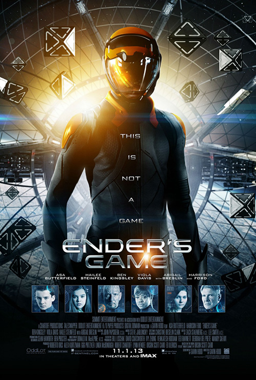
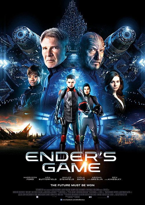
It’s no surprise then that BLT got the job on Ender’s Game (open 11/1) too because it’s the kind of flick that needs a rather innocuous campaign to earn exposure and not alienate audiences from being opaque. The title itself is bigger than lead Asa Butterfield, so of course the main sheet has a shadowed figure at center with his name amongst the rest, but the character montages at least throw Harrison Ford and Ben Kingsley a bone to do their best at selling a film way too many seem to want to boycott for reasons that have no bearing on the film itself.
 |
 |
 |
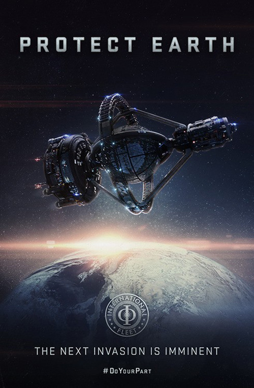
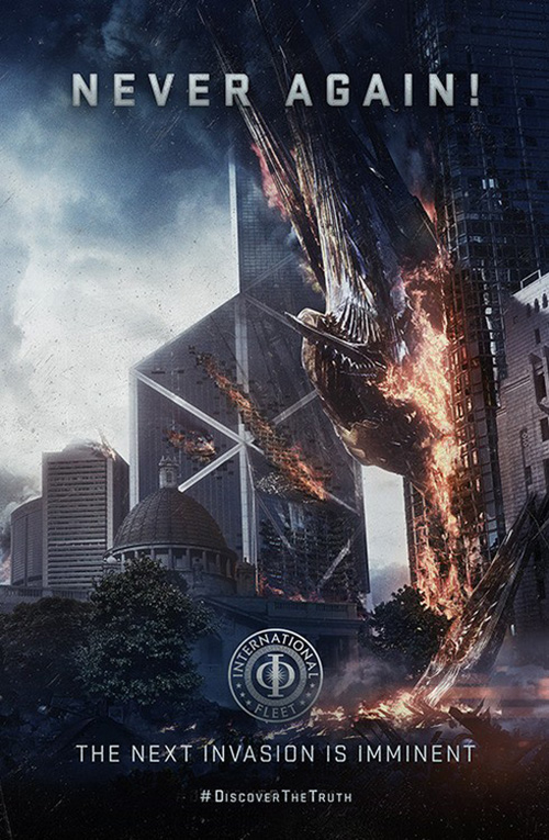
What I do like are the International Fleet sheets giving us some world building aspects. Yes, they’re too flashy and photo-real than one would desire from something that could easily go the road of Uncle Sam propaganda, but the idea is at least fresher than floating heads. In the end, though, it’s usually the Mondo variant that excels above the rest and Martin Ansin’s limited run does it again. You can get characters and exposition in the same frame after all.
 |
 |
 |
 |
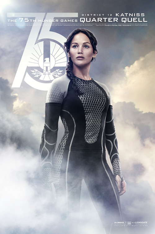
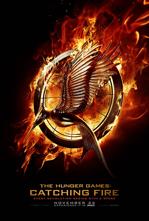
Ignition Print is the winning firm on creating a good mix of aesthetic pleasure and meticulous content-controlled subject matter, however, with their work on The Hunger Games: Catching Fire (open 11/22). I love the canvas-crackled texture and muted, heavy colors that allow a dark cloud to descend on Katniss Everdeen just like the doom and gloom she faces in the book after winning her Games with a middle finger raised to the Capitol. It truly is a gorgeous image.
 |
 |
 |
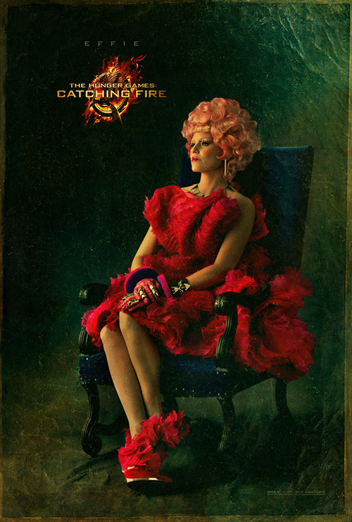
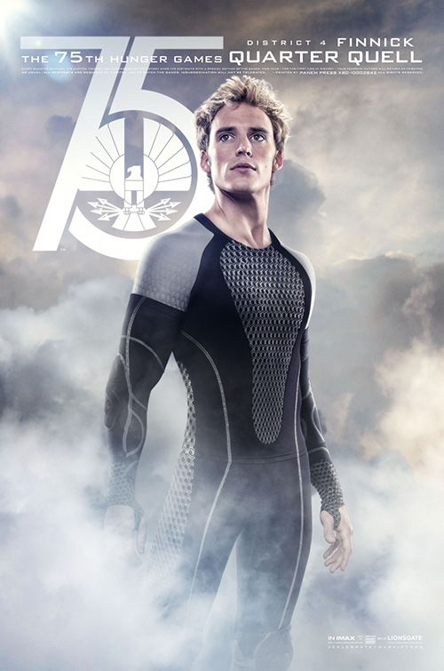
Likewise, the consistency of this filtering on the character sheets add a sense of atmosphere to the extravagant clothing while also instilling the despair that comes with having to look over your shoulders at every move. Ignition goes a bit lighter and brighter with their Quarter Quell series—ironic considering what those characters’ involvement in the 75th Games means—and gives theaters a nice contrast to the dark blacks necessary for the “fire” graphics to pop.
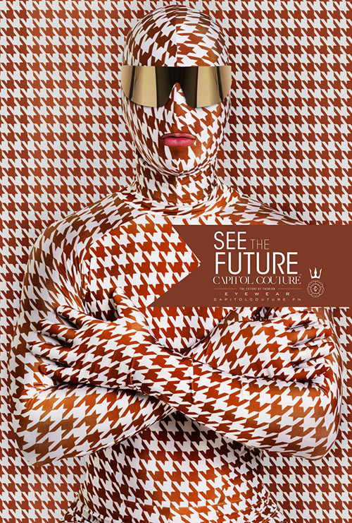
As far as their Capitol Couture goes: I’m not really sure what the firm was going for. The graphics are intriguing and they sell the film virally in a unique way, but I’m not sure any layperson on the street would care. They’d either think it’s a real product or ignore it altogether right before looking at the Mockingjay emblem next to it with a smile that a new Hunger Games is coming out.
Happy Holidays
 |
 |
 |
 |
 |
 |
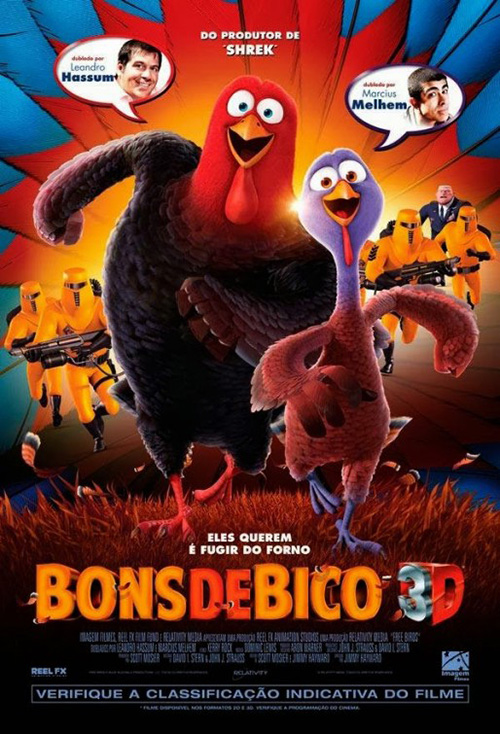 |
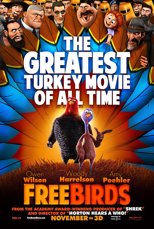
BLT gets in on the holiday cartoon fun too with the “Greatest Turkey Movie of All Time” Free Birds (open 11/1). I guess you can only do so many Christmas and Halloween films before Thanksgiving needs to enter the cycle—so why not let the turkeys roam free?
It’s a colorful entry that has a lot of fun even if it simply hits the usual family friendly checkpoints with the slightly imperfect sans-serif title font, pair of feathered heroes (one with a smile and the other a menacing scowl), and a grabby little girl wanting to play. The headdress feathers are a nice touch to separate the leads and supporting cast, though, as both an artistic motif and deliberate spatial wall while the tagline adds some layered depth to the whole.
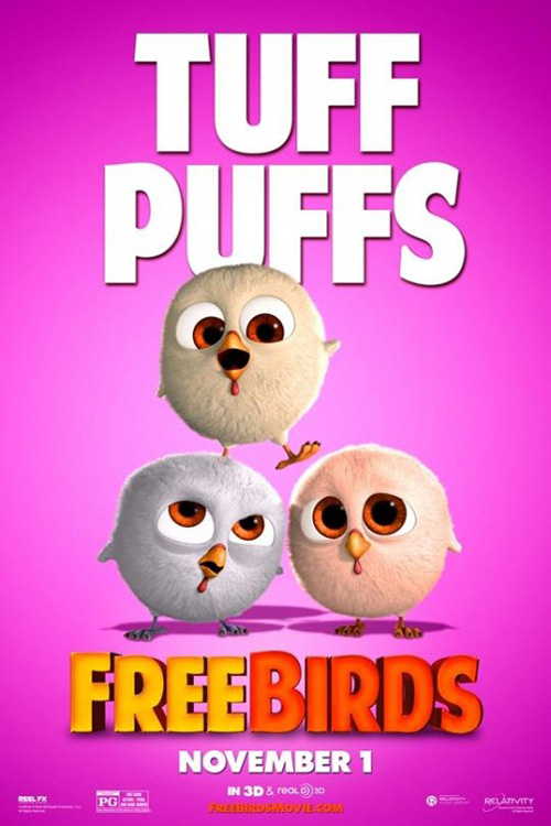
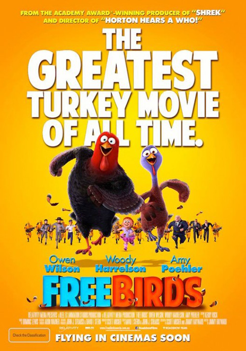
The character sheets by Iconisus L&Y – Visual Communication Systems give the hushpuppies some love as their full sheet has both lead turkeys with gaping smiles while removing most background elements and minimizing the rest. Goofy sells and the foreign sheet simply use the same imagery while also interestingly giving its vocal actors faces to go with their names.
From there we move to Christmas and the rather horrible poster for Black Nativity (open 11/27). Floating bodies of its cast help form a weird diamond in the center of the frame, none are shown singing despite it being a musical, and the snow/glitter/lights effect going on around them is distracting because of its excess and its complete refusal to integrate with what look to be static headshots. The colors are Christmasy so the poster will stand out in that way on the wall, but as a design it does little else.
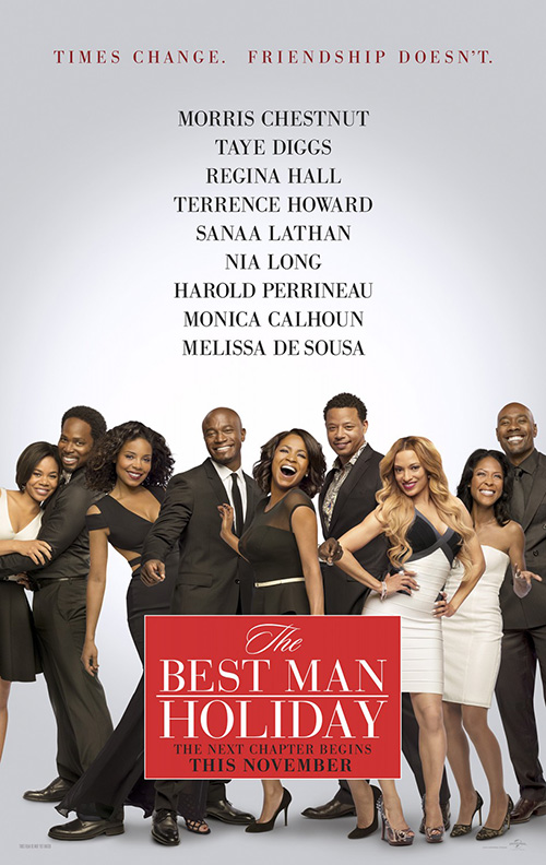 |
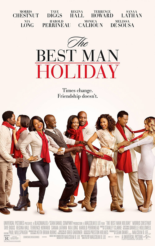
At least Concept Arts spices things up in their nicely minimal work for The Best Man Holiday (open 11/15). It’s about love, couples, and friendship so it’s no surprise that the actors more or less pair off. The Cimarron Group tried the same idea with a darker palette in their entry, but Concept Arts’ decision to give each something to do besides stand and smile is light years better despite possessing the same central conceit. The scarves work wonders in making sure we know who’s with whom, get two to kiss, two to dance, and two to form a sort of heart between them. Add the title not being constrained in an oppressive box and you’ll find yourself breathing easier and wanting to have fun with gang.
 |
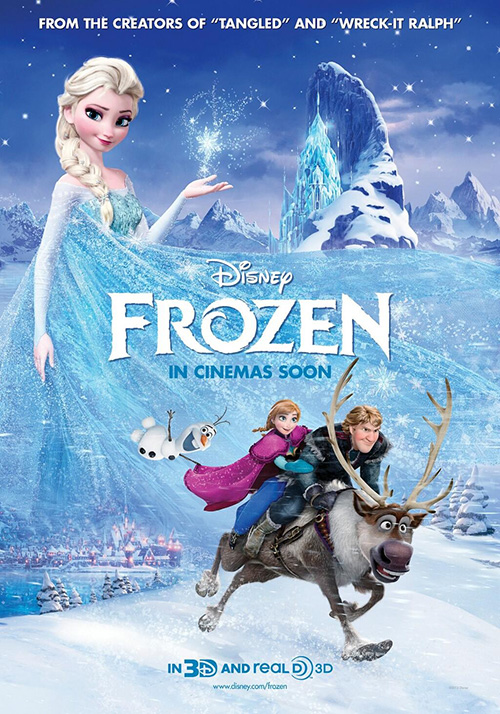 |
Needing some Christmas flavor too, BLT returns to animated fare with Disney’s Frozen (open 11/27). I’m not sure if it’s actually a holiday film or just a seasonal one, but I’m going to include it here anyway and try not to think about how the goofy snowman dude reminds me of South Park’s Mr. Hankey the Christmas Poo.
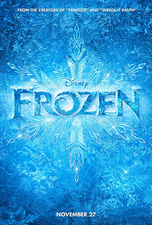
I really enjoy their use of the snowflakes’ translucency piling on top of each other to create a solid textural mass of blue ice and the epitome of cold. I like it better by itself on the teaser, but BLT found a cute way to integrate the cast without overpowering the aesthetic with full bodies. That job was left to Proof and they thankfully do a decent job of more or less putting everyone into a coherent scene with a Tinkerbell-wannabe at top and the mildly insane snowman breaking the fourth wall.
Dynamic duos
 |
 |
 |
 |
 |
Admittedly, none of the posters in this segment are anything to write home about. They get their characters on the page, add some flourishes, and pretty much let the film speak for itself. And I honestly have no problem with that.
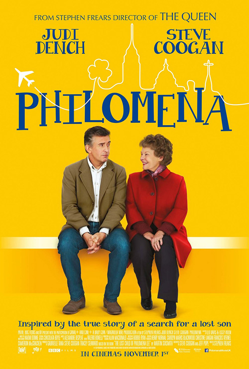
With the first sheet for Philomena (limited 11/22) we get a bright orange field that can’t help but grab your attention. Judi Dench and Steve Coogan are often big enough names to tell you whether you should watch or not, but the additional whimsy from the hand-drawn cityscape into plane motif helps ground us beyond their rather clashing personas. It tells us to expect a nice mix of his over-the-top and her regality.
Gravillis Inc. looks to simplify things by pushing into the image of the actors with a tight crop and you can see how the lack of that drawing changes the tone a bit—even if there’s a romantic bent to both despite his face saying, “Get away from me creepy smile lady.” I could almost see this second one being for a horror flick. Someone needs to recut the trailer stat.
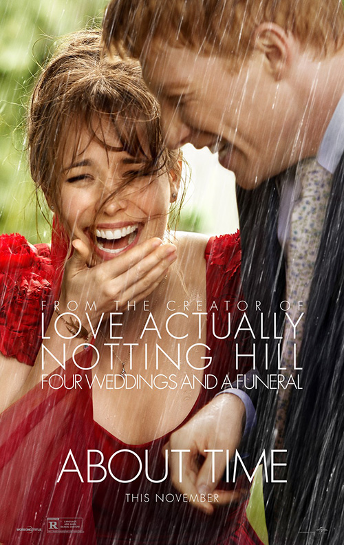
The Refinery’s About Time (open 11/8) makes sure not to add any conflicting emotions besides the joy of young romance. I love the soft depth of focus wherein Rachel McAdams is clear and Domhnall Gleeson is not; the rain looks authentic despite what was probably a lot of post-photo painting; and the text is simple, clean, and elegant. It doesn’t get into the time travel aspect, doesn’t try to shoehorn Bill Nighy into the mix, and lets two real laughs sell the chemistry that surely will be crucial to its success at the box office.
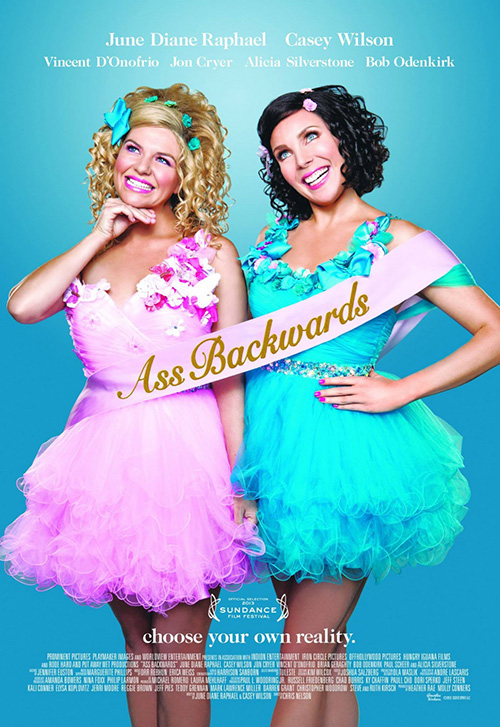
From authentic emotion to fake, I bring you the poster for Ass Backwards (limited 11/8). I’m not sure what firm handled its design but I do like the playful tone they used. The tagline “Choose Your Own Reality” adds to the sense of artifice that rules the image from the posed stances to the over-exuberant grins. Putting the title on the sash is a nice touch as far as integration goes and the color palette really pops their fluffy dresses into neon light territory. I have no clue what’s going on, but I am intrigued enough to discover it.
 |
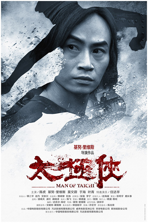 |
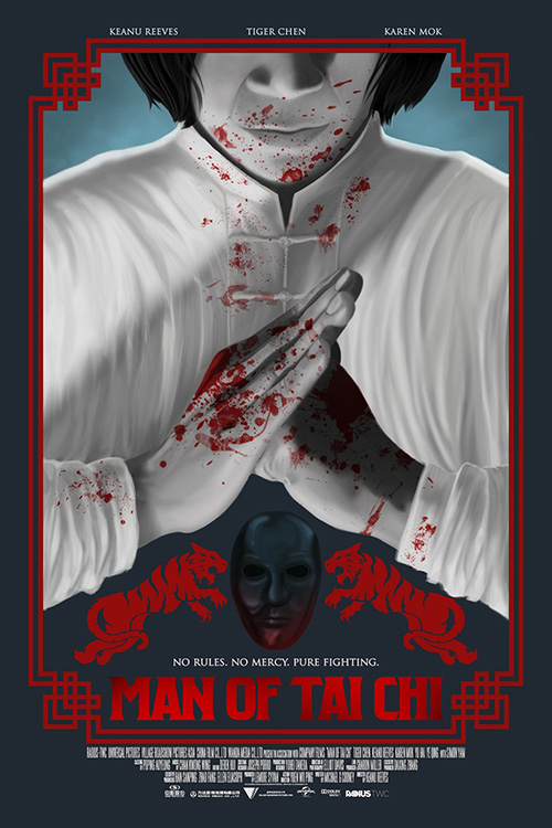
For the pair on the Man of Tai Chi (limited 11/1) poster, Oink Creative went the usual action direction with a nice infusion of Yin/Yang black and white. The severe faces border on laughable, the poses are very staged, and the backgrounds try to recognize their differing “worlds”, but at the end of the day I do enjoy the layout of the text. The title is broken up intuitively with names separated by hierarchy and space. It’s generic with a tough of ingenuity.
The other American release tries too hard to go retro with its tigers and geometric borders, an effect that only makes the illustration more fake than it probably would be on its own. The Asian iteration is conversely appealing for its lack of regimented cordoning. It uses a silhouetted body as a frame for the actor, injects some action textures with motion blurs and debris, and goes all-out on the title’s bloody characters. I also like that Keenu Reeves makes an appearance in the background of Tiger Shen’s photo. It was either a happy accident or a well-planned bit of Photoshop background manipulation.
Playing with space & form
 |
 |
 |
 |
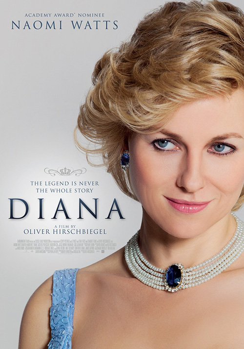 |
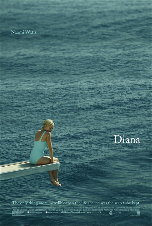
This is the part where the good posters take over. Just make sure you heard that correctly, though. I said posters, not movies because I haven’t heard one good thing about Oliver Hirschbiegel’s Diana (limited 11/1) yet. That doesn’t mean you or I will think it’s bad, but it doesn’t bode well either way.
Concept Arts doesn’t seem to mind and they’ve crafted a great sheet of melancholy with Naomi Watts hiding her face from an expanse of water. It is so much better than Part & Parcel’s headshot that does little more than show off the make-up artists’ work transforming the actress into someone as famous as Princess Diana. There are no crown-like swirls, no superfluity, and not even the director’s name (which is too bad because he had such promise before The Invasion was taken from him by the studio). We know who she is, so give us something that speaks to the movie. They do.
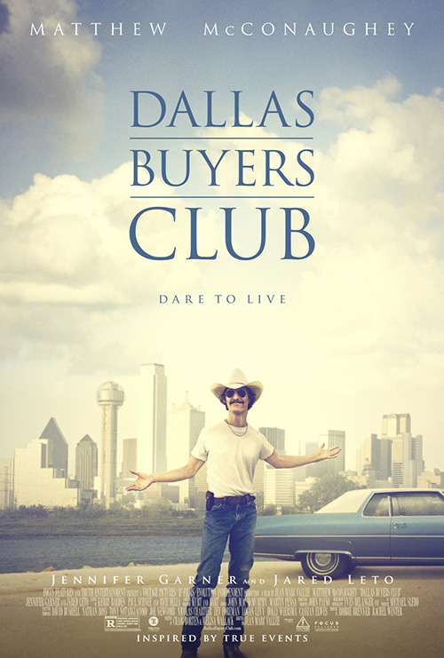 |
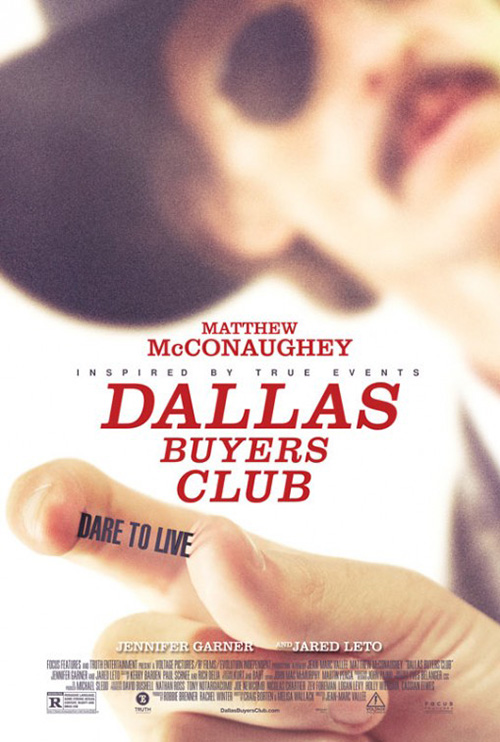
Bemis Balkind follows suit with their Dallas Buyers Club (limited 11/1). I like P+A’s entry with Matthew McConaughey presenting his emaciated body in front of the Dallas skyline—it’s washed out look, the title block’s color, and the vintage feel. But the carefully composed structure of that first tease is simply more captivating. The font is horrible, yes, but how great is that blurry face in the background as compared to his fingers grasping the tag? It guides your eyes to exactly where it wants them to look and that’s a success in and of itself.
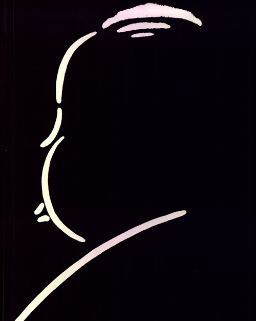 |
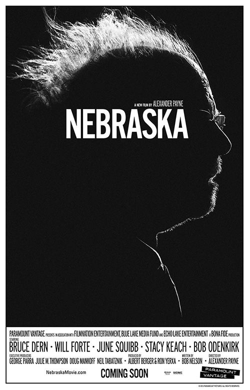
Then there’s BLT getting away from the blockbusters and showing they can still make good posters too. Their Nebraska (limited 11/15) is fantastic with its extreme halo of light peeking around star Bruce Dern’s profile. It’s an eclipse of this character that adds a sense of mystery and suspense akin to the old contour outline Alfred Hitchcock used. The textual layout on the bottom also harkens back to Hitch’s days and gives the whole a look and feel that sets it apart from everything else at the multiplex today.
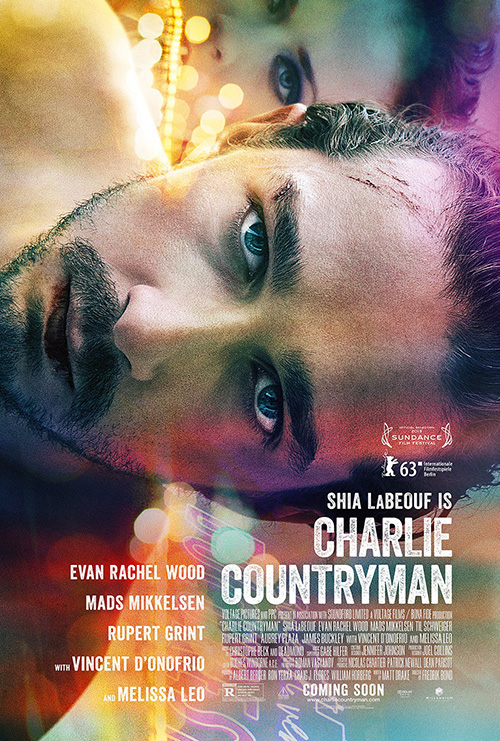
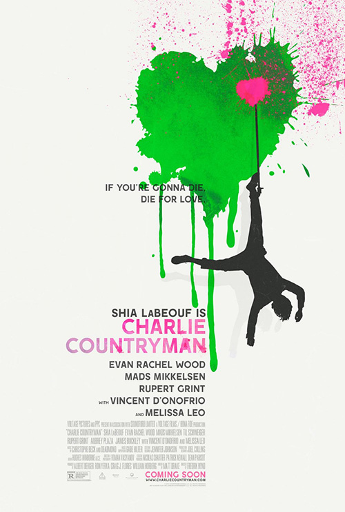
My winner of November, however, is cold open’s entire campaign for Charlie Countryman (limited 11/15). The final sheet is stunning in its 90-degree orientation, the fading glows of lights, and use of translucent superimpositions at top and bottom. The font is distressed yet still concrete in shape, Shia LaBeouf is staring into our souls with pain, and the text and imagery manage to disorient in their competing senses of balance.
 |
 |
This wasn’t the only homerun they hit, though, as the teasers both reach an aesthetic level of interest too. The first is a bit too polished with the falling silhouette very much plopped on rather than integrated in, but I like the way the hearts work with the text in opposing off-centered directions. The second takes this look even further by delving completely into the idea of watercolor paint from the paper texture to the fuzzy seeping of colors around the title, the eye/skyline, and falling man. It’s dreamlike with nightmarish consequences and that’s the feel I believe the film strives to attain.
Revenge redux
 |
 |
 |
 |
 |
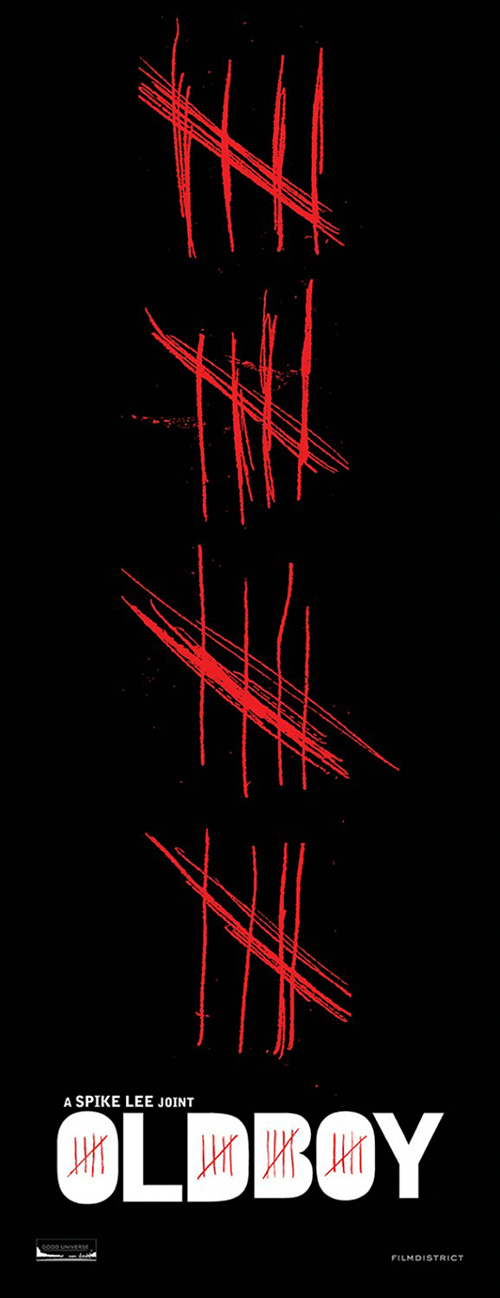 |
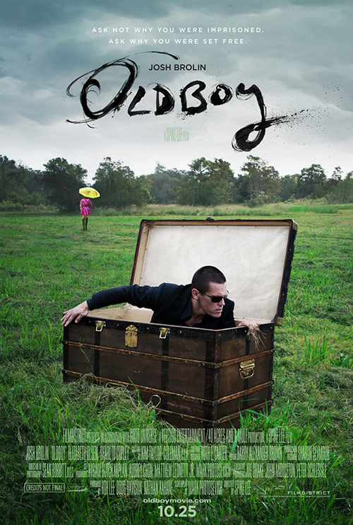
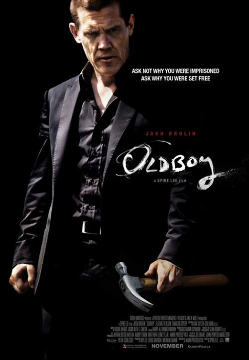
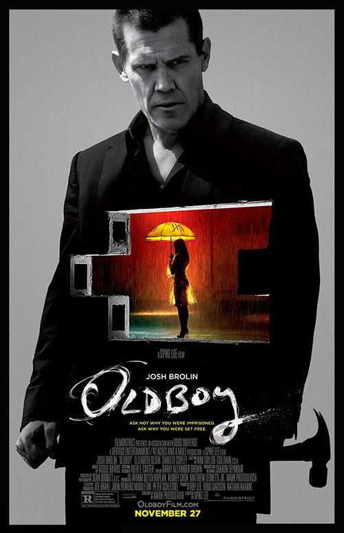
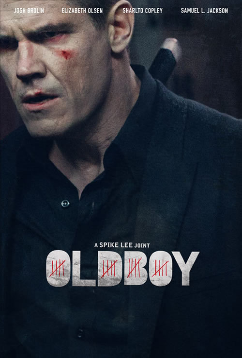
That said, how amazing is the ink swoosh for Oldboy (open 11/27)? I really like the thick sans serif with hash marks as font counters, but that rough, wispy, deep scrawl is iconic. I don’t know who created either since many artists use both across the board, but whoever it was needs to be applauded.
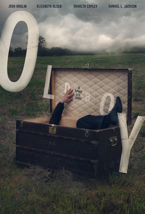
As far as imagery goes, the simplicity of this first sheet says so much that none of the others can. We have Josh Brolin exiting his prison, the girl with the umbrella in the distance that will soon play a bigger role than anyone can imagine, and a beautiful country scene where Concept Arts’ US release of the Korean original went all cityscape.
 |
 |
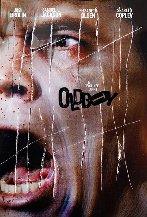 |
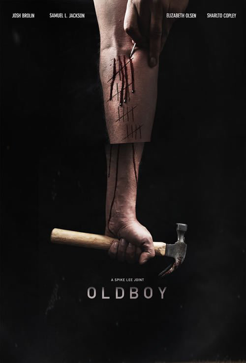
From there comes a straightforward look at the character by Dustin Stanton, a more illustrative variation on the same concept from WORKS ADV, and a nicely cropped close-up courtesy of Juan Luis Garcia. Spike Lee’s usual firm 11:24 Design Advertising adds an entry with nothing but hashes, and Garcia gives a slew of other commissioned work that went unused, but to me that first one is unparalleled.
The more the merrier, though—if you have the budget, why not see what options you can get? This scale of good variety only shows that it’s still possible to craft a visually stunning piece that also toes the company line if all parties are willing to take a couple risks.
What is your favorite November release poster? What could have used a rework?

