May’s artwork looks pretty good. It’s the first month in a while that I feel like I had to leave some worthy pieces out. That’s hopefully a positive sign heading into the summer months and their glut of Hollywood blockbusters. As long as the ingenuity and design quality stays high for the smaller films, they can stand a chance of standing out amongst the glossy photos.
Don’t therefore get excited for any A-listers to grace the frames of the nine titles chosen below. There are none to be found. It’s all mood and atmosphere calling you away from the Photoshopped, template-based character standees—whispering for you to consider changing your purchase plans … or, at least, prepare a few return trips to see whether the films make good on the posters’ promise.
Extra-large


Besides the bold all-caps title and gorgeous full justified text continuing throughout the page no matter how much space it puts in-between words, I really love the color choice for the poster for Solo (limited, May 24) best. It’s a perfectly measured reversal of yellow-orange atop red-orange that ensures legibility and homogeneity so the monotone black image can stand on its own without distraction.
The whole feels like a concert poster in many ways with its lo-fi Xerox photography on a colored page, augmented by the text as both crucial information and aesthetic flourish. And rather than serve as an unbalanced weight ready to fall, the separation of text creates harmony by offsetting that huge title with a block of words that feels equal in scope if not density. The two parts become bookends, framing the image as the focal point. Perhaps even manufacturing a claustrophobic sense of compression, leading our eyes to the middle before top and bottom fully converge.
The sheet for Lost Soulz (limited, May 3) does the opposite by positioning its large title as its center. The bright white letters become the star of the show, but not as an island separate from the rest like so many of its peers. The overlap is subtle, but the bottom of the letters touching the van behind them and the actor above them supplies a unity of place and reality. The text exists as the middle-ground of the scene to create depth and movement as well as a throughline connecting words with image.
And it just goes to show how you can turn what appears to be a still from the film into a full scene with nothing but a gradient sky. You don’t need AI to pretend like it knows what’s going on above this posed portrait of lost souls to expand its world beyond its borders. All you need is a bit of mirrored color to bounce off the reddish earth and enhance the overall sunset/sunrise mood. By matching that tone with a similar hue, you also allow for every letter and laurel to be crisp and clear in a singular white so as not to overcrowd the page or overstimulate the audience. Less can in fact create more.
Which isn’t to say “more” is inherently bad. Just look at the poster for Gasoline Rainbow (limited, May 10; MUBI, May 31). It still uses the vertical center as a grounding line for the whole—it simply tilts it 90-degrees so that the title can interact with the black and white image rather than just lead us to it. And instead of confusing things via the inherent overlap, the artist has found a way to simultaneously render the words star and support.
The color itself ensures the title pops as our initial focus. Its fluid rainbow, like the one found in a pool of gasoline, is everything against the high contrast black and white below. Yet it’s also nothing in the sense that a little bit of transparency turns it into a ghostly echo reverberating around the real subject: a group of people sitting on the roof of a van, framed by the white sun created from the yellow “O” on the horizon.
And don’t think the effect is a coincidence or happy accident. The “O” in “Gasoline” proves as much considering it is as compact as the rest of the typeface. No, choosing to put a circle in “Rainbow” instead of that rectangular ellipse was intentional. So too is the positioning of the critic quote and directors’ names as contrasting black and white knockouts tucked into the title’s negative space so they can pop and/or settle depending on whether your eye is currently gazing at the black or the color.
Obscured


Is it a painting? A photo filtered to look like one? I don’t think it necessarily matters as long as the style of oil and canvas shines through. Because when we’re talking about the Vatican or Catholicism itself, we conjure religious imagery from an era like the Renaissance. To therefore render the poster for Kidnapped: The Abduction of Edgardo Mortara (limited, May 24) in that medium seems a no-brainer.
Chiaroscuro aside, however, I really like the crop here. Rather than simply present the Jewish boy taken and baptized against his parents’ wishes atop a member of the papacy’s knee, the artist shifts the frame down and to the left so that these figures become jammed into the top right corner. By doing so, we pay attention less to the opulence and presumed innocence of the scene and more at the reason this cardinal’s eyes have been cutoff.
The answer is of course so that we focus on the eyes of the boy instead—eyes pleading with the viewer to help him escape. Suddenly the center point is revealed to be his hands, not folded, but tightened in distress. What’s on paper as a simple portrait of a “great man” and the child he’s stewarding towards God is now an indictment on the crime that has made the latter a prisoner to the former.
The Boland Design Company’s In a Violent Nature (limited, May 31) obscures its subject by forcing us to peer upon him from behind. Rather than have a face or expression to latch onto, we only have the foreboding presence of his broad shoulders and hooks in-hand. And instead of facing him to prepare ourselves for an inevitable attack, we must freeze in fear—uncertain of whether he’ll soon turn towards us with a growl.
It proves a welcome tease as a result. One that hinges on the suspense that lies in the unknown. Because despite the title inferring violence and this figure surely serving as a facilitator for violence, we don’t know what’s going to happen. Maybe he’s the hero of this tale. A man driven to fight against evil who thus performs evil acts for good. That’s probably not the case, but our inability to know makes it all the more provocative.
There’s a similar sense of uncertainty in the one-sheet for Evil Does Not Exist (limited, May 3) too. It lies in the juxtaposition of the title and the setting—a promise of peace alongside nature’s serenity. Except that we don’t know whether this watering hole is truly serene. Looks can often be deceiving with nature once survival is added to the equation. Because what is the man in the foreground looking at? What is he helpless to prevent?
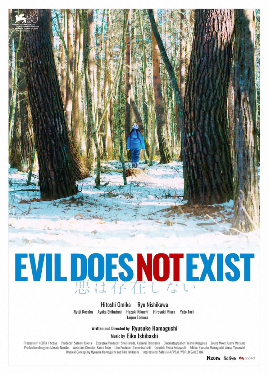
You really get an idea of the film’s themes insofar as man’s impact on nature. Take the two people out of the image and you simply have a beautiful forest vista whose soft focus causes the trees to bleed into the sky like a watercolor painting. It’s the humans that turn things sideways. It’s their presence in a place where they do not necessarily belong that creates the nightmarish reality that the deer in the background is at once predator and prey as much as the little girl running towards it.
That message does come through the festival sheet too, but more from a place of horror than drama. Here we don’t know what young Hana is looking at. We don’t know what has stopped her in her tracks. It’s the sense of scale that creates suspense this time—the notion that this tiny human on a tree stump is surrounded by hulking forms threatening to consume her. Again: evil does not exist … until fear creates it.
Framed


Can’t go wrong with an effective, minimalist tease and that’s exactly what GrandSon delivers with I Saw the TV Glow (limited, May 3). Tight, small sans serif text along the y-axis to create symmetry with the image of a person outlined by the light of TV static. A fun, playful title font of floating balloon letters to lend a contrast to the otherwise dark, Poltergeist scene. And, of course, the outlined ghost turning the “o’s” in “soon” into eyes. I haven’t seen the film yet, but I feel as though I understand the tone exactly.
And I guess that’s all we’re going to get. The movie is out now and there’s still no “full” sheet. That’s the kind of marketing I want to see from an entity like A24—a studio that has literally become a brand genre of its own with fans willing to take a leap of faith on their logo without ever learning about the film itself. Stick to the mystery. Stick to the tease. This enterprise is about getting butts in seats after all. Hook them in and let the movie speak on its own.
Whereas that “frame” was about creating a light source for the image, the one on the poster for Songs of the Earth (limited, May 24) is about focus. Because while one might assume an amazing photograph of mountains reflected in water is meant to advertise a documentary about the land, this is a much more personal look at the story of a man upon that land. This is about director Margreth Olin’s father.
That said, the image is amazing and able to turn heads at the multiplex alone. Yet there’s something powerful about that simple rectangle drawing us in further. It’s as though we’re given two posters in one as the camera zooms in. Here’s the landscape, but, wait, lets push in a little more. That frame within the frame is where the text lies—an overlay providing an intentional space without fully sacrificing the breadth of what’s outside its margins. Because even if this documentary is about a man, the place is just as important. One does not exist without the other.
The image I can’t get out of my head most this month, however, is Blackbird Blackbird Blackberry (MUBI, May 14). What a stunning piece crafted with layers upon layers of windows, surfaces, and collage. Initially appearing to be a photograph of Etero placed upon a light red background, the work actually proves to be an image of her upon a purple background placed upon that red. The simple act of letting her elbows stick out of her original frame creates a matte-like construction that keeps her centerstage in a modern, collaged portrait.
The details are therefore added intrigue. The blackberries of the title floating in front of and behind her figure. The streak of juice slashing diagonally across the middle and the puddle at the bottom supplying a sense of mortality and conflict. Etero’s pose buttoning (or unbuttoning) her blouse acting as an invitation in and a cue for us to leave. It’s a composition built upon duality much like the film itself and its subject’s decision between independence or love.