“Don’t Judge a Book by Its Cover” is a proverb whose simple existence proves the fact impressionable souls will do so without fail. This monthly column focuses on the film industry’s willingness to capitalize on this truth, releasing one-sheets to serve as not representations of what audiences are to expect, but as propaganda to fill seats. Oftentimes they fail miserably.
Welcome to June: The Summer Month of Sequels with five such examples ranging from, “That could be cool” to “Who even wants that?” There are a couple studio pictures with a modicum of interest attached worming their way in and A24 is thankfully bringing out two of its latest to help us cope.
So while there will be a lot of new posters at your local cineplex, most of them will be for the same movie infiltrating half the screens available that weekend. Money talks, though. If we keep giving bloated shlock millions and millions of dollars we’ll not only condone their monopolizing theaters — therefore diminishing the number of screens good indie cinema can inhabit — but also unwittingly demand they give us a Part 3.
Summer style quantity


Does it feel like it’s been twenty years since the first Independence Day exploded into theaters by destroying the world’s most iconic monuments? Actually, it does feel like twenty years — maybe even more. But that hasn’t stopped Roland Emmerich from delivering on his promise long ago to let the aliens return.


Everyone is back save Will Smith (and Mae Whitman, a glaring omission considering her character is still involved), but do we care? No and neither does LA who decided to give us the aforementioned monuments in differing states of disrepair. Fox knows what we want and it isn’t an older Jeff Goldblum or Bill Pullman gracing their posters. Independence Day: Resurgence (opens June 24) deserves better than that. It deserves special effects.
These posters aren’t bad, but they aren’t interesting either. In fact, the only thing they make me wonder is why the designer bothered moving the spaceship’s orientation and size from one to the other. There aren’t any lasers to line-up this time so maybe it was just a trick to make us think more care was taken than actually was?
Opposite these “character sheets” is an homage to BLT Communications, LLC’s original sheet from back in 1996. The craft has been improved — or at least I think it has considering we still haven’t come close to making anything similar in real life — and its target zoomed out from city landscapes to global continents. LA even went so far as to cater to each region by allowing them to be their own objects of destruction from America to Europe to South America to the Pacific.
Will people still care enough to buy a ticket off of nostalgia they may not have?


LA is also the firm of note for the sequel I’m certain many are still scratching their heads about: Now You See Me 2 (opens June 6). I personally enjoyed the first one and am looking forward to seeing what the filmmakers have in store this time around (although it was a missed opportunity not calling it Now You Don’t). Summit seems to think I’m not alone in this curiosity because they have commissioned not one, not two, but three character sheet series to promote it.


This first is flashy in as obvious a way possible. Mirrors cause illusions — especially when reflecting reflections to infinity — so the gimmick is hardly inspired. Neither is the title abbreviation to NYSM2 which for some reason keeps making me think of N*Sync. Michael Caine is wearing white while the others aren’t; Daniel Radcliffe gets cards to flick (resulting in the best of the bunch) while everyone else stands stoically in their Frank Ockenfels portraits. Meh.


Round Two is more unique if no less exciting. LA now goes retro with old school magic show ads recalling hand-painted work of the Houdini era. Each of the four main characters receives a showcase for their specific acts and we enjoy the vibe if not the attempt. The ballsiest aspect is actually what’s missing: the title. It’s asking a lot of the audience to remember people’s names from the first film and possess the ability to parse them together. “Oh, that Jesse Eisenberg magic movie? What was it called?”


Where the firm gets it right is Round Three. They’ve spelled the name out this time — but retained the disquieting removal of the right edge of most of the first letters to each word — and decided to create their own magic for once. Playing off the tag “Reappearing” allows them to use transparency filters so characters and backgrounds merge into a fascinating image that should capture attention. It’s a cool effect and gives the movie some nuance unlike the weak Photoshopped “house of cards” labyrinth baring just enough resemblance to the first film’s poster to be prove worse as a result.


The first film in this section (and possibly the only one) that warrants character sheets is Teenage Mutant Ninja Turtles: Out of the Shadows (opens June 3). These turtles spent a long time as action figures — I know because I used to have a set along with the quickly recalled Pizza Thrower that appears to have been reborn for the film — so giving them each a spotlight is crucial to hitting today’s youth wanting to see their favorite on their wall. This doesn’t mean it’s okay to just slap them on a poster with lens flares and motion blurs, though. At least Donatello has a drone to help give his a sense of place rather than flat cityscapes like the others.


Some may say BLT’s second series is more boring as a result of removing those post-production quirks, but I disagree. Their statuesque poses on the ledges of skyscrapers give them a heroic edge. These are warriors with courage and confidence, not cartoons jumping through the air. They’ve earned their Batman shots of peering down on the city they serve to protect. There’s a story here.


That said: I’d rather the group shots to just get this whole thing over with. Having them on the same ledge together earns the same regal quality of hope, the angle from below adding even more prestige to their God-like visage. Give the humans their own spotlight separately (Hi, April and Casey!) and call it a day.
Or — and this may be my nostalgia talking — burn all of these and settle upon Dave Quiggle’s grungy illustration of the clan riding through the streets.


Finally a non-sequel! Although I’m not sure the appeal of Warcraft (opens June 10) garners more fervor than a sequel would. Most people aren’t aware of what the MMORPG is and a select few are excited simply because Duncan Jones is the director (I fall in the latter category). Fantasy is big business and this could be good. Sadly the more I see of it the more I wonder if Jones fell prey to the Hollywood machine. Fingers crossed that he was able to stamp it with his signature sci-fi style regardless.


If he did, however, these posters from Concept Arts don’t show it. Self-important poses by characters we don’t know or care about? No thanks. Ben Foster looks more computer-generated than the orcs, Dominic Cooper’s non-existent soapbox makes him look like a giant, and Paula Patton seems to have been contractually obligated to not look like the species she plays. This doesn’t bode well.
Universal should have stuck to the teasers because they deliver promise and mystery. I loved those ComicCon weapon shots of Horde hammer and Alliance sword. They piqued interest rather than rolled eyes. Even Travis Fimmel in sandy repose makes us wonder at the majesty of the film’s scale. This is Man versus Beast with allegiances thrown in. Show us that, not pretty people who are too pretty to be hidden under CGI.


All is not lost on the character sheet front thanks to cold open, though. Their series for Finding Dory (opens June 17) is great. The name says it all and the Where’s Waldo idea to place Dory in the middle of random undersea foliage is inspired even if it’s easy to spot her. This concept has to have little kids going wild, pointing to her blue face while screaming to their parents that they found her. It’s the makings of a cute movie theater experience — or abhorrent one depending on your enjoyment of kids screaming in public.


The final poster by Legion Creative Group is okay, but it lacks this interaction. Dory is in the center, Nemo and his father are brightly below her, and the rest is muted to be lost in the water so only blue and orange pop out. Even the new octopus character is lost in the bottom right corner thanks to shadows. It’s as though Pixar said, “We need all these things, but we don’t care how you put them in.” Credit the firm for fitting them in, but it’s too much.
The only way you can improve on the hidden picture trope is to go even more minimal. Look at the teaser for proof. “She just kept swimming …” Yep. There she goes. Perfect.
A face for movies


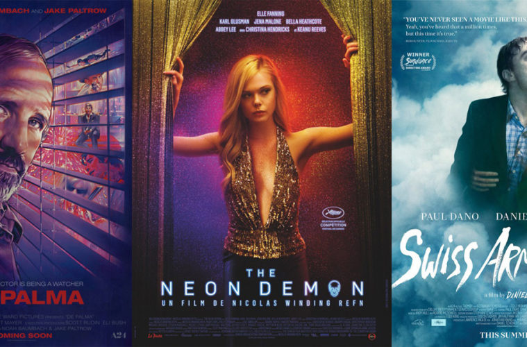
Sometimes a face is enough and BLT proves it with their poster for A24’s De Palma (limited June 24). This is what is being talked about as a definitive documentary about the master director so why not let him advertise it himself?
What makes the design great is the way the illustration includes glimpses of his films. There have always been comparisons between De Palma and Alfred Hitchcock as far as suspense goes, so having him peek through open blinds is a nice stylistic touch. Inside each gap is a painted still depicting Carrie, Dressed to Kill, Blow Out, Scarface (Pacino gets two slots), The Untouchables, or Mission: Impossible. When you have them all together like that it just shows how prolifically good he’s been throughout his career.
The color scheme provides a nice mood for mystery, the red text a bright flourish to earn attention and stand-in for a foreboding sense of blood. It may not do anything mind-blowing, but it does everything it needs.
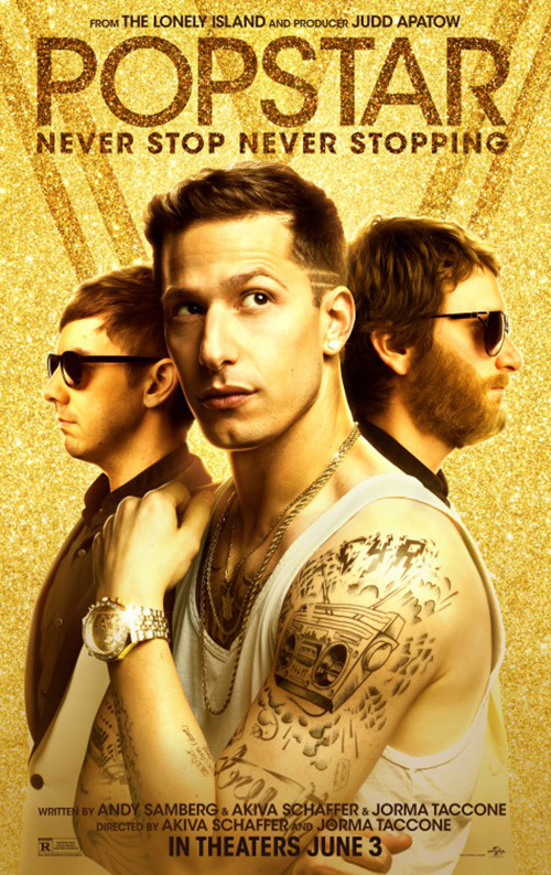
The same can be said for LA’s Popstar: Never Stop Never Stopping (opens June 3). This send-up of boy band and celebrity is about the glitz and glamour with money moving mountains words cannot. We don’t even care about Andy Samberg doing his Backstreet Boys pose with wife-beater and tattoos. All we see when looking at this monstrosity of sparkle is the golden shimmer. Gold? Diamonds? Camera flashes? Whatever it is we get the point thanks to its ironic use.
Its counterpart with all three Lonely Island boys is so similar and yet not nearly as effective. The designers made the title more visible — to its detriment — and added designs in the sparkles to temper its overwhelming excess. The irony is absent here to the point of laughing at it rather than with this time. It’s a fine line.
For Hunt for the Wilderpeople (limited June 24), one face in close-up is the best image when compared to ensemble shots or collage. We don’t know who this kid is or what’s happening with battle markings on his cheek, but there’s enough quirk to accompany Taika Waititi’s name to make us want to find out. His glare is cutely rendered and menacing just the same. I also like the playful logotype title — font and illustration alike.


InSync Plus retains the title icon for their equally playful profile portrait of the boy, Sam Neill, and a boar. Yes, a boar — wailing into the sky no less. Add the tagline “Nature just got gangster” and you have me chuckling on the floor in anticipation for what this could all mean.
Both Jeremy Saunders’ photo collage and Hadley Donaldson design based around a Ben Wootten painting just don’t quite match this feeling. They’re still wild, but with so many characters you start to imagine scenarios that were out of reach before. It starts to look generic and loses the appeal that got me excited in the first place. Gravillis Inc.’s graphic jacket tease for its American release is no better. I see weird but not charming. This is one I’d probably glance at and forget shortly after.
The face that’s sticking with me all the way to opening weekend, however, is most assuredly Vera Farmiga’s on Concept Arts’ poster for The Conjuring 2 (opens June 10). It doesn’t quite do what the original’s advertisement did with subdued colors and consuming flame, but there’s still a suitably creepy vibe happening that goes beyond cheap scares.


We see the fright in Farmiga’s eyes, the crucifix’s prominent positioning no coincidence as she hopes to dispel the demon in her sightline but out of ours. I don’t love the title — its clean, metallic look seeming more Saw than anything else — but it isn’t a deal breaker as far as the whole design goes.
cold open’s selection fits that Saw aesthetic much better and as a result fails to elicit the same visceral reaction as the other. Like the Wilderpeople collages, this one is drowning in a pool of generic water. The crucifix is now a prop rather than integral piece. The removal of Farmiga’s face removes her fear and the child in the window really seems inconsequential. The owner of the hand doesn’t seem worried so why should we?
Made you look


The beauty of Wiener-Dog‘s (limited June 24) poster is that it literally makes you look because it’s easy to assume you’re spying upon the ad-slick for a documentary. Not only is the title a noun, what it represents is also displayed — albeit only half of its full figure. There’s so little happening that you almost miss the fact of there are names of actors in the top left.
This detail is what draws you in. There’s too many to be narrators so is this not actually a film about wiener dogs? You search some more and eventually hit Todd Solondz’s name at the bottom to make everything much clearer before looking it up to discover it’s about a dog after all. Or at least it revolves around one.
P+A’s Swiss Army Man (limited June 24, expanding July 1) catches your gaze mostly because of the size differential between actors and island. This type of image is generally reserved to show how tiny and alone castaways are on their deserted homes, but for some reason Paul Dano and Daniel Radcliffe are giants. The tag arrives with “We all need some body to lean on” and the scale makes sense because it’s the leaning we’re to focus on. But why is it “some body” and not “somebody”. Well, if you’ve seen the trailer you already know.
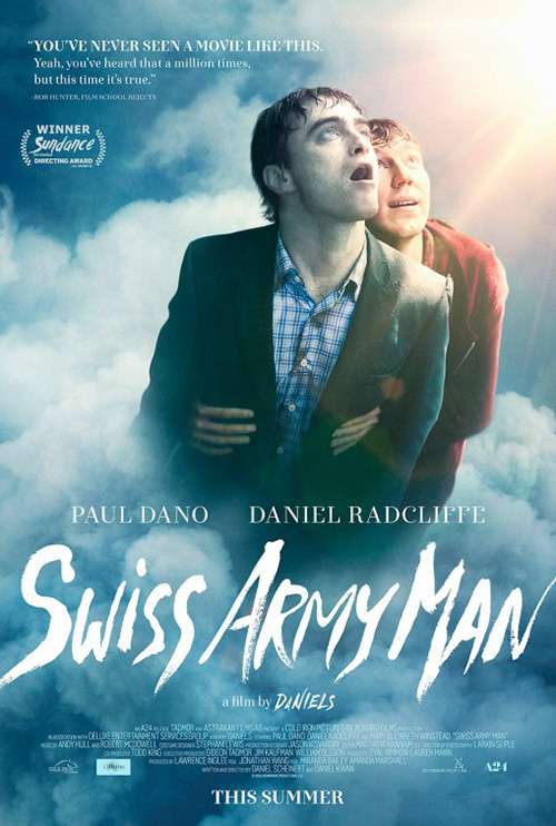
I’m really glad the designers didn’t try and make Radcliffe’s dead corpse into an actual Swiss army knife — although they surely had a few mock-ups to show A24 just in case. While doing so would have been funny, I think it’d have been too strange. Even going so far as making him Inspector Gadget-like with multiple views of him doing different things would be too much. This works as it is with Dano’s unfazed expression and the large scrawled font above. It’s just odd enough.
The second sheet is an example of going too far. I don’t hate it, but it’s difficult to tell what’s happening. Is Radcliffe singing? Burping? Catching flies? Is Dano carrying him or the other way around? It looks like he’s propping Radcliffe up like a mannequin despite my knowing he’s not. There are too many questions and they aren’t the open-ended kind. They irk me instead. At least we get some sumptuous clouds, though. The juxtaposition of them against death is a nice touch.
I’m a big fan of BLT’s The Shallows (June 29) because it forces me to look deeper at what’s not there. The sense of dread movies like Piranha 3DD deliver by showing its monsters in the poster is subverted by looking up at the victim as though we are the monsters. Think Jack Goes Boating but in reverse. Gone is the melancholy of isolation and introspection atop a calm sea and in its place the false sense of security that calmness supposes. You think you’re okay until it’s too late.


Good on Sony for letting this poster fly without Blake Lively mucking things up. For once she appears to have found a project bigger than her celebrity and I hope the partnership with Jaume Collet Serra pays off. It’s not about us wanting her to survive whatever danger lurks; we yearn to discover what Serra has in store for her.
The international posters miss this point by putting the shark in frame and Lively’s face in a prominent position to gawk at. Scale is no longer frightening these days, though. We assume the creature from beneath will be massive, so showing it early only helps us not care. The anticipation of being surprised by a creature we haven’t yet seen is what puts butts in seats. Tell us instead that it’s Lively in what may be a film with no co-star and we start to get second thoughts about whether we want to spend our time.
LA is going all Carrie on their English-language sheet for The Neon Demon (limited June 24), but ultra chic Carrie. Rather than an a-hole kid wreaking havoc on the loner at prom, Elle Fanning appears to have willingly doused herself with blood-like thick paint to make a statement — bejeweled eyes turning her into some Mardi Gras creature hypnotizing us to ignore the title at the bottom completely. Throw a black light on this and snap a new photo and you get a trippy horror if I’ve ever seen one.


It’s funny: you could slap this title on any of the posters from Nicolas Winding Refn’s last film Only God Forgives and it would make more sense. But maybe that’s the point. He’s done the neon glow, now it’s about what is placed underneath. Just look at the Italian ad from Vertigo Movie Advertising and how its neon frames the true object of our affection. The blood is real this time and the pose that of the dead. The font is authentically rendered, the triangles razor-thin. It’s sleek, sophisticated, and mysteriously sexy.


As for the French, just because it’s the most straightforward doesn’t mean it’s any less visually stunning. The designer uses the sparkles of the fabric curtains to mask the grain (or vice versa), Fanning’s gaze a quick glance to signify her moving towards us rather than her attention being stolen away. The neon title isn’t as effective as the previous version, but it gets the job done. I wish it were one continuous tube from letter to skull a la Only God Forgives (again), but maybe that would have been too much. This is about fashion, beauty, and intrigue and each poster has succeeded conjuring all three.
What is your favorite June release poster? What could have used a rework?