“Don’t Judge a Book by Its Cover” is a proverb whose simple existence proves the fact impressionable souls will do so without fail. This monthly column focuses on the film industry’s willingness to capitalize on this truth, releasing one-sheets to serve as not representations of what audiences are to expect, but as propaganda to fill seats. Oftentimes they fail miserably.
April is here and it’s a quiet month. Well, it is for blockbusters at least as theaters will still be jam-packed with releases. The biggest one—Furious 7—is out the first week, though. You know what that means: it stays up through May.
Otherwise we’re receiving a lot of small films with varying rollouts and the odd studio picture thrown in for good measure. This means the chance for a lot quality design and for the most part publicity firms have taken advantage.
(Yes, Paul Blart: Mall Cop 2 does come out April 17th. Don’t remind me.)
High concept trumps convention
 |
 |
 |
 |
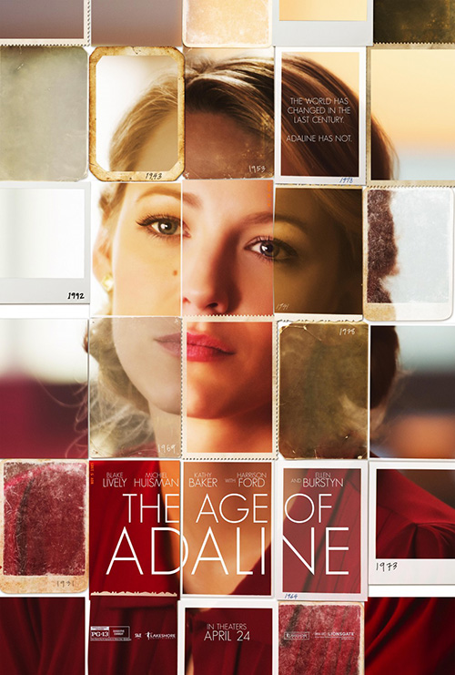
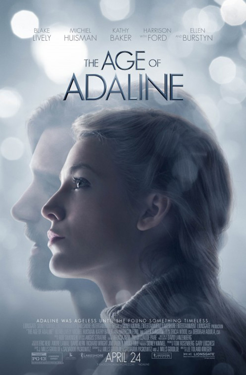
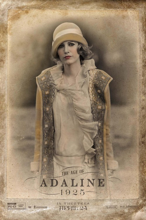
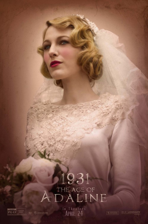
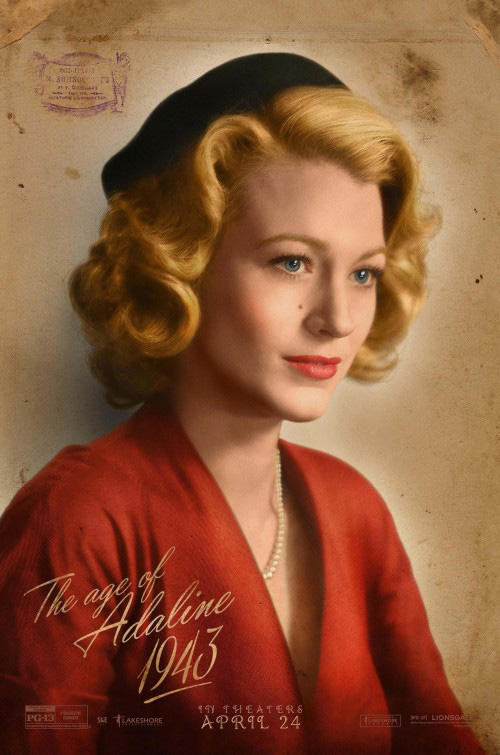
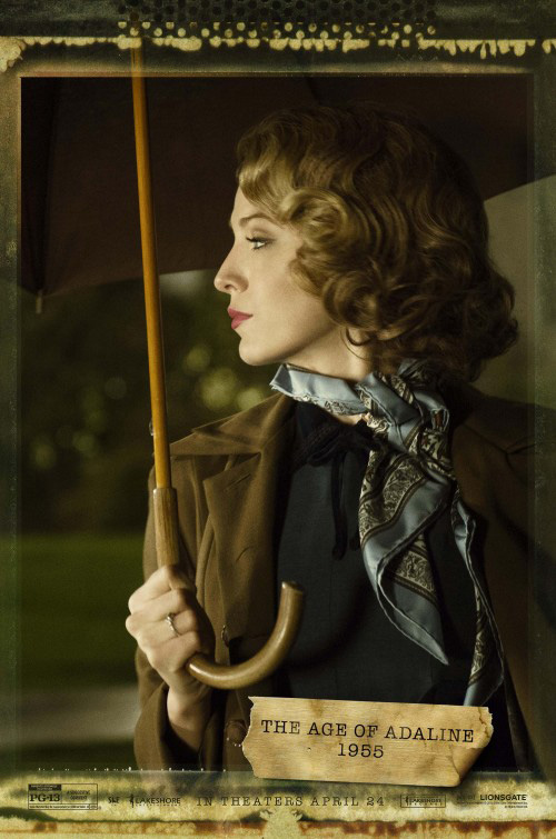
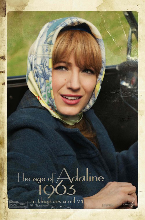
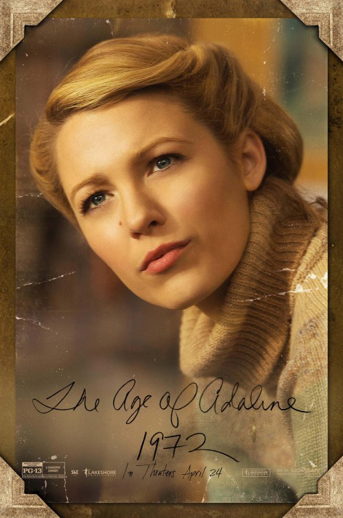
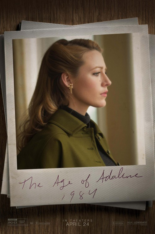
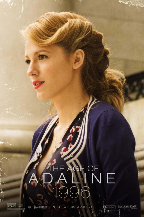
You can almost imagine the meeting. Ignition comes in with the inventive concept of putting The Age of Adaline (April 24th) star Blake Lively together with multiple photo aesthetics spanning her immortal life. Another firm LA speaks about how they can do a whole series of her in photos wearing period garb—shooting for class and intrigue while also putting a beautiful face on theater walls for months in advance of release. Lionsgate says they love it. But … can we do one that “pops” with a “sleek” font and “cool” photo manipulation?
We see it all the time—or at least its aftermath. Who knows how many derivative designs hanging on walls came after brilliant ones were dismissed? I’m sure more than we’d like to imagine. LA took the notes and came back with the steely logotype and tired imagery above. What’s going on here? Is the film’s secret that Blake Lively is actually Michiel Husiman?
The positive is that even if Lionsgate decides to dump Ignition’s fantastic photo puzzle for metallic hues, LA still got to see their series come to fruition. Just look at the first few. 1925’s distress is perfect, 1931’s hazy vignette a treat, and 1943 a neat wartime script stamped with authenticity.
 |
 |
 |
 |
 |
 |
 |
 |
 |
 |
 |
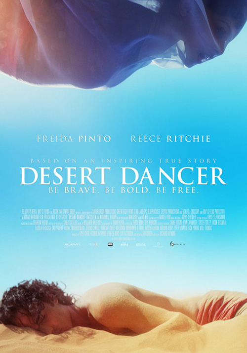
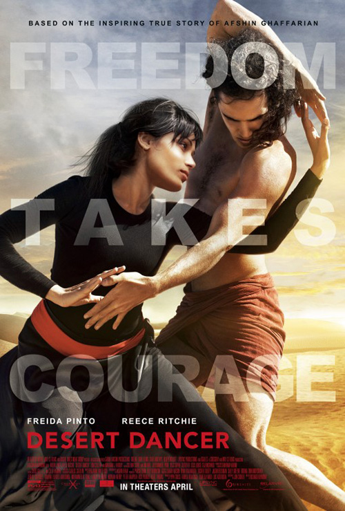
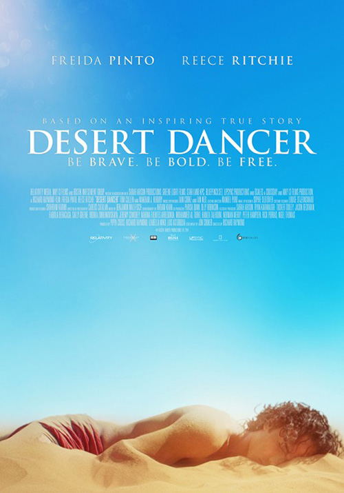
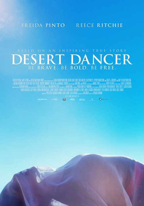
For Desert Dancer (limited April 10th, expands April 17th), ImageMassive embraces the dance aspect with a gorgeously shot diptych of its stars. The combination sheet with Freida Pinto at top and Reece Ritchie at bottom retains the curves of their separate iterations while losing the open sky, but there’s something nice about the radial symmetry drawing your eye clockwise around the page.
The sand and Ritchie are one and Pinto’s silk envelops her while also augmenting her body’s shape. There’s a sensuality to both that’s completely absent in the second version’s want for the familiar. The pose of both actors could be cool if the camera pulled back to show them on the wide expanse of desert behind, but its close-up removes any sense of scale or motion. Putting the tagline above in huge translucent letters only distracts us from the main content more.
Femme focus
 |
 |
 |
 |
 |
 |
 |
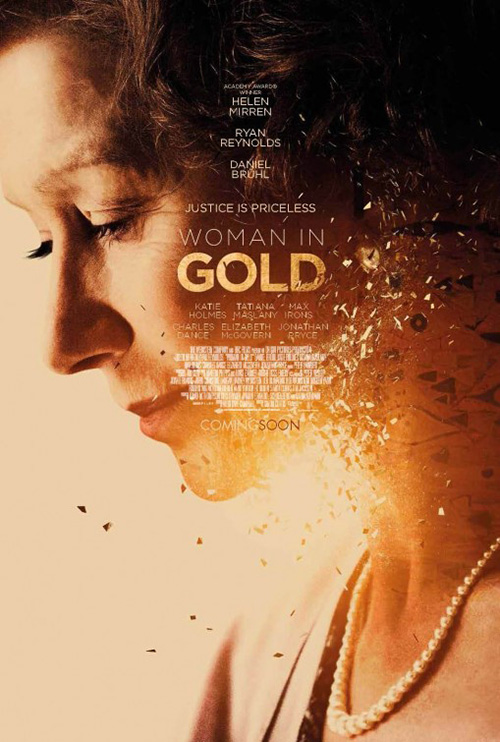
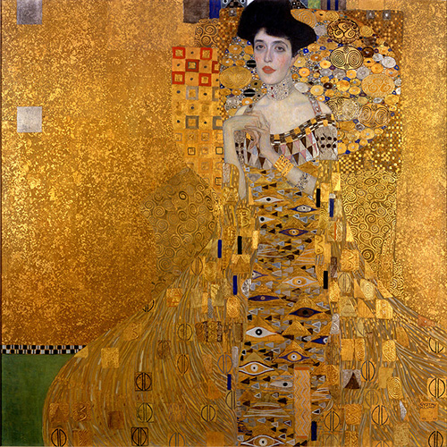
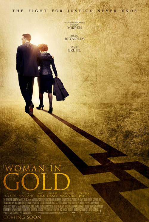
It’s not rocket science to use the aesthetic of a painting your film hinges its plot on, but it doesn’t mean it can’t be effective. Using the specks of gold and colorful motifs from Gustav Klimt‘s “Portrait of Adele Bloch-Bauer”, the poster for Woman in Gold (limited April 1st) possesses more interest than a sad portrait of Helen Mirren could alone. The gold looks like pixels of a disintegrating face—not the greatest outcome—yet the morphing idea from painting to photo still comes across.
While the imagery could be improved upon, I do like the text block. The thin sans serif is bright enough white to be read and tiny enough in width to fall out of view when judging the work as a whole. Making “Gold” and “Coming” gold gives it an attractive inverse effect as well to counter the confetti.
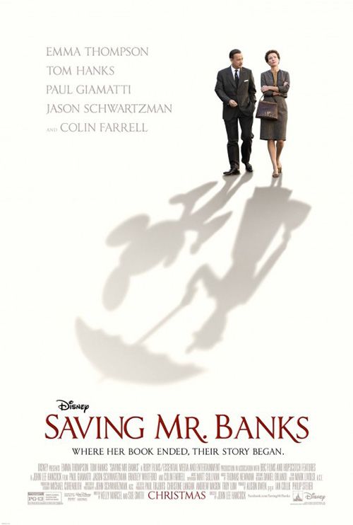
To me it’s the best of the bunch for this film—definitely better than the Nazi shadow. The way the title is scuffed and claustrophobic in the bottom corner recalls many horror movies of the past decade and the swastika elongated as it is makes it seem Mirren and Ryan Reynolds are dancing with arms in the air. The design does have one positive, though: comparing Mickey Mouse to Hitler via similarities to Saving Mr. Banks.
 |
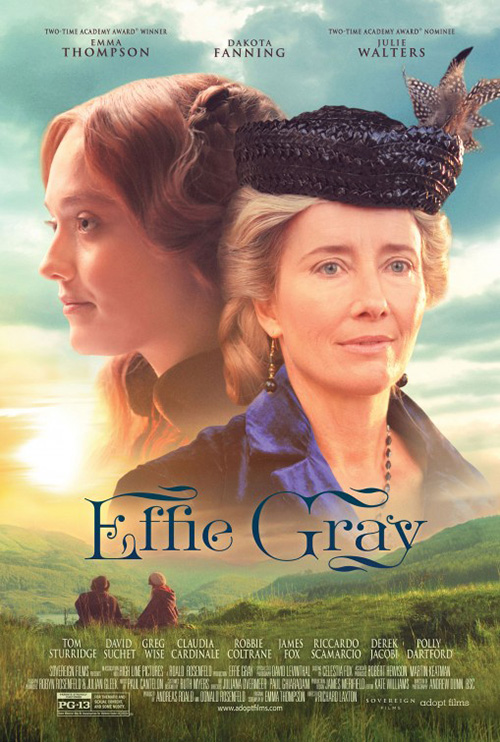 |
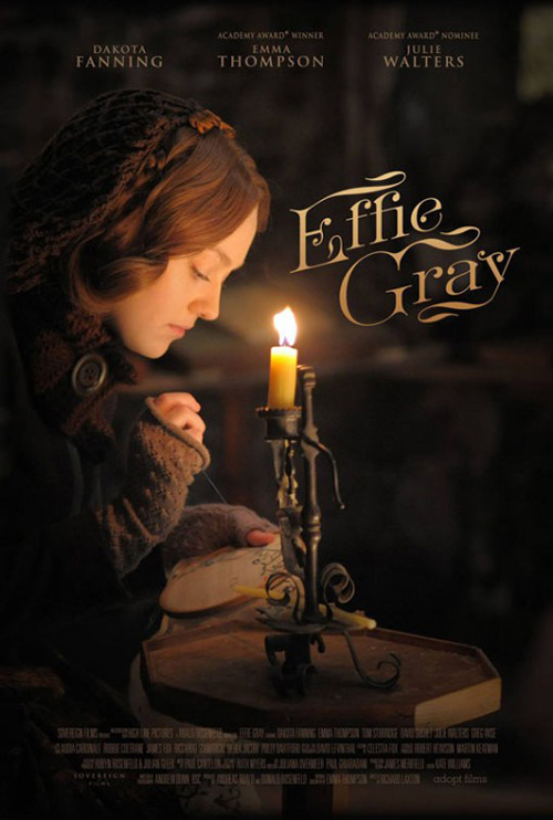
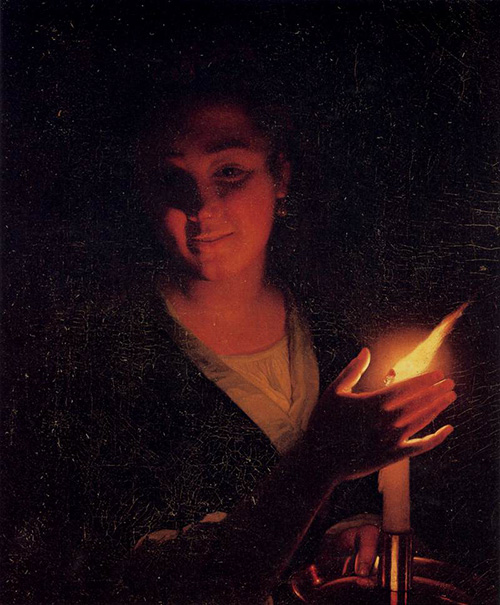
Effie Gray (limited April 3rd) has no reason to be inspired by the work of Dutch Baroque painter Godfried Schalcken, but it’s tough not to think about his use of focused light against darkness upon viewing this first poster. I’ve always been fascinated by his work and the use of a focal point making so much of the page’s surface dark. I say dark rather than empty because not seeing what’s beneath the shadow doesn’t make its absence less important.
The poster is a good one from the centering of the candle, the soft fabrics seeming soft due to the light hitting its fuzz, and the tilt of Dakota Fanning‘s head matching that of the logotype to place a triangle above the flame. I even enjoy the title font for its gaudy flourishes. It gets the old-timey feel right and this sheet would look great against the bright colors of Hollywood fare.
This is easy to tell because of how great it looks next to its more readily available sibling. Floating heads, bright light washing out the actors’ faces, and a dismantling of the logotype—all knocks making it a pale comparison. What was a neat breath of fresh air becomes another artwork of redundant design cliché to simultaneously fit in and get lost.
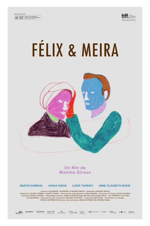 |
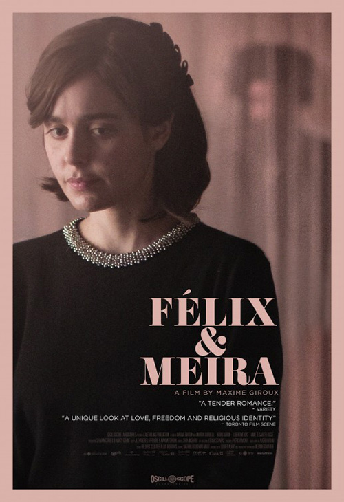
The work done on Félix et Meira (NY April 17th, LA April 24th) is pretty singular as well with its monochromatic palette subbing in for Effie‘s shadows. Something about the homogeneity of it along with the look on its stars face with a figure looming behind her makes it more horror/thriller than “tender romance”, but it definitely gets you to remember it. I love the precarious closeness of the text butting up against the edge of her silhouette too—completely enclosed yet attempting to break free.
It’s a rare improvement for English language posters compared to their international counterparts. I like this other one due to its hand-drawn aesthetic and roughly colored shapes, but it doesn’t have the same impact. The title’s bold stroke is its major flaw as it takes all your attention, making it’s tough to look elsewhere despite the coloring below being so bold.
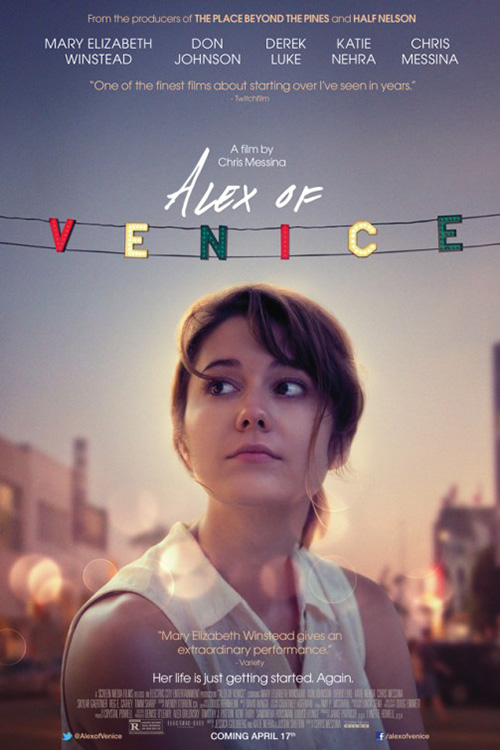
Of all the female-centric one-sheets this month, however, it is P+A‘s Alex of Venice (limited April 17th) that sticks out the most. It’s not just because of the sweet innocence on Mary Elizabeth Winstead either. I like the halo of light surrounding her so we take notice and the lens flares placed above to give a sense of distance and three-dimensionality to the flat space. And I really applaud the faith in the image that’s necessary to keep the text so small and in its place of secondary importance.
As for the title, the playfulness is a memorable bit of flair. The marker scrawl of the first two words give it character and personality while the lit-up letters in “Venice” add a dose of whimsy. There’s a sense of regal portraiture being subverted with its clear-cut view of Winstead and the contemporary banner of name and signifier. We are meant to know her and I can hear a voice announcing her introduction every time I look at it.
Wide open fields
 |
 |
 |
 |
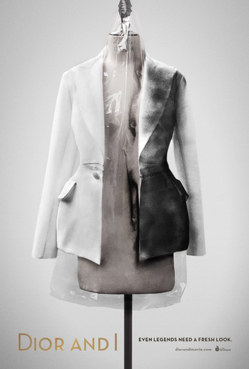 |
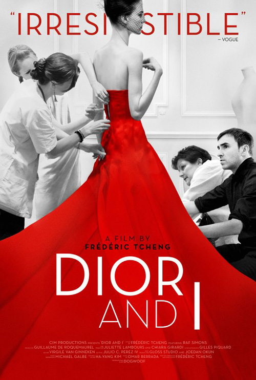
While Indika Entertainment Advertising‘s poster for Dior and I (limited April 10th) isn’t exactly a “wide open field”, its use of color resembles one. By going black and white with just the accented red, we’re of course drawn to the bright hue popping off the page. The way the dress falls down and bleeds through the edges is expertly cropped and the title font centered within it odd yet effective.
I just wish they didn’t cut the word “Irresistible” at top so the model’s head bisects it. We’d still know what it said if she overlapped two letters instead and it would have looked so much better. Heck, it would look better if the word overlapped her face. It’s not like we know who she is anyway.
As for Gravillis Inc.‘s alternate sheet—I’m not quite sure what is going on. The image is striking for no other reason than using a dirty article of clothing to advertise a fashion brand. I’m out of my element as to the why and the what, though. Was it burned in a fire? Is that charcoal? Is there a deeper meaning only Dior devotees would know?
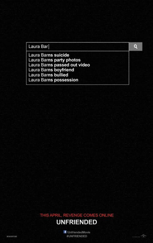
With Unfriended (April 17th), Ignition goes all-in on the stark color field with little disrupting it. This is a keen maneuver, especially for a horror film as it leaves everything to the imagination. And the computer angle of the film’s gimmick lends itself to the simplicity of a search bar without any answers. Those come when you buy a ticket and sit for the show.
You still get a ton of information, though. The whole Google guessing puts the engine’s results in order of relevance and chronology: girl commits suicide, her final night of debauchery goes out to the public, and some supernatural payback ensues. The trailer may only elicit giggles, but this definitely piques interest.
 |
 |
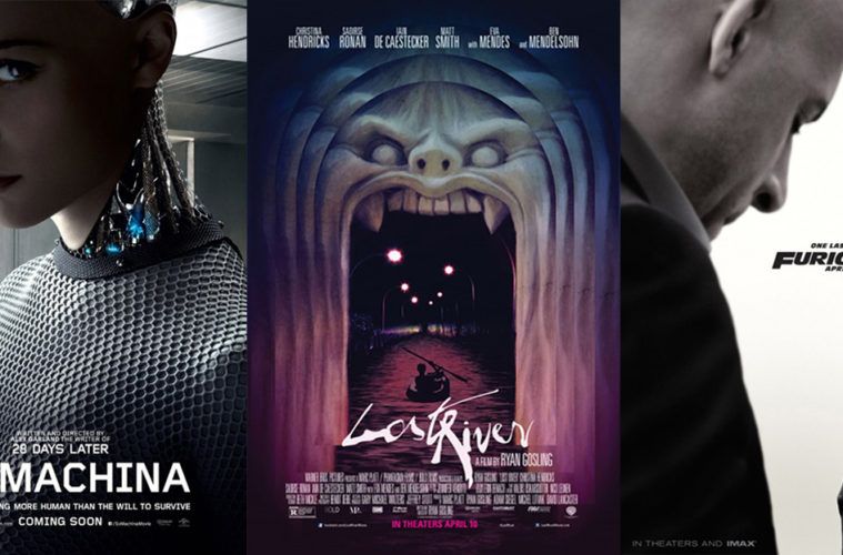
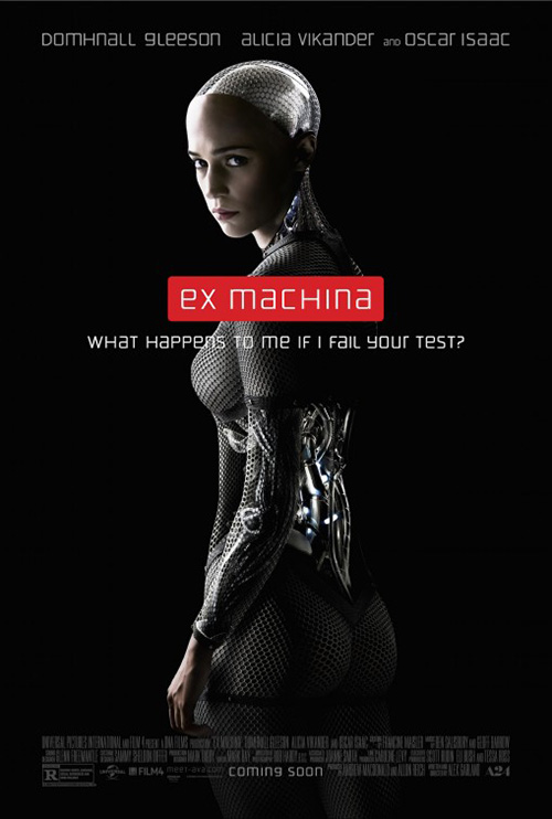
BLT Communications, LLC‘s Ex Machina (April 10th) gives a similar look with its stark black and few words at top. This one pops nicer, though, thanks to the bright red screaming at us to read the film’s name. Placing the mysterious android at bottom with her back turned gives the idea that she’s resting, rebooting, or biding time before being put online. The shadow work adds foreboding and you can’t help but think activating her is going to lead to trouble.
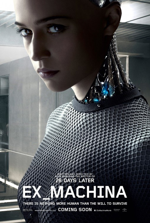
The reveal sheet isn’t as effective now that Alicia Vikander‘s droid is awake. Her look of menace is somewhat funny, the tagline is overly obscure, and the whole human/machine hybrid effect is less than awe-inspiring on a flat page. Watching her move with seamless CGI onscreen is unbelievably realistic while this could be done in Photoshop. The same goes for the close-up: way to make a cool effect look like an actor in costume.
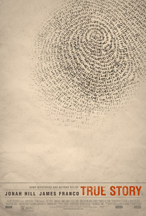
It’s InSync + BemisBalkind‘s True Story (limited April 17th) that takes the idea of empty space and abstract art to its full potential. This is a film with James Franco and Jonah Hill, so the desire to plaster their faces must have been immense. The firm ignored that urge and in turn gave us one of the best posters of the month.
I like the small text, never begging us to look at it or overshadowing the work above. The dotted lines provide the effect of a note pad with spaces to fill and the title’s distressed cracks appear as though a stamp adhered over creased paper. Making the fingerprint that takes up the majority of the frame a string of “LIES” adds a layer of intrigue, simultaneously telling us we’re about to here deceitful words and causing us to wonder if perhaps clues seemingly concrete like a print might be false.
Others of note
 |
 |
 |
 |
 |
 |
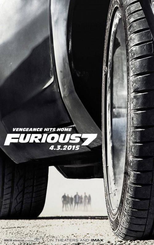
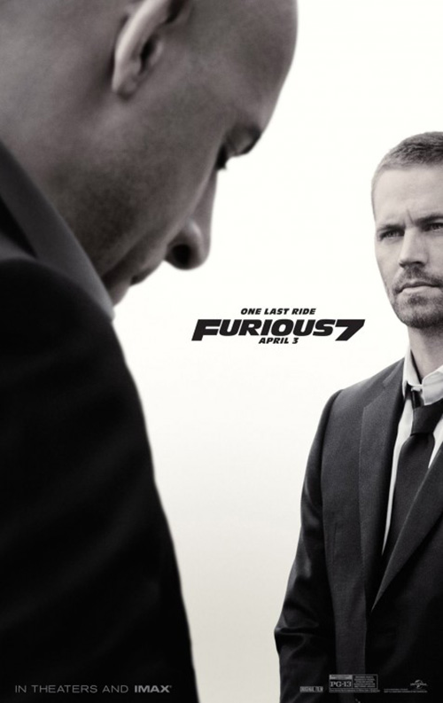
It’s hardly surprising that Universal decided against doing the usual character sheets for Furious 7 (April 3rd) since the big story is saying goodbye to Paul Walker. You cannot ignore this fact, but you also can’t overdo it on the sentimentality either.
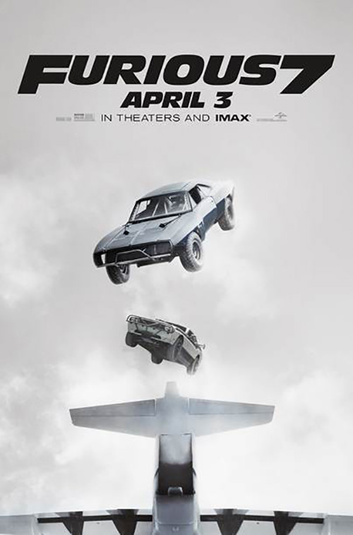
This is why the teaser by Concept Arts works so well. The crew is super small and blurred to shapes while the title is precisely located to take advantage of the composition. I love the crop of this car—the angle, the high definition of the tire tread, and the gorgeous shapes made. The films themselves may have gotten away from the race aspect a bit, but this poster shows that it hasn’t been forgotten.
The same can be said about Walker so the firm similarly provides a look at he and Vin Diesel cropped off the edges with a shallow depth of field too. Of course it is Walker who is crisp—a memory still fresh in fans’ minds—with Vin fading in revelry and sadness at the loss. The tag is changed to “One Last Ride” and the meaning of that is tastefully handled without creating some massive vigil.
And if you’re not going to focus on the actors, you might as well give a glimpse of the stunts. The vantage point is a little awkward outside this plane, but once you see the film you’ll know what’s going on here. I only wish we could see Tyrese Gibson‘s face screaming in one of the windows.
 |
 |
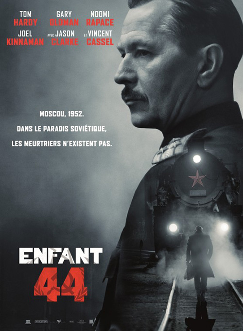 |
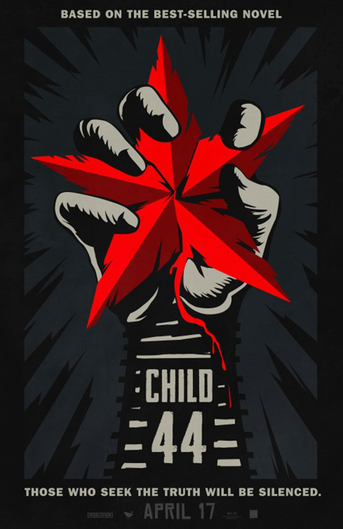
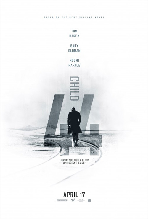
I really like this propaganda poster-lite image for Child 44 (April 17th). The subtle hue difference of the background creating lightning bolts, the crude placement of railroad tracks on the wrist of the central hand, and the bleeding Soviet star as though a human heart. Illustrative work like this is exactly what cinemas need to break free of floating heads depicting people we know all too well.
A bit of photography isn’t all bad, however, as its bright white counterpart will show. This is a pretty cool design that puts form above content from start to finish. I would have made “Child” face the other direction for easier readability, but making it vertical is the key maneuver regardless. There’s real motion as a result, propulsion from the silhouette of Tom Hardy up into the sky.
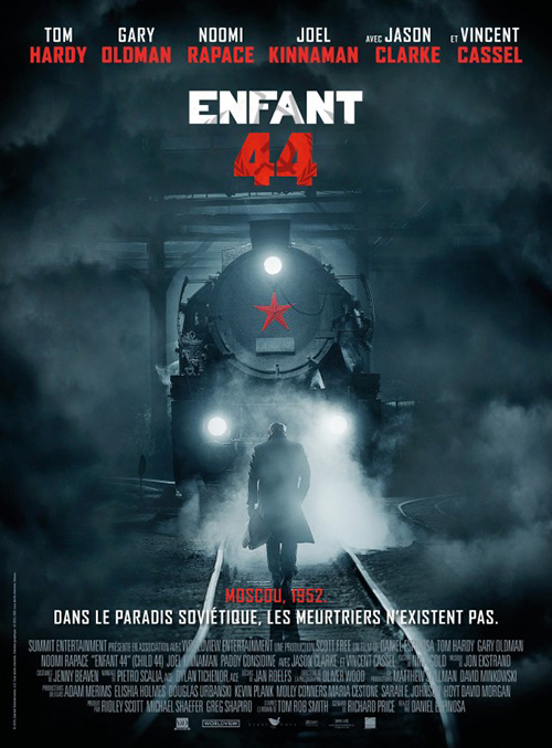
It’s when you go too literal like the foreign sheets that you lose impact. The elements of that first poster are present, but they’re completely lost in reality. Its fog and smoke doesn’t quite create the atmosphere the designer hopes to achieve and the watermark hammer/sickle in the logo is nothing but texture with its current placement. The character sheet idea is somewhat better if only because I like the way the train becomes the uniform accoutrement usually affixed to military personnel’s shoulders. Jamming six names at the top in such a small area was a huge mistake, though.
 |
 |
 |
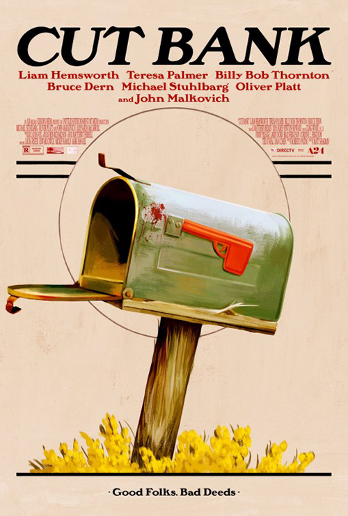
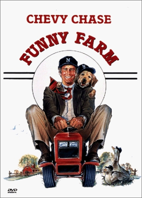
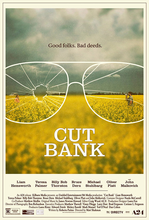
I know nothing about the movie Cut Bank (limited April 3rd), so I can’t tell you if the graphic similarity to the DVD cover of Funny Farm has relevant meaning. If anything, the weirdest thing is the fact I thought of Funny Farm the instant I laid eyes on what P+A and Akiko Stehrenberger created. For whatever reason that circle with two lines behind indelibly stuck in my mind.
As a poster itself, I do like what they did. It’s illustrative with a photo-real bent keeping it away from cartoon. Splinters aplenty and a splatter of blood conjure feelings of trepidation and danger as the whole retains a sense of fun despite them. While the font is different enough from other serifs, the name list still overwhelms it anyway. And the tagline is awkward with a period in the middle but not at the end, the bookended bullets clashing as a result.
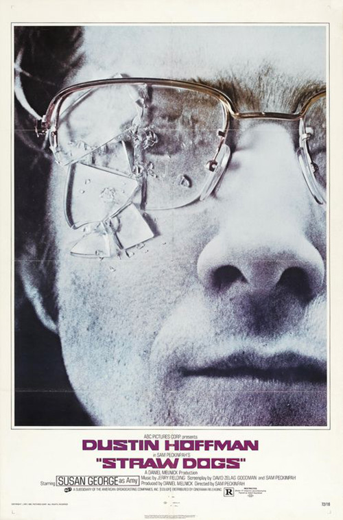
P+A’s second go-round bears resemblance to another film, this time the poster for Straw Dogs with its broken glasses lens. All this could be intentional or a complete coincidence, but they both make me want to watch the film to find out. And if that was the goal of the designers all along, well kudos to them.
 |
 |
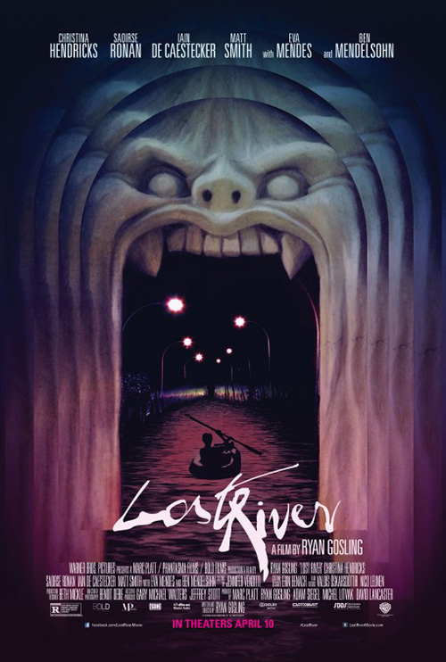
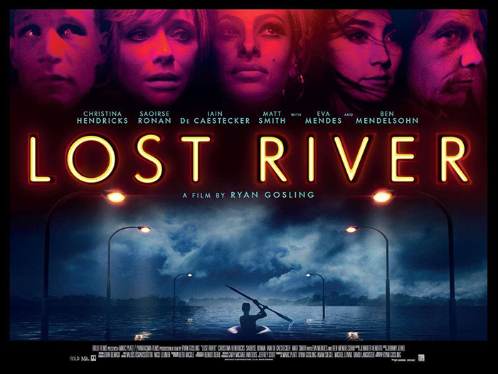
The poster that sticks out the most this month, however, is Lost River (NY/LA April 10th). It is creepy, attractive, and very strange. I mean what is going on with the fanged archway? Why are we seeing it overlap itself three times? There must be a reason other than allowing Ryan Gosling‘s name to be framed by the top-most layer. If nothing else it helps with depth as those lights inside its mouth take us towards the abyss of its throat alongside the mysterious paddler already making his way in.
My favorite detail is the title font. It reminds me of Ralph Steadman with its loose form and varying contour widths. Making it the brightest piece of the sheet forces our eye to it first, but the oddity of the rest brings us up into the tunnel quickly thereafter.
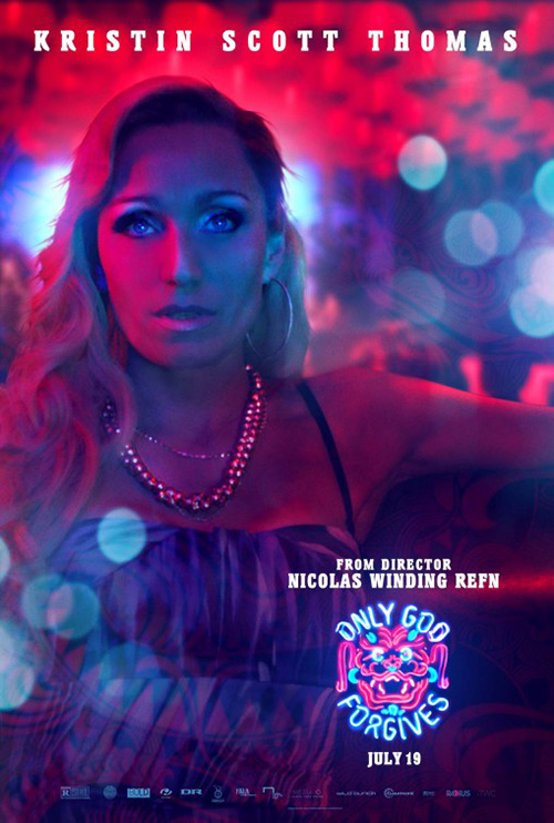
There’s an intrigue here that the quad-sheet doesn’t possess in its photo collage. The boy amidst streetlamps loses the pull its sibling had and the faces above simply look as though the designer thought Gosling would like to see the exact same aesthetic as was used on Only God Forgives. I do enjoy the title effect even if it isn’t as unique. Something about an attention to detail that keeps the flat base letter behind the glowing bulb puts a smile on my face.
What is your favorite April release poster? What could have used a rework?

