“Don’t Judge a Book by Its Cover” is a proverb whose simple existence proves the fact impressionable souls will do so without fail. This monthly column focuses on the film industry’s willingness to capitalize on this truth, releasing one-sheets to serve as not representations of what audiences are to expect, but as propaganda to fill seats. Oftentimes they fail miserably.
Festival season is upon with Venice and Telluride in full swing and TIFF just days away. I always contemplate making September into a festival poster piece only to discover there’s no point when so many of the films released are playing at those festivals anyway. Six of the sixteen movies below will be screening in Toronto. And that’s without including The Predator (September 14), Museo (limited September 14), and Fahrenheit 11/9 (limited September 21).
The added bonus to this fact: good posters.
The borderline


This main sheet for Life Itself (September 21) is not necessarily one of those “good” ones. InSync Plus pretty much takes three stills, stacks them up, and places text where it fits. The idea of having the title repeat is interesting, but none of the three are the same size to make it appear like these images were interchangeable. This isn’t a slot machine scenario.


The firm’s character sheets are much better if only because they have a sense of drama and scene. The title and cast list are unobtrusive and the subject itself generally interesting enough to grab some attention. I only wish they didn’t feel the need to put one of the others in the background of each. Having a blurred Olivia Wilde and Oscar Isaac behind Olivia Cooke and whoever’s leather-jacketed back with Cooke located behind Wilde/Isaac is tacky.
Going back to the headline of this section, the poster for Matangi/Maya/MIA (limited September 28) uses separation of imagery much better. Rather than just multiple images butted against each other, the designer takes the idea of a wall and expands its green field to be negative space with which to superimpose more photos atop. It creates a clear division while also ensuring both sides complement each other.
I love the plane images to coincide with M.I.A.’s name too. You have the helicopter for Sri Lanka, the jet that took her to London/America, and ultimately the “paper plane” of one of her most iconic songs. And it’s a captivating juxtaposition that works visually to draw our eyes down from top to bottom when reading the title regardless of our knowledge of their meaning.
LA’s Night School (September 28) takes the concept even further by allowing a prop to create the separation in a real world situation. They could have just place Kevin Hart and Tiffany Haddish next to each other in front of those lockers, but that wouldn’t have been as memorable as using them to tell a story. Hart is the “student” in this dynamic and therefore stuck in the locker. Haddish is the “teacher” and thus outside the door with a look of disparagement. It may not excite aesthetically or reinvent the wheel, but it’s effective in presenting its visual message.
If you want to see what creativity can do with borderlines, however, look no further than Concept Arts’ The Nun (September 7). Here we have full integration of images whether it’s alluding to Taissa Farmiga being the nun in question or simply showing how it has infiltrated her mind for optimal terror. The black versus white contrast pops and the burn marks along the edge of the rip really amplify this idea of Heaven versus Hell. And the reversed “N” in the title is an added bonus of palindrome symmetry.


You know you knocked the concept out of the park when something this simple and stark can conjure so much more dread than a sheet built to embody dark horror like eclipse’s work. Exorcist homage or not, the atmosphere here is as fake as the scene created.
Collaged overlays


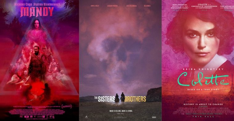
The Refinery’s Colette (limited September 21) isn’t anything new (see Creative Partnership’s Tulip Fever for recent period-set, washed-out color and texture), but it works. We get the star’s face from and center, the specially formed signature title below, and a nice clean all-caps sans serif font to work against the softness of the rest. The way the layers are integrated together is great too with the floral pattern seen in her hair but not her face. Everything has a dream-like quality as a result and yet the warm reds lend a touch of drama to go along with the tagline that “history is about to change” rather than leave things as delicate fluff.
Andrew Bannister’s I Am Not a Witch (limited September 7) takes the collage portion of the headline to heart by ignoring any desire for translucency in order to keep things strictly as scrapbook. All these images are cutout and pasted atop each other with a fantastic flair for paint outlines around them that look like fire. The red fields for text are clearly ripped into shape next to the contours of Maggie Mulubwa’s head.
It’s busy but legible thanks to the yellow/orange title and quotes being stuck to those dark red sections as opposed to the competing colors of the images below. Instead we get to find faces in those photos, moving us closer to see what else we might be missing.
I Think We’re Alone Now (limited September 14) by Champ & Pepper Inc. goes for full illustration to allow artist Blair Shedd freedom to build his image without a need to conform to what’s at his disposal. So rather than merge portraits with backgrounds or cut and paste existing promotional materials, he designs around the concept with his own specific style. His comic book sensibilities come through with graphic hair whether Peter Dinklage’s subtle highlights or Elle Fanning’s geometric flames. Contrast it with detailed gradient work on faces and minimalist line work on the goldfish and road scene and you get a memorable piece of original art.
It’s weird that Champ & Pepper Inc. would squish the director’s name under the large title, but otherwise the text block works to highlight the film’s selling points. The typography’s coloring helps the whole from feeling like two disparate entities—not that it’s a bad thing to simply slap a label underneath a canvas.
Mandy (limited September 14) conversely uses its painting for the poster’s canvas rather than forcing it to exist on its own. That’s easier in this case because of the way it is constructed. The actors form a triangle at the center for cosmic swirls of dark mood lighting to surround it as prime real estate for text. I think Nicolas Cage and Andrea Riseborough’s names are too close to be read separately and perhaps too big to let the title standout, but I do like the whole’s aesthetic. It looks like a heavy metal progressive rock album cover and that’s the perfect tone for what the film delivers.
Geometric negativity


I can’t stand the raised dots on the Assassination Nation (limited September 21) logotype. Why are those to “i’s” lowercase and nothing else? Why does the tagline not line up with them—both resting a tad higher than the bottom of the dot and a rising a tad taller than the top? Are they cigarettes? Will the film give them meaning? Whatever the reason, I can’t stop looking at them with disdain.


Once you get past those, however, LA’s teaser is fantastic. Not only does it do well to create ample white space at the bottom rather than top, but it’s also capped by a gruesomely hilarious bit of macabre with Odessa Young on the floor ready to lick up a trail of blood. It’s an iconic image made better by not being in your face at the middle of the frame. And the balance between she and the title is perfect.
The other two sheets aren’t bad either, but they go more generic with white space at top. I prefer the off-white one because of the intrigue keeping everyone’s back to us cultivates. It’s clean, simple, and even a little mysterious thanks to one character crouching down for a lens-flared reflection to take her place in line: a target? An assailant? The red one is nice because of its use of composition (the credits framing the whole rather than taking up a quarter of the page), but it hides nothing and therefore lacks the excitement of the previous two.
Midnight Marauder’s Hal (limited September 7) is quaint by comparison and yet no less memorable due to its apparent simplicity. I say that because there’s a lot more happening than meets the eye from the almost angelic halo of orange behind Hal Ashby’s head, his gazing at the signature title, and the so faint it’s easy to miss enlarged silhouette of the identical image of him in his chair behind it. I couldn’t even begin to explain why all this is happening, but you can’t deny its appeal.

The poster for Kusama: Infinity (limited September 7) takes things even further towards minimalism with the artist’s red dots filling the entire frame to the point of consuming her image at its center. Putting those same dots on her clothing renders an optical illusion wherein her face and hands float in space, the red of her lipstick and hair the only incongruity of shape. The circles almost feel as though they are moving towards us as we push closer to find the subject and learn her story.
It’s interesting to then look at its more colorful counterpart since it proves busier and yet much less kinetic. Without Yayoi Kusama as a stationary focal point for the shapes to float through our depth of field, they all become static instead. We’re left facing an attractive scene flat against the wall rather than a window into a brand new room with our host waiting.
The month’s best example of geometric motion, however, comes from LA’s A Simple Favor (September 14). The film’s whole campaign has been gorgeous (after the Saul Bass knock-off question mark at least), but this one rises above for its unabashed embrace of the abstract. Each triangle holds a piece of its actor whether an eye, mouth, ear, or nose—the black and white contrasting with the color overlays to conjure a 50s feel. It’s colorful noir with shadowy secrets shattered into a million pieces, each coming into focus as answers are won. We want to put the shattered glass back together only to wonder if they form two women or one.


By comparison the chic portrait on stairs is staid, the steely hues lending a cold metallic feel rather than the boisterous primes of the other. Even the title font slims down for a sleeker aesthetic exuding control above confusion. The third wields both styles as though a stopgap in-between the series’ complete dismantling of the image. We still get Anna Kendrick and Blake Lively whole, but the windows’ shapes fold over themselves to again ask who is who. We’re moving closer and closer to find the cracks within their idyllic lives.
Distressed atmosphere


Getting back to minimalism: The Old Man & the Gun (limited September 28) is a stunner. Everything is a little bit off from the right justified cast list lining up inconsistent lower case letters to the awkward yet charming stack of differing sized letters for the title to the figure of Robert Redford just a tad right of center to fake movement. His character is just another face in the crowd we don’t care to register, so innocuous that we can’t even see him when nothing else around. And that’s why he’s so good at what he does.

B O N D uses a similar premise of people on a clean background with White Boy Rick (September 14), but they go to town as far as dirtying things up for texture, tone, and flavor. It’s a wonderful piece in high contrast black and white with the perfect amount of red to punch up the tag and date while also framing the bold, barely kerned title. The graffiti crown above Richie Merritt’s head is a nice touch too to single him out in case the color of his skin didn’t already do the job.
Take Matthew McConaughey out and this poster would be first class all the way. I get that he’s the “name,” but they didn’t even try to make it look like he belongs. Everyone is posing in one photo while he’s drawn in as a forgotten lurker in another. We should be doing the old “one of these things doesn’t belong” with Rick and yet my eyes can’t stop singling the Oscar-winner out for being a sore thumb.
I want to give some credit to the teaser too while we’re here. I don’t generally love this type of text-heavy design, but the artists do well to use their three colors to maximum effect. And if we’re being honest, that description will sell more tickets alone than any actors placed beside it.

And then B O N D goes and outdoes itself with their tease of The Sisters Brothers (limited September 21). This thing is pure mood from the hazy colors to the skull formed by the dust. It’s the perfect mushroom cloud to rise from these two men in silhouette on horseback, the significance working whether we’re to believe they bring death or are prone to being the ones who will do the dying. I love how the cast names are colored to barely be visible above the sky and how the title shifts from white to yellow, the change in actor height almost making it seem as though the “Brothers” is slightly higher too (it’s not).
It’s an unforgettable image made more impressive by the lackluster final sheet dealing in hardened faces that look to be trying too to stifle a smile. Are we supposed to fear these men? Are those furrowed brows supposed to be imposing? I hope not, because all I want to do is laugh.
Mix the first White Boy Rick and The Sisters Brothers I mentioned together and you get something akin to The Refinery’s Bad Reputation (limited September 28). It’s uncanny how well it combines the two with color scheme and title shift (white to yellow) from one and the grunge-infused weathered touch of the other.
But even without those two by its side, this one gets the job down as far as conjuring the energy of a live concert and the do-it-yourself moxie of old school advertisement with hand-lettered fonts and washed-out printing. This thing feels like it’s from a bygone era and is kind enough to transport us back to it.
What is your favorite September release poster? What could have used a rework?