“Don’t Judge a Book by Its Cover” is a proverb whose simple existence proves the fact impressionable souls will do so without fail. This monthly column focuses on the film industry’s willingness to capitalize on this truth, releasing one-sheets to serve as not representations of what audiences are to expect, but as propaganda to fill seats. Oftentimes they fail miserably.
With five Fridays of box office fun to play with this month, many posters are obviously going to get forgotten. A majority of them are the franchises with built-in bases like Fast & Furious Presents: Hobbs & Shaw (August 2), The Angry Birds Movie 2 (August 14), and Scary Stories to Tell in the Dark (August 9). Whether we’re talking a blockbuster spin-off, videogame adaptation, or childhood favorite, the advertising becomes unnecessary. Just because one of the posters below may grab your attention away from the task at hand, the money you set aside to see those three films is still going to go towards those three films.
It’s therefore sad to leave work that will deserve extra attention such as The Peanut Butter Falcon (limited August 9) and What You Gonna Do When the World’s On Fire? (limited August 16) out of this feature. Are their one-sheets good enough to turn heads? Maybe. Maybe not. It’s just so easy to get drowned out these days when opening weekend dictates whether word of mouth is even a possibility. That “maybe” can sink you before you even get a chance.
Window shapes


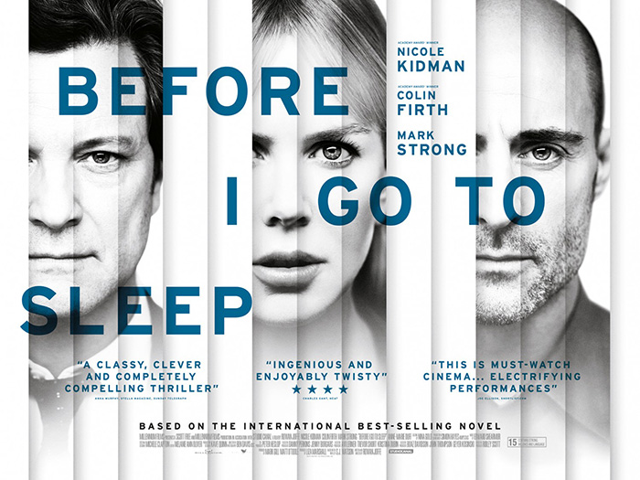
Another such borderline design is Legion Creative Group’s Luce (limited August 2). Similar to Empire Design’s quad sheet for Before I Go to Sleep, the firm looks to add intrigue and mystery via obstruction. Where that one had the added benefit of extra vertical boxes to mimic blinds as though we could flip them to see a different side of the actor, Luce sticks with one field each as a window into their turmoil.
Where it works best is the eyes. Everyone is looking at Kelvin Harrison Jr. while he looks directly at us. It’s a challenge of sorts—one for which we will either fear the consequences like those at his side or meet with equal tenacity.
Where it fails is the desire to use so many gradient fades into nothing. The designer doesn’t want to cancel the photos out by making them all solid from top to bottom, but those fades become distracting because we’re unsure what or where these characters are. Are they ghosts? Why do the women get a smidge of their left eye to remain visible? Why can’t we just get the quartet around a table with three staring at one? This isn’t a deck to shuffle. It’s faces of “truth.” But all I see is artifice.
That’s one reason why Canyon Design Group might have gone with straight-up boxes to separate its three leads on The Kitchen (August 9). The other reason is that this property is based on a comic book and colorful cells of action and character fit that mold. You can almost forgive how artificial things look with high-contrast cutouts pasted atop washed-out backgrounds because the visual style is the point. It’s still boring, but its flair isn’t to be dismissed completely.
What I can’t abide, however, is the title treatment bleeding out of the top stanchion in two directions. It becomes a part of the frame and thus a distraction rather than a focal point. We’re trying to look behind it to see Tiffany Haddish and Melissa McCarthy. It’s in our way. The last thing you want to do is make your name the thing we most want to ignore.
That’s why I like that Cardinal Communications USA tries to change the pattern up with their sheet for Sony Pictures Classic’s After the Wedding (limited August 9) remake. The whole is by no means “good” in the sense that you’ll see it as a tractor beam to look closer, but it will standout amongst the likes of those two films above. The triangle windows are perfect both as a way to triangulate where we’re to look (the center of each) and to guide us through the page with each pointing downwards to the next until one breaks free and points back up to the title.
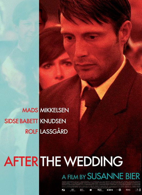
Unfortunately, those words are difficult to really enter our consciousness when they become so similar in size and shape as the cast list. While the title is twice the font size, its surface area is almost identical. As a result my eyes can’t stop breaking it apart into three sections: Julianne Moore’s After, Michelle Williams’ The, and Billy Crudup’s Wedding.
Something like Starfighters / Nordisk Film’s original sheet for Susanne Bier’s film conversely knows how to ensure there’s no confusion. The Wedding itself becomes a formal event wherein we use last names with the cast (all in white). It’s only After the wedding that things get more exciting to bleed red and let everyone become a bit more personal.
Creative Partnership’s Vita & Virginia (limited August 23) is thus the sole example within this section that utilizes its “window” as both an opening to imagery and an elegant design element in its own right. The double “Vs” recall the title as they segment the frame almost in half, the deep neckline of Elizabeth Debicki’s blouse creating a midway connection point between it and the decorative “Vs” behind her.
There’s not much else going on besides Gemma Arterton’s gaze bringing us into the fold, but there also doesn’t need to be more. The color is unique, the contrast from light to dark is eye-catching, and the title’s white can’t help but pop out at us to remember it. That’s really all you need.
Focal point assistance


There are other ways to guide our eyes into a poster than windows and The Refinery (with photography by Brian Bowen Smith) uses one on their Dora and the Lost City of Gold (August 9) teaser: a spotlight. Here’s a scene shrouded in shadow at the foreground with a trio of backs and one face looking up while Dora herself is found standing just high enough to let the sun bathe her with the same light that renders everything in the background colorful and inviting. She is the lead of this story. She is the leader of this group.
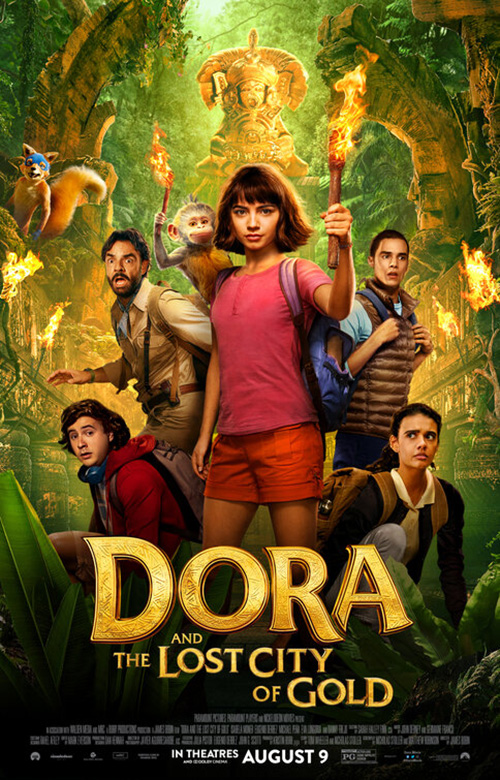
It might not be dynamic compared to some of the posters I’ll be discussing below, but it possesses a lot more panache than BLT Communications, LLC’s final sheet. Everything is now illuminated and there’s no mistaking how much photo manipulation has been done. Dora is still our focus, but it’s due to size now rather than intrigue. And everyone else is just flatly stood up behind her at different scales to pretend distance is in play when it surely is not.
Gravillis Inc. actually embraces that flatness with their poster for One Child Nation (limited August 9). They lean into it with a gorgeously rendered propagandist painting to be passed by and looked upon by the two characters at bottom left (and us). Rather than use light or size to draw our eye to a single person, this crew uses its absence. They cut this little girl away because she’s deemed less important than a son—expendable under the rule of law to which parents must abide.
With such an illustrative aesthetic, that gaping hole of white is impossible to ignore and thus impossible to misconstrue. That the yellow rays of the sun emanate out towards the yellow title assists us in moving from silhouette to haloed faces to text with the tagline serving as a pit stop along the way.
There are also ways to purposefully obstruct our view in order to lead us to one part of a composition above another. The Amazing Johnathan Documentary (limited August 16) does it by pixelating the face of the person behind the subject. Is he “the man behind the man?” Is he someone who has left the picture? Or perhaps a secret reveal we’re about to see uncovered? Who knows?
It’s nice to speculate because the boom microphone very clearly shows this scene has been manipulated. There’s a level of fiction to go with the documentary that could ultimately make the whole that much better.
As for the title: crossing out “Untitled” is a cute little joke. The Amazing Johnathan is the topic being discussed so of course an easy placeholder name would be “Untitled Subject Film.” That removing “Untitled” would also make sense is but a cherry on top. This is his documentary.
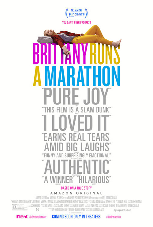
InSync Plus uses a similar bit of manipulation so that their Brittany Runs and Marathon (limited August 23) poster keeps its star Jillian Bell front and center. Because of the act of running being intrinsic to the film’s name, blurring everyone but her can also have contextual meaning. They are moving at too fast a speed to be captured crisply while she is virtually standing still. Not only that, she’s also going the opposite direction with a wine glass and straw in-hand. She might be running this event, but she’s obviously not worried about her ranking.
It works because it’s a scene that has so much to say. The firm’s text-based counterpart on the other hand does not. I’m not sure what they’re going for here with the shape of the text (title wider than quotes which is much wider than the “based on a true story” below it). Does the phallic nature of its shape contain relevant meaning or is it some sort of elongated mushroom cloud or geyser exploding into the air with Brittany comfortable at top? I’m at a complete loss.
Framed


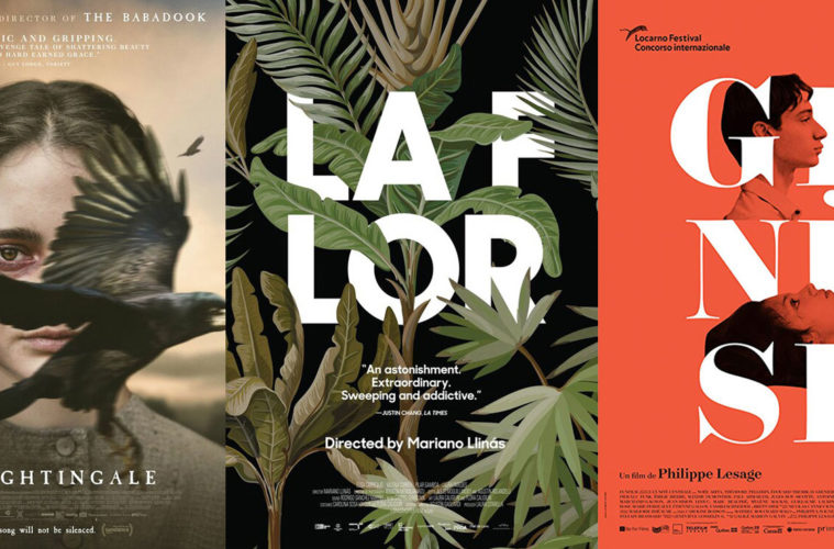
You wouldn’t think “framing” at first glance with P+A’s The Nightingale (limited August 2), but that’s what the wings of the bird are doing to Aisling Franciosi’s eye. The animal is flying by at speed and she is unfazed, gazing into our soul with malice. And if you look closer you’ll see that these birds might just be orbiting around her—minions of mood ensuring everyone who hears them knows what’s coming.
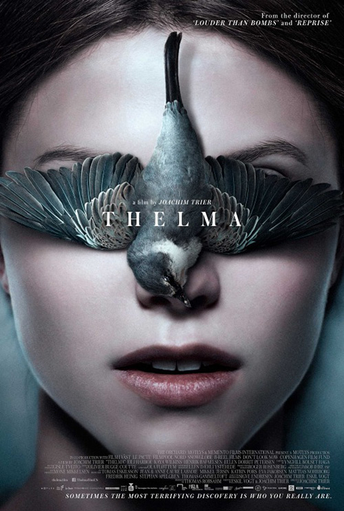
It’s a very different use of bird and face than P+A’s own Thelma from a couple years back. This one is covering her identity, letting what’s bubbling under the surface to remain dormant until she’s ready to unleash it. The Nightingale has moved beyond that point already. Her power has been set free and nothing will stop her.
The Refinery goes more traditional with their frame within Killerman (limited August 30) by quite literally drawing one around Liam Hemsworth. The poster itself is anything but traditional, however, as that line pushes in from the sides to shore up our focus towards the middle and onto his face and gun pointing off-screen, our eyes moving down the diagonal to the title.
How does the reflection manifest, though? What is real and what is false? The tagline “Nothing is as it seems” corroborates this confusion as the page seems ready to pull itself down to reveal a totally different scene or perhaps one more copy wherein Hemsworth is ultimately pointing his weapon at himself. Add a sleek font (love the ninety-degree curve of the “K” and “R”) and you get a gritty yet attractive photo to offset its glossy brethren on the wall.
Love, Antosha (limited August 2) is very similar in its curved corner line boxing its content at center. Here it’s more utilitarian than artistic, its presence a means to contain what might have floated away. Remove it and the heart loses its purpose in the moment to simply sit in stasis despite nothing preventing it from moving on. For ninety-two minutes, though, it is ours to experience—the film trapping the essence of its love until the lights come back up.
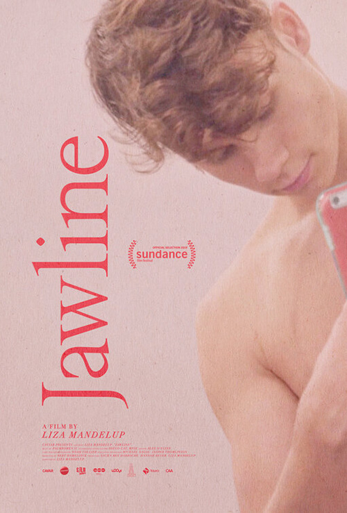
And finally there’s Jawline (limited August 23) arriving with its removal of lines to let a photograph of Austyn Tester speak for itself, the title cutting along its edge to marry outside and inside with a meticulously planned bisection at the offset center of the “e” and “a.” He’s both contained and free, the window opening to his world in order for his head to pop out and say hello. He’s engaging us personally whereas Jump Cut’s variation has us coming to him.
It’s a fascinating case study of how identical aspects can be reworked and reused with different meaning. The font and positioning of the title is the same as well as Austyn’s palette of soft pinks. One has him entering our space and the other us entering his—a duality that works in conjunction with his being a social media celebrity and thus existing at the borderline between. To me the frame becomes the defining piece that sets the first apart from the second because it creates a boundary we’ve both willingly eclipsed. We see him and he sees us.
Typography > photography


Are the words This is Not Berlin (limited August 23) hard to read? Sure. But that’s kind of the appeal. Their pink barely lifts off the dilapidated wall behind them and yet we must decipher what’s being said because we know it’s important. That the designer weirdly separates the “A film by” and director’s name by this title only makes it more subversive—an interjection screamed as loudly as possible, a detail that cannot even be overshadowed by its creator’s name. And the dots above the capital “Is” prove a delightful flourish.

The second poster has more bite with a face and splatter of paint/blood, but the effect isn’t nearly as potent. Separating the director credit makes no sense when the title lacks spontaneity and the way the words cover Xabiani Ponce de León is awkward. I find myself looking at the gaps between words rather than reading them—much like The Kitchen above. It confirms how less is almost always more.
And you can’t go “less” than Cold Case Hammarskjöld (limited August 16) and its redacted sheet of thick black lines isolating the title. This thing is bold and to the point: a stark contrast to everything else hanging at the theater as it literally sells its mystery by highlighting its exclusionary motives.
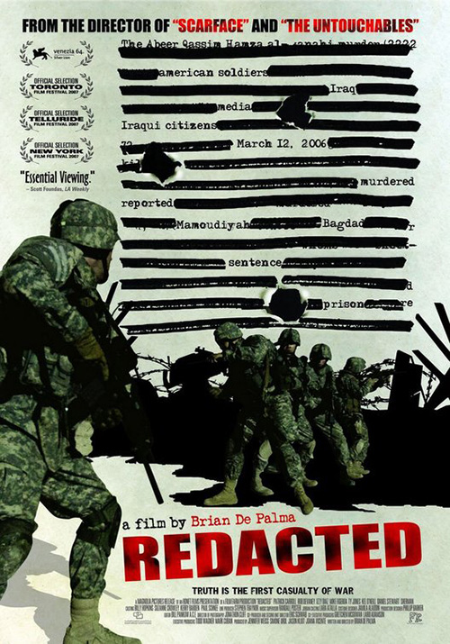
Compare it to the poster for Brian De Palma’s Redacted and it’s easy to laugh. This thing is a cartoonish play on the same concept that ignores the oppressive nature of what’s being depicted and tries giving it “personality” while also slapping a kitchen sink’s worth of superfluity on for good measure. That won’t fly in 2019. Redactions hold infinitely more weight than that and Mads Brügger isn’t playing around.
Neither is this sheet for Genesis (limited August 23). It puts its name front and center, breaking its six letters into couplets so the three “Es” all align perfectly. Then it decides to jut the “G” out as our starting point, subtly imploring us to catch its minor protrusion and continue from there.
It’s almost as though that one inconsistency then lets the designer do whatever he/she wants. The credit box bottom left is pushed to the edge so it can counteract the statue on Noée Abita’s breast as her body bleeds off the page at right. That she and Théodore Pellerin are added in via photography is itself an oddity too as they’re cutout in ways that augment the slopes and angles of the letters, the multiply effect letting them flatly merge with the background color and never distract from white title supplying the depth they cannot.

Scott Meola takes that effect further with La Flor (limited August 2) by complementing its inherent minimalism with a sumptuous illustration that doesn’t compromise legibility. These plants interact with the sans serif font as much as they can while still maintaining the integrity of each white field—my favorite bit being the leaf that covers the space between the “R’s” two legs with the exact angle necessary to draw its negative space through physical form.
A comparison to Empire Design’s Handmaiden is unavoidable and yet its increased scale makes it a beast all its own. The title there is the afterthought making its presence known within the landscape. La Flor is conversely the main focus invaded by overgrowth. The film being fourteen hours long is perfectly attuned with this distinction as life literally evolves from blackness to full garden. Time provides a gestation period for the art’s overarching message.
What is your favorite August release poster? What could have used a rework?