“Don’t Judge a Book by Its Cover” is a proverb whose simple existence proves the fact impressionable souls will do so without fail. This monthly column focuses on the film industry’s willingness to capitalize on this truth, releasing one-sheets to serve as not representations of what audiences are to expect, but as propaganda to fill seats. Oftentimes they fail miserably.
It’s festival season time—a time when I scour the internet for posters of films I’ll be seeing at TIFF only to come up empty-handed for a lot. That’s okay, though, as there are still movies being released at our local multiplexes as well. (And sometimes the two categories overlap.)
Surprisingly this month’s releases actually look pretty great (regardless of poster). So if you can’t make it to Toronto, Telluride, or Venice, you shouldn’t be too bored at home.
Laika trolls
 |
 |
 |
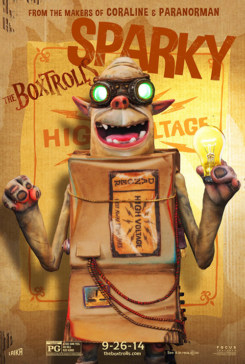 |
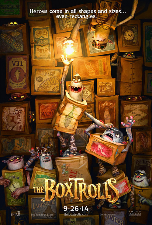
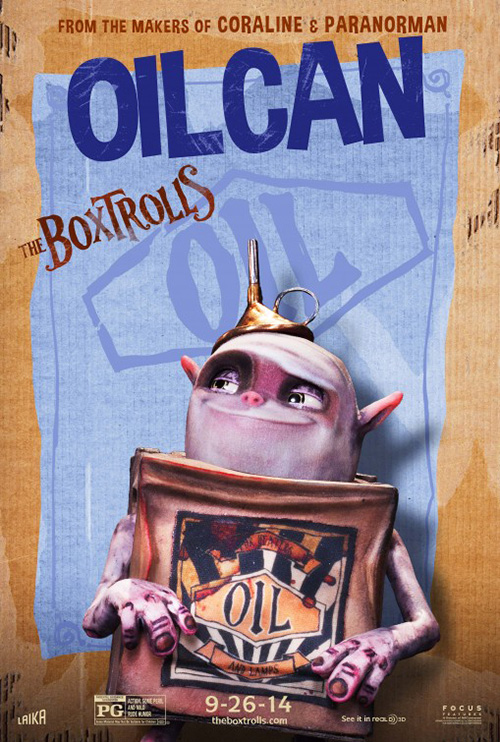
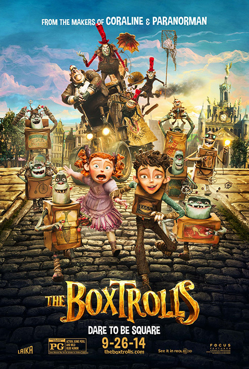
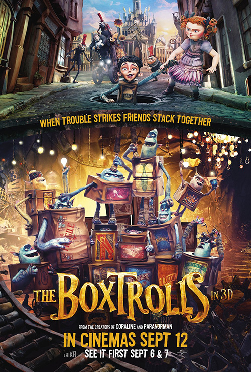
No one is going to say Ignition‘s posters for The Boxtrolls (September 26) are original or unique—at least not any more than the gorgeous visuals Laika creates for the films themselves—but that’s not to say they aren’t effective. There’s no shame in using what’s already there when it’s that good.
 |
 |
 |
 |
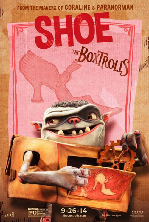
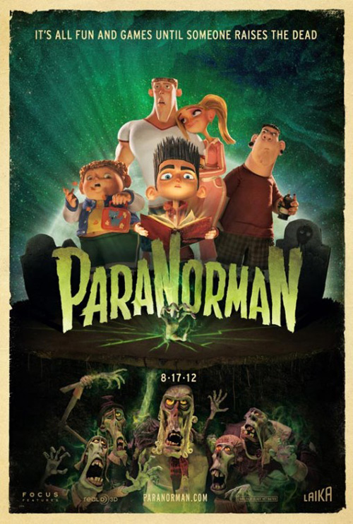
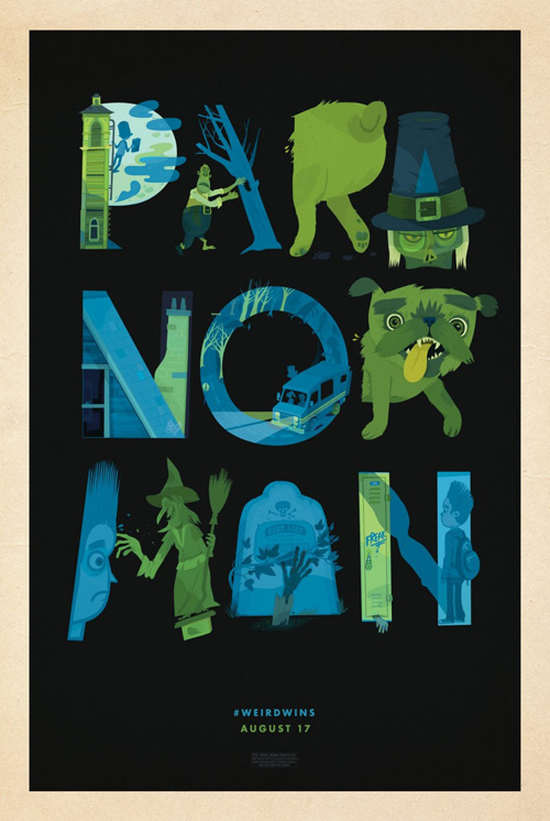
2012’s ParaNorman tried something new by getting a bunch of artists to create their own interpretation of the subject matter. It resulted in a few fantastic looking pieces that showed some ingenuity beyond the screen. I kind of wished The Boxtrolls would have found a similar campaign strategy, but instead they went the route of character posters for each little monster.
These separate images leave something to be desired as their main appeal is their background motifs revealing some unknown detail to help give each shape. If anything, their best use is to familiarize the hoards of children they’re targeting with the goofier side of what could be construed as nightmare inducing if you didn’t know any better. “Cute” rules the day here and that can only assist their cause for box office success.
While the two full cast iterations at right show compositions more akin to Ignition’s main ParaNorman sheet with their symmetry, separated hemispheres, and collage of every character that may show up in the movie, my favorite of the bunch is the first one above. It’s a teaser simply showing a wall of boxes and the few trolls sticking out to laugh, smile, and step on each other’s heads. Quite possibly rendered in real life through maquettes (Frank Ockenfels is credited as photographer), this is both the most fun and most indicative of the animation style itself.
All smiles
 |
 |
 |
 |
It’s officially festival season when the posters hanging in theaters—minus family films—are devoid of smiles. No independent work worth a damn can be caught showcasing a grin because it might not be taken seriously enough for Oscar contention if so. I seriously wouldn’t doubt a few of these might have found their way to the producers before coming back to their art directors with one simple note: “Make it less cheery.”
 |
 |
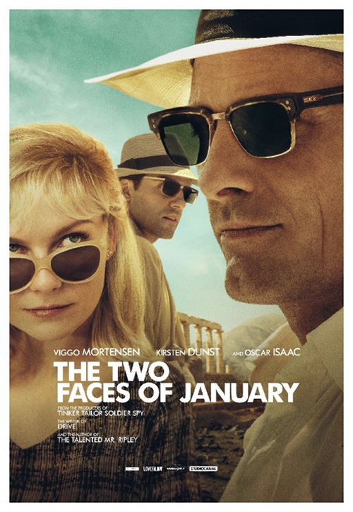
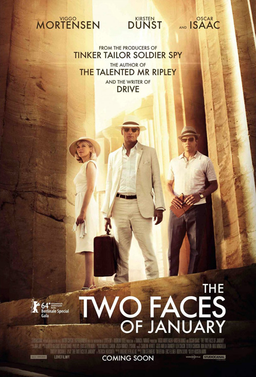
The first culprit is The Two Faces of January (limited September 26). All of its adverts make sure Viggo Mortensen, Oscar Isaac, and Kirsten Dunst remain as severe as possible. The latter verges on faltering with her lips ever so close to turning up in wryness, but that may only be because she’s stifling a laugh while looking Viggo’s way.
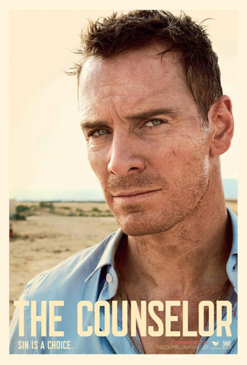
Facial expression aside, this sheet by The Refinery is a beautifully composed frame. The film could have gotten away with sticking to the one with everyone standing against a washed out background of columns, but they chose to go a little artsy instead. I love how Issac is framed between his costars in a way that lends depth and intrigue as far as how each interacts with the next. The grainy texture recalls and company‘s The Counselor too with its photorealism providing a look the glossy, plasticity of Hollywood simply cannot match.
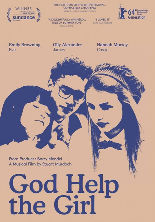 |
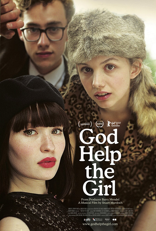
God Help the Girl (NYC September 5) utilizes a similar approach in how it showcases its stars without lending a fabricated collage feel. Rather than solely relying on scale to project distance, the responsible firm plays with focus as well. Olly Alexander is clearly farthest with his softness, Hannah Murray slightly before him, and Emily Browning crisp and clear at the foreground—each staring straight, daring us to continue peering back.
It’s light years ahead of the ugly two-tone secondary sheet displaying high contrast photocopy-like renderings of the trio. Talk about a poster that would get completely lost in the shuffle of more vibrant work. The first is simply better, sumptuous in its textures and color as our eyes are forever drawn into the red of Browning’s lips at the bottom before moving slightly right into the bouncy serifs of its stark white title font.
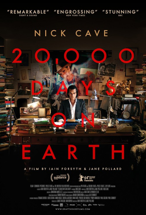
Where 20,000 Days on Earth (NYC September 17) is concerned, I don’t really know if Nick Cave has the ability to smile. His glare pointing our way from the center of the page is exactly the sight conjured while listening to his dark lyrics and brooding vocals. This is the devil of music lulling you closer, transfixed by his sharp eyes burning a hole into your brain.
Beyond his visage, though, this poster is also well designed. The black at top and bottom is expertly faded into the photo so there is no trace of its edge; the colorful office is muted just enough to not overpower the otherwise starkness of lights and darks mimicked in Cave’s wardrobe; and the bright Futura lettering is stepped inside the whole so we have another reason to enter cautiously, weary of any sudden movements by the man everything else appears to revolve around.
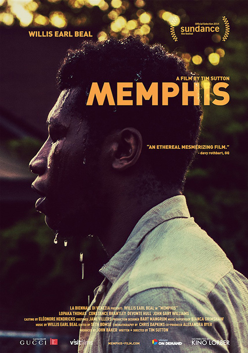
If September has one shining example of man caught in the throes of existential crisis as the world crushes his soul, it has to be Memphis (NYC September 5). The Kino Lorber release is given the most simplistic poster of all and yet it somehow proves to be one of the most powerful as well.
The coloring renders it into duotone although I’m quite certain it’s not actually so. The dark blacks and watered-down yellows simply permeate the image until it’s all you can see. Unafraid of fitting the pieces together wherever they look best, the designers refuse to follow any specific grid or justification. They wanted Willis Earl Beal‘s profile to fill the frame first and foremost, his silhouette creating an aura around him as water drips become suspended from his face. The text is mere afterthought, fit in not at the center like the bottom block, but in meticulously chosen areas meant for the greatest impact without sacrificing other crucial details to ensure legibility.
Running mazes
 |
 |
 |
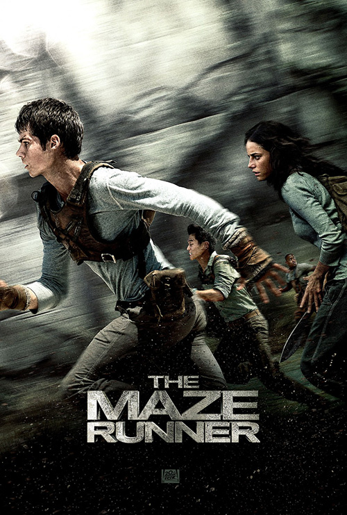 |
Teaming up on The Maze Runner (September 19) is Ignition and cold open. Well, I guess they’re actually competing, but one could say both are winners since both were selected together by the studio.
 |
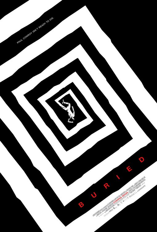 |
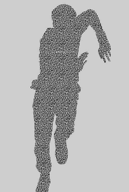
The latest attempt at cashing in on dystopian YA fiction, the brains behind the scenes of the property rightfully took a page from The Hunger Games‘ book by allowing themselves some sleek abstraction above glamour shot photography (Divergent decided on the latter). Just look at Ignition’s teaser. Was this ever hung in theaters considering no date is shown and only a tiny title at top and logo at bottom hidden in the right angles of the maze filling the page proves it’s a film at all? Do we care when the visuals are as iconic as this?
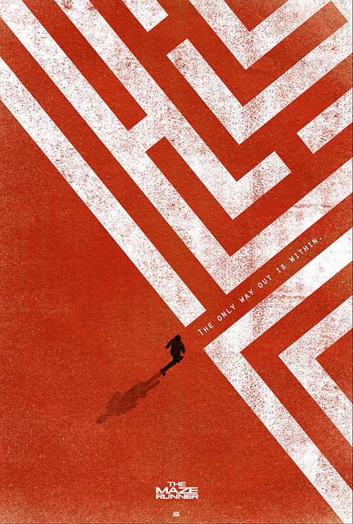
cold open looks to do similar things with their red and white counterpart recalling the oppressiveness of a swastika at first glance. It’s a totally minimal rendition of what the trailer showcases: empty expanse of safety against an unknown maze in the distance with one boy willing to enter despite the warnings. Like Ignition’s Buried before it, the geometry itself makes it stand out from the pack.
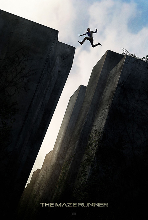
It’s not all lines though as the next two photo-centric examples are just as captivating. The first uses scale in a way that can’t help but wrest your attention from anything else it may have been honing in on. The walls are rising into the sky at an 80-degree angle—just askew enough from straight to warrant an uneasiness of balance while a shadowy figure leaps the gap. Again it’s just a title and logo, everything else seemingly inconsequential.
Hell, maybe it’s because the others are so good, but cold open’s motion-blurred piece of actors running horizontally is even worth mention. Between the stone texture of the title, grittiness of the imagery, and smoothness of the lines shooting across the frame, there’s a realism that shouldn’t exist with four characters at drastically different depths all appearing in-focus. Yet somehow my brain doesn’t seem to care.
Honeymoon guests
 |
 |
 |
 |
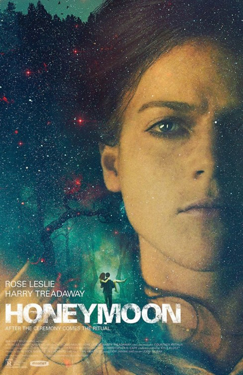
The Refinery wasn’t done showing off stoic faces looking into the distance. For Honeymoon (limited September 12), Rose Leslie‘s visage floats translucency on the surface as a starry sky pushes through to lend the whole an otherworldly feel. There’s a stunning beauty to this sheet, intriguing in its mystery despite revealing nothing of what it actually is. A man carrying a woman into a gap within the stardust of eternity—not quite the horror it is, but still unsettling just the same. I only wish the title font wasn’t so distressed and cheap looking in comparison.
 |
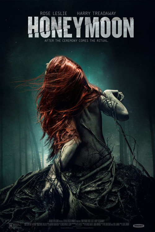
It’s much better as a piece of art than the firm’s other, blatantly horror-themed iteration of a twisted Leslie being dragged down into the earth by the clutches of tight roots. In come the foggy night air, the dark color palette of greens and grays, and the shattered title projecting a sense of helpless dread. As far as posters that hit you over the head, however, it isn’t the worst I’ve seen.
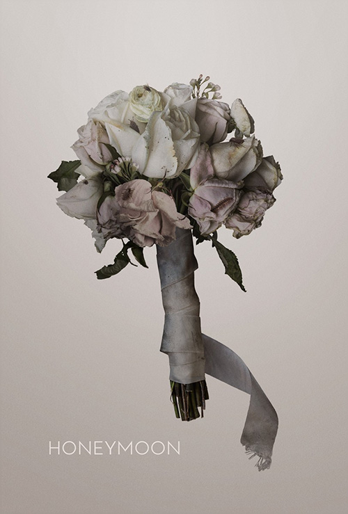
But while the first is tough to forget, this sparse tease is what cannot escape my thoughts. A simple bouquet of flowers suspended in the air with thin white letters giving us nothing but a name, it still possesses a feeling of uncertainty and fear thanks to the lighting and color. Who knew something so intrinsically linked with joy and celebration could cause the exact opposite feelings? Palaceworks, that’s who.
 |
 |
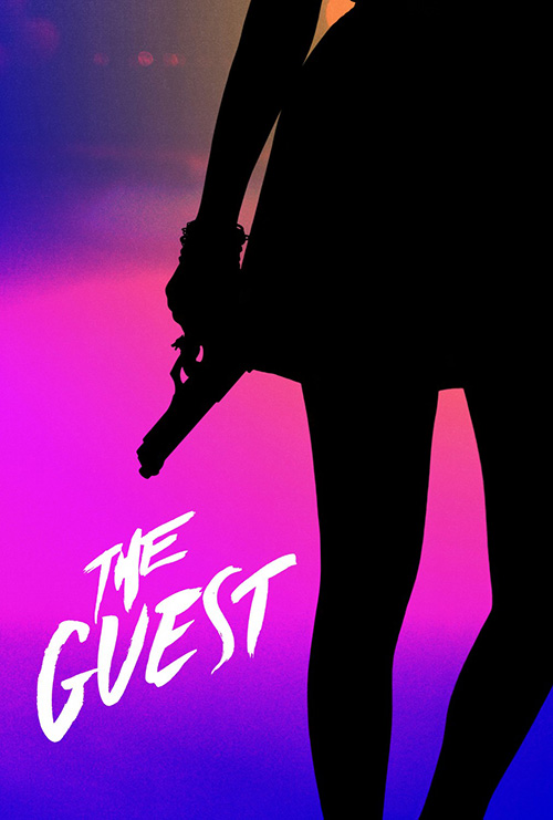
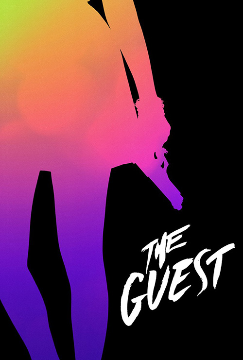
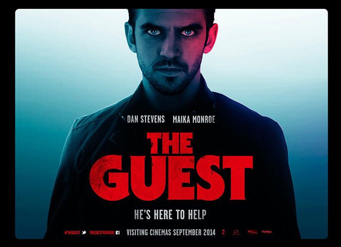
On The Guest (limited September 17), Blood & Chocolate feel okay using just a title too. Mirror images with the neon colored airbrush rainbow alternating between positive and negative space, you can’t help from getting a rush of adrenaline while looking at the piece. Utterly unique and abstract, you’d be hard-pressed not to remember the name hours afterwards considering it is literally all your mind can retain besides the two-dimensional aesthetic itself.
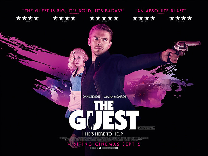
There’s no way the movie would have survived on just these alone, however. I haven’t seen a domestic version yet, but the UK quad-sheets definitely align with the already present style for an eighties look perfectly suited to its spot in TIFF’s Midnight Madness. While I prefer the colors and subtle darkness of the first to really let the thick red letters pop, the photographic version isn’t completely without merit. It may be the least interesting of the bunch and the neon pink splash beneath the actors may have been more effective without the burned-in image, but I enjoy the composition and the addition of its silhouette cutting the title regardless.
Peering into the sky
 |
 |
 |
 |
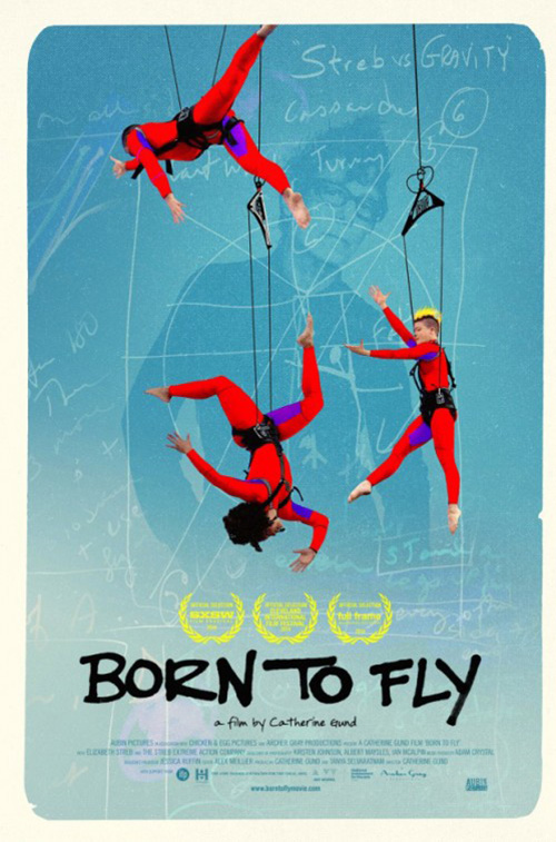
My favorite part of Desi Moore‘s poster for Born to Fly (September 10) is the fact that the rounded cornered border is so obviously off-center. It reminds me of old hockey cards when the printing process allowed for many to be so horrifically cropped that the value would be drastically different from another. It enhances the homemade feel of the central painting, the thickly scrawled font, and the blackboard diagram at its back.
Even without motion blurs too, you can still anticipate the spiraling occurring on behalf of each figure shown. They twist and twirl at their hip joints to contort like a Robert Longo painting in their bright red jumpsuits that ensure they’re seen as closer than any other aspect of the poster. There’s a comfort in how carefully constructed it all is; a welcome manufacturing that drawing affords where photo manipulation does not.
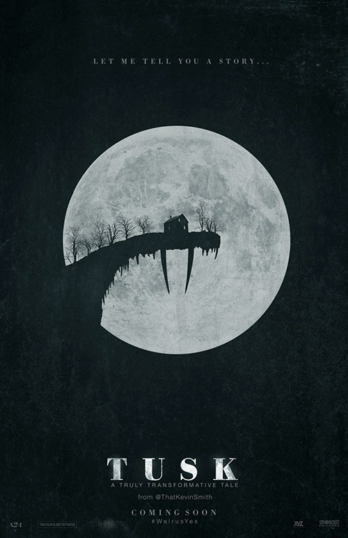
Meticulous positioning is also key to Ignition’s Tusk (September 19). The pun of the titular walrus appendages silhouetted against the moon as though extra-long stalactites adds a bit of humor despite the horror genre writer/director Kevin Smith now appears to be embracing of late. It’s a minimal design with just enough of a tease to whet your appetite and find out more thanks to the Twitter-heavy text at bottom giving Smith’s handle as well as the film’s official hashtag.
Did anyone ever think a Kevin Smith film would warrant an artistic poster such as this considering an oeuvre consisting of toilet humor and acerbically cynical slackers? Doubtful. But that makes its existence all the more potent.
 |
 |
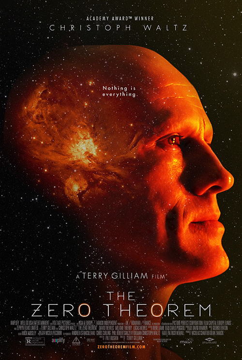 |
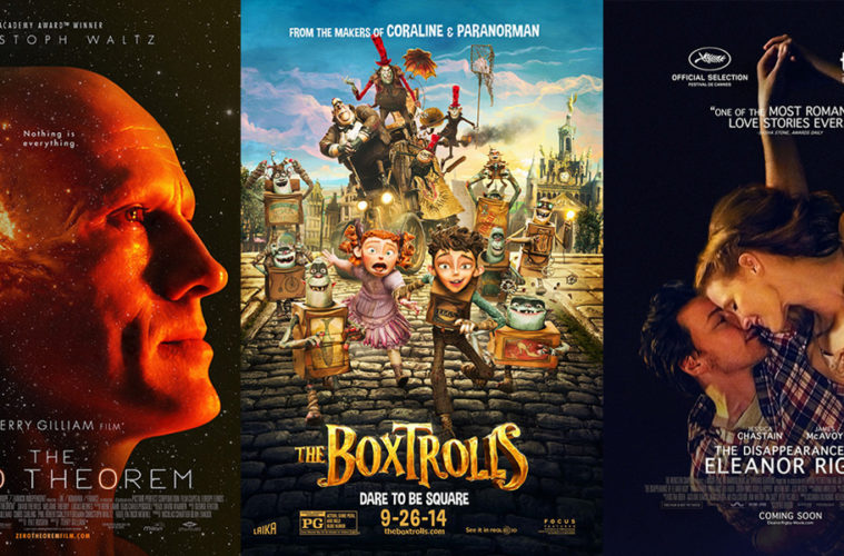
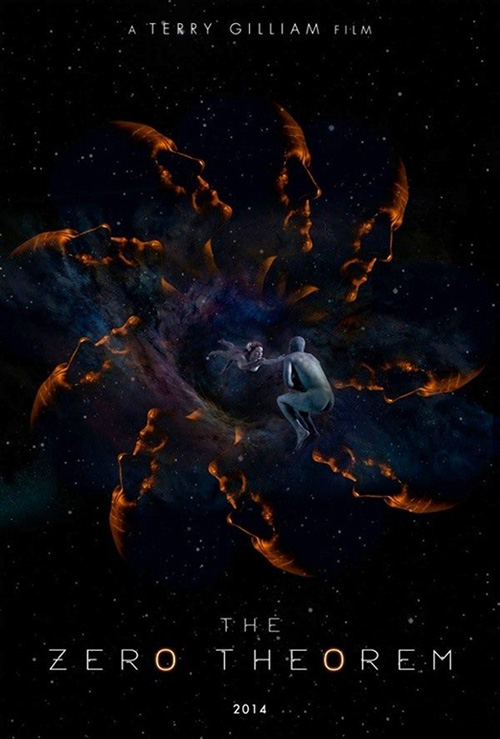
Keeping with the space/sky theme comes the infamously banned advert for Terry Gilliam‘s The Zero Theorem. Rather than last month’s contoured “under boob” courtesy of Sin City‘s Eva Green, the body part in question here is Christoph Waltz‘s butt. Yes, a bare-butt. Network television could advertise that NYPD Blue‘s latest episode would show Jimmy Smits‘ rear-end and yet this tiny, blue, floating backside is too much for the censors.
It’s a shame because the poster is interesting if not spectacular. I think it might have been even better without the spiral of Waltz’s faces fanning out to circle the floating bodies at center, but they do nevertheless add to the creepy/weird quotient. What I love about it is the fluorescent tube-like font burning brighter on the “o’s”.
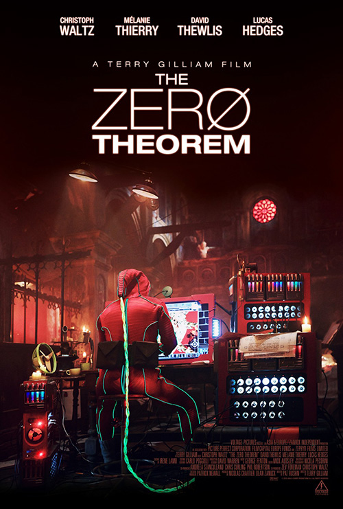
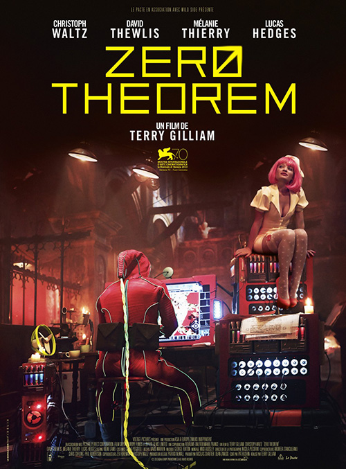
Much more captivating than what eventually replaced it—a red-suited man at a computer built from anachronistic spare parts a la vintage Gilliam without a bosomy Mélanie Thierry in nurse’s garb (US) and with (France)—at least a third giant Waltz head brings back some flavor from the original. The font remains as well as the sky of stars, and the way the celestial waves form his synapsing brain is a delight.
 |
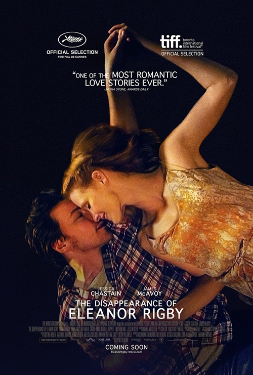
The one-sheet that most haunts me this month, however, is the beautiful The Disappearance of Eleanor Rigby (limited September 12). From the smallish title size to the not quite 90-degree turn of axis, there is a wealth of impeccable choices on behalf of the design team.
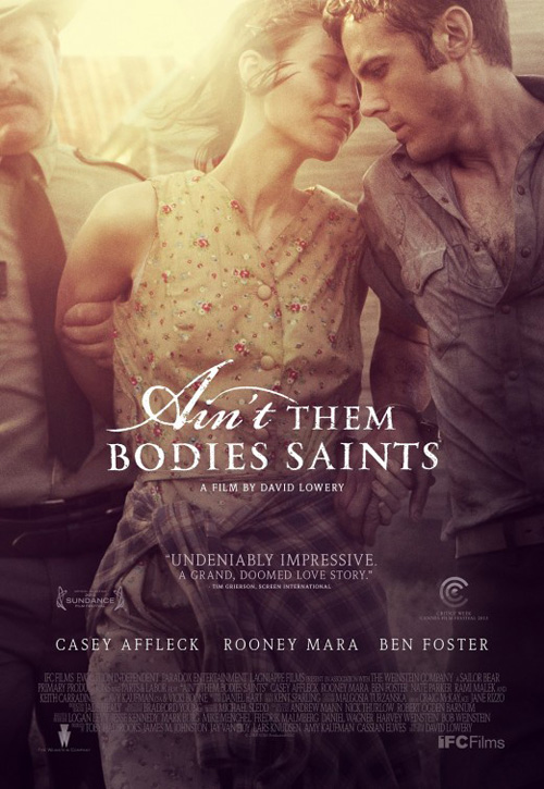
Reminiscent of P+A‘s Ain’t Them Bodies Saints as far as the positioning of these lovers—albeit with a completely different emotional context—there’s an unavoidable feeling of love. It’s as though James McAvoy and Jessica Chastain are floating in an embrace, the image a physical representation of what they’re experiencing internally. They are lost in each other—a fact only better surmised by the critic blurb at top. I just hope the final product is as romantically surreal as the image selling it.
What is your favorite September release poster? What could have used a rework?

