“Don’t Judge a Book by Its Cover” is a proverb whose simple existence proves the fact impressionable souls will do so without fail. This monthly column focuses on the film industry’s willingness to capitalize on this truth, releasing one-sheets to serve as not representations of what audiences are to expect, but as propaganda to fill seats. Oftentimes they fail miserably.
Thank goodness for the fall season. Not only are the films better, but the artwork generally has its own yummy indie flavor too. Close-up faces covered by sans-serif text reign supreme and somehow don’t wear out their welcome as big budget tentpoles dump boring rehashed character collages to assuage actor egos. If a Johnny Depp vehicle can be marketed without his adored visage on the one-sheet, you know the design world still has some tricks up their sleeves. If only they’d use them more regularly.
Heavy metal dancefight failure
 |
 |
 |
 |
Let me get this out of the way early. I love Craig Brewer’s films. Hustle and Flow and Black Snake Moan are two of my favorites from the past decade. So, even though he decided to remake a film I’ve never had an interest in seeing, I’m going to assume greatness until the finished piece proves me wrong.
 |
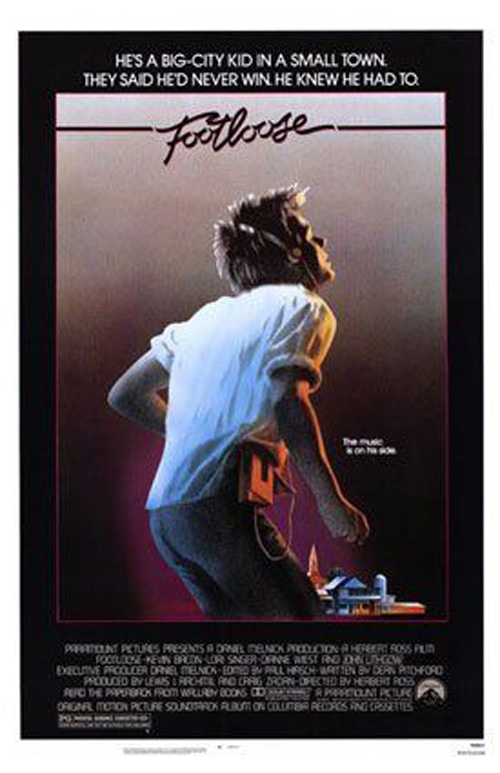 |
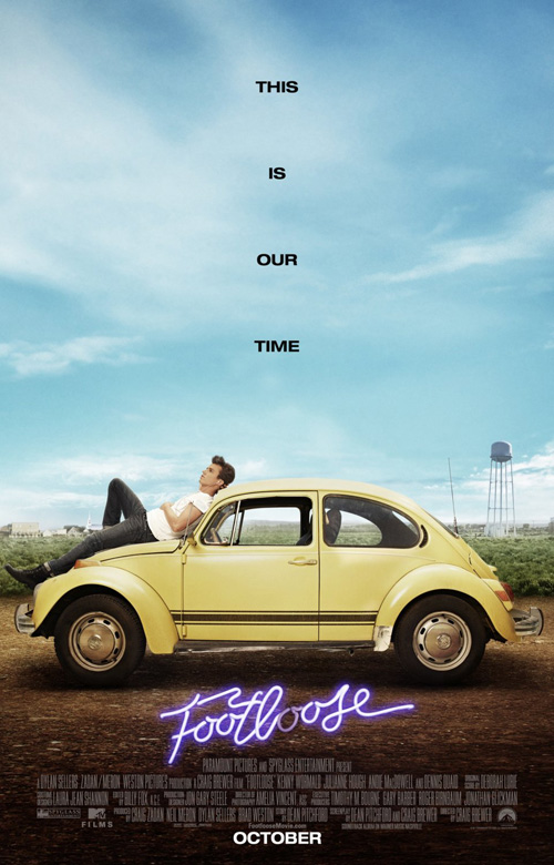
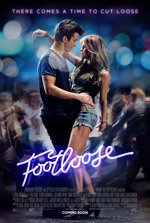
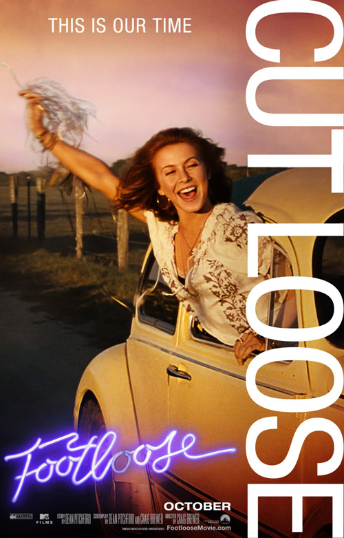
That said, however, the posters for Footloose (open October 14) are out and besides a really fun neon tube font, the generic vibe given doesn’t bode well for my anticipation of the film. I do love that updated title treatment, especially when BLT & Associates turns the first ‘o’ out—very subtle, highly effective.
But what’s with the images? Yes, they use the sky as white space in the first design and the blurred light spheres give the second a fantastic color scheme, but neither pops. Throw in the completely worthless character poster templates with “Cut Loose” awkwardly spanning the height backwards, (this is English, we read left to right, the line should start bottom right and read up—trust me, it’s easier to read that way), and the marketing team obviously doesn’t care about getting anyone to buy a ticket except for the newest brand of MTV-generation lemmings. Give me Kevin Bacon groovin’ to his Walkman any day.
 |
|
 |
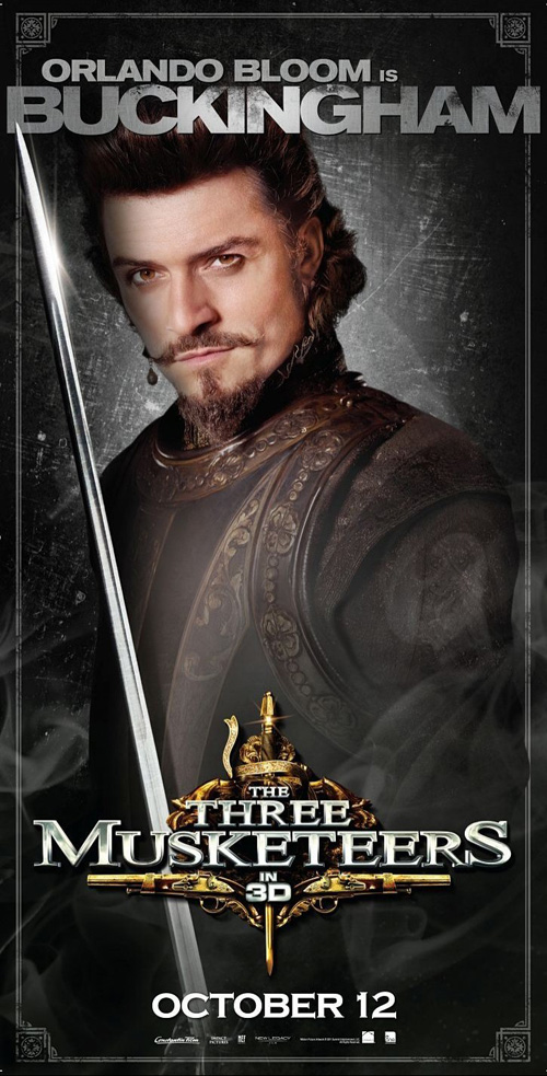 |
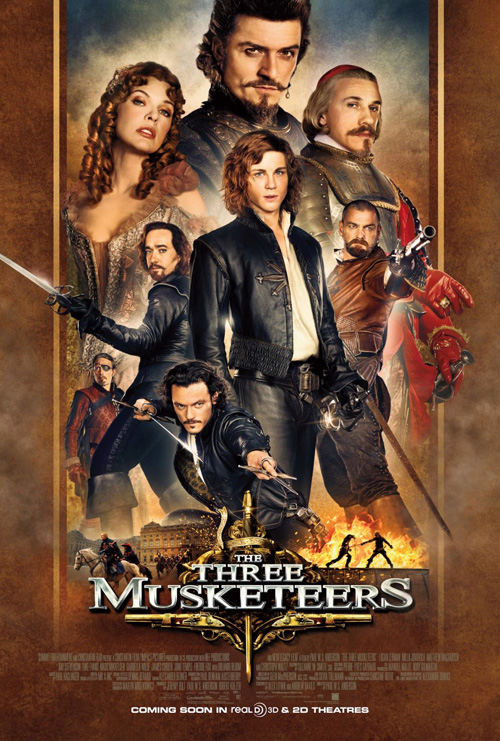
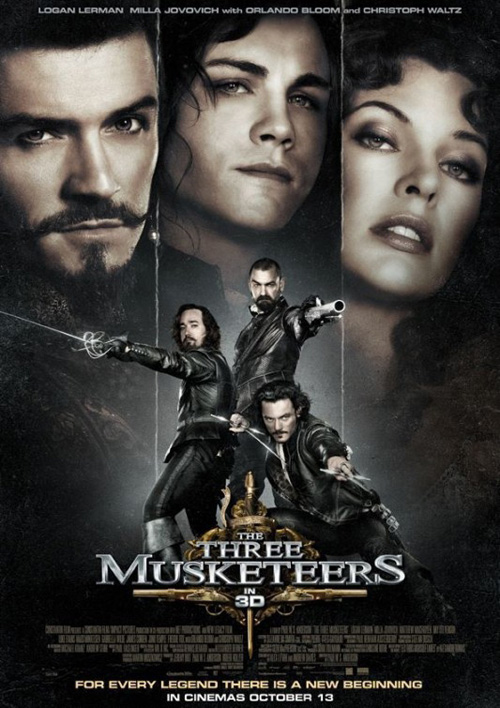
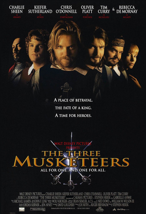
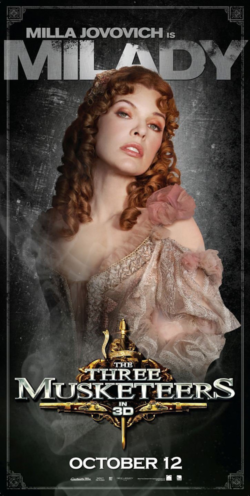
As for Paul W.S. Anderson’s October remake, The Three Musketeers (open October 21), there really isn’t anything redeeming about the posters. Except maybe nefarious Orlando Bloom and his earring—that’s … something.
The sad fact of the matter is that BLT’s storybook airbrushed tower of actors is the best entry. I have no clue who the titular three are—if Ray Stevenson is a musketeer, why does he have a gun instead of a sword—but the aesthetic seems to fit the subject matter more than the second attempt. Its giant faces oddly segmented by swiggly lines backdrops the trio in the foreground who look as though they’re posing for a statue to be erected in their honor. With character posters that do nothing but tell us the actor’s name and who they play, what’s the point?
I like Anderson—for the most part—but campaigns like this just scream to be bashed like all the little fangirls and boys love to do with anything he touches. At least the 1993 version didn’t try to be more epic than its mini Young Guns reunion.
Lazy, lazy, lazy, bad
 |
 |
 |
 |
 |
 |
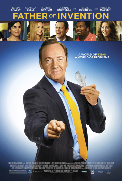
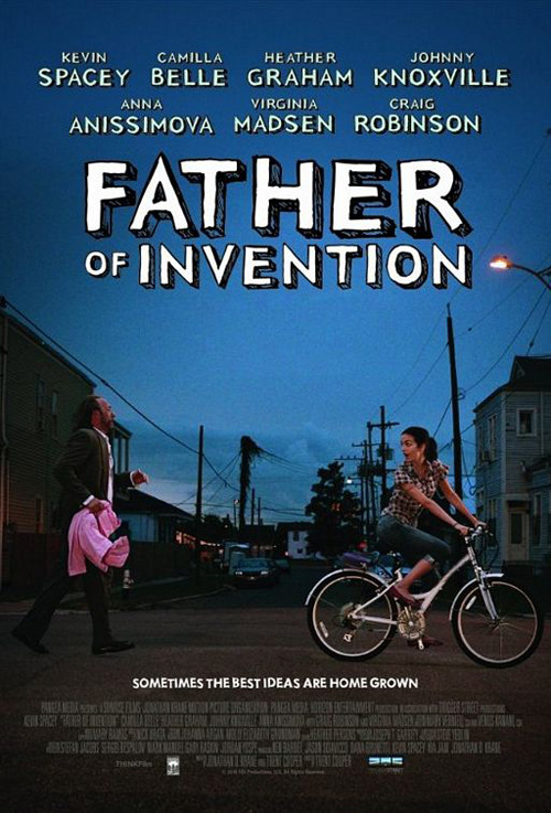
Is Kevin Spacey the Uncle Sam for light bulbs? Could this poster be any worse? The Refinery’s ad for Father of Invention (limited October 14) does nothing to make me want to see it. The usual cast photos at the top bore me and the huge Spacey grin makes me want to avoid it like the plague.
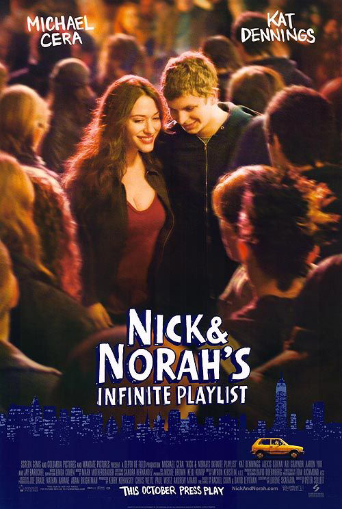
A second work does a better job at the intrigue—why is he running after her—but the Nick and Norah font seems completely out of place. I’ll take mimickers every time, though, if it meant over-produced dreck stops production. You can barely even see the title hiding above that giant head. And don’t get me started on its foreign counterpart … what is this film about?!
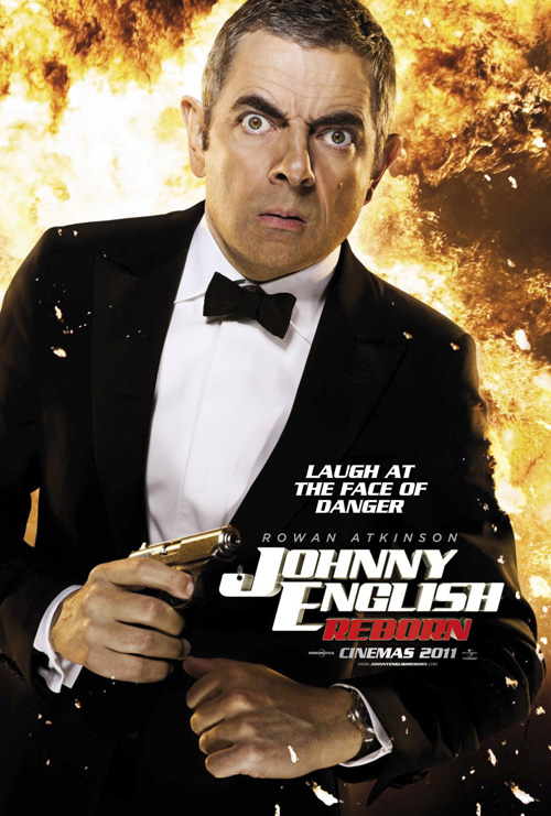 |
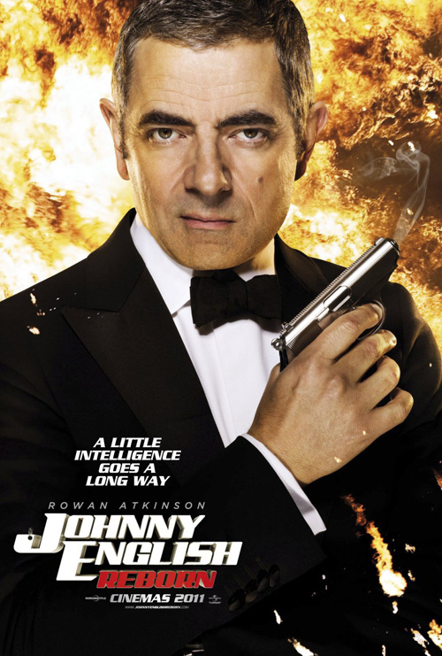
At least Johnny English Reborn (open October 28) is supposed to look lazy and generic. It’s Mr. Bean as Bond. Part Two. I didn’t think the first did business stateside let alone enough to make Universal Pictures give its sequel a wide release. I like Rowan Atkinson as much as the next guy, but most Americans probably still don’t know who he is.
So, if you’re going to try and get butts in the seats, go for the funny, Creative Partnership. If you have no clue of genre or character, that first poster would probably have you thinking Bond copy full of action and adventure. Boy would those people be surprised. Let Atkinson shed some light on his physical comedy and make a silly face. At least then people may take pause and do some research.
 |
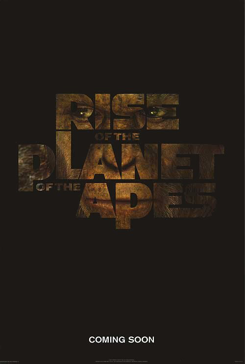 |
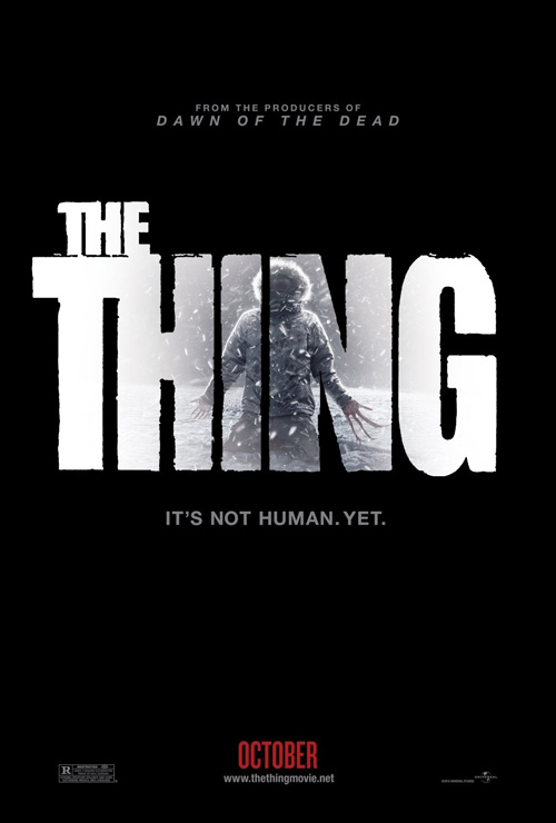
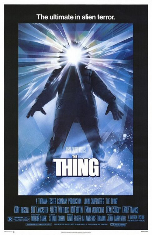
And if having your star center stage isn’t lazy enough, how about The Thing’s (open October 14) title treatment window tease? Drew Struzan created a captivating image for John Carpenter’s original in 1982 and the remake’s marketing firm decided to copy it realistically and shroud it from view. Go for glory; don’t be afraid of getting in our face with this creature. It’s still hidden and the allure is present, so why crop the image with letters? Rise of the Planet of the Apes tried too and all I can ask is when did this become good advertising? If you have something to hide, hide the whole thing. Create an artistic representation of it; have some fun. Sometimes using the title treatment itself make us wonder what the ‘thing’ could be.
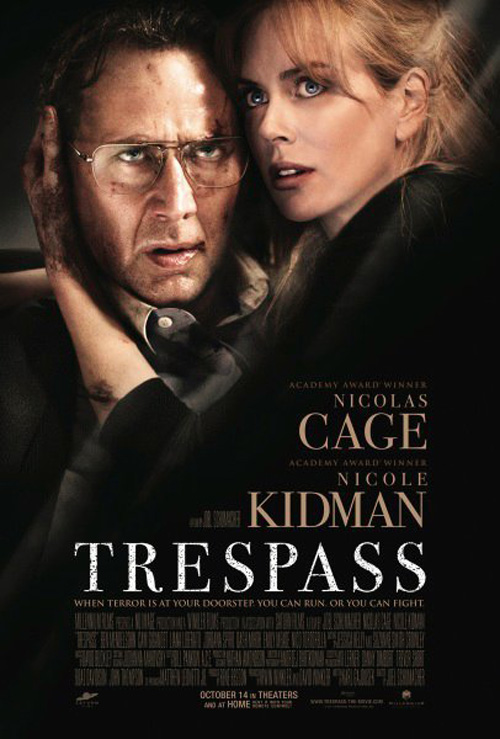
Stockholm Design should have utilized this trick with their poster for Trespass (limited October 14). They couldn’t have put a more unappealing image on display. It’s scary, it bothers me, and the unnatural airbrushing effects don’t help. I do find it funny, though, that Joel Schumacher’s name is squeezed so thin it’s barely readable compared to Cage and Kidman’s. Stockholm made a smart decision there.
Intriguing in spite of themselves
 |
 |
 |
 |
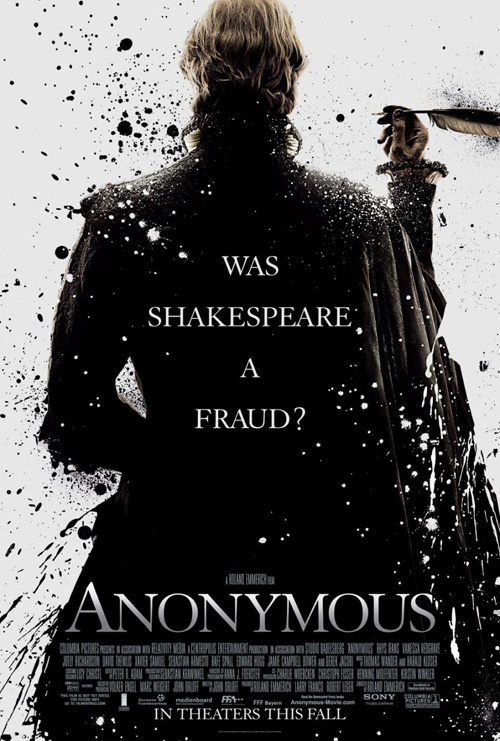
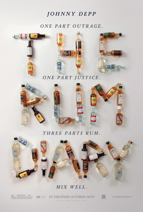
Sometimes abstract is where you need to go to drum up interest. Look no further than Anonymous (open October 28) and The Rum Diary (open October 28) for examples of how it can be done—effective or not.
In all honesty, the fact Roland Emmerich made a film that doesn’t involve the destruction of our world has me buying a ticket on its own. Maybe this thing goes all Doctor Who on us with aliens attempting to rip a hole in the fabric of space through the orations of William Shakespeare’s actors, but I don’t think so. There might be more to the Master of Destruction than meets the eye, just like Ignition Print’s poster of Rhys Ifans’ back splattered as though between Jackson Pollack and a canvas. I imagine blood, flowery phrases, and at least one good explosion. How can he resist one?
But Ifans—no matter how awesome—is no Johnny Depp. This is why the idea of leaving Depp off the poster for the Fear and Loathing in Las Vegas sequel is inspired and actually doing it insane. While such a concept is strong, this one-sheet unfortunately isn’t too great with unattractive rum bottle wordplay. I can get behind a poorly executed poster that tried to be clever, though, much easier than a run-of-the-mill floating head monstrosity we all assume every poster will be.
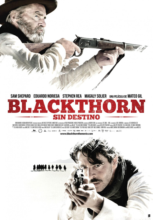 |
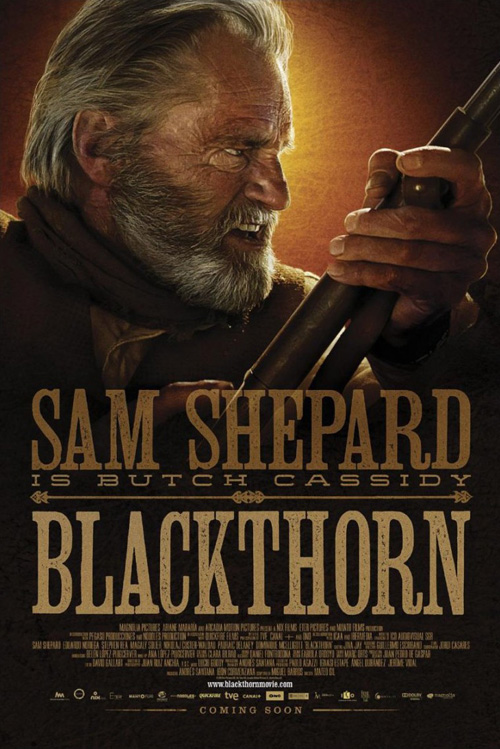
Luckily, not all assumptions prove true. Sometimes utilizing half the design space with an actor’s face can be great. Sam Shepard’s angrily contorted growl as Butch Cassidy thinks so at least. This menacing expression has definitely piqued my interest in Blackthorn (limited October 7), as does The Refinery’s dark earth tone palette and the wanted poster style font. Its aggression overshadows its foreign comrade from Barfutura. The stark white is attractive with brushed image erasures, but it’s missing the in your face assault.
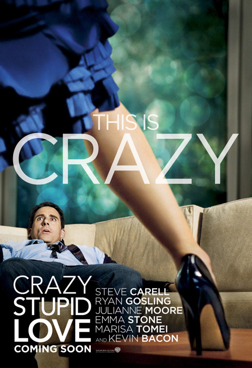 |
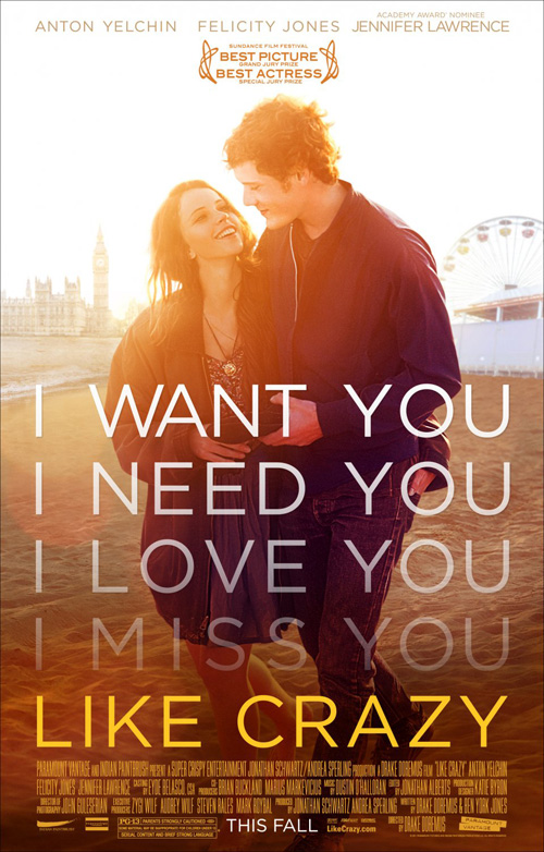
It also makes the mainstream appeal of washed out light and flaring color lack bite. Like Crazy (limited October 28) does what we assume it would by posing its leads in a romantic, fun embrace with the orange of the sun glowing bright like their love. I’d probably like it more if the film it advertised was a studio picture—look how it uses the same translucent font as another ‘Crazy’ film this year—but this is a Sundance favorite and independent darling. Wow me like your movie supposedly will. Don’t throw creativity out the window and give me a CD cover.
![]() Fascinating faces
Fascinating faces
 |
 |
 |
 |
And while the above includes some lackluster examples of actor face assault, October has a very healthy portion of inventive and artistic ways of that motif.
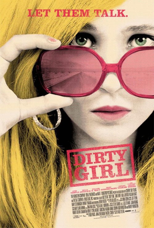
Cold Open goes for some artistic grandstanding with Dirty Girl (limited October 7). Procuring Pop Artist Roy Lichtenstein’s halftone dot patterns, the design screams for attention by stepping just outside of photography’s grasp. The muted yellow and pink complement each other nicely and the framing of Juno Temple’s face is off-center enough to be satisfyingly unique and in concert with the off-kilter type at bottom right. There is an attitude portrayed along with a sexuality that begs to be discovered.
 |
 |
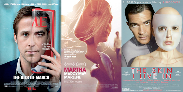
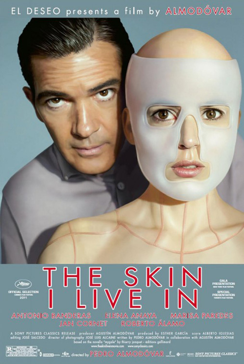
Frequent Almodovar design collaborator Juan Gatti decides to subtly play with photography in his advert for The Skin I Live In (limited October 14). The imagery scares like I hope its melodramatic horror film will too. The fearless cropping of one eye from each actor adds a fantastic flourish in full bleed. Between her mask and Antonio Banderas’ smoothed, re-touched skin, the mirroring of pristine looks gives an odd feel of kinship. And of course America’s need for clarity mucks it all up by simply using the original still. It’s always crazy to see the same image used twice with completely opposite levels of effectiveness.
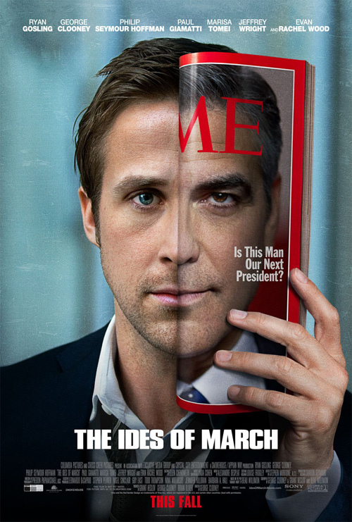
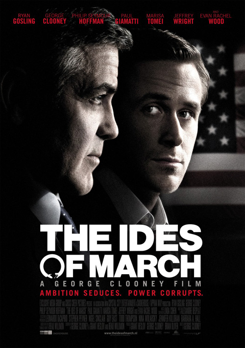
Continuing with face combinations, Ignition Print goes one step farther for The Ides of March (open October 7). Showing up Cold Open’s more rudimentary design, these kids go aggressive by either creating every woman’s ultimate fantasy—a Ryan Gosling/George Clooney hybrid—or seriously creeping people out. It’s the man behind the man, a perfect allusion to the Presidential race of the movie’s plotline, and the seamless use of a Times magazine prop hits it out of the park.
 |
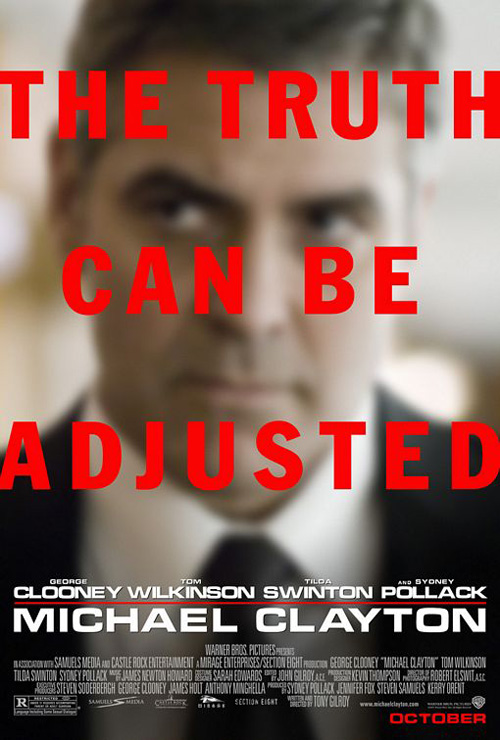 |
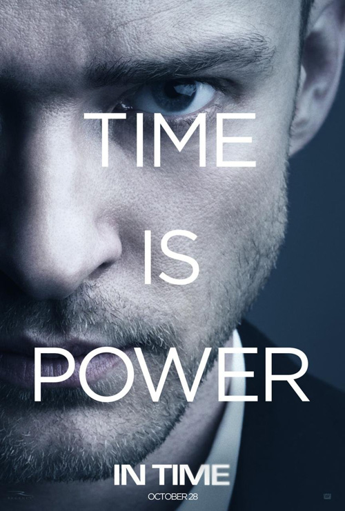
But to me, no matter how inventive, (yes, I know it kind of rips off Mad magazine’s fold-in), The Ides of March doesn’t beat out Ignition’s other campaign—In Time (open October 28). It’s simple, but effective. The cropping of both Justin Timberlake and Amanda Seyfried are identical and the text overpowers despite its thin, clinical sans serif font. It reminds me of the effective one-sheet for Michael Clayton and does a great job to make a tagline do the heavy lifting.
![]() Mmmm, mmmm … good
Mmmm, mmmm … good
 |
 |
 |
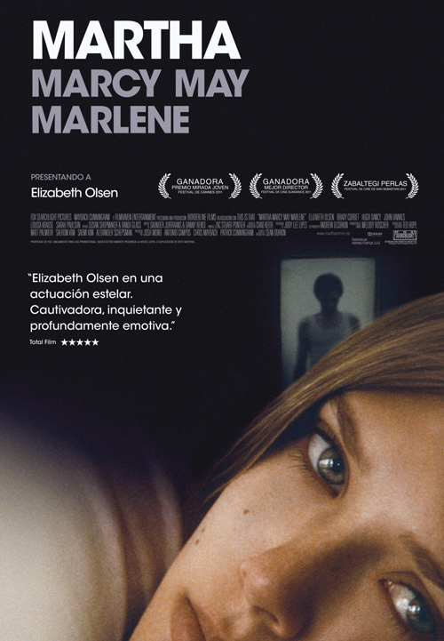 |
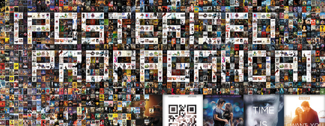
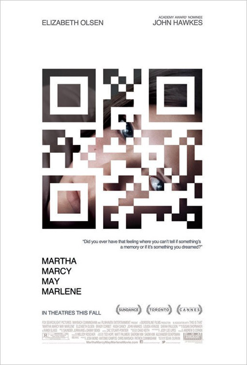
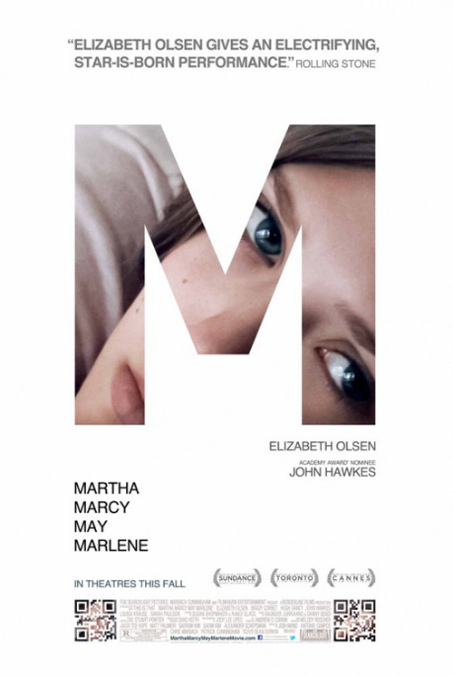
The month’s winner—and most likely the year’s winner—is Martha Marcy May Marlene (limited October 21). It’s a campaign that began by actually utilizing QR Codes for their intended purpose and evolved to the gorgeously ethereal sheet from Empire Design and eventually its black, neatly cropped photo-based counterpart.
With so many companies deciding to throw QR Codes into their ads without fully understanding their use—I can’t even count the number of clients where I work who put one in that links to their very non-mobile friendly websites—MMMM does it right by linking directly to the films trailer for handheld ease. A mystery of identity, the posters also double as a new age ‘missing’ advert, this girl played by Elizabeth Olsen lost in memory and unknown.
 |
But that entry from Empire is simply amazing. Its use of negative space to construct positive is mesmerizing and one could even say the newest Girl with the Dragon Tattoo by Neil Kellerhouse takes a more minimal page from its book. Fox Searchlight definitely knows what they are doing.
What is your favorite October release poster? What could have used a rework?

