“Don’t Judge a Book by Its Cover” is a proverb whose simple existence proves the fact impressionable souls will do so without fail. This monthly column focuses on the film industry’s willingness to capitalize on this truth, releasing one-sheets to serve as not representations of what audiences are to expect, but as propaganda to fill seats. Oftentimes they fail miserably.
—
August isn’t fooling around with a ton of releases spanning both big budget and independent productions. I couldn’t even begin to talk about them all here—sorry Sparkle—but there sadly aren’t many designs worth mentioning anyway.
A lot of rehashed ideas litter the slate to accompany the sequel/reboot material they’re advertising and only an inspired viral campaign from the king of artistically minded posters saves us from mediocrity. Festival season better come soon or I won’t have enough worthy work to construct a top ten at the end of the year.
Sequel series
 |
 |
 |
 |
 |
 |
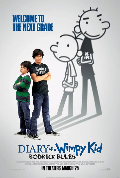 |
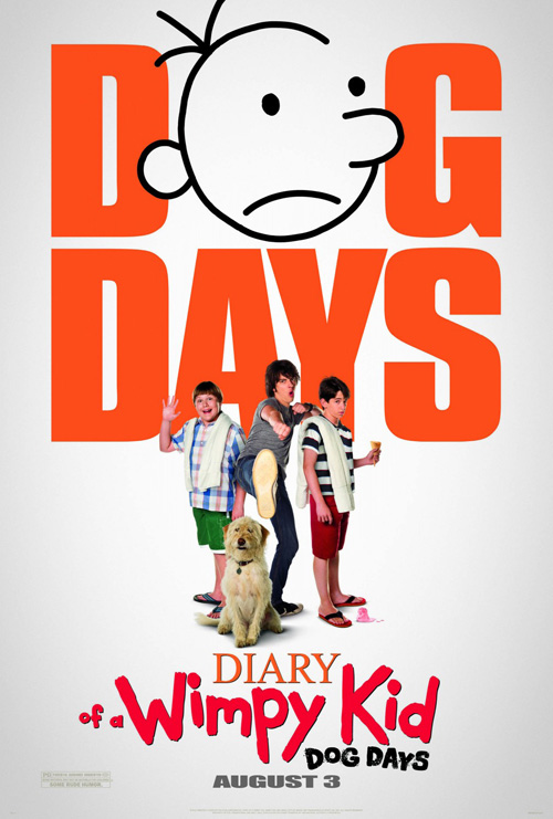
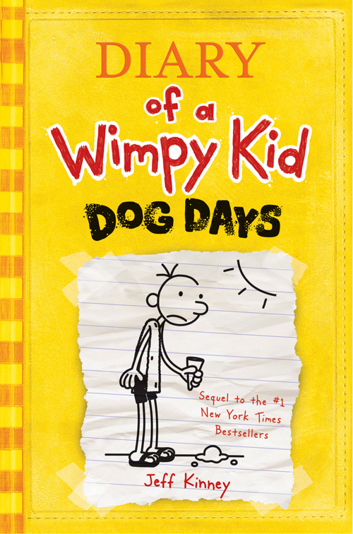
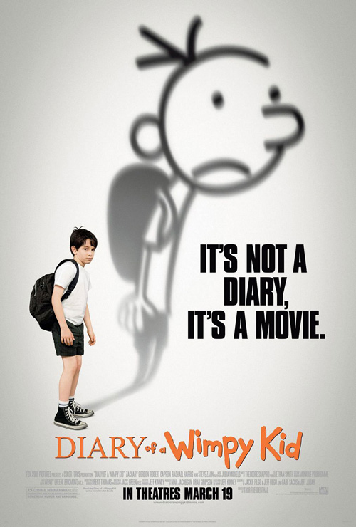
I’m not sure why 20th Century Fox Domestic Theatrical Creative Advertising decided to move away from the original line-drawing animation of Jeff Kinney‘s children books, but Diary of a Wimpy Kid: Dog Days (open August 3) could have used the shadowed cartoons to stop audiences from quizzically starring at Robert Capron‘s goofy face. The endearing quality of the original two films’ isolated actors with elongated, animated counterparts is absent here, leaving us with an assault of huge sans serif orange letters.
I’m pretty sure I saw a shadowed rendition at my local Regal in stand-up advert form, so I’m not sure why the poster didn’t follow suit. Fox designed the original too—with Gravillis Inc. doing the honors for Rodrick Rules—so it’s not like there was some sort of copyright issue. The crudely lined figures are a staple on the page and should be here as well.
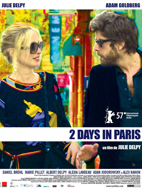 |
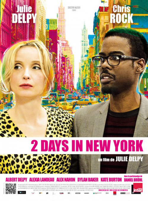
A series—well, pair—that should have refreshed its look is Julie Delpy‘s 2 Days saga. Silenzio Communication ends up taking the exact same layout for 2 Days in Paris and simply changes the color scheme and leading man for 2 Days in New York (limited August 10). Weirdly filtered in Photoshop and possessing awkward expressions on behalf of their actors, it’s almost like the firm wants to make viewers uncomfortable.
Something is definitely off-putting in the stylization and its white rectangles housing the title only projects a feeling of laziness. Maybe Delpy plans on doing more of these in other cities and wants a cohesive visual theme throughout by plugging new, colorful imagery into the drab shell, but I’d recommend trying something else.
 |
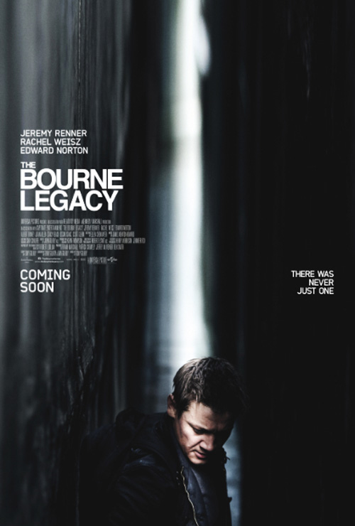 |
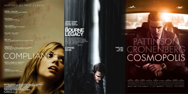
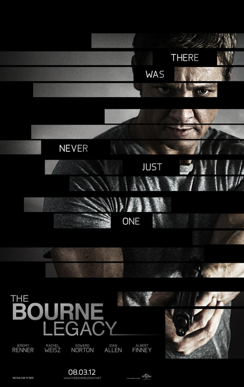
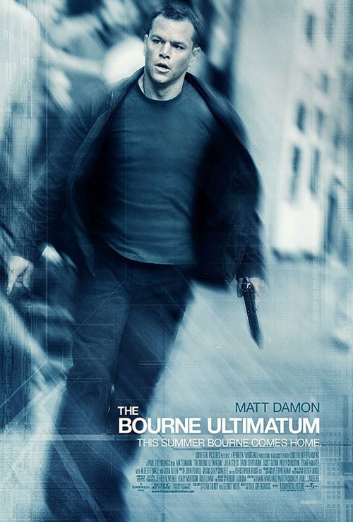
Conversely, cold open looks to give a new spin to the Bourne saga despite being unable to move away from the determined spy’s active, gun-toting visage. Looking to mirror the black bar effect of the film’s trailer, The Bourne Legacy (open August 10) looks like a last minute idea to quickly change-up an intrinsically boring photo. If you’re going to make people think the motif was planned, don’t forget to keep the rectangle height consistent throughout. I don’t care if the gun would be bisected at bottom right; the huge, untouched image block there looks like a mistake.
I’m not saying Crew Creative Advertising‘s one-sheet for The Bourne Ultimatum is much better, but at least they didn’t half-ass some sort of redaction theme. The blur creates motion/action—perhaps alluding to Paul Greengrass‘ penchant for shaky-cam—and does its best to create intrigue from a static shot. Legacy’s division serves no purpose and looks more underwhelming when put alongside what I can’t confirm is an official teaser poster or fan made art of an abstract Jeremy Renner lost amidst a corridor of diffused light.
This series has always been more than just action—this alternate piece portraying a higher level of artistic worth to complement why we’ve been following the Robert Ludlum brand so closely over the years.
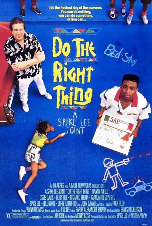 |
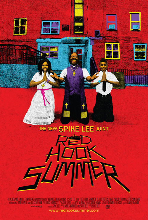
But it’s 11:24 Design Advertising—a firm who has put out a slew of Spike Lee joints—that finally improves upon their film’s predecessor. Designer of Do the Right Thing too, the continuation of Lee’s Mookie in Red Hook Summer (limited August 10) retains an extreme angle of over-exposed pigments to invite us in through its characters.
Lee and Danny Aiello are looking right at us back in 1989, making us a part of the work housing its fantastically chalk-lettered title on the pavement. While Red Hook‘s text treatment is unfortunately simple vector art adding perspective between Clarke Peters‘ welcoming priest and us, its lack of excitement only confirms what’s above to be our focal point. Peters and his extremely happy followers want us to join them and I’ll admit I would love to comply—if only because I feel he could hit an over-the-top preacher role out of the park.
I’ve seen you before, part 1
 |
 |
 |
 |
 |
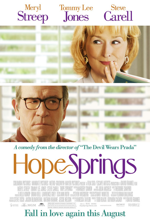
Aww, Meryl Streep is smitten and that cranky ol’ Tommy Lee Jones is having none of it. Who knew they could say so much with their emotive eyes and a generically composed poster? Iconisus L&Y – Visual Communication Systems do what others have been doing for romantic comedies since the dawn of time—separate their love interests by not separating them. Those blinds behind them on the Hope Springs (open August 8) sheet puts them together despite the top image being second linearly and the bottom, first.
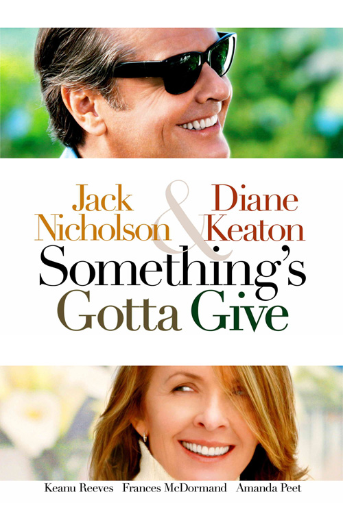
It’s not identical to BLT Communications, LLC‘s Something’s Gotta Give because Jack and Diane look consensual in their wink, wink flirting, but it’s just as boring. Too much white without ‘white space’, two weighted photo compositions that could easily be combined, and a weird hyphen flourish, (is the “Hope” springing into “Spring”?), between the words of the title all cause us to realize it’s a waste of paper.
 |
 |
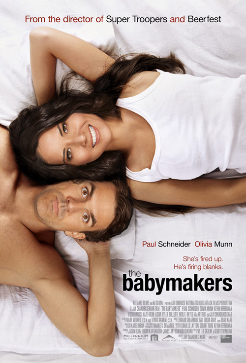
The Babymakers (limited August 3) achieves the exact same effect but at least Blood & Chocolate does it in one image. They don’t need to cut Paul Schneider and Olivia Munn apart to get the idea that she is “into it” and he is not. If anything, seeing them together makes the juxtaposition more effective.
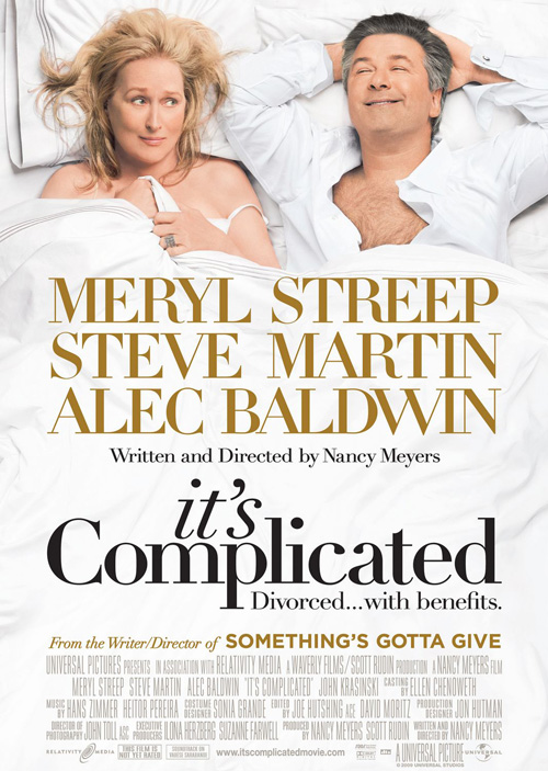
It’s funny too because BLT unknowingly combined both of these posters with the equally boringly white It’s Complicated. The difference between them all is that Streep and any co-star she’s allowed to share a bed with will always be more marketable than Munn and Schneider. When a Broken Lizard reference gets top-billing—although the studio still won’t put Jay Chandrasekhar‘s name in big letters—you’re going to need more than an overhead reaction shot to drum up intrigue.
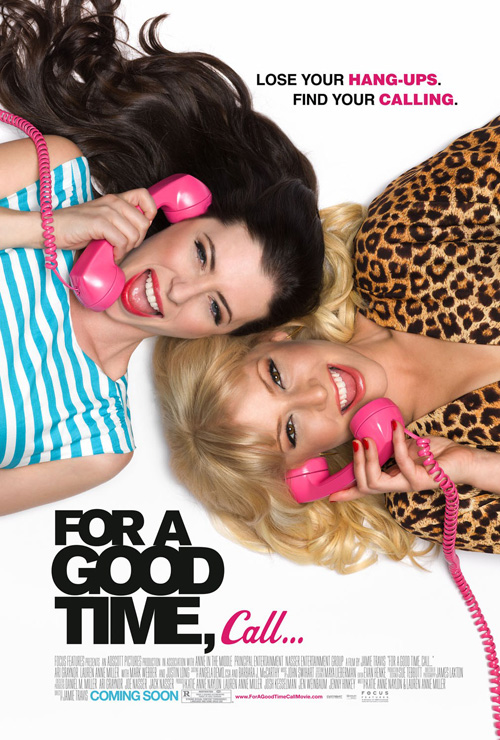
Maybe if Munn was the topless actor people could get behind the advert. Hell, Streep unabashedly lets a ruffled sheet sexualize her in the Complicated shot. And as far as August releases go, even For a Good Time, Call … (limited August 31) is more fun despite being the exact same layout due to its characters’ slightly kooky expressions and hot pink phones.
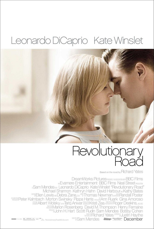 |
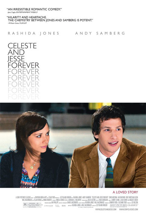
Not to fall prey to Hope Springs‘ problems, Cardinal Communications USA does let Celeste and Jesse Forever (limited August 3) keep a full screenshot intact. Does its depiction of Rashida Jones and Andy Samberg looking anywhere but our way help draw us in, though? Not really. BLT’s Revolutionary Road uses pretty much the same concept yet the engagement of its actors allows us to care about them instead of what they’re indifferently looking at.
And what’s with the weird placement of the title? Dwarfed by the massive field of white to its right, its repetitious fade loses all importance by being almost as small a point size as the quoted platitudes above. It took me forever just to notice a tagline was included at the bottom, crushed by the weight of the image and a complete afterthought. I guess Cardinal hopes recognizable TV faces are all they need to attract viewers.
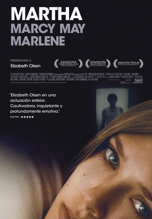 |
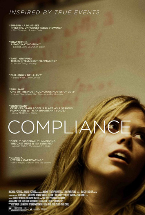
Compliance (limited August 17), on the other hand, feels the need for applause above its unknown face. Copying Bemis Balkind‘s Martha Marcy sheet from last year without the sense of foreboding John Hawkes‘ figure cultivates in the background, the coolest aspect is the meticulously spaced text placing the center of the title’s second “C” directly above Dreama Walker‘s eye.
Maybe those quotes could have been scrawled on the whiteboard or maybe closer together at the bottom so the glorious excess of empty space the crop creates could breathe. It’s a cool image that is let down by the need to tell people what others thought. And is Drew McWeeny‘s blurb misquoted or was the film initially named Significant? Significant ‘what’ cements Zobel‘s place? Tell me!
I’ve seen you before, part 2
 |
 |
 |
 |
 |
 |
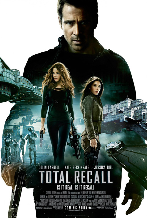 |
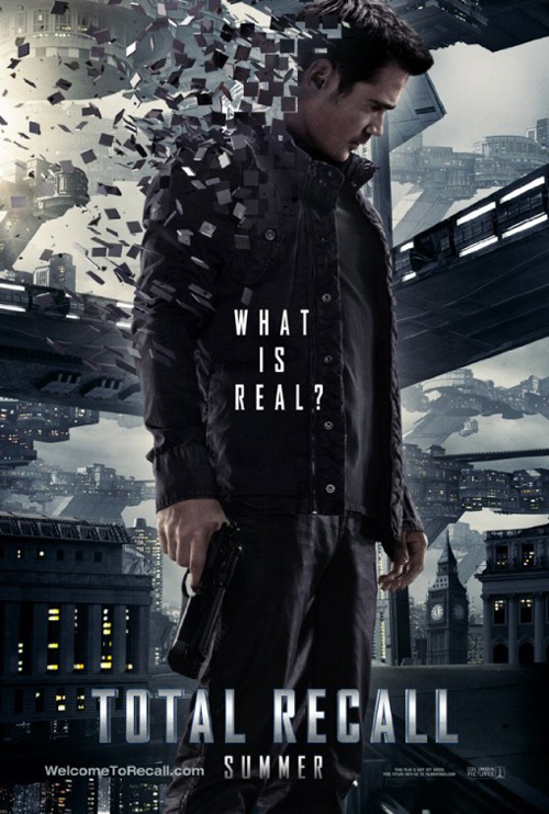
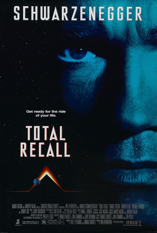
One of the best things to come out of the 1990 version of Total Recall was its oddly abstract marketing campaign. A monolithic triangle rose from the surface of Mars—coinciding with the key plot detail Pyramid Mining Corporation—as the blackness of space is blocked by a giant, blue-tinted, high-contrast image of Arnold Schwartzenegger‘s face. The icon had little to no relevance to the film itself, but it drummed up interest and helped the movie achieve great success.
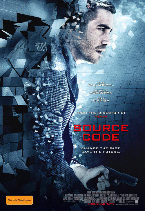
Instead of copying this platform, however, BLT decides to instead rip-off the already lackluster poster for Source Code by trailing Colin Farrell with a plethora of spinning squares. I guess this design element is the go-to for fabricated reality breaks. Between this parallel and the use of the exact same title font from two decades ago, Total Recall (open August 3) does little to show it will be an inventive new vision of anything.
Sadly, the campaign’s second sheet does worse by plopping its actors into a central totem while screenshots are integrated into Farrell’s silhouette. When did science fiction lose creativity? The sky should be the limit and all we get is retreads.
 |
 |
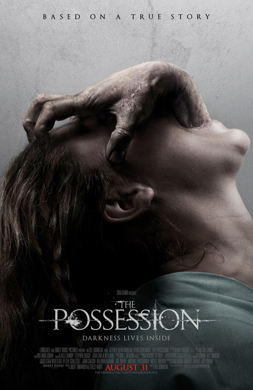 |
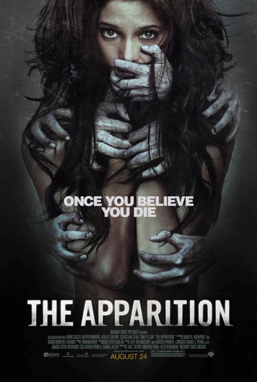
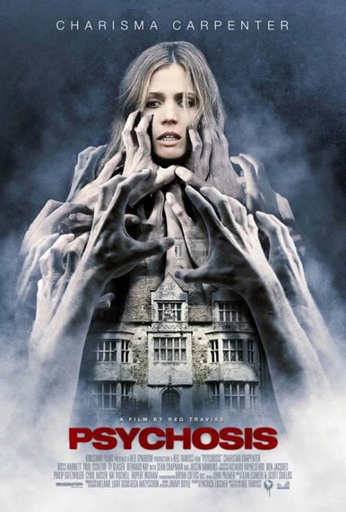
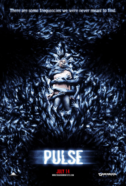
It’s not as bad as The Refinery’s The Apparition (open August 24), though. How many times are our horror films going to be advertised with their lead characters dragged down into a vacuum of black by demonic entities? Add grabby hands or subtract them, the idea is the same and it only shows audiences they’ve seen it before—the poster and probably the movie.
Stockholm Design‘s Psychosis and Refinery’s own Pulse do the same worse and better respectively while Ignition Print adds another rendition this month for The Possession (open August 31). Maybe if the background was pitch black and the hands didn’t seem disconnected from an evil body, I’d like this one more. Even the font irks me, though, looking as though the T-1000 from Judgment Day is turning each letter into a weapon.
 |
 |
 |
 |
 |
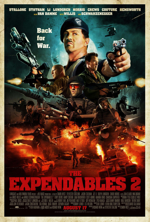
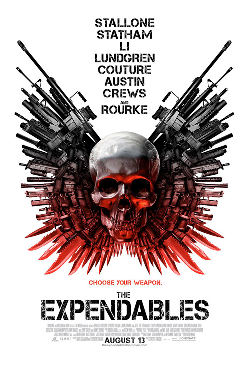
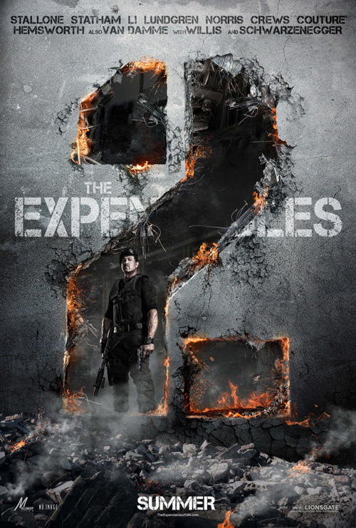
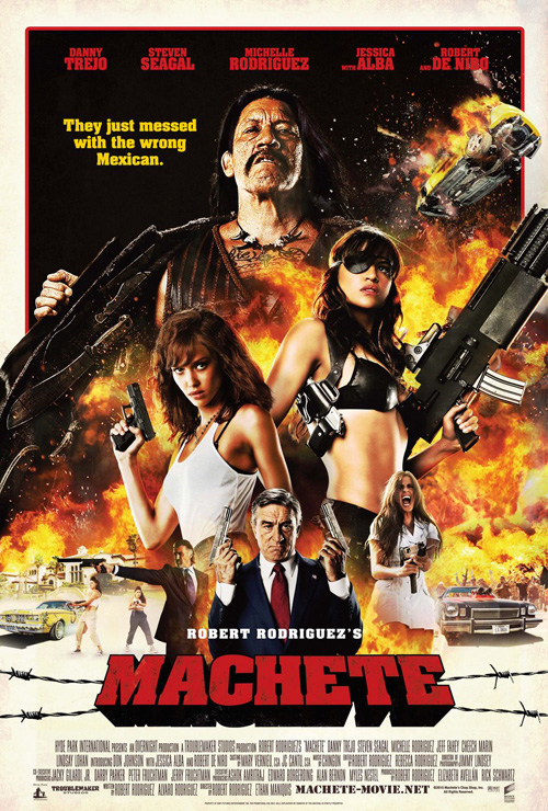
The Expendables 2 (open August 17) should have creativity, right? I loved Ignition’s skull headdress of guns for the first so I was actually a bit excited to see what they had in store this year. Admittedly, their destroyed wall forming the “2” wasn’t quite the unique design I hoped for. And then when they looked to get everyone on at once they just remade Kustom Creative‘s Machete, straight down to the font type and color.
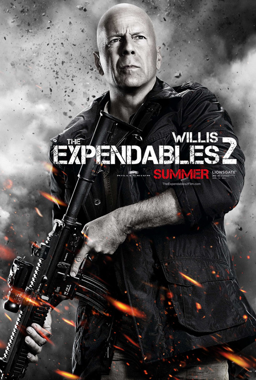
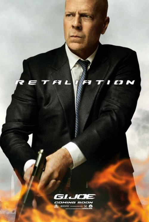
The separate characters also do nothing but annoy with flying debris and blurred yellow sparks of explosion making staged looks by each actor appear overwrought and far from the campiness I expect from the film. These Photoshop template constructions are easy and repeatable and Bruce Willis discovers he’s the best at stern badassery. Put his Expendables 2 image next to the delayed G.I. Joe: Retaliation from BLT and only the suit admits it isn’t the same film.
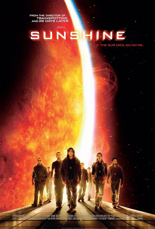 |
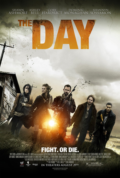
Whether apart or together, though, shots of would-be heroes showing no fear have officially become trite. As I’m still wrapping my head around why Bemis Belkind went this direction for Sunshine when the film had such stunning cinematographer and lighting, seeing The Refinery’s poster for The Day (limited August 29) steal its concept may not automatically mean the movie will be lame. But, considering the actors look motion-blurred for added effect, maybe it will.
I don’t know why it looks coffee stained or why the title makes the ‘The’ so much smaller than the ‘Day”, but I’m not surprised to see a sun become powerfully bright as it squeezes and magnifies through legs. Is it a horror flick? Post apocalyptic? Oh, it’s a WWE Studios production—maybe these kids are about to fight John Cena on the farm down the street.
Adequate is the best I can do
 |
 |
 |
 |
 |
 |
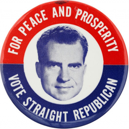 |
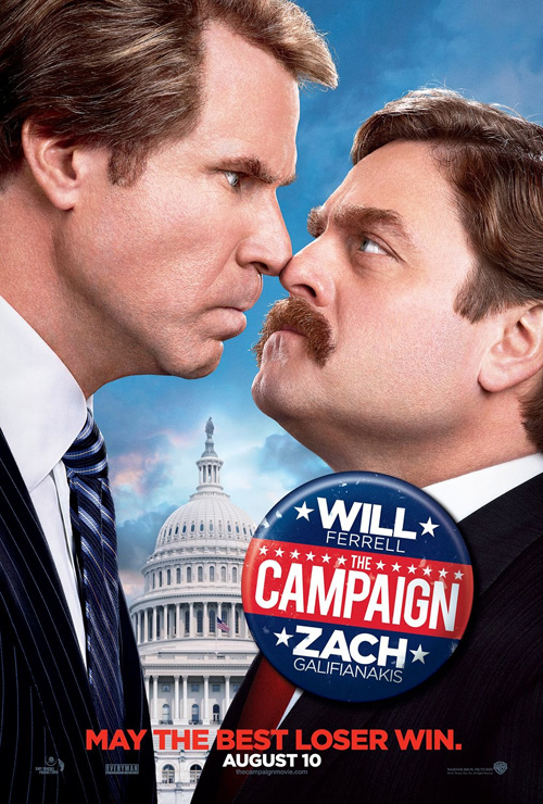
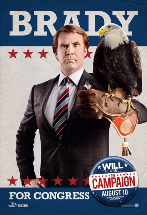
I actually really like cold open’s design for The Campaign (open August 10), pitting Will Ferrell and Zach Galifianakis nose-to-nose in front of the Capital Building. There’s humor, Americana, and a nicely drawn-up voter button giving us the details in red, white, and blue. Politicians are all about putting their faces in the public’s consciousness and this is a successful play on that while also depicting the vitriol between candidates.
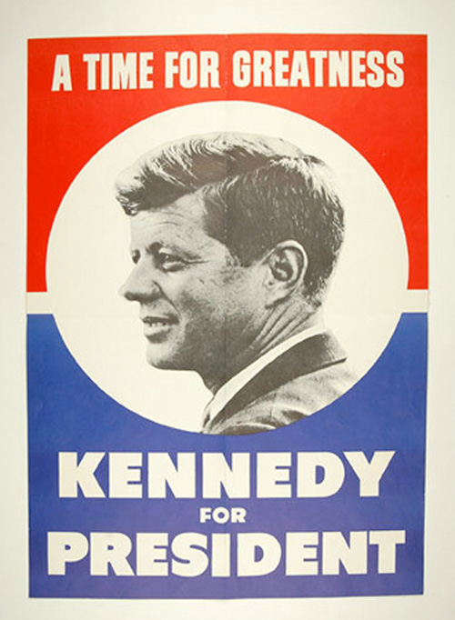
Where I wish the film’s marketing machine could have been better is with Art Machine, A Trailer Park Company‘s dueling sheets. They try and portray the simple, clean look of a Kennedy or Nixon campaign, but end up falling prey to the glossy look of today. I know it’s a comedy and putting eagles or dogs on display elicits giggles, but I feel the concept could have gone further to make it look like a legitimate party-produced placard as opposed to a movie theater display. Good in concept; disappointing in execution.
 |
 |
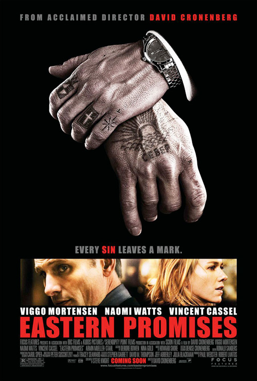 |
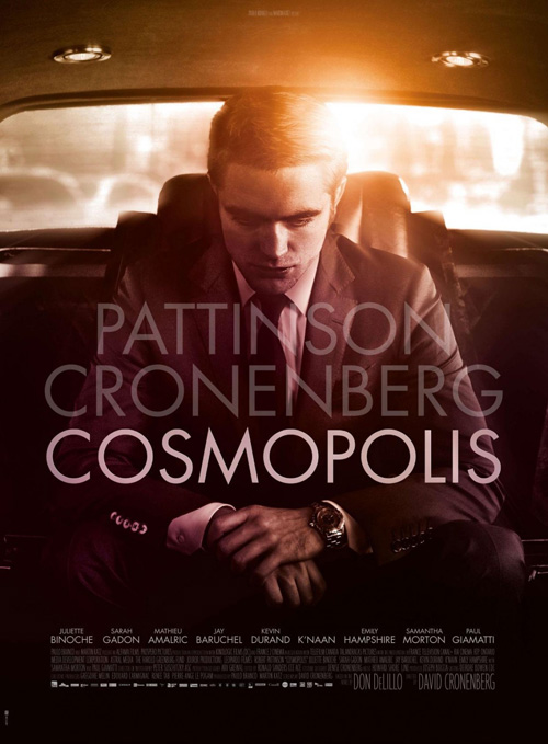
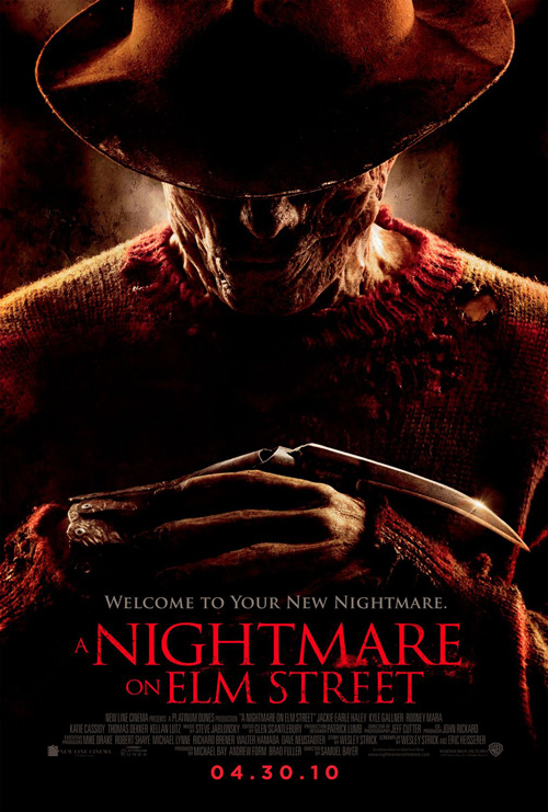
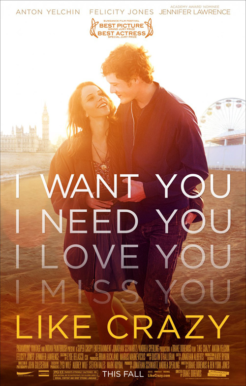
Where David Cronenberg‘s Cosmopolis (NY & LA August 17) is concerned, I really want to like its stoic Robert Pattinson trying to leave the Twilight series behind. But then I look at it again and see how many contemporary clichés are around his neck. From the bowed head—see Abraham Lincoln: Vampire Hunter and A Nightmare on Elm Street—to the sun glow—see The Day above, Like Crazy, People Like Us—to the faded Century Gothic overlay of text—see about one in ever three posters the past two years—and it’s almost impossible to enjoy this newest entry at all.
And that’s without mentioning the folded hand motif that paired with Eastern Promises is starting to make me think Cronenberg has a fetish. This thing is a Frankenstein’s monster of overdone elements that looks crisp on the surface but completely redundant at the slightest second look.
 |
 |
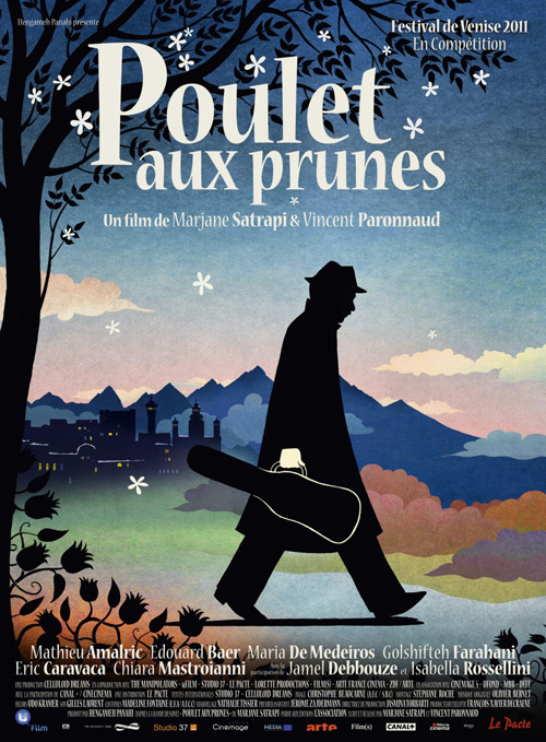
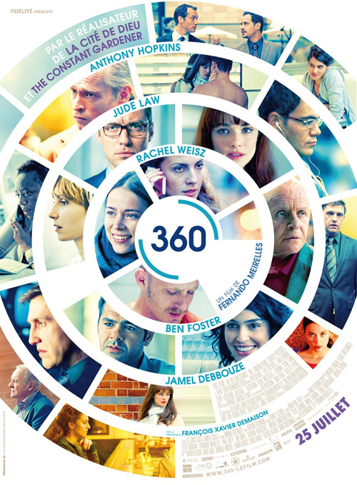
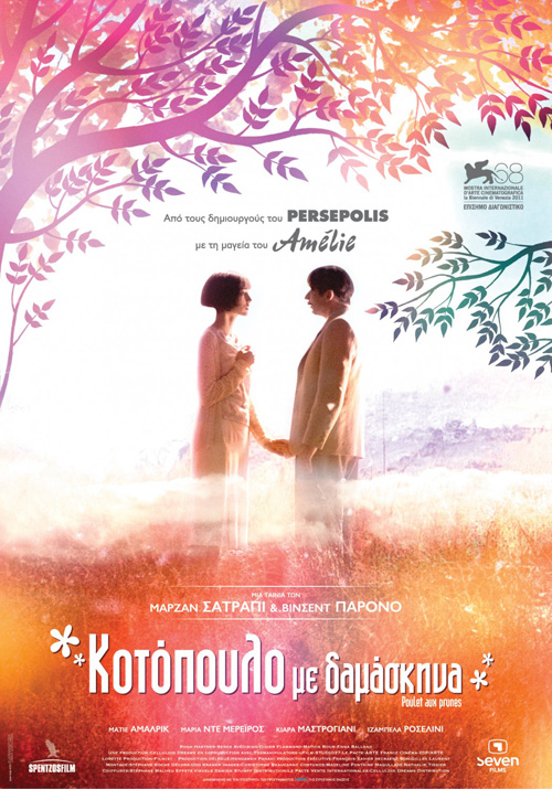
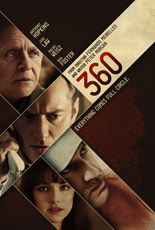
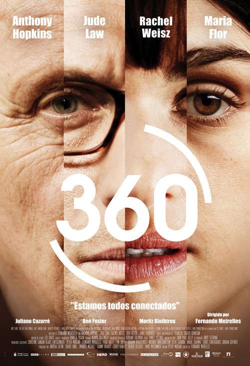
It’s therefore up to two 2011 Toronto International Film Festival selections to give me something redeeming to talk about this month. Chicken with Plums (limited August 17) and 360 (limited August 3) both swoop in at the last second with posters easily standing out from the pack.
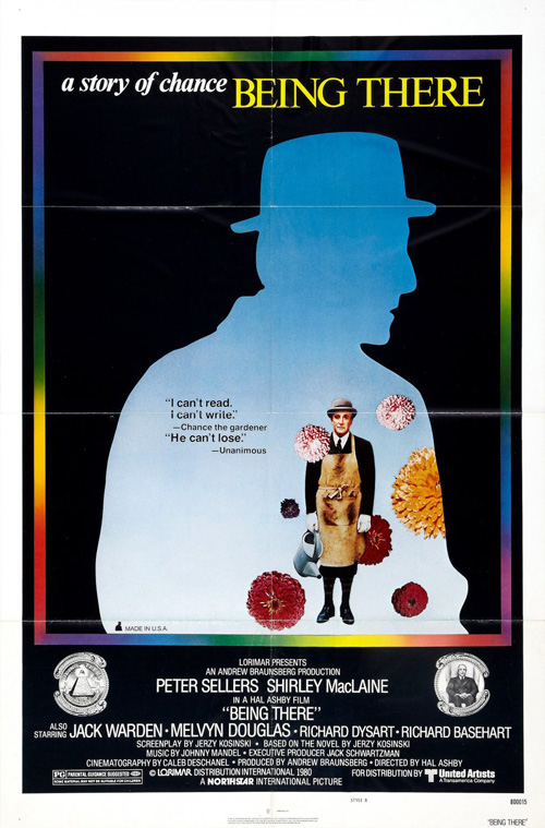
The gorgeously colored Soviet (?) example of Plums has a stunning utilization of warmth to really work up an emotional reaction, but I’m even more partial to the original French image from last September. With a deeply saturated graphical art piece of a man in silhouette against a cool, mountain landscape, I’ll admit I anticipated the film being animated like the directors’ previous effort, Persepolis. The fact it isn’t only makes me more fascinated.
There is a whimsy included that rivals the equally minimalistic work advertising Being There as well as a deep-rooted drama that could be either depression or a hope for more. It’s a great update of Marjane Satrapi‘s original American hardcover imagery too.
 |
 |
 |
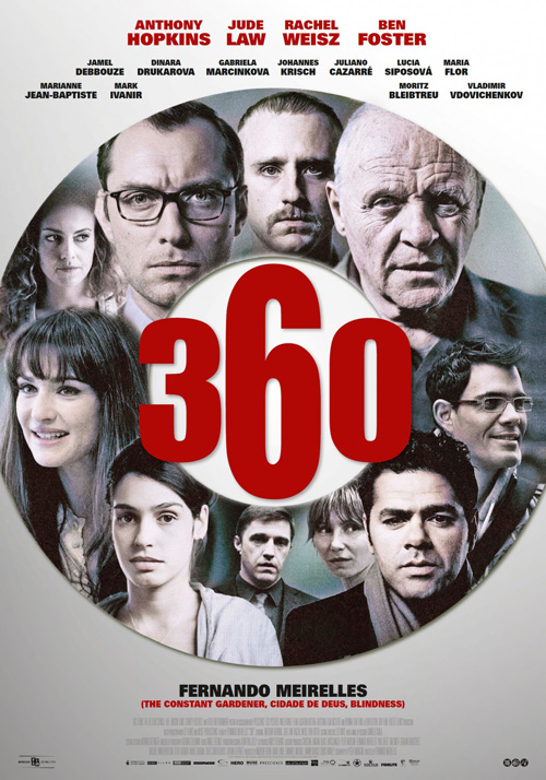 |
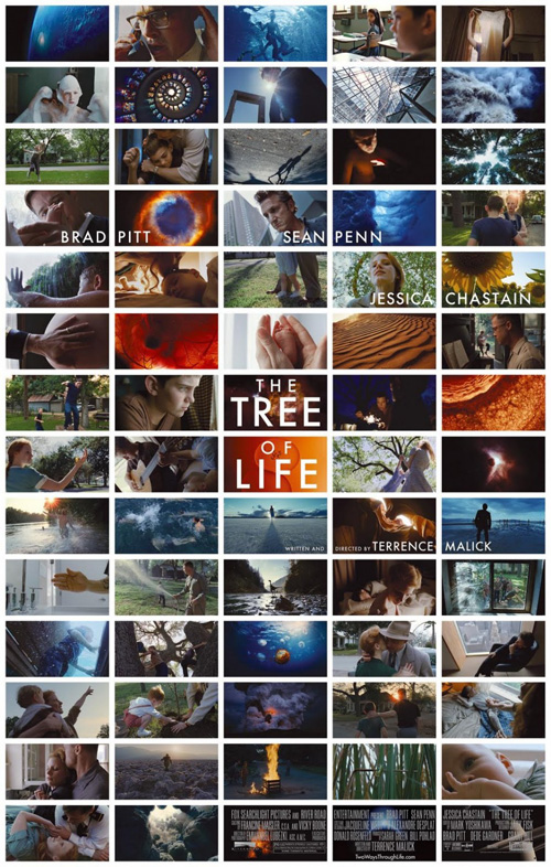
As for 360, monsieur x studio‘s circular layout is made more enticing by the horrible posters existing alongside it. Recalling the rather inspired film still grid of Mark Carroll‘s Tree of Life from last year, this wheel of imagery is colorful and emotive in its myriad actor poses. Even the subtle logotype with quarter curves representing revolution around the titular number works to really make our eyes spread outward from the center.
Light years better than the rest, I’m not quite sure what the firms were thinking. cold open creates a blocked collage for a film intrinsically circular by its name; Moovie makes some weird amalgamation of faces to form a monstrosity of weird; and a lesser attempt at a rounded layout fails from it’s harsh contrast of cutout people and blood red name oddly sized at its core. It’s amazing how different the ideas each conjures for the film—and yet monsieur’s is the only one I’d be interested in seeing.
Mondo is breaking loose
 |
 |
 |
 |
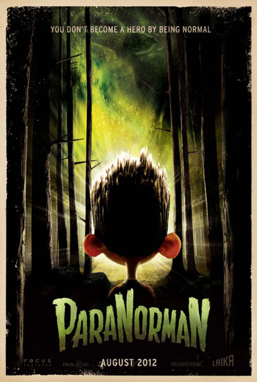
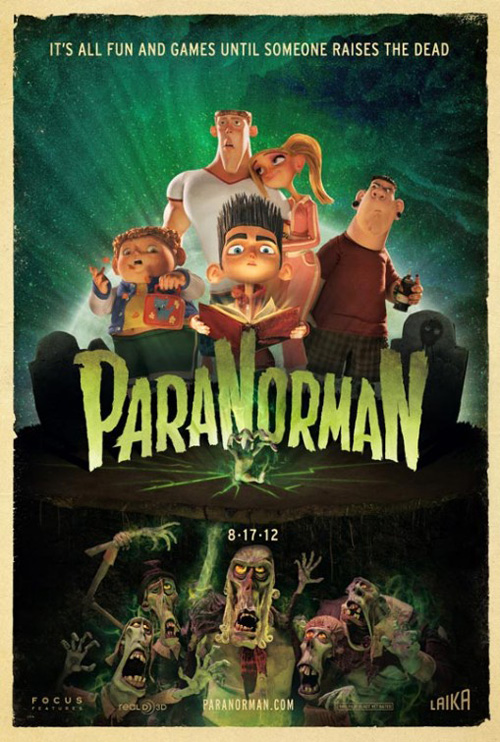
First things first: whoever did the studio posters for ParaNorman (open August 17) did an amazing job. There is atmosphere, mystery, and a great sense of Laika’s stop-motion animated style. I love the deckled edges and the horror movie title font. We didn’t need anything more and yet what came next only increased the appeal.
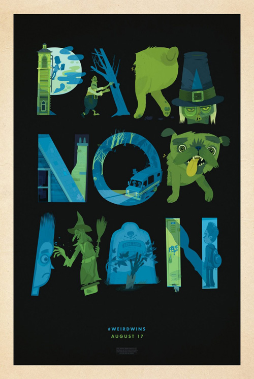
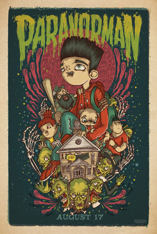
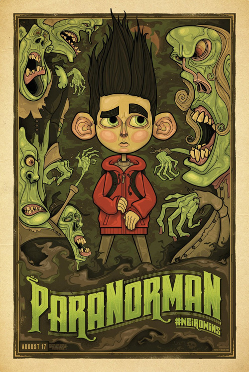
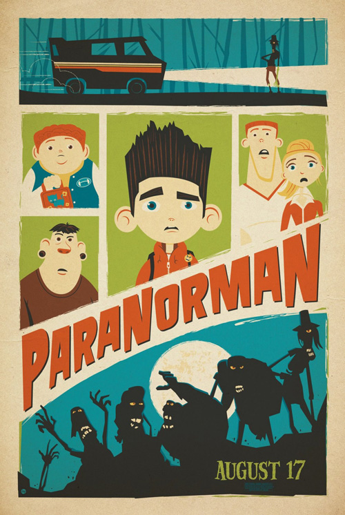
Mondo Tees was tasked to have its slew of artists create five more alternate sheets to hang in limited locations around the country as part of a viral recognition and Twitter hashtagging (#WEIRDWINS) promotion at weirdwins.com. A couple of the pieces may use a similar style of cartoon-ifying the 3-dimensional maquettes, but all add a little extra flavor to one of the summer’s most anticipated movies.
Little Friends of Printmaking‘s is my favorite as it truly treads its own path with a cool interpretation of the title through animated letters. The border mimics the studio adverts and the bright colors on pitch black really help the image to pop. Second place goes to Drew Millward‘s warped, “Adventure Time”-esque (at least in my very naive brain as to that show’s style) design. There is an otherworldy feel of the grotesque and a composition that recalls psychedelic concert posters.
 |
 |
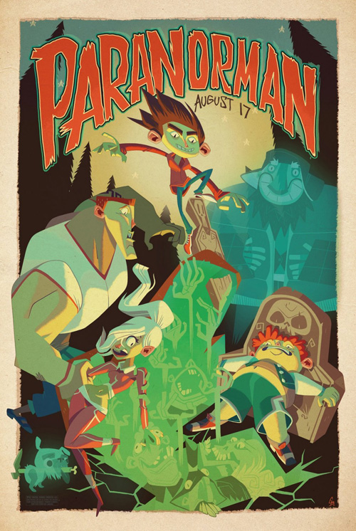 |
Graham Erwin‘s woodcut-like design, Dave Perillo‘s highbrow Sunday comics aesthetic, and Glen Brogan‘s sharply angular rendition of the characters at a graveyard round out the series. Each is a work of art and should be made available through mondotees.com soon—and sell out in less than five minutes, I’m sure. The limited run art shop generally does their posters after release when the films show at the Alamo Drafthouse, but I’d love to see them partake in more unique campaigns like this. It would definitely put some pressure on the regular marketing firms to equal their level of stellar output.
What is your favorite August release poster? What could have used a rework?

