Summer blockbusters are here with the likes of Jurassic World: Dominion (June 10), Lightyear (June 17, bucking the Disney+ only trend for Pixar films), and Elvis (June 24) bowing this month. The power of their box office estimates seems so high that Disney decided to just put all its Searchlight titles on Hulu instead of taking their own screens away from Buzz’s origin story. We’re living in a brand-new time of monopoly math.
Thankfully the independent studios are chugging along to provide the type of counter-programming cinephiles need to get out of the sun. And, as per usual, those are the ones sporting the creativity that carries the poster art form away from floating head collage towards aesthetic ingenuity.
Heading out


ICONARTS CREATIVE’s Fire Island (Hulu, June 3) shows that you can still create excitement and motion with a film still. All it takes is a slight tilt of the frame, an image of characters on the move, and an impeccable font choice to create depth by manifesting a window from foreground to background.
We’re on that dock, laughing along with the cast as they approach. We’re figuring out personalities and tone while basking in a muted sunlight skewing green to allow the title to pop. It’s a simple, subtle mood piece that puts the viewer in the right headspace for a good time.
Xan Black’s Neptune Frost (NYC, June 3; LA, June 10) shows you can also create excitement by playing with that same, often derisively lambasted, floating head collage format I mentioned in the opening. And all it takes is a magnificent handle on color to flatten its photography into a more graphic representation bordering on Xerox.
The blue and red alternate to create depth, the heavily contrasted shadows and highlights projecting a three-dimensionality that simply wouldn’t exist from the original image. And it’s only enhanced by the symmetry inherent to a one-point perspective built by fields of text in the background—chyrons rapidly moving front to back, back to front, and left to right. It’s as though the whole is about to pop out and move through us, our own head ducking and dodging as each level passes until we find ourselves caught in the void this hacker collective has left behind.
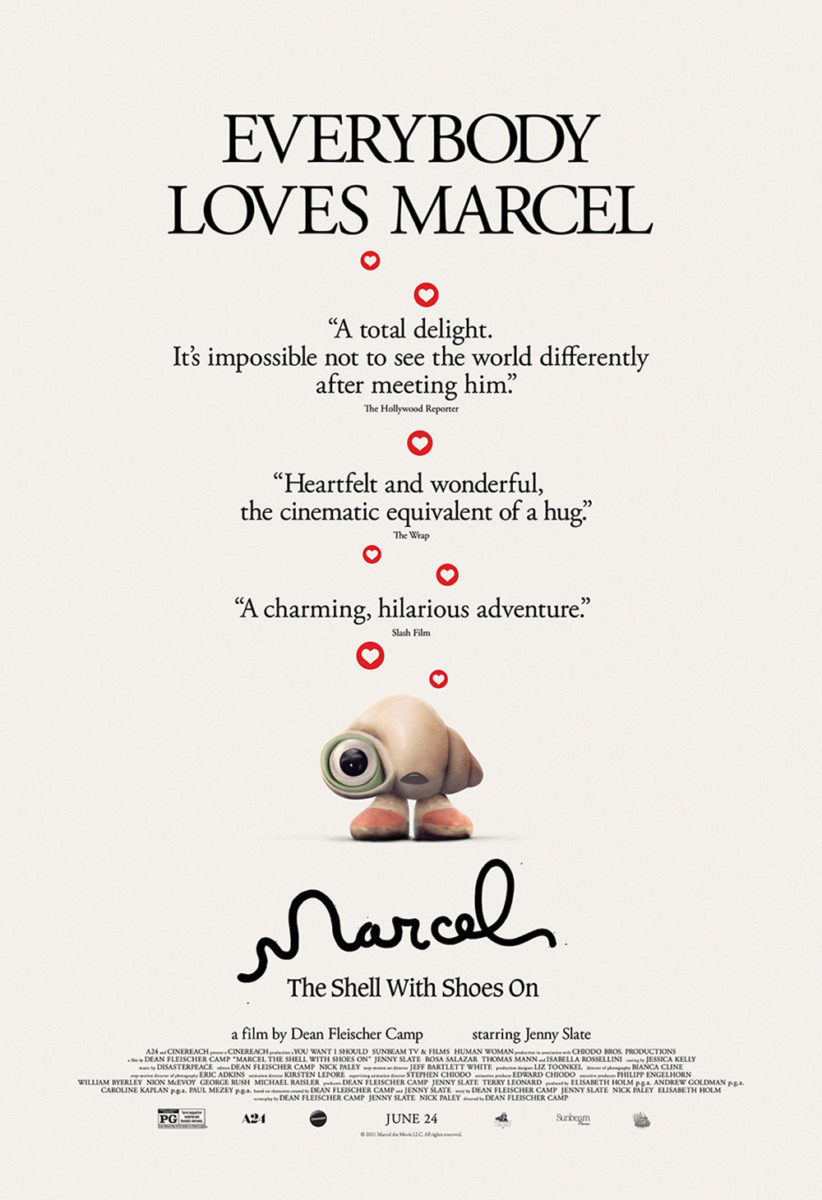
From layered composites to the shallowest depth of field, we move to GrandSon’s achingly cute Marcel the Shell with Shoes On (limited, June 24). By blurring the entirety of the scene, our eyes find themselves processing the whole as little more than a field of light upon which our tiny lead character has escaped. Marcel has implicitly floated through the air, through that open doorway, and into our hearts courtesy of a brilliantly rendered Tootsie Pop parachute tied around its spirals.
What a wonderful entry point into this world of stop-motion animation via real world environments and objects. You can even imagine Marcel’s feet kicking as he approaches the ground, readying for impact before moving away from the wrapper that will soon follow. Add the playful loops of his handwritten name and it’s impossible not to smile. So, it’s no wonder A24 would eventually just commission a one-sheet full of accolades—knowing their star is enough to sell tickets on his own since we all want to love him too.
Double exposure


Speaking of creating excitement with a film still, look no further than William Laboury and Scott Saslow’s work on After Blue (Dirty Paradise) (limited, June 3). I won’t lie: the image they use is what sold me on adding the film to my TIFF schedule last year. How could you see that gorgeously muted and grainy image of ethereal beauty coupled with the nightmarish image of a face saddled by a mucous-dripping hole in its center and not want to watch straight away?
Don’t fix what isn’t broken. Double-down and mirror it into a kaleidoscopic Rorschach test of acid-fueled sci-fi fantasy. And make sure you let it speak for itself by moving all other text besides the title to top and bottom for legibility’s sake without allowing it to become a distraction. I’d like said title to be a bit more legible itself (the glow doesn’t hurt the white text, but it also doesn’t help the red from getting lost in shadow), but that’s a minor quibble with an effective piece.
And if that one is considered “out-there” in scope, The Refinery’s Watcher (limited, June 3; VOD, June 21) is conversely grounded. From space to urban sprawl, we find mirrored duality through practical means rather than illustrative ones. The poster is a window onto a darkened apartment building with a single lit room—its inhabitant staring back at us. “We” are Maika Monroe, reflected in that window with a look of shock and awe.
What’s interesting is that her gaze isn’t upwards towards the voyeur. It’s almost as if she’s looking down upon someone else just as he looks down upon her. Couple that incongruity with his rectangle of light absorbing her right eye and you must start wondering about whether this image is grounded at all. When does the watched become the watcher? What if that composition reveals “he” exists only in her head? The mystery rises to the top, bubbling upon that pane like those drops of rain.
And from a metaphoric fracturing to a literal separation comes Brandon Schaefer and Jump Cut’s sheet for Poser (Columbus, June 3; NYC & LA, June 17). The idea of stopping time with a slow shutter speed to permanently affix multiple views of the same person isn’t necessarily unique, but its use to showcase the duality of identity at play is thanks to a mesmerizing series of filters and manipulations.
It only gets more impressive once you realize these two faces aren’t of the same person at all. One is Bobby Kitten. The other is Sylvie Mix. Bring in the title and you start to infer that one is an impostor. Is it the celebrity or the fan? Where does one begin and the other end?
Interpretation and extrapolation aside, this is also just an attractive piece of art on its own. From the color palette to the film scratches to the expert compositing to the muted nature of the whole making it feel like an image trapped in resin, there’s a tactility to it that glossy photography can rarely mimic. Print this on satin stock and hang it on the wall.
Single focus


It’s fun to be able to see someone’s style come through so much that one look at the poster for Bitterbrush (limited, June 17; VOD, June 24) had me thinking, “I wonder if Midnight Marauder designed that?” They did.
That mixture of minimalist simplicity, stark beauty, and impeccable typography is a dead giveaway. Add the augmented glare washing out the top of the subject in a ray of sunshine and it all comes together for a wonderfully focused projection of near fairy tale aesthetic. The mystery in hiding the rider’s face lends a heroic slant to the whole—a cowboy riding off to glory as we stare in awe.
The sheet for Beba (limited, June 24) has a similar vibe with its matte, grainy look taking us away from the glossy nature of photography and into the boutique concert poster realm. I love the type here too with its hand-painted/chalked strokes in huge bubble letters to complement the font choice above, its white proving bright enough to pop but muted enough to stay enmeshed with the rest.
It’s a portrait as much as an advertisement—the words framing Rebeca Huntt’s face to ensure we linger upon her as she gazes back. The wide kerning of the “film by” credit does a lot of work here, cutting off the top portion as legal prerequisites the viewer can decide to visit or ignore. She’s writer/director/subject and the reason we’re here. She’s what we’re buying our ticket to see.
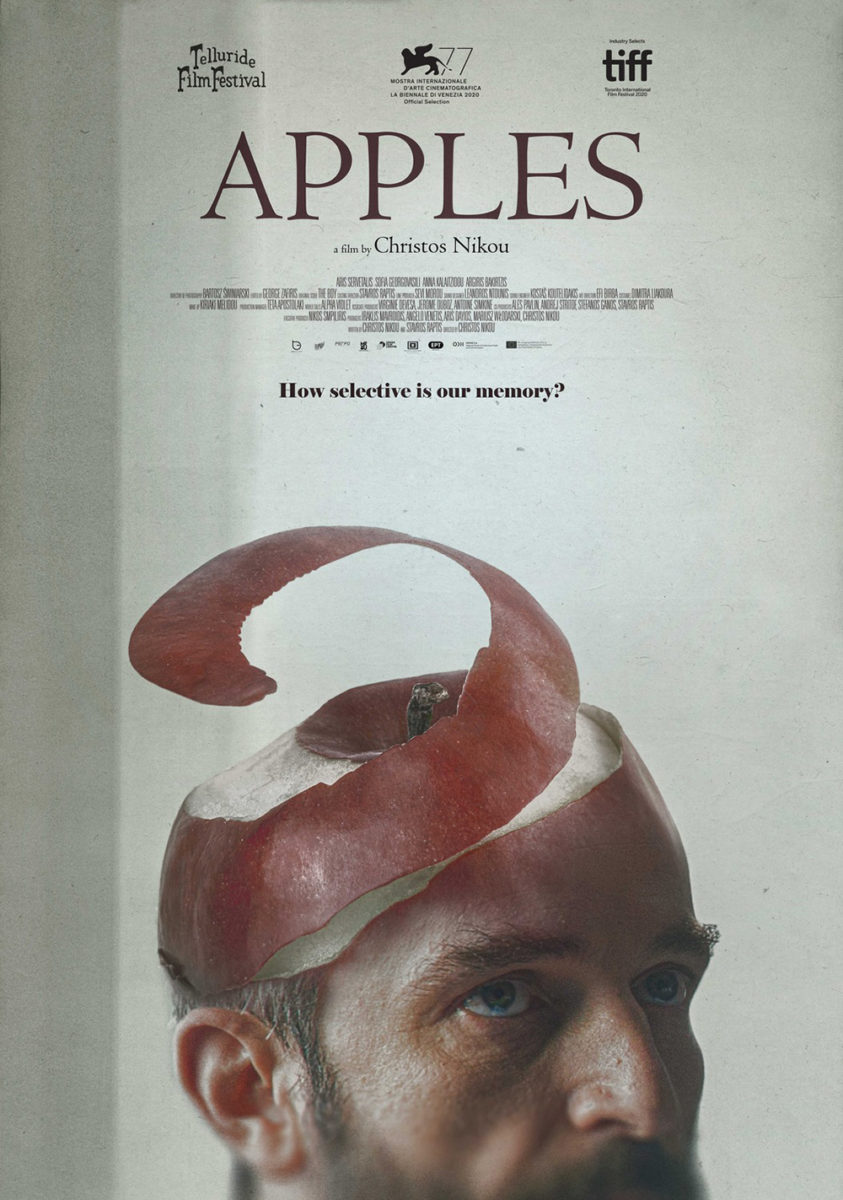
Now merge those two styles together and find yourself marveling at the ingenious Apples (limited, June 24). It’s a layout so good that the US release decided to change nothing but the language so as not to mess with perfection.
The challenge here ultimately becomes not screwing up an unforgettable image. The composite work turning Aris Servetalis’ head into an apple is magnificent and proves the epitome of what this Greek dramedy has to offer. You still must optimize how it’s used, though. Does it work as well if we see his entire face rather than cropping at his upper lip? Probably not. The ratio of image to text becomes unbalanced, the desire to let the title do more than simply exist comes in, and you find yourself distracting from the reason we’ve stopped to look. This is it—the product of surely infinite shifts and scales necessary to find that sweet spot of bliss.