Between Despicable Me 4 (July 3), Twisters (July 19), and Deadpool & Wolverine (July 26), there aren’t going to be too many open screens in theaters this month. So marketing becomes a huge piece of the puzzle as far as standing out and turning heads goes. This is especially true since all three of those movies stuck to the status quo of jokey, bland Photoshop work.
Give us artistry, lo-fi aesthetics, and a healthy dose of grain to counteract that gloss. Give us the below counter-punches and redistribute some of that summer box-office profit.
Playful


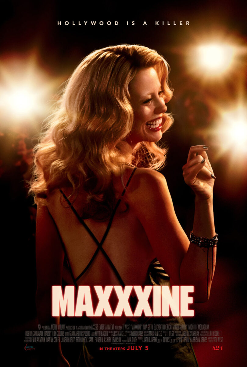
Yes, the MaXXXine (opens July 5) campaign is glossy and A24 is hardly “the little guy” anymore, but MOCEAN’s teaser is also a lot of fun. Ti West’s trilogy arrives in 1980s Hollywood the best way it can: via the iconic Hollywood sign, now reworked to present the film’s title.
It’s a roadmap. A flag planted to signify ownership in the theater that Mia Goth is coming to spill blood. The “XXX” is sufficiently popped out to get our imaginations running and the building behind the sign gives us a potential setting for the carnage.
To then just give us Goth smiling on the red carpet for B O N D’s main sheet is a letdown. Maybe you look close enough to see the two trails of blood on her forearm, but that’s hardly enough to pique interest. Not like a landmark primed for disaster.
The original poster for Crumb Catcher (limited, July 19) is the epitome of playful as it distills its synopsis (a newlywed couple held hostage by an inventor and his wife in the hopes of funding his project with the blackmail money) into a Will Vinton-esque Claymation scene atop a wedding cake. You have the victims, the gun-wielding perpetrator, and stacks of boxes / luggage to get our minds racing as far as what the couple does and what the inventor is trying to build.
It’s a wonderfully inventive and unique image so good that the designers really couldn’t do too much with the rest of the page. Not wanting to ruin the scene with any superimposed text, they drop the title treatment to the bottom (probably a bit too small) and risk the heavily inked photo crushing the credit box with its saturated weight. Maybe there’s a better way to put it all together, but the work itself is still great.
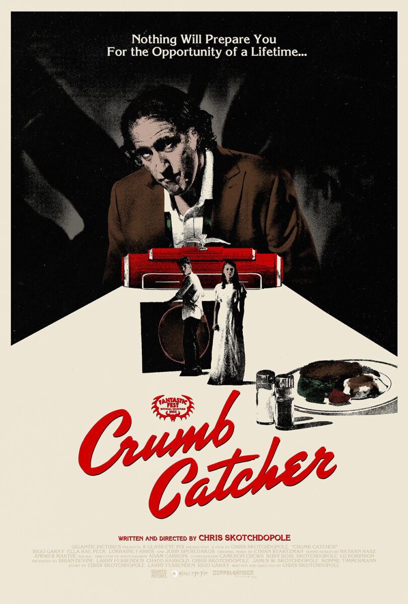
I thus have to wonder why the distributor decided to go in a completely different direction for its latest poster. It’s a Xerox duotone with high-contrast, lo-fi pieces cobbled together in grays and reds. The choice delivers more moodiness than playfulness, erasing the rather ingenious visual plot summary for foreboding malice and unknown mystery. I might not like it as much as the original, but it does get right the ratio of title size to full composition.
While there’s nothing “playful” about the subject matter of Mother, Couch (limited, July 5), its ability to blur the line between reality and imagination certainly is. Artist Aleksander Walijewski taps into that sense of play with his illustrative poster by taking us inside lead character David’s head––literally. He slices a section of Ewan McGregor’s face away for us to gaze at the tumultuous waves of his psyche, an act that simultaneously supplies the water an escape for the character’s mother (Ellen Burstyn) to ride out.
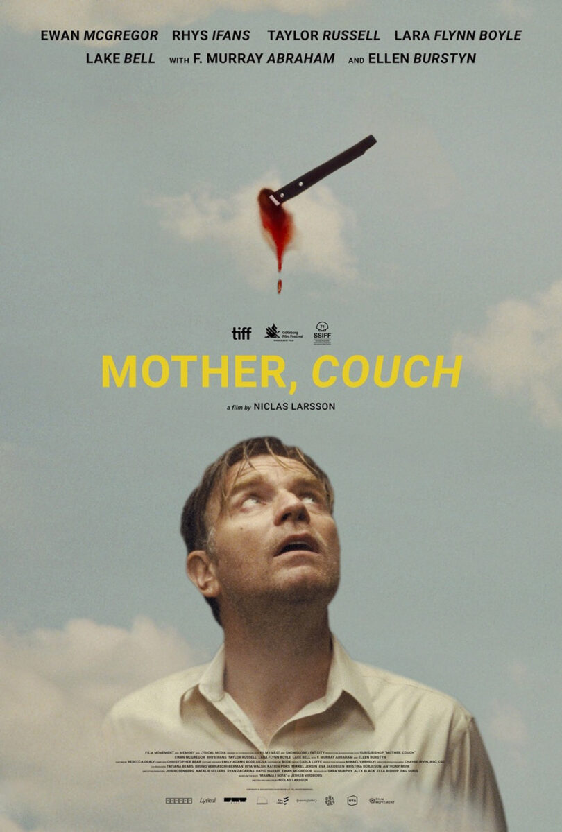
It’s a brilliantly surreal interpretation of the film like only Walijewski creates these days. David’s isolation. A disembodied hand reaching to help, despite his disinterest. The calm woman at its center, stuck in time and waiting for him to decide whether to hold on tighter or finally say goodbye. There’s kinetic motion in the swirls, solemn melancholy in his sad stare, and a hand-lettered title to remind us of the personal nature of David’s decision (as well as the letters he wrote that play a decent-sized role to the plot).
The piece is a nice evolution upon the original sheet of McGregor staring up into the sky at a bloodied cloud that’s been stabbed with a knife. Surreal in its own right, the result is less personal with its inconsistent text (extra-large cast names, extra-small credits) and a title placement that perhaps separates the image too much from itself. It’s effective, but incomplete. A nice first draft brought home by the above.
DIY


Who needs a staged (or Photoshopped) group image when you can have some fun with line drawings? For a film about a man in turmoil like The Practice (limited, July 23), deconstructing his life into little pieces proves an intriguing direction.
Most of it is yoga-centric since the character is an instructor (who’s unable to instruct due to an injury). Mats, weights, photographed participants stretching. The only oddball is a man on a motorcycle in the bottom-left corner. Well, not the only one considering one of the yogis is split in two––half his body coming up out of a hole and half poking out down through a different one.
What makes the piece work, however, is the placement of the text. Rather than just put the title and credits in the center, the designer has offset the block right to provide motion throughout the page. We’re not stuck in the middle with no impulse to move around. We’re instead asked to jump from one little island of content to the next, hypothesizing the story that connects them all.
For Dead Whisper (limited, July 5), we shift from line-work to Xeroxed collage. It’s a very meticulously crafted image that starts with a heavily inked man against a curved-top window that’s cut to pop off the textured white behind it with sharp, crisp lines along the entire perimeter––except for the bottom, which is conversely ripped at an angle to provide a deckled edge.
That edge is crucial to the whole because it supplies depth to the man who is then placed in the foreground atop that larger shape. Coupled with his own shadow, the slant gives the page room to trick our minds into creating perspective with these otherwise flattened layers. A tunnel forms from front to back just as a path from right to left manifests for the figure itself.
A simple lined border holds it all together with the text (director’s name at top and title, the only splash of color, at bottom) integrating with the horizontals so as not to distract from the overall form. It’s a beautiful composition that at once comforts in its symmetry and disturbs in its dark atmosphere.
And then there’s Dìdi (July 26). It too has a Xeroxed look, but less lo-fi zine aesthetic and more mass-produced, we-sprung-for-color fliers like one might plaster on school walls during a student government election. With a tagline like “For anyone who’s ever been a teenager,” there’s no better, more universal sense of nostalgia than that.
Where it goes above and beyond, though, is the authenticity of its trompe-l’œil effect. The muted page color, textured creases, and grainy image all scream “printed on construction paper before being jammed into an already stuffed backpack.” The adherence to the y-axis gives it that Microsoft Word feel where everything is just center justified with no need to worry about graphic design rules.
The defining feature is therefore the title and its playful bubble letters. That’s something that takes more talent than typing words and pasting a photo. That gives it character––a polished doodle scribbled in a notebook and refined as a personal tag to turn heads and stand apart with its creativity.
Grain


I love a grainy photo and an unusual font––both of which can be found on the poster for The Nature of Love (limited, July 5).
The former is helped by a good crop. Yes, it’s just two people kissing in the center of the page, but it’s also a purposefully measured frame. His body is cut off at the left side. Hers isn’t cut off the right. His head is fully visible. Her hair goes off the edge. It’s a product of the diagonal lean created by their height difference, but also a keen eye knowing the “center” isn’t always the center. Give us a glimpse of her hand on his shoulder. Move the tops of their heads to better fit text on top. Everything influences everything else.
The same goes with the title. It’s always tough to have multiple articles in the name––the impulse is to make them smaller due to them not being as “important” as the nouns and / or verbs. Doing so out of habit and making it look good are two different things, though. By working with the image as it’s currently cropped, you know you have ample space to create a block with the words. Increase “Love” to match the width of “Nature” and you suddenly have the articles moving the left to where there’s less room due to the man being taller than the woman. Shrink and tuck “of” into the corner created by “The” and a slope forms. Add the director’s name at the lower right and you have a built-in zigzag for the viewer’s eyes to move down the page.
MOCEAN’s Dandelion (limited, July 12) has a similar vibe. Grainy image cropped to serve the page and an unusual font to grab attention.
This time, however, the image isn’t pushed in for close-up. The angle from below has its slant formed via a mid-shot where two-thirds of the bodies are visible against an open sky that fills two-thirds of the full canvas. That diagonal still provides left-to-right motion, but it does so in a more abstract way with the added glares covering the actors’ faces and the parallel line created by the darkened gradient above.
Putting the title straight across provides the perfect contrasting anchor. It offsets the bottom-heavy image in weight and keeps the slanted nature of the page from toppling over onto itself off the bottom corner with no return.
And I really do love that font. Also, the decision to shrink the “I” and tuck it above the “L” so as not to saddle the line with unnecessary empty space. Although I do find it interesting that the kerning between the first “D” and “A” is so large. Why minimize wasted space in one area and create it in another?
There’s zero wasted space in GrandSon’s Longlegs (limited, July 12). The crop doesn’t allow it. By zooming in so there’s just enough of Maika Monroe’s right hand and gun to be visible in the frame while her left hand covers her face in horror at top, a direct line is formed to intersect with the reverse diagonals manifested by the light on her blouse. An “x” is made in the process, one that draws us into the bright red title. You can look at the gun and / or at her face, but only for a second as the page pulls you to the center.
The odd kerning of the title helps this phenomenon––it’s built in a way that forces our brains to do extra work. Looking at it from the corner of your eye while gazing at the hands makes it read like multiple words. “LO” and “NG” with the “L” and “E” delivering islands of their own before the “GS.” Only when the oddity of those small sections demands we look at the full line together do we realize it’s a single word.


I must believe this is a play on the symbology used throughout the film’s marketing campaign. When you look at the line of text at the top of the character posters (themselves wonderful companion pieces that brilliantly showcase the back of their actors’ heads rather than their faces), you try to interpret it as you would English. Where are the gaps? Do they signify the start and end of words? We want to read these lines via the rules of our language, regardless of whether those rules can help us solve their meaning. It’s a subversion of our inherent understanding of seemingly simple visual cues. Another way to keep us off-balance along with the unsettling nature of the images themselves.