Blockbuster season is here and everyone is apparently buying tickets to everyone else’s films, posting them on social media, and then probably not going (millionaires spending fifteen bucks on a piece of paper might be a shrewd marketing ploy towards manufactured kumbayah profit-sharing, but I’m not sure it’s moving any needles).
I do like seeing those celebrities staging their photo op in front of a multiplex’s wall of posters, though. Show those designers some love. Though it’d be even better if they used interactive standees. Give me Christopher McQuarrie and Tom Cruise with their heads sticking through holes above Margot Robbie and Ryan Gosling’s cardboard bodies. That would truly be inspired.
Bright lights


You probably won’t see Christopher Nolan and Cillian Murphy continuing the trend, but the poster BOND created for their film Oppenheimer (wide, July 21) is a good one. It feels like a nightmarish dream sequence with J. Robert Oppenheimer standing in a world of dark portentous clouds of his own making. There’s beauty in the horror of what that image represents and a succinct visualization of what the film is about. Here is the power of one man, the power of an atom.


I put it in this segment of the column not because it contains “bright lights,” but because the other sheets in the campaign do. LA comes in and hides those clouds behind a much bigger Murphy and his bomb with fire crackles flying all around them. Here is the literal, in-your-face billboard that depicts man and machine as powerful. It puts the onus on them as monsters or heroes stealing the limelight from the tragedy wrought. It’s therefore an interesting direction to take––pushing reverence and introspection aside for flashy theatrics. Replacing what will hopefully be a story of complicity and guilt with popcorn-fueled, hubristic intent.
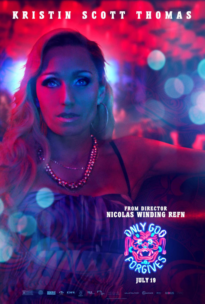
The lights of The Refinery’s Sympathy for the Devil (limited, July 28) might not be bright per se, but their neon hue does allow them to shine through the foggy darkness of its warm palette much like Ignition and LA’s Only God Forgives. Its red is almost reflecting off us and back onto the actors, giving them a glow that renders them into an extension of the title as the blurred lights in the background provide an intriguing contrast that never distracts from the focus. Because those tubes are less a sign demanding our attention than the coils of a heating element refusing to let anything cool when placed beneath its light. Joel Kinnaman and Nicolas Cage are being cooked alive.
GRAVILLIS’ Kokomo City (limited, July 28) is the opposite. Its yellow flickers against the darkness to clearly steal our attention. It interacts with us rather than the woman in the scene––labeling this room one we can enter.
Is it a safe haven within a noir-ish world? Or one part of a shadowy landscape in which the trans sex workers at the center of the film must traverse? That mystery is the allure. We don’t know what to expect. We don’t know if the woman on that bed is the femme fatale, victim, hero, or all of the above. We imagine the jazzy score and overwrought, affected dialogue of a hard-boiled thriller when gazing upon the image, ensuring that we understand this isn’t a moment of comfort or relief as much as a brief respite from the uncertainty and danger faced.
Top to bottom


GRAVILLIS is also responsible for creating the Black Ice (limited, July 14) poster. It’s a refreshingly simple design that avoids the knee-jerk desire for star power that can be attained by littering the frame with images of Willie O’Ree, Grant Fuhr, PK Subban, and more. Because it’s not just about Black hockey players; it’s about the sport itself and the systemic racism that continues to prevail within it at all levels.
It goes back to the notion that the onus to stop racism isn’t on the Black community to do the heavy lifting. It’s the white community that must look inwards upon itself and learn, evolve. It’s about all those white sticks welcoming that lone black one into the locker room and working to make it feel safe and included. Thus what we get from this image is the isolation of constantly waiting for the other shoe to drop. Of wondering which of those other sticks will turn on you or whether they all will if you dare speak up. It’s a strong metaphor for the imbalance of power at play.
Similar to how that vertical composition draws our eyes through the sticks towards the title, the poster for Amanda (limited, July 7) by F Ron Miller utilizes the vertical symmetry created by building upon its central y-axis to do the same. The image is intentionally cropped to keep everything balanced from Benedetta Porcaroli’s bent elbows to the plastic circles of the flotation device upon which she’s lying. She becomes our focal point, seemingly traveling into frame from the top to push us downwards towards the fun if distracting typography.
I love the font and its bubbly nature mirroring the blue curves of the pool’s waves below, but the alternating colors makes it difficult for my eyes to adjust. The letters are connected to form a single entity by virtue of the thick cursive creating a joined white field, but the changing borders forcing my brain to pause and read each individual character rather than the whole detracts from such effect. I’d love to hear the reasoning for this choice––I think it takes away more than it adds.
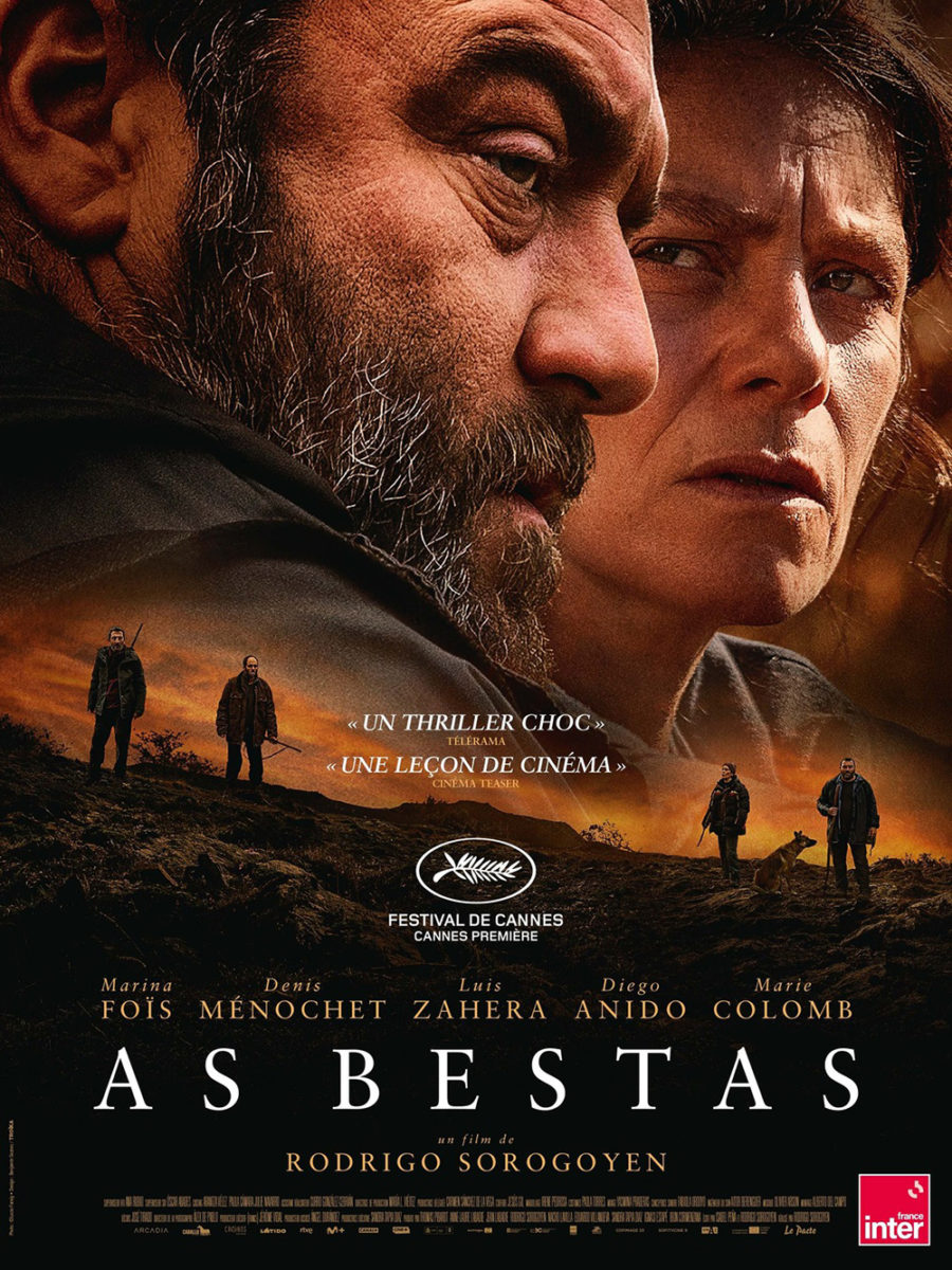
Whereas that one uses its vertical construction for subtle movement, Indika Entertainment Advertising’s The Beasts (limited, July 28) takes things to the extreme by freezing its very violent movement. The first thing I see when looking at the poster is Denis Ménochet’s open mouth screaming. The white teeth highlight its dark void as a central dot of intrigue that pushes us downward to the text. On the way there, though, it also brings us to the arm around his neck, slingshotting us upwards to the arm covering his eyes so we can catch the bared grimaces of the men accosting him. It becomes a spiral atop an upside cross. A whirlpool of brutality above a calm word block buckling under the pressure.
The sheet by Troïka pales in comparison. It’s effective in its own right as far as presenting a glimpse of good vs evil, but things aren’t as overtly emotional in the translation. Yes, Ménochet and Marina Foïs are on one side of the poster with the men we assume are attacking him on the other poster residing on the opposite side, but they seem together here. All four are more or less looking forward at something else. We don’t know that we should fear them as a result. The drama here is conjured by an abstract foreboding rather than the intensely personal reality of the poster above.
Obstructed portraits


The poster for Christian Petzold’s Afire (limited, July 14) continues a trend of obstructed portraiture that moves through Undine and the Boland Design Company’s Transit. Each depicts two characters. Each one hides all or half of the duo’s eyes. And each presents a sense of melancholy rather than romance––tension and potential fracturing, whether wittingly or not.


While Transit is my favorite of the bunch––due to its use of reflection to portray the central relationship––Afire provides a captivating scene that shouldn’t be dismissed as just another “film still poster.” The angle of the shot and the positioning of Paula Beer’s hair mimics the flame sparks below which themselves mimic the foliage bottom left. The “real” fire is thus offscreen, yet it seems to be consuming the whole anyway. It’s as if Thomas Schubert is burning in those flames while Beer watches––the grass taking his body and her hair consuming his face.
Earth Mama (limited, July 7) obstructs via its aesthetic, casting Tia Nomore in a dim light to transform her pregnant body into a silhouette against the horizon behind. I love the grainy texture and muted contrast. There’s no patch of rich black anywhere on the page. Only shadows born from a purplish haze of light. Thus it becomes an ethereal, almost psychedelic image: this otherworldly visage of a woman turned God, a creator of worlds.
And the type is gorgeous. A playful spin on blackletter fonts that could grace the album cover of a ’60s band. I don’t know what the motivation was for the hollow triangle motif on the capital letters, but it also gives the typography a futuristic detail to counter the otherwise naturalistic peace and love touchstones. The words become simultaneously ancient and unknown. Characters from beyond the present, alien and out of time. We simply don’t know which direction they go.
Speaking of duality: Akiko Stehrenberger’s leans into the “chicken and egg” conundrum with her painted one-sheet for Biosphere (limited & VOD, July 7). Have Mark Duplass and Sterling K. Brown destroyed the world, existing in a self-made prison to survive the apocalypse outside their dome’s windows? Or are they humanity’s salvation, implausibly positioned to change the course of history as a new, science-based Adam and Eve? Could the second truth have happened if not for the first?
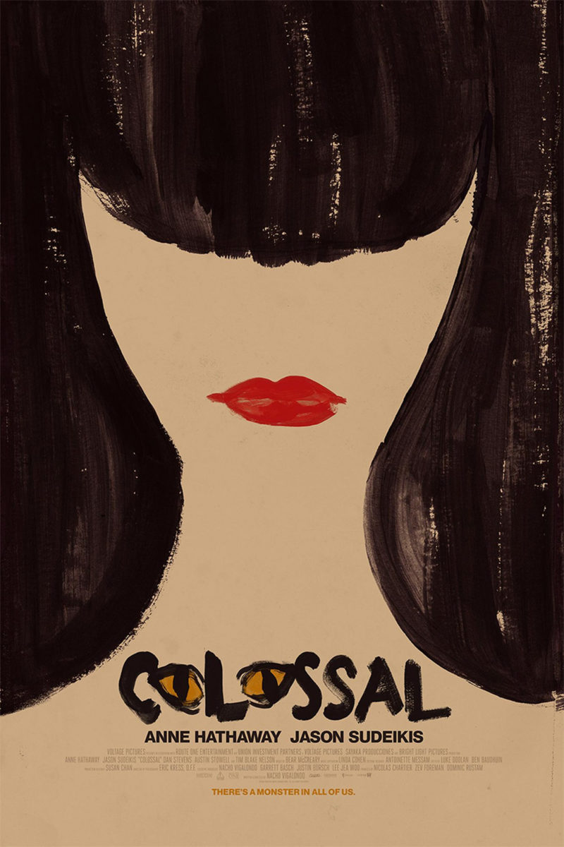
It’s an intuitive distillation of the film’s themes. (A spoiler in some ways, but only if you already know what the spoiler is––similar to Stehrenberger all-timer Colossal poster.) Eggs, birth, and isolation. The biodome’s architecture. The need to look forward––what a fantastic touch to make the bullet between the names green like the inexplicable light in the sky that sparks so much of what occurs. It’s comical yet introspective, like the movie itself. The stark banality of a brave new world that can only be born if the two men positioned to steward its genesis are willing to first be reborn themselves.