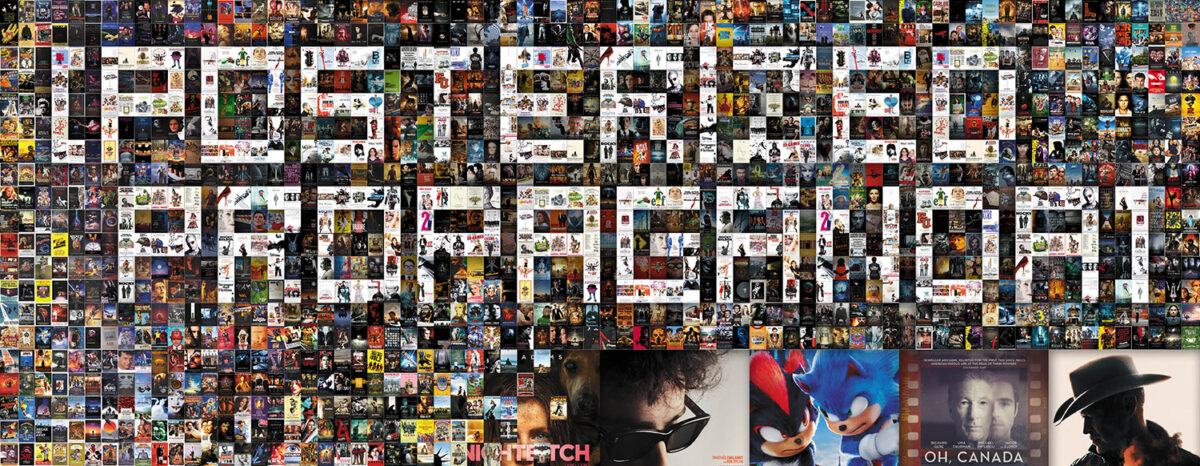
We’ve reached another year’s end, so get ready for all the limited releases and qualifying runs primed for Oscar consideration as guild votes start propping up their prospective favorites. All while most of you cross your fingers that you won’t have to wait too long for everything to finally open at a theater near you.
And for those treating the month like any other by simply circling the popcorn tentpoles, Hollywood doesn’t disappoint with Mufasa (December 20), Sonic the Hedgehog 3 (December 20), and Kraven the Hunter (December 12) all making an appearance. Pair those with the usual logjam of Christmas Day debuts and there should be something for everyone.
Portraits


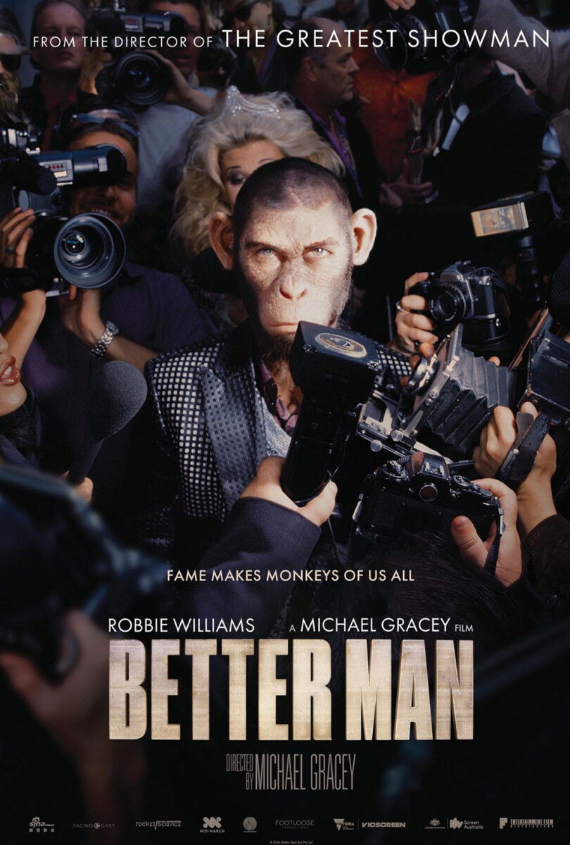
Wild concept for the film aside (a biopic about Robbie Williams where he’s played by a motion-captured, CGI chimpanzee), Better Man’s (limited, December 25; wide, January 10) marketing campaign is effectively simple. The subject is a pop star who’s made a career in the spotlight of magazine covers and paparazzi photos, so why not lean into that experience while trying to humanize the tuxedoed primate filling his shoes?
BOND pretty much creates a mock-up Rolling Stone cover for the first poster while The Refinery gives us an “in the wild” shot of Chimp Williams glaring through a sea of media types at what appears to be a red-carpet event. The latter is fun in its juxtaposition (including the tagline “Fame makes moneys of us all” despite chimpanzees being apes), but I’m a big fan of the former for its dedication to the bit. Here is your icon legitimized by a mainstream publication. What more do you need?
LEROY & ROSE answer that question with in-your-face color via their French sheet for The Room Next Door (limited, December 20). What a stunning, minimalist piece of red and yellow alternatively popping against each other depending on which your eye caught in the moment.
Tilda Swinton’s yellow suitcoat bleeds into the yellow background while Julianne Moore’s red sweater rises behind her to merge with a red door that creates a frame within the frame. It’s almost at an optical illusion level of visual symmetry, our minds strobing from one to the other because the brightness simply won’t let us focus on one. They exist in tandem even as their palettes set them apart.
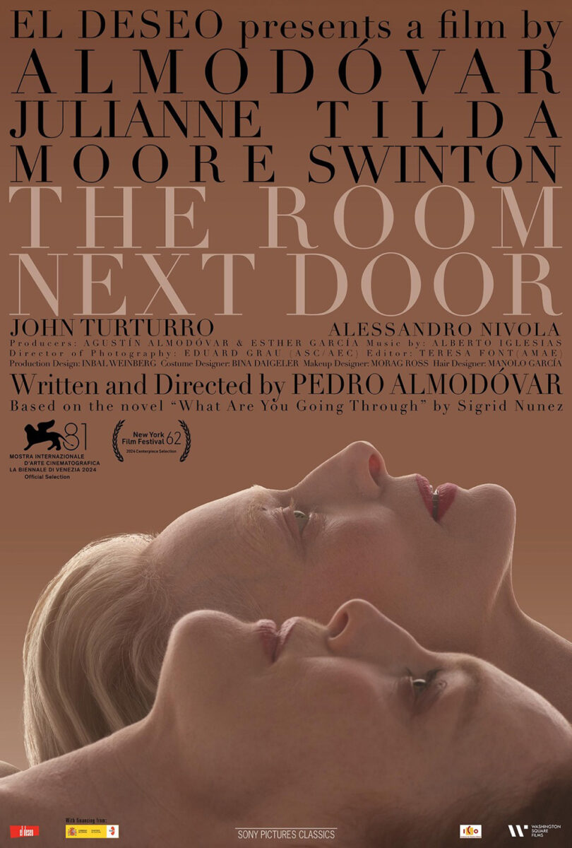
It’s the superior poster for the film in my opinion, although I can’t deny the English language iteration succeeds too. The colors are much more subdued, but still build a duotone alternating between the faces and title and their black text counterparts. I also really enjoy the full justified text. Despite an instance of bad kerning (the three line credit box moving from way too much space to not enough), the rest is immaculate.
The best portraiture of the month, however, belongs to P+A’s absolutely gorgeous character sheets for Nosferatu (December 25). The whole campaign has been a delight with its gothic horror overtones (see P+A’s shadowy character reveal and AV Print’s pairing of human and silhouetted monster below), but there’s something about the stripped faux monochrome of those cast posters that transcends.


Not only do they allow the exquisite logotype to shine in full width, but they also play with the notion that we’re all a bit monstrous via those creepy pinpoints of light in their eyes. Sure, we’re probably supposed to read them as mirrors for the creature in their sight, but the duality to also supply an eerily discomfiting aura to them is obvious.
And while the cut and paste aesthetic generally frustrates because it screams Photoshop fabrication, the bisection of light shrouding each character in darkness is rendered too well to look fake regardless of the repetition. The overall composition is too good to lose anything in the transference. Each one is a masterpiece.
Floating


The image on the poster for Leos Carax’s It’s Not Me (limited & Criterion Channel, December 10) is a captivating freeze frame because it doesn’t quite feel right. Our initial assumption is that this is a woman floating in water, seen from below. Or maybe she’s mid-dive in the air, above the water. Since there are no landmarks to give us an idea on vantage outside of the full frame of water, it becomes both simultaneously. A truth and a lie, so to speak. After all, this is a film about Leos Carax by Leos Carax and yet it’s “not him.”
The poster for The Brutalist (limited, December 20) is equally disorienting because the person who’s floating is the viewer. By rotating an image of the Statue of Liberty less than 180-degrees and augmenting the resulting slant with heavy black lines and type, the designers have created a spiraling effect that puts us out of control.
It’s also just an upside-down symbol of America, though. A flipped notion of the American Dream perhaps? A nightmarish vortex of broken promises? The symbolism is infinite.
I don’t even care that I abhor the typography. The way the B is so far away from the rest of its word. How the kerning on “The” forces it to go beyond the B’s width. That the title is a rounded sans while the rest of the type is squared. More disorientation—a sense of the familiar tipped askew.
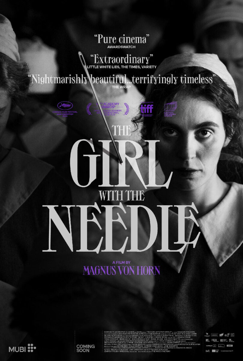
I’m conversely a big fan of the old-school script on Yellow1’s poster for The Girl with the Needle (limited, December 6). It’s super tiny yet completely legible so that it delivers the message (it’s still the largest type overall) without distracting from the more important visual portrayal of its words.
That image is the true draw. A bright white needle cutting through total blackness of the page, enlarged so that a girl can fit into its eye when contorted into the fetal position. Or is she a fetus growing inside a womb with the needle being the body of the mother? Considering the synopsis, it’s a bit of both.
Give credit to MUBI for following that imagery up with an effective sheet of their own. Yes, it’s more literal with a photograph of the lead, but the needle stuck into its center provides a sense of violent uncertainty that matches the unnerving tone of its predecessor. The trompe l’oeil effect with shadow and superimposition (perfectly tilted to only really be covering part of the Oscar submission laurel) really helps drive that home.
Seamless


Sometimes there’s an image that just perfectly encapsulates a film and GRAVILLIS found it for Nickel Boys (limited, December 13). RaMell Ross’s latest is (mostly) shot from a first-person perspective, and, as such, rarely allows both of its main characters to share the screen. The exception is a moment where the two young men are both looking up into a mirror so that we can see them through the one’s eyes.
It’s a great passage in the movie and, perhaps, an even more captivating scene on the page since it proves daunting to figure out what’s going on if you don’t already know. We initially assume we’re simply above the boys looking down. Except why would there be stanchions? And yet, it we’re looking up at a ceiling, how can they be looking up too? It’s a visual feedback loop that at once puts us in their shoes while keeping us in our own—the perfect embodiment of why Ross used this perspective in the first place.
The poster for Gaucho Gaucho (Jolt, December 1) also transports us elsewhere, but this time it’s to another era. Talk about a throwback to yesteryear, this illustrated collage has gorgeous typography, an aged tactility, and a story to tell. The period detail is impeccable. Its myriad pieces all prove worthy of our undivided attention as we slowly move from one portrait to the next. It’s a shame that its streaming release means it won’t grace a theater wall near you.
My personal favorite of the month, though, is Mark McGillivray and GrandSon’s The End (limited, December 6). It’s such a joyous scene of revelry mixed with a somber sense of danger when spying upon the automatic rifle lying on the table. You can really feel the three-dimensionality of the scene too as each level of characters brings us further back towards the flowing yellow title stamped above the wall.
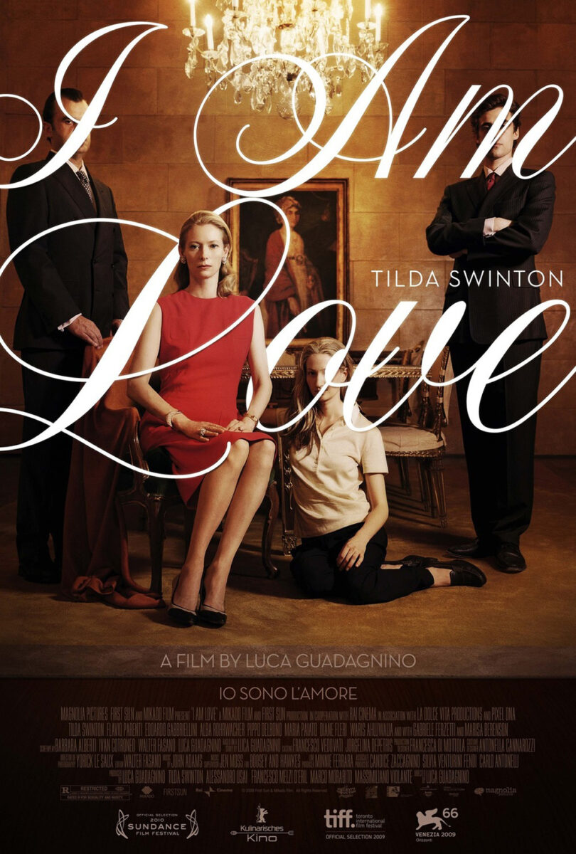
The obvious touchstone is another Tilda Swinton film in I Am Love (designed by The Refinery). While the appearance of the type is similar in font choice and size, however, its use is not. That one used it to block out the children’s faces and highlight Swinton. This one uses it to complement the over-the-top poses of those at the back. It lends an elegance to madness here. A flourish of curved personality amidst an otherwise staid room of straight lines.
This one-sheet is also a case where the critic quote does a lot of work setting this specific scene rather than merely dropping overall praise. “A mad, apocalyptic musical masterpiece” really gets our minds going as far as what we’re looking at. Suddenly that room becomes less like a museum and more like a bomb shelter. The dancing looks less like a performance and more like a break from reality. And the gun becomes as much a symbol of protection from what awaits as a violent way out. Who knows, maybe another version will arrive with bodies on the floor and blood everywhere else.
