“Don’t Judge a Book by Its Cover” is a proverb whose simple existence proves the fact impressionable souls will do so without fail. This monthly column focuses on the film industry’s willingness to capitalize on this truth, releasing one-sheets to serve as not representations of what audiences are to expect, but as propaganda to fill seats. Oftentimes they fail miserably.
The critics group selections for best of everything “Cinema 2017” are here and the major players involved are arriving in limited release so audiences can play along. Big city living should provide ample opportunities to see what the hullabaloo is about and choose your own faves within it.
Not only are studios dropping their contenders all at once to ensure their yuletide cheer is tempered by box office receipts, though. They’re also not disappointing us with posters that can’t do their movies justice. I had to leave a couple good ones on the cutting room floor this month as a result, among them: The Ballad of Lefty Brown‘s (limited December 15) western chic (poster) and Happy End‘s (limited December 22) subtle viewfinder frame (poster). Competition is therefore fierce on screens and walls this winter.
Familiar is at it again


What’s great too is that even the so-called “copycats” are attractive enough to warrant a look. We may desire something fresh, but familiarity works too—especially if it triggers thoughts of another movie you enjoyed.
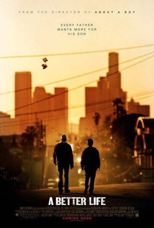
For Quest (limited December 8), the comparisons are many. Of late the poster I automatically think of is BLT Communications, LLC’s A Better Life. The foreground adult and child with backs to us, the urban setting in the background, and even the somewhat washed out glow at the center to ensure we see the figures as paramount allows the familial aspect of love and protection to shine.
What I like about this one more, however, is that things aren’t shrouded in foreboding shadow. There’s optimism to Quest—a notion of moving towards something rather than away from it. I also really like the title font’s calligraphic serif moving thin to thick. It’s regal and strong, but not overpowering. It serves its purpose by complementing the whole.
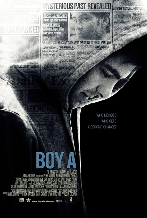
With Hollow in the Land (limited December 8) I recalled Iconisus L&Y – Visual Communication Systems’ Boy A. Beyond the characters’ wardrobe choice of a hoodie there’s also the pensive look, desire to hide, and mysterious atmosphere alluded to via smoky clouds and superimposed newspaper clippings respectively. The latter shows a glimpse into the past with those articles just as the former provides a scene from an unknown time as a picture-in-picture within the darkened folds of a coat. We’re given room to explore.
That added street scene may distract our attention a bit, but I’d still consider it an effective means to provide layers to the imagery. The same goes with the title. Rather than up the point size so its letters cover everything like so many “text on face” designs do, this layout keeps them small (relatively speaking). And yet there’s still scale in its orchestration through the liberal leading that keeps each word away from the next. It works as an arrow of sorts, our eyes deliberately moving from one to the next—character down to car.
You can’t blame The Refinery for going homage as far as their Jumanji: Welcome to the Jungle (December 20) sheet is concerned. Its sequel is releasing more than twenty years after the original and almost forty since Chris Van Allsburg’s source picture book. They should be doing all they can to resemble the Robin Williams’ starrer because they have their work cut out for them as far as making the property relevant again (although the concept behind the film itself seems to do exactly this).


From there you have B O N D’s tease with four silhouettes falling from the sky and another with everyone submerged in water to their noses (with an alligator to boot). Both give enough of a sense of scale and humor to draw interested parties closer despite the circumstances of this world remaining unknown to those unfamiliar with the book.
While those two examples do work, however, the final sheet is less than stellar. Humor is removed for scale alone and the result is a generic action adventure scene of jungle animals and their human foes. If only they did something to acknowledge how these actors are the avatars of teens. What if they had the kid actors with these “stars” translucently superimposed above them similar to Vixen and her animal powers in Legends of Tomorrow? Sure it would perhaps be too much, but at least it’d be something.
Sadly the most egregious copier this month has few redeeming qualities. The culprit is BLT’s Downsizing (December 22) and its identical concept to the firm’s own Ant-Man. I get that both center upon a plot wherein the lead character is shrunk, but are you really going to dust off your own design (that’s less than two years old) to portray as much? At least Ant-Man didn’t put “Paul Rudd” in giant letters at the top to compete with the actor’s photo. Nor did it put “people” icons into the title.


A foreign sheet with Matt Damon on a welcome mat is at least more attractive to look at, but it’s even worse in execution. It screams Photoshop from the floating mat atop fake porch slats to Matt looking at nothing when the angle is very specifically positioned to have us looking at him. Why isn’t he looking back? Why is the poster only pretending to engage with its viewer?
I guess Ignition’s is therefore the best of this trio, but it’s hardly good either. What it does to improve upon the first is this: more text (it’s not a Damon sandwich anymore), a comparison point (saying “actual size” isn’t the same as putting an object next to him), and the improvement of that awful “logo” (the people aren’t toothpicks being crushed anymore). Like the film itself, the idea is much better than how it’s being utilized.
That’s how you do characters


For what I believe is the first time since writing this column, I can put a section together with good character sheets. Yes, good. I had to reduce from four posters to three to allow it, but the sentiments are still pure.
First up is The Greatest Showman (December 20). While BLT had the reins on the teaser above (which is very nice in its mirror between reality and fantasy alongside a period specific font), WORKS ADV was put in charge of the characters. Where most films would choose a background and then just swap out each actor, they’ve decided to create four distinct “scenes” instead.


You have Hugh Jackman with top hat, Zac Efron and Zendaya swinging through the air, Rebecca Ferguson looking royal for the camera, and Michelle Williams being hoisted into the sky against the moon. They’re all in motion as the world behind them blurs with a spin. They simultaneously exist as a series and on their own.
Allowing them to be in their element creates excitement rather than portraiture. They embody the magic that the studio hopes the film possesses for its audience. The care to which they are allowed individual identities assures that they stand apart.
The same can be said for Proof’s Ferdinand (December 15) campaign. They could have just stopped after two effective one-sheets (the “bull in china shop gag” and simplistic 2D-animated vintage beauty are wonderful) and yet I’m glad they didn’t.


You could argue these three aren’t character sheets, but they serve that purpose nonetheless. Just because the firm didn’t merely put the girl in a frame and the bull in another doesn’t mean these designs don’t represent them in unique ways. To look upon the minimal bull and bee is to conjure images of Pablo Picasso and his sketch work. The rose takes that contoured drawing and creates something new from it in a bold, woodcut ranch type of way. But my favorite is the colorfully cartoonish flower with bull-shaped petals and 1950s postcard aesthetic. Whether relevant to the film or not, it’s absolutely stunning.


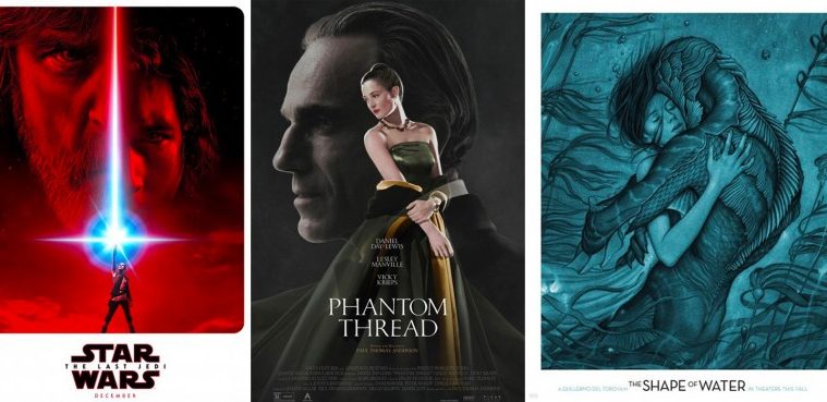
When you combine both (the thematic/aesthetic strain of Greatest Showman with the minimalistic beauty of Ferdinand) you get LA’s memorable character series for Star Wars: The Last Jedi (December 15), a film that needs no marketing at all let alone pretty marketing.
This is another where I would have been happy with the teaser alone and its refurbished lightsaber glow from A New Hope (which in turn has been mimicked by the likes of Turbo Kid too). I like the red outline on the title, the competing faces of good and evil, and the hero destined to traverse the chasm between them.
But how could I not also love the characters? From the red cloaks against grungy gray backdrop to the logo’s crisply bright colors to the progression of photography into painterly brushstrokes, these things are a perfect amalgam of portraiture and illustration. Removing the eyes with an astute crop doesn’t create anonymity, but mystery instead. There’s dark drama and an almost totem like permanence as though these stories truly are carved onto cave walls. They aren’t fading. They’re coming to life.
A cast worth seeing


Just because LA’s I, Tonya (limited December 8) is Margot Robbie on a non-descript background with a large title doesn’t mean it isn’t effective. The firm could have just slapped her face large and centered and called it a day, but they took a great attitude pose and created a well-designed piece instead.
It probably won’t turn heads, but it won’t make you look away either. They’ve implemented their generic elements in perfect synergy by moving Robbie’s figure to the side for space to put critics quotes. They’ve placed her in the scene by masking out her head to cover part of the title. And they’ve chosen a bold yet fun font with reverse serifs that almost have our eyes moving against the grain. I like to think it creates an ice-skating movement with our wanting to propel forward despite physics pushing us back.
P+A crafts a similarly deceptive work with their tease for The Disaster Artist (limited December 21). Despite highlighting its star and director James Franco channeling the infamous Tommy Wiseau against a plain green backdrop, everything is intentionally positioned for the greatest impact.


They’ve pushed Franco to the bottom so that ample space can be freed at top for the title—only they stick an embellished one-liner there instead to dial into the cult appeal of The Room and get fans into the joke. The green isn’t “plain” but the green screen used to recreate a rooftop they could have just shot on anyway. And the boom mic and spotlight signify the behind-the-scenes aspect of the story being told. We’re given access to the chaotic insanity that occurred during the making of the worst movie in the history of cinema.
The final sheet simply cannot equal its efficacy of saying so much with so little. Instead it provides a scene of excitement and trepidation with the two stars (and a couple familiar faces Photoshopped in behind them). Rather than look behind the curtain, this poster is merely homage with its black and white coloring and specific font choice. All it needs is that hideous reflection filter to finish the job.
The Refinery delivers a lot more detail than these previous two with Wonder Wheel (limited December 1), but it’s just as minimalistic. It’s still only actor (Kate Winslet), title, and background. What’s different is that the latter isn’t a solid color. No it’s a gorgeous window view onto a perfectly centered Coney Island Ferris wheel in bright yellows and blues to contrast the shadowy figure haloed in light at the foreground. We’re suddenly transported to a time and place unlike our own.
I love the heavily saturated hues that render it with a painterly touch. I want to believe the entire film is shot with this same aesthetic knowing that it would be impossible. Talk about using the “magic hour” with some post-production filtering involved to augment its otherworldly time capsule. There’s drama, austerity, and beauty all at once as it moves from light to dark to subtly bright text in Woody Allen’s trademark font. The film will have a lot to live up to with this serving as its introduction.
Take that faux illustrative work to the next level and achieve something akin to James Jean’s delicately unforgettable The Shape of Water (limited December 1; wide December 15). Talk about unorthodox romance and yet I can’t think of a sight that expresses love any better this year. To these two creatures nothing else matters but the other.


Give the studio credit for letting this piece of art virtually standalone. Jean wasn’t able to create a unique typeface like he did with mother!, but I can’t say the chosen font isn’t attractive in its own right with a thin weight and lowered centers. The light touch of his lines becomes a brilliant contrast to the rigidity of those within text. And it’s not like the latter is taking up a lot of space to distract anyway.
The colored version is great too thanks to its added definition, but I do prefer the other’s more wistful existence as though of a dream. This version is made too “real” and therefore closer in tone to the photography-based sheet of an actual underwater embrace than the fantastical storybook feel of the first. It’s a very fine line of distinction, though, as all three prove extremely memorable nonetheless. Much like I’ve heard the film does too.
Distinct perspectives


You’ll probably never see LA’s poster for Voyeur (streaming December 1) in the wild considering it’s a Netflix “original,” but I have to commend the subscription service for finally spending the money to commission it anyway. A lot is said about how they don’t take the time to market their products (no argument there), but they are starting to embrace the theatrical machine now. Just because the film won’t play in many theaters doesn’t mean you can’t still canvas big cities and push awareness.
Many of the studio’s posters have been generic at best, photo/title at worst. This one, however, is really nice. The benefit of not needing these for multiplexes is that they don’t need a lot of text. While this works for the piece itself, it does do a disservice to the film’s artistic team. At least put the documentary’s director’s name on there somewhere.
I like the use of scale with the tiny subjects dwarfed by the massive neon sign displaying the title. You literally read the tag at top and follow the lit line at left down to the arrow point to see Gay Talese and the release date. It’s economical and captivating.
There’s always ways to get around the amount of text theatrical posters are required to hold too: just make it all really small. That’s what Devon Gibbs did with The Tribes of Palos Verdes (limited December 1). The title is important, the cast will sell tickets, and the studio logos should be readable at tiny sizes (if not, that’s their brand manager’s problem). Stick it all in the middle and go wild with a concept.
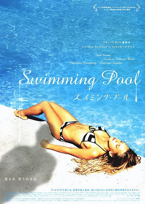
The one’s simple with Maika Monroe sunbathing and Jennifer Garner shadily peering down upon her. There are obvious similarities to the international sheet for Swimming Pool, but the tension is ramped up thanks to an extreme vantage point heightening the drama. The way the pool edge angles to break up the whole’s symmetry is especially nice since its positioning also ensures the actors fall onto the center line to maintain symmetry nonetheless. And it looks real. There’s probably a ton of manipulation at work, but it’s hardly noticeable.
With BLT’s The Post (limited December 22), I will admit I needed to give it time to grow on me. At first I hated it because of the giant translucent names at top and the white border hiding the fact that those horizontal lines are stairs rather than background texture. I still hate the former, but the latter has become a sort of intriguing optical illusion that draws me in rather than completely shut me out. It’s probably a stretch, but I keep thinking about Filth and its warped perspective of having an overhead shot of cocaine lines become a straight-on shot of ladder rungs.


But just think how good this thing would look without “STREEP” and “HANKS” dwarfing things at top. Those words are almost twice the size of the title and not nearly as expertly placed (I love the bleed of white on white so “The Post” becomes part of the frame). Take off those names and this is a Top Ten contender. With them, however, it’s merely a great concept undone by celebrity commodification.
InSync Plus’ version does the right thing by keeping ratios consistent with importance: title is number one, star power number two, and filmmaker third (whether I’d argue filmmaker should be first or not). It’s all clearly there without assaulting our eyes. I even like the angle and positioning of the actors despite them looking a bit too airbrushed. It possesses good movement and intrigue despite its familiarity.
What’s not quite familiar? That would be eclipse’s Phantom Thread (limited December 25). It has the same ratio as that second The Post sheet as far as text goes (title, actors, then director) and has only two figures displayed, but the drama isn’t manufactured. It feels like an actual image captured and cropped rather than worked over. It provides us a predatory gaze masked as “occupational hazard,” subtly showcasing the notion reported weeks ago about the film having a Fifty Shades of Grey sexual vibe. This man sees this woman as an object.


That’s a lot to say with a simple image like the one presented. Much of it arrives from that full-bodied 45-degree cock of interest and judgment. We don’t need to see his face to know what it looks like. And he’s not leaning so we can see the text. The text is there because he’s leaning to view her—to visibly be seen as being in the act of seeing. The result is an insidious potential for danger, the dark title suddenly appearing horror-infused and American Psycho-esque rather than formally noble. We should expect nothing less from Paul Thomas Anderson.
And while the final sheet isn’t that much different as far as the players, the mystery is removed. The firm goes for a translucent overlap a la BOND and Nocturnal Animals—an interesting idea that still doesn’t quite work. Suddenly things become perfume ad meets romance drama. By seeing their faces we can begin assuming motivations. Daniel Day-Lewis doesn’t have judgment. He has sorrow. An intense power dynamic has been transformed into love scorned.
What is your favorite December release poster? What could have used a rework?