“Don’t Judge a Book by Its Cover” is a proverb whose simple existence proves the fact impressionable souls will do so without fail. This monthly column (with a special year-end retrospective today) focuses on the film industry’s willingness to capitalize on this truth, releasing one-sheets to serve as not representations of what audiences are to expect, but as propaganda to fill seats. Oftentimes they fail miserably.

Another year is complete and the time has come to revisit the best one-sheets that did all they could to help their films achieve box office glory. Unsurprising to those of you who been following the Posterized Propaganda series all year, most of the ones I’ve singled out are teasers. Frankly, marketing firms find themselves freer to take chances and really toy with our perceptions before knowing too many details about the finished piece.

Compositions rule the day alongside carefully placed typography and a fearless desire to play with aesthetic and the medium by exceeding their constraints. Print is inherently flat as it handcuffs designers into a preordained space with regulated text. The following firms thankfully continue to find ways to ignore the rules and give us work that doesn’t hit us over the head or treat us like Kindergarteners.
Honorable Mentions

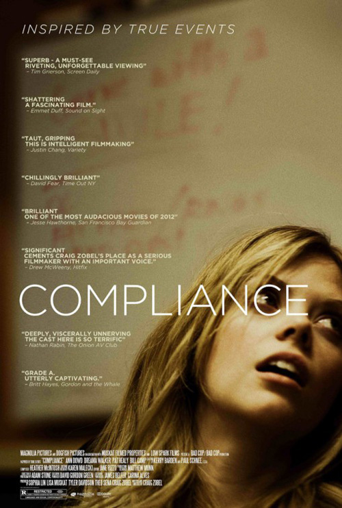
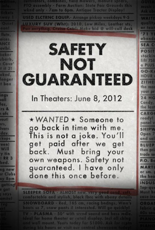
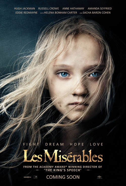
Les Misérables Moonrise Kingdom This is Forty Compliance Safety Not Guaranteed
#15
Les Misérables
Ignition Print
.
#14
Moonrise Kingdom
P+A
#13
This is 40
The Cimarron Group
#12
Compliance
.
.
#11
Safety Not Guaranteed
.

Here #10
Here
Ignition Print
I remember loving this poster when it came out a few months ago as Ignition really went all out rotating the page 90 degrees clockwise so Ben Foster and Lubna Azabal can be anchored at left. It’s a brilliant way to transform a horizontal image vertical and the beige field of sky is a perfect blank slate for the pertinent production text to hover atop. Add in the authentic, map-like paper folds and you really do get a sense of the title’s Here being used as a destination. But instead of a place for these lovers to look towards, the location they seek is anywhere they can be together.

Rust and Bone #09
Rust and Bone
The Rageman
I know the scrawled text over image trope is a bit overused these days, but I can’t help feel it enhances the fragility this still of Marion Cotillard and Matthias Schoenaerts emits. It along with the distressed, faded edges of scratches and folds add age to the image as well as character. We’re only seeing a small portion of the two before they continue out of frame, her expression projecting a sense of trepidation and a strengthening trust. The film is called Rust and Bone, but the poster is all about flesh and emotion.

The Loneliest Planet #08
The Loneliest Planet
Perhaps my inclusion of The Loneliest Planet makes it seem as though turned pages are presently my motif of choice, but this sheet truly captivates. Not only do the heads of Gael García Bernal and Hani Furstenberg perfectly bisect the page vertical, they also meet at the horizon line of the poster’s alternate image’s mountain landscape on which our actors hike along. It’s a gorgeous expanse of desert dunes filtered through a green marble juxtaposed against the colorful faces of the film’s stars. Forcing the crisp san serif text within a thinner vertical band only helps keep our attention constantly shifting from side to side to up and down.

Deepsouth #07
Deepsouth
Brian O’Dell
Honestly, I don’t care if Brian O’Dell‘s poster for Deepsouth should or shouldn’t be on this list when release schedule and notoriety are brought into question because it is a stunning piece of art notwithstanding. I love the delicate, lowercase Courier-like font with a not-so-subtle red cross serving as its “t” pushed down to the bottom of the page so our gaze can wind our way through the upside down tree’s barren branches. Is it a depiction of lungs? Is it a representation of a family tree stretching out wide? It’s beautiful in a purely formal aesthetic way—that’s what it is.

The Cabin in the Woods #06
The Cabin in the Woods
Phantom City Creative
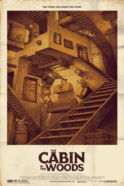
The surprise film of the year—for the studio who shelved it two years, not the fans who knew they’d love it—The Cabin in the Woods was ripe for Mondo Tees to print a limited edition art run. Thanks to Phantom City Creative, the result is everything we could have hoped. Playing with the genre-bending, multi-level plot structure and set of the film, this homage to M.C. Escher‘s Relativity perfectly encapsulates what Drew Goddard and Joss Whedon created. Handdrawn and meticulously detailed to even include the honeycomb pattern its science fiction side utilized, it’s a breathtaking rendering.

Wreck-It Ralph #05
Wreck-It Ralph
How great is it that Disney made a film with 8-bit-like characters stuttering around the screen let alone had the courage to tease it with its fully pixelated lead character to children who have never played a game that didn’t include three-dimensionally rendered worlds? Ever since I saw Wreck-It Ralph‘s angry face in theater poster frames I knew I had to see the film whether it would be all 8-bit or not. The Mouse House went full bore into nostalgia for this one and it played huge with people my age—the same money-earners now spawning the studio’s key demographic clamoring for cartoons and popcorn.

Sound of My Voice #04
Sound of My Voice
Having now seen Sound of My Voice, it’s poster somehow still possesses much of the same intrigue it had upon release. The image is an eerie one with a white, shrouded Brit Marling about to uncover her face as oxygen tubes wrap down around her nose. I wrote earlier in the year that it had an other-worldly, Matthew Barney feel projecting a sort of alien filter to her character. Knowing her secret now only bolsters this comparison. The art direction is spectacular from Marling’s pose to the low contrast delineation between text and image and its muted color palette draws you into the spirals of her gown and will not let go.

The Paperboy #03
The Paperboy
and company
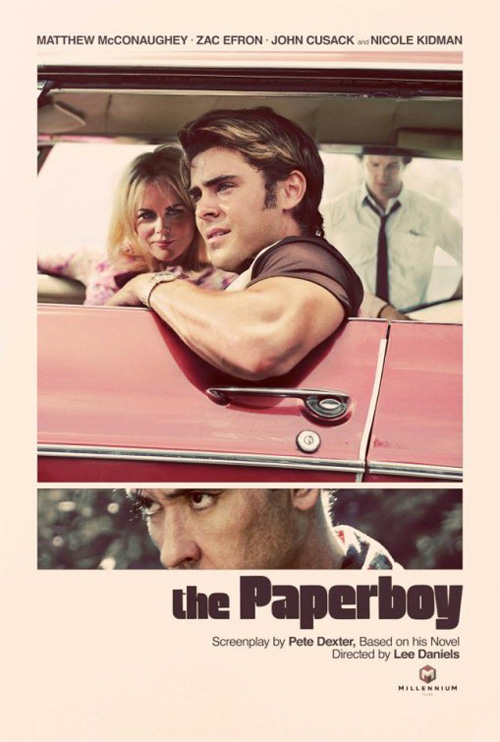
Vintage chic with an off-white tint, and company effectively recreates The Paperboy‘s 70s era. The thick, stylized font weighs down the sheet as the painterly, air brushed imagery helps its high contrast photos lighten in an almost pastel hue. Having the car door not run parallel to the page’s edge gives it just enough of a slant to create that gorgeously shadowed triangle above the second widescreen cell of John Cusack‘s menacing glare and you can’t ask for better depth of field where its trio of actors in the main frame are concerned. It drips confidence and make me want to ignore all the bad press the film has received.

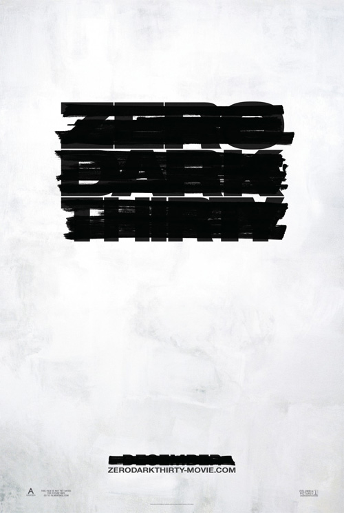
Zero Dark Thirty #02
Zero Dark Thirty
BLT Communications, LLC
BLT must be applauded for fearlessly covering their advertisement’s main element for recognition. Where most firms would have littered the frame with unnecessary words so it could redact everything but the title, they understood that the power of censorship is in deleting what means the most. They utilize a well-measured marker width perfectly positioned so that enough of each letter is visible to still read the Zero Dark Thirty and December. Simple and exacting, if there were a scale for efficacy in design this couldn’t get lower than a 98%. It’s a fantastic stand-in for what seems to be the consensus favorite for Oscar season.

The Master #01
The Master
Dustin Stanton
Dustin Stanton’s work for The Master exemplifies what the industry needs to remain fresh—a living, breathing representation of the film. Before anyone knew the plot of Paul Thomas Anderson‘s newest, this impressively manufactured faux bottle of alcohol elicited hypotheses while also piquing interest. The liquid’s surface edge magnifies the word it intersects and the fluid’s murky translucency obscures what’s below. You could almost believe it possible to reach through and touch the polished wall of text behind. Who knew something so flat could be so tactile? And without a floating, Photoshopped head too.

What is your favorite poster of the year?

Click for more Posterized Propaganda

Follow our look back at 2012: The Year In Film.

No more articles