“Don’t Judge a Book by Its Cover” is a proverb whose simple existence proves the fact impressionable souls will do so without fail. This monthly column focuses on the film industry’s willingness to capitalize on this truth, releasing one-sheets to serve as not representations of what audiences are to expect, but as propaganda to fill seats. Oftentimes they fail miserably.
Hollywood is making up for last month by opening a slew of box office marquee selections as summer has officially arrived.
There’s a little something for everyone too—even a horror film if a remake of Poltergeist (opening May 22) can get you excited. I guess we’ll soon find out if its latest iteration of the creepy doll motif can lure in paying customers.
Putting the pieces together
 |
 |
 |
 |
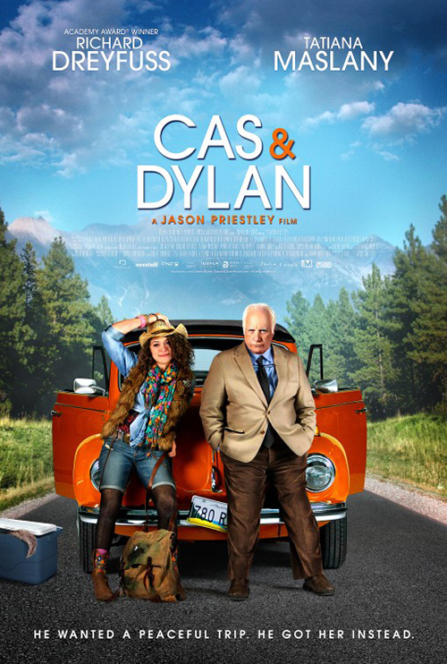
Here is a case of “do what you can”. Or at least I hope that’s what happened. DOG & PONY‘s poster for Cas & Dylan (limited May 1) seems to have been cobbled together from whatever was at their disposal. Have a photo of the car driven in the film? How about Tatiana Maslany and Richard Dreyfus‘ faces? I say faces because the rest of their bodies look cartoonish at best.
The background isn’t even real. There’s a distracting white cloud of overlay behind the car (to make the white text pop more?) that makes the landscape look like a JC Penney photo department backdrop. And I know it’s a small, innocuous detail, but the fact the road is only one lane is unfathomably irksome to me. But maybe that’s just my being used to I-90’s multiple lanes on the east coast.
If this were advertising a stage show where the actors literally stand inside a two-dimensional car façade and playact their journey, I’d say bravo. Since it’s a feature length film getting a theatrical release—albeit small—I must blame the producers for failing to assume a poster would be necessary. I understand not being able to afford a post-production publicity shoot, but at least take a couple set shots in anticipation of marketing.
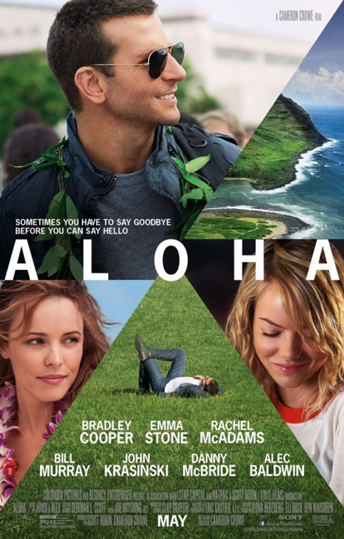
DOG & PONY would have been better off using a film still so its multiple parts looked like they belonged. Just one still, though, because the whole boxy collage theme is obnoxiously combative to its own needs. Look at BLT Communications, LLC‘s Aloha (opening May 29) to see what I’m saying. Should we look at Bradley Cooper? Rachel McAdams? Emma Stone? How about the amazing expanse of Hawaiian Islands made to look small and pedestrian by shoving it into a tiny corner?
And the radial compartmentalization—is that a play on the name? If so I’ll share a slow clap of approval for taking “Aloha’s” mirrored meaning of “Hello” and “Goodbye” to a full circle metaphor. Why don’t the pieces fit, though? If you’re going to fan out from a central “O”, do it correctly. Or just use four photos so the weird extension past the pivot point doesn’t look arbitrary. It’s not like we needed two Coopers anyway.
 |
 |
 |
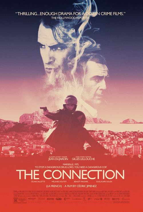
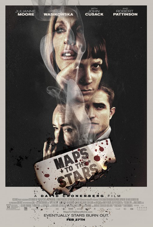
I may be completely fed up with the wispy totem montage being utilized every month (see Maps to the Stars), but The Connection (limited May 15) is light years better than both of these others. I think it has to do with the wonderful desaturation of color, stripping it of modern brightness and lending an old school feel for its 1975-set thriller. It might actually be better without those two floating heads. Give us the purple sky, empty above the squinting shooter on the motorcycle. Now that would be bold.
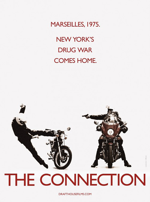
Le Cercle Noir tried boldness but their stark white teaser is too plain. What’s happening? Did the bullet blow the other guy off his bike or is he flying to avoid it? Where is the context? I can see this as a black and white flier handed out after you leave the theater of another movie to whet appetites months before release.
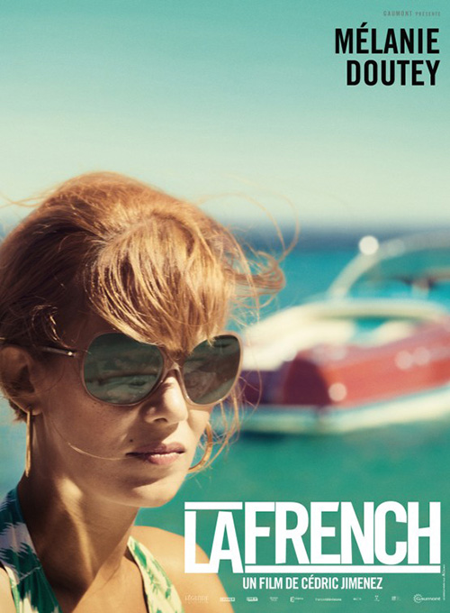
The firm did do much better with their European work (La French). I love the crop of Mélanie Doutey and its shallow focus. It’s very 70s and dramatic. It sets a tone.
 |
As for Maggie (opening May 8), there weren’t really any “pieces” to fit together in post. That’s not saying this isn’t a Photoshopped image of Arnold Schwarzenegger and Abigail Breslin, but if it is they did a good job. No, my inclusion under this banner was more a poor joke about Breslin’s face looking like a puzzle.
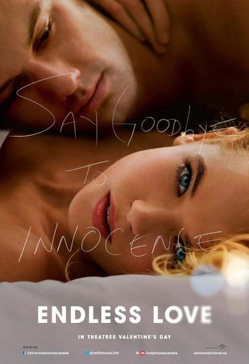
Where the poster itself is concerned—I like it. There’s nothing new going on as we’ve seen the white Polaroid framing countless times and its lack of color for apocalyptic drama is old hat. (Also, the radioactive logo being placed below the second “G” in the title with the only color in the entire poster is distracting in a bad way.) But you get the tone, star power, make-up effects, and flair nonetheless.
My favorite part is the hand-scrawled “Save Her” cutting through the top half. Similar to Endless Love, this one is much subtler and much more relevant to the idea. A father reminding himself to save his daughter no matter what is a powerful sentiment in a zombified future. A lot more than a spoiled rich kid angering her bigoted father by dating the kid from across the tracks.
Teasing without intrigue
 |
 |
 |
 |
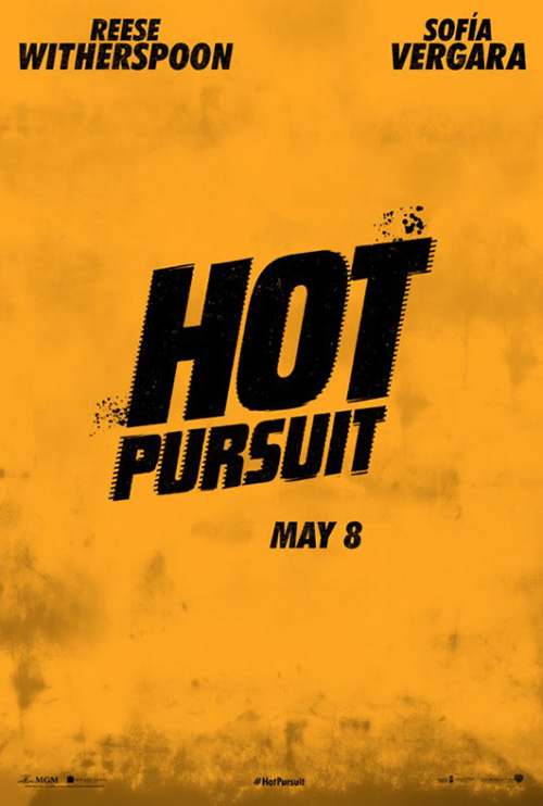
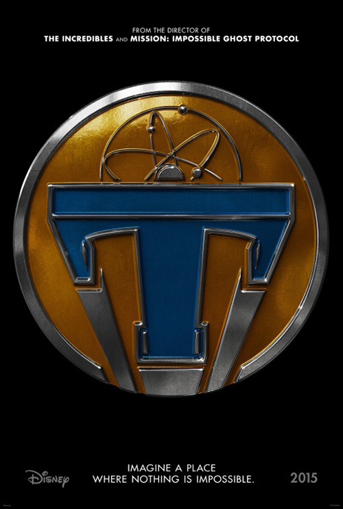
I love teaser sheets. LOVE them. But I’m talking inventive, viral designs that put you into the movie and ratchet anticipation to the point of bursting. So I implore studios: please don’t make one for your movie unless you have something to show us. Sometimes a logo is good enough. Most times it’s not.
 |
 |
 |
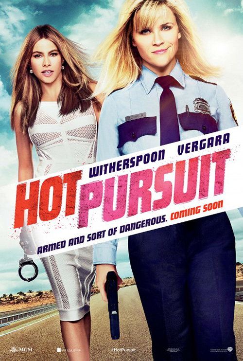
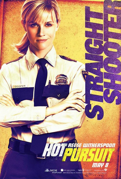
Case and point: Hot Pursuit (opening May 8). Why? Are we writing down dates in our calendar based on what we see on theater walls? Doubtful. The release date should mean next to nothing when the public doesn’t know the content. You’re supposed to be creating intrigue by coaxing viewers to find out more. And to many, seeing Reese Witherspoon and Sofía Vergara‘s names with nothing else will have them praying to never know anything more.
Not that a film like this needs a teaser when the final poster from cold open merely depicts the two women smirking at us. But then that appears to be a tease too with its “coming soon”. And is that really Witherspoon’s smile? I know she has a one-sided curl, but it looks like the designers drew it out extra long to compete with Jared Leto‘s Joker.
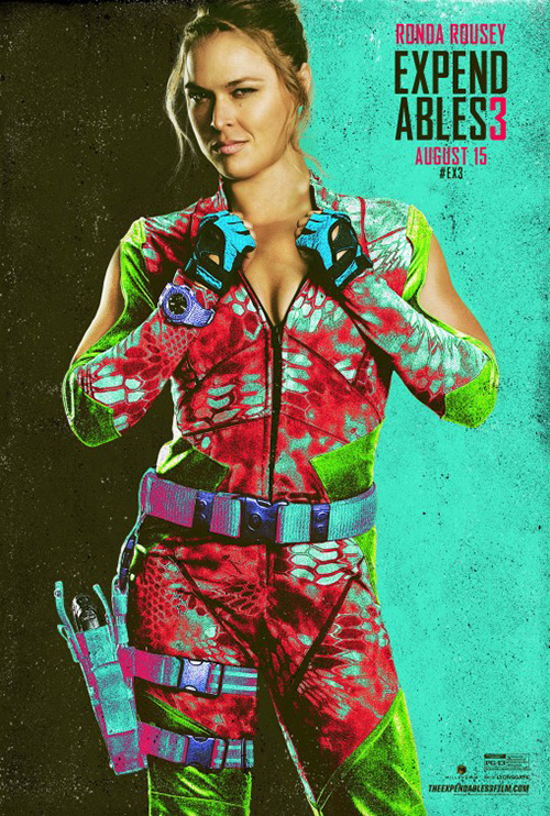
I just don’t know what this campaign’s purpose is. Obviously Warner Bros. knows the thing will sell tickets on name recognition alone. But give us something to sink our teeth into besides gritty color filters a la Expendables 3.
 |
 |
 |
 |
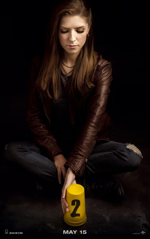
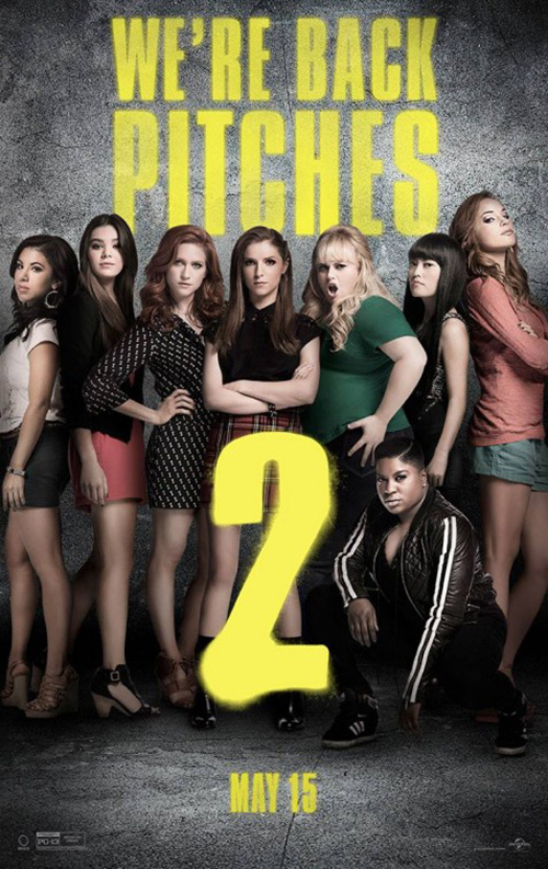
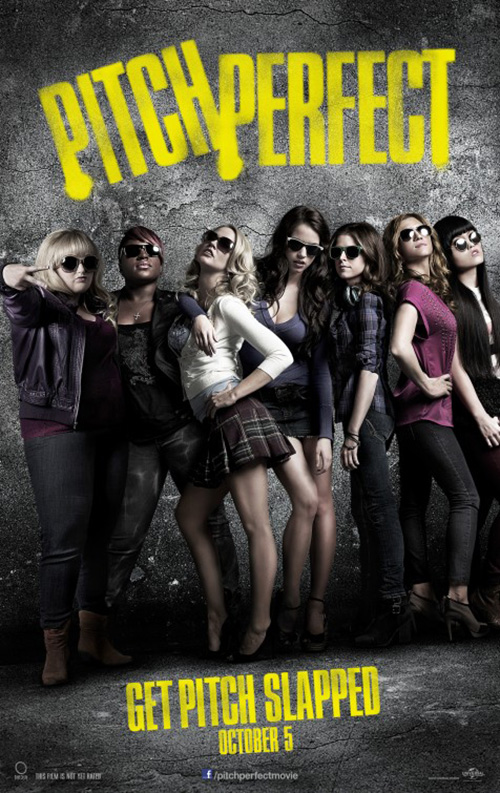
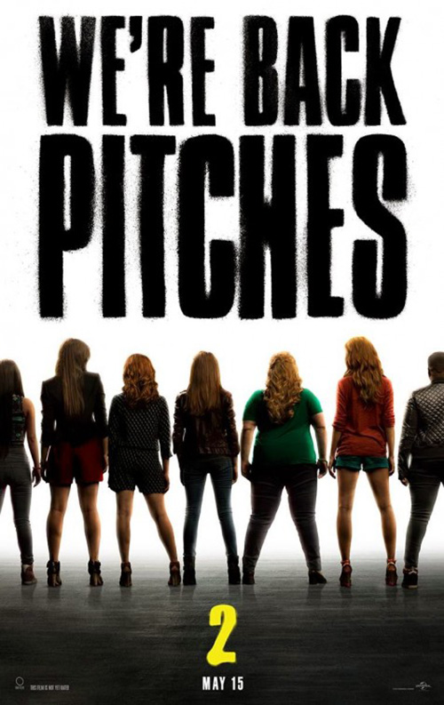
The same goes for Pitch Perfect 2 (opening May 15). The original was a surprise hit (and surprisingly very entertaining), but this one is a total moneymaking home run from the get-go. It’s hardly unique then that Ignition would hinge everything on its predecessor’s success.
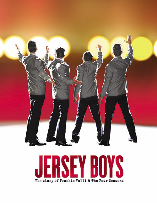
First comes Anna Kendrick and her cute little cup with the number 2 spray-painted on it. Subtle right? Next comes a blatant rip-off of the firm’s own poster for Pitch Perfect sans sunglasses and plus one Hailee Steinfeld. I can’t even say anything nice about BOND‘s attempt since it’s just a riff on the Broadway Jersey Boys graphic.
Again, though—people are going to see this because they want to see it. Posters aren’t going to win over those who’ve been hiding under a rock for three years. That doesn’t mean you shouldn’t at least try.
 |
 |
 |
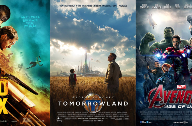
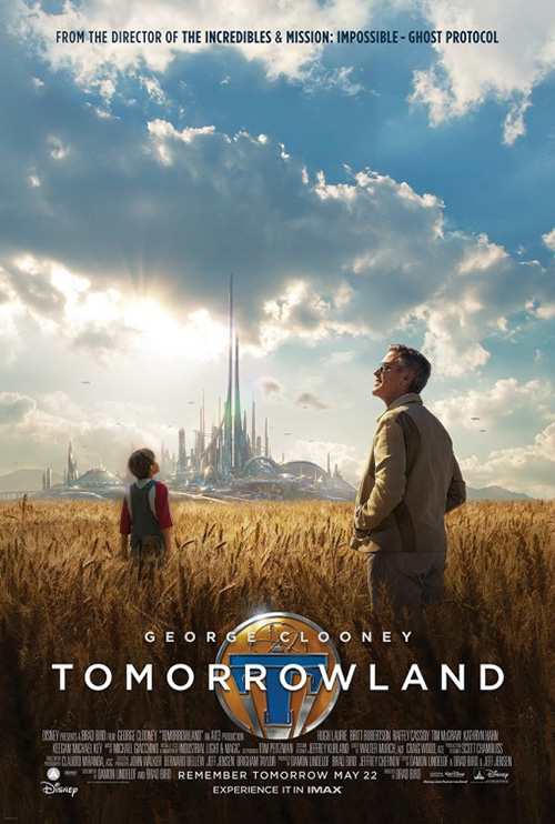
BLT tries with Tomorrowland (opening May 22). Or maybe they just got lucky by having a film with a cool design ripe for utilization. After all, if you’ve seen the trailer you know that a tiny pin transports the lead to a parallel universe. It’s a no-brainer to simply take that pre-conceived prop and focus everything its way. The object is already synonymous with the title and therefore easy to permeate our subconscious to stick.
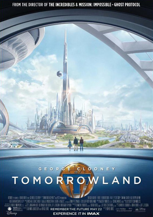
The firm is smart by including it on all other materials albeit smaller and behind the actual title now revealed. This first one is neat with its futuristic city in the background and expanse of cloudy dreamlike sky. Why George Clooney is looking in one direction and the little boy another is confusing, but there’s an aura of adventure and mystery that really plays. Definitely better than the clinical steely blue of Proof‘s sheet trying too hard to show a sense of scale when the film’s architectural design is paramount.
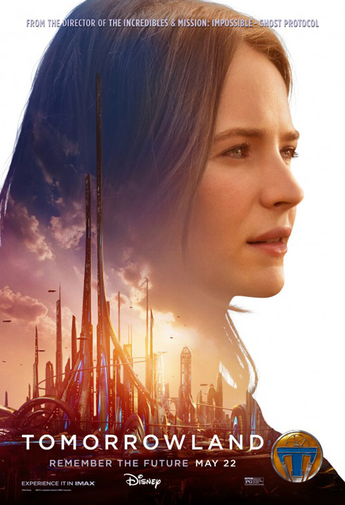
As for BLT’s character sheets—yawn. The actors’ names aren’t even included. Neither are their character names. So what’s the point? It’s not like the layout of blank faces against white with Tomorrowland’s buildings in the positive space is exciting. I look at them and think Disney had a quota to fill and this was the least time-consuming solution.
 |
 |
 |
 |
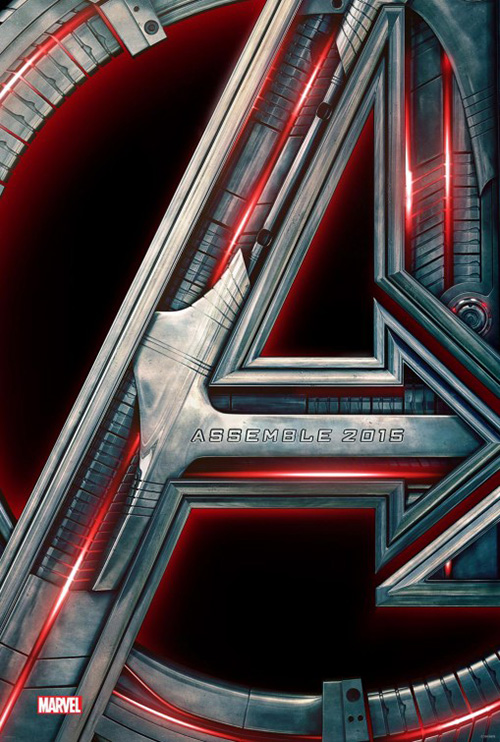
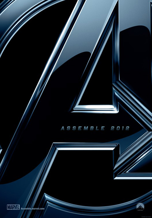
Similar to this teaser, BLT goes with a metallic insignia for Avengers: Age of Ultron (opening May 1) too. Itself a riff on their teaser for The Avengers, its robotics aesthetic is an obvious allusion to Ultron without showing the character. The tag is even the same “Assemble 20XX” to lend consistency and trigger the memory of seeing its original counterpart back in 2012.
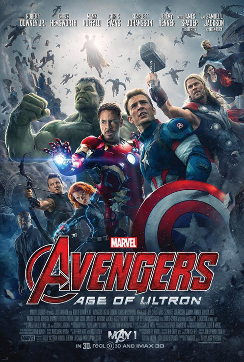
The final sheet with its circus of superheroes is exactly what you would expect, but it does have a welcome balance to not get completely lost on the wall. Would I want to bring it home? No. But as far as marketing goes, it does its job well thanks to the vantage point from below allowing everything to teeter on crashing down upon us.
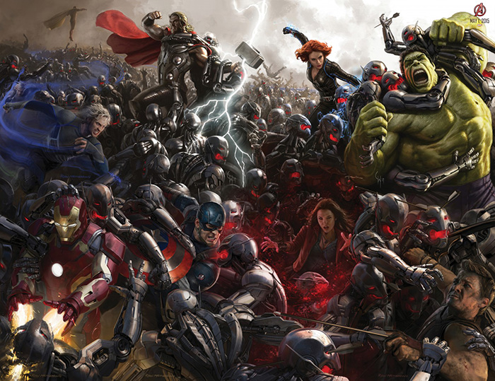 |
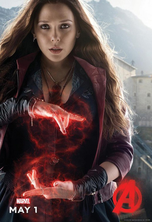
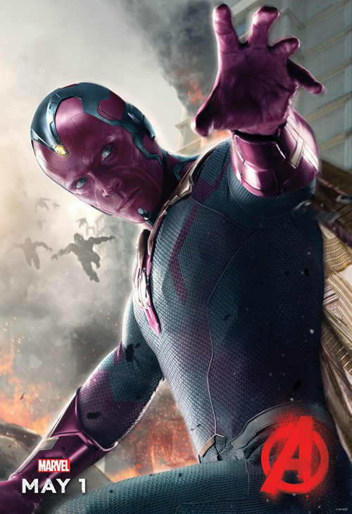
Where Avengers 2 really excels is in the character sheets. I like the one’s BLT did recently with the painterly depictions of heroes and villains underneath a grungy “A” because they come at dramatic angles with some cool effects. In contrast, I absolutely love the collector’s edition versions from way back when whether broken in six pieces or altogether in its chaotic glory. This is a comic book brought to life and a mural worthy of existing as a piece of art beyond commerce.
Typography textures
 |
 |
 |
 |
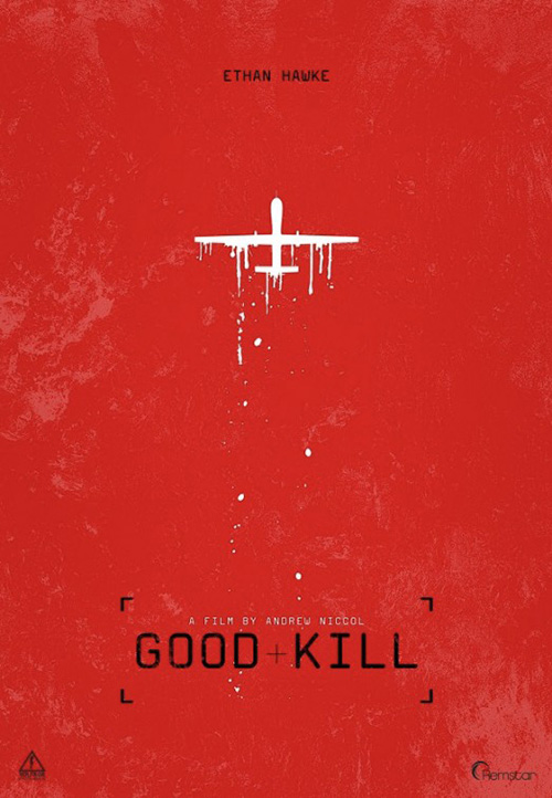
I’m purposely staying in the dark when it comes to Andrew Niccol‘s Good Kill (limited May 15). Yes, I’m a Niccol fan (albeit not big enough to have watched The Host) and his reunion with Gattaca star Ethan Hawke is a positive development. I’m therefore happy that this tease is still the only marketing material I’ve been exposed to so far. There might be another poster (or perhaps this is the final piece), but I’m not going to seek it out.
And honestly, that’s a testament to the appeal of this design. I like the lack of clarity in what we’re looking at. Is it red water? Is this pockmarked stone, maybe acid wash? Add the dripping airplane—not spray painted necessarily—and target bordered title and we are placed inside the poster. I can see that target being my eyes, slowly moving up towards the plane to take it out.
I don’t need anything else to want to buy my ticket.
 |
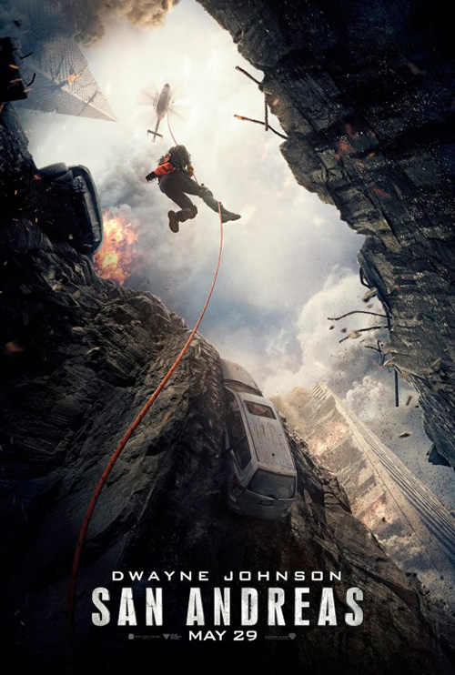
Concept Arts‘ San Andreas (openi May 29) is on the complete opposite end of the spectrum. I say that with no disrespect since this is a neat teaser in its own right. They’ve simply put me in the scene literally rather than figuratively. By using realistic footage and a vantage point looking up, we become a victim of the carnage as we ready to grab hold of the rope and get lifted to safety.
The distressed typography mimics the environment of an earthquake rather than the mental state of me as the viewer. I’m also static as the scene itself moves around me. I’m left waiting for the helicopter to lift me up rather than moving myself within the frame. It’s a window, not an adventure.
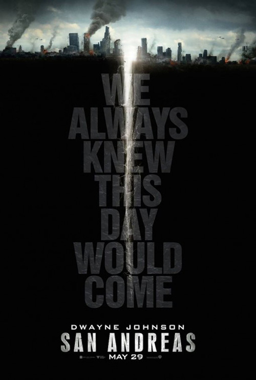
WORKS ADV goes a similar route with the same typography (must be studio-issued), but a view that removes us even further. This is an advertisement with no involvement other than pitching me a product. I’m supposed to be shocked by the large crack in the earth, reading the tagline as I follow it to the title, but the impact is marginal. To me a fault line is horizontal, cutting through the earth like a tear dividing cities. Make this overhead like Good Kill and it becomes something massive and memorable.
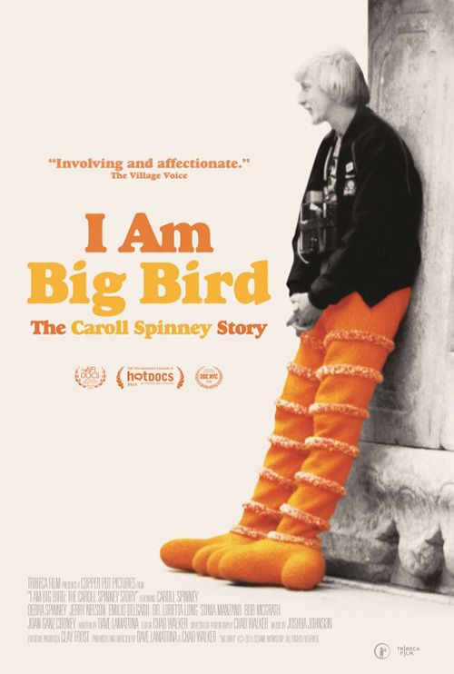 |
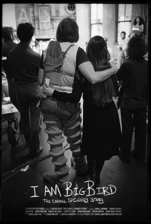
For I Am Big Bird (limited May 6), the typography’s lack of crispness instills a feeling rather than metaphor. It is a personal, hand-written touch to show the emotional scope of what Caroll Spinney and his big yellow bird continues to provide countless young children. There’s love in its imperfection—warmth.
The image is great too because it’s about the person who brought Big Bird to life. Seeing Spinney half in costume and half out with an arm around his coworker’s shoulder is a sweet look behind the scenes. It depicts the camaraderie and closeness of what goes on to produce Sesame Street. The joy on set is such that you stay to watch whether you’re going on or not.
The black and white contrast and photography edging become wonderful choices to counter the bright colors associated with the character. It doesn’t add drama or place things in a darker light; it renders the image real and removed from artifice. This decision is even more profound when viewing it next to the alternate poster. Making this one’s photo monochromatic besides the legs is awkward. Maybe there’s a sense of fantasy from reality at work, but it just looks unfinished to me.
 |
 |
 |
 |
 |
 |
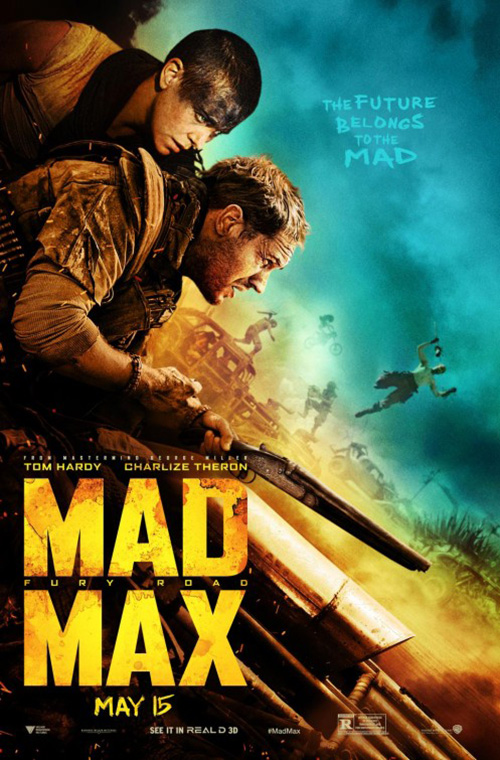
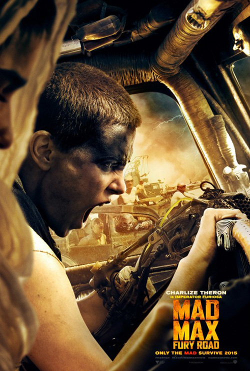
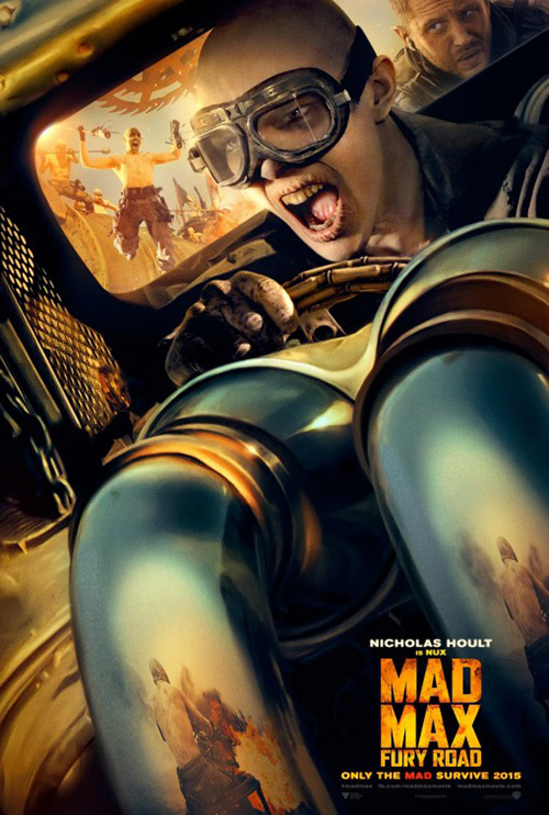
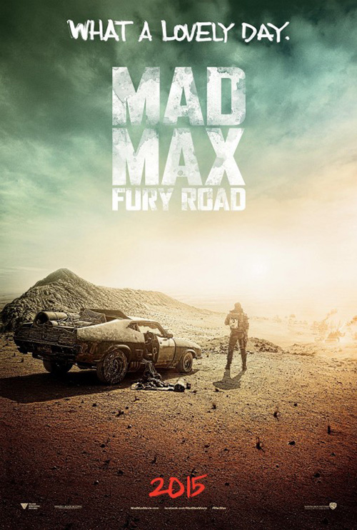
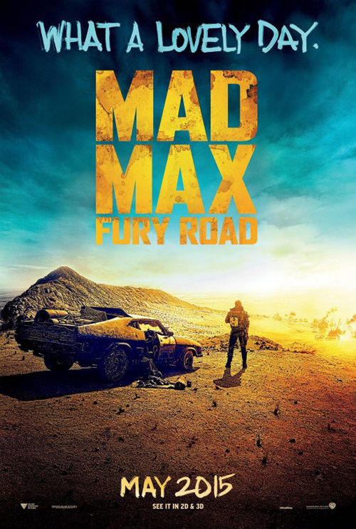
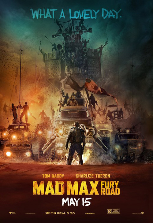
What the studio does to Mad Max: Fury Road‘s (openubg May 15) logotype is threefold. It gives us the metaphor to the hazy reality of the film’s post apocalyptic nightmare, feeling in its permeating dye creating a sense of anxiety in the viewer, and aesthetics to match the imagery rather than stick out in bright perfection. Not to say it isn’t still bright—it’s hard not to look at the title before anything else.
I’m singling out BOND’s sheet because it possesses the best use of focus from the bunch. There’s realism to the crispness of Charlize Theron and Tom Hardy against the soft blur of chaos in the background. The others like Theron or Nicholas Hoult in their cars neglect this depth of field. They both make everything clear, giving them a flatness of two-dimensionality where the first invited the belief that miles of world were set before us.
While they give us insanity, the teasers provide a calm before the storm. We see the impending chase in the background coming our way and the sky is about to swallow us whole, but something about Hardy standing still is comforting. He is the hero we must follow as we anticipate the battle. As for which variation—bright or desaturated—is best, I’m not quite sure. I like the color because of the yellow, but stripping it away really gives an idea of the dust, darkness, and oppression.
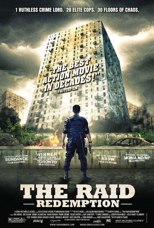
And although the most recent poster of Hardy standing before monsters of flesh and metal is attractive and probably the most bankable, I can’t stop seeing The Raid and it’s own design’s unfortunate stagnancy. One man versus the world may be true conceptually, but it does nothing to conjure the excitement of the high-octane kinetic dance the trailers promise.
Turn on the spotlight
 |
 |
 |
 |
 |
 |
 |
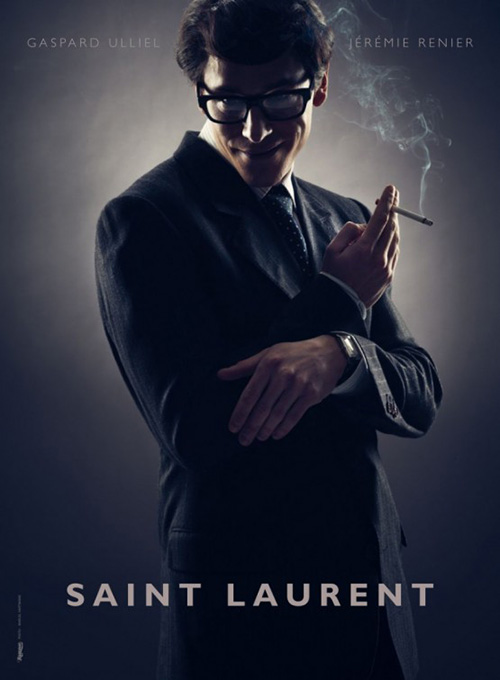
I don’t know if the intention was “creepy” but that’s my first reaction upon looking at The Rageman‘s one-sheet for Saint Laurent (NY/LA May 8). I say that with praise too because I’m utterly intrigued by what the film entails. That’s a rather menacing leer isn’t it? This thing could be a horror film for all I know with its lead turning out to be a serial killer.
Regardless of this intrigue, the image is very good too. I love the light work playing with dark darks and bright lights on his face. The cigarette smoke is a nice touch and the halo glowing on the back wall a wonderful framing device. It doesn’t hurt that the only text is two names and a title.
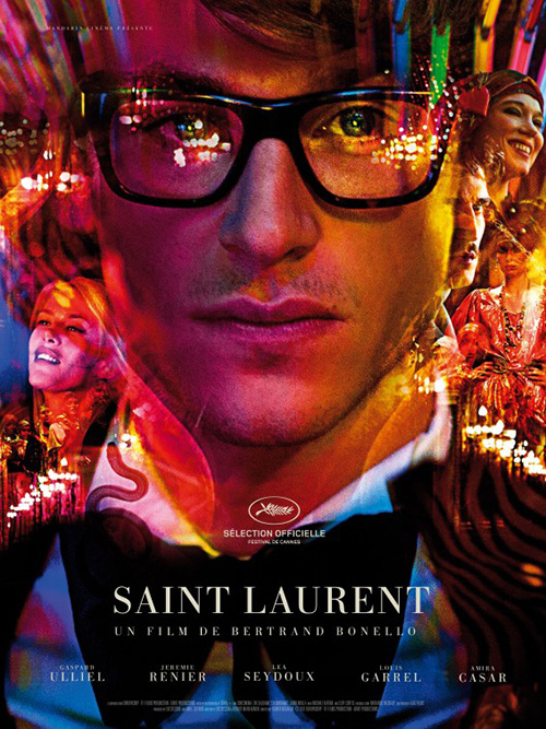
This is a huge departure from what KINGSHOKO and RYSK did with the international poster. Here Gaspard Ulliel is merely staring at us with determination—a man caught in the splendor of yesteryear at a creative peak. The psychedelic nature is attractive and a nice juxtaposition with the elegantly thin serifs of the text. Its imagery overlap is a bit tenuous on the bottom half but the glares covering his eyes are a gorgeous touch.
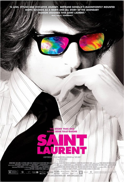
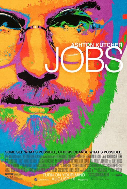
Both shine brighter than the American poster and its drab B&W with tie-dye coloring in his eyes. It’s very Jobs-like with a boring expression and dated aesthetics.
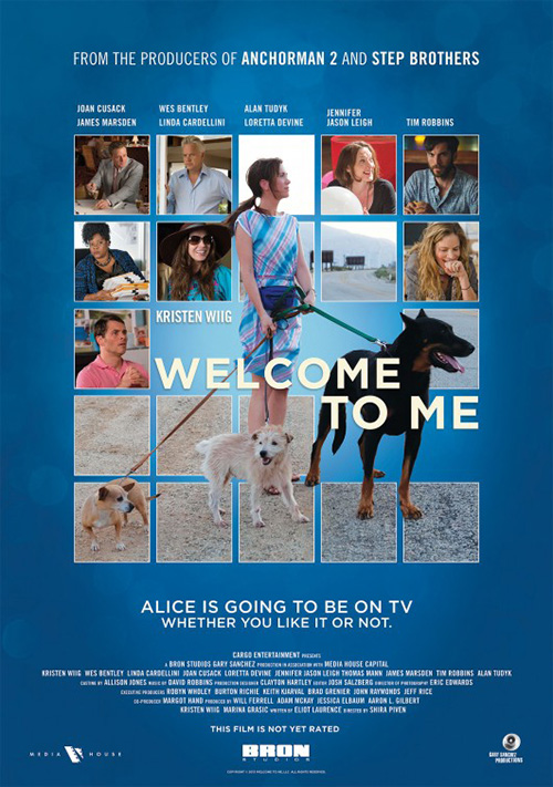 |
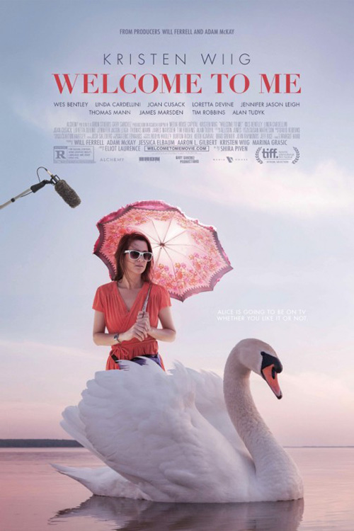
For Welcome to Me (limited May 1), LPH and Leroy and Rose have perfectly encapsulated the film. I recall the original poster of boxed stills released around the time I saw it at TIFF 2014 and can’t believe this brilliant evolution.
The movie and poster—rightfully so—are all about Kristen Wiig‘s character. Here’s a psychologically disturbed depressive who wins the lottery and goes hog wild with her imagination. This image projects every feeling you experience while watching from the absurdity of the swan (upon which she rides onto the stage of her very own public access talk show), artifice of the façade she’s erecting internally and externally via the boom mic, and the melancholy of what’s underlying every action. It’s simultaneously funny and sad just as it should.
 |
 |
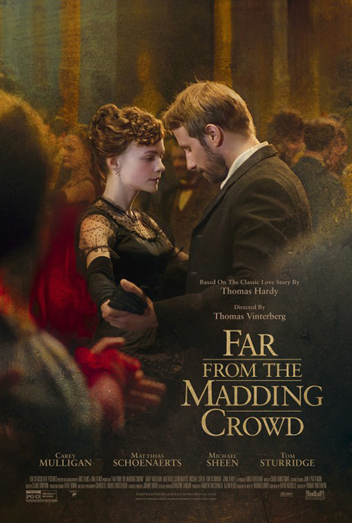
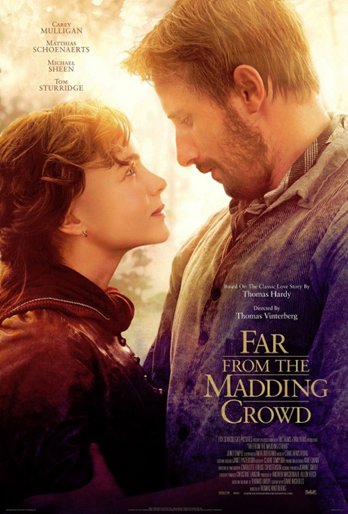
Far From the Madding Crowd (limited May 1) by Mark W. Carroll succeeds where so many have failed before it. The visual difference between focal point and background is keenly astute and its change from photo to painting respectively looks natural. This is a difficult accomplishment when so many would have it seem both halves were from two wholes, hastily cobbled together. There’s an invisible transition here instead where you can almost see the love and lust between these dancers causing everything around them to fade away. It’s a breathtaking image that makes this other iteration of Carey Mulligan and Matthias Schoenaerts peering into each other’s eyes childish by comparison.
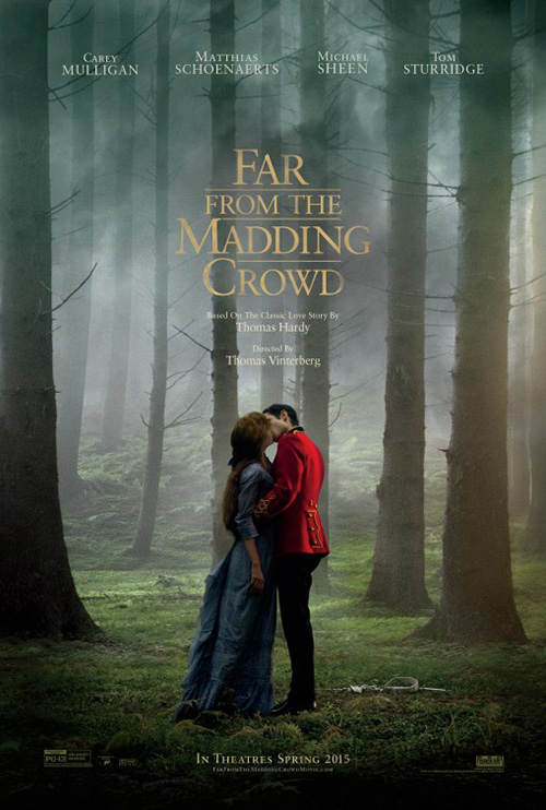
Carroll also excels with the tease. The atmosphere surrounding Mulligan and Tom Sturridge‘s embrace is oppressive and rolling towards us yet we can see nothing else besides their kiss. The colors of her dress and his uniform help by drawing us instinctively towards them, but the power of the composition allowing them to be a beacon of hope in the worrisome climate is the real cause.
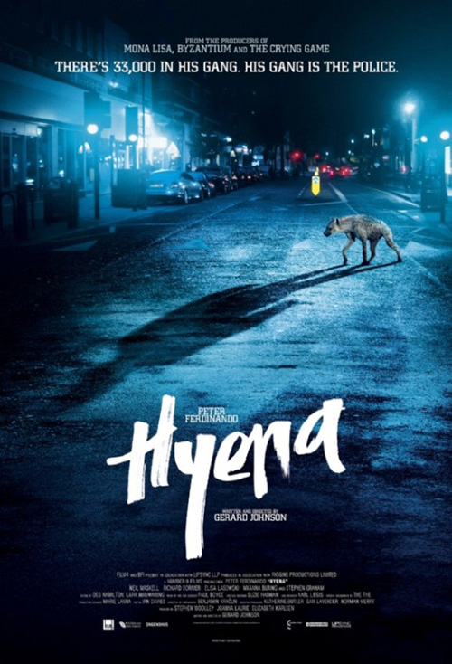 |
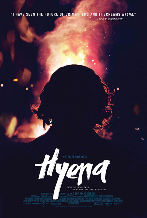
No matter Carroll’s success, though, the poster that will not leave me this month is InSync + BemisBalkind‘s Hyena (limited May 1). This thing is dangerous with its fire burning, silhouetting the perpetrator (?) for us to feel exactly as he does. There’s anger in this effect to the point where we see his shoulders rising in anticipation for a fight. The fire is his rage, the stillness his preparation. And that white, marker-edged title font only enhances the unpredictability of what’s occurring.
That’s not to say the second sheet of the figure transformed into animal doesn’t work too. There just isn’t as much malicious intent. This is more a horror poster than thriller and this fact is a great illustration at how an image can conjure different tones. I do love the tilt of the title here even though I like the “H’s” descender cutting into the text block more on the other. They’ve both won me over—I need to see this film.
What is your favorite May release poster? What could have used a rework?

