Is spring the new summer? Because it’s a pretty big month of movies.
Mario. Michael Jackson. Pattison/Zendaya 1.0. Universal’s déjà vu psyop delivering yet another new Mummy. Even Faces of Death (April 10) carries some potential zeitgeist allure for a new generation that may have heard urban legend whispers from their parents. (I almost wrote “grandparents,” but I’m not that old yet and it was still kicking around during my youth.)
Since you must appreciate all those campaigns (including the latter’s fun, frosted NSFW teaser campaign that I hope some bold theaters used to blanket their entire lobby), film studios had their work cut out for them to pry eyes away.


And, as you’ll see below, they did a great job accomplishing that goal with some stellar poster art.
Faces


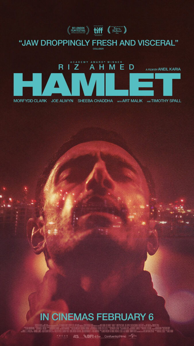
The Refinery delivers a simple yet effective one-sheet for the latest Hamlet (limited, April 10) adaptation, this one starring Riz Ahmed. Whereas the international sheet utilizes some nice cityscape translucency to capture the feel of the film’s memorable “To be or not to be” highway scene, the American iteration leans more into the overall notion that this isn’t your parents’ Shakespeare. The creative team very purposefully leaned into their star’s rap career to give the dialogue a raw, lyrical quality that shines the play through a more contemporary lens.
So we get Ahmed in a glamour shot profile with a giant crown graffitied onto his head for some street art aesthetic. It’s not quite Basquiat, but the film does center the juxtaposition of counterculture with wealth, since the kingdom here is a corporation rather than a country. This image is very Netflix “Luke Cage” with Cottonmouth’s Biggie photo on the wall. It’s a battle between how outsiders see you and how you see yourself.
You get a music/cinema crossover with Erupcja (limited, April 17) too. Yes, it stars Charli XCX, but the poster itself gives off a DIY concert notice with its duotone imagery. It’s a rockstar pose of two women feeling good: one basks in the moment while the other confidently stares back at us as the orange tint provides an almost infrared filter.
The piece that pulls it all together, though, is the title text. Whereas everything is very tidily placed in blocks at the bottom, it’s huge and tilted along the line connecting the women’s heads with kerning so close that the letters overlap. The bold white grabs our gaze. The angle provides motion. And the pronunciation guide confirms the word is exactly what we think it is—just in another language.
My favorite “portrait” of the month goes to Bunnylovr (limited, April 10) and its extreme angle from below of Katarina Zhu’s camgirl. The crop sees her face descending from the top of the frame. The eye contact given by the one visible eye draws us in. The blurred foreground shadow of bunny ears perfectly frames her falling curls. What a shot.
When you have an image that good, you do whatever possible not to ruin it. Thus all the text gets shoved to the bottom. Credit block. Cast call outs. Logos. Title (with heart in “O” for an extra wink). Do not distract from the photo—especially since it’s been built for us to gradually make our way down. Steal our attention first and then reward us with the information that we suddenly crave to know.
Echoes


Billed as a “reimagining of the lost Lon Chaney classic,” it makes sense to give the poster for A Blind Bargain (limited, April 24) old-school vibes. The artist probably could have even mucked it up a bit more to really exude that era of scissors and paste graphic design that predated Photoshop masking. It’s best approximated by that crisp line around Glover’s head to match the circular field of spirals behind him.
I also love the texture scratches throughout to make the whole seem like it was quickly adhered to an outdoor wall with no regard for creasing. Yes, it can get confusing when you also see paint cracks as though this is a canvas, but who cares? It’s not just another glossy photo, and that’s what matters most. My only suggestion would be to make the title fuzzier so it’s not just an obvious computer font superimposed above the rest.
I wish I could remember the origins of the pattern used as an overlay on the poster for Mārama (limited, April 17), but one can presume it is yet another part of Ariana Osborne’s character’s heritage usurped by Toby Stephens’ duplicitous Brit. Regardless of its full context, however, the stitches provide a great window with which to add to the symmetry and mirroring that occurs throughout the rest of the image. Not just with Osborne herself, but the title also.
Because it’s not just a one-to-one relationship. One image of Osborne has hands folded in front and the other hanging by her side. One half of the title slants down to the middle as the other rises. The poster is thus a sort of nexus point. An overlap. Past and future converging. Identity and heritage. The film is a moment of elucidation in which Mary must choose between who she is and who the world demands she become.
Bangers & Mash / Lussier’s Exit 8 (limited, April 10) one-sheet is less an echo than a repetition. What better way is there to represent an inability to escape what repeatedly seems like the same place than the number in the title reworked as a Möbius strip? We catch the protagonist in three distinct places along the pathway—top, middle, bottom—and we assume the other figure waiting on the underside isn’t here to help.
The hand-drawn illustration lends a necessary counterpart to the glut of photography that will surely be placed beside it on theater walls. It’s nice to have that imperfect (although the perspective is spot-on thanks to the subway tiles providing a built-in grid to help with signage) personal touch too considering we can guess by the trailer that the film might prove coldly methodical in its own visual style.


This whole campaign has been effective even when embracing straight photography. The empty, foreboding hallway leading to potential horrors. The darkened stairwell to an uncertain escape. The smiling visage of the stranger that we can’t help but fear. And the eight becoming a window for the protagonist to burst through with opened mouth perfectly aligned to the curve so he turns into a human ouroboros. Mystery and dread sell.
Revisions


The concept behind Kellerhouse, Inc.’s poster for The Christophers (limited, April 10) is brilliant. Its plot concerns siblings who decide to hire a forger to complete their father’s paintings so they can sell them as unreleased works upon his death. As such, the choice to have James Paterson partially paint Ian McKellen and Michaela Coel is thematically perfect—not just to portray the unfinished quality of the canvases needing to be filled in either, but to better understand the characters themselves.
It leans into the tagline: “Art can be copied. Artists can’t.” Thus we have the father and the forger posed together as fully formed heads atop empty, lined bodies. That shared state doesn’t represent the same thing, though. The former is fading away while the latter is coming into focus—she’s finishing his work while his experience is helping to finish her craft. What a wonderful convergence of the literal and metaphorical.
From that subtractive place we move to the additive Fiume o morte! (limited, April 10) and its image of one of the many reenactments of photos taken during Gabriele D’Annunzio’s 1919–1920 occupation of Rijeka, Croatia. Rather than just supply the portrait of a shirtless man with a dagger between his teeth, however, the designer has scribbled over his face with blue and red crayons.
The colors—with the addition of the title’s overlay in white—are those of the Croatian flag. So we can presume this storm is representative of that period in the country’s history. It can also just be an example of the “fun” with which director Igor Bezinović sought to imbue his docudrama. Either way, the juxtaposition works on a purely aesthetic level thanks to the exclamation mark in the title. It exudes energy, emotion, and the tongue-in-cheek vibe aspired towards.
Less revision than repair, Brandon Schaefer / Jump Cut’s poster for Blue Heron (limited, April 17) reveals an image torn in half and hastily stitched back together by three pieces of scotch tape. What better way to visually manifest barely concealed tumult?
The crumpled folds in the otherwise serene sky, the large chasms of black where the tears don’t quite line up—this is an image that’s already experienced violence. A volcano that’s already erupted to now instill fear in those bracing for a return of the worst. It’s why the image itself must seem innocuous and happy by comparison. We need that “brave face” to fully comprehend the danger that awaits via the fault line, and we wonder if positioning that line to cut one person off from the rest is perhaps the most meaningful piece of the whole.
If that’s not enough, the sheet also possesses a great feel for composition with the text segmented into two blocks that mirror the off-balance nature of the tectonic plates on which they reside. The critic quotes are higher to the left and right-justified. The title and credits are lower to the right and left justified. The difference adds motion to the rip as though they are still sliding farther away despite the tape. And the TIFF logo floats as an island unto itself, expertly balancing the whole as though a precarious boulder whose absence would guarantee everything falls apart.