“Don’t Judge a Book by Its Cover” is a proverb whose simple existence proves the fact impressionable souls will do so without fail. This monthly column focuses on the film industry’s willingness to capitalize on this truth, releasing one-sheets to serve as not representations of what audiences are to expect, but as propaganda to fill seats. Oftentimes they fail miserably.
April has a lot of movies coming out stateside and so many have decided to sell themselves on their star. Dom Hemingway (limited April 2), Alan Partridge (limited April 4), and Draft Day (April 11) simply put the face front and center. Joe (limited April 11), Only Lovers Left Alive (limited April 11), and The Other Woman (April 25) throw a few characters together to stare back at you and beg for money. And one word can describe them all: boring.
I’m not saying the posters that follow are necessarily better, the definition of good, or even worth looking at, but at least they all have a story, intrigue, or excitement about them. What’s the point of having designers if you just want faces? At least floating head sheets need Photoshop skills to meld it together; the above just a camera and a font. Kevin Costner‘s face isn’t going to stand out from the crowd when every other poster is another familiar celebrity shilling for the studio.
Parody and integration
 |
 |
 |
 |
 |
 |
 |
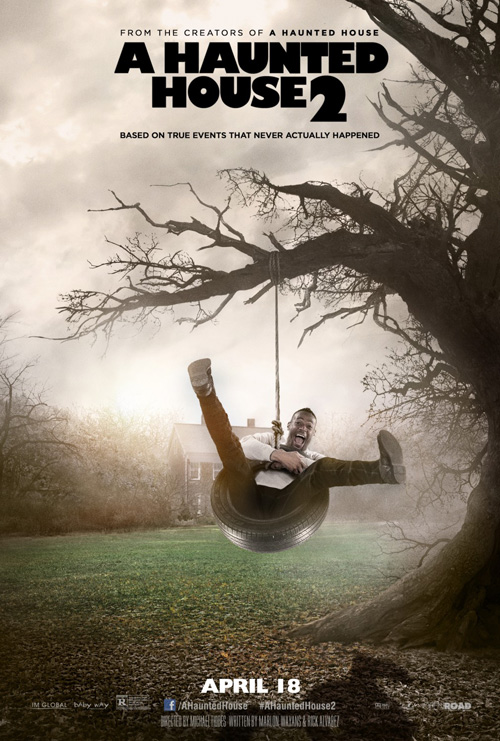
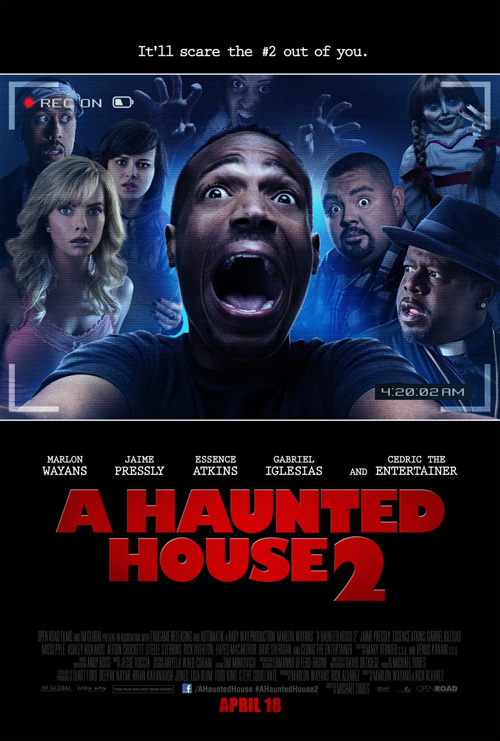
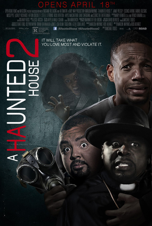
Yes, I know Marlon Wayans is doing just that with his posters series for A Haunted House 2 (April 18), but he has fun with it. Not the kind of fun I necessarily enjoy having, but that Scary Movie kind where a big grin goes a long way with the masses. A spoof film marketed with spoof posters? You can’t go wrong.
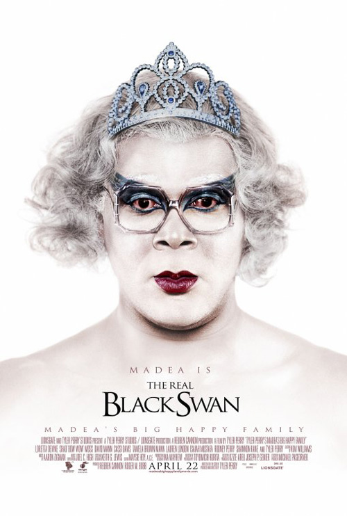
Ignition Print did it with Madea’s Big Happy Family for whatever reason popped in their head to think parodying Oscar contenders would be a viable way to promote a cross-dressing comedy, and here we are. The idea actually makes sense with Wayans’ newest enterprise and kudos to Concept Arts for taking a couple popular horror flicks and paying homage. The tagline catchphrases are crude and stupid for the most part, but I do enjoy “Based on true events that never actually happened”. For some reason that tickles my fancy.
 |
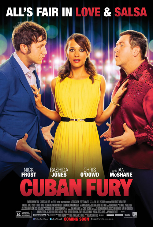 |
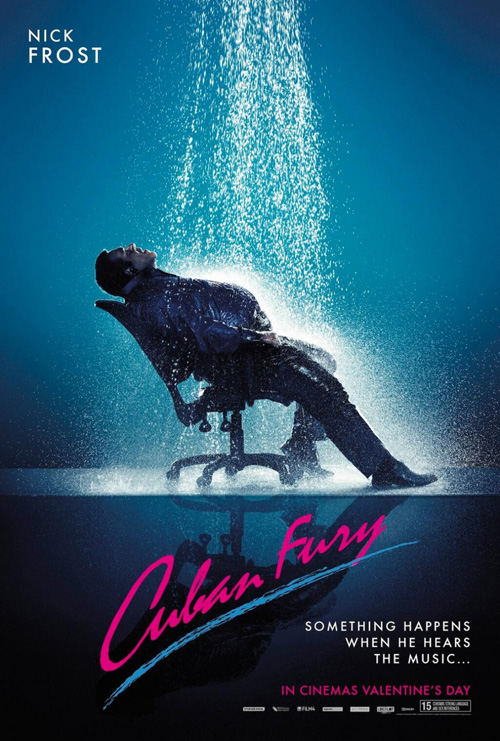
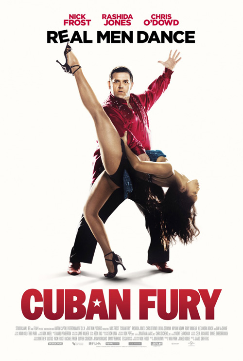
I’m not sure if Cuban Fury (limited April 11) has more than this Flashdance joke (I haven’t found any), but I hope they did. When you have a guy like Nick Frost willing to put himself in these comedic situations without shame, you should go big. Because honestly, the poster with Rashida Jones separating him and Chris O’Dowd is as lame as the ones I mentioned in my opening paragraph. We know those three are in the movie, thanks for the obvious.
At least the main sheet with Frost and his dancing partner posing against a white background has his goofy idea of “determined” forcing us to stare into his crazy eyes. But I guess that has more to do with his ability to earn a laugh than the designer’s work. I know nothing about the film, am clueless to the Cuban connection considering the Brits at the lead are far from that nationality, but you know it will probably be at the very least a good time after checking out the artwork. And that’s a success.
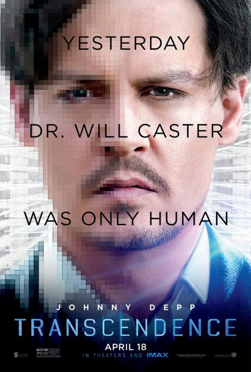 |
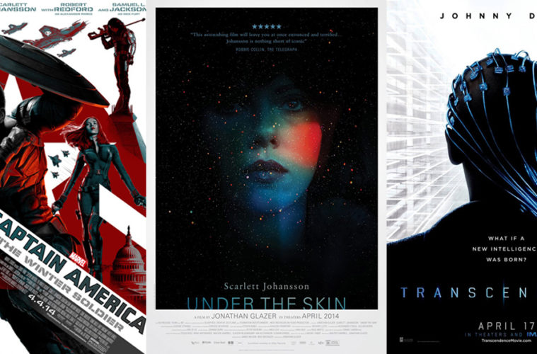
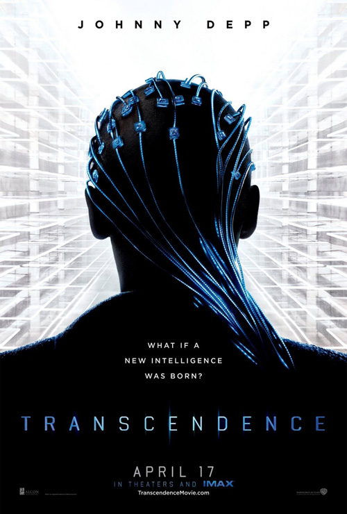
I’d like to say the same about Concept Art’s Transcendence (April 17) advert, but there is something about this film that irks me. The trailer is convoluted at best with a ton of star power and a sprawling plot of futuristic computer tech and this teaser does little to pique interest either. I appreciate the fact they didn’t put Johnny Depp‘s mug front and center (although you can see they did with the next one), but it’s almost too abstract and mysterious to care.
Yes, it seems to concern a hybridization of organic tissue and silicon (but not in the Baywatch definition of the pairing) and we get that with the nicely glowing blue microchips against black silhouette. All those empty panels/floors/balconies/glass panes/ what? unfortunately only make me think of some sort of warp speed motion to the center thanks to its perspective. As a result I conjure memories of The Matrix, place pods of sleeping people on each, and imagine Depp’s Neo 2.0 is waking up to the injustice. I hate to say it but I need more.
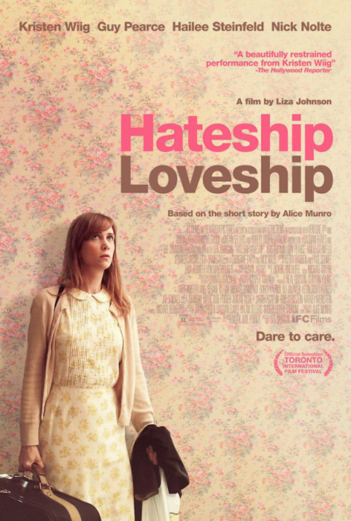
So, the classic example of minimalism for this section lies with Hateship Loveship (limited April 11). Not only does the floral wallpaper fit perfectly with Kristen Wiig‘s dress (just a hair of difference in hue and pattern to not be Zach Braff in Garden State), but the color palette of the text also matches to keep everything homogenized. Some of the words really make you look close to catch them while others use the same color in a heavier saturation to grab attention. Just like the quote from The Hollywood Reporter heaping praise on Wiig says: it’s a beautifully restrained design.
America likes its Captains in masks
 |
 |
 |
 |
 |
 |
 |
 |
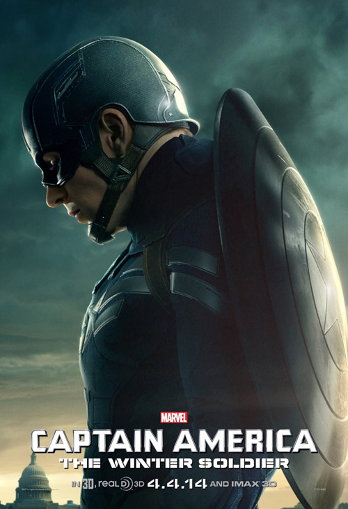
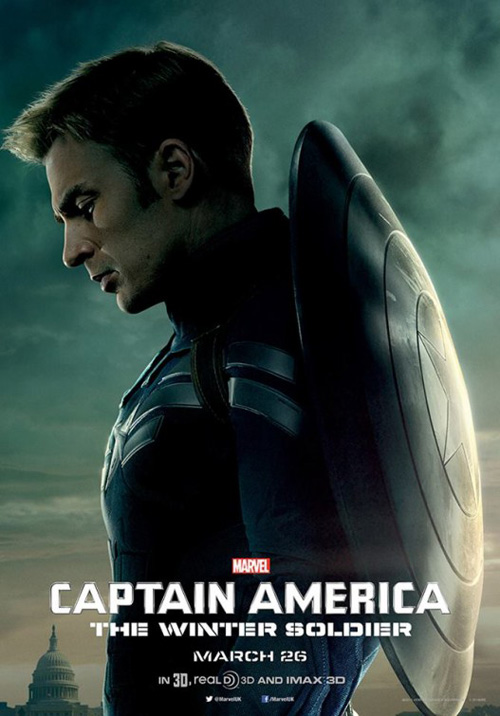
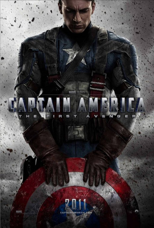
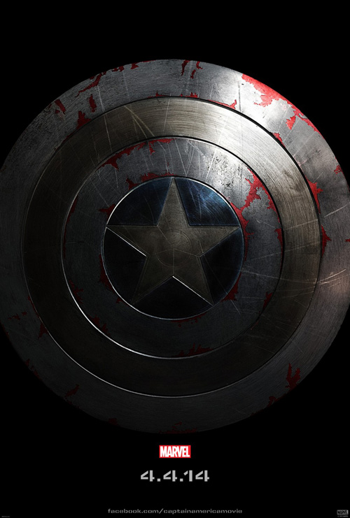
When you look at what BLT Communications, LLC did for Captain America: The First Avenger, I’m not really certain what was behind their decision to cover star Chris Evans’ face for The Winter Soldier (April 4). Yeah they cropped his head a bit and focused more on the old school uniform and scuffed up metal shield, but it’s still Evans giving us his best look of severity.
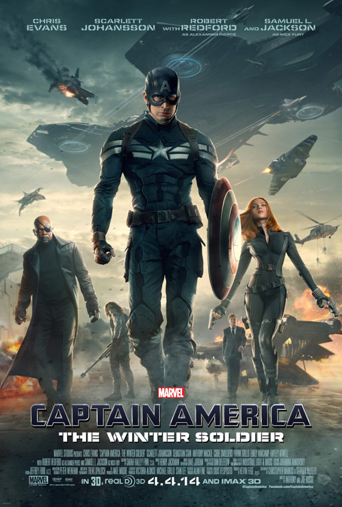
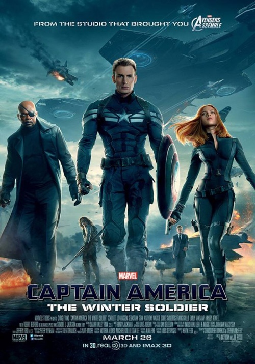
Maybe it’s because I don’t know the comic—maybe BLT thinks Britain doesn’t either—but do fans really get excited by that helmet/mask with an “A”? They obviously had some kind of thought process to make them give UK audiences Evans while Americans settle with a wannabe Batman scowl, I’m simply in the dark. They also allow Samuel L. Jackson and Scarlett Johansson to be bigger across the pond too, but that’s probably some stipulation in Chris’ stateside contract.
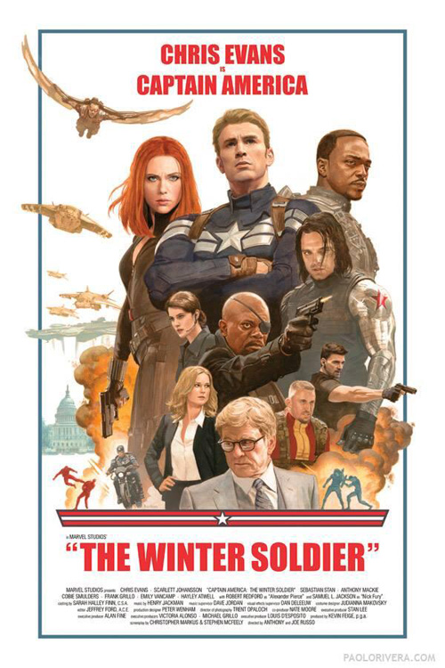
Either way, neither version is that great. BLT loses the interesting, dramatic crop from the first film and settles with a profile of sadness. And then you have the main sheet with every character in it proving to be as drab as you’d expect. Thankfully we at least get the teaser shield in glorious shadow with authentic wear and tear to show that this isn’t your grandfather’s superhero who saves the day with little trouble. Captain America isn’t invincible and he is going to get beat up.
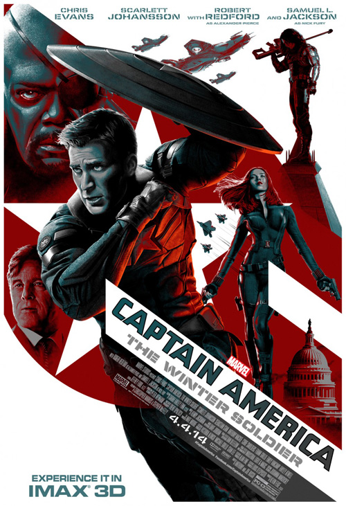
My favorite, though, (no, not Paolo Rivera‘s version that tries to be retro and G.I. Joe-esque but only ends up being a contemporized variation on the theme that’s off-centered placement distracts the heck out of me) is the IMAX sheet. I love the blacks and reds, the abstract placement of objects/actors cropped and segmented as the shapes they cut through see fit, and the comic book shading that’s more painterly than photo-realistic. This thing could be a special edition cover for one of the books and it proves to be a nice collectible for those heading out at Midnight the day before release.
A tale of four firms
 |
 |
 |
 |
There is something about competition and seeing the myriad results of each firm campaigning to win the account that fascinates me. I get that agencies bid on jobs, do a ton of mock-ups, and eventually end up alternating with opponents as the movie picks and chooses what they like, but I still find it weird. To me the winner should stand alone, but I guess if you’re paid no one probably cares.
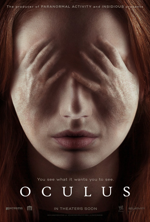
This month’s example comes from Oculus (April 11). Our first iteration comes courtesy of ARSONAL and in my mind is by far the worst of the quartet. Karen Gillan‘s face looks like plastic, the hands covering her eyes are man hands the size of a baby’s to fit and ultimately look beyond fake. It’s less creepy than laughable and I’d be more likely to avoid the film completely than buy a ticket sight unseen solely because of it.
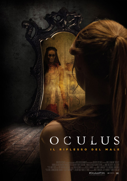
Number two is by Federico Mazza and I believe Italian. The Photoshopping isn’t the best with Gillan’s edgework being way too crisp for the soft focus of the foreground (especially with her strand of hair that looks hand drawn and cartoony) and the content shows a bit more than I’d like as far as less is more scare tactics. It’s obviously not a natural scene, but it at least makes sense.
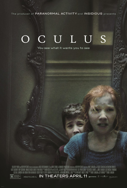
Things start getting good with eclipse, though. By this time we have a release date and lo and behold another actor. Or is that two new actors? Yes, I like this a lot because I know Gillan is in the film, know that this girl is her character, and yet also know this isn’t her (it’s actually Annalise Basso who plays the same role only younger). So, we being told it’s horror conceit spans decades, finally get a good and realistic view of the mirror that obviously plays a major part in the film, and witness some nice framing of the scene to keep us off-kilter. I literally want to turn my head and catch whatever it is they’re frightened of in the glass behind them.
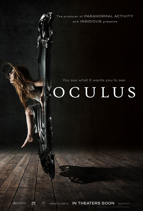
But the best of the bunch comes from Iconisus L&Y – Visual Communication Systems. Boy I love this poster. Not only is the actress stepping out of the mirror frame a nice flourish with so much of the page filled with black at right to show she wasn’t in the room, but the motion of her hair and facial expression of tense fear also draw our view. It’s a gorgeous use of space and imagery that sets up the film without just lamely using a still.
Intrigue over coherence
 |
 |
 |
 |
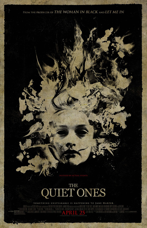
Ignition goes above and beyond for their work on The Quiet Ones (April 25). They don’t bog it down in celebrity, don’t mind being illustrative, and make it so you can’t help but peer close to see if you can see something in the blotches besides the face of a girl. The monotone black on textured earth tone keeps it simple to stand apart from the regular posters you’ll see at your local multiplex and the title font’s refusal to be flashy only helps the imagery set the mood.
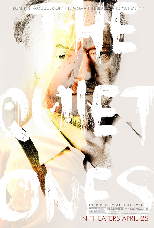
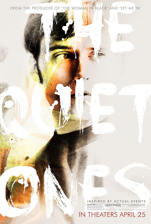
It’s BOND, though, who takes this fearlessness to another level by using the film’s actors and drawing all over them. There is a yellowish filter discoloring the black and white chiaroscuro photos like they’ve been stained and the title is laid atop it all in huge, distressed, paint strokes of white barely discernable above the off-white background. One may argue you cannot tell what the name is, but I feel that fact only forces you to find it. And if we’re being truthful, you’ll probably make it out much easier when walking into the theater from the parking lot. Once the name draws you in to be face-to-face, that’s when you see the actors beneath and wonder at what this movie could be.
Heavy ink
 |
 |
 |
 |
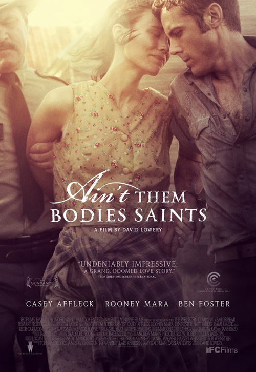 |
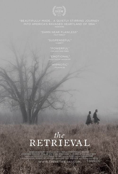
Okay, so Kajsa Björs and Dylan Marchetti’s poster for The Retrieval (NYC April 2, expanding April 18) isn’t using a ton of ink—it’s a murky gray after all. But I like it, wanted to include it in this post, and felt it at least used a lot of color rather than white to fit in the category in a technical way. I’m still not sure whether my enjoyment is due to the font and fuzzy sheen resembling P+A’s Ain’t Them Bodies Saints from last year, but even if that’s the only reason it doesn’t discount the allure.
I haven’t seen the film so I can’t say two people under a barren tree in the fog is going to explain anything of importance, but boy does it create a mood. There’s a dramatic sense of foreboding that goes hand-in-hand with the one word reviews posted on top: “Suspenseful”, “Powerful”, “Emotional”, “Hypnotic”. I can believe each one in context with the imagery as my imagination wanders to guess at what these two souls are walking from. Because they are walking away from something rather than towards, the distance behind them as compared to in front explains this perfectly. Wherever it was, you have to believe the fog mean they won’t get away for very long.
 |
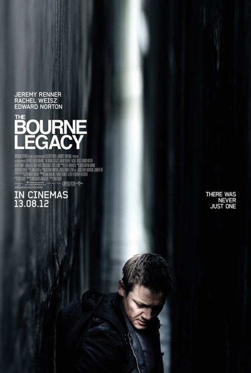 |
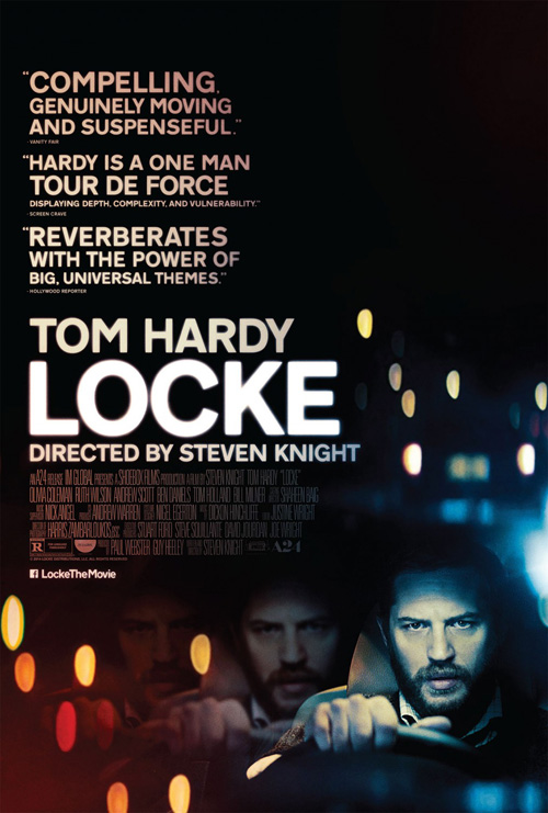
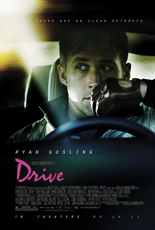
Speaking of P+A, they’ve gone deep into the black ink stock with their sheet for Locke (limited April 25). Yes it’s pretty much a hybridization of The Refinery’s Drive and Empire Design’s Bourne Legacy, but dare I say it’s better than both? It’s a hard sentiment to back up when half the page is covered in large, wordy quotes that actually dwarf star Tom Hardy, yet there is some nice stuff going on.
I like the fuzzy, too-bright edges of the words as though they are lights about to explode. Everything kind of fades into the black of the background when you go left to right and the blurry orbs glowing in the distance give you a sense of late night insomnia where you could have driven a mile without any recollection of what you’ve passed. The tripling of Hardy’s image intrigues as far as where such a motif might play into the story (or maybe it’s just an additional reference to the stupor of impaired focus) and despite everything the title still somehow pops out most thanks to being the only true white against slight tinges of yellow.
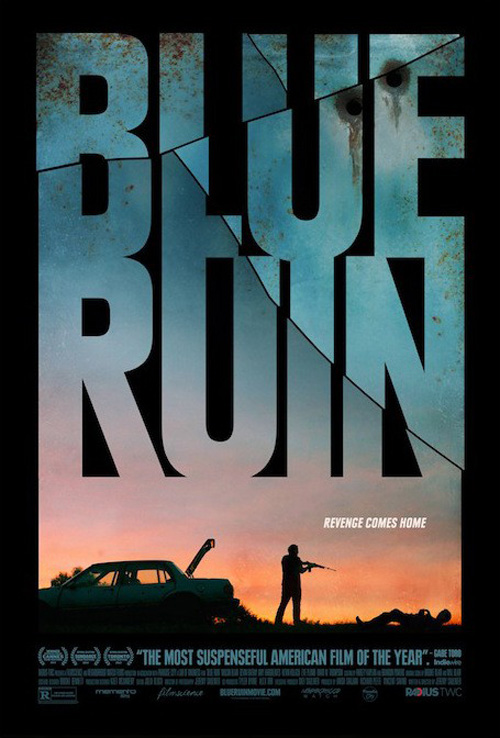
These next two are my favorites of the month, though. First comes Palaceworks’ Blue Ruin (limited April 25). I love when designers find an appealing way to transform the text into the window with which we see the action. By placing the scene small at the bottom they are able to fill the positive space of the letters with a colorful sky at sunset that only adds to the tension created by showing a silhouetted character caught helpless at the end of another’s gun barrel.
Add cracks that make the title into a pane of glass and rusty bullet holes making it into the metal door of the car as well and you find yourself looking at layers upon layers of aesthetic motifs and story points in one carefully formed composition. It screams revenge with obvious intent and creates as much suspense as I’ve heard the film packs on its own.
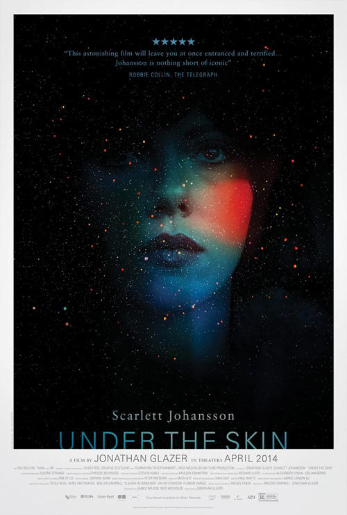
While memorable and effective, I still can’t help but think Kellerhouse, Inc.’s poster for Under the Skin (limited April 4) blows it out of the water. Neil created a bunch more teaser sheets with Twitter-ready hashtags that have been making the rounds, but they are simply part of the campaign that revolves around this mesmerizing final key art.
The colors of ScarJo’s face are ethereal, the stars Jackson Pollack-esque paint blots my eyes can’t stop trying to lump together in a connect-the-dots of constellations. The title is cropped at the bottom as though it’s sinking or rising from the white border and the five star critical acclaim at top is subtle and easily gets lost from our sightline when checking out the image at center. A seductive design for an alien seductress—she’s who we desire when dreaming our fantasies into the darkness of space and it appears she’s coming to Earth.
What is your favorite April release poster? What could have used a rework?

