
“Don’t Judge a Book by Its Cover” is a proverb whose simple existence proves the fact impressionable souls will do so without fail. This monthly column focuses on the film industry’s willingness to capitalize on this truth, releasing one-sheets to serve as not representations of what audiences are to expect, but as propaganda to fill seats. Oftentimes they fail miserably.
Because December’s posters unfortunately leave a bit to be desired, this month’s roundup will be somewhat brief. I tried to cull together three more to join with the very spare Uncut Gems (December 13), but finally decided there wasn’t much to say about that one either. It’s tough when two of the most recognizable titles are Cats (December 20) and its cheaply shadowed logo alongside Just Mercy (limited December 25; wide January 10) and its … text.
There are still a few gems to look out for, though. Not every Oscar-hopeful’s budget is completely wasted. A few of them are down below.
All lined up


Before we get to those ones, however, here’s a quartet that unabashedly leans upon its casts to conjure excitement. Some firms find an interesting way to deliver the likenesses and others let the actors do the talking themselves.
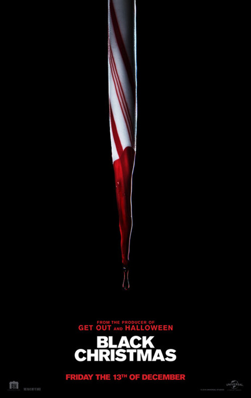
Black Christmas (December 13) is of the latter half with its line-up of bruised and determined heroines. While I’m surprised the film didn’t just stick to its effective tease (LA’s peppermint stake) considering Imogen Poots is the only household name featured, I do applaud the decision. Whether or not the other three women might are recognizable today doesn’t mean they won’t be tomorrow. You cast them to be the face of the film, so let them do their job.
The property already has a stigma associated with it anyway considering we received a remake of the 1974 slasher in 2006. This one is different, though, as fans of the genre will be able to tell via Sophia Takal and April Wolfe’s names at the bottom. That creative team is the real draw here with a gritty pack of empowered co-eds to slay their patriarchal demons. It doesn’t hurt either that December has a Friday the 13th this year—the holiday twofer sells itself.
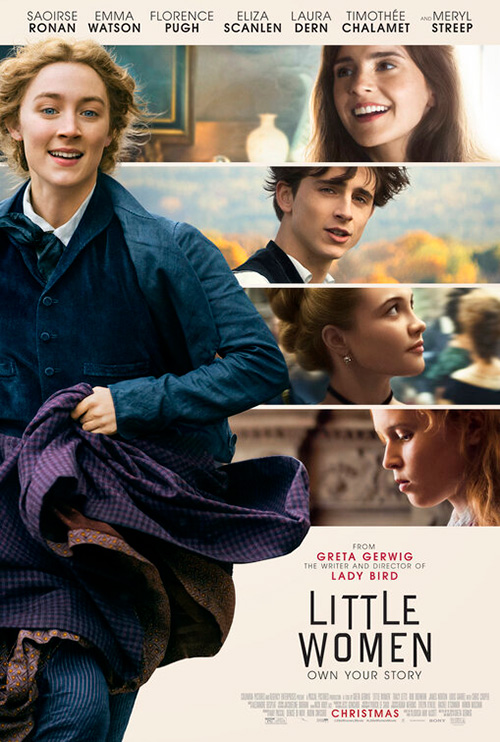
WORKS ADV might not do much more with their poster for Little Women (December 25), but they did at least pick a more dynamic image to wield. It’s still a main cast of four women, but they’re gazing out the window at something we cannot see rather than engaging directly with the viewer as though issuing a challenge. The positioning therefore piques our interest because our eyes follow theirs to nothing. They’re dangling a ticket in our sightline for us to discover what has them so enamored ourselves.
That’s good too because there are simply way too many names to read through at the bottom. Writer/director Greta Gerwig is highlighted in red for good reason while the others have their surnames bolded so we can ignore the rest. Those artistic embellishments can’t prevent it all from becoming white noise anyway, though. The title pops, the faces glow against their shadowy backs, and we wait for more.
It’s much better than the firm’s other entry with segmented portraits competing against one another as Saoirse Ronan runs happily towards us. Where the previous sheet had mystery, this exudes made-for-TV frivolity. Where the sharp edges of the title’s odd typography looked formidable, the letters now seem like they’re caught in a jaunty bounce. I haven’t seen the film yet, but I’m going to guess its tones lies somewhere in-between.
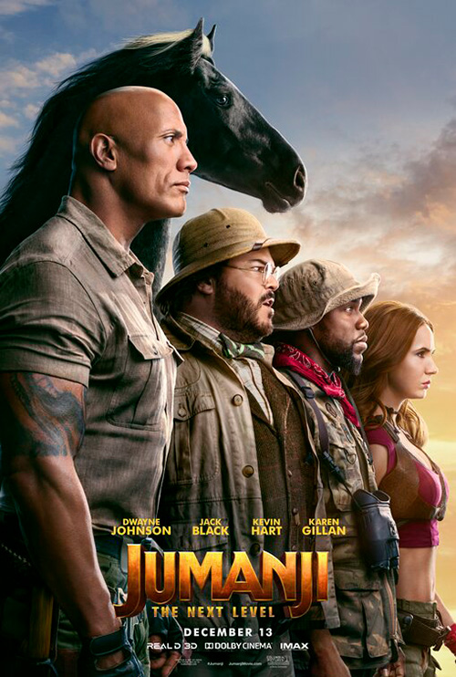
If you want straight ahead playful, however, look no further than B O N D’s Jumanji: The Next Level (December 13). Not only do they put the four lead actors on the page in a more captivating way than straight across, they mix them in with a bunch of mandrills for added jungle effect. What’s greater yet is an added flourish of having one of those primates turn its head to stare daggers at Dwayne Johnson. I’m hoping we discover one of the “players” accidentally got this animal as his/her avatar and they are none too happy about it.
Rather than infer something of that sort, The Refinery unabashedly places “Bethany” (the horse) in frame as a member of the core group. I like the motion created by having the actors shrink in height as our eyes move left to right, but Karen Gillan is half a foot taller than Jack Black (let alone tiny Kevin Hart). And since their heads all look the same size, I don’t think it’s an optical illusion of vantage. I guess that’s the peril of actually putting the correct names under their corresponding bodies for once.
B O N D is also responsible for the Bombshell (December 13) teaser—one that I think does this whole line-up trope best. The poster isn’t relying on creating a scene or even showing the trio’s full faces because that’s all unnecessary. Their names are enough to know who they are and the grainy, burned color aesthetic works as a flashy news channel graphic by way of tabloid cover photo.
Cutting the triptych as they have also allows the characters’ obvious similarities take center stage—something that makes sense since we’re talking about sexual harassment and Roger Ailes’ most certainly having a “type.” And while Margot Robbie is playing a fictitious amalgam, halving the other two helps force us into a double take on whether we’re looking at Charlize Theron and Nicole Kidman or Megyn Kelly and (to a lesser extent) Gretchen Carlson.
What a tease


Does Art Machine’s teaser for Star Wars: The Rise of Skywalker (December 20) look like a cartoon? Yes. But it works just the same. There’s drama to the scene of Rey v Kylo. The blue and red force light confirms their adversarial positions. And the translucent face of The Emperor brings the franchise full circle. A major battle between good and evil is present through these three characters and it’s an exciting thing to behold.


Compare it to Art Machine and LA’s full sheet of character collage. There’s simply too much happening to provide fan service to audiences wanting a look at Poe, Finn, Chewie, Billy Dee, and the rest. I do like the lightsaber effect though. Rey and Kylo are on totally different visual levels, but their weapons connect nonetheless. And letting her face rise above his red ensures our hero is the major focal point of the whole.
If I’m truly picking the best of this campaign, however, the prize goes to LA’s IMAX sheet. I love the watercolor texture, the fearless use of profiles as positive and negative space, and the muddying of good and evil by pairing off Luke with his nephew. There’s an old school vibe here that really works. No one needs Star Wars posters to remember a new one is coming out, so why not use the marketing budget to create art?
Sometimes you can do exactly that with a single photo too if you know how to manipulate it to its full emotional and aesthetic potential. That’s exactly what Concept Arts does with 1917 (limited December 25; wide January 10). They take the title’s visual pattern (“1” with “1” and the similar angle of “9” with “7”) to form windows onto a magic hour of sunset colors as two heroes run towards presumed death through enemy territory.
Font choice is key here because you need legibility at that size as well as a boldness that delivers extra area to see beneath its stenciled matte. Centering one man in the bottom “1” and another in the “7” so that his head nicely continues in the “9” is perfectly orchestrated. The smaller figure is looking towards the tagline and the bigger one supports the line of text that says Sam Mendes without daring to assume audiences know his name.
Where that one keeps its title huge, Le Cercle Noir banks on Kit Harington to sell The Death and Life of John F. Donovan (limited December 6) for director Xavier Dolan. I’m not quite certain what we’re looking at, but it’s hard to look away in search of an answer. Is the actor peering into a mirror that had been pasted over with layers of paper? Or is he printed on one such page with the new ones that had covered him finally removed? Either way the layering of torn remnants lends a distressed and anxious feeling to the whole. It speaks to Harington’s expression as though he’s haunted by demons too. The title is practically an afterthought.
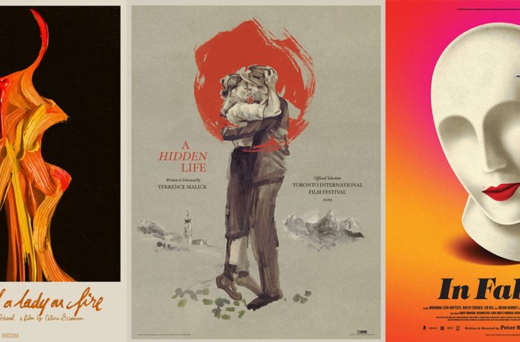
It’s that emotion that leads us to A Hidden Life (limited December 13). A cross between the composition of Dheepan and the weathered beauty of Ain’t Them Bodies Saints, the designer went all in on the power of an embrace. That clenched fist atop crumpled clothing says everything we need without the use of words—whether it’s a hug of sorrowful goodbye or relieved reunion.


The toughest part of successfully executing a poster like this is finding the places to sprinkle in text. You have a crop that does everything you need it to do, so the last thing you want is to ruin its effectiveness with garish type. That’s what’s so great about Terrence Malick’s use of a common serif for his titlecards the last few years—the font becomes a calling card for the auteur and ensures the delicacy necessary to complement rather than usurp.
It’s something Alphaville won’t even mess with for their gorgeously hand-illustrated sheet in thick and messy brushstrokes. A wonderful alternative to the former’s photography, it too highlights the strength of humanity amidst the brutality of the film’s World War II setting.
Double trouble


Legion Creative Group’s poster for Clemency (limited December 27) is simple yet profound. Here’s a death row warden looking inside herself to reconcile the ramifications of her position only to dissolve into doves flying free. Tumult is turned into peace, duty into morality.
What more do you need? No matter what people are saying about the film itself, I haven’t heard anything but praise for Alfre Woodard’s performance. The studio is driving interest through her and the design firm found an attractive, metaphorical way in which to accomplish that goal.
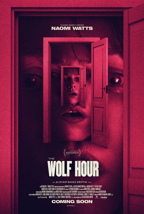
The Wolf Hour (limited December 6) goes the minimalist route too as its square in square design beckons our eyes to travel its counter-clockwise swoop from Naomi Watts at bottom to the title and beyond. It’s almost impossible not to find your head tilting the longer you stare because your brain wants you to read everything on a horizontal. Look too long and you might lose your balance as you draw nearer towards its black abyss.
It’s an improvement over the original design that’s frankly doing way too much. Rather than repeat a motif around Watts, this one makes her into the motif by sending us down a rabbit hole to Wonderland. On paper the concept is intriguing and nightmarish—worlds falling in on themselves a la the effects in Doctor Strange—but such an idea works better in motion. Because this is static, the doors feel pasted on top of each other instead of existing in tandem for us to enter. It’s unsettling, but nowhere near as engrossing.
La Boca looks to balance unsettling and engrossing with their singular advertisement for In Fabric (limited December 6). The firm goes vintage chic for this ghost story involving a cursed dress during a department store’s winter sale by utilizing a broken mannequin’s head about to let the clothing’s power escape.
The cracked skull alludes to insanity, the red lipstick and beauty mark complement the reds and blacks of the dress folds, and the font is perfectly selected to enhance the whole’s old timey store sales flier aesthetic. With a mix of foreboding horror masked by colorful fun, it no surprise this has been a hotly anticipated title for me since bowing at TIFF in 2018.


Not to be outdone, a second poster leans more heavily on the horror aspect for a darkly shadowed portrait of the dress itself—billowing and beckoning for its next victim. It won’t standout on the wall as easily as the mannequin, but it’s still quite effective. As is Curzon’s beautifully constructed quad for a UK Q&A tour. The soft colors and catalog look hew closer to La Boca’s design, but with a more lived-in authenticity. And the glimpse at this woman’s muscular system beneath its torn edges takes that cracked plaster interior to a nightmarish level.
Even so, however, nothing else above can approach the sheer audacity of Akiko Stehrenberger’s latest marvel for Portrait of a Lady on Fire (NY/LA December 6). I could have easily left this one off the list considering it’s only getting a week-long Oscar-qualifying run before going wider in February 2020, but a release is a release and that engagement renders the film a 2019 title. So you can bet it will also be included in my roundup of this year’s best a few weeks from now.
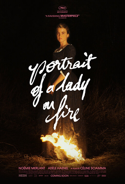
This optical illusion of two women kissing opposite the flames of their passion (and the title) between is brilliantly conceived with expert execution. The texture of the paint adds to the fire’s aggression by creating a sort of static animation to make it flicker in our minds while the lips seemingly grow closer together. It’s provocative, sensual, and menacing all at once with the handwritten words below adopting that drama as their own. Nothing about this sheet feels born from the usual Hollywood machine.
The wildest thing is that its predecessor was really good too. Little more than an image of the lead actor with a superimposed title describing the scene, it somehow possesses immense character and strength by confronting us as we confront it. There’s elegance to its challenge and simplicity to its literal depiction of metaphor. Neon could have stuck with this one throughout their campaign and achieved success, so asking Stehrenberger to go further and improve upon an already memorable graphic only confirms their understanding of posters as a worthy art form unto themselves.
What is your favorite December release poster? What could have used a rework?