
“Don’t Judge a Book by Its Cover” is a proverb whose simple existence proves the fact impressionable souls will do so without fail. This monthly column focuses on the film industry’s willingness to capitalize on this truth, releasing one-sheets to serve as not representations of what audiences are to expect, but as propaganda to fill seats. Oftentimes they fail miserably.
We’ve entered awards season territory as November sees a bunch of critical darlings making their way across the country fresh off festival circuit bows. I’m talking the likes of Brooklyn (limited November 4) and Trumbo (limited November 6), whose posters I couldn’t fit in here. But don’t think you can’t also catch some counter-programming like Heist (limited November 13) (poster) and Love the Coopers (November 13) (poster), two films whose posters make them look like direct-to-DVD fare and lame holiday rehash respectively.
The first grouping comes with pedigrees from reviewers and audiences alike so it’s nice to see studios allowing their design firms to deliver a visual aesthetic equal to the task. It doesn’t happen often, but I actually really like all the section headline one-sheets compiled below.
Child’s play
 |
 |
 |
 |
 |
 |
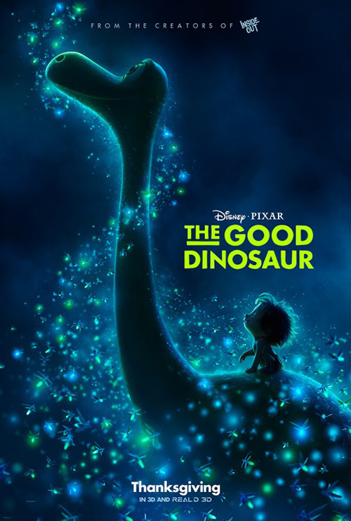
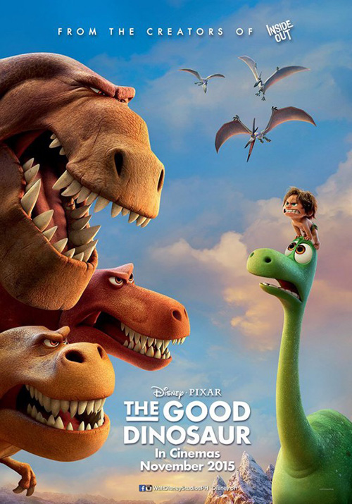
I guess wading through Monsters University and a year with no Pixar film comes with its benefits as 2015 carries not one but two installments. Inside Out didn’t have the greatest poster campaign of the studio’s history but it was their best film since Up. Does that mean The Good Dinosaur (November 25) having memorable posters will cause the finished product to not be as good? Maybe. But if this is what ends up happening, I think it will have more to do with Inside Out being so good than its own demise.
That said: I really enjoy what Proof has done on the teaser. Dealing with dinos and cavemen, it’s a no-brainer to go cave wall painting and yet it seems to be the only way to have gone. This thing is so simple—giving us both species in pictographic form while also showing the expected comradery formed by the characters. Pixar and Thanksgiving are the only other information tidbits we need.
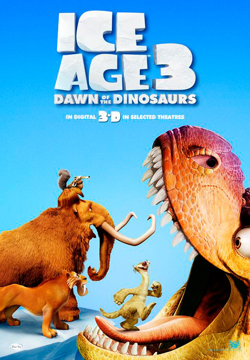
It may not be as great, but the firm’s final sheet with sparkling bugs flowing against the fully rendered dino and cave-boy is as memorable on theater walls. The layout gives us a glimpse at the artistic design while also setting a mood that moves it past comparisons to that other prehistoric animated series Ice Age. Unfortunately Proof cannot keep it up with the next advert looking practically like an Ice Age: Dawn of the Dinosaurs cast-off.
 |
 |
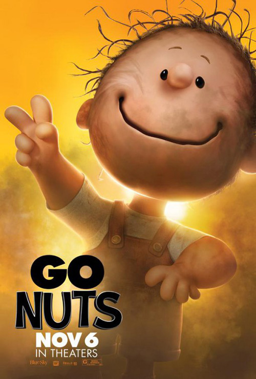 |
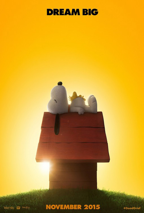
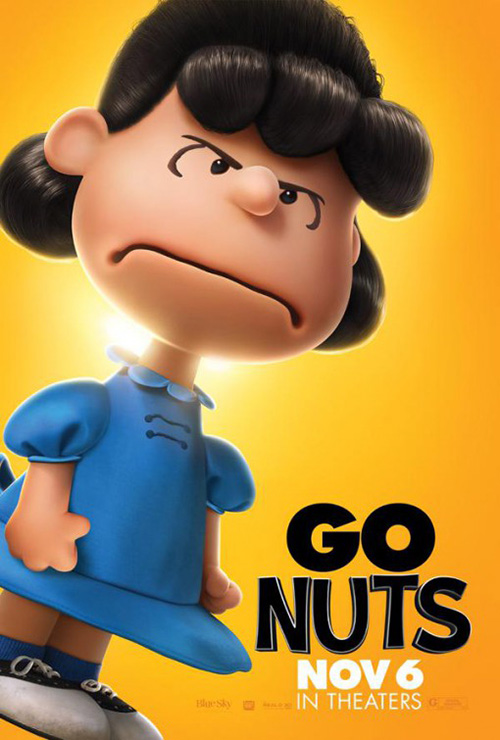
Proof was also in charge of Blue Sky Studios’ family-friendly entry The Peanuts Movie (November 6). It too is self-explanatory with Snoopy and Woodstock atop the former’s doghouse—fitting into each other similarly to the handprint into dinosaur painting. November and a tagline are also all anyone needs otherwise for a property such as Chuck Schultz‘s icon pooch. The simple fact he has a poster and therefore a feature film is enough to get many excited.
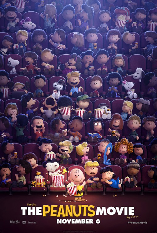
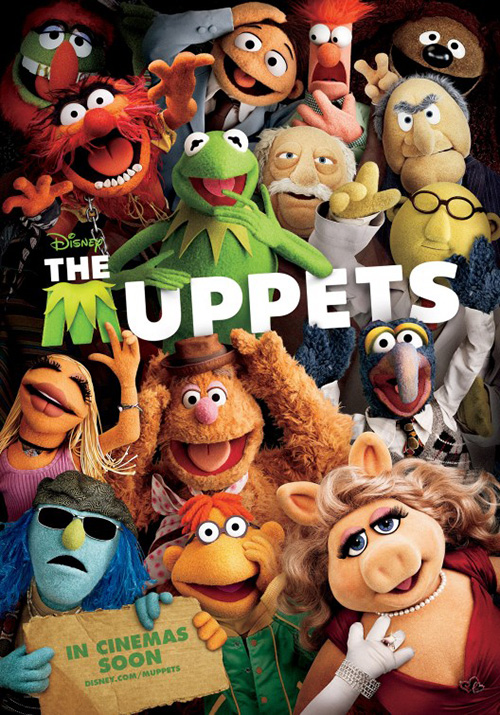
I’m not sure who did the next one, but it may be safe to say Proof as well considering the firm did a similar design for The Muppets. I liked it then and I like it now—just throw everyone in at once and give us calculated chaos. It forces us to find our favorite characters and iconic expressions, the spotlight making sure we see Charlie Brown front and center. Everyone together just gets the tone right. I’m not saying that because Ten30 Studios‘ character sheets don’t—that’s definitely Lucy and Pig-Pen—just that these kids all deserve an equal share of the glory.
Indie faces
 |
 |
 |
 |
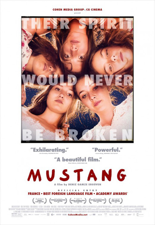 |
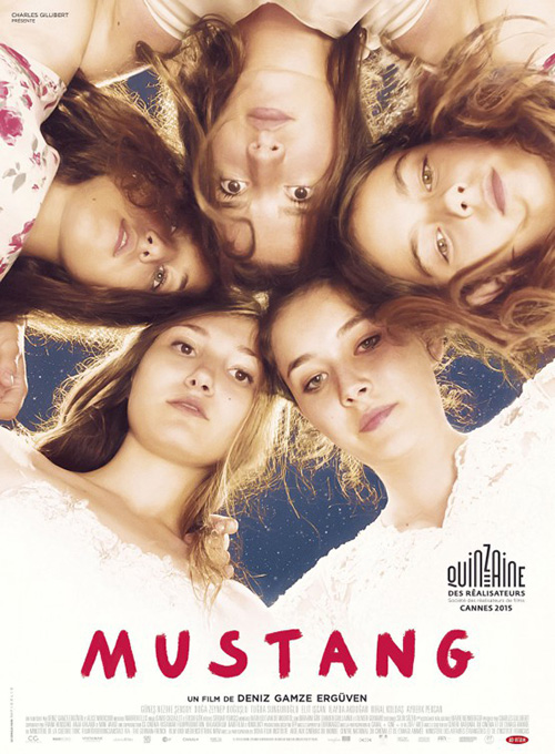
There are so many faces this month. But while most are very familiar, the quintet in France’s Foreign Language Oscar hopeful Mustang (limited November 20) is not. That doesn’t mean these five actresses are any less interesting than their Hollywood counterparts, though. And the from-below pose with heads together by Le Cercle Noir is enough for audiences to want to meet them.
It’s a really nice composition, almost forming a heart with the sky seen behind them. I also like its simplicity. The lace dresses of the two at bottom fade into white so the title can pop while the rest is unencumbered are ready to be focused on.
Blood & Chocolate‘s English-language version loses this clean aesthetic by putting text everywhere. The idea that the poster is about the girls is thrown out the window so that the image can be just another framed photo meaning less than what is around it. The firm thinks we’re so uninterested in the girls that they even superimpose text on top of them to basically say, “Ignore these faces and read the tag instead. That’s what’s going to hook you. Yeah!”
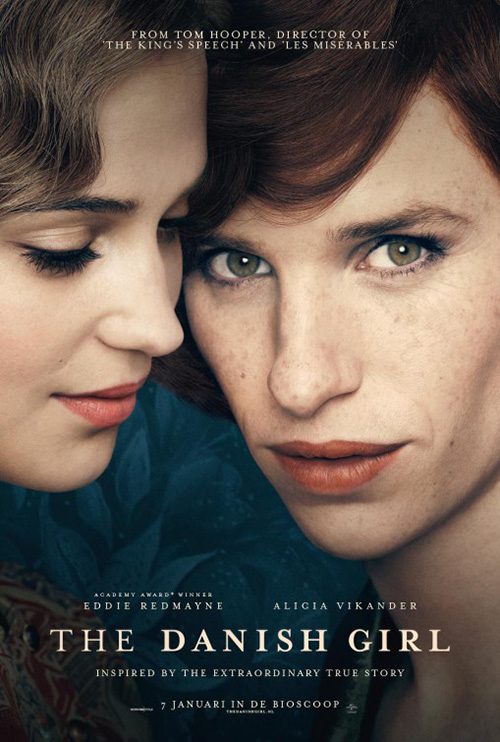 |
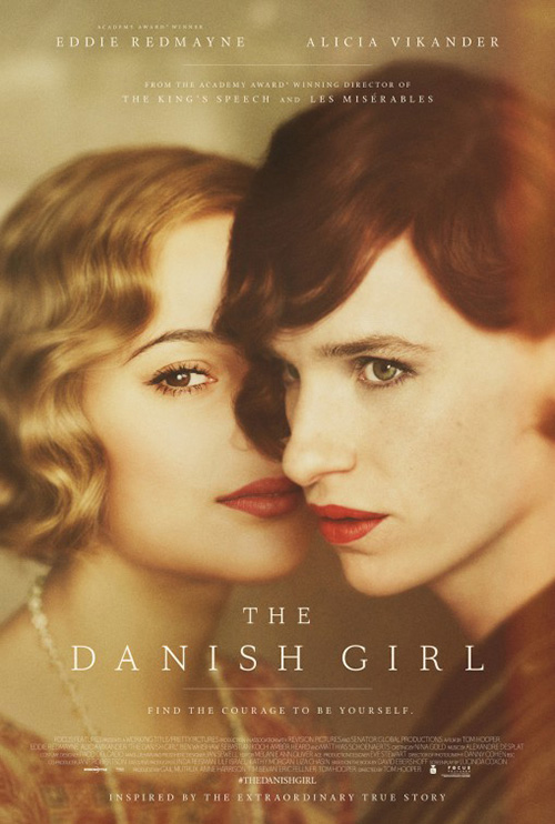
P+A isn’t going to cover the faces of bona fide stars like Eddie Redmayne and Alicia Vikander. Nope, they’re going to ride their celebrity to the bank on The Danish Girl (NY/LA November 27). That doesn’t mean they’re only worth a meaningless still, however. Celebrity can be augmented by artistic flourish: the stripping down of color for a monochromatic tone definitely working towards this goal here to stand apart from any bright counterparts on the wall.
I also like the font choice of thin serifs that almost get lost against the image. Because of this our eyes go straight to the actors, intrigued by Alicia’s right eye and Eddie’s left forming a sort of hybrid face together. There’s a merging of sorts happening that piques interest before lowering our view to find the title.
The foreign example loses this by delivering a still and nothing more. They thicken the font so it grabs our attention and replace a cool pose with Eddie simply staring at us while Alicia stares at him—how romantic comedy. The color is dulled nicely, but not enough to make it anything but a photo like everything else.
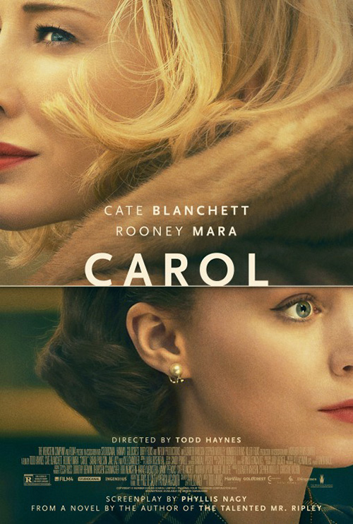 |
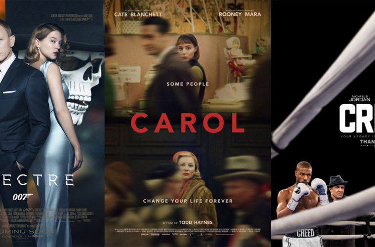
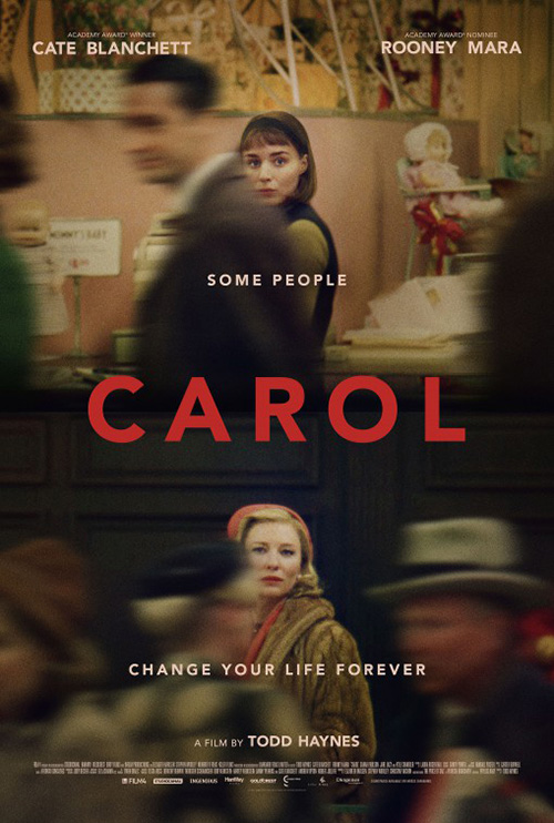
For this first Carol (limited November 20) poster, the designers have done something different in showing us two characters’ vantage points in lieu of the audience’s. Rooney Mara at top and Cate Blanchett at bottom aren’t looking at us from their frame, they’re spying upon each other. It’s an effectively static split-screen that creates its own motion via periphery players blurring in between. No matter what’s going on, these two women have laser focus on each other.
I enjoy P+A’s alternate sheet with close-ups of the two—this time with Blanchett at top to coincide with her higher box office status in comparison with Mara—but it’s completely formal. The first design puts us into an action as though it’s unfolding before us. This one merely gives interesting crops of photos that say little other than who’s in the film. By making them look in opposite directions you could almost assume their relationship is adversarial. That fantastic longing of attraction able to capture attention from across the room in but a second’s time is gone.
 |
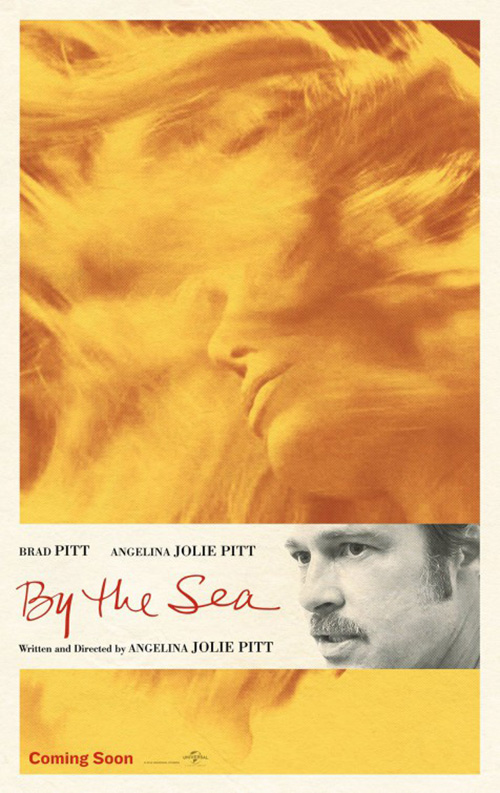
If there’s one depiction of a face that trumps them all, it’s by far Angelina Jolie‘s on Iconisus L&Y – Visual Communication Systems‘ advert for her By the Sea (limited November 13). Oh, how I wish this thing were that golden wash of hair and nothing else—what an amazingly beautiful image. All Brad Pitt‘s scowl adds is distraction. Artistic wonder ruined by celebrity appeal.
And you can’t tell me that Pitt’s contract stated he had to be visible on the ad for it to be approved. A. Neither he not Jolie are on the teaser (a poster with equal beauty if more conservative). B. His wife wrote and directed this thing. Vanity shouldn’t be a factor above captivating viewers with something uniquely special.
The saddest part, though, is that Pitt’s inclusion probably will get more people to buy a ticket.
Stripped of color
 |
 |
 |
 |
I would generally call going black and white a plus to single a poster out from the pack. In an apparent fluke, however, it seems a handful of firms decided to do just that this November. It doesn’t all of a sudden make the choice mainstream by any stretch of the imagination, but putting them together does make it somewhat hard to discern one from the next. Thankfully the odds of doing so are slim.
 |
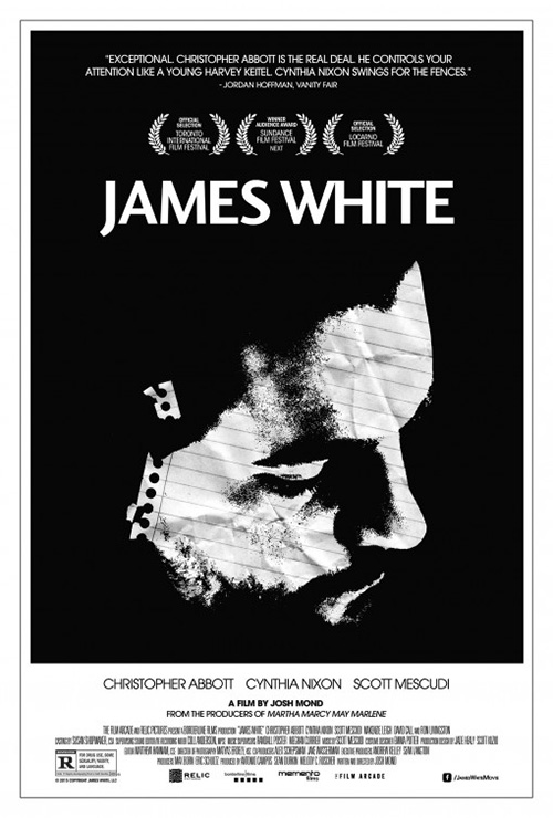
They are striking on their own. Not only does James White (limited November 13) embrace the aesthetic with a ton of ink, it has some cool ideas to go along with the barebones lined border you can trace back decades. Instead of just putting a face in the void that looks like a Xerox for texture against the solid fields, the designers utilize a piece of lined paper with spiral holes. It grabs our attention as a result, giving meaning to the image as object on top of portraiture.
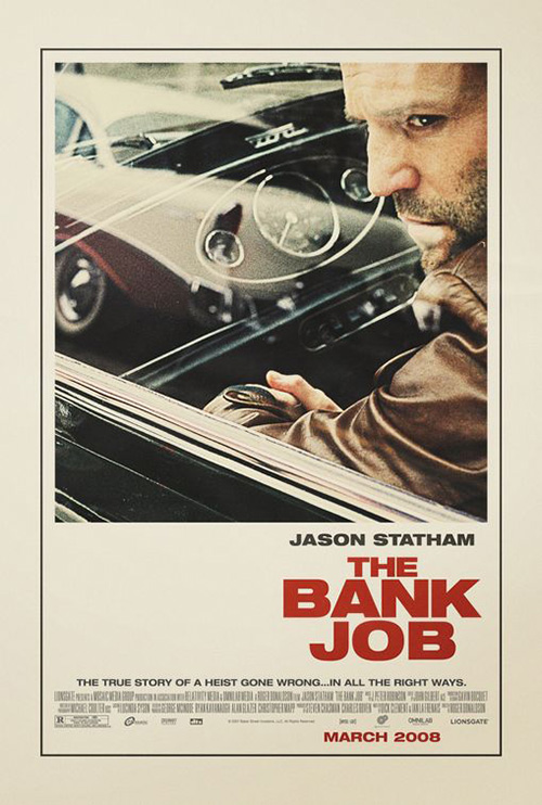
The rest is hardly inventive, but this style has such longevity because it is very effective. Keeping the title bright white makes it a central focus and the crisp border provides a box for more text while also giving our brains a break from the deep black. Like The Bank Job back in 2008, this installment shows how the template will truly never die.
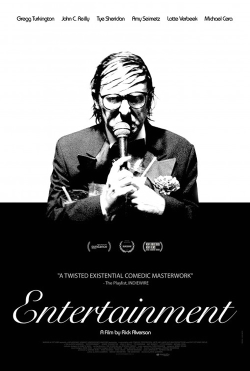
Entertainment (limited November 13) goes for the black and white full bleed. The reasons for bisecting the image is a direct result of sticking to grayscale because the darkness would completely consume Gregg Turkington‘s visage had the designers not changed his background to white. But you cannot make the whole thing white—it would be boring if you did. At the very least this maneuver keeps our eyes moving from one stark field to the next.
Beyond that, though, I think the photo and font choices work regardless. The elegant type juxtaposes nicely with the intense image above—pristine lines opposite wild unpredictability. The tenacity of Turkington is enough to need the simplicity of calm around him. It’s as though he’s about to burst in rage from the shell that’s contained him for far too long.
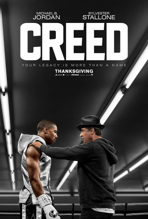 |
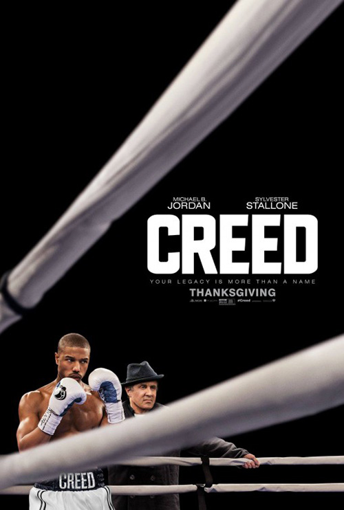
Concept Arts‘ Creed (November 25) isn’t quite black and white, but it’s close enough to include here. If not for all that ink the fact that Michael B. Jordan and Sylvester Stallone are in color wouldn’t matter. Because it is, though, we can’t help but find them readying to uncoil in the bottom left corner. The white ropes perfectly frame them and their kinetic energy by amplifying both towards the title and us in a steep crescendo.
This is a great evolution from the firm’s first entry. In it the lights try to do the same thing as the ropes, but being behind the characters rather than in front is a big difference. Making Jordan and Stallone bigger and in the foreground doesn’t help either. In the end it’s still just a movie frame—composed well, but generic nonetheless. I’m glad they went back to the well to come up with the other because it delivers on their design premise so much better.
 |
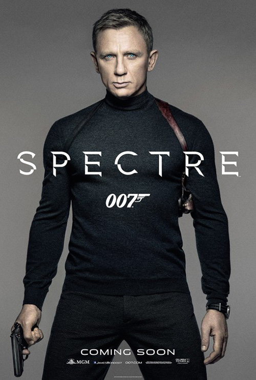 |
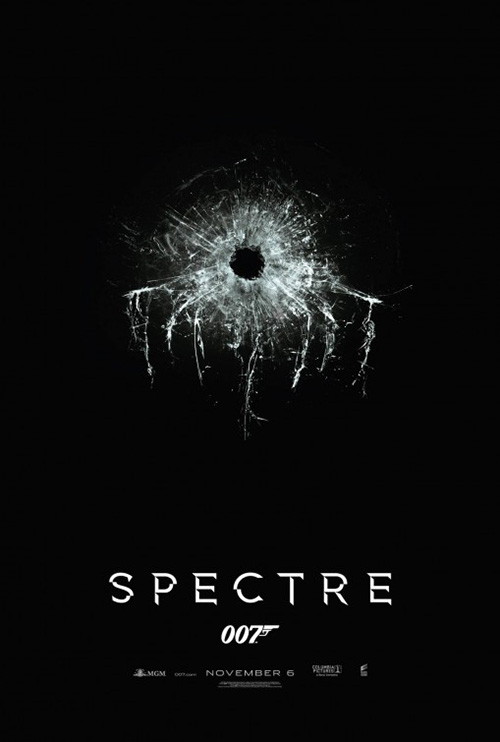
Placing Empire Design‘s Spectre (November 6) tease here is probably unfair too because it’s easy to let a tease be monochromatic, but the fact there’s an image and not just text makes me believe it okay. This might be the best poster of the month on a purely design level—it’s simple, effective, unique, and informative.
For those aware of the old “The Octopus” logo in Bond lore, the bullet hole’s shattered glass will seem familiar. But its sleekly modern reboot is gorgeous in its sense of dread. It grounds us in the story and captivates our thinker to conjure ideas for how the film will improve upon what we’ve already seen.
I really like the font too. It’s different because the checkers aren’t black and white—they are color and nothingness. You can’t tell on the tease because your eyes simply fill in the blanks with the same black that the background contains. Against Daniel Craig, however, you realize what’s happening. And none of the letters lose clarity either. Each is legible because our brains read more than is actually there.
 |
 |
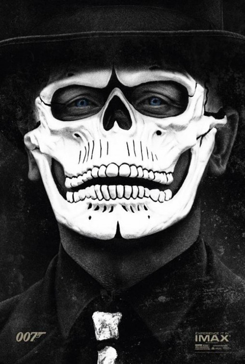 |
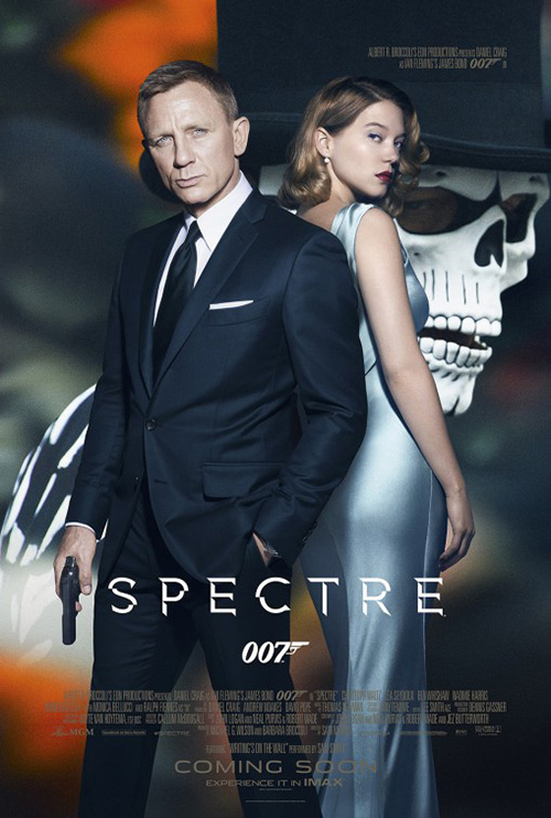
It’s just too bad that the posters utilizing it are pretty bad after that tease. Do we really care about Craig standing against solid colors at this point? Black and white or color on grey—it doesn’t matter. They are equally boring. The same goes for the one with Léa Seydoux and Craig above a skull-masked villain. This one’s even worse because there’s no discernable separation between the three characters. Everything becomes flat just like when The Man From U.N.C.L.E. tried it.
As for the IMAX poster: why? I get trying to be different, but this says so little about the film. To me it is begging people to rip it off the wall, cut out the mask, punch two holes, and affix some string to wear it yourself in the theater.
A cut above
 |
 |
 |
 |
 |
 |
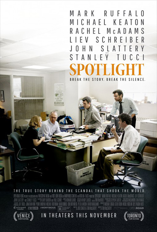
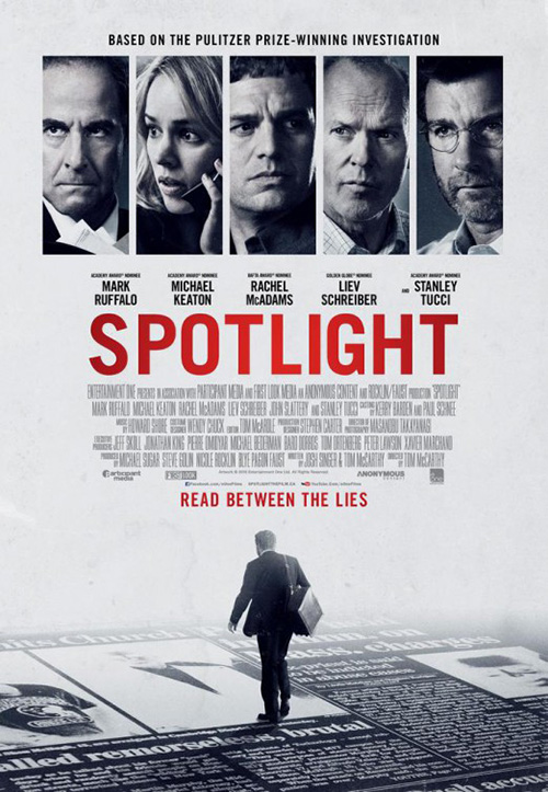
Calling BLT Communications, LLC‘s one-sheet for Spotlight (limited November 6; expanding November 13; wide November 20) a cut above the rest may seem odd since I’ve been harping on firms utilizing film stills, but this one is really good. It’s hard to get five actors in frame without Photoshop, so I say go for it when you can via an authentic image. Showing them doing something rather than looking at the camera is a plus too. We’re watching something unfold that we’ll only understand the particulars of if we buy a ticket.
Kudos to them for going text block on the names and title too. We don’t need huge letters spanning the full width of the page and the word “Spotlight” doesn’t need to be gigantic in comparison. Give it a different font and color and it will pop out by itself.
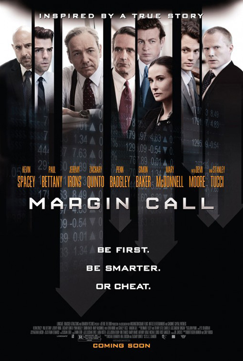
And if you still don’t believe me that this is effectively done, look no further than the movie’s second sheet. A guy walking on a newspaper as five faces float in boxes at the top? A huge garish red title above credit text that’s as big as the highlighted actor names? Way to do the Margin Call guys.
 |
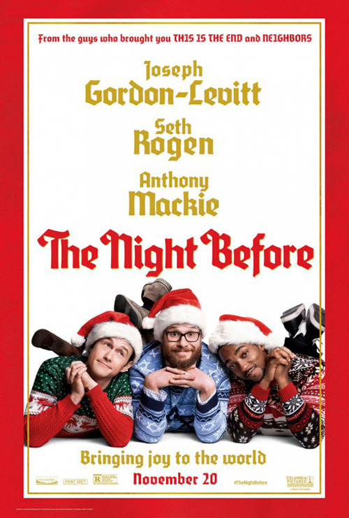 |
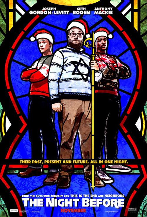
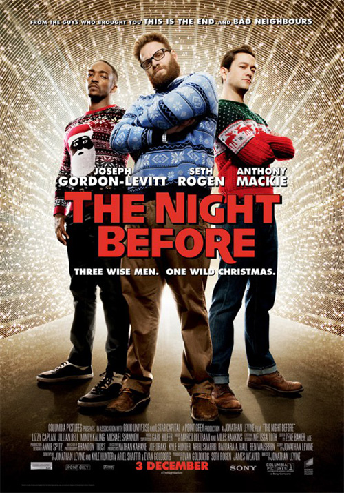
BLT was also in charge of The Night Before (November 20)—a poster so bright and distinctive that my local one-screen art-house theater put the one that the studio sent them up despite there being no chance they’ll actually show the film. The stained glass aesthetic is fun, the juxtaposition of Catholic motifs and Christmas with Seth Rogen‘s Star of David sweater funny, and having all the text placed away from the image’s core components a welcome departure.
It’s colorful, authentically textured, and definitely unlike anything you could have done with the photo this was manipulated from—just look at the very bad example with the guys transplanted onto a light tunnel background. It’s nice when the title only has to be white to standout against so many colors.
There’s also a weight to this design that the third entry cannot replicate with its Christmas card style. This fails in much the way Entertainment would have had the bottom not been black. Too much white with nothing but a couple characters can kill a design. It doesn’t help that the artists feared the negative space and bumped every line of text about 50 points too high to compensate. The actor names are almost bigger than the title—distractingly so.
 |
 |
 |
 |
 |
 |
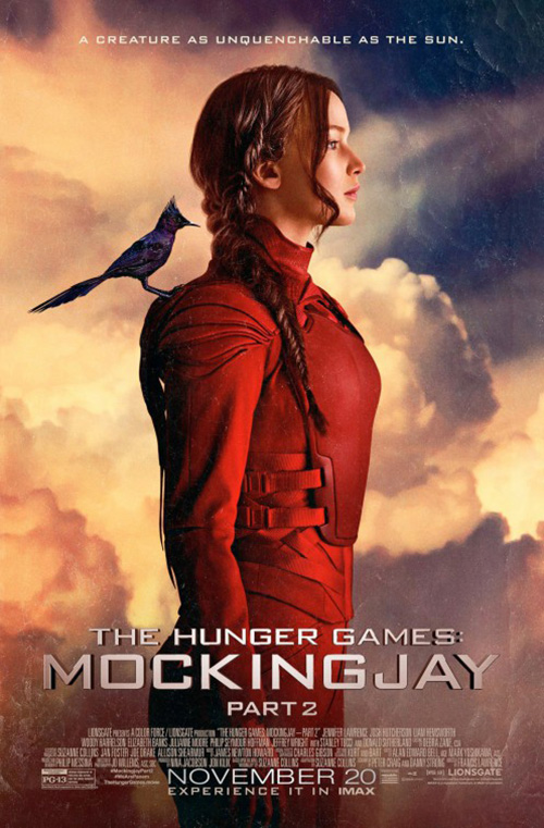
I’ve liked The Hunger Games campaigns throughout the franchise’s run in cinemas. Mockingjay – Part 2 (November 20) doesn’t disappoint as far as keeping appearances up. What’s odd, however, is that newcomer on the scene LA designed the fourth installment’s materials whereas the first three were handled by Ignition. If you compare them together you’ll wonder why because nothing has changed. In fact, things have pretty much stayed one hundred percent the same.
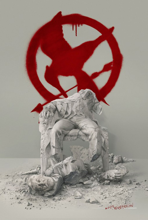
This first teaser, for example, is a direct sequel to the President Snow statue used for Mockingjay – Part 1. The difference is that the revolution is in full swing with Part 2 and therefore the sculpture is in shambles. It’s a provocative bit of imagery—especially in context of being created within The Hunger Games‘ world. A leader has fallen and been replaced by someone new. Even though Katniss Everdeen isn’t in frame, the blood-red spray painted icon on the wall tells us all we need to know.
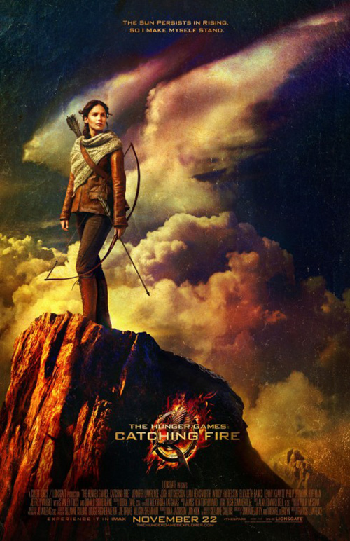
As for the rest: the character sheets of hands doing the “honor” symbol used throughout the series bears resemblance to Mockingjay – Part 1‘s character set against the grey of District 13. It’s better because it gives us the diversity of souls fighting without simply giving generic portraiture, but the comparison is there. And the painterly one of a red-suited Katniss against a cloudy sky on faux canvas proves a carbon copy of the style used on the great Catching Fire portrait of the heroine in regal pose.
So why change designers? The similarities only prove to us how much input the studio wields with their marketing materials. They obviously told LA to do exactly what Ignition had and ultimately make us question whether the switch was financially based: “We can do the same thing for half the cost.” Yes, yes you can.
The white weirdness of rose-eyed Katniss is at least fresh. I don’t love it, but not being exactly like a previous poster is surely a plus.
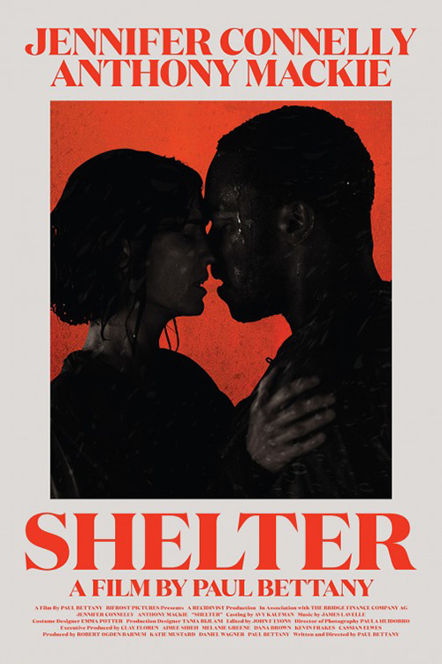
Good or bad, nothing above compares to CHIPS‘ TIFF 2014 poster for Shelter (NY/LA November 13). This thing is gorgeous. It reminds me of an old school book jacket with its large text and font selection. The red is bright by not overpowering against the off-white background. And the shadowy image of Jennifer Connelly and Anthony Mackie is a perfect complement. Not only do the shadows of its photography contrast the crisp geometric letters, the saturation of black turns them into virtual silhouette to mimic the minimalist shapes surrounding.
 |
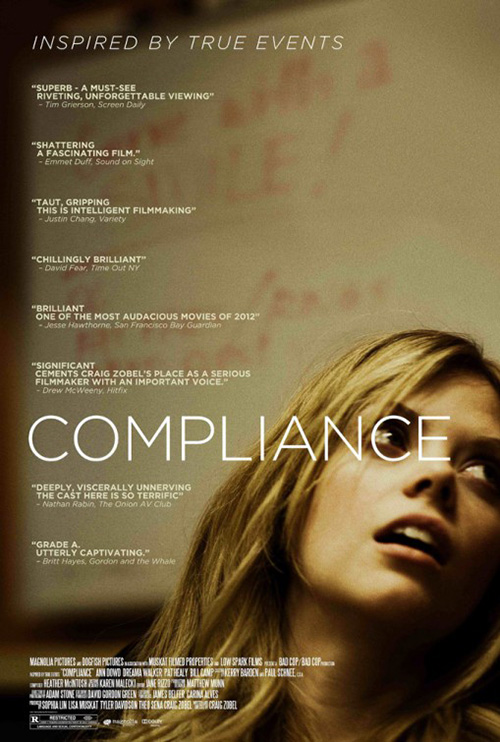 |
It’s visually enthralling, sexy, dramatic, and unlike anything else. It’s so good that Gravillis Inc.‘s competent and memorable final poster pales in comparison. The drama it projects is different than the charge its predecessor possesses—fear and uncertainty looming larger than the other’s pure carnal desire. The need for so much text a la Compliance also loses impact. Rather than stare at the two actors and lose ourselves to the void they form at the center of the page, our attention is divided by the top left’s supposedly crucial information.
What is your favorite November release poster? What could have used a rework?