“Don’t Judge a Book by Its Cover” is a proverb whose simple existence proves the fact impressionable souls will do so without fail. This monthly column focuses on the film industry’s willingness to capitalize on this truth, releasing one-sheets to serve as not representations of what audiences are to expect, but as propaganda to fill seats. Oftentimes they fail miserably.
There are a lot of films opening this March that hold some interest. And not just the limited releases either. Disney has Zootopia (poster), Paramount has 10 Cloverfield Lane (poster) and Whiskey Tango Foxtrot (poster), and Universal is bringing everyone’s favorite Windex-using family back with My Big Fat Greek Wedding 2 (poster).
Some of those received intriguing posters—well one did even if Zootopia‘s overflow of characters is similar to The Muppets and The Peanut Movie before it—but none are worth talking about beyond meeting expectations. Not all the ones below exceed theirs, but at least they give us something to discuss about outside of the status quo. Yes, even the superheroes.
Grungy faces


While I honestly can’t muster much interest in seeing Batman v Superman: Dawn of Justice (March 25), I do love WORKS ADV’s teasers. They look like real photos of hastily plastered wallpaper posters, wrinkled and translucent atop an unspecified number of adverts formerly possessing that prime real estate. Superman’s is better because you can actually see the layers beneath it through the shredded Batman logo—a logo I’m thankful looks more like it should rather than the bloated nonsense revised to fit the Superman crest inside it for the film’s own icon.
These two are visceral and tactile while the second go-round is somewhat tame. Henry Cavill looks constipated and Ben Affleck only shows his lips. The Bat logo is the bloated one I just mentioned hating out of context from combining with Superman and the stamp of it aligning with the image doesn’t have the same impact as when they contrasted. I like the idea of some Supes fan ripping into the Batman poster and vice versa—defacing one hero for another. I don’t need a logo and a full body shot of the same person it represents. That’s redundant. And I definitely don’t need one with the Daily Planet logo and a Wayne Manor stationary seal to give Amy Adams and Jeremy Irons some play either.


As for the “fight” shots—I can get behind them. Fanboys have wanted a Batman/Superman showdown for decades so playing up the war sells. The face-off shot is boring, but the one with both engaged and ready to pounce is pretty effective. I like that they stuck with only showing Batman’s back since showing his mouth isn’t enough to care about whether Affleck is being represented well. We know who he is and we’d rather see an actual face staring back than a mask.
Pristine faces


I really love what LA did on their character sheets for Allegiant (March 18). If memory serves, the representation of a pane of fogged glass with plus signs was shielding Tris from Jeanine during the climax of Insurgent. This was the barrier containing her as she was tested to the death—a see-through coffin of sorts boxing her in like everyone in this post-apocalyptic Chicago has been since the beginning of the series.
The design provides a very cool aesthetic as the actors are seen behind in intriguing poses showing emotion rather than portrait ambivalence. There is a very small center of focus and the rest fades into a blur towards the edges. I haven’t seen any posted at my local theater, but I can imagine it looking fantastic behind those glass frames—as though these characters were literally trapped inside looking for a way out.
LA’s second set of character sheets is less inspired as it simply supplies close-ups devoid of expression. I can get behind the percent “pure” detail because I’ve read the book and know what that means, but it’s abstract to the layperson going in having no clue about anything except the previous movies. At least the other theme had visual impact beyond bland information.


The diptych of Tris and Four embracing from both sides is much better. It’s not about who they are to the community or the world, but instead who they are to each other. There’s worry, love, trepidation at the unknown—a scene is constructed by the two that plain faces square to the camera can never deliver.
How about the final sheet with spiral staircase? It’s attractive. I’ll give them that. But what’s happening? The figures are too small to discern identities—is the woman in white Kate Winslet? Naomi Watts? Both don’t make sense to have such a predominate focus in this chapter. Is it therefore Shailene Woodley? Probably, she being the true Divergent with the others lingering in the dark below. Maybe we’re just supposed to appreciate its prettiness and not care about the rest.
Isolated figurines


I’m the first person to champion minimalism in movie poster design, but sometimes ad agencies strip things down without reason. Case and point: Cardinal Communications USA’s I Saw the Light (limited March 25). It looks incomplete as though they isolated Tom Hiddleston from his stage in order to place him atop a different background and forgot to finish. Making all the text a uniform black doesn’t help because nothing pops from the pack. This is what you set up before actually creating a design. Title? Check. Actors? Check. Media quote? Check. Leading man photo? Check. They simply forgot to start moving things around to see what they could come up with.
The one-sheet for Grimsby (March 11) isn’t much better except for the fact that it’s mocking another recent spy venture in Spectre. They are purposely going for the sleekness of silver—the edge of a razorblade—to juxtapose against Sacha Baron Cohen’s off-putting sultry gaze and Mark Strong’s angry confusion. Does it work? I guess. But I credit any success to the contrast of the former’s underwear and latter’s suit. That’s what’s funny, not the Bond spoof.


While no less inventive, at least ARSONAL’s poster with the two actors shooting guns whilst flying through the air is fun. You know what you’re getting with explosions in the background and sloshing beer in the fore. Both brothers are shooting and intense—one an embarrassment and the other a professional. It perfectly predicts the film as either being a complete mess or just funny enough to be watchable.
The Bronze (limited March 18) is exactly what I Saw the Light is trying to do. The lead is isolated, but Melissa Rauch is standing against a texture rather than appearing as though her background was accidentally deleted. She’s also engaging the audience (us) rather than singing to a crowd that no longer exists. She therefore isn’t out of place.
It also excels over that other poster by not placing text on the top over her head. She isn’t boxed in as a result, but instead given the position of ‘main focus’. The actors’ names have a color that complements her wardrobe and the title pops with its obvious play-on-word. Is it a resounding success? No. But it’s effective and looks intentionally drawn.
To truly succeed in letting your actor sell your film regardless of place, you must add intrigue. The Young Messiah (March 11) does exactly that. The designer isn’t beholden to showing his face but instead uses a profile so the fabric of his shirt and curls of his hair can play against the subtly colored background rather than float above. He can be cropped over the edges, trapping our gaze from traveling around him freely without ever stopping. There’s emotion in his contemplation, beauty in the over-exposure. And the title font is thinly serifed, just bold enough to draw our eye.
Piquing interest


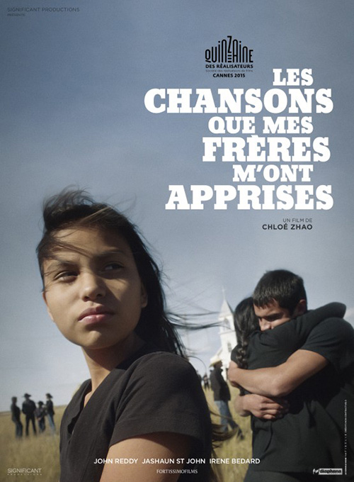
There’s some weirdness happening in the poster for Songs My Brothers Taught Me (limited March 2), but not enough to distract from the uniqueness of its handwritten scrawl and layered collage. For instance: why are there creases on the image in the top left but nowhere else? Why isn’t there a shadow or something to separate the top image from the bottom when there’s a distinct rip line proving they aren’t on the same plane?
Besides those points of contention, however, I really like the feel of it. The paper looks pulpy—something you would draw on in an art class. It’s imperfect and gritty with a gorgeous blue/gray sky burning in orange at the bottom. There is character that the original advertisement doesn’t quite deliver. That’s not to say Le Cercle Noir’s Cannes design isn’t good. It is. I just think the sense of loss and sadness comes through more on the English-language entry rather than a sharp photograph.
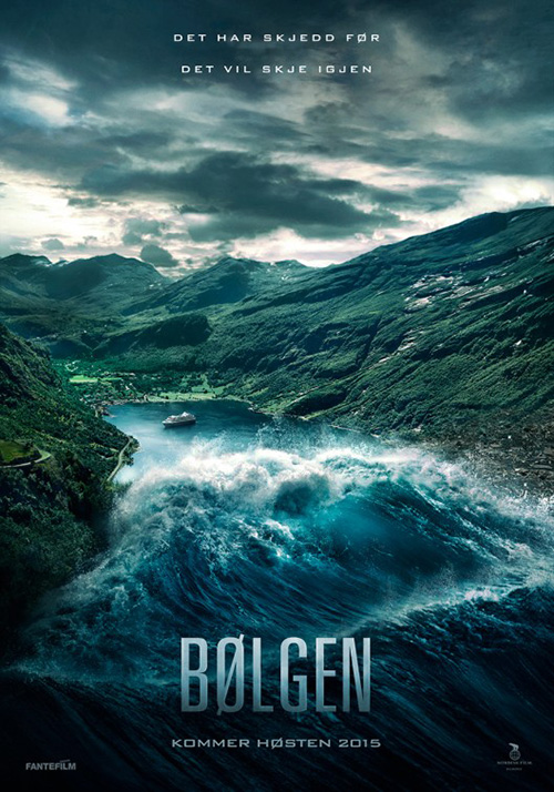
I feel the same with the English-language poster for The Wave (limited March 4) by Gravillis Inc. There’s simply a greater sense of danger than the one done by City Rain Design. The latter is too pristine—it looks computer generated in its crispness. There also isn’t any critical sense of fear because we see this huge expanse dwarfing the wave despite knowing the small city in the distance will be submerged.
In contrast, Gravillis’ has an immediate sense of destruction. We are now on the level of those that will be affected. We see people running into their home as a tidal wave fifty stories high or more is about to consume them and us in the process. It’s all about vantage point and perspective. The international sheet shows the wave leaving us to take on something far away. We are voyeurs deciding whether to worry or relish the chaos. The domestic puts us in danger now. We have no time but to worry because we’re about to be swept up in the carnage.
For The Program (limited March 18), Creative Partnership has embraced a minimalist aesthetic through metaphor. It’s a captivating image in its simplicity of yellow and black, its’ needle doubling as racetrack and pursuer to take down a hero, and the way in which Ben Foster’s Lance Armstrong has been transformed into a Christ on the cross—albeit one of his own making.


On quick glance that’s what this poster is: a cross with America’s favorite son turned villain stretching his arms wide. That’s a far cry from the other rather boring look over the shoulder in shadow making Foster’s face look plastic and cartoonish. At least the French sheet gives us more to go on with a realistic photo and the jerseys in the background. Too much touch-up work is never a good thing.
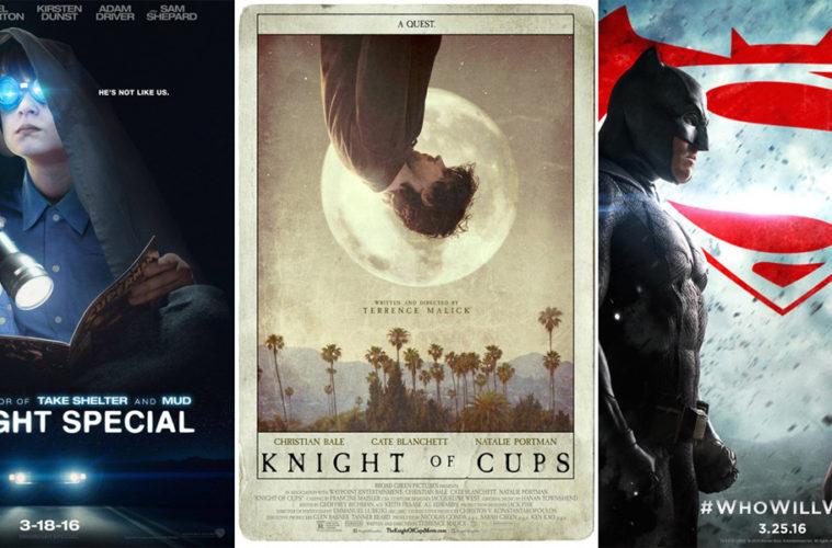
Well, that’s true in most circumstances as the ad for Midnight Special (limited March 18) has its own brand of post-production work. But it makes sense here in its sci-fi underpinnings. The use of light and reflection gives it an otherworldly feel that gets the blood pumping as we wonder what this boy sees in the distance. I do wonder if it would be better without the car headlights below, though. Rather than give us a moment in time we have a diptych instead. Artifice therefore takes over mood.
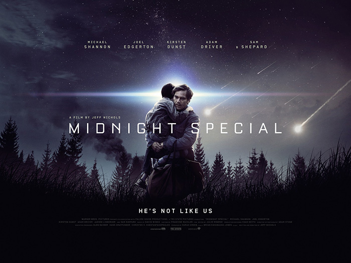
That’s why the quad sheet should be better. Empire Design keeps it a single scene to allow the science fiction tropes of shooting stars and glowing halos speak for themselves. Unfortunately, by placing us into a scene rather than just darkness, the designers show their hand anyway. The actors are obviously Photoshopped onto the trees, the light effects added afterwards. It’s all too perfect—but maybe that’s intentional. Maybe there’s something seemingly concrete to see through within the film as well.
A cut above


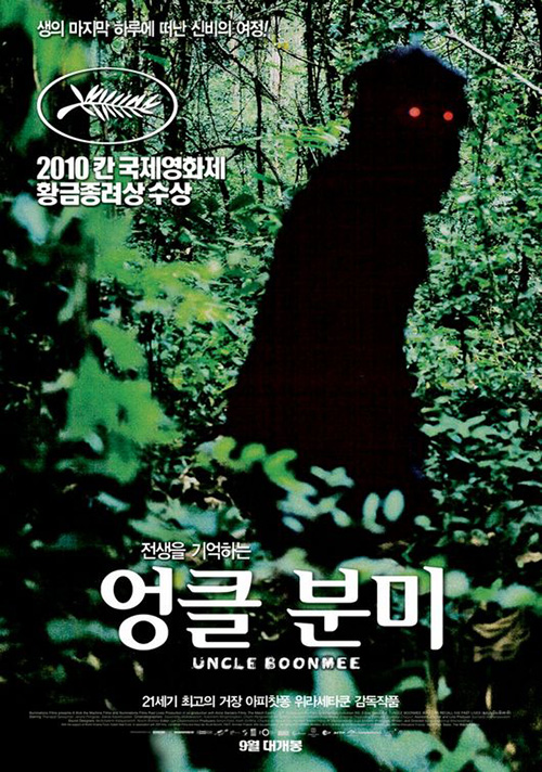
Apichatpong Weerasethakul’s last couple films have had posters as fascinating as the works themselves. Who could forget Uncle Boonmee Who Can Recall His Past Lives and its creepy sasquatch-like nightmare peering back at us?
His latest Cemetery of Splendour (limited March 4th) takes a page out of that book as far as its locale of thick foliage, but it goes further into the movie’s concept of dreams, phantoms, and romance by merging place with being. The person in question is Jenjira Pongpas, a lonesome housewife at the center of the tale—her positive space silhouette against white blooming the flowering tree of life and imagination. It’s amazing how the image itself exudes the synopsis’ sense of dream right off the bat, but the coloring and light washing her thoughts into the expanse behind her delivers the romance whether you’ve read the descriptor or not. Her closed-eye smile combines the two into one grand gesture of metaphor.
Even though both versions above are virtually identical, I do prefer the original Cannes design with title info at the bottom. The way the first “C” and last “R” fade into the white like her forehead brings everything together—the tiny bit of vine top right perfectly balancing the composition. Because the final sheet had to add press quotes, that balance goes awry. Suddenly Pongpas becomes a triangle shifting our eyes to the title wherein we completely stop. The sense of natural free-flowing adventure is gone.
I’m not sure it’s possible to dislike Midnight Marauder’s teaser for Knight of Cups (limited March 4)—even if it’s just an appropriation of a 1764 illustration by Dionysius Andreas Freher (as detailed by Adrian Curry on mubi). To clean it up and think to use it for this film is inspired enough. It’s pretty, mysterious, and scientifically spiritual if that even makes sense. And topping it off with Terrence Malick’s trademarked title font (all caps since The Thin Red Line, mixed with italics since The Tree of Life) is perfection.


It’s no surprise the designer found that image while searching tarot cards (the title is the name of one) considering P+A had the same idea with their entry. They decided to actually make their one-sheet into a card with Christian Bale as its titular knight. I love the texture and the faded colors as well as the choice to put Bale upside down. I’m not quite sure why the title text is then superimposed on top of itself as a reverse shadow since the image isn’t, but it lends a cool touch.
In the end, both overpower Wonderland’s international piece that pretty much copies To the Wonder. It’s confusing in its angles that go against the horizontal triptych format, the women’s hair creating an odd frame of Bale at center. It’s abstract and literal at the same time and my eyes don’t know what to do with it.
What is your favorite March release poster? What could have used a rework?