
“Don’t Judge a Book by Its Cover” is a proverb whose simple existence proves the fact impressionable souls will do so without fail. This monthly column focuses on the film industry’s willingness to capitalize on this truth, releasing one-sheets to serve as not representations of what audiences are to expect, but as propaganda to fill seats. Oftentimes they fail miserably.
Sorry, Hollywood. June 2015 is not your month. Or maybe I should actually applaud the indie studios for grabbing June 2015 and claiming it as theirs. I only lean towards the latter because this month’s big budget films have lackluster marketing campaigns at best.
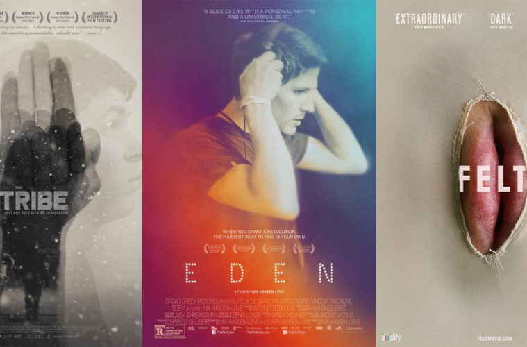
I don’t need to see the Entourage (June 3) boys as plastic dolls, Canyon Design Group. (poster 1 / poster 2)
I also don’t need a refresher on Jurassic World‘s (June 12) scale disparity between humans and dinosaurs, BOND. (poster 1 / poster 2)
Something can be said about Ignition sticking with the same minimalistic style of the original for Ted 2 (June 26) (poster) and I don’t want to rain on BLT Communications, LLC‘s effective circle motif morphing into characters with Inside Out (June 19) (poster 1 / poster 2), but they’re all boring.
I’d rather talk about the below instead.
I spy something familiar
 |
 |
 |
 |
 |
 |
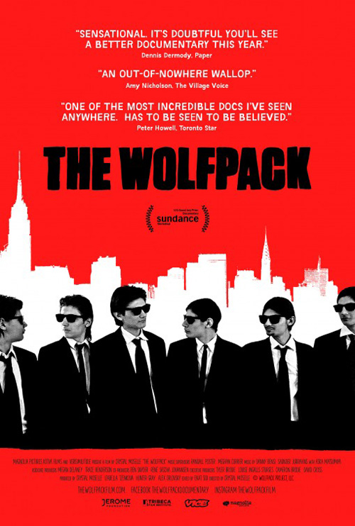
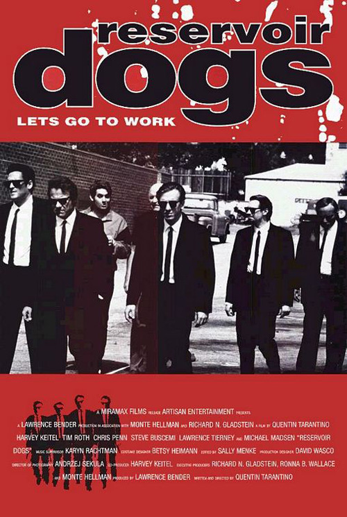
If a film is allowed to pay homage to other films’ posters with its own, The Wolfpack (limited June 12) is that film. After all, this documentary is about brothers who learn about the outside world through the films they watch while locked inside their Manhattan apartment. Why not shed some light on that subject matter visually to get the idea of tribute and movie as reality into audiences’ subconscious?
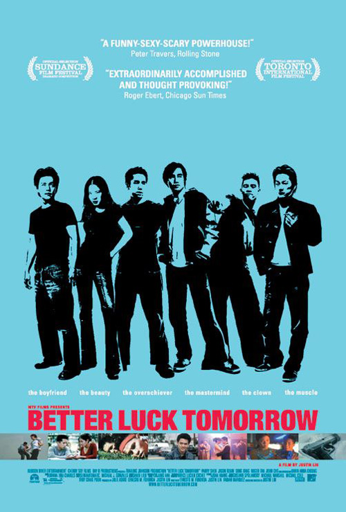
The work obviously calls back to Reservoir Dogs with its wardrobe and color scheme, but I also couldn’t get Better Luck Tomorrow out of my head with its stark contrast of dark black figures against a bright solid hue. Beyond the comparisons, however, the poster is striking in a way to grab attention if not wow with aesthetics. How can you not turn your head towards that red?
It’s simple in its mission to get across brotherhood, NYC, and hipster cool. The title font is strangely playful as its roughly drawn letters juxtapose against their boldness. And the fact no one is looking our way despite the sunglasses has us feeling as though we’re in on a joke.
 |
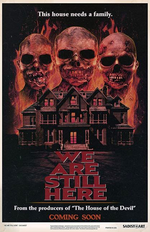 |
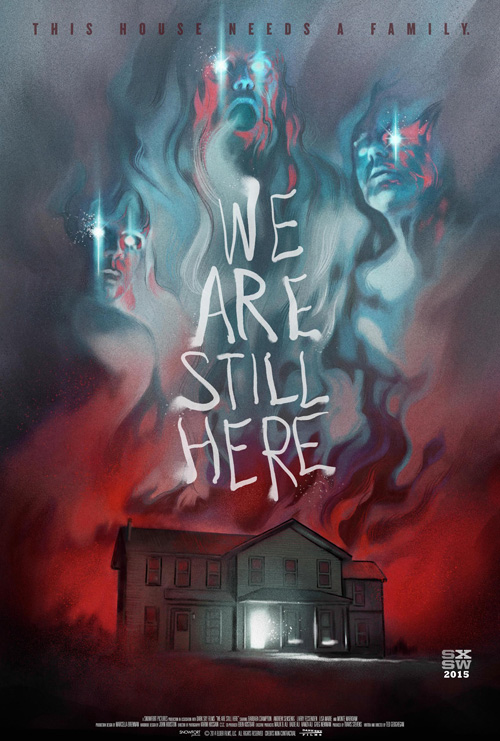
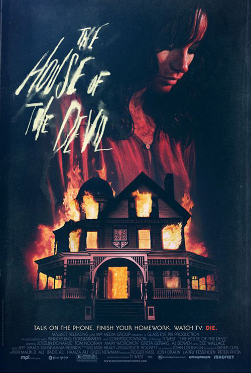
For We Are Still Here (limited June 5), the work completed is attractively spooky and wonderfully painterly to stand out against photo-heavy counterparts. It’s also eerily similar to The House of the Devil.
What makes this fact so interesting, though, is that an alternate poster that’s itself way too 80s straight-to-VHS for my liking states how the two films are produced by the same team. Perhaps it’s therefore no coincidence they are practically carbon copies of one another: what worked then might work again.
The House of the Devil is the more assured piece, however, in both its hybrid photographic depiction allowing for more spookiness and its title seeping into the darkness as though still wet and tactile. The richer black also helps the tone while We Are Still Here‘s blue-greys and orange-reds almost push its look into cartoonish territory. It’s obviously an illustration where the other makes you question its medium and the title is too precisely edged to cultivate the same texture able to make you reach out and touch it.
 |
 |
 |
 |
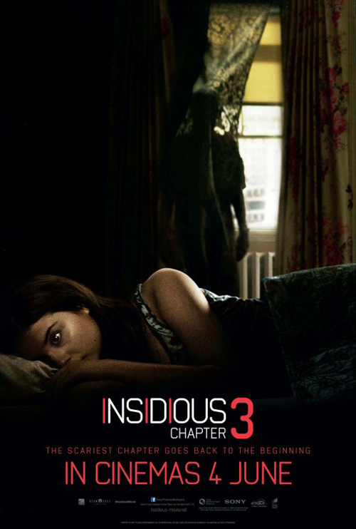 |
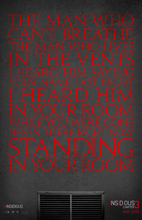
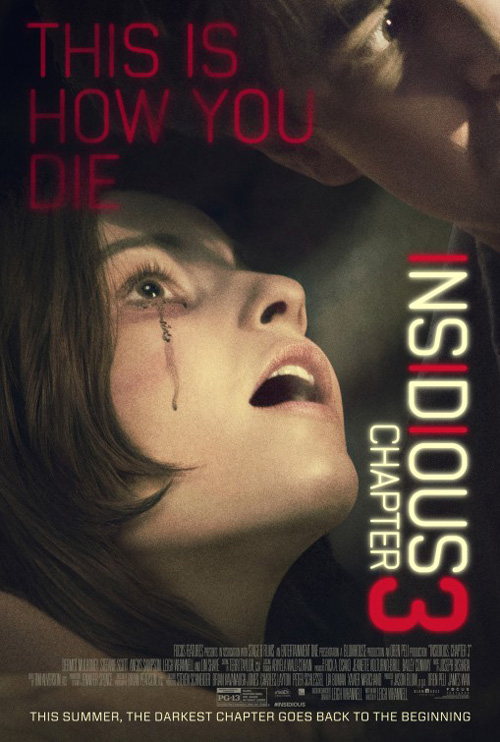
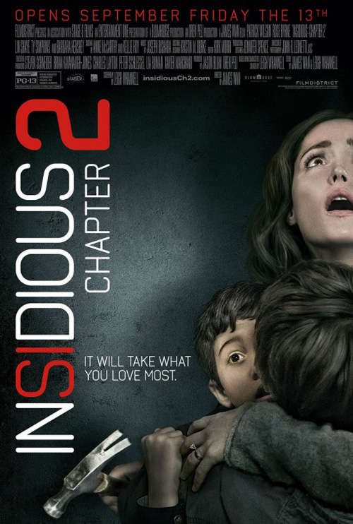
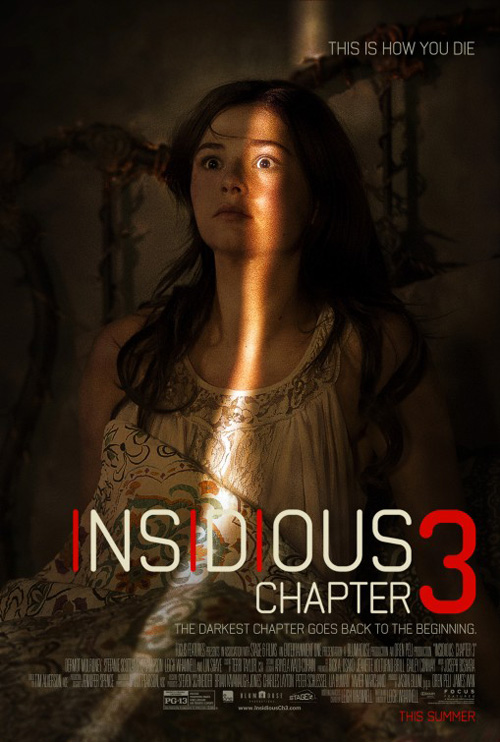
Bringing Ignition’s Insidious: Chapter 3 (June 5) into this conversation is a bit of a stretch considering so many designs have utilized text block before. Where the previous two fall under homage, this one is a trending motif. It’s no coincidence then that I thought of the remakes of Evil Dead and to a lesser extent Carrie when spying upon it. The difference here is my thinking this newest iteration is better.
My reasoning for this is not the stunning photography—I honestly laughed when I saw there was a photo credit attached considering it’s a wall with the top of an air vent all the way at the bottom (my apologies to photographer Cullin Tobin). No, I enjoy this one because of the sheer quantity of text and the fact none is a media quote. This block is the pitch: the prologue getting us in the mood before the film even hits theaters. You must read it and you must wonder what could be in that vent.
It’s definitely more inspired than P+A‘s shot of Stefanie Scott with the exact same expression as Rose Byrne in the sheet for its predecessor Insidious: Chapter 2. The one where Scott is sitting stock still on her bed with a sliver of light from a doorway illuminating her eye is sufficiently creepy, but cold open wins best in show with their “monster” shrouded in shadows behind her curtain.
 |
 |
 |
 |
 |
 |
 |
 |
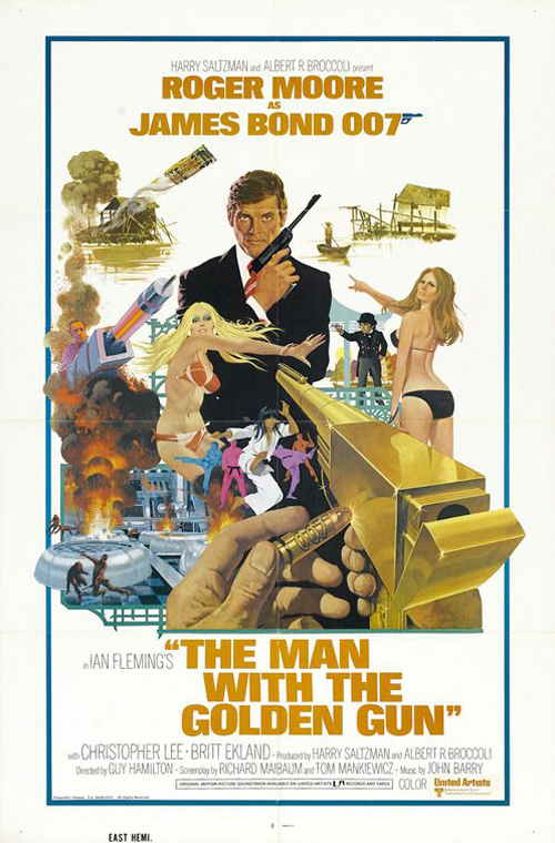 |
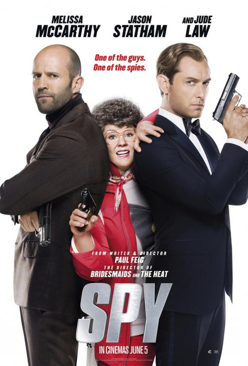
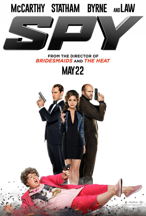
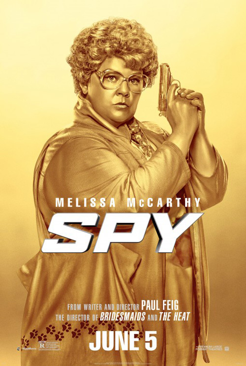
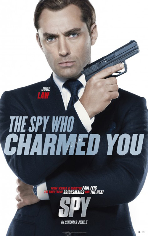
Joining Insidious as the only other wide release in this month’s rant is Spy (June 5)—a film I cannot get excited about. Let’s just say this top poster by The Refinery with photography from Larry D. Horricks does nothing to bolster my anticipation with its badly Photoshopped head of Melissa McCarthy plopped onto a different body and squeezed between costars Jason Statham and Jude Law.
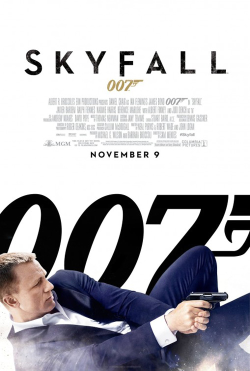
Ignition’s entry with Byrne added in might be worse, but its use of McCarthy sliding across the ground brings us our opening into the world of James Bond spoofing. I dislike spoofing—I’m looking at you studios who promote Tyler Perry‘s work—but I won’t deny the joke’s appeal. It’s just tough not to see how effective Daniel Craig sliding in front of a giant 007 is on Skyfall is when looking at McCarthy rather than care about her movie instead.
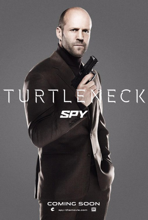
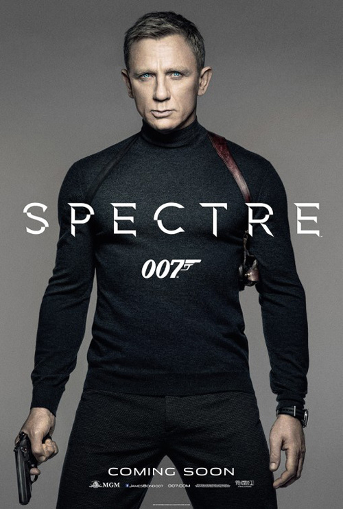
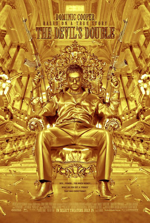
The same can be said with the rest whether it’s Statham mocking Spectre, a golden McCarthy looking like Dominic Cooper in The Devil’s Double, or Law honoring both Sean Connery and Roger Moore with his weirdly posed not-quite-crossed-arms moving into a gun pointed over shoulder maneuver. They’re cute, but Spy isn’t supposed to be cute. It’s supposed to be uproariously funny.
Exposed expressions
 |
 |
 |
 |
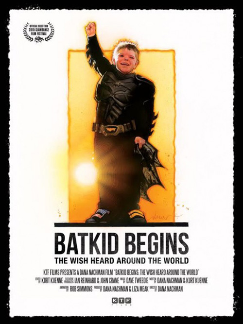 |
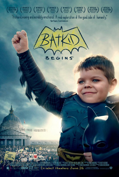
There’s a lot to like about Batkid Begins (limited June 26). I’m not the one to go through a laundry list of reasons why being that I know little about the subject matter other than the whole thing being a Make-A-Wish come true (I think?), but I guess that’s why the movie is here to explain. I do know the tone, though, and I believe P+A captures it nicely.
This is a feel good story that went viral when it occurred and there should be no surprise the film world came knocking. Revolving around Miles Scott and his wish to be Batman’s sidekick, it captures how he was able to do exactly that. What better way to show this victory than a fist pump and a smile? Earth took notice and strangers everywhere cheered on this young boy as he lived his dream.
You don’t need flashy graphics or a montage of images because this says it all. And the childish handwriting in a hand-drawn Batman logo ties it all together with a bow. The whole has a polished feeling that Drew Struzan‘s iconic style doesn’t quite match being that it only takes up half the page while a bland white background and black sans serif font surrounds it. Give P+A this image to rework their design and we may see something that truly resonates.
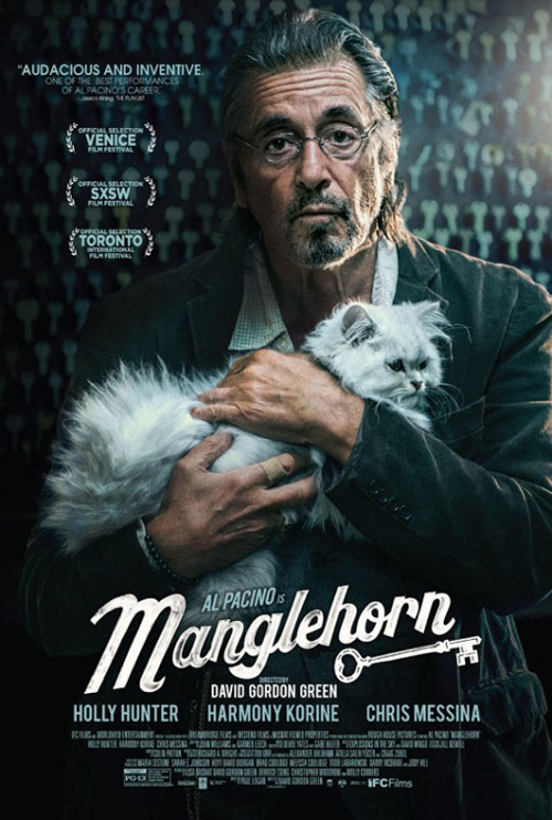
Where Batkid is no-brainer in concept, Manglehorn (limited June 19) is not. Well, it might be to those who’ve seen it. Without any context, though, the image used on its poster is for lack of a better word creepy.
What is happening? Elderly Al Pacino carrying his cat and coming close to “ducky face” while doing so? It’s hyper-stylized and thrown through a contrast filter to give it a glossy oil paint sheen and somehow comes out creepier by making the actor look like a wax statue. Again—this might be the perfect way to sell this film. As someone yet to witness Manglehorn’s shenanigans, though, it makes me want to steer clear. Even the title’s rendering has me questioning its quality above a niche comedy that will definitely not be for everyone.
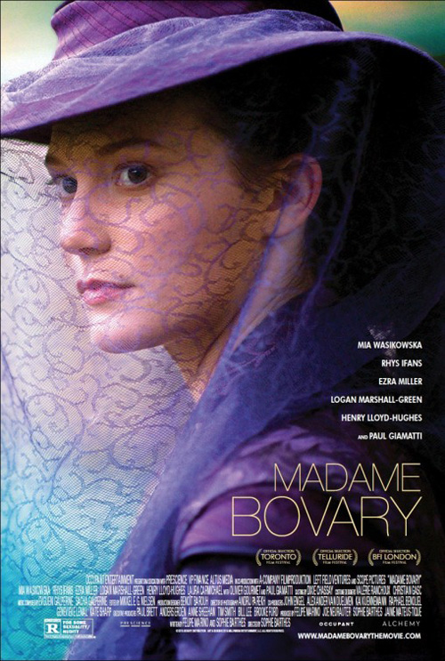
In comparison, Cardinal Communications USA also puts its star of Madame Bovary (limited June 12) front and center, but they do so in a pleasing light. Not only is she not touched-up with any broad aesthetic flourishes, she’s without props beyond her expression. There’s mystery here courtesy of the veil separating her from the viewer as well as her eyes looking off into the distance at something very clearly capturing her full attention.
I love the purple and the way the crop frames Mia Wasikowska‘s face in extreme darks of shadow while a triangle of light cuts through with the veil. The ultra-thin font adds a classic contemporary look to contrast the period costuming and the actor list is small enough to never distract us. It’s a captivating image and Cardinal lets it speak for itself.
 |
 |
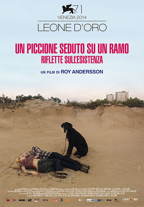
Mert Güner lets his work on A Pigeon Sat on a Branch Reflecting on Existence (limited June 3) stand on its on merits too by supplying a scene from the movie in all its eccentric glory. The museum set depicted reminds me of a Wes Anderson film with the dinosaur in the back seemingly hand-picked for its not quite “real” look and the practically albino character spying the titular pigeon like a still life. The camera literally lingers on the artifice of this experience and tells a story without words. The title font adds to this fabrication with the playfulness of each letter having pinched edges to keep them from becoming too rigid.
internozero comunicazione continues this trend by providing another set shot slightly off-kilter with whimsy. Just look at the looming mound of sand pretending to be a cliff face dwarfing the tiny tops of buildings in the distance as though it’s all a small-scale model. How about the young couple rounding second base? Not only does their inclusion tell us the sand is definitely not a cliff, but it also makes a brilliant fourth-wall breaking look from their dog possible. He’s definitely rolling his eyes like, “There they go again”.
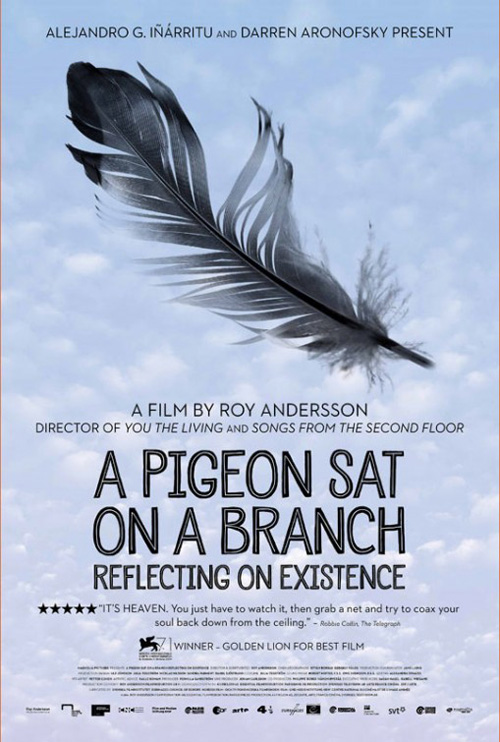
How shocking is it that the American sheet removes all sense of fun visuals for a text heavy layout housing a feather? Who knew you could look so lazy despite being compared to two posters that are simply shots from the movie?
Trendy successes
|
|||
|
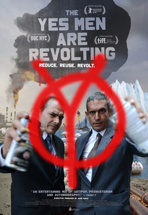
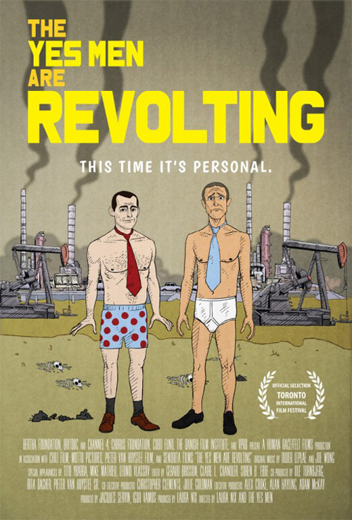 Even though there’s a lot going on in The Boland Design Company‘s poster for The Yes Men Are Revolting (limited June 12), I find it a complete winner. Probably a result of its depth of field, I don’t mind the visual collage at the back either. Pipelines, smoke stacks, oil rigs, polar bears, fire, and ice all populate the frame in a sort of apocalyptic narrative yet their construction is more in a storybook tone due to their flatness. And I love the textured paint blob rising in the air to house title and laurels as negative space.
My favorite part is the gorgeously rendered spray painted “Y”. Perfectly blurred and translucent to appear as though it’s on a pane of glass between viewer and subject, it really brings us into the work. The shallow focus from faces to cans draws us nearer to the center to really engage with these men and want to begin a conversation.
It’s light years better than its TIFF cartoon counterpart despite having similar subject matter. The animated style actually gives it less fun than Boland’s as if the style is being used ironically rather than intentionally. These are real people and there’s something to putting them in front of us to understand that fact.
 |
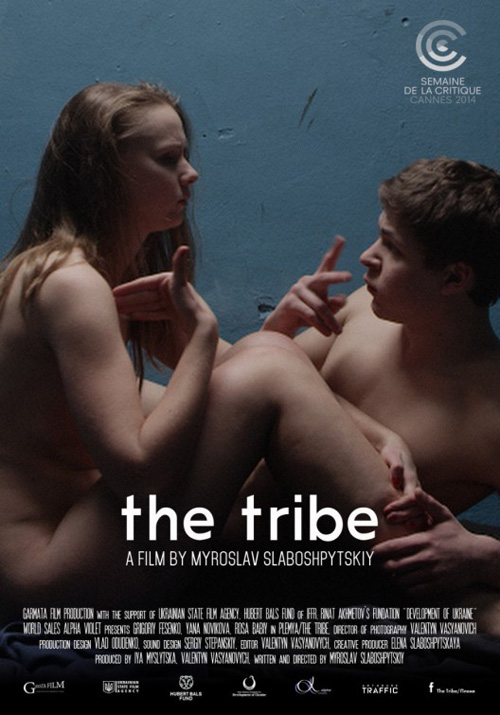 |
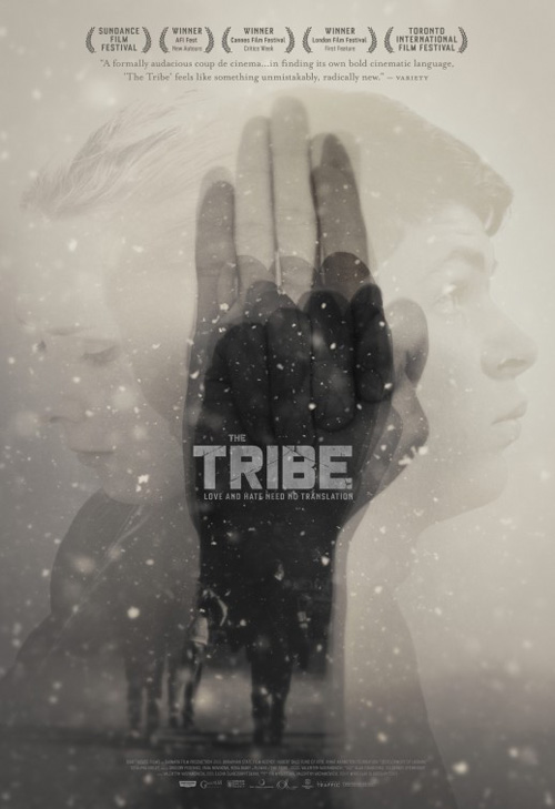
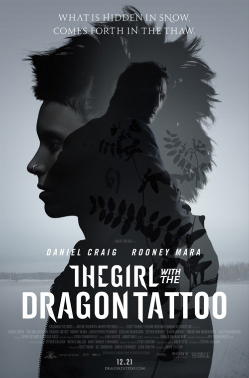
For The Tribe (limited June 17) Boland again comes through with a winner. I may use this Girl with the Dragon Tattoo example a lot to portray the layered transparency trope, but it’s merely because so many firms utilize it in their work. While I generally frown at the sight, Boland has an actual reason to roll it out here.
My sign language is rusty (my legally deaf third grade teacher taught us a bit), but I’m pretty sure the multiple hands at the center are spelling each letter of the title. I definitely see a “T” and a “B” so I’m going to go with it. This is an attractive way to explain the aspect of the film being silent without just showing a series of five cartoonish hands. If a deaf person were signing you the word it would come quick and smooth as depicted.
It’s a step up from the festival sheet of the stars naked and talking. This one isn’t bad, but it isn’t the most eye-catching either since for all we know these two are simply talking with aggressive hand gestures. I do like the motion blur on his hand, though. That’s a nice signifier to the act’s importance and how we should be looking at the hands rather than mouths to comprehend what’s being said.
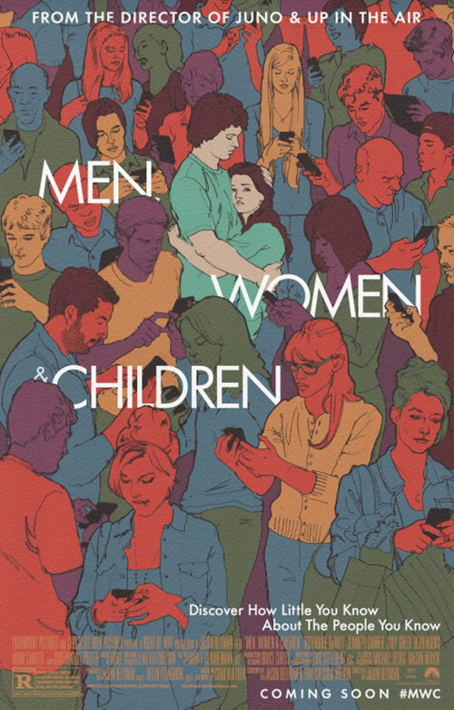 |
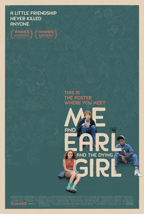
Another common design choice these days is hand-drawn line work to complement photography or stand on its own. BLT used it on one of my favorite sheets from last year (Men, Women & Children) and they do so again with Me and Earl and the Dying Girl (limited June 12). Nathan Marsh is the artist behind the scribbles stepped back in saturation to give the background texture while our focus directs towards the title and actors bringing color into the otherwise monotone field.
Every aspect is tied together subtly with a barely visible gradation of stairs behind the characters to give them something to actually sit on and not float in mid-air. And there’s even a cute little squirrel to bring the illustration to the forefront on top of the first “L”.
 |
 |
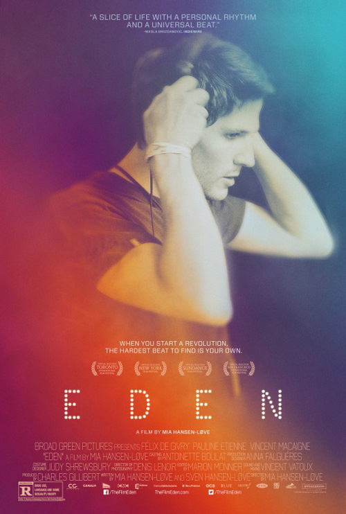
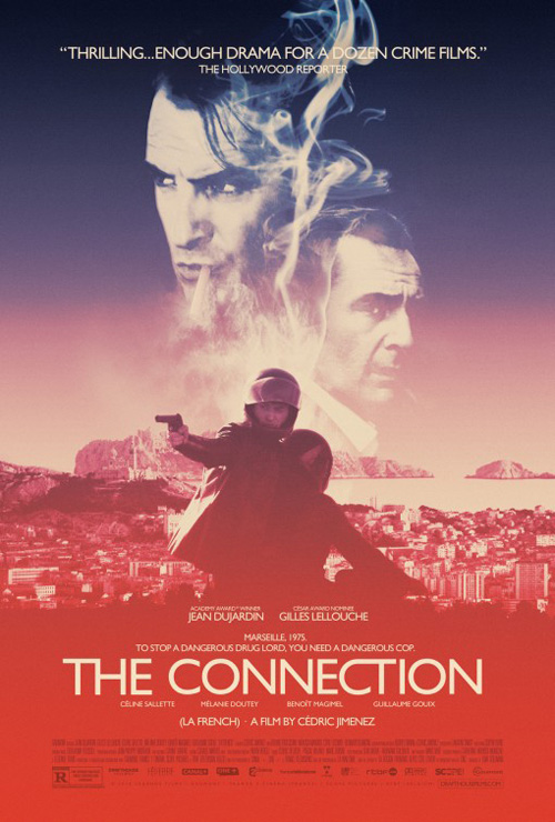
If color is your game there’s always P+A’s Eden (limited June 19) using the exact same scheme as The Connection. This smoky gradient of a desaturated rainbow from cool to warm has been popping up recently and does if nothing else help contrast the brights of cartoons and bleak broodiness of actioners seen at the multiplex.
Besides the surface attractiveness, however, I’m not so sure about the poster itself as anything more than a modern portrait from the Instagram filter generation. I may have liked it more if the actor was shot in a more exciting pose or doing what he’s obviously about to do.
To me the international sheet from Le Cercle Noir is much better at providing interest with its expertly collaged characters filling the central sphere. The font is a cool complement to the photo too with its thick drop shadow and thin borders popping the letters out just as the circle above cuts into the page for us to enter deeper into the void.
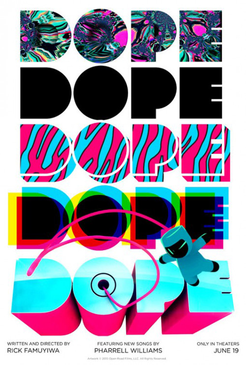 |
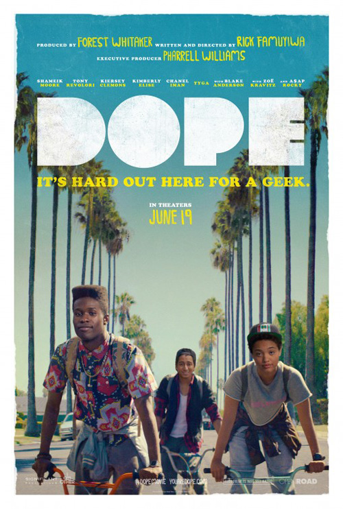
The epitome of hipster chic this month, however, has to be Gravillis Inc.‘s Dope (limited June 19) with its counter-less bulky sans lettering and naturally symmetric image. They give the white some grungy texture and alternate between the boldness of Cooper Black and the thin marker stroke used on the date and certain names at top. Something about the heads of the trio at bottom doesn’t quite match with their bodies, but the air of artifice enhances the heightened feel of the picture as a whole.
It’s definitely targeting a youthful demographic, something the teaser owns with its artistic box of flavors warping the logotype through patterns and dimensions. I adore number four with the cyan, magenta, and yellow letters overlapping to give us the black from number two as a welcome contrast to the loudness of both the kaleidoscope and zebra print. But you can’t not find the final iteration adorably cute too as its winking spaceman flies out to invite you to the show.
Minimal bliss
 |
 |
 |
 |
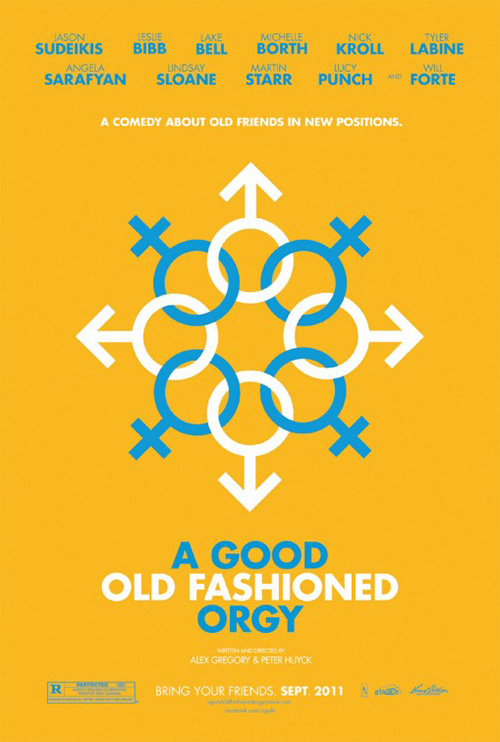 |
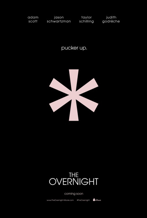
The idea is nothing new (see cold open’s Good Old Fashioned Orgy), but that doesn’t mean P+A haven’t used it to perfection on The Overnight (limited June 19). The asterisk paired with the tagline “Pucker up” conjures ideas of either someone’s mouth after eating something sour or—thanks to Community‘s Greendale logo—an anus clenching in the same situation or otherwise. Being that Adam Scott and Jason Schwartzman are top-billed, I’m going to guess the film’s a comedy and that the iconography leans towards the latter.
Would anyone let this stand as a finished poster? Probably not. The starkness thing with a minimalistic symbol is teaser material and the final sheet will most likely contain a collage of actors making bitter beer face or bracing for impact. As a tease, however, this definitely piques my intrigue.
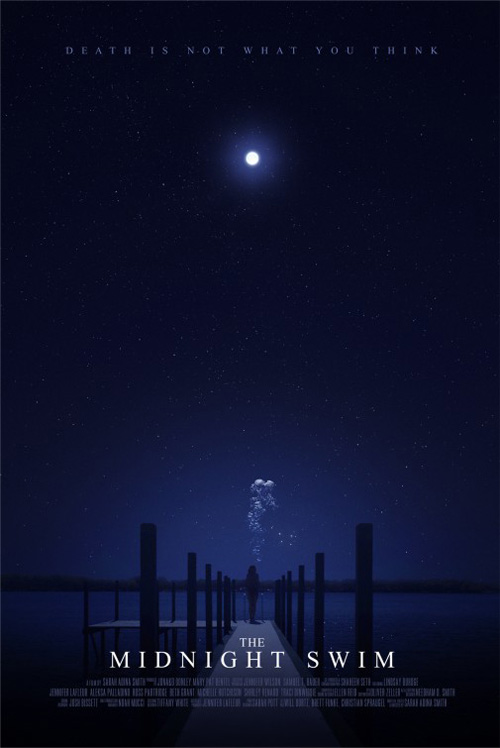
Leroy and Rose‘s Midnight Swim (limited June 26), on-the-other-hand, is most likely its finished work despite not displaying a release date. Not all independent features do considering theatrical releases beyond the festival scene are never a guarantee. This fact makes its simplicity that much more effective because it’s all about atmosphere and mood selling us rather than names or faces.
The content is beautiful its own right removed from the spiritual “Death is not what you think” tag pulling at emotions. It’s a gorgeous night scene with symmetry and a wealth of empty space drawing a straight line down the center from person to moon. The glow is warm in its cool blue and the stars suggest infinite possibility.
But the icing on the cake is that mass of air bubbles right above the actor’s head—bubbles a person would exhale when completely submerged in water. A small detail on paper, this addition to the scene changes everything as what was a view of ground and sky transforms into an overhead shot of a swimmer approaching a light in the distance.
 |
 |
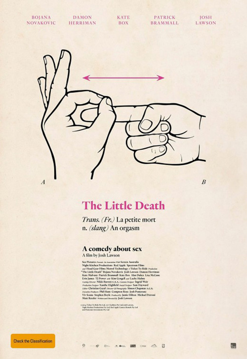
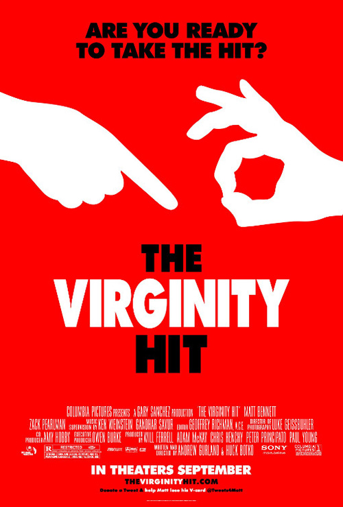
It may seem small, but the difference between The Little Death‘s (limited June 26) advert and that of The Virginity Hit is actually huge. There’s humor in both, but the latter is playful in a sort of “Can we?” way while the former goes clinical with dictionary definition and diagram bringing a whole other tone and awkwardness to act.
The reason it succeeds is because the designers went all in by mimicking an entry like you’d see in Webster’s and its ilk visually as well as contextually. A lesser piece would have placed the definition big on top as a tagline, forgotten the figure letters, and not aligned the production text in the same format. There’s not much happening, but this is far from lazy as it brings its concept to fruition with authenticity and planning.
It’s also chock full of character where Zero Degrees West‘s UK version is merely boxes of actors in humorous garb and expressions with text telling us what to think. It’s effective, but it’s just like everything else. Nothing about it stands out—least of all the changed name that recalls Californication‘s whipping boy “A Funny Little Thing Called Love”. That’s not a good thing.
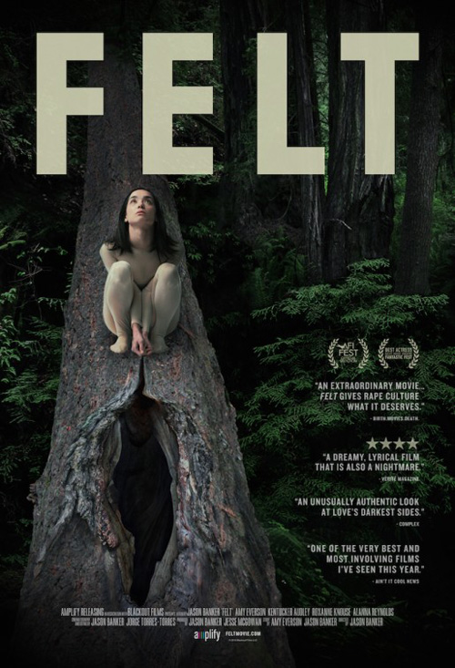 |
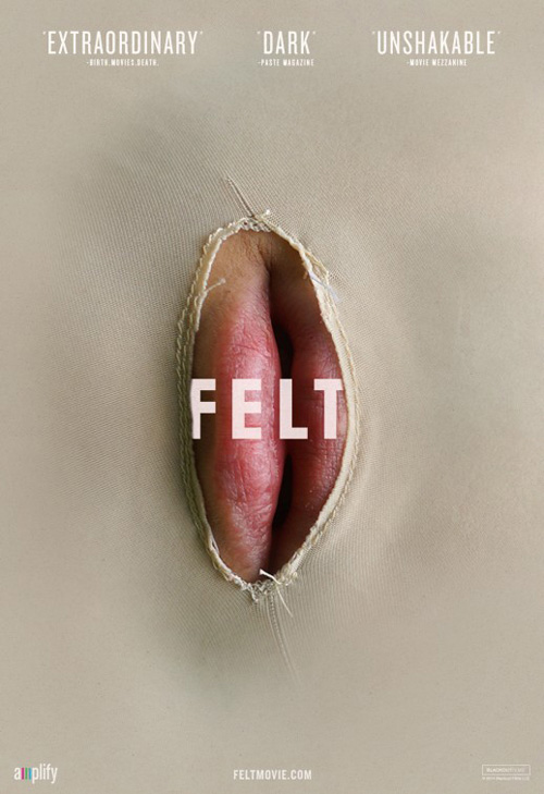
If you want provocative this month, though, you don’t have to go farther than Felt (limited June 26). This thing is so memorable that IMPAwards tweeted it with a disclaimer stating how it wasn’t NSFW despite looking like it was. They were correct to do so because a quick glance shows a vagina, much like the opening of the tree trunk below Amy Everson at right. They both demand you take a second look, discover what’s actually there, and memorize the title to ensure you gravitate towards it the next time you hear it or see it on a marquee.
Not only is the metaphor sound, but the composition is too. The covered mouth is dead center screaming out at you, pushing the title through its whole and protruding into your space as a result. Those one word reviews only enhance the aura and ratchet up anticipation.
I like the tree trunk one too even if it’s a more literal depiction. The title’s oppressive in its size and most likely intentionally so, but I wonder how the tree would look devoid of the text at right and centered like the mouth. Something about the letters dwarfing the impact of the dark forest and its allusions to the subject matter seems like a missed opportunity.
What is your favorite June release poster? What could have used a rework?