
“Don’t Judge a Book by Its Cover” is a proverb whose simple existence proves the fact impressionable souls will do so without fail. This monthly column focuses on the film industry’s willingness to capitalize on this truth, releasing one-sheets to serve as not representations of what audiences are to expect, but as propaganda to fill seats. Oftentimes they fail miserably.
Dust your awards season Bingo cards out because the season is in full swing and we have the festival favorites hitting multiplexes to prove it. That’s not saying there isn’t also an Alvin and the Chipmunks sequel entitled The Road Chip (December 18) for its inexplicably loyal fanbase or a repairing of Will Ferrell and Mark Wahlberg in Daddy’s Home (December 25) for those ignoring the Academy pomp and circumstance. We’d just rather pretend those two were pushed to January to free up more screens.
It’s hard to say no to a new Tina Fey/Amy Pohler starrer in Sisters (December 18) and yet I probably will as the films below make their way to town. Because let’s face it, the above three are made for the small screen whereas the new Quentin Tarantino and Alejandro González Iñárritu beg for the biggest one you can find. Their posters are doing their best to beckon you back to the theaters in which you saw them gracing the walls. So do it.
Character roulette
 |
 |
 |
 |
 |
 |
 |
 |
 |
 |
 |
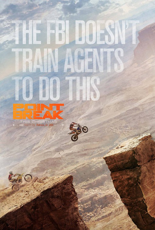 |
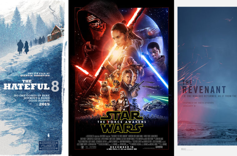
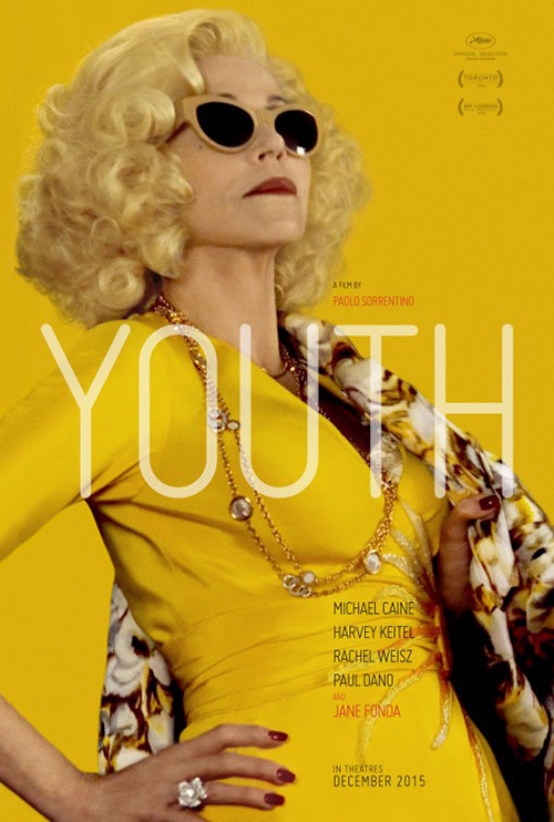
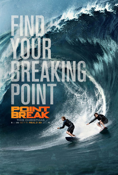
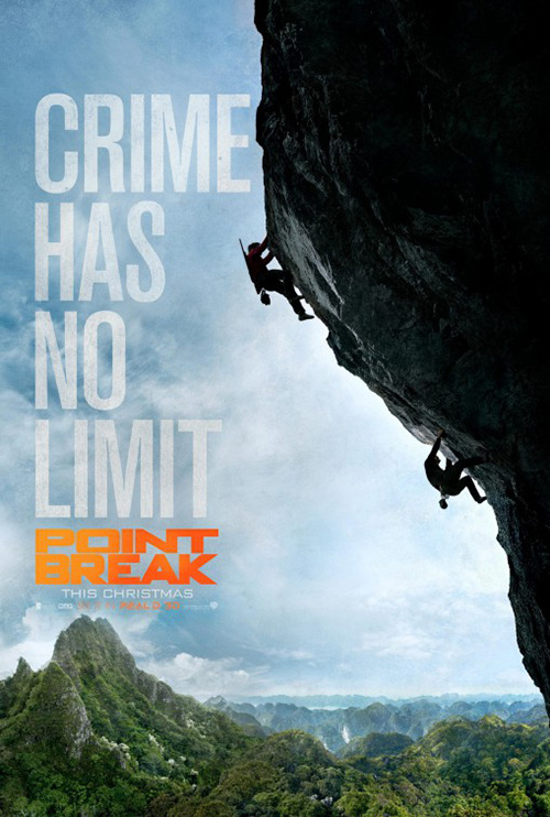
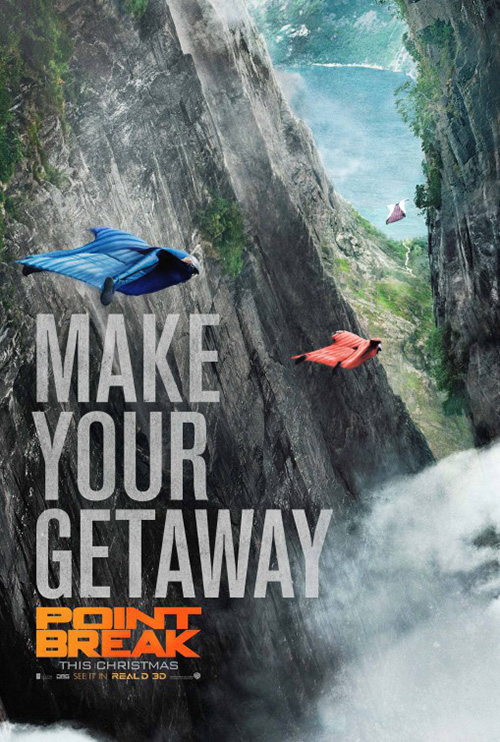
The character poster campaign is big business and it’s utilized by films both big and small—as evidenced here. Some use it for intrigue like Star Wars: The Force Awakens (December 18); some for facial recognition to draw audiences who know nothing of the work like Youth (limited December 4); and others to sell the product when neither of the above two options work as with the unnecessary remake of Point Break (December 25).
 |
 |
 |
 |
 |
 |
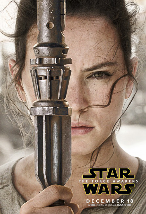
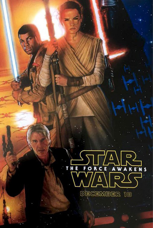
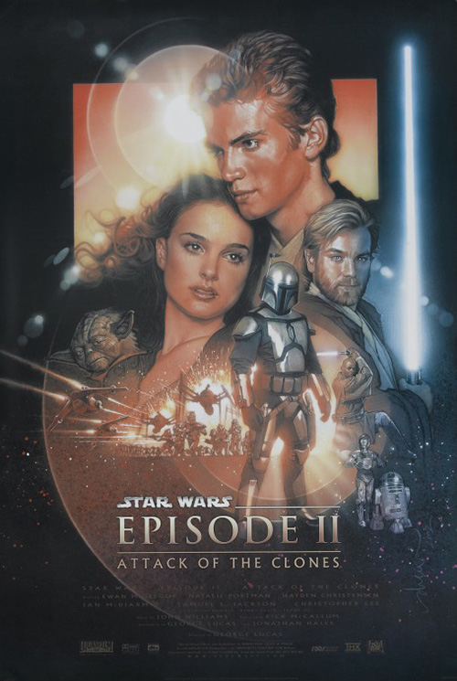
What eclipse did for Force Awakens is nothing short of magnificent as the covering of one eye for each character created a firestorm of rumors and speculation as to its meaning. AND WHY DIDN’T LUKE SKYWALKER GET ONE???
This fervor has a lot to do with the film being Star Wars, but don’t discredit what the firm did to create something cool alongside a Drew Struzan original like his old school painting of John Boyega, Daisy Ridley, and Harrison Ford. People want to see the different weaponry—the lightsaber colors, handles, guns, whatever. Any little inclusion that might not have been shown in detail before is a gift for this fandom. And it’s better than simply putting their mugs front and center for no purpose other than saying they’re in the film. Trust me, everyone knows who’s in this film.
 |
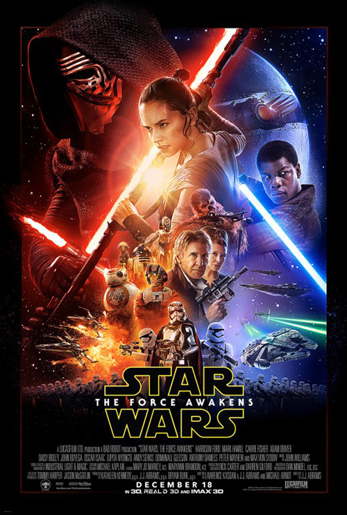
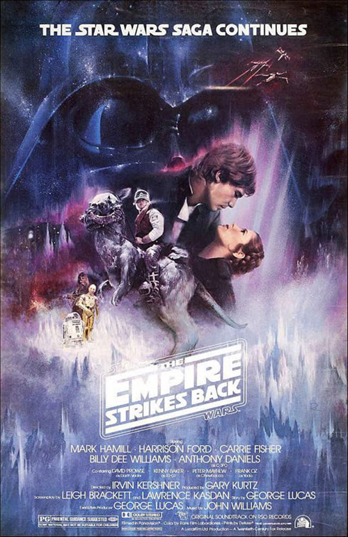
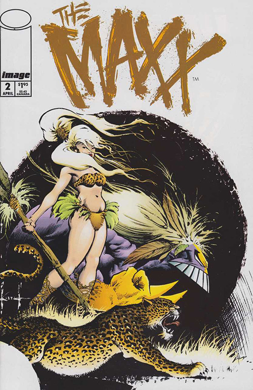
LA was still given the duty of making the requisite large-scale collage every big budget Hollywood behemoth is contractually obligated to deliver, though. It’s not bad as much as it is boring. But consistency is everything and both Empire Strikes Back and Attack of the Clones had one. So here you go. The same goes for Dan Mumford‘s Mondo-esque IMAX illustration: cool but familiar (see Julie Winters from The Maxx).
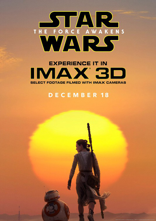
They’re all better than BLT Communications, LLC‘s hazy sun, though. Is this the cover for the forthcoming novelization? Can the logo be any bigger? Could the IMAX 3D for that matter? I just don’t see this thing actually going up at a movie theater when the others are available.
 |
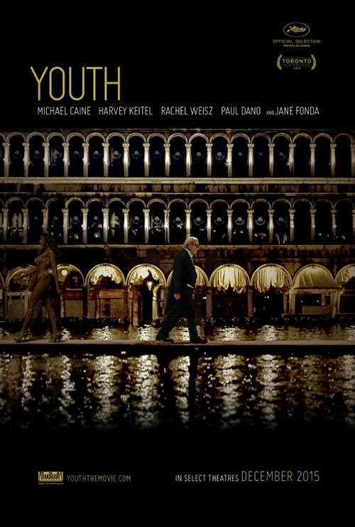 |
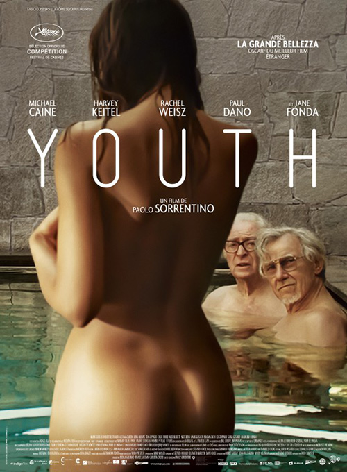
When you look at Le Cercle Noir‘s sheet for Youth you see some sex appeal for international audiences to distract from the painted(?) faces of Michael Caine and Harvey Keitel to the naked body’s right. Would it ever make its way onto walls in America? And would people care with two old guys oogling her? I’m not sure.
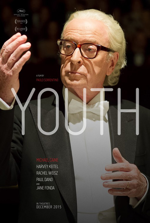
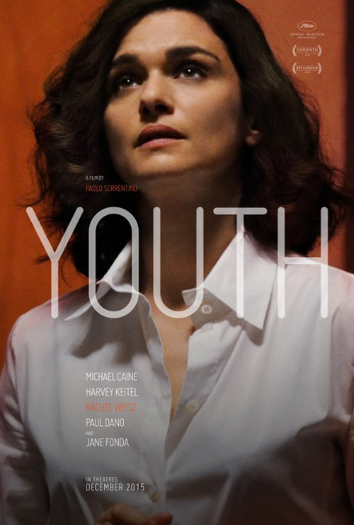
Fox Searchlight seems to have thought no as they went with a cool poster of an actor from a distance against a symmetrical geometric grid of curves behind him. Cool, but confusing. And while the names are listed you can’t tell who the actor is by sight. So they did the only thing they could by commissioning portraits with the title large for all to see.
If columns aren’t going to sell tickets you have to believe Caine, Keitel, Rachel Weisz, and Jane Fonda‘s mugs will. The bright colors help them pop; the modern, rounded font separates them from the usual sans serif; and the poses pique interest if nothing else. Just look at Fonda in yellow on yellow. I need to see the movie for this image’s context alone.
 |
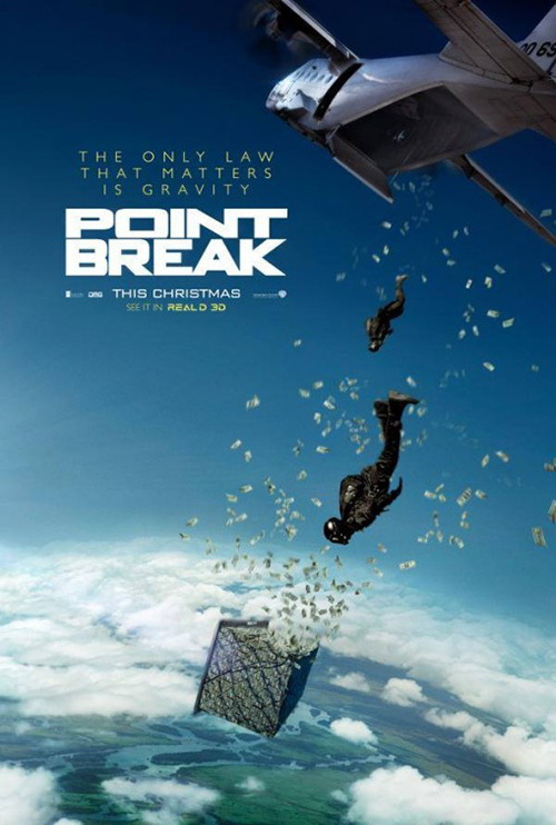 |
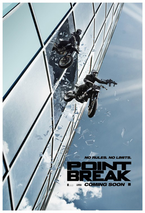
As for Point Break, I applaud Concept Arts and the studio for admitting to themselves that Édgar Ramírez—no matter how great an actor—and Luke Bracey are not going to sell tickets for a film they’ve already seen (eight times if you count The Fast and the Furious as an unofficial remake itself like I do). Nope, its box office hinges on the action so they’ve delivered surfing, climbing, base jumping, and cycling to the extreme.
It’s effective because I’m wondering what the sports have to do with a bank robbing gang of miscreants—it’s been a while since I saw Kathryn Bigelow‘s original, but I don’t recall this level of chaos. Even better than the tagline intrigue are the standalone posters that still refuse to make either star’s face visible. I love the angles and the fun, though. These guys are jumping with no regard for their safety put plenty for our sense of enjoyment … and now I want a Mountain Dew.
Leading the way
 |
 |
 |
 |
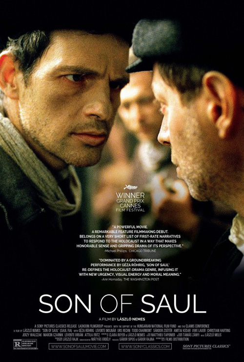 |
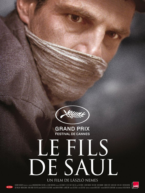
When character choices aren’t necessary either because of buzz or celebrity status, one good glimpse at the star is all you need. Géza Röhrig is not a household name, but it’s impossible not to be mesmerized by his gaze poking through a scarf on the international poster for Son of Saul (limited December 18). There’s sadness in his eyes along with fatigue and we need to know what it is that’s made him this way. He isn’t looking at us, but it’s less because he’s looking elsewhere as much as it’s an inability to bring his eyes up.
You really don’t need more than that image, the title in stark white, and one of the most prestigious laurels the industry has to offer. Signed, sealed, delivered—a must-see.
The American counterpart loses this intensity despite trying to manufacture more by giving Röhrig someone else to stare daggers at. The photo delivers a much different effect and the addition of more colors and characters muddle the whole. Here it is a winner at Cannes now and the laurels are a quarter of the size because the studio wanted soundbytes that are themselves so small no one would read them anyway.
For Joy (December 25), BLT supplies a teaser hitting everything necessary to be successful as the full sheet too. Star Jennifer Lawrence? Check. Large title? Check—and I like the eccentric font mixing rounded exterior corners with sharp interior counters. Cast and crew roster? Check and check. Heck, they even neglected to put David O. Russell‘s name on in case his behind the scenes infamy is too much for some to bear. Loving his movie titles is different than forgeting what his name signifies.
The image is appealing too mostly because it doesn’t just glamorize Lawrence and make her stare out with a pretty face and no context. Her looking up into the snow isn’t much, but it gives a sense of the hopeful nature her character’s rags to riches trajectory supplies. This is a woman looking into her future and basking in the possibilities no matter the inclement weather. Lemons into lemonade as it were.
 |
 |
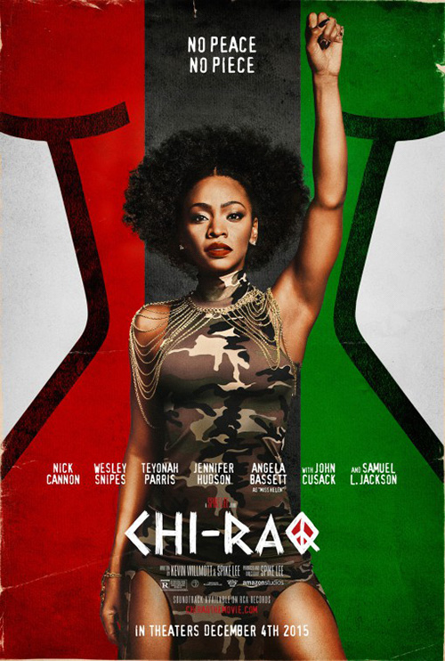
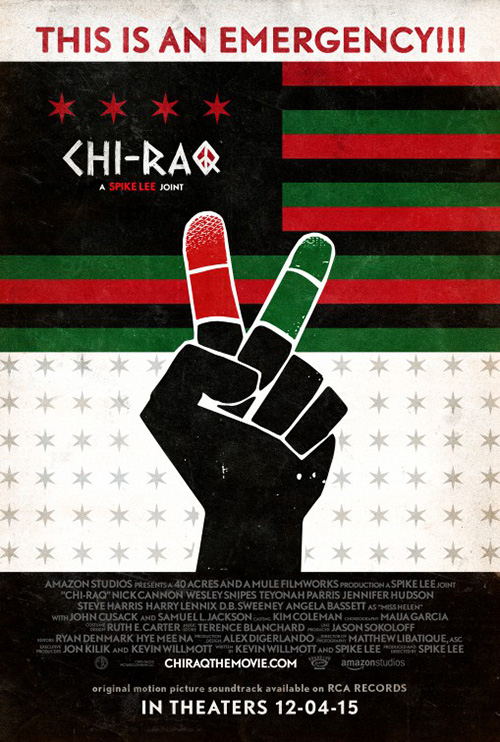
Teyonah Parris isn’t a name often placed next to Lawrence, but it might be yet after a great run in Mad Men has vaulted her to star status in Spike Lee‘s latest Chi-raq (limited December 4). Why she isn’t top-billed despite having her face front and center on everything, I don’t know. But she’s definitely soaking up the spotlight nonetheless.
I like this sheet by Gravillis Inc. because it combines the graphic/graffiti design of their tease with the straight photo filter of another. Using the black, green, and red of the Iraqi flag lends a unique flavor as well as the juxtaposition of the camouflage. Politics meet sex as someone other than the man with the gun gets to wield true power.
The logotype is fantastic too with its lack of curves and polish as well as the peace sign “Q”. It works great whether on a flag with iconic fist opening into its own symbol of peace or beneath Parris’ determined face painted over with her own message declaring no sex until the violence ends. Gravillis turned their pitch into a political campaign and it works perfectly.
 |
 |
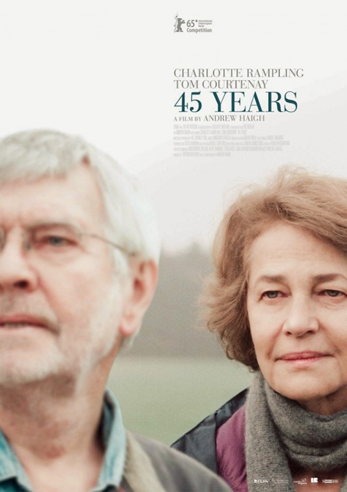
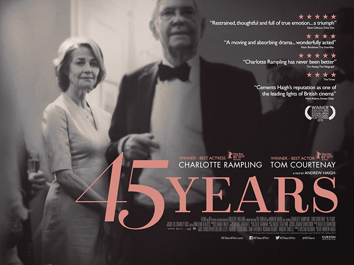
The last leading actor(s) in this section arrive in the form of Charlotte Rampling and Tom Courtenay for 45 Years (NY/LA December 23). With a carefully cropped film still of both, where one is sharp and the other not in shallow focus, we receive a compelling image that engulf our focus. I only wish the text at top did a better job complementing the photo because it ends up being too solid a box with closely kerned letters of an already hard to read font.
It’s a shame they didn’t take a page out of TEA – The Entertainment Agency‘s book by using the gorgeous font in their quad-sheet portraying a delicate wave of motion with its inherent elegance. What’s cool to see, however, is that the idea of Rampling being clearer than Courtenay remains despite both being blurred here. There’s still a slight differentiation drawing our eyes to her while he fades into the background.
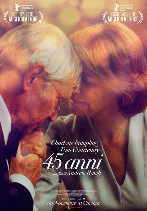
Both show a sense of separation—which the synopsis foreshadows by introducing the news that something from his past is about to derail their current lives. There’s still warmth involved though, as if the two are surprised rather than forlorn. So it’s interesting that Federico Mauro‘s European selection goes the opposite direction by putting the two together inside the love that appears to be threatened in the others. His is a nice emotionally resonate image of marriage shrouded in the glare of light as though we’re spying on an intimate moment now immortalized.
Title & image
 |
 |
 |
 |
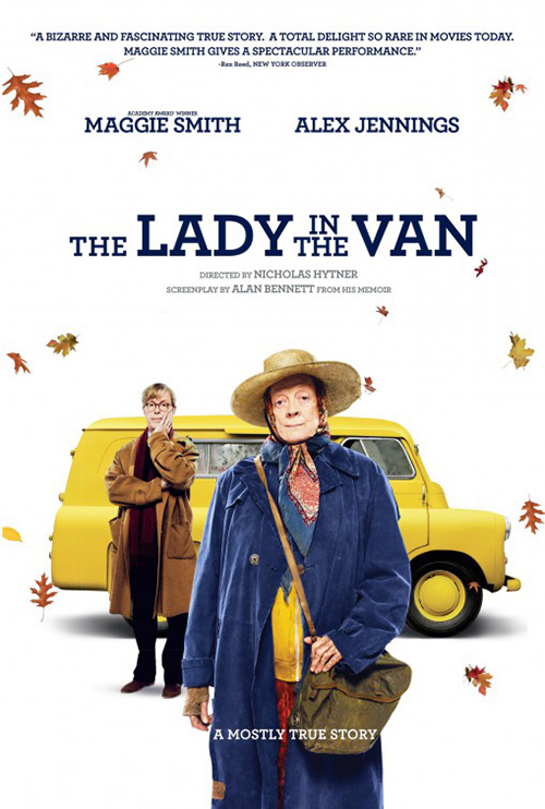 |
I feel like I shouldn’t enjoy the title box on Empire Design‘s The Lady in the Van (limited December 4) and yet I love it. The mix of two fonts, two sizes, the extreme width of the whole, and the addition of “A True Story” inside the top border line all point to excess. Maybe it’s the strange hybrid of playfulness and strength or that it stands by itself against white space above the bright yellow van, but it’s a great, self-contained entity.
The poster on the whole is uniquely suited to a world of photo-heavy artwork too by letting the comedy of the van at bottom play unencumbered. There’s Alex Jennings breathing heavy as he pushes this vehicle while Maggie Smith looks on from the comfort of the front seat. It’s a brilliant encapsulation the second version ruins with hierarchy.
So what if Smith is the star? She doesn’t need to be so much bigger. And if you’re going to make the title all one font while stacking the middle “In The” you have to do something else with that initial “The”. It throws the whole design off just hanging by itself at left when everything else is nicely compacted.
 |
 |
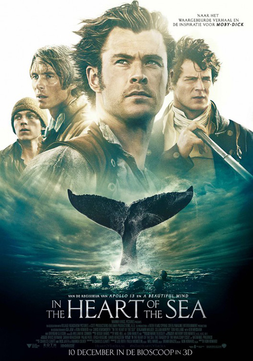 |
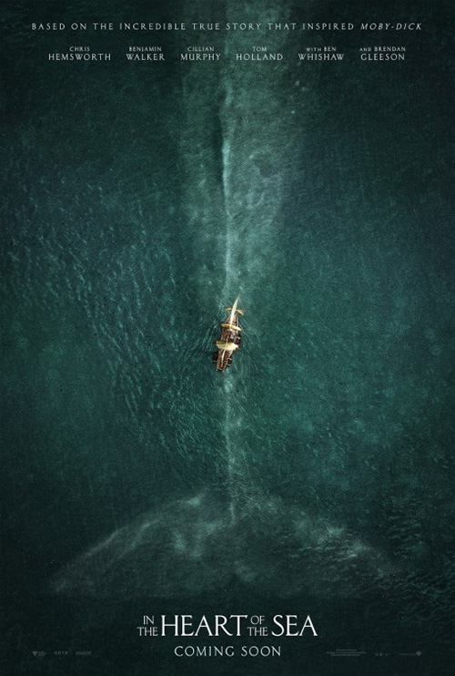
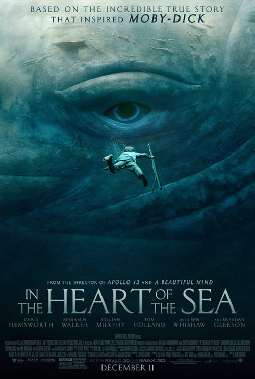
Sometimes starkness isn’t always literal white space, though. Sometimes the photo itself can become a minimal background on which everything else can rest like in WORKS ADV‘s In the Heart of the Sea (December 11). Here’s a grand expanse of water that shows us the fearsome scale of “Moby Dick” juxtaposed with the small vessel holding the stars we’re to watch on their adventure. The line of the whale’s back perfect bisects the page and acts as an arrow from title to cast. Less is definitely more.
The firm’s next sheet with Chris Hemsworth swimming up towards the whale’s eye is equally captivating in its scale. How could you not be frightened and enthralled by this image? The text gets bigger considering it’s no longer a teaser, but the focus is still man versus monster like it should.
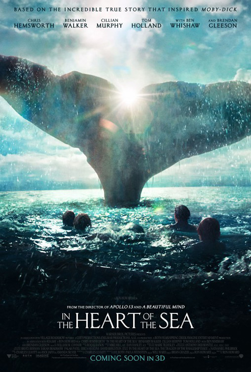
The Refinery on the other hand tries to put more in the frame by getting the whole cast involved underneath the creature’s tail fin. Credit to them for sticking to silhouettes on this one—the foreign poster prefers hamfisted portraiture instead—because it retains the fact that they aren’t necessarily the most important part of this story. The lens flare is a nice touch too by casting a fantastical, mythical filter of sunlight and awe-inspiring nature.
 |
 |
 |
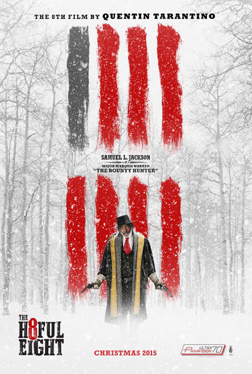 |
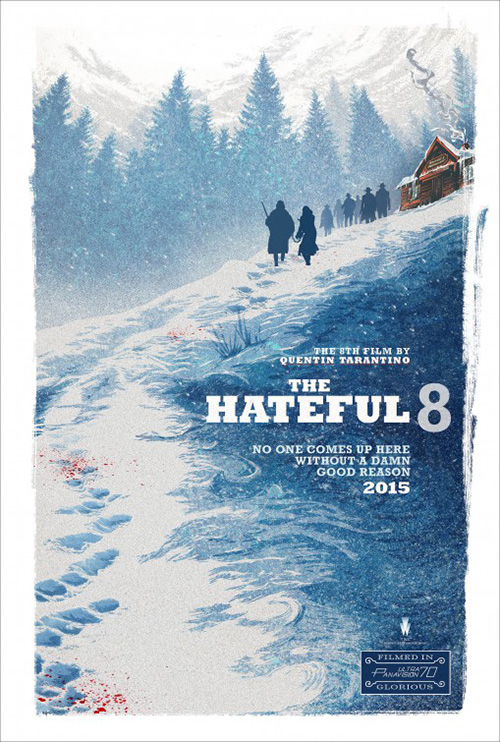
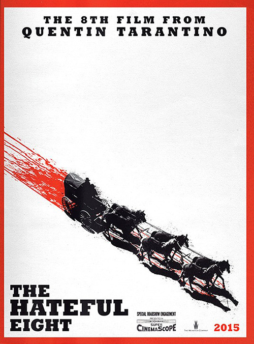
BLT’s The Hateful Eight (limited December 25) does a similar job as WORKS ADV in keeping the palette simple and the imagery vague. They go the illustrative route rather than photography and it lends a brilliant woodcut effect to match the old fashioned 70mm Panavision logo at bottom right. This thing oozes vintage appeal while ensuring our eyes move through the blue by latching onto each blood splatter until reaching the top cabin setting. Each silhouette is rendered an anonymous body about to engage in their violent game.
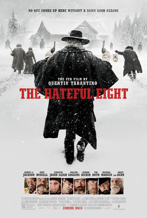
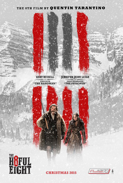
There’s plenty more mystery here than on the firm’s tease of a horse-drawn carriage trailing blood. The imagery on that is obviously jarring next to mainstream posters, but it doesn’t have the same texture or nuance. Even Leroy and Rose‘s photo-based entry has it by sticking to everyone’s back climbing up to the cabin. The red title pops off the otherwise greying snow and Samuel L. Jackson‘s dark coat proves an abyss to stare into. I don’t even mind the portraits at bottom because the cropping and expressions give each character.
And I’ll give special mention to Gravillis Inc.’s character sheet aesthetic. They take a boringly mundane practice and add some personalization by changing the backgrounds and the hash mark to demarcate each member of the title’s eight. I really hope there are no other actors involved in the entire film besides them.
 |
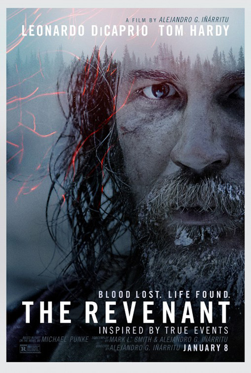 |
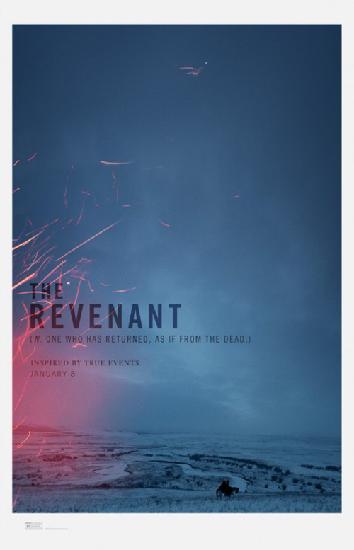
Minimalist glory this month goes to The Revenant (limited December 25), though. Not only is the coloring of the sky great in itself, but it also carries down the whole frame into the landscape and tiny horse ridden by whom we can assume is Leonardo DiCaprio and Tom Hardy. The frame’s soft in the corners for a Polaroid feel and the title/tag multiplies to let the background show through as though each letter cuts into the sky. Add the subtle crackle of fire to scratch its orange way across and this thing will get your heart pounding.
Trying to repurpose this look atop the actors unfortunately doesn’t quite succeed. I like the close cropping and the intense faces, but I think the designer would have been better off leaving the portraits whole. By cutting the tops off to showcase a horizon of trees loses some of that intensity. Rather than smacking us in the face, it gives an almost hopeful reprieve of light.
Atmosphere: before and after
 |
 |
 |
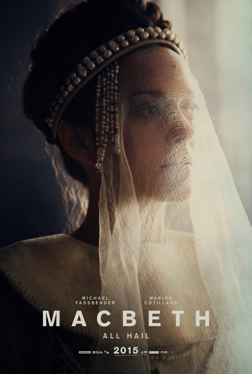 |
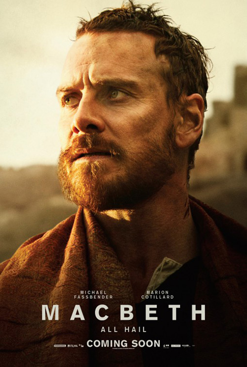
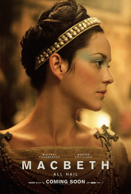
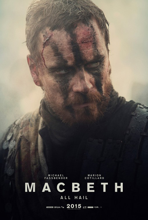
These obviously aren’t before and after photos, but the fact that each one has identical Macbeth (limited December 24) title boxes save the “Coming Soon” and “2015” makes it hard not to compare them directly with each other. You wonder how much post-production effects were added after principle photography—did the firm only have access to untouched images and that’s why the teases are so pristine and bland? It is night and day between each pair as the second coupling brings the pain and suffering of Shakespeare’s play to the forefront. They are straight out of a horror film and that atmosphere is what sold me on wanting to see it.
 |
 |
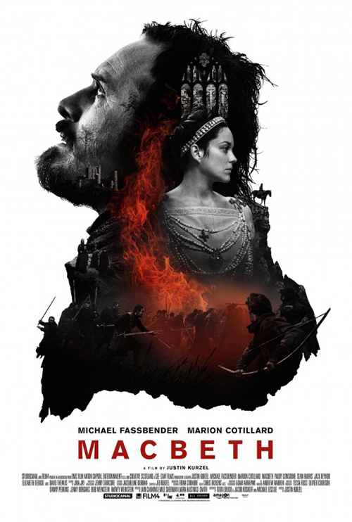
It definitely wasn’t the very weird and unlikeable collage inexplicably contained inside the frame of Michael Fassbender‘s profile with additional mini warriors crawling down his shoulders. What’s actually going on here? I have no inclination to dig in and discover the answer because the bright white is too distracting. It almost emits a blinding light that makes everything in the middle fade into itself as a black shadow without definition.
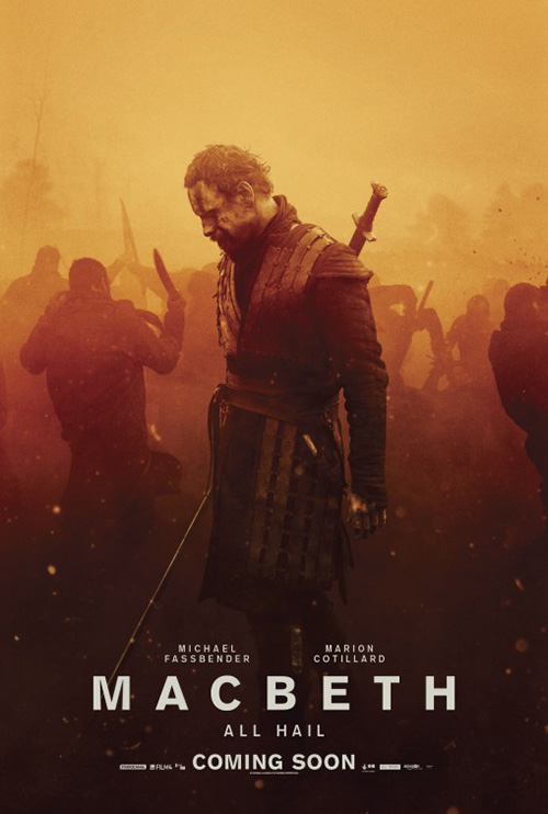
That white is a killer. Just look at the warm coloring of another poster with Fassbender lamenting the tragedy surrounding him on a battlefield with fighters who are actually there. The mood is back and my want to enter the frame and watch the carnage has returned. I want to see this broodingly dark adaptation, not the bright and shiny one caught in sunlight with blemish-free faces.
What is your favorite December release poster? What could have used a rework?