
“Don’t Judge a Book by Its Cover” is a proverb whose simple existence proves the fact impressionable souls will do so without fail. This monthly column focuses on the film industry’s willingness to capitalize on this truth, releasing one-sheets to serve as not representations of what audiences are to expect, but as propaganda to fill seats. Oftentimes they fail miserably.
Is it just me or has 2015 really shown an increase in the disparity between Hollywood studio-driven marketing and that of the independents? There’s no one to blame but the producers because the same design firms are working on both. The artists obviously have it in them to wow us, so someone must be tying their hands for the generic mediocrity we’re supplied in lieu of unbridled creativity.
I’m forced yet again to place the bigger releases here as afterthoughts of uninspired theatrics [Fantastic Four (August 7)], god-awful color schemes that assault the senses with transparent floating faces [The Man from U.N.C.L.E. (August 14)], the drably obvious [Straight Outta Compton (August 14)], and could-have-been-betters [American Ultra (August 21)].
Well, I do actually like the latter example’s graffiti work. It’s the character sheets of Jesse Eisenberg and Kristen Stewart smoking up that put me to sleep.
That reminds me of the time …
 |
 |
 |
 |
 |
 |
 |
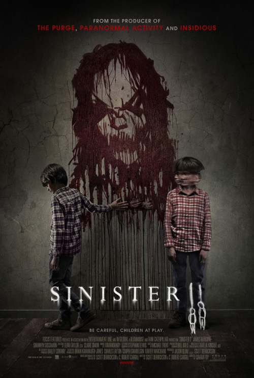
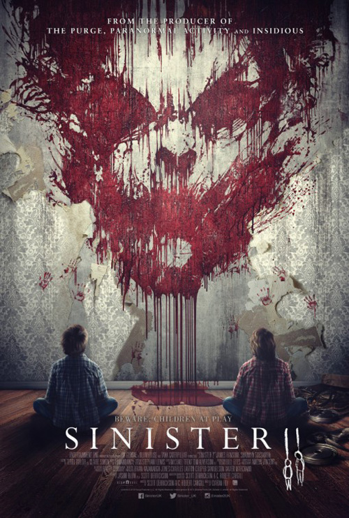
That’s not to say there isn’t a wide release worth mentioning, even if it’s for playing copycat like Sinister 2 (August 21). I might be cheating by lamenting how a sequel’s poster could dare look exactly like its predecessor, but here we are regardless.
My issue is the new design being so exacting to BLT Communications, LLC‘s original that it comes off as smug. Let’s put two kids with hands on the wall spreading the ink of their victimizer to match the dual sketches of hanging bodies. It’s the same font, same menacing sneer, and possibly the same arm/hand dressed in a new sleeve.
At least that one equals the creepy factor of its mirror rather than the second entry, which loses its impact by zooming out and adding superfluity. What I loved about this giant scrawl is that we’re enveloped by it as soon as our eyes meet his. The remix not only lightens his visage and cleans up the excess seeping away from the contours of his face, but it adds those two children again. Why have us watch them look at him instead of looking at him ourselves? Why would you remove that visceral connection?
 |
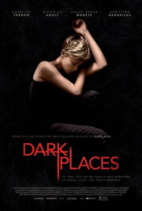
Dark Places (limited August 7) is different—as are the next two—in that it merely resembles another poster rather than purposefully seeking to copy it. I like the piece and its deep blackness swallowing Charlize Theron into its center, consuming her like the memories Libby Day has endured for more than two decades. The red title pops nicely and its sharp sans font complements the chiaroscuro flesh above, but I’m not sure what’s happening with the random line extensions. I wonder if there was a reason for them or simply a desire to not feel static. It’s distracting.
The first time I saw the sheet my mind drifted to Crew Creative Advertising‘s Birth, falsely remembering it as Nicole Kidman in matching fetal position. It’s not, but the color scheme and stark shadows are virtually identical. My memory was right to conjure it, just wrong as far as why.
 |
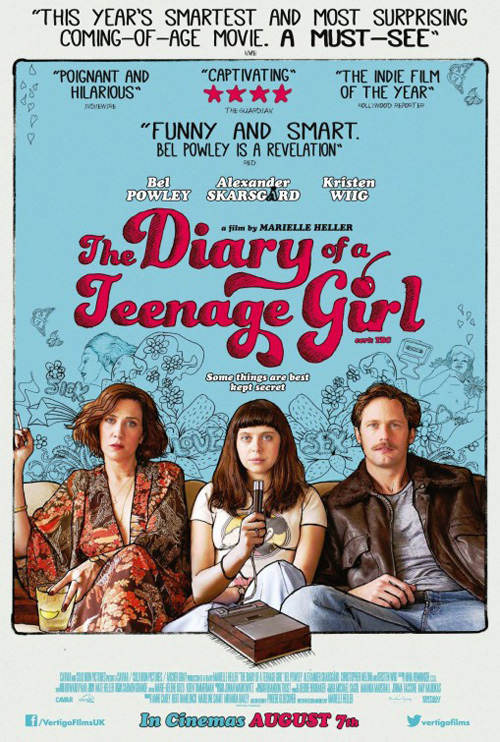 |
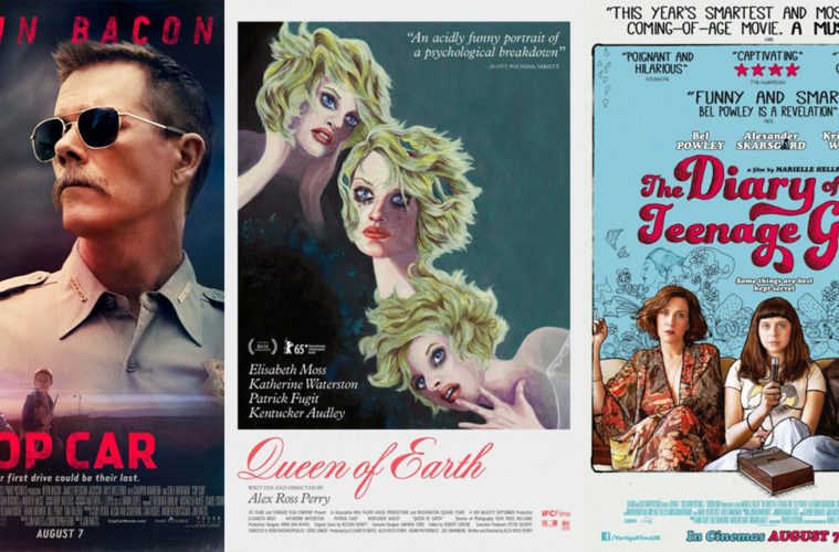
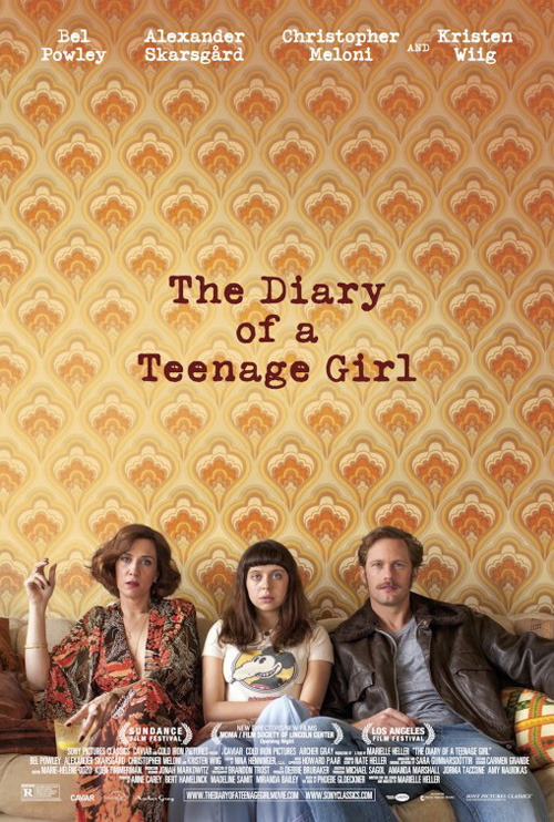
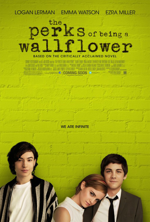
Where Diary of a Teenage Girl (limited August 7) looks like BLT’s Perks of Being a Wallflower is the result of their subject matter and clichéd design sensibilities. There’s something inherently attractive about the use of expansive negative space—more than is possible in the former’s instance since their living room wall would probably end where the title is—to dwarf the focal point below. The wallpaper’s uniformity begs for us to find something different and unique to spy. And the same goes with Perks‘ bricks. We must look at the actors because there’s little else as compelling.
Despite being an effective, albeit over-used, decision, I prefer the more personal touch of Diary‘s hand-drawn alternate. It puts us into the titular girl’s mind/page to witness her doodles and learn something about her beyond the blank stare of boredom shared with those on either side. There’s a whimsy to offset the hipster awkwardness and I adore the thickly inked lines highlighting the photography to make it almost seem three-dimensional.
 |
 |
 |
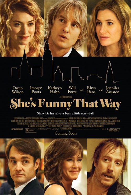
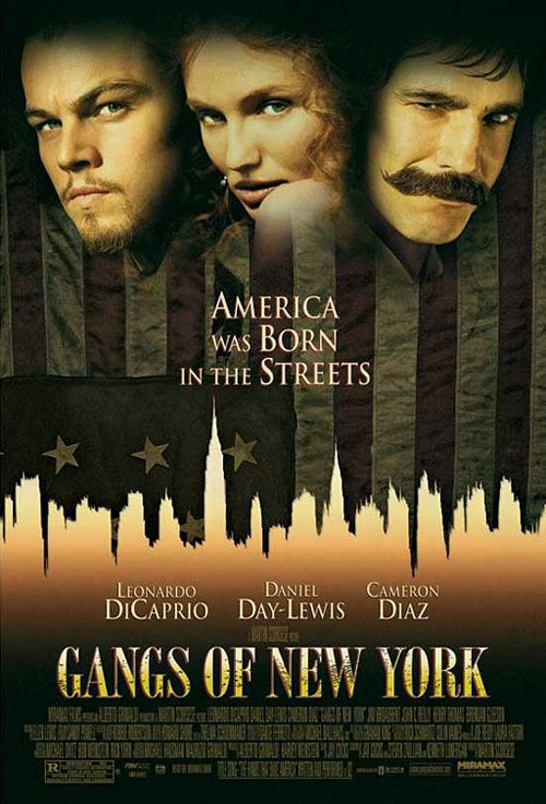
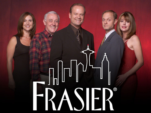
The mundane-ness of She’s Funny That Way (limited August 14) is so ubiquitous that I cannot pull the one poster I know it lifts from out of my memory. I thought it was a couple different films only to discover they were different variations on the blocked actor portraits with black and gold hues. Finally I settled upon Gangs of New York and the logo from Frasier as the most relevant comparisons of the many I’m sure you will start listing off right now. The colors and motifs are the types of buzzworthy attributes obnoxious clients ask for because they can’t comprehend they want them because they’re everywhere else.
I don’t love the crudely minimalized illustration of its French sheet under the name Broadway Therapy, but it at least grabs our attention with a style not found in a design program’s stable of do-it-yourself templates. There’s life to its imperfect line-work and its font’s incongruous middle points ascending into the air. Who knew you could recognize faces when they weren’t closely cropped stills looking in all directions but at each other or us?
Standing on the edge
 |
 |
 |
 |
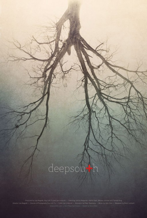 |
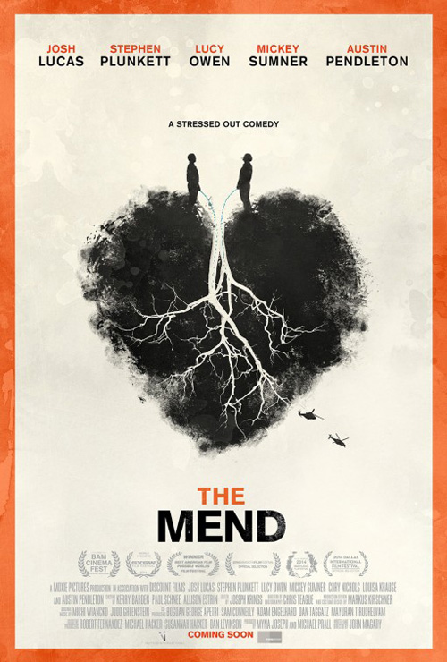
Moving on towards the indie sheets unafraid to experiment and provide something fresh comes Bravo Design Inc.‘s The Mend (limited August 28). What’s great about this poster is its deceptive humor. At first you see the delicately illustrated heart with tree roots that resemble a pair of human lungs—similar to the pretty Deep South ad from a couple years back.
Only afterwards do you notice the two figures at top urinating into its open veins. The rough charcoal intricacies juxtaposed with such a crass act can’t help but spark something in you. Love it or hate it, it’s hard to forget. Just don’t ask me about the helicopters because they are so out of place I’m already unable to stop my eye from landing on them before looking away.
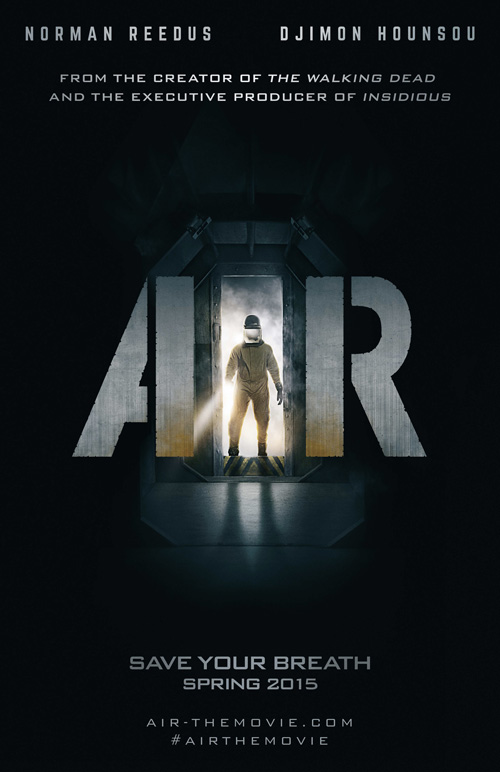 |
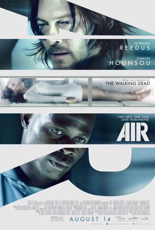
Air (limited August 14) is a bit of an anomaly in its decision to use its title as window frames for images because it actually takes advantage of the space each letter provides. Usually the entire word would expose a single image for no other reason than it being an interesting way to give us text and photo simultaneously. With just three letters to Air, however, each can become its own field.
The designers take advantage by utilizing their individual spaces. They play on the angle of the “A” with Norman Reedus looking down and the right leg of the “R” with Djimon Hounsou following suit as the thinness of the “I” perfectly contains Sandrine Holt‘s sleeping body. It may not be overly dramatic like the illuminated door of the teaser, but it definitely tells more of a story to stand alone opposite an already existing wealth of high contrast black and white at the multiplexes.
Similarly The Boland Design Company takes special care with Autumn de Wilde‘s photography to let it frame Meru‘s (limited August 14) expanse of natural beauty while also portraying the craziness of what this climber is doing. The crop gives us a sense of scale and space by placing us inside the shot. I want to reach out and grab the cliff face before vertigo sets in and I fall.
My favorite part is a much more minute detail. I absolutely love the tiny corner of the “U” disappearing behind the rock. The artist could have easily shrunk the name to fit the whole thing in the middle, but he/she took the chance to really bring it together as one cohesive whole. It, coupled with the perspective of the wall, sucks us in with legitimate depth.
 |
 |
 |
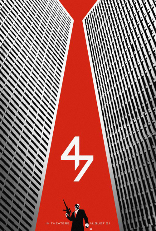
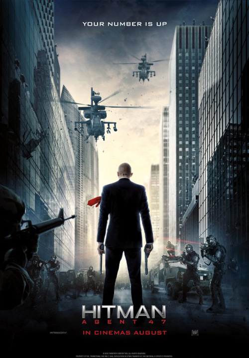
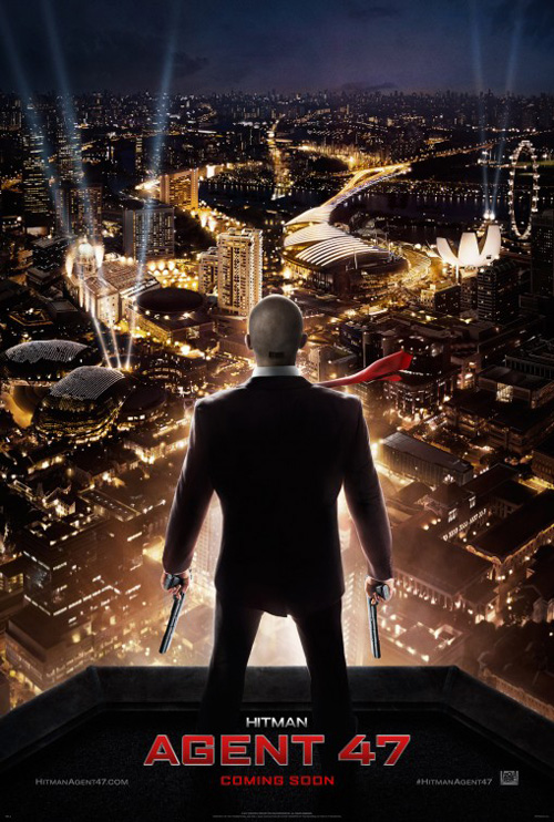
Special mention in this section goes to Hitman: Agent 47 (August 21) because it’s a major studio (Fox) letting BOND have some fun. Its tease knows exactly what fans of the videogame franchise would find recognizable: its bald headed antihero and his bright red tie. This movie existing proves this fan base is alive and well because the original film couldn’t have made enough money to green light a sequel on its own.
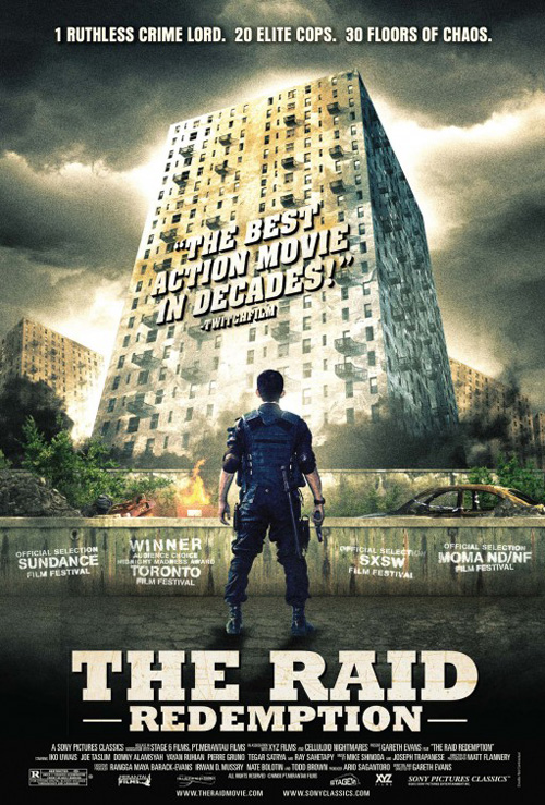
Its graphic nature with its dual use of the larger tie as iconography and sky between two skyscrapers is a definite departure from most work churned out today. Heck, BOND was even forced to deliver a couple photo-centric entries mimicking The Raid‘s third-person shooter aesthetic that’s become an action norm. What those two are truly missing, though, is the attractive “47” insignia of the first. It’s z-axis mirroring is an optical illusion of sorts and a brilliant focal point to subliminally earworm into our brains.
Drawing pictures
 |
 |
 |
 |
 |
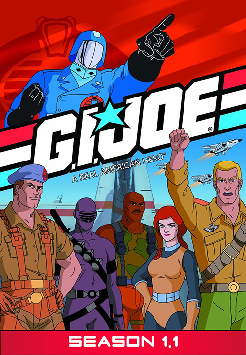 |
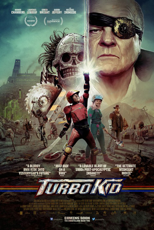
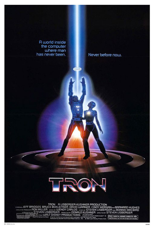
This month’s Drew Struzan award goes to The Robot Eye‘s Turbo Kid (limited August 28). From the collage of characters on the ground to the looming faces in the sky, everything is painted with photo-realistic quality that never tries to mask its brushstrokes. The design content’s morphing of Tron and G.I. Joe also provides a wave of nostalgia—a powerful sensation that ensures viewers will want to see exactly what the film brings.
Each critic blurb seems well-represented too considering Michael Ironside is looking very One-Eyed Willy from The Goonies and the metal masked man behind him straight out of Mad Max. Sign me up for this film’s “80s insanity” right now.
 |
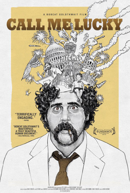
Stripping down the artwork angle to outline is Vodka Creative‘s use of Jesse Vital‘s drawing for Call Me Lucky (limited August 7). It’s a brilliantly cartoonish collage of motion and insanity coming out of a man who looks as though he’s just been hypnotized. The gradient detail in his face contrasting the simpler line work elsewhere also helps point our attention at what really matters.
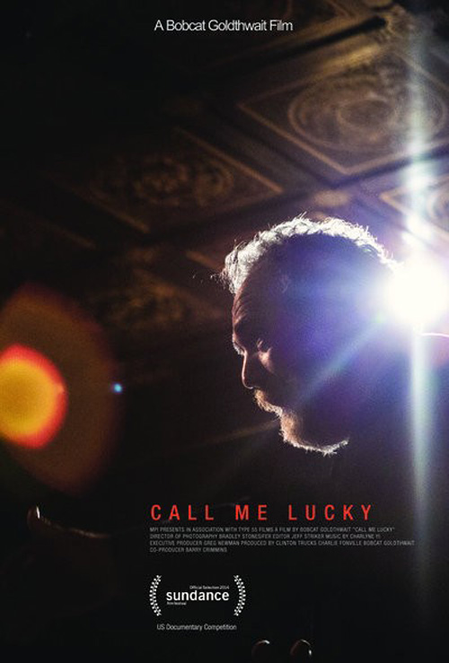
While a fun sheet and potentially more appropriate for the subject matter, I prefer the film’s alternate Sundance advert. The photo selection is captivating with its washed out light aura blowing out the color of an otherwise heavily saturated scene. And the left justification of all the text starting closer to center than the page’s edge adds a nice visual change of pace that has me wanting to chop off the left third and enjoy it super thin.
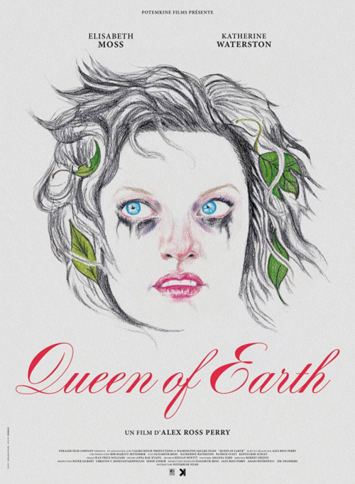 |
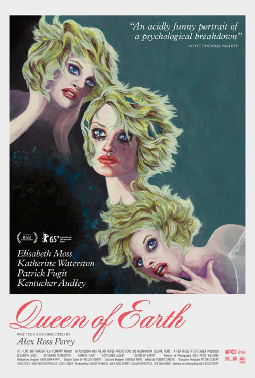
Where Vital’s artwork delivers an infectious joy, the artwork utilized by Queen of the Earth (limited August 26) is much, much different. The grotesque representation of Elisabeth Moss in triptych sets a darker mood. It’s not quite photo-real portraiture also helps put us in the mindset that we’re looking through a warped lens of her psychological breakdown. It’s her and not at the same time—a nightmarish filter placed atop reality that no still or glamour shot could recreate.
The foreign sheet—composed of pencil drawing with colored leaves, eyes, and lips—is equally jarring in its sparseness. And like the previous entry, its use of a pristine script font for the title showcases a kind of “control” of normalcy that Moss’ character has obvious lost her grip on. Elegance meets chaos.
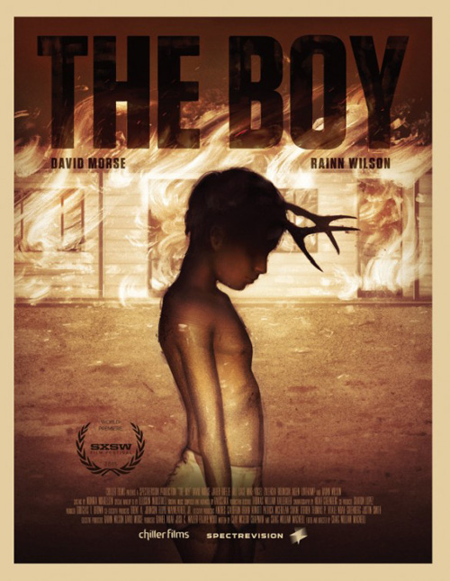
The Boy (limited August 14) takes this darkness one step further by embracing it completely in a show of hellish proportions tempered by the innocence of a child. While David Morse would fit the tone, Rainn Wilson wouldn’t. So it’s a smart move to not rely on actor recognition to sell its mood—especially when the muted yellow of fire and brimstone does it infinitely better.
Its imagery’s construction is very cool from the deep blacks of shadows to the speckled yellow of brushstrokes missing their mark. The flames in the background are created by pigment subtraction; the house scratched and wiped away so the path behind can manifest translucent waves. Putting the dark title on top with a multiply filter allowing those streaks to show through only adds to its unsettling nature. It’s an unforgettable art piece re-appropriated for commercial use.
Singular sensations
 |
 |
 |
These next three posters are by far my favorites of the month. They’re not necessarily the most classically attractive, but they’re definitely unlike anything else you’ll be seeing under lights in your hometown.
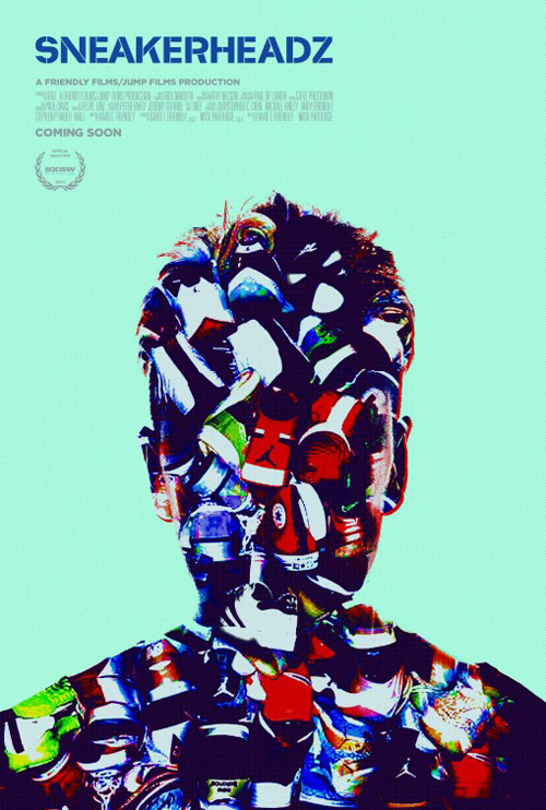
First up is Sneakerheadz (limited August 7) and its silhouette built from sneakers. It isn’t some measured mountain, though, where each size and shape is selected specifically to create the body’s contours. It’s a mishmash of overlaps that the shape crops.
The colors are brightly assaulting and yet grungy like a Xerox copy that’s gone through the machine five times too many. I even like the stencil-y title font unnecessarily breaking up the letters even though the rest of the text—in the same font—doesn’t. The whole is eerily gripping and undeniably unique.
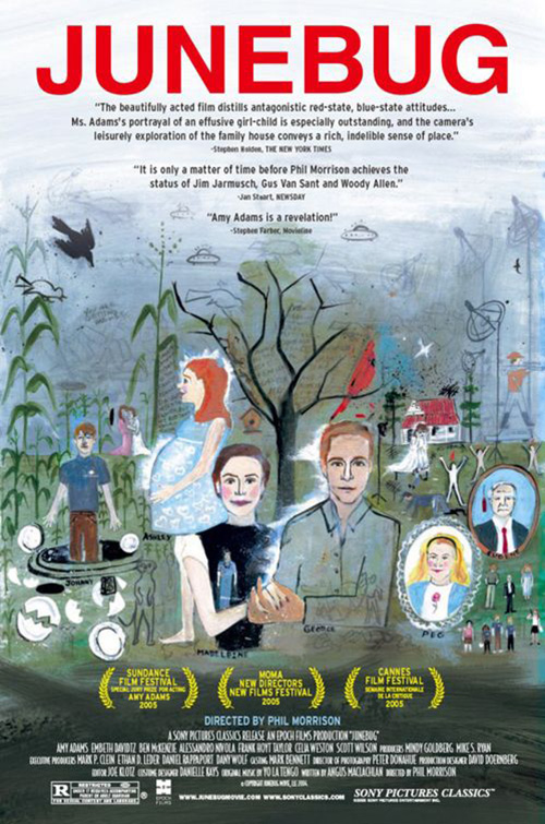 |
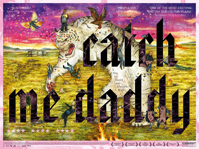
That’s not to say the second—Mu Pan‘s Catch Me Daddy (limited August 7)—isn’t. This thing is Cardinal Communications USA‘s Junebug on crack and it is viciously captivating to the point I wouldn’t be surprised to see it hanging on a gallery wall. I hate the font choices at the top for the critic blurbs and middle for director, but everything else is a delightfully hellish “I Spy” of carnage, carcasses, and butterflies.
It’s the juxtaposition of the soft paint strokes against the razor sharp, gothic-tinged Old English lettering of the title that gives it its power. The black inverts the colors of what it overlaps for an even more other-worldlier feel than the image conjures on its own. I’m lost in its nooks and crannies each time I look, discovering new details that reignite my imagination to wonder how it relates to what’s onscreen.
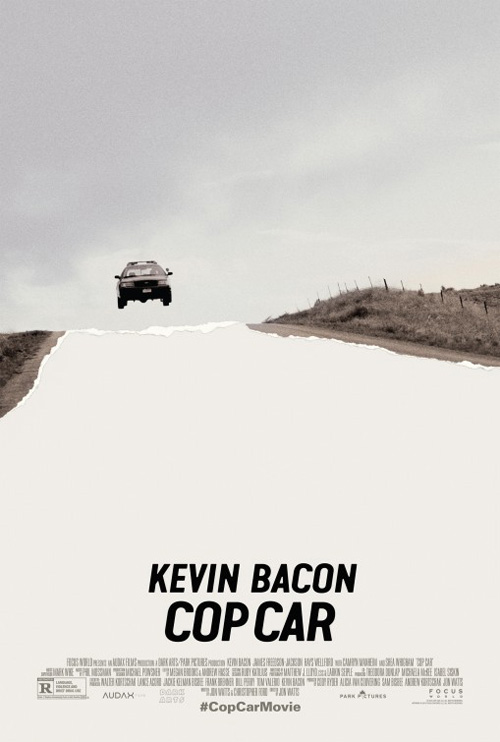
Despite those singular aesthetics, though, I’m still a sucker for minimalism and Cop Car (limited August 7) delivers. On first glance you think it’s merely a photographed still showing the titular car bouncing over a hill with way too much air underneath. It’s a greying sky and lightened road intersected by the horizon line—or is it?
 |
Finally the torn edges come into focus and you realize the road is actually missing. Ripped away so the car hovers above an abyss of the unknown, the piece becomes anything but simple. The only thing I can think might make it better is if the empty white was textured with a faux brick wall so it looks even more like the bottom half is truly gone. But that might make it too busy—the white is probably best.
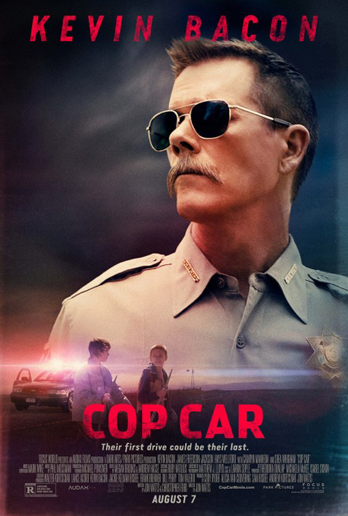
No offense to Kevin Bacon, but his mug isn’t close to equaling its impact by comparison.
What is your favorite August release poster? What could have used a rework?