
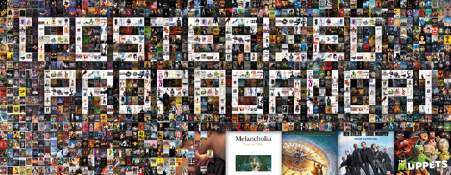
“Don’t Judge a Book by Its Cover” is a proverb whose simple existence proves the fact impressionable souls will do so without fail. This monthly column focuses on the film industry’s willingness to capitalize on this truth, releasing one-sheets to serve as not representations of what audiences are to expect, but as propaganda to fill seats. Oftentimes they fail miserably.
—
Hark! The holidays are upon us!
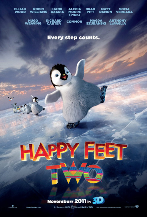
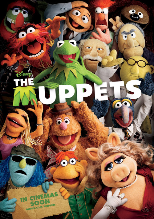
While that signifies the beginning of what should be the glorious awards season flood of quality work only the lucky few of us attending film festivals have seen, it also means time for family-friendly matinees. Dancing penguins and Muppets return as DiCaprio cultivates yet another accent for a veteran director only to end up watching someone else take the golden statue next February.
Sadly, it’s a very poor month for posters, though, as the kiddies generally receive work erring on the less inspired side of caution. The rest of November’s releases do thankfully contain a couple of intriguing designs mixed in—hell, even those sparkling vampires learned what asymmetrical composition is …
Character posters, anyone?
 |
 |
 |
 |
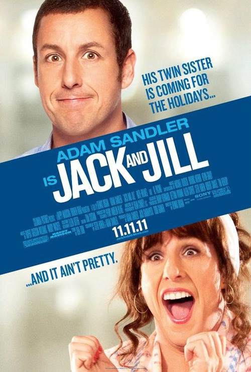 |
Who thought Jack and Jill (open November 11) was a good idea? Whoever had the unfortunate task to advertise this debacle at ARSONAL should be given a reprieve and as far as the American entry is concerned, they deserve it. What else could you really do with a concept of Adam Sandler playing his twin sister? Slap the faces on a sheet, throw the credit list in the middle, and take a nice long shower to wash that unclean feeling away.
Well, ARSONAL’s Spanish branch decided it wasn’t good enough. They decided to not only put some characters into a scene that screams fabrication, but also airbrush the hell out of them. Sandler A is way too giddy in the pool and Sandler B is shrugging his shoulders like it’s the punchline expression to a horrible laugh-track sitcom. And what’s with Katie Holmes? Could they have made her head look any more out of place on that body?
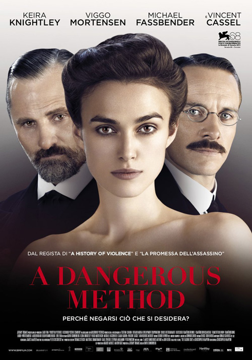 |
If only they could have used a bit of the class from this intriguingly gorgeous sheet for A Dangerous Method (limited November 23). It really is amazing what can be accomplished with simple effects like transparency filters.
Two posters with the same subject—a shot of Keira Knightley flanked on either end by Michael Fassbender and Viggo Mortensen—and yet they have completely different feels. Whereas one barely escapes the horror of floating heads by its simplicity of concept, the other nails the psychological angle of the film perfectly. Still floating heads on the surface, the combination of each actor’s head into Knightley’s speaks volumes for the film itself. And it doesn’t look too shabby on the artistic front either.
 |
 |
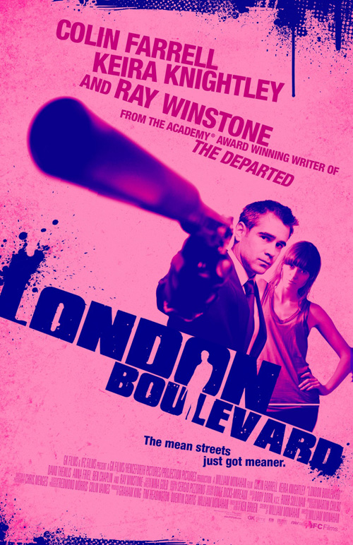
And moving along to another of the actress’s films, while people will harp on about artists’ over-use of filters and aesthetic reappropriation, I do believe the poster for London Boulevard (limited November 11) succeeds in both. Exuding a Guy Ritchie vibe and utilizing the long angled barrel of a gun for in-your-face effect, the dirty and crude design works to grab your attention alongside a color palette that somewhat subverts the subject depicted. I would have liked the font at the top to embrace the style more than its skewed sans serif, but perhaps it would have become too busy. Either way, the cliché works for me.
But if you are looking to see how filtering and digital manipulation can truly alter an image’s tone, look no further than WORKS ADV and Bill Gold’s J. Edgar (limited November 9 and open November 11). Coupling the intensity of Leonardo DiCaprio’s face with the gentle slopes of the title’s cursive gives the poster an interesting dynamic.
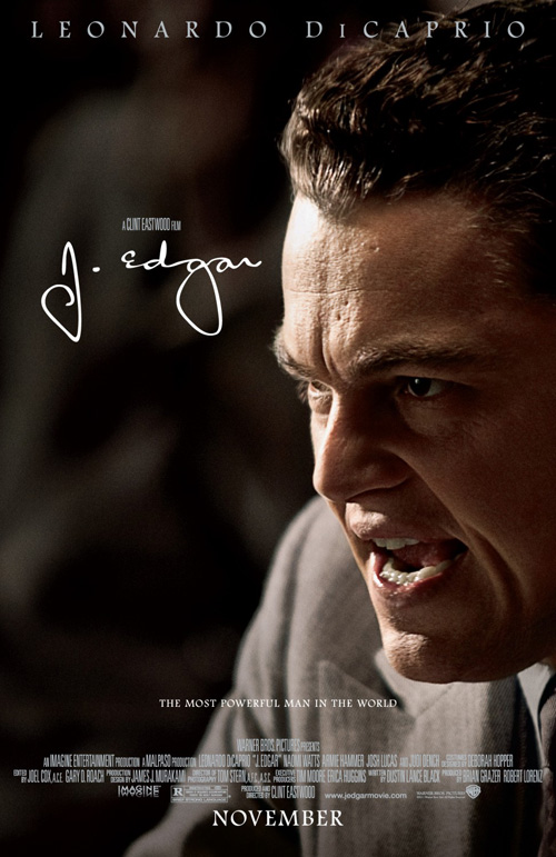 |
Despite that, though, it still is merely a photograph covered with text. So why not make it a little more patriotic? Yes, it is fully on the nose in terms of topic, but I kind of like the old halftone/newspaper feel of the image and the roughly textured stripes of red and white behind it. The text drowns a bit in comparison to the white on dark of the untouched design, but that’s okay. The purpose of the work is to scream America and the CIA’s father. To that end it is directly on the mark.
Kids love Thanksgiving
 |
 |
 |
 |
One of my—if not the—favorite films this year somehow falls victim to the character poster too. And it isn’t done well.
 |
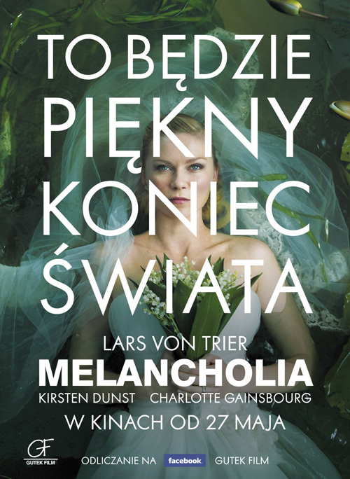 |
Melancholia (limited November 11) is fantastic in scope and aesthetic with an opening prologue that contains a slew of brilliantly composed images ripe for the picking. But rather than go that route, OTMentertain decides to frame the actors in a thin white line while they look into the sky—the same tagline used for all. I see absolutely no use for these when you have great shots like Kirsten Dunst in her wedding dress.
And while the foreign poster uses the umpteenth example of covering an image with sans serif white text—an element that is slowly eating away at me no matter how much I enjoy it—the original one-sheet for Cannes uses the still perfectly. I love the bright white background, the small windowed image, and the black border at its edge. Resembling a book cover, I can see it blown up on easels outside the theatre door, beckoning you in for its tale of Biblical-scale apocalypse.
Another festival film’s poster—Alexander Payne’s The Descendants (limited November 18)—comes to mind as far as minimal scope is concerned. Diving into the mental aspect of the film’s central plotline of a father dealing with his two young daughters after the death of his wife, Mojo beautiful constructs an image with his pensive hope to understand their needs as they play in the distance. The movement into the image is powerful and the simplicity of its elements a wonderful example of economy by using only the necessary pieces to portray its message.
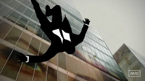 |
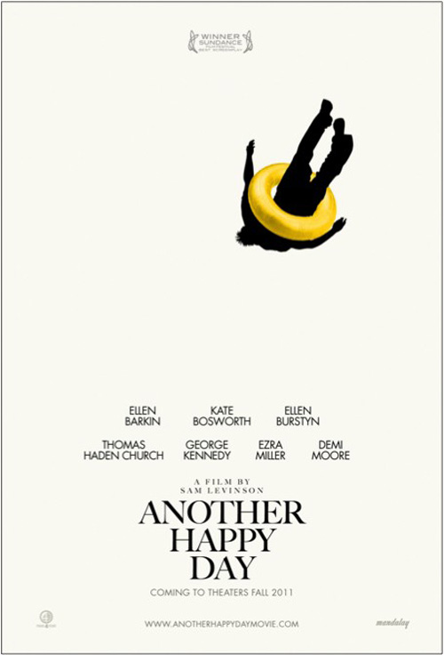
But if you really want an economy of design, look no further than my favorite two adverts of the month. The first being for Another Happy Day (limited November 18), its blank canvas with only a silhouetted male figure falling at top right is magical in its use of space. Reminiscent of the title sequence from AMC’s “Mad Men”, the black and white palette gives it a sophisticated style that uses its bright yellow intertube as a playful reprieve. With your eye drawn automatically to the colorful flourish, it slowly falls like this man to eventually settle upon the title below.
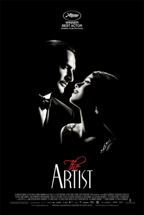
And with that comes one of the most stunning examples of artistry this year in the classy sheet for The Artist (limited November 23). Portraying its silent film aesthetic through the brightly lit chiaroscuro of its lead actors’ faces, the contrast is riveting. The font of ‘Artist’ is sophisticated as it mirrors the contours of the faces above it and the use of red is a beacon for attention. I abhor Scriptina as a font—well, at least its overuse—but even it’s ‘The’ seems right at home. More a testament to the design than the font itself, this poster helps me remember that effective art does still exist in the industry.
What is your favorite November release poster? What could have used a rework?