“Don’t Judge a Book by Its Cover” is a proverb whose simple existence proves the fact impressionable souls will do so without fail. This monthly column focuses on the film industry’s willingness to capitalize on this truth, releasing one-sheets to serve as not representations of what audiences are to expect, but as propaganda to fill seats. Oftentimes they fail miserably.
—
We’ve come to March and still no posters to really write home about. The season of blockbuster tent poles and their litany of character posters begins, proving once more that a studio can never throw too much marketing cash behind a film already over budget to the point it has no shot of breaking even.
There are a lot of independent releases on the slate along with some names from 2011 festivals, so don’t think it’s a month solely for big Hollywood studios. The sad reality, however, is that their outside-the-system synthesis didn’t find room for out-of-the-box design. We can always hope the coming summer season brings some glory—hah!
Copying doesn’t always work
 |
 |
 |
 |
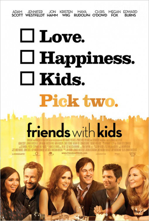 |
This poster for Friends with Kids (limited March 9) is so familiar that I can’t even make my brain recall an example to compare it with. Through the little boxes aligned off-kilter on a slant—for no other reason than the designer to say “it’s more exciting”—we’re shown Jon Hamm‘s huge mug as though he’s the star when in fact he and Kristen Wiig‘s coupling is seen less than all others. It’s as though the studio needed something right away and all the artists could grab were film stills and clip art of NYC.
Bemis Balkind at least tries something different, but the execution is all wrong. The check boxes are way too big and the melding of tinted actors at the bottom is so unrealistic that I’d almost rather have the boxes back. A choice of either photo or graphic was needed … make a teaser with only the multiple choice question to pique interest and than give us the reveal. Looking at pretty people smiling as though having kids is a cakewalk actually goes against the film’s plot. I’ve been lucky enough to have seen the film, but sadly I’m not sure the artists have.
 |
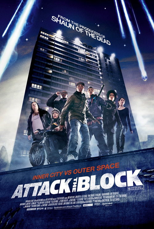 |
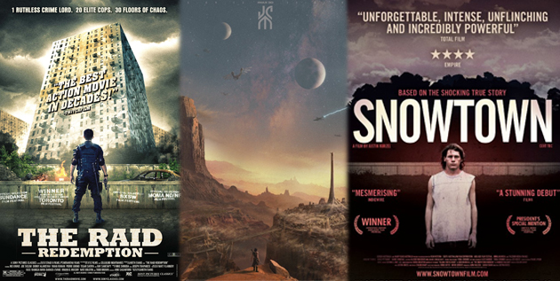
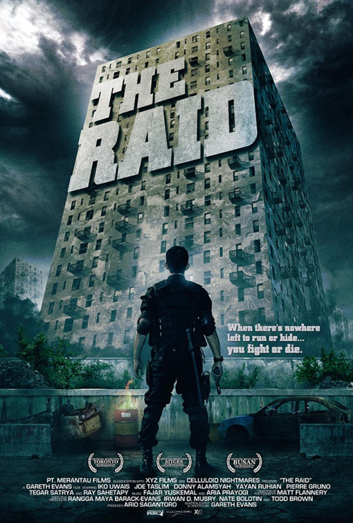
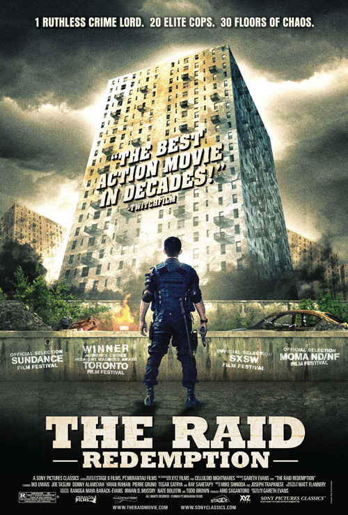
It’s hard to say whether copying was done here but the similarity between The Raid: Redemption (limited March 23) and Attack the Block is uncanny. Released within the confines of the same year, the level of intensity is much higher in the more gritty actioner. Both displaying the high-rise locale of their respective films in the background, the Indonesian actioner leaves our hero with his back turned to the audience. He is ready to enter the fray and bust some heads while the collaged cast of the British sci-fi horror stand ready to protect.
I have no idea why Hollywood found the need to add ‘Redemption’ as a subtitle since it’s completely unnecessary, but whatever. My main concern making the newest poster an inferior copy of the one seen during TIFF is the removal of the title treatment’s slick perspective on the building side. Replaced by a quote while the title resides normally below, the effect is diminished and the imagery much less appealing.
 |
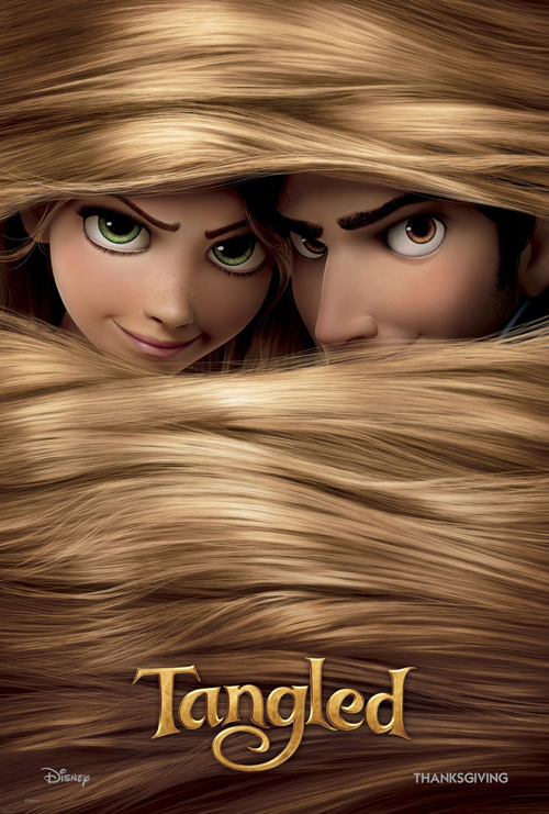 |
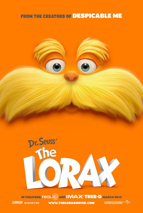
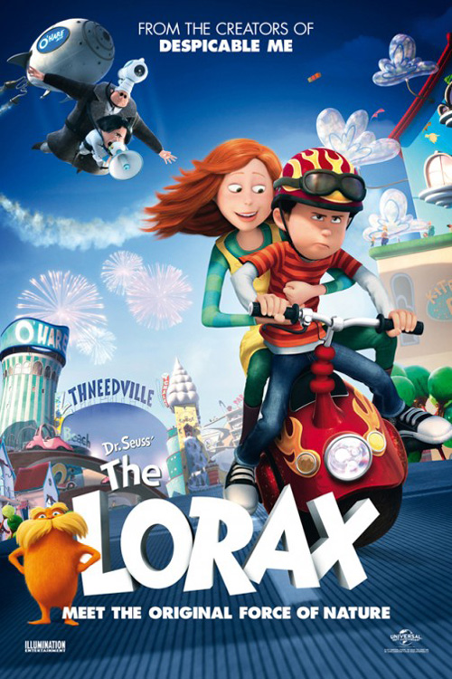
The same goes for the full one-sheet of The Lorax (open March 2) and its lack of excitement when compared to the teaser’s full bleed orange. Much like eclipse did with Tangled, The Arterie singles out its main character’s key attribute and lets it speak for itself.
I understand wanting to showcase the cuteness of Ted, Audrey, and Mr. O’Hare inside the plastic world of Thneedville, but there is something stunningly simple about the Lorax’s moustache isolated as a calling card for a Dr. Seuss story many know and love. It’s as recognizable as Rapunzel’s hair and the bright color allows for one’s full attention when posted alongside photography-based samples at a theater. And the three-dimensional, overlapping white letters of the name fit perfectly with the children’s theme.
 |
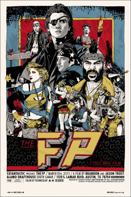
More parity like this is needed at the multiplex in order to them a fair shake. I’d generally follow such a statement up by applauding alternative artists like Tyler Stout and his Mondo Tees work for Drafthouse Films, but despite having three of his posters on my wall, I must admit his style is wearing thin.
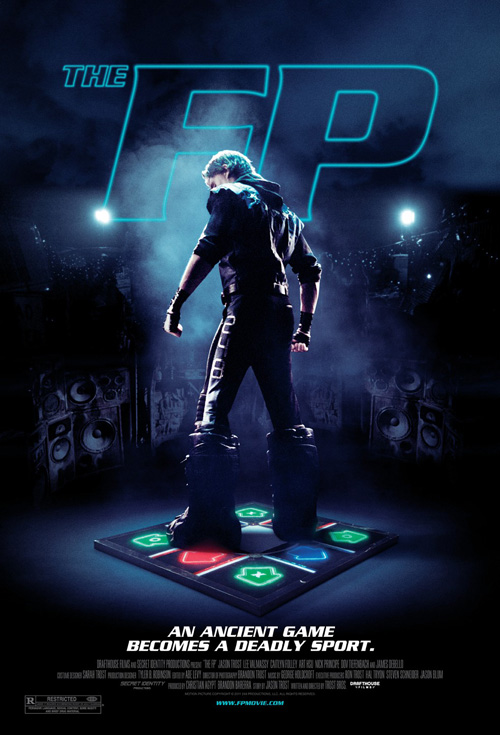
An interesting choice to accept Stout’s work as the main advertising art for The FP (limited March 16), I can’t help but be intrigued by the more common design of its Tron-like counterpart. The neon light font is cool and seeing this man looking like he’s straight out of The Warriors while standing on a Dance Dance Revolution pad can’t help but pique your interest. Playing into the absurdity of the movie’s plot, sometimes a direct representation can become more effective than an artist’s original work in a style we’ve come to expect.
Flood the market and hope something sticks
 |
 |
 |
 |
 |
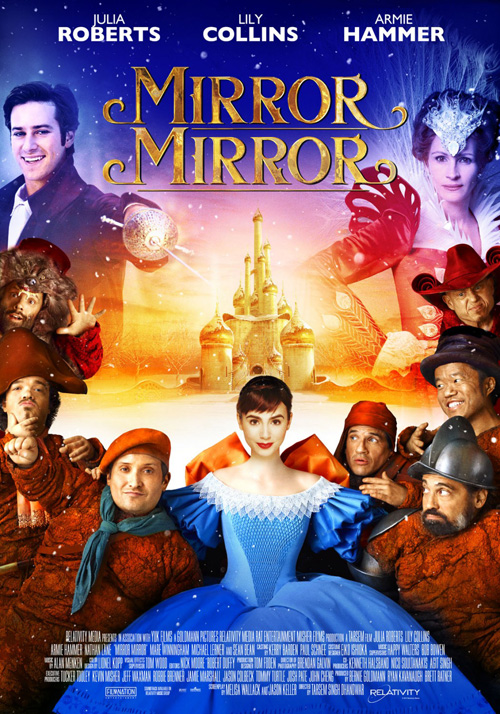 |
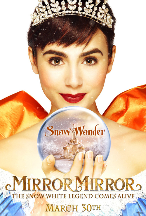
I still have high hopes for Mirror Mirror (open March 30) due to Tarsem Singh‘s name in its director’s slot, but I’m not sure about Iconisus L&Y – Visual Communication Systems‘ marketing campaign. Julia Roberts is a face to put front and center and Lily Collins is doing her best to channel Audrey Hepburn, but the whole aesthetic is too bland considering how visually sumptuous this work should end up being.
The font choice on the taglines is lame and the title treatment seems to be wasting the easy yet effective opportunity to play with the ‘mirror’ concept. And it all falls apart horribly when you put the leads together with the seven dwarfs and Arabian looking castle. There is absolutely no creativity in any of these and it’s a real shame.
 |
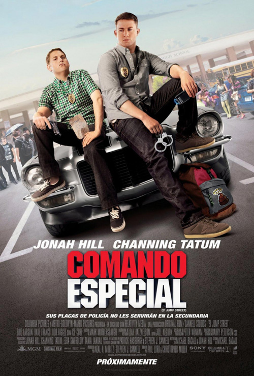 |
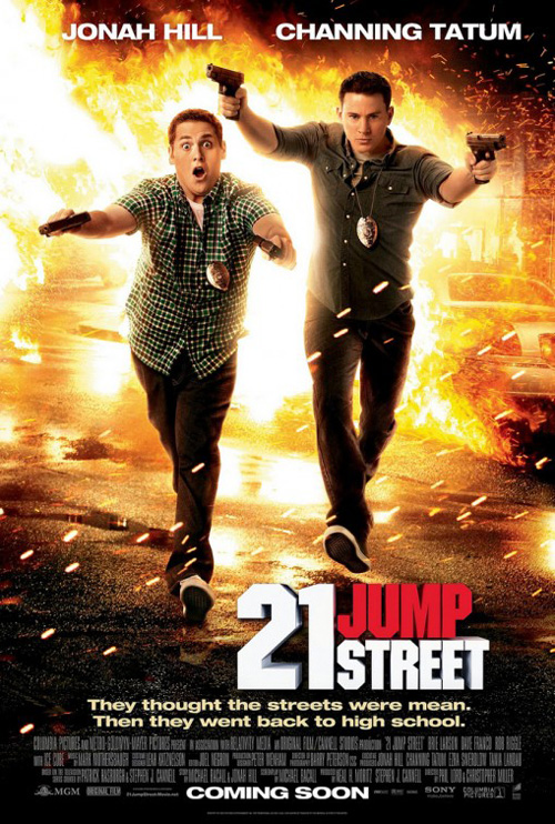
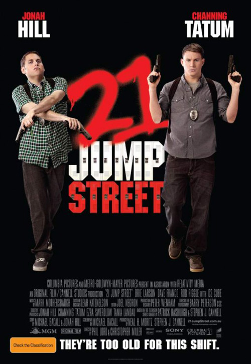
Moving on to 21 Jump Street (open March 16), the word creativity isn’t one anyone expects to utter. I’ve seen the film—and it is really funny—but there isn’t much you can do in the advertising besides what BLT & Associates have in putting its two stars Jonah Hill and Channing Tatum in the usual buddy action type poses.
I like the font treatment on this poster much better than the lame, 80s spray paint and locker motif of the other and the fiery effects at the back work brilliantly with Hill’s goofy face. It has some movement and excitement where the other two examples become bland cutouts of completely different postures with the exact same heads. There is literally no change in Hill’s expression from one to the other but the awesome title translation Comando Especial makes up for any lameness on the artwork.
 |
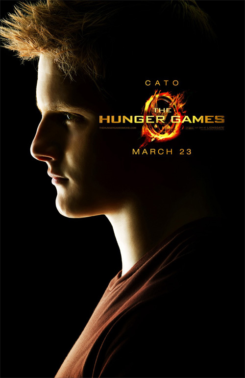 |
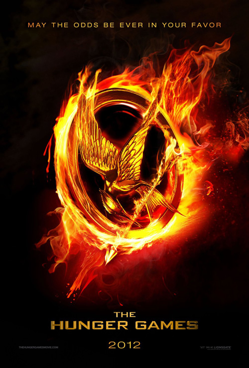
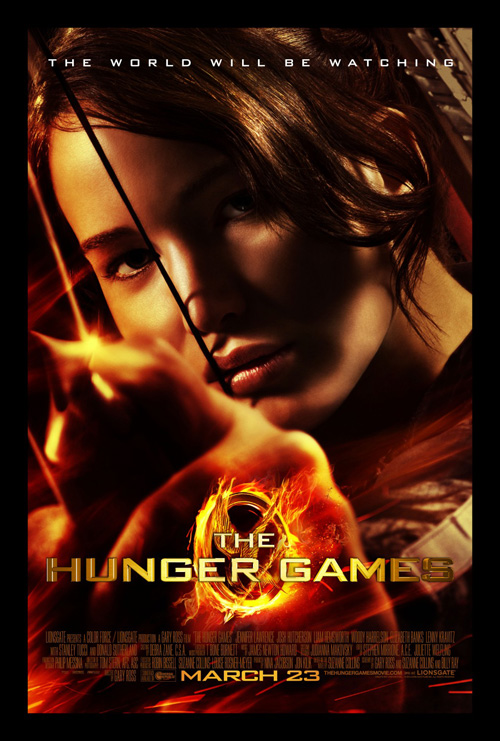
But while these two fail to succeed in doing anything more than the bare minimum, the next two have some flair. Yes, The Hunger Games (open March 23) has around fifty different posters with their ‘district’ series and character faces, but something about the flaming logo straight off the book covers appeals to me. It really burns with some heat and whets your appetite while the angular sans serif at bottom bulges out with slight perspective.
The character sheets might not show too much or set themselves apart from one another, but I do enjoy the stark contrast from bright yellows to pitch black. The chiaroscuro effect makes their faces’ a minimalist outline that retains its photographic realism with an undeniably cool glow. Even the latest in close crop of lead Jennifer Lawrence works because of its dance of shadows and the haze of fire on her bow. Ignition Print straddles the line between the mundane and fascinating well.
 |
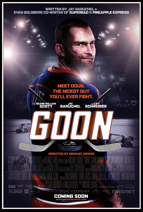 |
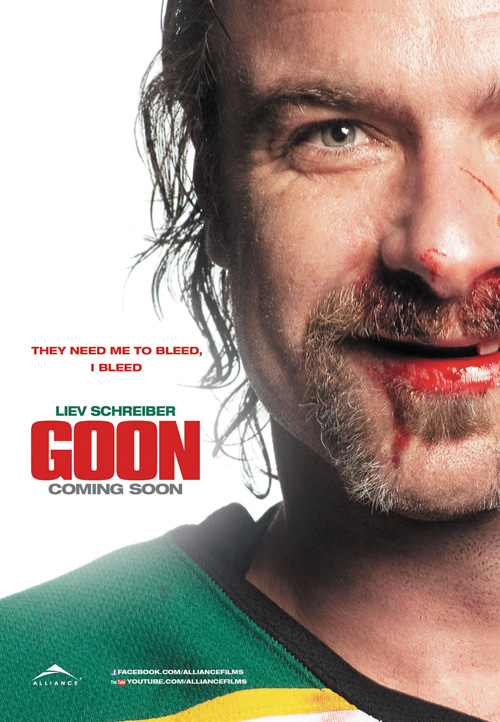
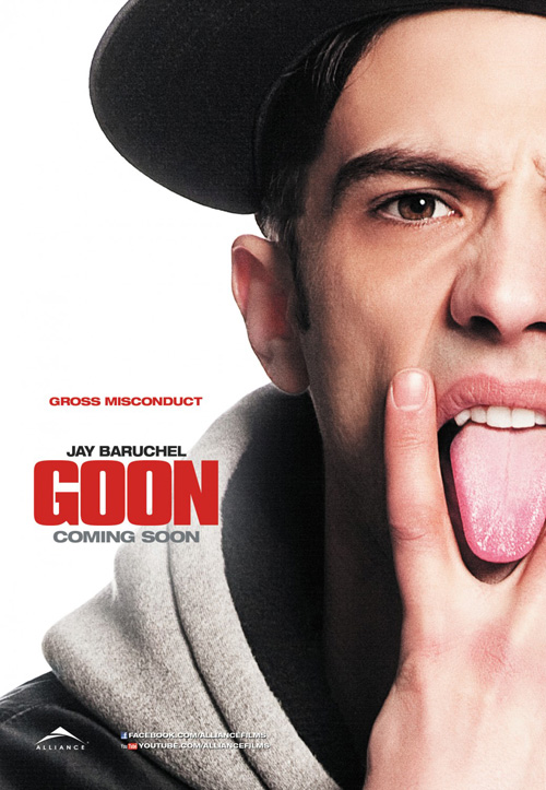
But it is Goon (open March 30) that wins the championship of character shots with the grotesque depiction of hockey carnage. The main one-sheet of Seann William Scott at right may be lame with its air brushed scars and overuse of lens flares, but the half profiles of each actor are a ton of fun.
Liev Schreiber‘s bloody, toothless grin is fantastic and co-writer/actor Jay Baruchel‘s lewd gesture is right on the cusp of offensive/hilarious. The film looks to be a blast and bpg really captures that feel in its design. Even the closely kerned heavy red letters portray the mix of brutality and humor we’re sure to experience.
Novelty works
 |
 |
 |
 |
 |
 |
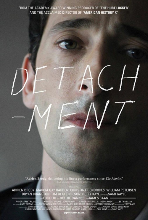
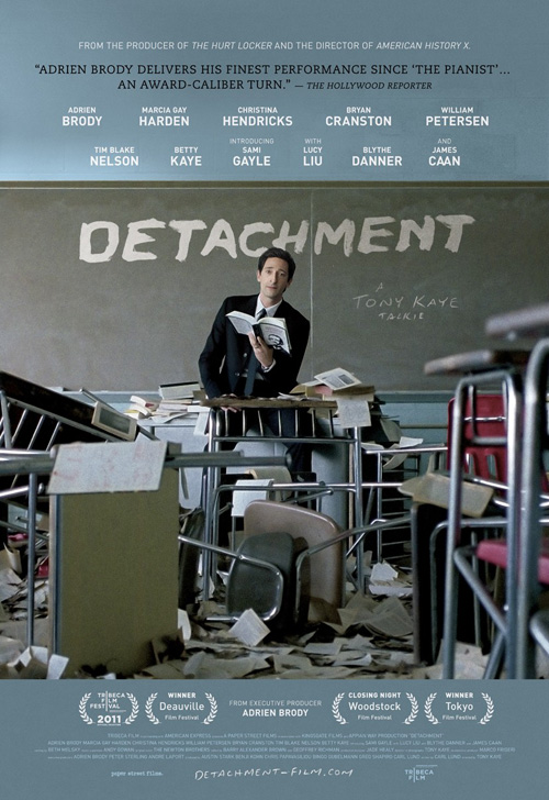
Sometimes using a gimmick isn’t all that bad. We’d like to think using a scrawled chalkboard font for the title of a film taking place in a classroom is clichéd and easy, but if used correctly it could be the perfect flourish to depict subject matter and tone.
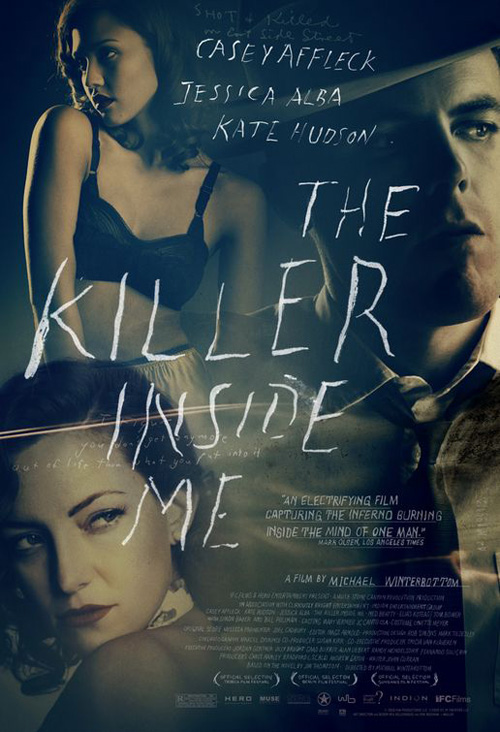
Looking at The Boland Design Company‘s work for Detachment (limited March 16) at right you can see how this idea can fail. The thick text looks more like the trails of an eraser than a thin piece of chalk and the chaos of the foreground hits its viewer way to bluntly on the head. But its misuse only makes the example above better because of its rawness. The handwritten font becomes scratched onto the troubled, angry face of Adrien Brody, etching both his physical and emotional selves. It bears to mind Kellerhouse, Inc.‘s wonderfully gritty sheet for The Killer Inside Me, representing the psychology of the tale by the imperfection of text.
 |
 |
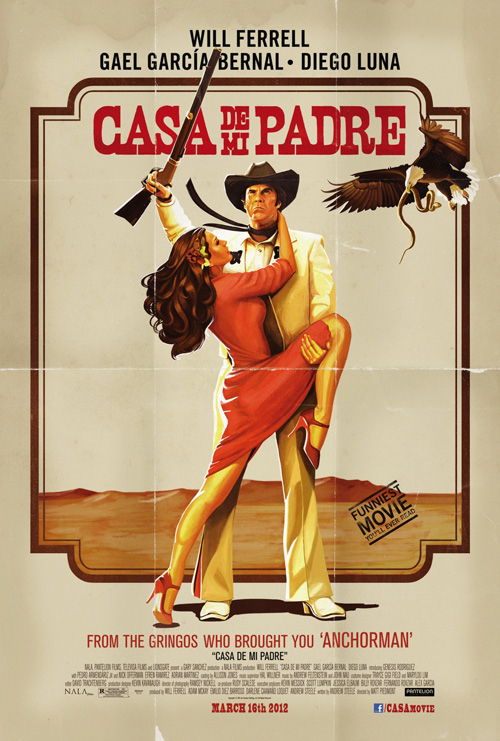
But while font is merely one aspect to take a risk with and give more importance, it’s more of a gamble to roll the dice on a full aesthetic homage. If not for Will Ferrell‘s face in the Casa de mi Padre (open March 16) poster by The Cimarron Group with artwork by Akiko Stehrenberger, this ploy would buckle under its lofty ambitions.
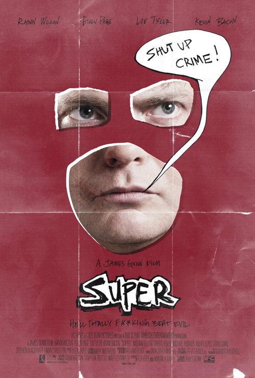
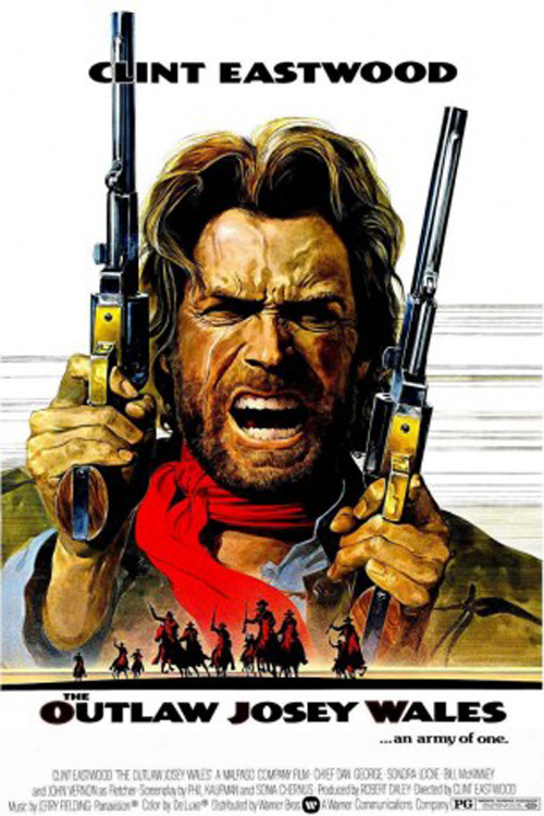
It’s a high concept piece working solely because the subject matter is absurd enough for the artwork to not take itself too seriously. Giving it an aged look from the painterly feel and creased folds—used nicely by Super last year—we believe it to be some obscure telenovela-esque Spanish western unearthed and brought to the masses for a revival. The expressions recall the likes of Clint Eastwood on the poster for The Outlaw Josey Wales and the fluid lines of the title treatment really drive the idea of this being an old time, hand-printed advertisement.
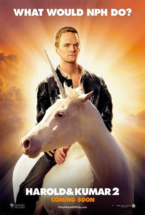 |
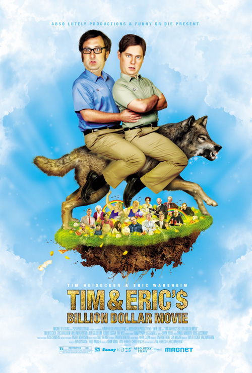
On the flipside, however, you can also allow novelty to cultivate an air of zany eccentricity like the sheet for Tim & Eric’s Billion Dollar Movie (limited March 2). I’m not familiar with the show but the simple fact the two comedians are depicted riding a wolf is enough to make me want to find out more. Much like Harold and Kumar Escape From Guantanamo Bay used Neil Patrick Harris atop a unicorn to sell tickets, the fantastical aura surrounding this artistic depiction of two of the most unfortunate looking human beings on the planet is pure genius.
I can’t even begin to figure out what’s happening with the characters beneath their menacing steed but you really don’t have to look farther than Eric Wareheim‘s look of shock and Tim Heidecker‘s smug indifference with arms folded to be ensnared. I could do without the lame dollar sign for an ‘S’ but not everything can be perfect.
 |
 |
 |
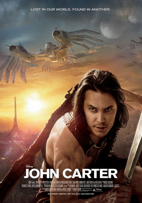 |
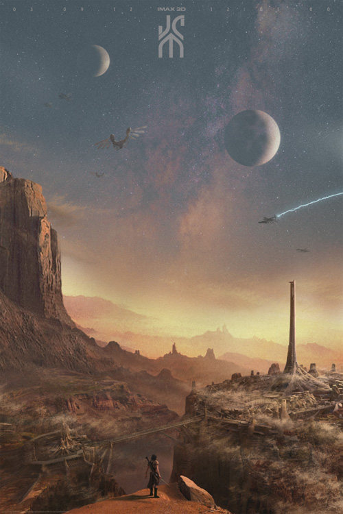
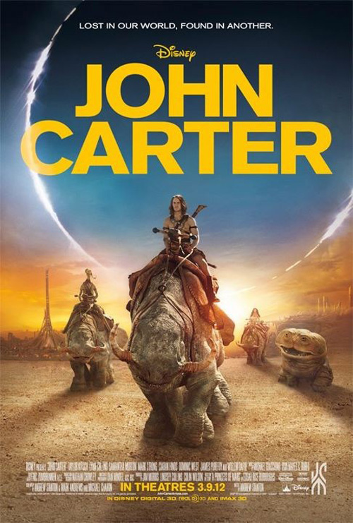
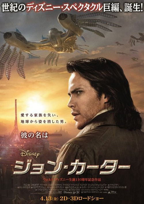
And in that regard, no truer words can be spoken when wading through the campaign for Riggins in Space—er, I mean John Carter (open March 9). I do think the designs with their thick yellow sans serif fonts running through the photography work well. The effect gives a nice sense of three-dimensionality while also depicting some action scenes from the film.
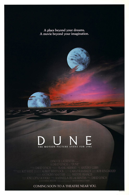
The problem lies with us not really caring about the Star Wars-like computer-generated creatures gracing the posters in larger-than-life splendor. To me—with the original title John Carter of Mars intact—it is the infinite possibilities of the red planet that intrigues the most. This is why J.C. Richard‘s limited edition print for IMAX screenings is so breathtakingly gorgeous. The elegant logotype of JCM is nicely faded into the sky at top and exotic locale’s expanse is allowed to live below. We don’t need John Carter big at center; we want to see the world Andrew Stanton and crew have created. It possesses the same sense of wonder that Dune had in 1984.
I’d be remiss to also show a couple designs from FIVE33 because the laziness is too much to ignore. The backgrounds of both barely differ but it’s interesting to note Taylor Kitsch‘s positioning differences. Clothed and shrouded with an air of mystery in the international piece, we see him ready to pounce and shirtless domestically. It just goes to show what sells tickets in America these days.
Blocking perspective
 |
 |
 |
 |
I’m all about depth of field. Some of the best posters use it as a tool to create space and draw the eye in to exactly what the designer wants you to look at. Sometimes objects will block out people or the cast gets cropped askew by a wall or a tree—whatever the pair, there is no better visual device to achieve your goals if utilized correctly.
 |
 |
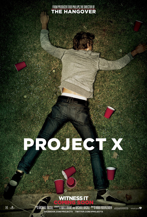
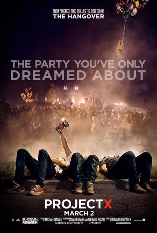
WORKS ADV‘s poster for Project X (open March 2) may not use this device per se, but the fact we are above the focal object gives a similar effect. What works for me—and don’t get me started about the vague name and no longer relevant question of “is it real?”—are the extended extremities forming the ‘X’ of the name. It’s simple, yes, but also much more appealing than the lame drunks passed out while a dog flies away on foil balloons.
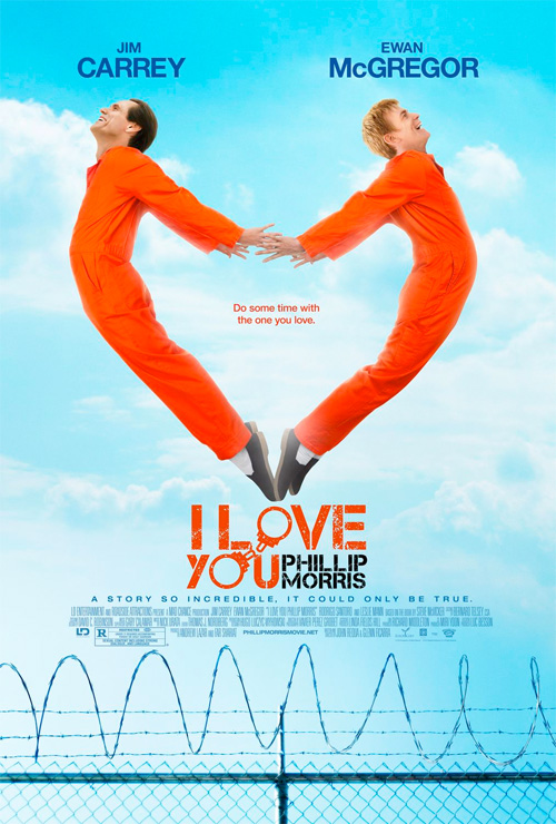
Similar to how the great Ignition Print I Love You Phillip Morris sheet uses its stars to form a heart, the passed out adolescent and his red cups epitomizes what this movie is trying to accomplish. It’s all about a night of unbridled debauchery and I wouldn’t be surprised to find this kid’s ‘X’ the first of a trio—if you know what I mean.
 |
 |
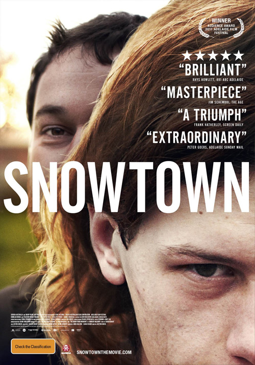
A better example of depth of field comes from Madman Entertainment‘s Snowtown (limited March 2, retitled The Snowtown Murders). This advert is quite phenomenal and blows the second more festival showcase layout away.
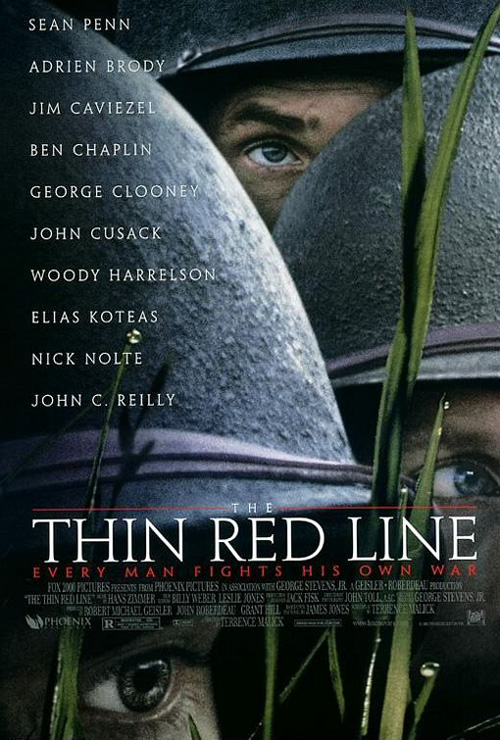
Like the brilliant Thin Red Line poster from BLT & Associates, the precise cropping of these two boys’ heads in order to focus on their eyes is stunning. The white text overlays nicely, perfectly placed in the center and away from anything else but hair. There’s malice in Lucas Pittaway‘s glare and although we can only barely see half his face it still overpowers the whole.
 |
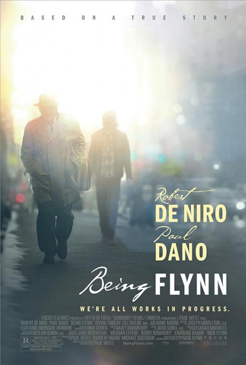
BLT’s Being Flynn (limited March 2) uses a comparable technique but with atmosphere going against the people rather than two actors vying for position. The sun almost washes out the entire artwork to leave it in a watercolor palette of muted hues while the fonts’ dynamic of strong sans adjacent to a more painterly script helps express the story’s clash of father and son while the overall anonymity combines them as one.
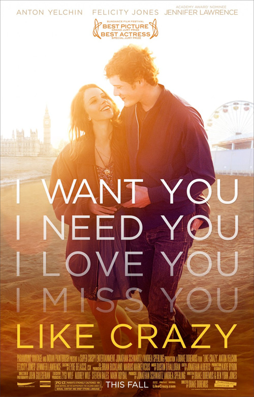
Solar flare is common these days—see Like Crazy amongst others—but something about its more subdued result here helps let a calm wash over me when looking closer. There is a quiet, contemplative aesthetic at work and from what I’ve seen of the trailer, this is exactly what the marketing should share.
 |
 |
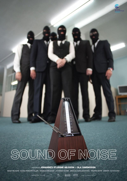
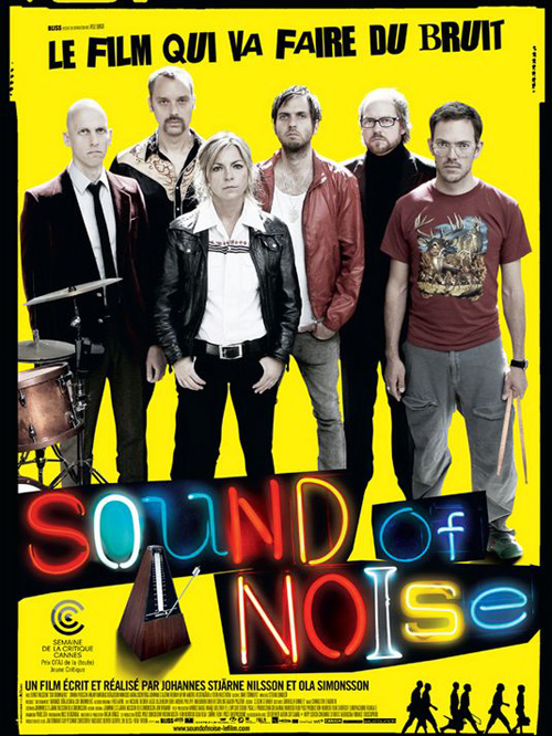
And that brings us to Sound of Noise (limited March 9). A crime musical with percussion set pieces, you have to applaud the shallow depth this poster contains. It’s all about the metronome keeping time while the cast embroiled in the escapade blur into the background. It’s as though the instrument is a ticking time bomb waiting to go off as much as the crucial piece to keep the beat and find order amongst the chaos.
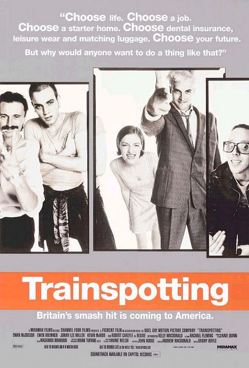
Le Cercle Noir‘s attempt in yellow simply loses all allure by using an over-used ransom note font collage with actors trying to look badass. But the bright colors make such a feat impossible and I only think of Trainspotting or some similar European romp of fast-paced cuts at hyper speed.
 |
The third entry—with a single masked burglar at the drums—nails the production value but may come across as too dark and scary. Whereas he looks as though he’ll jump over the kit and kill you with those drumsticks, the giant metronome of the first retains a playful demeanor to counteract the criminals behind it. An extreme vantage point from the ground, it keeps us at the defensive while remaining somewhat harmless considering the gang may in fact break into a musical interlude at any moment.
What is your favorite March release poster? What could have used a rework?