“Don’t Judge a Book by Its Cover” is a proverb whose simple existence proves the fact impressionable souls will do so without fail. This monthly column focuses on the film industry’s willingness to capitalize on this truth, releasing one-sheets to serve as not representations of what audiences are to expect, but as propaganda to fill seats. Oftentimes they fail miserably.
—
There’s a good mix of work coming out in April and the posters do well to mirror such. Chris Sparling‘ last script, Buried, found itself possessing one of the best poster series of 2010 while his return to the big screens gets the lackluster Vodka Creative sheet for ATM, proving how not everything can be perfect.
I can’t complain too much, however, since the month does bring some quality pieces of marketing material. And while Jack Black‘s creepy pedo-stash and Cardinal Communications USA‘s quirky Whit Stillman revival didn’t make the cut, they do deserve mention. It’s just too bad names like Richard Linklater and Joss Whedon, don’t always necessarily garner the same caliber talent in design.
Laziness is not a virtue
 |
 |
 |
 |
 |
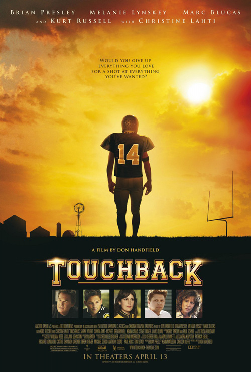
How about that film Touchback (limited April 13), though, right? Just looking at the poster makes me think feel good tale about a down on his luck kid making a man out of himself on the gridiron. Stealing the font from Craig T. Nelson‘s “Coach”, we’ve got letter jackets, concerned parents, and a dusky sky above the inspired juxtaposition of farmland and goal posts. I really hope #14 succeeds …
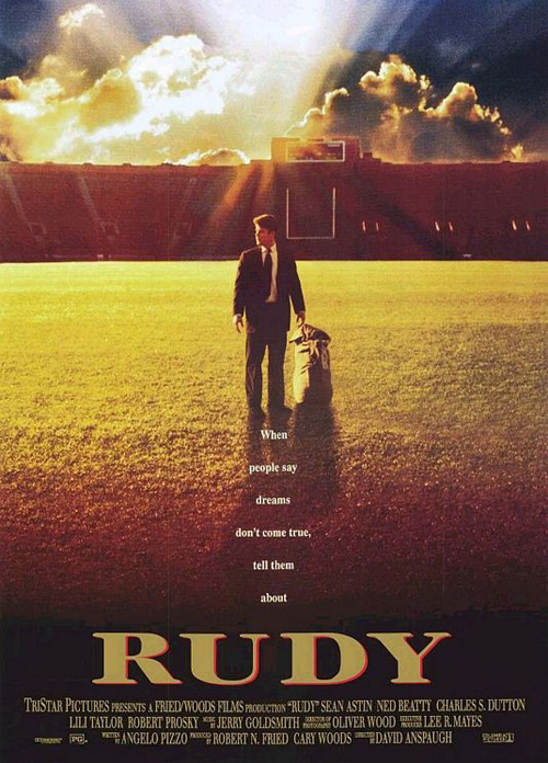
It’s kind of like how a nation pulled for Rudy. Remember that Sean Astin starrer? How about the plethora of other sports flicks that came before and after it? Is the only idea for creativity really showing the player’s back instead of the forlorn look on his face? Even the taglines say the same thing with different words. Who knows, though, maybe this is a remake of that seminal 1993 film. Can’t say this advert makes me care enough to find out.
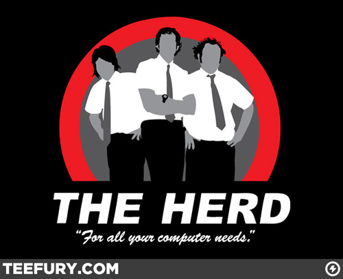 |
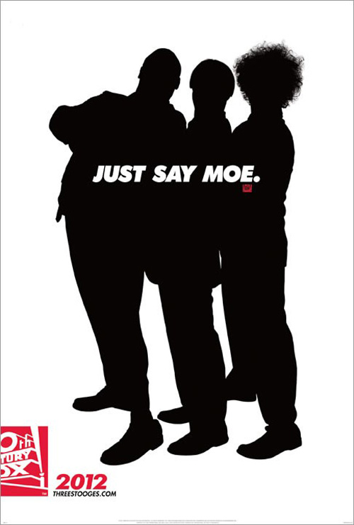
When it comes to the Three Stooges (open April 13), I guess I can understand the want to go minimal and strip the characters down to their bare essentials—bald head, bowl cut, and frizzy ‘fro. But how much do you want to bet that reasoning was an afterthought once the decision was made to hide the actual actors playing the roles? When Sean Penn, Jim Carrey, and Benicio Del Toro left after being rumored to help the Farrelly Brothers, it was a race to fill the roles and hope the antics on screen could speak for themselves.
And I mean no disrespect to the men who were removed for this silhouette looking more like a Teefury.com t-shirt a la Philip McNulty‘s “Chuck” than imagery to drag butts into seats. I like Will Sasso and Sean Hayes (and perhaps I’d like Chris Diamantopoulos if I knew who he was), but by making them invisible all my interest in the film is gone. No, I’m not a Stooges fan. Showing me the actors would have been a better bet at getting me to buy a ticket than using the iconography of a tired comedy schtick—whether my saying that is blasphemy or not.
 |
 |
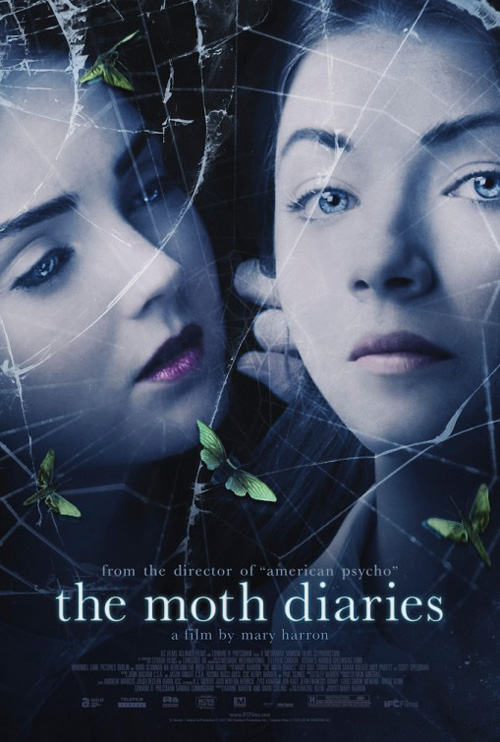
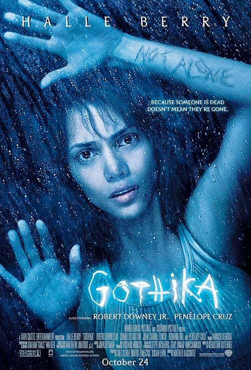
Similar to how one style can be awesome in a different medium but lame in another, concepts can succeed or fail within the same. I wanted The Moth Diaries (limited April 20) to have a one-sheet that fit my expectations of seeing a horror film from American Psycho‘s Mary Harron. Instead Indika Entertainment Advertising gives its leads a Gothika hue through either broken glass or cobwebs. I really can’t tell.
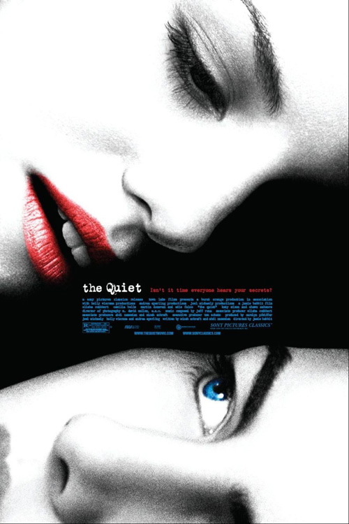
Even then, though, the dynamic of its actresses still had the potential of being something worth looking at. Maybe there are just too many layers for my taste and the demonic eyes of one against the fourth wall breaking of the other too cheesy. All I keep thinking about is the 2005 artwork for The Quiet. It wasn’t a great film, but whoever designed the poster knew what he/she was doing. I love the scale of the faces with their white and black contrast with red/blue highlights. That is what Harron’s horror needed.
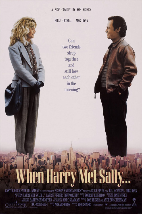 |
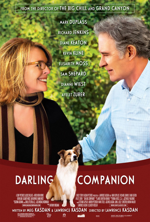
Thank God it isn’t as tragic as Darling Companion (open April 20), though. Wow, is that a bad poster. What were they thinking? I get the wanting to mimic the When Harry Met Sally aesthetic, but please hire someone who can use Photoshop. Maybe Kevin Kline and Diane Keaton are actually looking at each other, but there is no way that background is real.
Then there’s the contemporary font trying to be cool with a curved red covering of the image at bottom. Last names are made bigger as though to make them stand out when it only hurts our eyes. I feel sorry for the dog and his unfortunate luck at being stuck in this film because it’s not like he had a choice. And this is from a huge fan of Lawrence Kasdan‘s work on The Big Chill … I simply cannot condone this sad example of graphic design.
Sparks, Hipsters, Geeks, and an Algerian
 |
 |
 |
 |
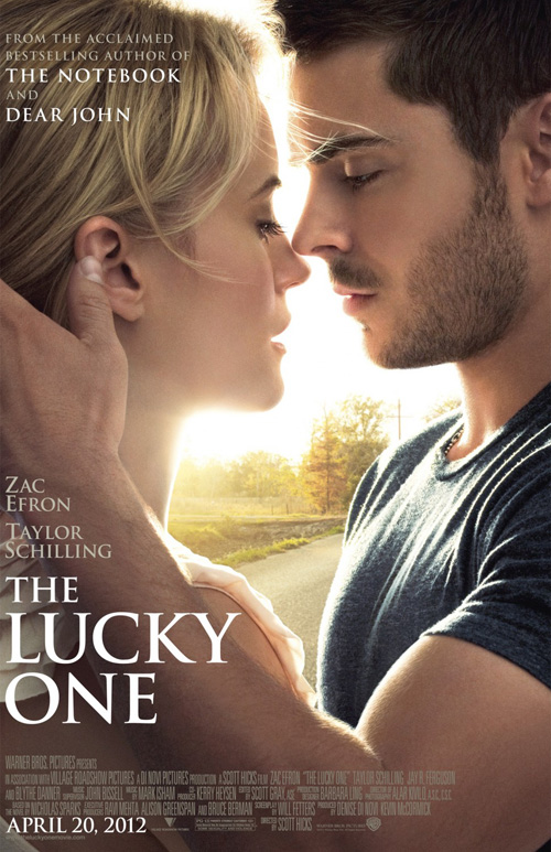
I think my praising of Twilight: Breaking Dawn – Part 1‘s poster has cursed me. I think every college-aged romance flick since has used its painterly photo’s loving embrace in close-up. The Vow did it in February and now WORKS ADV takes a stab with The Lucky One (open April 20).
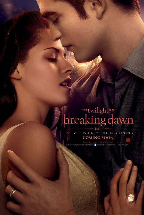 |
Due to my enjoyment of Atlas Shrugged, I know who Taylor Schilling is. This insight allows me to infer that the Nicholas Sparks adaptation must deal with a tryst between an older woman and younger man—unless Zac Efron has aged like ten years since the last time I checked.
I like the composition of the image and the stare into each other’s eyes; I’ll even trumpet the extreme left-hand justifying of the text to weigh everything down and allow us to pan right. But why not show Schilling without a sun’s glow at her cheek and an airbrush job? Why does she have to be made to look like Emma Watson? Each ticket sold will most likely be by a girl who read the book, so stop trying to fool us and advertise the film for what it is.
(Full disclosure—Upon further review, Schilling is actually only three years older than a 24-year old Efron. Kudos to her for making me buy her performance in Shrugged, even if myself and the family members I saw it in the theatre with are the only four people that care.)
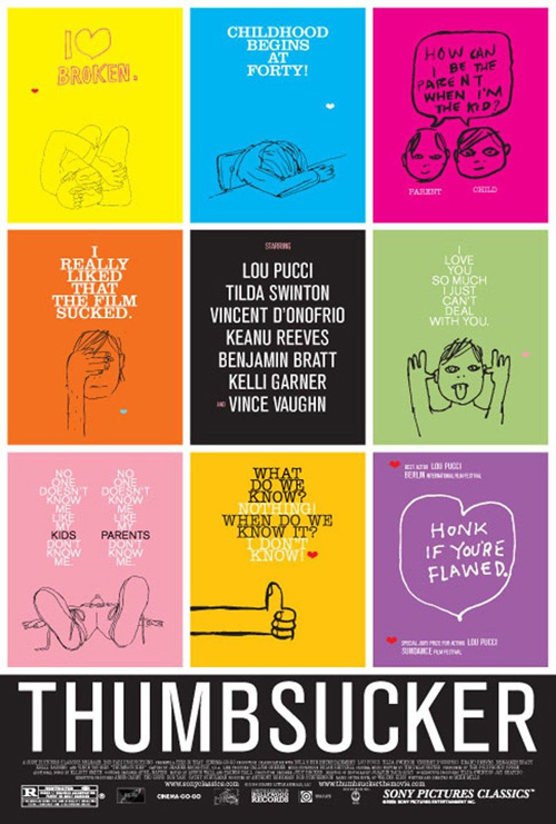 |
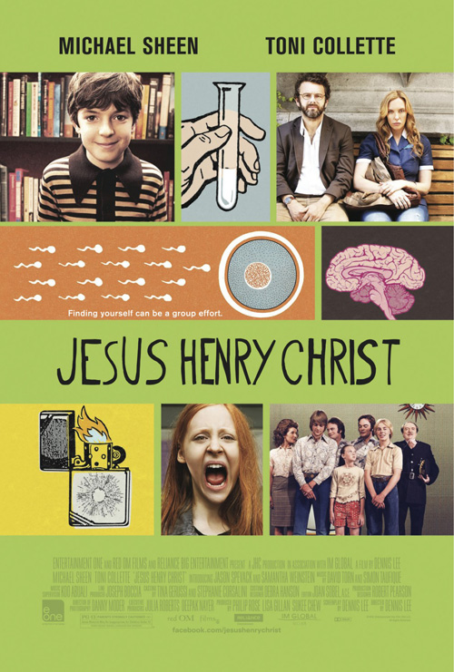
Another trend becoming more and more prevalent is the use of crude hipster animation in posters. It’s happening everywhere, but Thumbsucker was the first to come to my mind after seeing The Cimarron Group‘s Jesus Henry Christ (limited April 20). Aesthetically, it actually reminds me of The Squid and the Whale—movie, not poster. The 70s vibe is strong and who doesn’t want to see a school of sperm swimming on your local multiplex’s wall?
The scrawled font for the title is perfect if only because the designer didn’t overstep and use it for Michael Sheen and Toni Collette‘s names at top. It’s the best green this side of Sideways and the drawings remind me of the rudimentary ones you could find in a sex-ed presentation. Sheen and Collette’s looks of defeat are glorious and Samantha Weinstein‘s scream takes top prize. But what’s up with ‘Introducing’ her and Jason Spevack. Yeah, they’ve been in quite a few things each my friends. He’s the little boy from Sunshine Cleaning for chrissakes. Check your facts. (Yes, I see the irony after my error at Taylor Schilling’s age.)
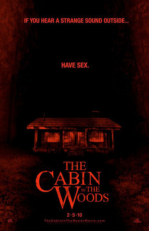 |
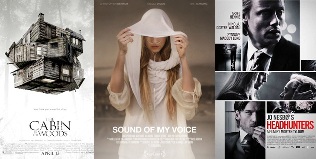
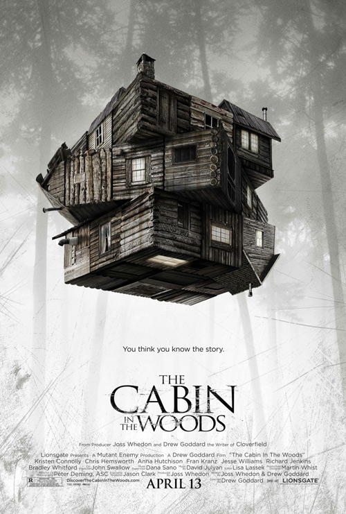
At least Cabin in the Woods (open April 13) knows what’s up: get rid of any and all mention that we had posters hanging two years ago. Seriously, how depressing is it to see those 2010 one-sheets with their tongue-in-cheek catchphrases and know it’s been on the shelf collecting dust the whole time? Couple that with the fact critics are pretty much adoring the thing and I simply don’t understand what went wrong—MGM bankruptcy or not.
The new tag, “You think you know the story” has as many connotations to the genre-bending film as it does its prolonged genesis. Much cooler to look at, Ignition Print used their time wisely to update from simple dark red cabin to the sci-fi-infused puzzle box of their newest. Calling to mind an architecture project on South Putnam in Buffalo, NY back in 2007, I also can’t stop thinking about the moving labyrinth from Wrath of the Titans. Parallel dimensions? Choose your own adventure? Psychological breaks? Anything is possible.
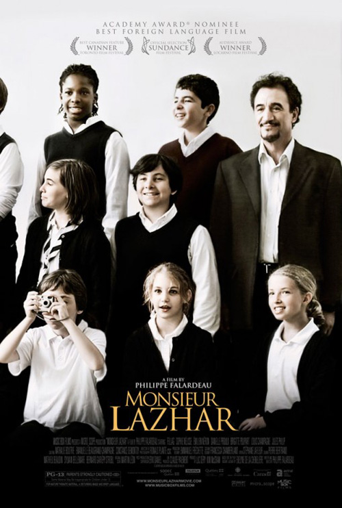 |
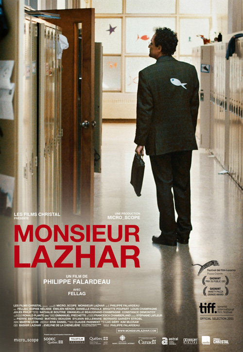
Which leads us to Monsieur Lazhar (limited April 13). I really like this festival sheet that seemingly takes a still and uses its wonder to get our imaginations working. How great is the paper fish stuck to his back and the disheveled state of the school hallway he’s walking through? Yes, Helvetica is overused and making it red doesn’t help matters, but there is this wonderful grain to the photo that somehow sends a jolt of excitement down my spine when I think it may have been shot on real film.
I like Greenlight Creative‘s second example too. It’s a bit more stylized in font and concept, but there is still a childlike whimsy in the smiling face of Mohamed Fellag. The kids are in differing states of attention with the photo taker and candid atmosphere really put you in the action. There’s just something about that fish in the first, though. A simple touch, yet so captivating.
A new spin
 |
 |
 |
 |
 |
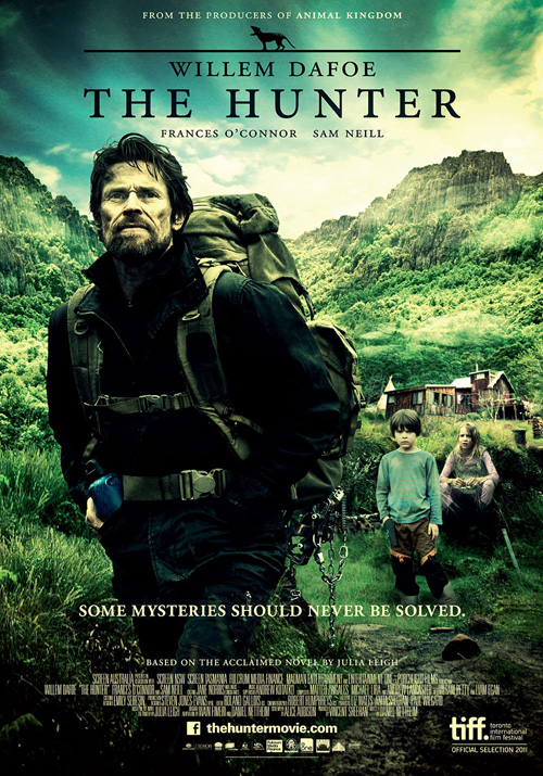 |
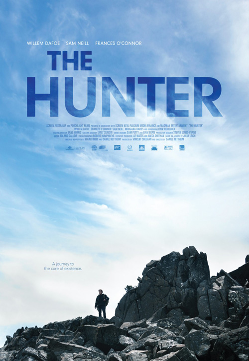
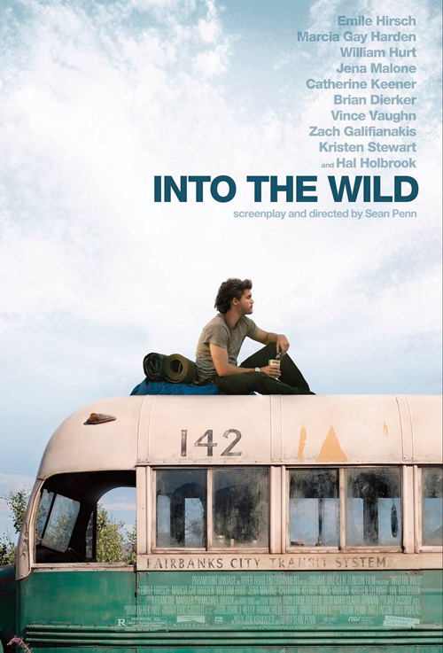
Using the same type of framing as Into the Wild and many others, Agency 71‘s new piece for The Hunter (limited April 6) is a stunner. I enjoyed the burned, green tinted craggy landscape with Willem Dafoe large and in charge staring beyond us in the festival poster, but nothing compares to the wispy clouds in the clear blue sky here. Multiplying the Futura to darken the blue of the image shown through each letter may be overkill, but I’ll forgive it.
There is also something refreshing about letting a film’s title standout amongst everything else. It’s too often that we see a producer or an actor’s name overpowering the movie itself in order to sell seats on a promise rather than a mystery. Putting Dafoe small and alone at the bottom really feeds into his isolation inside the story and his quest to find an elusive animal. The atmosphere is palpable and natural where the other’s filter infers too much. We are allowed to stand in awe of the vast emptiness here and understand the pressures weighing on Dafoe’s character.
 |
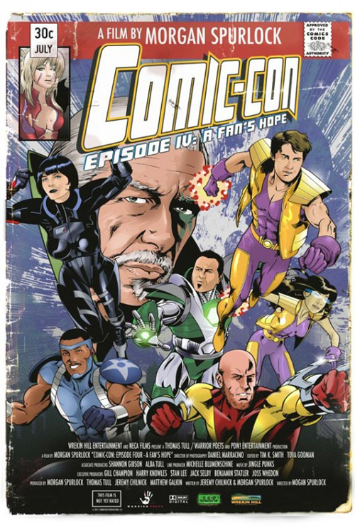
Where Comic-Con Episode IV: A Fan’s Hope (limited April 6) is concerned, the Morgan Spurlock documentary finds a way to really capture the spirit of the subject matter. The faux book cover has been done to death, but that doesn’t mean it isn’t still relevant when appropriate. And what better way to portray the culture of comics than with one of its own?
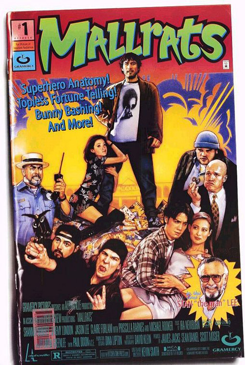
Mallrats used a similar technique, but it retained the flesh of its characters. What I like about Comic-Con is that each superhero on display is a legitimate pen and ink drawing. The frayed edges and aged creases add a nice touch to fabricate a feel of authenticity. Admittedly, the worn corners—especially the bottom right—do make it look like a paperback novel before comic, but it’s a minor squabble for an otherwise entertaining piece.
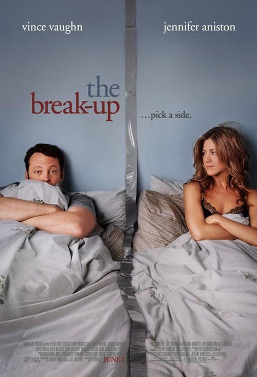 |
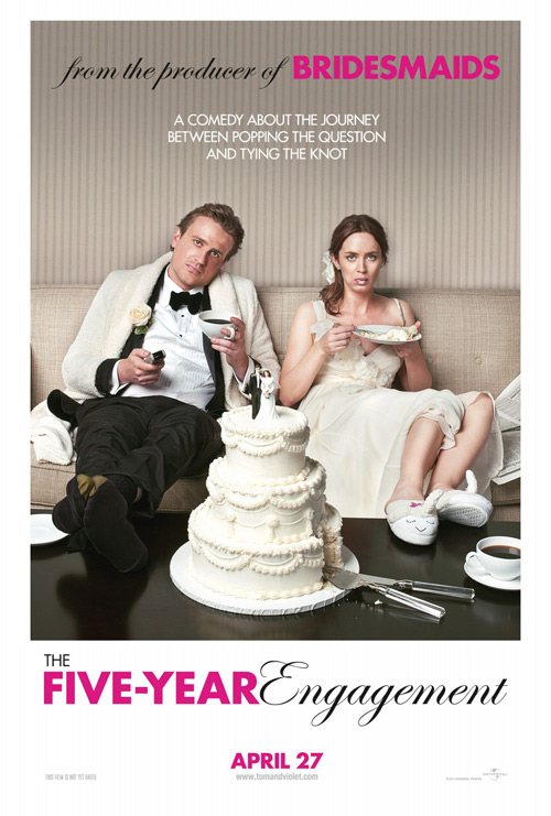
Coming back to photography, you don’t get a more perfect image than what The Cimarron Group used for The Five-Year Engagement (open April 27). Playing on a theme used throughout the romantic comedy genre—see The Break-Up and more—we’ve got guy and girl split down the middle. Rather than engaging each other with either mirth or malice, they are gazing at the viewer with looks of surrender. No more will this bride and groom play the games associated with blissful engagement. They are ready to gorge on the cake, take off their shoes, and relax for the first time since the proposal.
The way the scripty “E” fits inside the negative space of the sans-serif “R” in the title is a wonderful flourish as the two fonts complement each other nicely. I like the stark white of the bottom to offset the yellowish tinge of Emily Blunt‘s dress and the cake while her full mouth is a glorious shot of pure surprise without caring. Add in Jason Segel, ready to give up on life and live inside his hotel bathrobe forever, you’ve got the epitome of what every couple feels after the long slog of matrimony finally frees you into being more than slaves to “The Day”.
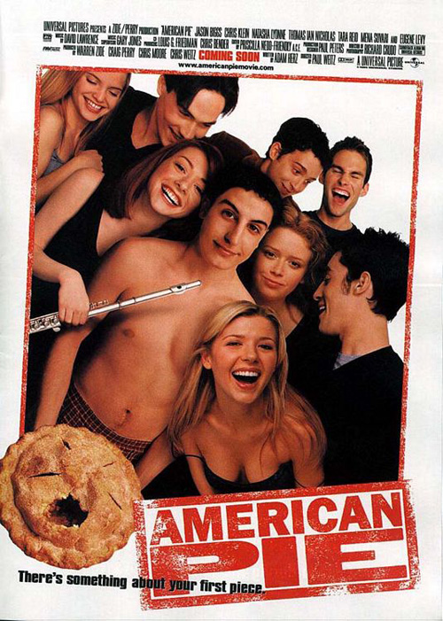 |
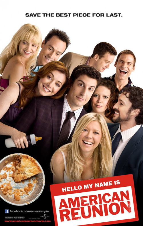
But the real ‘spin’ of the month doesn’t come from a film playing around with a design staple to refresh it. Nope, Bemis Balkind‘s American Reunion (open April 6) stays true to its source and literally reenacts KO Creative‘s sheet from the original. From first piece to last, this cast of characters has grown up and we’re able to have a front row seat to the transformation from one to the other—suits replacing bare chests and a bottle usurping the trusty old flute.
I grew up on these films with coinciding graduations and summer break from college. They got married and had kids while my friends did the same and now it’s reunion time. It’s really cool to see how each has aged and a stunning revelation when you think that the two who found the most success are Ms. Alyson ‘Band Camp’ Hannigan and John ‘MILF’ Cho (who doesn’t even get to grace the poster).
It’s all in the mood
 |
 |
 |
 |
 |
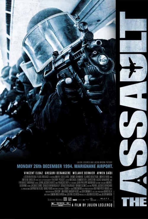 |
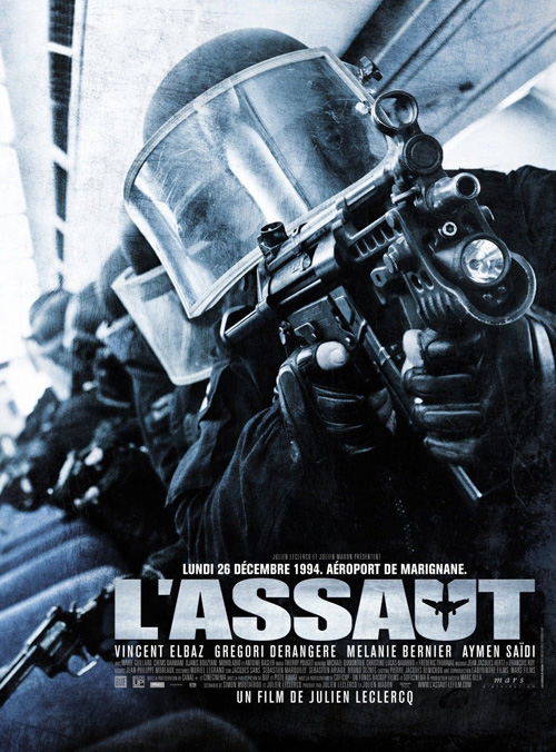
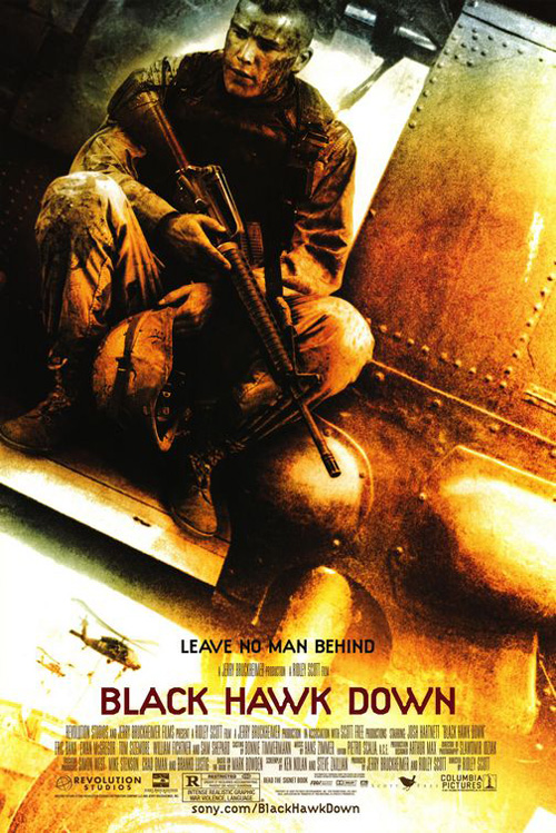
Le Cercle Noir‘s poster for The Assault (limited April 6) really sets up tension. The gun is in our face and we’re on the ground floor in wait for these men to bust down doors and wreak havoc. There is a very palpable sense of déjà vu looking at it for me, but when I check on Black Hawk Down‘s advert or any other that comes to mind, the thought I’ve seen something almost exactly like it is not satisfied.
Maybe I’m thinking of a video game box cover, a Call of Duty or some such cousin. Whatever it is, the adrenaline rush building definitely piques my interest into seeing whether the film can retain the same tone. I even like the metallic font treatment with an airplane creating the negative space of the “U”. Leave it to the American version to ruin things by putting the Eiffel Tower in their “A”, effectively ruining all subtly so we’re made aware it takes place in France.
 |
 |
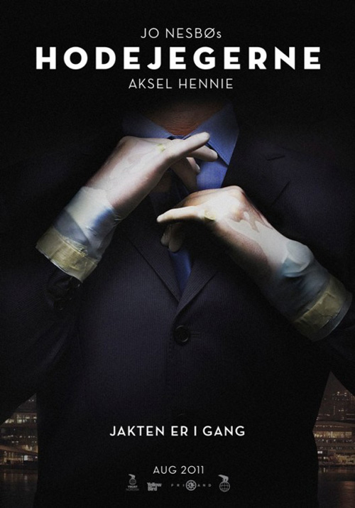
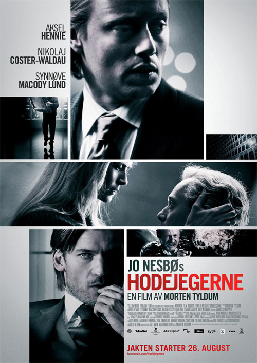
My second favorite foreign film poster of April also finds a way to intrigue where so many can’t. Unsure who is behind this breathtaking display of shadow and iconography, it sure blows City Rain Design‘s attempt to portray Headhunters (Limited April 27) out of the water. The white sans-serif is crisp and clean, the removal of the model’s head alludes to the double-meaning of the title, and the simple act of fixing a tie becomes absolutely menacing.
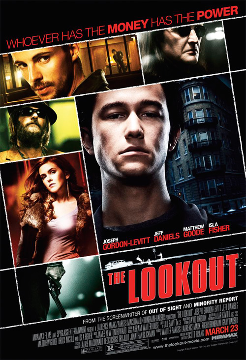
How could anyone think the second poster does a better job of driving word-of-mouth? Like last month’s Friends with Kids or the unending stream of photo box one-sheets for which The Lookout is but one, it’s utterly bland. No steely filter or stripped color palette can replace the fear induced by its predecessor’s headless businessman. And it’s not even an American release as the text remains in Norwegian. I really hope Scandinavia isn’t going the way of our own neutered industry.
 |
 |
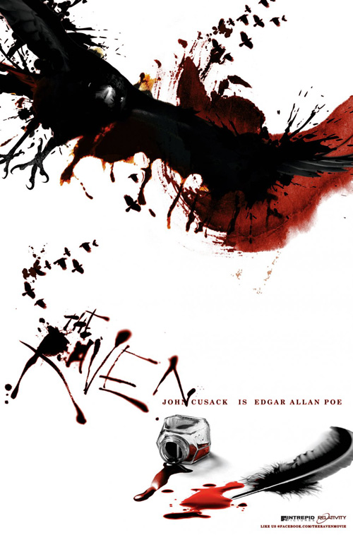
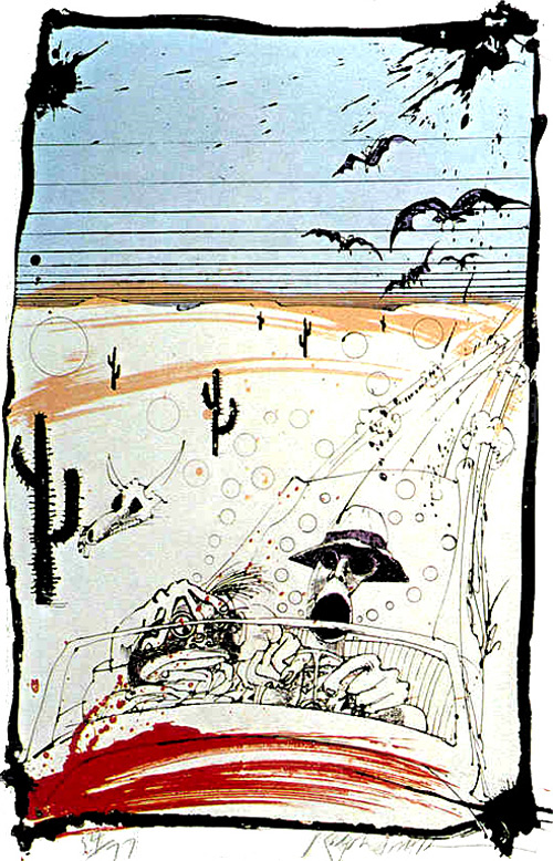
Perhaps the time has come where teaser posters can be risqué while their main counterparts cannot. Like Headhunters, The Raven (open April 27) is allowed a shockingly artistic flair before castrated in general release. Bearing an uncanny resemblance to Ralph Steadman‘s work, the bloody mess of pitch black ink against the bright white background will stick in your head. The raven flies forward as the title absorbs into the page, giving an exciting vantage to enter the work and meander through its horror.
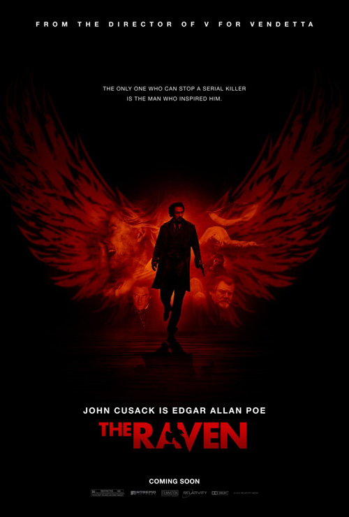
On-the-other-hand, The Arterie‘s print goes completely generic with John Cusack surrounded by an uninspired collage of characters tinted red by a silhouetted bird. Managing to appear no different than any other action/mystery this side of Colombiana, the concept falls flat when compared to the jarring use of texture in the first. At least the title treatment utilizes a sleek subtraction of a raven between the “A” and “V”, but it’s still not enough to save the whole.
 |
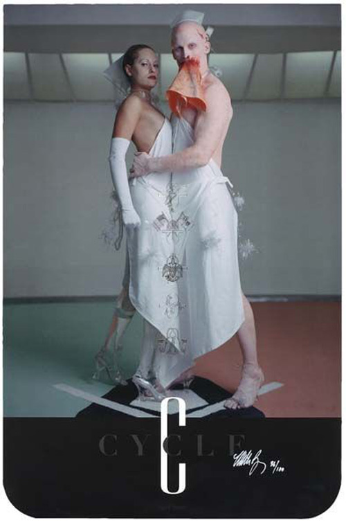 |
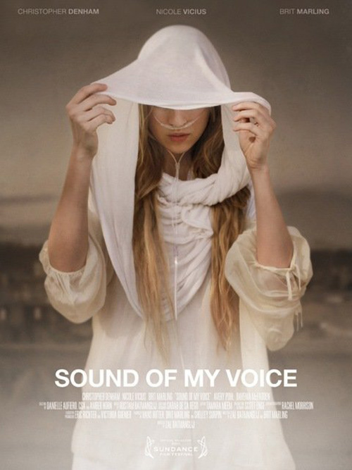
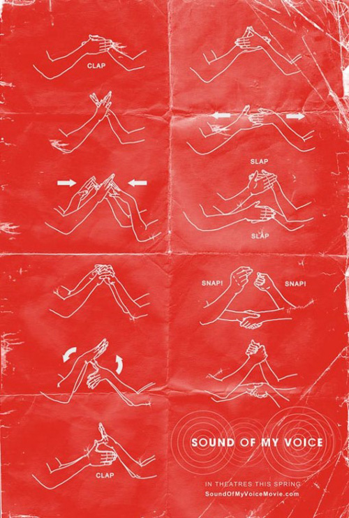
And that leaves us with what could easily be a Top Ten poster of the year for me in Sound of My Voice (Limited April 27). Mark Carroll worked on the teaser sheets which intrigue with red fields and white text, but the Matthew Barney-esque Cremaster vibe going on in the poster with Brit Marling is absolutely gorgeous.
It screams Barney and maybe even a little Zola Jesus with the beauty of a scarf-covered head about to be revealed. An alien feel comes in too once you notice the oxygen tubes extending from her nose off the bottom edge. There is just an ethereal quality I cannot get out of my head and my need to see the film only grows the more I think of this image. There is no better praise for a poster than that.
What is your favorite April release poster? What could have used a rework?

