“Don’t Judge a Book by Its Cover” is a proverb whose simple existence proves the fact impressionable souls will do so without fail. This monthly column focuses on the film industry’s willingness to capitalize on this truth, releasing one-sheets to serve as not representations of what audiences are to expect, but as propaganda to fill seats. Oftentimes they fail miserably.
It’s a huge five-week November with a ton of box office potential and small screen awards flavor sprinkled in. I don’t even have room to talk about them all with the former category’s Last Christmas (November 8), Charlie’s Angels (November 15), A Beautiful Day in the Neighborhood (November 22), and Queen & Slim (November 27) proving lackluster where poster design is concerned. The latter grouping isn’t much better served with The Irishman (November 1, Netflix on November 27) either.
That’s okay, though, since so many titles going wide guarantees your inability to see them all. It won’t hurt for some of the smaller scale stuff below to grab your attention away from them anyway as the holidays are supposed to be about spreading the wealth.
Frame job


Starting things off is a case of awkward feet courtesy of WORKS ADV’s The Good Liar (November 15). You might be saying, “What feet?” since none are shown on the above poster, but one look to the right will show what could have been if they were. These two are pretty much identical in intent and yet the first excels because of a carefully measured crop to remove excess information that did nothing but distract our eyes. While that’s not to say the former is anything to write home about, it does prove a wonderful example of how important composition is at driving our gaze through the page.
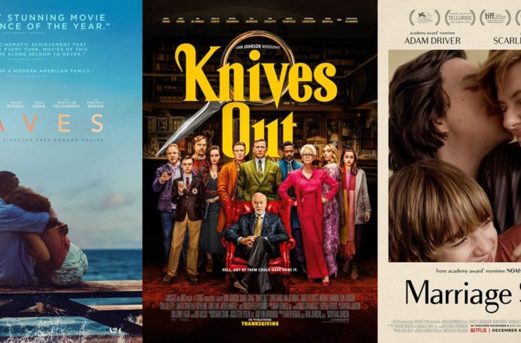
LA’s Knives Out (November 27) isn’t anything special either and yet you can’t help but see it as this iconic graphic popping out from whatever theater wall it might adorn. It’s interesting because it honestly ignores the film to depict its genre instead. This magnifying glass/knife hybrid that warps the title while also spotlighting it wants us to know about the “whodunit” mystery above everything else, aping a generic motif to guides us towards the proverbial “x” marking the spot.
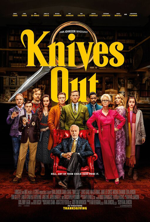
The firm’s final sheet with family portrait goes in the opposite direction to give us the eclectic cast of suspects in the murder of the man in the chair. The same fun curves of the font above come through nicely here too while the magnifying glass is at best unnecessary and at worst suddenly rendered cliché. I say this because of the misguided decision to still pretend its glass has shape enough to warp the director’s name (a flourish that now appears to be a mistake) while the knifepoint jutting out the side almost seems like it’s pointing at the culprit. It just doesn’t quite come together.
I similarly like LA’s sheet for The Report (limited November 15, Amazon Prime on November 29) even if what it wants to do is better than what it actually does. The whole Adam Driver as a word frame is too polished to be truly effective as anything more than a photo filter where highlights and shadows act upon the letters as a cohesive field instead of letting the letters create the image on their own. The decision to play with the film through a crossed-out word that doesn’t actually belong, however, is fantastic.


That’s the detail that makes me think of the brilliant Cold Case Hammarskjold from earlier in the year. It lets the design be interactive in a way few mainstream works ever are while unfortunately also making me wish they did a better job allowing that real world flair to impact the whole.
It’s at least better than the second sheet and its decision to expand the image to Driver’s co-stars (even if Hamm is on-screen for about ten total minutes). With the contrast dialed to eleven, the words become tracking noise more than a layer of secondary information. And the desire to add a US seal in the back and white tag reminiscent of The X-Files cheapens the whole.
The best use of framing in this section is therefore The Kingmaker (limited November 8). Here we have a frame within a frame juxtaposing the squalor of Imelda Marcos’ country and the opulence she and her husband enjoyed via a reportedly illegal fortune grown while holding office as first lady and president of the Philippines respectively.
It’s an obvious bit of duality with black and white versus color and yet its construction is subtle in how things pretend to be one single image. The background doesn’t disappear behind her—it just fades into the red. Her dress doesn’t start in the confines of the “painting”—it just gathers focus with it now brighter hue. We’re meant to see what she wants us to see by ignoring the rest, the frame proving a lens of her own creation to distract us from the truth.
On the horizon


The intrigue of BLT Communications, LLC’s Terminator: Dark Fate (November 1) poster is that it isn’t adorned with Arnold Schwarzenegger’s face. James Cameron’s original two films each did this regardless of whether he was a bad guy or good. Did it make sense narratively? No. It did for box office glory, though, since he was the bigger name and the title was his character.


While he’s also in this latest offering, however, it’s Linda Hamilton’s Sarah Connor who graces us on the horizon line—the star of those first two and the main draw of this one. It really is enough to sell tickets too since her return is a huge draw back after subpar sequels. So let her have a boring poster all her own. It’s not like the full cast sheet is more inspiring.
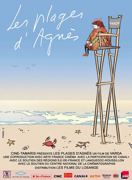
Varda by Agnès (limited November 22) arrives with a similar bisection of sky and land as well as an additional dose of fun. It makes sense to advertise the auteur’s final film with her as its star and director seated on the beach with cartoon seagulls in what is certainly an intentional nod to the French poster for The Beaches of Agnès. Simultaneously joyous and introspective, it means something that the birds are digging their feet in the sand to stare out at the distance with her. This is a clear-sky day for rest, relaxation, and remembrance.
Not quite as serene, Mickey and the Bear (limited November 15) delivers its lead in direct visual contact with the viewer. The horizon is lower with an actual scene playing out as James Badge Dale walks towards us. Camila Morrone has conversely stopped, meeting us with a look of indifference as though to silently ask what we’re doing here. There’s a truth to her expression that hints at a human drama devoid of frills.
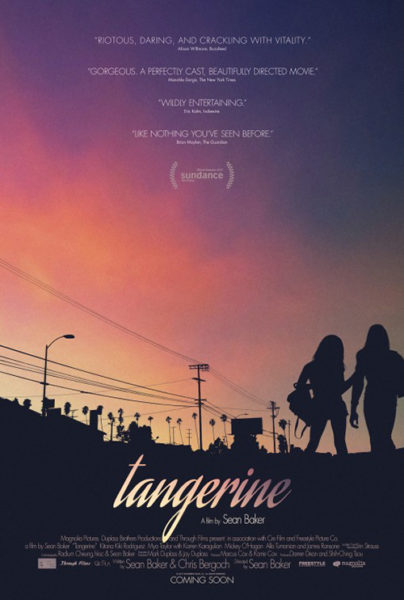
I do have to mention the font choice, though, as a point of distraction. Rather than do so because it doesn’t fit the whole (it does), I’m mentioning it because it conjures images of another one-sheet. That text will always be synonymous with Tangerine for me—a work advertised in similar fashion albeit with a greater sense of atmosphere and drama.
And that leaves us with InSync Plus’ Waves (limited November 15): a design that practically forgets its background setting completely to focus solely on the foreground’s embrace. It’s water meeting sky rather than land as the picnic bench the actors are sitting on appears to be floating in it with waves foaming on the side closest to us. They rise upwards beneath an architectural arrow pointing to the pair above. Our eyes thus drawn through the water and the actors to the title shimmering in a subtle gold—the letters rippling like the tide.
It’s hardly something that will stick with you after a glance, but it does its job nonetheless. There’s an emotional center, a name in visual opposition to the field beneath it, and white accolades to give us the buzzwords for excitement (“stunning,” “rare,” and “epic”). It’s creating a mood. It’s asking us to absorb its promise rather than drown in details.
Infinite sky


Animated films always seem to have an advantage on live-action insofar as they’re not obligated to include a credit block. Title, date, and studio are all most have—the writers and directors left off almost as a rule while the cast is sometimes included for star appeal. This means a firm like Legion Creative Group can worry about image first and never think about the giant space necessary to include everything else. They can give Frozen II (November 22) a gorgeous forest scene with trees rising into the air while Elsa and Anna stand tall in the fog. When commerce is assured, art can excel.


That’s why they can also team up with InSync Plus to deliver a similar tease with a more hand-cut paper aesthetic that creates an artificial sense of depth while augmenting the film’s computer animation with a personal touch. A studio like Disney will still demand a more generic sheet like the collection of returning characters at right, but it exists as a forgettable necessity rather than the only option at their disposal.
Indie films get a bit more leeway in this department because they have to do whatever they can to be seen. So pieces like Crown Vic (limited November 15) will ignore legibility beyond the title. They must include all the top-line names, but there doesn’t appear to be a stipulation about the size of the letters utilized to do so.
Now the opportunity to create is born—something a film shot in Buffalo, NY yet set in Los Angeles, CA demands. The result is obviously Photoshopped with skyline in the distance and large cop car up-close, but the composition and energy is real. And because the whole film takes place on the street, a quiet reprieve looking down on the city is a welcome contrast.
Midway (November 8) therefore proves an exception to the rule. Similar to their Deepwater Horizon, LA gives Roland Emmerich’s latest epic some scale on the vertical page. From water to sky they move from oil rig to airplane in distress, the plume of smoke yellowed and new at bottom right before growing darker as our eyes scan upwards to the left while the pilot stands to look down. It’s simple and powerful despite the uninspired, distressed title treatment.


Lionsgate can afford rolling this out to pique interest knowing P+A is entering later with their collage of characters and explosions over the Pacific. It doesn’t touch its predecessor’s suspense, but it satisfies contractual obligations—something the studio may actually care about more.
LA’s not done there, though. They get to go all-out with their Ford v Ferrari (November 15) teaser too. There’s the 70s color work matching title to image, the grainy texturing topped with a coat of artificially brightened hues, and the completely empty space above it. This is about the car and what it can do. It’s about being attuned to the insulated world created within it to drown out the noise outside. Nothing else matters except what’s between the driver’s ears.


Legion Creative Group tries to duplicate that success with a scene on the track, but the moment they bring the environment back into view (fading it out or not) is the moment our intrigue wanes. Now it’s about the noise itself with car and actors becoming two parts of many composing it. We’re awake again—the vacuum of speed broken by the cheers, engines roars, and uncertainty.
It’s still better than the international sheet, though. Who needs artistic wonderment when you can get made-for-TV melodrama that makes it seem like Matt Damon and Christian Bale are racing each other in the cars below their busts? Who needs a succinct title when you can turn it into a tagline and rename the whole something different? I guess Americans know car manufacturer names more than the European race they competed in.
What’s in a face?


B O N D tries to replicate the very cool imagery from their The Little Stranger poster with Doctor Sleep (November 8). It doesn’t work. The former’s success comes from how seamless the texture and materials combine with Domhnall Gleeson’s profile. All the latter does is take the text formed by wall cracks in the film, place it atop Ewan McGregor’s face, and put a multiply filter on it through Photoshop. It comes across as rushed and off-putting rather than scary or memorable.


cold open’s entry doesn’t unfortunately do much better with its red tint (blood?) overpowering a reunion of past and present. And that’s not the worst part. This distinction goes to the type placed around the title. While the entire poster is centered on its middle y-axis, “Stephen King” and “The next chapter in The Shining story” are willfully obstructed from doing the same. The author’s name is screwed up because of the actor’s placement. If he’s centered, the front heavy name can’t. A similar issue occurs with the other text since the designer decides to contain it underneath “Sleep” without taking the negative space beneath the “P’s” loop into consideration. Both lines are therefore pushed too far left.
It’s a little thing, but it’s impossible not to see once you do.
We know that Gravillis Inc. understands this problem thanks to how they’ve handled the sheet for Honey Boy (limited November 8). They smartly centered all the text at top before skewing the block as a single unit. So while it looks like the bottom line is pushed right, it’s actually as far from the left of the “H” as it is the right of the “Y”. It too is a small detail, but it makes all the difference.
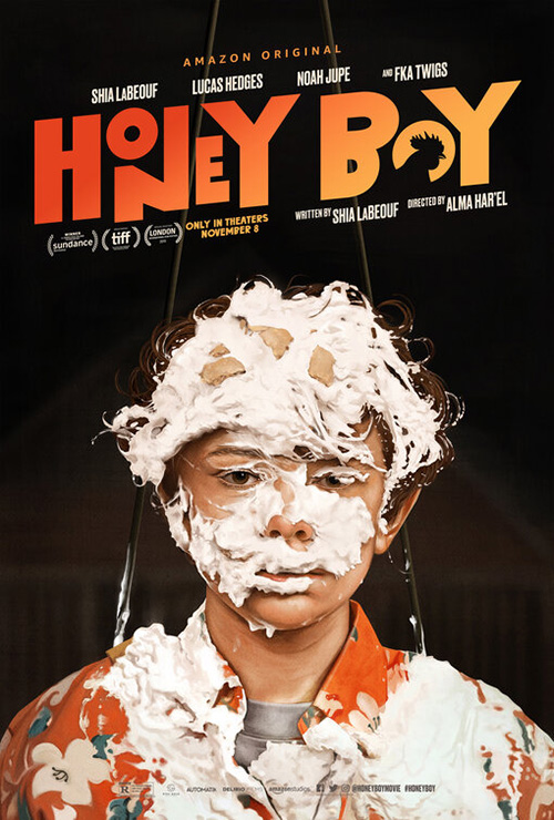
The poster itself is great with its painting of Shia LaBeouf as a clown—sad, depressed, and pleading for our attention. The color of his glasses and skin balance that of the title and the treatment of those two words is funky without losing readability. (I can’t wait to discover the rooster’s role.)
Gravillis’ tease is nice too with its photo of Noah Jupe covered in cream. On the surface they are the same and yet you can see how much more dramatic the whole becomes via a close-up as opposed to mid-shot. Where the first delivers emotion, the second provides a scene.
From bright colors to severe shadows, BOND delivers Harriet (November 1) as a thief in the night waiting for her moment with gun at the ready. It’s an interesting direction to take and yet one that works really well tonally considering this legend was an outlaw in the truest sense of the word.

Letting everything fade to black besides Cynthia Erivo herself lends an artificial theatricality to the whole—its lighting feeling like that of a stage as she awaits her cue while the audience tenses with anticipation. But maybe that’s just me, the Tony-winner in slanted hat imbuing this idea that she could burst into song at any moment. Her co-stars being Leslie Odom Jr. and Janelle Monáe (see the hackneyed alternate design with floating heads at right) doesn’t help in that respect either. Is this a musical after all?
I digress. In the end that first sheet is enough to pique a passerby’s glance, the darkness letting its subject slowly escape her atmospheric disguise with a mind to cause trouble if needed. The bright title pops with nothing else besides Erivo’s cheek light enough to compete—our attention firmly directed where it needs to go.
The best faces this month, however, are those we don’t see at all. I’m speaking of BLT’s dual teasers for Marriage Story (limited November 6, Netflix on December 6) with silhouettes of Scarlett Johansson and Adam Driver facing each other as windows onto their disparate homes of beach and city respectively. It’s a simple conceit and yet we could speculate so much: Are they falling in love as two people from different places or has their love grown cold to force them into going their separate ways towards these locales?
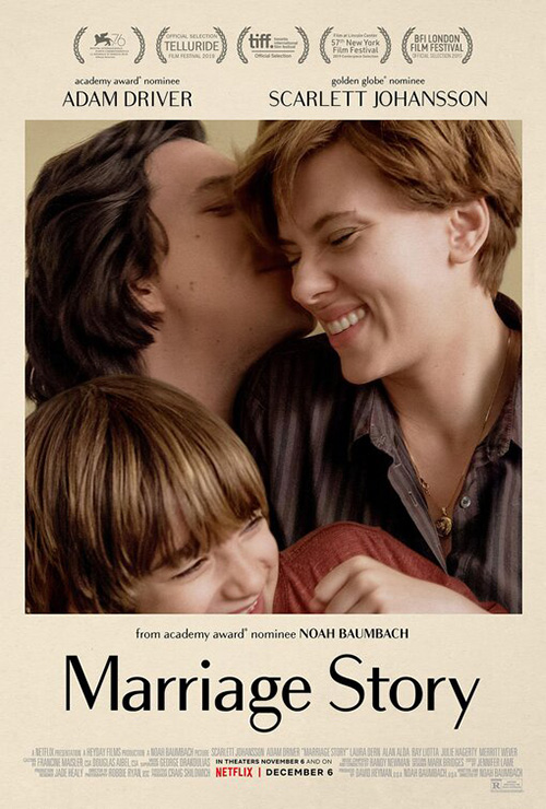
BLT’s final sheet helps explain it could be both—the joy of parents with child a perfect midway point between the two possibilities. What I do know for sure, however, is that the font choice is exquisite. It’s a unique sans serif with a few curved flourishes to augment a variable line thickness that works no matter which case is used. This is key since the designers utilize both for emphasis. Descriptors are lowercase while names are all-caps. Only the title is allowed a mixture of both—a marriage unto itself as delicate as the wisps of hair atop each of their outlined heads.
What is your favorite November release poster? What could have used a rework?