“Don’t Judge a Book by Its Cover” is a proverb whose simple existence proves the fact impressionable souls will do so without fail. This monthly column focuses on the film industry’s willingness to capitalize on this truth, releasing one-sheets to serve as not representations of what audiences are to expect, but as propaganda to fill seats. Oftentimes they fail miserably.
It’s going to get to the point where I just ignore the big Hollywood studio posters completely since so many indies get released every month. You can’t blame them for wielding a quantity over quality mentality considering exposure is more of a friend to them than artistic inventiveness, but it’s a sad state of affairs nonetheless. Commercialization has officially crested the line between box office and art where they’re concerned.
While this failure disappoints due to them getting the prime wall space, it does allow for increased creativity outside the system. Design firms can live that Ben Affleck/Matt Damon scene from Jay and Silent Bob Strike Back and do the safe poster for Disney before the risky poster for Oscilloscope. You paint by numbers so you can change the game in hopes that the studios evolve. They probably won’t except on very rare occasions, but it’s nice to dream.
Blockbuster quo


While Empire Design’s Peter Rabbit (open February 9) is effective for what it is, there’s obviously no game-changing involved. Go back to 2014 and look at the firm’s Paddington poster to see how this layout is at worst lazy and at best tired. But the tease does work. It’s become cliché because it works.


And if I’m being honest, it’s light years ahead of the other two posters I’ve seen for the film. Whether it’s WORKS ADV’s carrot assault or Proof’s carrot bed, there’s no intrigue. Their goal is to showcase their lead rabbit, knowing he’s cute enough to sell himself. They epitomize the question that’s ruining the movie poster industry: Why waste time and money doing more when this is enough?
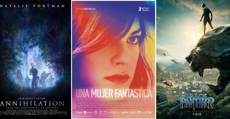
I hoped Black Panther (open February 16) might avoid this query and go all-out anyway because of what it stands for. But it’s still a cog in the Marvel machine and personality is still removed for superhero staples. So rather than show the colors and designs showcased so beautifully in the trailer, LA gives us the titular hero standing on a stone panther head. He’s lording over his kingdom, ready for a fight.


Somehow this is still better than all the other sheets because it at least creates a scene. That’s more than the cartoonish teaser of a throne with Chadwick Boseman’s head superimposed on top offers. It’s more than the Great Gatsby art deco collage too.
At least Art Machine’s character sheets try to add intrigue and regality thanks to Marco Grob’s photography. But they are so dark and dreary, more focused on the drama that’s plagued the MCU for so long. How does Disney let Thor: Ragnarok go crazy with brightly eye-popping visuals and not this one? It’s a missed opportunity for sure.
For Early Man (open February 16), LA was tasked with that campaign staple known as homage. It’s an unfortunate reality since the film is animated and therefore not beholden to a ceiling on creativity. So why are you mirroring Mad Max: Fury Road? I get why Moana did it in-film (to appeal to adults). But on a poster targeting children? This thing is just too busy for kids to gravitate towards anything.


Ignoring character sheets in favor of faux advertisements doesn’t either. Is an eight-year old going to read “The Beetle Razor” and chuckle to himself about how much the image looks like his own shaving apparatus? No. “Boar’s Snot” is at least funny for kids who read and the poster finally shows one of the cavemen creations to give them an idea of the absurd fun aspect the trailer so nicely projects. The same goes with “Fur-fection”. The joke may be over youngsters’ heads, but the character design gives them more to lock onto than a chaotic sheet of armored elephants and the backs of heroes.
So here we are with Hollywood’s best campaign (relatively speaking) in the form of Fifty Shades Freed (open February 9). I wouldn’t have believed it either since the series has been nothing but hollow depictions of the concept of sexuality without actually possessing any sexuality. While these are just as hollow, however, they add something else: franchise consistency.


Empire Design’s entry above is just a placeholder. What I really want to discuss is the work from B O N D at right. On the surface they are more of the same. But if you go back to the original film’s materials, you’ll see they are intuitively related and reversed to embody the power dynamic shift on screen. Where Jamie Dornan was in control back then, Dakota Johnson is now. She has her hand on him. She’s initiating the kiss.
The mirroring for the teases is even better. Mr. Grey facing out and Mrs. Grey turning back in—cold versus warm. The movies themselves offer little in the form of value besides this shift so it’s nice to see the design highlight as much rather than ignoring context to merely phone-in content yet again.
Text at the bottom, now look here


It’s no coincidence that three of the four films in this section are genre whether horror or science fiction. When you don’t want to show too much in order to maintain mystery, the easy thing to do is just put the star front and center with the title at bottom. I would question why the producers wouldn’t want to add intrigue by stripping things down with illustrative and typographic techniques, but the answer is probably budget. Why pay an artist to create something when you can use a Photoshop filter on existing materials?
Curvature (limited February 23) has a nice built-in geometric motif with its circular device (a time machine?) framing a woman’s body. It supplies symmetry, contrast, and focal point so that the designer only has to darken the edges to keep our vision centered. Add a modern sans serif font with some duplicitous shadows to feign motion and voila.
BLT Communications, LLC’s Annihilation (open February 23) wants to do a little more despite using less. They’ve taken a still with star Natalie Portman in the foreground and threw a filter atop it to manufacture an aesthetic of “monster” vision. It reminds me of old actioners like Terminator and Predator where the frame would alter to place us into the perspective of the hunter rather than retain our status as third person voyeur. It still creates symmetry, the text still pops bright, but the lack of excitement sadly doesn’t go away.
MOT thankfully builds rather than add with their The Lodgers (limited February 23) tease. Rather than use a publicity shot of this secluded mansion, they’ve taken the horror aspect at the core of the film to visually represent the thriller to come. The watery reflection has contextual purpose to the story and this notion of two characters being different yet the same does too. The designer therefore provides symmetry on x and y-axis, flipping the image from reality to nightmare and back and forth. It’s an eerie sight that grabs our attention, the title cutting through its dark blues with sharp edges and artful composition grounding us before we too float away.
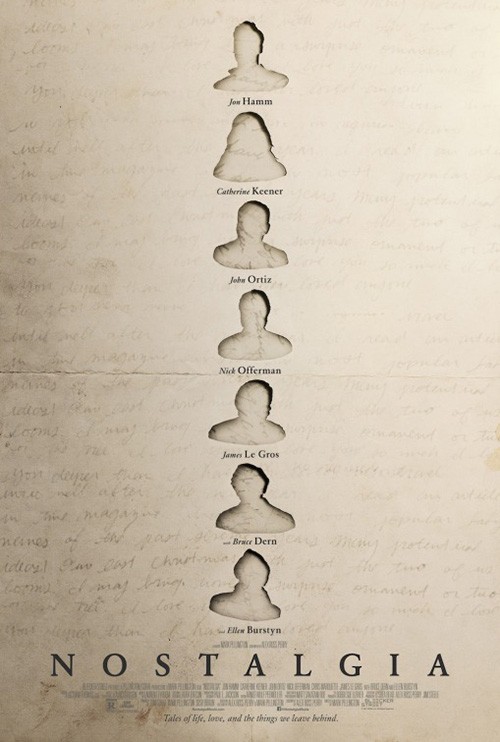
To see this design trope done right, check out Nostalgia (limited February 16). It possesses all the traits of the above—film still, bright white text, and symmetry—but it wields them with intent rather than ease in large part through the selection of its image. While it seems slight, shifting the person from center to right makes a static shot come to life. We’re forced to leave our path down the middle to find him in that illuminated doorway of framed light that’s brighter than everything else. From there we see the attic setting, bask in the sun’s atmospheric burn, and realize the whole is both present filtered through past.
I love when the simple becomes profound, especially when you have something like P+A’s teaser to contrast against. This sheet isn’t bad, but it lacks the other’s drama. It subtracts through addition, complicating a cast list with cutout silhouettes that don’t actually do anything but dwarf the names—the real content. Its idea of loss and presence does come through, but it would probably have worked better with one instead of seven examples.
My text is better than yours


I don’t think cold open’s poster for The 15:17 to Paris (open February 9) is great, but I do like its use of text. The image itself looks like four flat pieces pasted on top of each other (the background’s low opacity on black along with each of the three figures). It’s boring considering what these men eventually do—an act that would make a vastly different ad. That scene in the trailer where the one stares down the bad guy over a seat back? That’s your winner.
But I digress. While the text isn’t a literal manifestation of train station LED signs, it does portray that effect. The numbers and letters have a tactile feel, popping up with three-dimensionality the actors (real heroes whose names are assumedly in the “based on credit” since no cast is listed) don’t possess. So while it’s weird that the part of the poster that shouldn’t be flat is and the part that should isn’t, we do look at the title and remember it. That’s what’s important.
I have similar feelings about Fourplay (limited February 9). The design itself is rudimentary with a contained illustration floating on a solid background, but the text is great. Where the painting lacks personality in its stiff representation of actors trapped in an overturned glass, the title arrives with imperfections and flair. I’d be impressed to find out it’s a workable font since the connectors between letters are always shifting height, but I’ll be more impressed to learn it’s not because that would mean the firm did what too few do: use actual handwriting. That human touch is often unquantifiable.
For Blood & Chocolate’s Every Day (open February 23), text is more than just font—although that font is still important and nicely chosen. The thin width allows it to be placed above the image without hindering our view, the kerning allows the “R” to lead directly into the second “Y”, and the justification keeps everything compact with “Y” on “Y” driving our eyes down to the rest of the sheet.
But none of that matters if the title isn’t placed exactly where it is. It’s not there for readability or composition, but instead to interact with the photo so a sparkler can become the “A”. While posters often do this (see Peter Rabbit above with an ear as “A”), few find success when the thing serving as the letter doesn’t look like the letter. Our mind makes this yellow pompom what we need it to be simply because it exists in the gap. This is the type of psychological maneuver designers need to utilize more in order to stand out from the pack and be remembered.
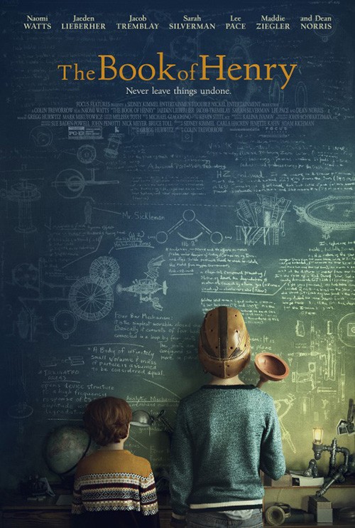
In contrast to that is Champ & Pepper Inc.’s Entanglement (limited February 9), a piece that could be good if not for our brains seeing past its artifice. The culprit: a bad drop shadow. Not only does the light shadow beneath Thomas Middleditch force our eyes to acknowledge his flatness above a background that does absolutely nothing to look real (as opposed to Book of Henry‘s chalkboard), the darker shadow on the title’s “yarn” renders it almost unreadable with a bad faux shimmer effect. And why does the yarn have a shadow anyway? Are we to believe Middleditch is lying on the ground with this word meticulously spelled out? Or is the word impossibly floating above him? The image’s depth is out of whack and all I want to do is stop looking.
Textual healing


You don’t always need a flashy font to standout. Sometimes a “boring” one is actually crucial to allowing the image to speak for itself—a complement rather than distraction. This is the case with The Female Brain (limited February 9). When you literally have actors spilling out of the central focal point with flowers, drawings, and scrawled labels, a nice austere serif lends stability. You can’t oversell a thing like that amidst a mix of photography, halftone, and illustration designed to create chaos. When a visual breather is necessary, letting the title serve that role allows it to stick by contrast.
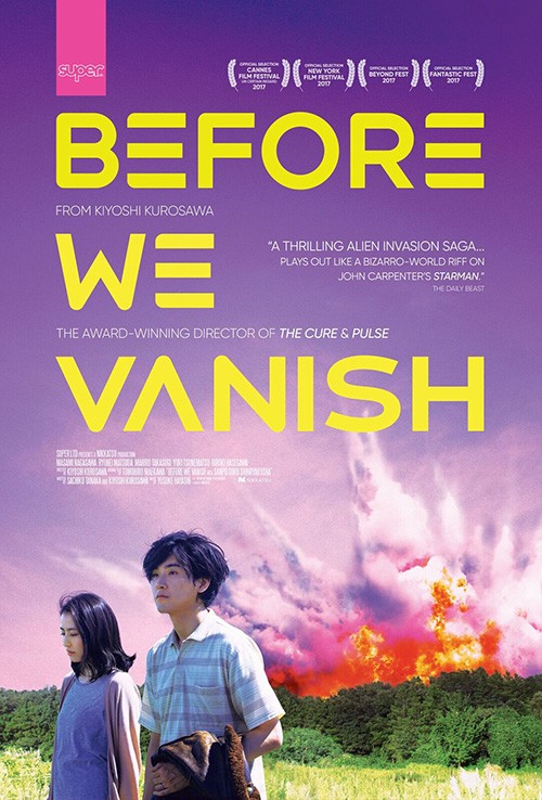
Similarly, Before We Vanish‘s (limited February 2) Japanese sheet resonates by being the lone entity within a vacuum of space. The designer has intentionally pushed all the action (two characters calmly walking away from an explosion) to the bottom of the frame. Whereas this open space would generally be filled in America with a bold font to bisect the page horizontally, Japan’s top to bottom text provides both symmetry and a landmark with which to follow down into the scene. There’s a nice sense of serenity as a result, despite the volatility of the fire. It lets the incongruity of emotion to circumstances shine.
Look at the American sheet by comparison. It sharpens the colors for a more violent eruption and covers the top two-thirds with its title much like I said it would. While the font is an attractive one—the missing lines in the “Es” and “A” providing the sci-fi feel sought—it screams at us rather than guides. The orange flames are now dangerous rather than necessary relief in its darker purple atmosphere as opposed to the former’s blue. Where the first looked like two people surviving a crazy event, this second poster looks like they are the culprits walking away from their own carnage nonplussed. I’m interested to watch and see which is true.

If you want to see a marriage of text and image without compare, however, take a gander at Dan Petris’ A Fantastic Woman (limited February 2). This thing is gorgeous with its color moving from foreground cool to background warm and its personalized script title as signature. Think of this as Marina Vidal’s headshot—a glossy photo handed out after her performances to sign for enamored fans in sharpie. The way the lines of text lose opacity mimics the inconsistent pressure of pen to page, lending the whole a rare sense of authenticity beyond mere advertisement.
This other just can’t compare to its beauty. It takes the color to an extreme that washes out half the image under spotlight triangles that add little. The font is pedestrian by comparison and ruined by an outer glow that’s less “in lights” than low budget sci-fi mystery. Here’s an example of two designs wielding similar tactics (color/contrast) wherein one “gets” the film it is speaking for and the other does not.

The poster to see this month isn’t from Chile, though. It’s from Estonia with the mesmerizing November (NY February 23; LA March 2). I look at this sheet and think The Witch on ‘shrooms dancing down to a hellish Wonderland. The image is spectacular by itself with the woman seemingly underwater and the goat staring us down with a challenge. The prickly, aggressive lines of the font interact with them both, the title broken by syllable for a staccato cadence—a mantra of heavy metal evil.
It’s amazing how such an intriguing aesthetic can be ruined with a couple changes, but the domestic sheet proves it’s unfortunately not rare. Rather than demand our focus on the title before leading us into the image by proximity, this design separates everything so they compete for attention. Do I look at the less interesting image of “clean” woman and “dirty” man? The still-electric title? Or the confusingly composed critic blurb that’s laughably out-of-place? Sadly I look at nothing. My eye travels around once and moves on, the lasting power of that international poster all but gone.
What is your favorite February release poster? What could have used a rework?